Objective 6. Chart Data
A chart is a graphic representation of data in a worksheet. Data presented as a chart is usually easier to understand than a table of numbers. When using a chart to communicate an idea to other people, choose a chart title and chart labels that make your point clearly.
Activity 1.12. Charting Data
The Chart Wizard guides you step by step through the process of displaying data as a chart. In this activity, you will chart the total tableware purchases at the Dallas restaurant for each month. Then you will compare the monthly purchases and identify any significant differences.
|
1. |
Select the range B2:G2. Hold down |
|
2. |
On the Standard toolbar, click the Chart Wizard button Figure 1.53. (This item is displayed on page 632 in the print version) 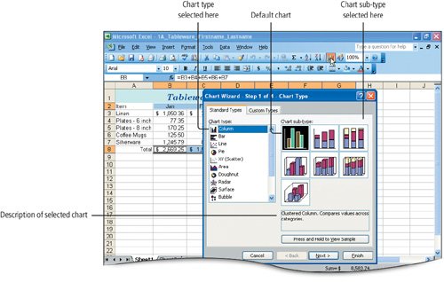
The Chart Wizard opens to the first step in the wizard with the Standard Types tab selected. In the first step of the wizard, select the type of chart you want to use. On the left side of the Chart Wizard dialog box, you can select from among fourteen standard chart typespredefined chart designsand then, on the right side, you can select the chart sub-type, variations of the selected standard chart type. The default chart is the Clustered Column chart. A description of the selected chart displays on the lower right side of the dialog box. |
|
|
|
|
3. |
Be sure the Standard Types tab is selected. Under Chart type, be sure Column is selected and then, under Chart sub-type, in the second row, click the first sub-type. |
|
|
|
|
4. |
In the lower right corner of the dialog box, click the Next button, and then compare your screen with Figure 1.54. Figure 1.54. 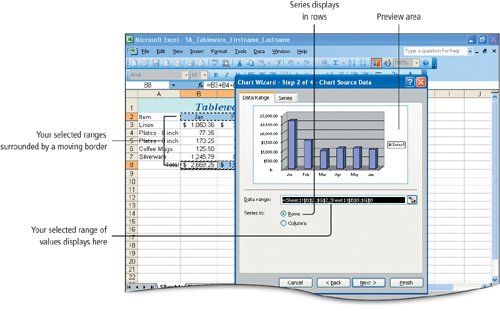
In Step 2 of the Chart Wizard you can see a preview of the data as it will display in the chart. |
|
5. |
Click the Next button to accept the settings in Step 2 and move to Step 3 in the Chart Wizard. Click the Titles tab. NoteValue (Y) Axis Typically, the value axis in a chart is known as the Y-axis. In this example, the value axis has been changed by the Chart Wizard to the Z-axis because a 3-D chart sub-type was selected. If a two-dimensional chart is used, such as the default clustered column chart, the label for the vertical axis in the wizard would be Value (Y) axis. |
|
|
|
|
6. |
Click in the Chart title box, type Tableware - Dallas and then compare your screen with Figure 1.55. Figure 1.55. 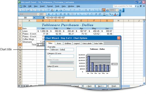
After a moment, the title displays in the chart preview area, and the chart area is resized. Adjustments to the chart can also be made after the chart is complete. |
|
7. |
Click the Legend tab, and then click to clearremove the checkmark fromthe Show legend check box. Compare your screen with Figure 1.56. Figure 1.56. (This item is displayed on page 635 in the print version) 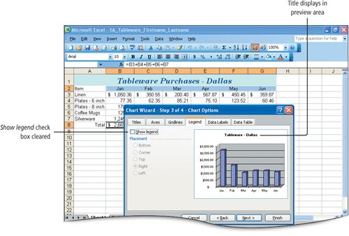
The legend is removed. If you chart more than one range of data, Excel places the columns or lines next to each other on the chart and assigns a different color to each group; a legend is used to explain the color code. In this chart, there is only one set of columns and they are all the same color, so a legend is not necessary. |
|
|
|
|
8. |
Click Next. |
|
9. |
Click the Finish button, and then compare your screen with Figure 1.57. Notice the dollar values on the Value axis increase in increments of one thousand dollars. The size and appearance of your chart may be different depending on your screen resolution. Figure 1.57. (This item is displayed on page 636 in the print version) 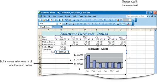
The Chart Wizard dialog box closes, and the chart displays on the current sheet. Sizing handles display around the perimeter of the selected chart object. Sizing handles are small squares or circles that indicate an object is selected and that it can be resized or moved. |
|
|
|
|
10. |
Point to a white space just inside the edge of the chart to display the Figure 1.58. 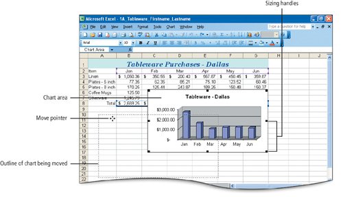
A dotted outline displays to show the position of the chart as you move it. As you drag, the pointer changes to a move pointer to indicate that the selected object is being moved. |
|
|
|
|
11. |
Scroll as necessary to bring row 29 into view on your screen. Point to the sizing handle in the lower right corner of the chart to display the diagonal resize pointer Figure 1.59. 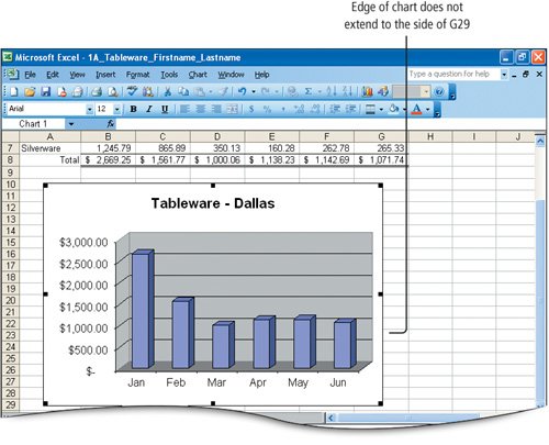
When you use the corner sizing handles to resize an object, the proportional dimensionsthe relative height and widthare retained. When you embed a chart in this manner, visually centering it below the data will achieve a more attractive result. Increments of the labels on the value axis are adjusted to fit the size of the chart. |
|
12. |
Scroll up as necessary, and then select the range A1:G29. On the Standard toolbar, click the Zoom button arrow |
|
13. |
Select the range B4:G7. On the Formatting toolbar, click the Decrease Decimal button twice. |
|
14. |
Select the nonadjacent range B3:G3,B8:G8. On the Formatting toolbar, click the Decrease Decimal button twice. Notice that the display of the numbers in the selected cells are all rounded to the nearest whole number and the chart labels on the left side display in whole numbers. The chart and the data in the cells are interactive and the chart is updated when you change the data. In many situations, decision makers do not want overly detailed information; rounding the display of numbers results in an uncluttered worksheet. If the reader of an electronic worksheet wants more detail, he or she can click the cell to see the underlying number or formula in the Formula Bar. |
|
15. |
On the Standard toolbar, click the Save button |
 and then select the range B8:G8. Alternatively, type b2:g2,b8:g8 in the Name Box.
 . Alternatively, from the Insert menu, click Chart. Compare your screen with Figure 1.53.
 pointer and then drag the chart until the upper left corner of the chart is positioned in the middle of cell A10. Compare your screen with Figure 1.58.
 , and then drag until the lower right corner of the chart is positioned in the middle of cell G29. Compare your screen with Figure 1.59. Notice the labels on the Value axis are in increments of 500 dollars.
 , and then click Selection.
 .
.
|
[Page 638 (continued)] Objective 7 Annotate a Chart |
Windows XP
- Chapter One. Getting Started with Windows XP
- Project 1A. Windows XP
- Objective 1. Get Started with Windows XP
- Objective 2. Resize, Move, and Scroll Windows
- Objective 3. Maximize, Restore, Minimize, and Close a Window
- Objective 4. Create a New Folder
- Objective 5. Copy, Move, Rename, and Delete Files
- Objective 6. Find Files and Folders
- Objective 7. Compress Files
- Summary
- Key Terms
- Concepts Assessments
Outlook 2003
- Chapter One. Getting Started with Outlook 2003
- Getting Started with Microsoft Office Outlook 2003
- Project 1A. Exploring Outlook 2003
- Objective 1. Start and Navigate Outlook
- Objective 2. Read and Respond to E-mail
- Objective 3. Store Contact and Task Information
- Objective 4. Work with the Calendar
- Objective 5. Delete Outlook Information and Close Outlook
- Summary
- Key Terms
- Concepts Assessments
- Skill Assessments
- Performance Assessments
- Mastery Assessments
- Problem Solving
- GO! with Help
Internet Explorer
- Chapter One. Getting Started with Internet Explorer
- Getting Started with Internet Explorer 6.0
- Project 1A. College and Career Information
- Objective 1. Start Internet Explorer and Identify Screen Elements
- Objective 2. Navigate the Internet
- Objective 3. Create and Manage Favorites
- Objective 4. Search the Internet
- Objective 5. Save and Print Web Pages
- Summary
- Key Terms
- Concepts Assessments
- Skill Assessments
- Performance Assessments
- Mastery Assessments
- Problem Solving
Computer Concepts
- Chapter One. Basic Computer Concepts
- Objective 1. Define Computer and Identify the Four Basic Computing Functions
- Objective 2. Identify the Different Types of Computers
- Objective 3. Describe Hardware Devices and Their Uses
- Objective 4. Identify Types of Software and Their Uses
- Objective 5. Describe Networks and Define Network Terms
- Objective 6. Identify Safe Computing Practices
- Summary
- In this Chapter You Learned How to
- Key Terms
- Concepts Assessments
Word 2003
Chapter One. Creating Documents with Microsoft Word 2003
- Chapter One. Creating Documents with Microsoft Word 2003
- Getting Started with Microsoft Office Word 2003
- Project 1A. Thank You Letter
- Objective 1. Create and Save a New Document
- Objective 2. Edit Text
- Objective 3. Select, Delete, and Format Text
- Objective 4. Create Footers and Print Documents
- Project 1B. Party Themes
- Objective 5. Navigate the Word Window
- Objective 6. Add a Graphic to a Document
- Objective 7. Use the Spelling and Grammar Checker
- Objective 8. Preview and Print Documents, Close a Document, and Close Word
- Objective 9. Use the Microsoft Help System
- Summary
- Key Terms
- Concepts Assessments
- Skill Assessments
- Performance Assessments
- Mastery Assessments
- Problem Solving
- You and GO!
- Business Running Case
- GO! with Help
Chapter Two. Formatting and Organizing Text
- Formatting and Organizing Text
- Project 2A. Alaska Trip
- Objective 1. Change Document and Paragraph Layout
- Objective 2. Change and Reorganize Text
- Objective 3. Create and Modify Lists
- Project 2B. Research Paper
- Objective 4. Insert and Format Headers and Footers
- Objective 5. Insert Frequently Used Text
- Objective 6. Insert and Format References
- Summary
- Key Terms
- Concepts Assessments
- Skill Assessments
- Performance Assessments
- Mastery Assessments
- Problem Solving
- You and GO!
- Business Running Case
- GO! with Help
Chapter Three. Using Graphics and Tables
- Using Graphics and Tables
- Project 3A. Job Opportunities
- Objective 1. Insert and Modify Clip Art and Pictures
- Objective 2. Use the Drawing Toolbar
- Project 3B. Park Changes
- Objective 3. Set Tab Stops
- Objective 4. Create a Table
- Objective 5. Format a Table
- Objective 6. Create a Table from Existing Text
- Summary
- Key Terms
- Concepts Assessments
- Skill Assessments
- Performance Assessments
- Mastery Assessments
- Problem Solving
- You and GO!
- Business Running Case
- GO! with Help
Chapter Four. Using Special Document Formats, Columns, and Mail Merge
- Using Special Document Formats, Columns, and Mail Merge
- Project 4A. Garden Newsletter
- Objective 1. Create a Decorative Title
- Objective 2. Create Multicolumn Documents
- Objective 3. Add Special Paragraph Formatting
- Objective 4. Use Special Character Formats
- Project 4B. Water Matters
- Objective 5. Insert Hyperlinks
- Objective 6. Preview and Save a Document as a Web Page
- Project 4C. Recreation Ideas
- Objective 7. Locate Supporting Information
- Objective 8. Find Objects with the Select Browse Object Button
- Project 4D. Mailing Labels
- Objective 9. Create Labels Using the Mail Merge Wizard
- Summary
- Key Terms
- Concepts Assessments
- Skill Assessments
- Performance Assessments
- Mastery Assessments
- Problem Solving
- You and GO!
- Business Running Case
- GO! with Help
Excel 2003
Chapter One. Creating a Worksheet and Charting Data
- Creating a Worksheet and Charting Data
- Project 1A. Tableware
- Objective 1. Start Excel and Navigate a Workbook
- Objective 2. Select Parts of a Worksheet
- Objective 3. Enter and Edit Data in a Worksheet
- Objective 4. Construct a Formula and Use the Sum Function
- Objective 5. Format Data and Cells
- Objective 6. Chart Data
- Objective 7. Annotate a Chart
- Objective 8. Prepare a Worksheet for Printing
- Objective 9. Use the Excel Help System
- Project 1B. Gas Usage
- Objective 10. Open and Save an Existing Workbook
- Objective 11. Navigate and Rename Worksheets
- Objective 12. Enter Dates and Clear Formats
- Objective 13. Use a Summary Sheet
- Objective 14. Format Worksheets in a Workbook
- Summary
- Key Terms
- Concepts Assessments
- Skill Assessments
- Performance Assessments
- Mastery Assessments
- Problem Solving
- You and GO!
- Business Running Case
- GO! with Help
Chapter Two. Designing Effective Worksheets
- Designing Effective Worksheets
- Project 2A. Staff Schedule
- Objective 1. Use AutoFill to Fill a Pattern of Column and Row Titles
- Objective 2. Copy Text Using the Fill Handle
- Objective 3. Use AutoFormat
- Objective 4. View, Scroll, and Print Large Worksheets
- Project 2B. Inventory Value
- Objective 5. Design a Worksheet
- Objective 6. Copy Formulas
- Objective 7. Format Percents, Move Formulas, and Wrap Text
- Objective 8. Make Comparisons Using a Pie Chart
- Objective 9. Print a Chart on a Separate Worksheet
- Project 2C. Population Growth
- Objective 10. Design a Worksheet for What-If Analysis
- Objective 11. Perform What-If Analysis
- Objective 12. Compare Data with a Line Chart
- Summary
- Key Terms
- Concepts Assessments
- Skill Assessments
- Performance Assessments
- Mastery Assessments
- Problem Solving
- You and GO!
- Business Running Case
- GO! with Help
Chapter Three. Using Functions and Data Tables
- Using Functions and Data Tables
- Project 3A. Geography Lecture
- Objective 1. Use SUM, AVERAGE, MIN, and MAX Functions
- Objective 2. Use a Chart to Make Comparisons
- Project 3B. Lab Supervisors
- Objective 3. Use COUNTIF and IF Functions, and Apply Conditional Formatting
- Objective 4. Use a Date Function
- Project 3C. Loan Payment
- Objective 5. Use Financial Functions
- Objective 6. Use Goal Seek
- Objective 7. Create a Data Table
- Summary
- Key Terms
- Concepts Assessments
- Skill Assessments
- Performance Assessments
- Mastery Assessments
- Problem Solving
- You and GO!
- Business Running Case
- GO! with Help
Access 2003
Chapter One. Getting Started with Access Databases and Tables
- Getting Started with Access Databases and Tables
- Project 1A. Academic Departments
- Objective 1. Rename a Database
- Objective 2. Start Access, Open an Existing Database, and View Database Objects
- Project 1B. Fundraising
- Objective 3. Create a New Database
- Objective 4. Create a New Table
- Objective 5. Add Records to a Table
- Objective 6. Modify the Table Design
- Objective 7. Create Table Relationships
- Objective 8. Find and Edit Records in a Table
- Objective 9. Print a Table
- Objective 10. Close and Save a Database
- Objective 11. Use the Access Help System
- Summary
- Key Terms
- Concepts Assessments
- Skill Assessments
- Performance Assessments
- Mastery Assessments
- Problem Solving Assessments
- Problem Solving
- You and GO!
- Business Running Case
- GO! with Help
Chapter Two. Sort, Filter, and Query a Database
- Sort, Filter, and Query a Database
- Project 2A. Club Fundraiser
- Objective 1. Sort Records
- Objective 2. Filter Records
- Objective 3. Create a Select Query
- Objective 4. Open and Edit an Existing Query
- Objective 5. Sort Data in a Query
- Objective 6. Specify Text Criteria in a Query
- Objective 7. Print a Query
- Objective 8. Specify Numeric Criteria in a Query
- Objective 9. Use Compound Criteria
- Objective 10. Create a Query Based on More Than One Table
- Objective 11. Use Wildcards in a Query
- Objective 12. Use Calculated Fields in a Query
- Objective 13. Group Data and Calculate Statistics in a Query
- Summary
- Key Terms
- Concepts Assessments
- Skill Assessments
- Performance Assessments
- Mastery Assessments
- Problem Solving
- You and GO!
- Business Running Case
- GO! with Access Help
Chapter Three. Forms and Reports
- Forms and Reports
- Project 3A. Fundraiser
- Objective 1. Create an AutoForm
- Objective 2. Use a Form to Add and Delete Records
- Objective 3. Create a Form Using the Form Wizard
- Objective 4. Modify a Form
- Objective 5. Create an AutoReport
- Objective 6. Create a Report Using the Report Wizard
- Objective 7. Modify the Design of a Report
- Objective 8. Print a Report and Keep Data Together
- Summary
- Key Terms
- Concepts Assessments
- Skill Assessments
- Performance Assessments
- Mastery Assessments
- Problem Solving
- You and GO!
- Business Running Case
- GO! with Help
Powerpoint 2003
Chapter One. Getting Started with PowerPoint 2003
- Getting Started with PowerPoint 2003
- Project 1A. Expansion
- Objective 1. Start and Exit PowerPoint
- Objective 2. Edit a Presentation Using the Outline/Slides Pane
- Objective 3. Format and Edit a Presentation Using the Slide Pane
- Objective 4. View and Edit a Presentation in Slide Sorter View
- Objective 5. View a Slide Show
- Objective 6. Create Headers and Footers
- Objective 7. Print a Presentation
- Objective 8. Use PowerPoint Help
- Summary
- Key Terms
- Concepts Assessments
- Skill Assessments
- Performance Assessments
- Mastery Assessments
- Problem Solving
- You and GO!
- Business Running Case
- GO! with Help
Chapter Two. Creating a Presentation
- Creating a Presentation
- Project 2A. Teenagers
- Objective 1. Create a Presentation
- Objective 2. Modify Slides
- Project 2B. History
- Objective 3. Create a Presentation Using a Design Template
- Objective 4. Import Text from Word
- Objective 5. Move and Copy Text
- Summary
- Key Terms
- Concepts Assessments
- Skill Assessments
- Performance Assessments
- Mastery Assessments
- Problem Solving
- You and GO!
- Business Running Case
- GO! with Help
Chapter Three. Formatting a Presentation
- Project 3A. Emergency
- Objective 1. Format Slide Text
- Objective 2. Modify Placeholders
- Objective 3. Modify Slide Master Elements
- Objective 4. Insert Clip Art
- Project 3B. Volunteers
- Objective 5. Apply Bullets and Numbering
- Objective 6. Customize a Color Scheme
- Objective 7. Modify the Slide Background
- Objective 8. Apply an Animation Scheme
- Summary
- Key Terms
- Concepts Assessments
- Skill Assessments
- Performance Assessments
- Mastery Assessments
- Problem Solving
- You and GO!
- Business Running Case
- GO! with Help
Integrated Projects
Chapter One. Using Access Data with Other Office Applications
- Chapter One. Using Access Data with Other Office Applications
- Introduction
- Project 1A. Meeting Slides
- Objective 1. Export Access Data to Excel
- Objective 2. Create a Formula in Excel
- Objective 3. Create a Chart in Excel
- Objective 4. Copy Access Data into a Word Document
- Objective 5. Copy Excel Data into a Word Document
- Objective 6. Insert an Excel Chart into a PowerPoint Presentation
Chapter Two. Using Tables in Word and Excel
- Chapter Two. Using Tables in Word and Excel
- Introduction
- Project 2A. Meeting Notes
- Objective 1. Plan a Table in Word
- Objective 2. Enter Data and Format a Table in Word
- Objective 3. Create a Table in Word from Excel Data
- Objective 4. Create Excel Worksheet Data from a Word Table
Chapter Three. Using Excel as a Data Source in a Mail Merge
- Chapter Three. Using Excel as a Data Source in a Mail Merge
- Introduction
- Project 3A. Mailing Labels
- Objective 1. Prepare a Mail Merge Document as Mailing Labels
- Objective 2. Choose an Excel Worksheet as a Data Source
- Objective 3. Produce and Save Merged Mailing Labels
- Objective 4. Open a Saved Main Document for Mail Merge
Chapter Four. Linking Data in Office Documents
- Chapter Four. Linking Data in Office Documents
- Introduction
- Project 4A. Weekly Sales
- Objective 1. Insert and Link in Word an Excel Object
- Objective 2. Format an Object in Word
- Objective 3. Open a Word Document That Includes a Linked Object, and Update Links
Chapter Five. Creating Presentation Content from Office Documents
EAN: 2147483647
Pages: 448
- Information Security and Risk Management
- Telecommunications and Network Security
- Legal, Regulations, Compliance, and Investigations
- Appendix D The Information System Security Engineering Professional (ISSEP) Certification
- Appendix E The Information System Security Management Professional (ISSMP) Certification
