Objective 8. Make Comparisons Using a Pie Chart
Pie charts are used to show the relationship of each part to a whole. To create a pie chart, you must select two ranges. One range contains the labels for each slice of the pie chart, and the other range contains the values that add up to a total. The two ranges must have the same number of cells and the range with the values should not include the cell with the total. You can use a legend to identify the slices of the pie using colors, but it is usually more effective to place the labels close to each pie slice.
Activity 2.14. Creating a Pie Chart
The purpose of the Golf Course Pro Shop Inventory worksheet is to determine how each item contributes to the total retail value of the inventory. To display the relationship of parts to a whole, use a pie chart. In the worksheet, you calculated the percent of the total in column F. Alternatively, this percentage can be calculated by the Chart Wizard and added to the chart as a label.
|
1. |
Select the nonadjacent ranges A3:A9 and E3:E9 to select the item names and the total retail value of each item. Alternatively, in the Name Box, type a3:a9,e3:e9 and press |
|
2. |
Click the Chart Wizard button Figure 2.36. 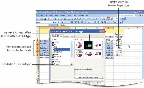
|
|
3. |
In the Chart Wizard dialog box, click Next. |
|
4. |
In the Chart Wizard dialog box, click Next. Click the Titles tab. In the Chart title box, type Percent of Total Retail Value and then click the Legend tab. Clear the Show legend check box. |
|
5. |
Click the Data Labels tab. Under Label Contains, select the Category name check box and the Percentage check box. Confirm that the Show leader lines check box is selected, and then compare your screen with Figure 2.37. Figure 2.37. (This item is displayed on page 732 in the print version) 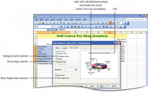
The Chart Wizard calculates the percentage of the total and displays the percentage next to each slice. The Chart Wizard formats the percentages with no decimal places. This is an alternative to calculating the percentages in a separate column in the worksheet; however the worksheet is a better place to display percentages with more decimal places. A leader line is a line that connects the label in a chart to the pie slice. Excel uses leader lines to connect labels to the slices where the slices are too narrow to display the labels close to the slices. |
|
|
|
|
6. |
In the Chart Wizard dialog box, click Next. Under Place chart, click the As new sheet option button. In the box to the right, type Percent of Retail Value Chart and then click Finish. |
|
7. |
If the Chart toolbar displays, close it. In the displayed chart worksheet, point to the slice labeled Polo Shirts 23%, and notice that the ScreenTip displays the value upon which the percentage is based. |
|
8. |
Click any of the chart's labels to select all of the labels. Then click any label that does not display a leader line to surround the label with a patterned box as shown in Figure 2.38. Figure 2.38. 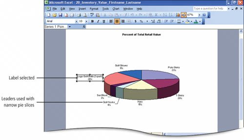
|
|
9. |
Point to the border of the selected label to display the |
|
10. |
Point to the Chart Title and click to select the title. From the Formatting toolbar, change the Font Figure 2.39. (This item is displayed on page 734 in the print version) 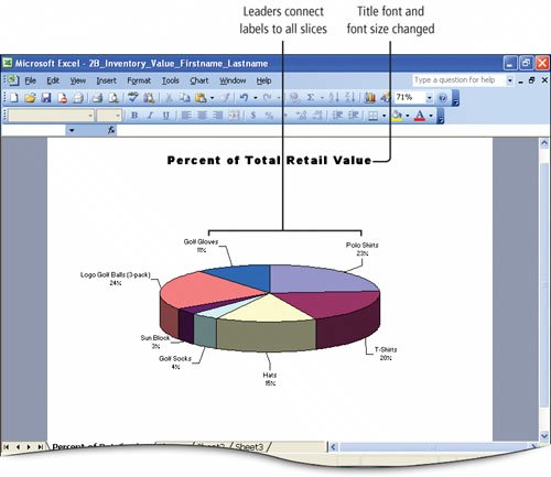
Each element of the chart can be formatted using similar methods. |
|
|
|
|
11. |
Save |
 .
. . In the displayed Chart Wizard dialog box, under Chart type, click Pie. Under Chart sub-type, in the first row, click the second type, Pie with a 3-D visual effect. Compare your screen with Figure 2.36.
 pointer, and then drag the label slightly away from its pie slice to display its leader line. Repeat this technique on any label whose leader line is not displayed.
 to Arial Black and the Font Size
  to 18. Click outside the chart to deselect, and then compare your screen with Figure 2.39.
 your workbook.
Activity 2.15. Moving Worksheets
Within a workbook, you can rearrange the order of the worksheets.
|
1. |
Click Sheet1 to make it the active worksheet, and then rename the worksheet tab Inventory Data |
|
2. |
Click the Percent of Retail Value Chart sheet tab to make it the active sheet, then point to the same sheet tab, hold down the left mouse button until a sheet icon displays. Compare your screen with Figure 2.40. Figure 2.40. (This item is displayed on page 735 in the print version) 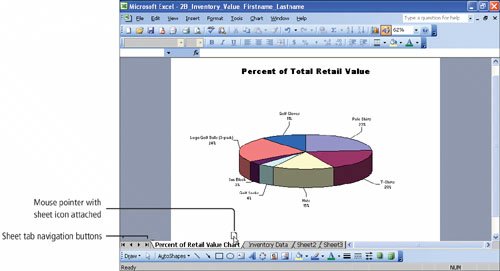
When you see the sheet icon, you can drag to move the selected sheet to the left or right of the other sheet tabs. |
|
|
|
|
3. |
Drag the Percent of Retail Value Chart sheet icon to the right of the Inventory Data sheet tab, and as you move, notice the tiny trianglecalled a caretthat indicates the location where the worksheet will be positioned, and then release the mouse button. |
|
4. |
Delete Sheet2 and Sheet3, and then Save |
|
[Page 735 (continued)] Objective 9 Print a Chart on a Separate Worksheet |
Windows XP
- Chapter One. Getting Started with Windows XP
- Project 1A. Windows XP
- Objective 1. Get Started with Windows XP
- Objective 2. Resize, Move, and Scroll Windows
- Objective 3. Maximize, Restore, Minimize, and Close a Window
- Objective 4. Create a New Folder
- Objective 5. Copy, Move, Rename, and Delete Files
- Objective 6. Find Files and Folders
- Objective 7. Compress Files
- Summary
- Key Terms
- Concepts Assessments
Outlook 2003
- Chapter One. Getting Started with Outlook 2003
- Getting Started with Microsoft Office Outlook 2003
- Project 1A. Exploring Outlook 2003
- Objective 1. Start and Navigate Outlook
- Objective 2. Read and Respond to E-mail
- Objective 3. Store Contact and Task Information
- Objective 4. Work with the Calendar
- Objective 5. Delete Outlook Information and Close Outlook
- Summary
- Key Terms
- Concepts Assessments
- Skill Assessments
- Performance Assessments
- Mastery Assessments
- Problem Solving
- GO! with Help
Internet Explorer
- Chapter One. Getting Started with Internet Explorer
- Getting Started with Internet Explorer 6.0
- Project 1A. College and Career Information
- Objective 1. Start Internet Explorer and Identify Screen Elements
- Objective 2. Navigate the Internet
- Objective 3. Create and Manage Favorites
- Objective 4. Search the Internet
- Objective 5. Save and Print Web Pages
- Summary
- Key Terms
- Concepts Assessments
- Skill Assessments
- Performance Assessments
- Mastery Assessments
- Problem Solving
Computer Concepts
- Chapter One. Basic Computer Concepts
- Objective 1. Define Computer and Identify the Four Basic Computing Functions
- Objective 2. Identify the Different Types of Computers
- Objective 3. Describe Hardware Devices and Their Uses
- Objective 4. Identify Types of Software and Their Uses
- Objective 5. Describe Networks and Define Network Terms
- Objective 6. Identify Safe Computing Practices
- Summary
- In this Chapter You Learned How to
- Key Terms
- Concepts Assessments
Word 2003
Chapter One. Creating Documents with Microsoft Word 2003
- Chapter One. Creating Documents with Microsoft Word 2003
- Getting Started with Microsoft Office Word 2003
- Project 1A. Thank You Letter
- Objective 1. Create and Save a New Document
- Objective 2. Edit Text
- Objective 3. Select, Delete, and Format Text
- Objective 4. Create Footers and Print Documents
- Project 1B. Party Themes
- Objective 5. Navigate the Word Window
- Objective 6. Add a Graphic to a Document
- Objective 7. Use the Spelling and Grammar Checker
- Objective 8. Preview and Print Documents, Close a Document, and Close Word
- Objective 9. Use the Microsoft Help System
- Summary
- Key Terms
- Concepts Assessments
- Skill Assessments
- Performance Assessments
- Mastery Assessments
- Problem Solving
- You and GO!
- Business Running Case
- GO! with Help
Chapter Two. Formatting and Organizing Text
- Formatting and Organizing Text
- Project 2A. Alaska Trip
- Objective 1. Change Document and Paragraph Layout
- Objective 2. Change and Reorganize Text
- Objective 3. Create and Modify Lists
- Project 2B. Research Paper
- Objective 4. Insert and Format Headers and Footers
- Objective 5. Insert Frequently Used Text
- Objective 6. Insert and Format References
- Summary
- Key Terms
- Concepts Assessments
- Skill Assessments
- Performance Assessments
- Mastery Assessments
- Problem Solving
- You and GO!
- Business Running Case
- GO! with Help
Chapter Three. Using Graphics and Tables
- Using Graphics and Tables
- Project 3A. Job Opportunities
- Objective 1. Insert and Modify Clip Art and Pictures
- Objective 2. Use the Drawing Toolbar
- Project 3B. Park Changes
- Objective 3. Set Tab Stops
- Objective 4. Create a Table
- Objective 5. Format a Table
- Objective 6. Create a Table from Existing Text
- Summary
- Key Terms
- Concepts Assessments
- Skill Assessments
- Performance Assessments
- Mastery Assessments
- Problem Solving
- You and GO!
- Business Running Case
- GO! with Help
Chapter Four. Using Special Document Formats, Columns, and Mail Merge
- Using Special Document Formats, Columns, and Mail Merge
- Project 4A. Garden Newsletter
- Objective 1. Create a Decorative Title
- Objective 2. Create Multicolumn Documents
- Objective 3. Add Special Paragraph Formatting
- Objective 4. Use Special Character Formats
- Project 4B. Water Matters
- Objective 5. Insert Hyperlinks
- Objective 6. Preview and Save a Document as a Web Page
- Project 4C. Recreation Ideas
- Objective 7. Locate Supporting Information
- Objective 8. Find Objects with the Select Browse Object Button
- Project 4D. Mailing Labels
- Objective 9. Create Labels Using the Mail Merge Wizard
- Summary
- Key Terms
- Concepts Assessments
- Skill Assessments
- Performance Assessments
- Mastery Assessments
- Problem Solving
- You and GO!
- Business Running Case
- GO! with Help
Excel 2003
Chapter One. Creating a Worksheet and Charting Data
- Creating a Worksheet and Charting Data
- Project 1A. Tableware
- Objective 1. Start Excel and Navigate a Workbook
- Objective 2. Select Parts of a Worksheet
- Objective 3. Enter and Edit Data in a Worksheet
- Objective 4. Construct a Formula and Use the Sum Function
- Objective 5. Format Data and Cells
- Objective 6. Chart Data
- Objective 7. Annotate a Chart
- Objective 8. Prepare a Worksheet for Printing
- Objective 9. Use the Excel Help System
- Project 1B. Gas Usage
- Objective 10. Open and Save an Existing Workbook
- Objective 11. Navigate and Rename Worksheets
- Objective 12. Enter Dates and Clear Formats
- Objective 13. Use a Summary Sheet
- Objective 14. Format Worksheets in a Workbook
- Summary
- Key Terms
- Concepts Assessments
- Skill Assessments
- Performance Assessments
- Mastery Assessments
- Problem Solving
- You and GO!
- Business Running Case
- GO! with Help
Chapter Two. Designing Effective Worksheets
- Designing Effective Worksheets
- Project 2A. Staff Schedule
- Objective 1. Use AutoFill to Fill a Pattern of Column and Row Titles
- Objective 2. Copy Text Using the Fill Handle
- Objective 3. Use AutoFormat
- Objective 4. View, Scroll, and Print Large Worksheets
- Project 2B. Inventory Value
- Objective 5. Design a Worksheet
- Objective 6. Copy Formulas
- Objective 7. Format Percents, Move Formulas, and Wrap Text
- Objective 8. Make Comparisons Using a Pie Chart
- Objective 9. Print a Chart on a Separate Worksheet
- Project 2C. Population Growth
- Objective 10. Design a Worksheet for What-If Analysis
- Objective 11. Perform What-If Analysis
- Objective 12. Compare Data with a Line Chart
- Summary
- Key Terms
- Concepts Assessments
- Skill Assessments
- Performance Assessments
- Mastery Assessments
- Problem Solving
- You and GO!
- Business Running Case
- GO! with Help
Chapter Three. Using Functions and Data Tables
- Using Functions and Data Tables
- Project 3A. Geography Lecture
- Objective 1. Use SUM, AVERAGE, MIN, and MAX Functions
- Objective 2. Use a Chart to Make Comparisons
- Project 3B. Lab Supervisors
- Objective 3. Use COUNTIF and IF Functions, and Apply Conditional Formatting
- Objective 4. Use a Date Function
- Project 3C. Loan Payment
- Objective 5. Use Financial Functions
- Objective 6. Use Goal Seek
- Objective 7. Create a Data Table
- Summary
- Key Terms
- Concepts Assessments
- Skill Assessments
- Performance Assessments
- Mastery Assessments
- Problem Solving
- You and GO!
- Business Running Case
- GO! with Help
Access 2003
Chapter One. Getting Started with Access Databases and Tables
- Getting Started with Access Databases and Tables
- Project 1A. Academic Departments
- Objective 1. Rename a Database
- Objective 2. Start Access, Open an Existing Database, and View Database Objects
- Project 1B. Fundraising
- Objective 3. Create a New Database
- Objective 4. Create a New Table
- Objective 5. Add Records to a Table
- Objective 6. Modify the Table Design
- Objective 7. Create Table Relationships
- Objective 8. Find and Edit Records in a Table
- Objective 9. Print a Table
- Objective 10. Close and Save a Database
- Objective 11. Use the Access Help System
- Summary
- Key Terms
- Concepts Assessments
- Skill Assessments
- Performance Assessments
- Mastery Assessments
- Problem Solving Assessments
- Problem Solving
- You and GO!
- Business Running Case
- GO! with Help
Chapter Two. Sort, Filter, and Query a Database
- Sort, Filter, and Query a Database
- Project 2A. Club Fundraiser
- Objective 1. Sort Records
- Objective 2. Filter Records
- Objective 3. Create a Select Query
- Objective 4. Open and Edit an Existing Query
- Objective 5. Sort Data in a Query
- Objective 6. Specify Text Criteria in a Query
- Objective 7. Print a Query
- Objective 8. Specify Numeric Criteria in a Query
- Objective 9. Use Compound Criteria
- Objective 10. Create a Query Based on More Than One Table
- Objective 11. Use Wildcards in a Query
- Objective 12. Use Calculated Fields in a Query
- Objective 13. Group Data and Calculate Statistics in a Query
- Summary
- Key Terms
- Concepts Assessments
- Skill Assessments
- Performance Assessments
- Mastery Assessments
- Problem Solving
- You and GO!
- Business Running Case
- GO! with Access Help
Chapter Three. Forms and Reports
- Forms and Reports
- Project 3A. Fundraiser
- Objective 1. Create an AutoForm
- Objective 2. Use a Form to Add and Delete Records
- Objective 3. Create a Form Using the Form Wizard
- Objective 4. Modify a Form
- Objective 5. Create an AutoReport
- Objective 6. Create a Report Using the Report Wizard
- Objective 7. Modify the Design of a Report
- Objective 8. Print a Report and Keep Data Together
- Summary
- Key Terms
- Concepts Assessments
- Skill Assessments
- Performance Assessments
- Mastery Assessments
- Problem Solving
- You and GO!
- Business Running Case
- GO! with Help
Powerpoint 2003
Chapter One. Getting Started with PowerPoint 2003
- Getting Started with PowerPoint 2003
- Project 1A. Expansion
- Objective 1. Start and Exit PowerPoint
- Objective 2. Edit a Presentation Using the Outline/Slides Pane
- Objective 3. Format and Edit a Presentation Using the Slide Pane
- Objective 4. View and Edit a Presentation in Slide Sorter View
- Objective 5. View a Slide Show
- Objective 6. Create Headers and Footers
- Objective 7. Print a Presentation
- Objective 8. Use PowerPoint Help
- Summary
- Key Terms
- Concepts Assessments
- Skill Assessments
- Performance Assessments
- Mastery Assessments
- Problem Solving
- You and GO!
- Business Running Case
- GO! with Help
Chapter Two. Creating a Presentation
- Creating a Presentation
- Project 2A. Teenagers
- Objective 1. Create a Presentation
- Objective 2. Modify Slides
- Project 2B. History
- Objective 3. Create a Presentation Using a Design Template
- Objective 4. Import Text from Word
- Objective 5. Move and Copy Text
- Summary
- Key Terms
- Concepts Assessments
- Skill Assessments
- Performance Assessments
- Mastery Assessments
- Problem Solving
- You and GO!
- Business Running Case
- GO! with Help
Chapter Three. Formatting a Presentation
- Project 3A. Emergency
- Objective 1. Format Slide Text
- Objective 2. Modify Placeholders
- Objective 3. Modify Slide Master Elements
- Objective 4. Insert Clip Art
- Project 3B. Volunteers
- Objective 5. Apply Bullets and Numbering
- Objective 6. Customize a Color Scheme
- Objective 7. Modify the Slide Background
- Objective 8. Apply an Animation Scheme
- Summary
- Key Terms
- Concepts Assessments
- Skill Assessments
- Performance Assessments
- Mastery Assessments
- Problem Solving
- You and GO!
- Business Running Case
- GO! with Help
Integrated Projects
Chapter One. Using Access Data with Other Office Applications
- Chapter One. Using Access Data with Other Office Applications
- Introduction
- Project 1A. Meeting Slides
- Objective 1. Export Access Data to Excel
- Objective 2. Create a Formula in Excel
- Objective 3. Create a Chart in Excel
- Objective 4. Copy Access Data into a Word Document
- Objective 5. Copy Excel Data into a Word Document
- Objective 6. Insert an Excel Chart into a PowerPoint Presentation
Chapter Two. Using Tables in Word and Excel
- Chapter Two. Using Tables in Word and Excel
- Introduction
- Project 2A. Meeting Notes
- Objective 1. Plan a Table in Word
- Objective 2. Enter Data and Format a Table in Word
- Objective 3. Create a Table in Word from Excel Data
- Objective 4. Create Excel Worksheet Data from a Word Table
Chapter Three. Using Excel as a Data Source in a Mail Merge
- Chapter Three. Using Excel as a Data Source in a Mail Merge
- Introduction
- Project 3A. Mailing Labels
- Objective 1. Prepare a Mail Merge Document as Mailing Labels
- Objective 2. Choose an Excel Worksheet as a Data Source
- Objective 3. Produce and Save Merged Mailing Labels
- Objective 4. Open a Saved Main Document for Mail Merge
Chapter Four. Linking Data in Office Documents
- Chapter Four. Linking Data in Office Documents
- Introduction
- Project 4A. Weekly Sales
- Objective 1. Insert and Link in Word an Excel Object
- Objective 2. Format an Object in Word
- Objective 3. Open a Word Document That Includes a Linked Object, and Update Links
Chapter Five. Creating Presentation Content from Office Documents
EAN: 2147483647
Pages: 448
