Objective 6. Insert an Excel Chart into a PowerPoint Presentation

Activity 1.6. Adding an Excel Chart to a PowerPoint Presentation

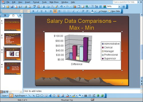
The last step in your preparation for the meeting is to add the chart you created in Excel to your PowerPoint slides.

1.

Start PowerPoint. Open the file Meeting_Slides.ppt from the folder that contains your project files. Save the file as Meeting_Slides_Firstname_Lastname.ppt

PowerPoint can give ideas that you convey a lot of visual impact. The Excel chart created from the Access data will add more visual content to the presentation. Each of the Office applications has tools that may be more specific for the type of information you want to create.

2.

Click Slide 3, where you want to add your chart.

3.

On the taskbar, click the button to return to your Excel file, Meeting_Data_Firstname_Lastname.

In the Office applications, a chart is a graphic object. When you want to select a chart, click the Chart Area. You should see the sizing handles on the corners and borders of the chart object.

4.

In the Chart Area, click to select the chart. On the Standard toolbar, click Copy, and then on the taskbar, click the button to return to your PowerPoint presentation.

5.

On the Standard toolbar, click Paste. The chart will be placed on the slide, but it is smaller than you want it to be. You can size and position the chart on the slide just as you did in the Excel worksheet. Use the sizing handle in the lower right corner of the chart to make it larger. Click in the Chart Area to Move and position the chart on the slide as needed.

You decide to edit the appearance of the chart. An Excel chart pasted into another Office application will have Excel tools available for editing the chart. The menu bar and toolbar display will change to show these tools when editing the chart.

6.

Double-click in the Chart Area. The display changes to the chart edit mode and shows Excel tools on the menu bar and toolbars. On the Chart menu, click Chart Type. The Chart Type dialog box displays. Chart types display to the left, and subtypes of these categories display to the right.


[Page 1353]

7.

In the Chart Type dialog box, click the Clustered column with a 3D visual effect subtype, the first item in the second row, and then click OK. The chart columns now have a different look to them.

8.

Move the mouse pointer outside the Chart Area, and then click to close the Excel edit tools. The menu bar and toolbars return to display PowerPoint tools.

Compare your screen with Figure 1.6.

Figure 1.6.


9.

Save and close your file, and then close the Excel file.

End

This integration project is now complete.


[Page 1355]

Windows XP

Outlook 2003

Internet Explorer

Computer Concepts

Word 2003

Chapter One. Creating Documents with Microsoft Word 2003

Chapter Two. Formatting and Organizing Text

Chapter Three. Using Graphics and Tables

Chapter Four. Using Special Document Formats, Columns, and Mail Merge

Excel 2003

Chapter One. Creating a Worksheet and Charting Data

Chapter Two. Designing Effective Worksheets

Chapter Three. Using Functions and Data Tables

Access 2003

Chapter One. Getting Started with Access Databases and Tables

Chapter Two. Sort, Filter, and Query a Database

Chapter Three. Forms and Reports

Powerpoint 2003

Chapter One. Getting Started with PowerPoint 2003

Chapter Two. Creating a Presentation

Chapter Three. Formatting a Presentation

Integrated Projects

Chapter One. Using Access Data with Other Office Applications

Chapter Two. Using Tables in Word and Excel

Chapter Three. Using Excel as a Data Source in a Mail Merge

Chapter Four. Linking Data in Office Documents

Chapter Five. Creating Presentation Content from Office Documents


Go! With Microsoft Office 2003 Brief
GO! with Microsoft Office 2003 Brief (2nd Edition)
ISBN: 0131878646
EAN: 2147483647
Year: 2004
Pages: 448

Flylib.com © 2008-2020.
If you may any questions please contact us: flylib@qtcs.net