Working with Lists of Data
Many reports are nothing more than simple lists of data. Examples include such things as task lists, customer lists, overdue invoice reports, student test scores, and phone directories. Besides being the most frequently encountered type of report, lists of data are also the easiest type to create. As such, they provide us with a good starting place to begin delving into report creation.
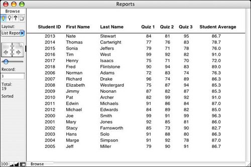
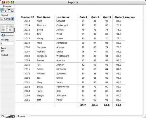
List view layouts can be created with the Layout Wizard or by hand. Figure 10.1 shows an example of a basic List view layout that displays student names and quiz scores. Depending on your needs and aesthetics, this alone might serve as a report.
Figure 10.1. Basic List view layouts are the simplest types of reports you can create.
|
For more on creating layouts and working with layout tools, see "Working with Objects on a Layout," p. 106. |
Beyond being simple to create, List views make nice reports for several other reasons. The first is that they're very flexible. You can allow users to perform ad hoc finds, or you can write scripts with canned searches, and then simply display the results using your List view.
Users can also view list reports while in Browse mode. We recommend that you consider the final delivery of a report as a separate issue from generating the report for users to view onscreen. We often design systems in which a report displays for a user (in Browse mode) and then the user can, as a second step, send it to a printer, attach it to an email, and so on.
The key benefit of being able to work with a report in Browse mode is that you can place buttons on your report that give the user additional functionality, such as drilling down to additional levels of detail, re-sorting the data without having to regenerate the report, or providing buttons for printing, emailing, and so on.
This isn't the case with subsummary reports, however: They can only be viewed in Preview mode. Subsummary reports depend on being sorted in order to group data together. Display of summary fields is a special operation that FileMaker performs in Preview mode. In these cases we still recommend thinking of final output as a second step in the process, but in the case of subsummary reports you'll need to build routines that take the user into Preview mode and then back again into Browse mode at the conclusion of the process.
There might be buttons (or other objects) on your layout that you wouldn't want to appear when the report is printed (such as navigation buttons). While building the report in Layout mode, select those objects and then choose Format, Set Sliding/Printing to open the Sliding/Printing dialog, and then select Do Not Print the Selected Objects.
Note
If your users are likely to print from a List view, be sure that you constrain your report to the width of the printed page rather than the monitor screen width. You'll also find that although 10- to 12-point fonts generally work well for reports that will be viewed onscreen, 8- to 10-point fonts are more appropriate for printed reports. Be sure to actually print your reports to proof them rather than simply relying on what you see onscreen.
 |
If you have problems printing your reports, see "Printed Reports Show Only a Single Record" in the "Troubleshooting" section at the end of this chapter. |
Of course, you can make your List view layout as crafted and attractive as you desire. You might consider employing some common techniques, however, for enhancing List view reports.
Trailing Summaries
A list report in and of itself does little synthesizing of data; it just organizes data for easy review. The main tools at your disposal for synthesizing a set of data are summary fields. Summary fields enable you to perform aggregations across a set of records, including counting, totaling, and averaging.
|
For more information about creating summary fields, see "Working with Field Types," p. 72. |
Adding a trailing grand summary part to a basic list report gives you a place to put summary information about the set of records in your report. For example, in a list report that displays invoice data, you might choose to put the total amount invoiced in the trailing grand summary part.
|
For more information about working with layout parts, see "Working with Parts," p. 103. |
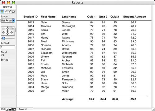
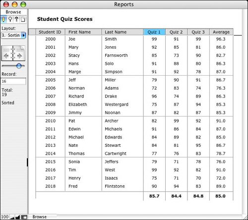
Summary fields placed in a leading or trailing grand summary part summarize the entire found set of data, so as you view different found sets of records on a report layout, your totals change accordingly. Figure 10.2 shows the same report as Figure 10.1, except that here four summary fields (Average_Quiz1, Average_Quiz2, Average_Quiz3, Average_Overall) have been added to the database and placed in a trailing grand summary.
Figure 10.2. Summary fields placed in a trailing grand summary part act on the entire current found set.
Alternating Row Color
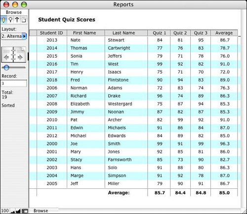
Another enhancement you may want to make to a list report is to alternate the row color. The option to alternate row color is found in the Part Definition dialog, which is shown in Figure 10.3; the quickest way to get there is by double-clicking on the body part label while in Layout mode. Figure 10.4 shows the effect this feature can have on a list report.
Figure 10.3. The option to alternate row colors can be applied only to body parts; it is grayed out as an option for any other type of part.
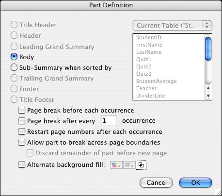
Figure 10.4. Adding a subtle alternate row color can make a list report easier to read.
Alternating the row color is more appropriate for use in reports that are to be viewed onscreen rather than printed, but if you use a light enough color, it may still print well. If you have a need for both print and onscreen versions of the same report, you may end up creating two different layouts, each optimized for a particular usage.
Horizontal and Vertical Dividers
Another method of increasing the readability of a list report is to add horizontal and/or vertical lines between the columns and rows. When both are used, the resulting report may resemble a spreadsheet; your perception of whether this is good or bad should guide your use of dividers.
We find that using thin gray lines as dividers is more effective than using solid black lines. That way it's easier to differentiate the data on the report from the grid. There's a risk, though, that too many grid lines, especially in a complex list report, can actually obscure the data. Try to use as many lines and/or field borders as necessary to increase the readability of your report, but no more.
Placing dividers into your report typically involves nothing more than drawing some lines on the layout. When adding a horizontal line between rows of data, we generally put it below the data as a baseline rather than above it. You can then add whatever effect you need under your column headers to set them apart from the first row of data.
Adding vertical dividers to a list report can be a bit tricky until you get the hang of it. The key is that your vertical lines need to be the same height as the height of the body part itself. If they're too small, you'll get a dotted-line effect. Use the Object Size palette to ensure an exact fit. The top of your vertical line should begin one pixel below the top of the body part. It usually looks better if there's some horizontal space between vertical lines and your data cells. If users are allowed to click into fields on the report, however, the field frames that appear may not look aesthetically pleasing. If your List view is truly acting as a report, you should turn off entry into all fields (using the Field Behavior dialog). That also means that your field frames will never be visible, which is a good thing. Your vertical lines can define the space between fields without interference from field frames. If users need to be able to click into fields, consider turning off the option Show Field Frames When a Record Is Active, in the Layout Setup dialog.
|
For more on the Layout Setup dialog, see "Creating and Managing Layouts," p. 94. |
If you find that having horizontal lines between every row of your report makes the report look too cluttered, it's possible also to add horizontal lines that appear just, say, every fifth row. This effect is illustrated in Figure 10.5.
Figure 10.5. Having lines appear less often provides the visual guide necessary to follow a row across but doesn't overpower the data itself.
You need to add two new fields to your table to achieve this effect. The first is a global container field, which we'll call gLine. Place this field on a layout that you can use as a resource area (we generally refer to these as developer or utility layouts), and then draw a horizontal line on your layout. Copy the line to your Clipboard, switch back to Browse mode, and paste the line into the gLine field.
The other field you need is a calculation field (set to return a container result) with the following formula:
Case ( Mod ( Get (RecordNumber) ; 5 ) = 0 ; gLine )
In effect, this formula says that for any record that's a multiple of 5, be the contents of gLine, or else be nothing.
On your list layout, finally, place the calculation field as a long, thin object along the bottom of your body part. You need to reduce the field's font size to make the object thin. Also, go into the Graphic Format options for the field (by right-clicking it in Windows, Control-clicking it on Mac), and select the Reduce or Enlarge Image to Fit Frame option, uncheck the Maintain Original Proportions option, and set the alignment to be Left, Bottom.
Note
You might be wondering whether you can just use Table view for your list reports; it provides a lot of the functionality discussed here (gridlines, sortable headers) for free. In general, though, Table view isn't suitable for reports, especially those that need any degree of polish to them. For one thing, the column labels must be the names of your fields; if you use any naming conventions, your field names may not be terribly user friendly. Another issue in some reports is that you can't have multiple lines of data per row or any objects that overlap one another.
Sorting by Columns
One of the easiest methods to use for sorting reports is to teach users how to make use of the built-in Sort dialog in FileMaker; however, an interface convention that's been widely adopted by software applications is that of clicking on the various column headers of a list report to sort the set of records by that column. It's relatively easy to add this functionality to your list reports in FileMaker Pro, but it does take some additional development work. There are several ways you can go about this task; they're all essentially variations on the same basic theme, so we present a relatively vanilla method that can be elaborated on as a solution warrants or a developer prefers.
Note
Another easy way to sort a set of records is to (Control-click) [right-click] on any field and choose one of the three sort options. You don't need to know the name of the field or fret about finding it in a long list of available fields.
Note
 |
The Sort dialog in FileMaker 8 has been enhanced to present to users only those fields that are present on a given layout. Although the interface convention we're describing is still important and commonly preferred, FileMaker 8's field list filtering has significantly improved the ease with which users can sort. |
The two components of a sortable column header routine are a script (which does the actual sorting) and a graphic indicator to let the user know by which column the list is sorted. You can use whatever graphic indicator you want for this purpose. One of the simplest is a special background color, but you can also use iconic indicators if you prefer.
Figure 10.6 shows an example of what a list layout might look like after sortable column headers have been implemented. In the example, the set of records has been sorted by the values in the Quiz1 field, and the fourth column header is highlighted with a darker color.
Figure 10.6. Users can re-sort this list report any way they want by clicking on the column headers.
Tip
An alternative to indicating the sort column graphically is to use text formatting functions to change the appearance of the column labels. It's quite similar to the approach discussed here, except that you would use calculated text fields rather than calculated container fields.
Several fields need to be added to your database to make the graphic indicators for this routine. These fields can be added to whatever table you're working with (here, Student), but it's arguably better to place these new fields into a separate resources table. This allows them to be reused in other places, and it also helps keep your data tables free of clutter. In this example, the utility table is called globals.
The following fields need to be created in the globals table:
gHighlight - Container - Global
Highlight_Quiz1 - Global Calculation - Case ($$columnSort = "Quiz1" ; gHighlight)
Highlight_Quiz2 - Global Calculation - Case ($$columnSort = "Quiz2" ; gHighlight)
Highlight_Quiz3 - Global Calculation - Case ($$columnSort = "Quiz3" ; gHighlight)
Highlight_Average - Global Calculation - Case ($$columnSort = "Average" ; gHighlight)
Highlight_FirstName - Global Calculation - Case ($$columnSort = "FirstName" ; gHighlight)
Highlight_LastName - Global Calculation - Case ($$columnSort = "LastName" ; gHighlight)
Highlight_StudentID - Global Calculation - Case ($$columnSort = "StudentID" ; gHighlight)
Notice that all the calculation fields have been set to use global storage. This is so that they can be used on any layout, even those attached to unrelated tables. They should also be set to return a container result. After the variable $$columnSort has been set to the name of a field from the quiz score report (this happens in the script shown in Listing 10.1), one of the seven calculations will resolve to the contents of gHighlight; the other six will be empty.
Note also that we've opted in this example to use separate fields for our various functions. You can make this approach a bit more elegant by using repeating fields (and thus reducing the elements you'd be using); for an example of this, see the following discussion.
After these fields have been defined, you need to put a swatch of color into the gHighlight field. Switch to Layout mode and draw a colored rectangle. Copy it to your Clipboard, return to Browse mode, and paste it into the gHighlight field.
There's still a little layout work to be done on the report itself:
- Position a single gray rectangle behind all the column labels.
- Place horizontal lines on top of the gray bar as necessary to segment the header row.
- On top of the gray bar (but under the column labels), place the seven Highlight calculation fields from the globals table. Each should be sized to fit its particular label.
- Define each to be a button that calls a script called List Report-Sort (which is shown in Listing 10.1; you need to create the script before defining the headers as buttons).
Although all seven buttons call the same script, each passes that script a unique parameter. In this example, the parameters are simply the names of the fields themselves. That is, clicking on the Quiz 1 header sends the parameter Quiz1, and clicking on the First Name field sends the parameter FirstName. You can also choose to pass a numeric code instead of the field name. This type of abstraction makes the buttons more reusable and means that you don't have to edit the parameter if your field names change or if you choose to use the same routine for multiple reports, but we think it's more intuitive when learning this routine to use the actual field names.
|
For more information about using script parameters, see "Script Parameters," p. 437. |
Listing 10.1. List Report - Sort Script
Set Variable [$$columnSort; Get(ScriptParameter)] If [$$columnSort = "Quiz1"] Sort Records [Restore; No dialog] Else If [$$columnSort = "Quiz2"] Sort Records [Restore; No dialog] Else If [$$columnSort = "Quiz2"] Sort Records [Restore; No dialog] Else If [$$columnSort = "Average"] Sort Records [Restore; No dialog] Else If [$$columnSort = "FirstName"] Sort Records [Restore; No dialog] Else If [$$columnSort = "LastName"] Sort Records [Restore; No dialog] Else If [$$columnSort = "StudentID"] Sort Records [Restore; No dialog] End If |
Each of the Sort Records steps is defined to sort by the appropriate field. Also, because $$columnSort is set in the first step, the correct Highlight field will be turned on in the globals table; after the sort is performed, the column heading will therefore accurately reflect the sort order.
Caution
If you have your list report displayed simultaneously in multiple windows, each report can be sorted differently, but the graphic sort indicator highlights the same field in all the windows. That is, if you were to click on the Last Name header in the active window, that window's found set would be sorted appropriately, but all open windows would have Last Name highlighted as the sort order, even when they may in fact be sorted differently.
Using Repeating Fields for Column Highlights
It is arguably inelegant to add a field to your database for each column by which you intend to sort. This approach adds clutter and incremental complexity and time to the development of your solution.
If you are comfortable working with repeating fields, you can collapse the logic we've presented into just four fields for your entire database. The overall technique is the same, but instead of creating a separate calculation field for each column highlight, we use the extend function to compare the name of the column label to the text in the gSort field:
gHighlight - Container - Global
gColumnLabels_r - Text, Repeating - Global
gSortPref - Text - Global
gColumnHighlight_r - Calculation, Container, Repeating - Global:
 Case ( Extend ( gSortPref ) = gColumnLabels_r ; Extend ( gHighlight ); "" )
Set the field gColumnHighlight_r to be a calculation field that returns a container result and has an equal number of repetitions to the gColumnLabels_r field.
You should then enter the names of your columns into the gColumnLabels_r field and use those same names as script parameters attached to your sort script.
FileMaker will then compare the repeating field labels to the gSortPref contents and apply a highlight to the repeating highlight field as appropriate. If the third repetition of the gColumnLabels_r field contains Last Name and $$gSortPref contains Last Name, the third repetition of gColumnHighlight_r will resolve to hold the contents of the gHighlight container field.
You then should place copies of your gColumnHighlight_r field in the header of your report and use the Field/Control Setup dialog to show only the appropriate repetition. For example, the third column of the report shown in Figure 10.6 (Last Name) would be set to show repetition 3 through 3. The fourth column (Quiz 1) would use repetition 4 through 4.
Notice that we opted to use a global field instead of a variable to store the user's sort preference. The Extend function works only with fields. If we were to use a variable, this process would work fine for the first value in the repetition, but not for any of the others.
Adding Ascending/Descending Logic for Column Sorting
You can easily extend this example on your own to allow for both ascending and descending sorts. To do so, you need another variable (or field in the globals table) to indicate the direction of the sort. Then add more conditional statements to the script so that a combination of field name and direction determines how to sort the records. Finally, alter the Highlight calculations in the globals table so that they display different images for ascending and descending sorts (perhaps triangles pointing up or down). You can either create a separate global container field to house the descending image, or simply turn gHighlight into a repeating field and have a conditional statement in the calculation resolve to the appropriate repetition. As an example, the definition for Highlight might end up as the following:
[View full width]
Case (gSortField = "Quiz1" Case ( $$sortDirection = "Ascending" ; gHighLight[1] ;  gHighlight[2] )
Alternatively, if you prefer to use the repeating field technique described previously, your gColumnHighlight_r field might look like this:
Case ( Extend ( gSortField ) = gColumnLabels_r ; Extend ( gHighlight ); "")
Finally, because the sort order and the column images are all based on global values, this routine is multiuser friendly. Two different users can be viewing the same report but have it sorted differently.
Go to Detail
No matter whether the set of records displayed in your list report is the result of an ad hoc find by a user or a canned report routine, you'll probably want to enable users to see additional details for a particular record. Typically, if you allow users to enter into fields in the list report, you have a discrete button at the beginning or end of the row that a user can click on to get to a detail view. If you don't allow data entry, it's common to let a user click anywhere on the row to be taken to a detail screen, or perhaps to format the primary bit of information to look like a blue underlined hyperlink. To make the entire row a clickable button, place a long transparent rectangle (to which you attach a navigation script) on top of the row. It should be the same height as the body itself so that there aren't any dead spaces between rows.
You have a few choices about how to display the detail record. The easiest thing to do is have the script navigate to a form view data-entry layout. Another option to consider is to have the detail record pop up in its own window. This enables users to go back and forth more easily between detail and list layouts.
|
For more on scripting techniques like this, see "Window Management Techniques," p. 455. |
Part I: Getting Started with FileMaker 8
FileMaker Overview
- FileMaker Overview
- FileMaker and Its Marketplace
- Introduction to Database Software
- FileMaker Deployment Options
- Whats New in FileMaker Pro 8
Using FileMaker Pro
- Getting Started
- Working in FileMaker Pro
- Troubleshooting
- FileMaker Extra: Becoming a FileMaker Pro Power User
Defining and Working with Fields
- Defining and Working with Fields
- Working Under the Hood
- Working with Fields
- Working with Field Types
- Assigning Field Options
- Troubleshooting
- FileMaker Extra: Indexing in FileMaker
Working with Layouts
- Working with Layouts
- Whats a Layout?
- Creating and Managing Layouts
- Working with Parts
- Working with Objects on a Layout
- Working with the Tab Control Object
- Working with Fields
- Portals
- Troubleshooting
- FileMaker Extra: Designing Cross-PlatformFriendly Layouts
Part II: Developing Solutions with FileMaker
Relational Database Design
- Relational Database Design
- Understanding Database Design
- Database Analysis
- Working with Entities and Attributes
- Understanding Relationships
- Relationship Optionality
- Understanding the Role of Keys in Database Design
- Many-to-Many Relationships: Solving the Puzzle
- The Basics of Process Analysis
- FileMaker Extra: Complex Many-to-Many Relationships
Working with Multiple Tables
- Working with Multiple Tables
- Multitable Systems in FileMaker Pro
- Creating a One-to-Many Relationship in FileMaker
- Working with Keys and Match Fields
- Understanding Table Context
- Working with Related Data
- Creating a Many-to-Many Relationship
- Relational Integrity
- Rapid Multitable Development
- Troubleshooting
- FileMaker Extra: Building a Three-Way Join
Working with Relationships
- Working with Relationships
- Relationships Graphs and ERDs
- Relationships as Queries
- Creating Self-Relationships
- Creating Ranged Relationships
- Creating Cross-Product Relationships
- Working with Data from Distant Tables
- Working with Multiple Files
- How and When to Use Multiple Files
- Troubleshooting
- FileMaker Extra: Managing the Relationships Graph
Getting Started with Calculations
- Getting Started with Calculations
- Understanding How and Where Calculations Are Used
- Exploring the Calculation Dialog Box
- Essential Functions
- Using Conditional Functions
- Aggregate Functions
- Learning About the Environment
- Troubleshooting
- FileMaker Extra: Tips for Becoming a Calculation Master
Getting Started with Scripting
- Getting Started with Scripting
- Scripts in FileMaker Pro
- Creating Scripts
- Common Scripting Topics
- Triggering Scripts
- Working with Buttons on Layouts
- Troubleshooting
- FileMaker Extra: Creating a Script Library
Getting Started with Reporting
- Getting Started with Reporting
- Deriving Meaning from Data
- Working with Lists of Data
- Summarized Reports
- Delivering Reports
- Troubleshooting
- FileMaker Extra: Incorporating Reports into the Workflow
Part III: Developer Techniques
Developing for Multiuser Deployment
- Developing for Multiuser Deployment
- Developing for Multiple Users
- Sessions in FileMaker Pro
- Concurrency
- Audit Trails in FileMaker Pro
- Launch Files
- Troubleshooting
- FileMaker Extra: Development with a Team
Implementing Security
- Approaching Security
- User-Level Internal Security
- File-Level Access Security
- Troubleshooting
- FileMaker Extra: Working with Multiple Files
Advanced Interface Techniques
- Advanced Interface Techniques
- User Interfaces in FileMaker Pro
- Navigation
- Multiwindow Interfaces
- Working with Custom Menus
- Showing/Hiding Layout Elements
- Dedicated Find Layouts
- Data Presentation
- Working with Table View
- Troubleshooting
- FileMaker Extra: User Interface Heuristics
Advanced Calculation Techniques
- Advanced Calculation Techniques
- Whats an Advanced Calculation Technique?
- Logical Functions
- Text Formatting Functions
- Array Functions
- The Filter-ing Functions
- Custom Functions
- GetNthRecord
- Troubleshooting
- FileMaker Extra: Creating a Custom Function Library
Advanced Scripting Techniques
- Advanced Scripting Techniques
- What Is Advanced Scripting?
- Script Parameters and Script Results
- Script Variables
- Window Management Techniques
- Go to Related Record
- Troubleshooting
- FileMaker Extra: Recursive Scripts
Advanced Portal Techniques
- Advanced Portal Techniques
- Portals in FileMaker Pro
- Portal Basics
- New Record Only Relationships
- Horizontal Portals
- Using Portals to Create Calendars
- Selection Portals
- Filtered Portals
- Dynamic Portal Sorting
- Troubleshooting
- FileMaker Extra: Portals and Record Locking
Debugging and Troubleshooting
- Debugging and Troubleshooting
- What Is Troubleshooting?
- Staying Out of Trouble
- Planning for Trouble
- Troubleshooting Scripts and Calculations
- Troubleshooting in Specific Areas: Performance, Context, Connectivity, and Globals
- File Maintenance and Recovery
- FileMaker Extra: Other Tools of the Trade
Converting Systems from Previous Versions of FileMaker Pro
- Converting Systems from Previous Versions of FileMaker Pro
- Migration Choices
- Converting Files
- Pre-Conversion Tasks
- Post-Conversion Tasks
- Troubleshooting
- FileMaker Extra: Converting Web-Enabled Databases
Part IV: Data Integration and Publishing
Importing Data into FileMaker Pro
- Importing Data into FileMaker Pro
- Working with External Data
- Flat-File Data Sources
- Importing Multiple Files from a Folder
- Importing Photos from a Digital Camera
- Importing from an ODBC Data Source
- Importing from an XML Data Source
- Using a Script to Import Data
- Troubleshooting
- FileMaker Extra: Exploiting the FileMaker-to-FileMaker Import
Exporting Data from FileMaker
- Exporting Data from FileMaker
- Getting Out What You Put In
- The Basic Mechanics of Exporting
- Export File Formats
- Formatting Exported Data
- Exporting Related Fields
- Exporting Grouped Data
- Exporting to Fixed-Width Formats
- Working with Large Fields and Container Fields
- Scripted Exports
- Accessing FileMaker Data Using ODBC and JDBC
- Using FileMaker Pro as an ODBC Client
- Troubleshooting
- FileMaker Extra: Accessing FileMaker Data via JDBC
Instant Web Publishing
- Instant Web Publishing
- An Overview of Instant Web Publishing
- Enabling and Configuring IWP
- Designing for IWP Deployment
- Using an IWP Solution
- Troubleshooting
- FileMaker Extra: Building Your Own Next and Previous Page Buttons
FileMaker and Web Services
- FileMaker and Web Services
- About Web Services
- FileMaker and XML
- Transforming XML
- XML Import: Understanding Web Services
- Working with Web Services
- Troubleshooting
- FileMaker Extra: Write Your Own Web Services
Custom Web Publishing
- Custom Web Publishing
- About Custom Web Publishing
- Custom Web Publishing Versus Instant Web Publishing
- Custom Web Publishing Versus XML Export
- Getting Your Databases Ready for Custom Web Publishing
- Publishing FileMaker Data as XML
- Using XSLT with Custom Web Publishing
- Building Web Applications with XSLT-CWP
- Other Custom Web Publishing Commands and Parameters
- About the FileMaker XSLT Extensions
- Troubleshooting
- FileMaker Extra: About the Custom Web Publishing Tools
Part V: Deploying a FileMaker Solution
Deploying and Extending FileMaker
- Deploying and Extending FileMaker
- FileMaker Deployment Options
- Single User
- Peer-to-Peer Hosting
- FileMaker Server
- Web Publishing
- ODBC/JDBC
- Citrix/Terminal Services
- Runtime Solutions
- Deploying to Handheld Devices
- Customized Deployment Options
- Troubleshooting
- FileMaker Extra: The Limits of Customization
FileMaker Server and Server Advanced
- FileMaker Server and Server Advanced
- About FileMaker Server
- Installing FileMaker Server
- Running FileMaker Server
- Using the Server Administration Tool
- Configuring and Administering FileMaker Server Using the SAT
- Managing Clients
- Managing Databases
- Administration from the Command Line
- Working with External Services
- Automatically Updating Plug-ins
- Scheduled Tasks
- Monitoring FileMaker Server
- Troubleshooting
- FileMaker Extra: Best Practices Checklist
FileMaker Mobile
- FileMaker Mobile
- FileMaker Mobile 8 Overview
- Using FileMaker Mobile on Your Handheld Device
- Troubleshooting
- FileMaker Extra: Publishing Related Data
Documenting Your FileMaker Solutions
- Documenting Your FileMaker Solutions
- Why Is Documentation Important?
- Developing Naming Conventions
- Using Comments Effectively
- Documenting the Relationships Graph
- Using the Database Design Report
- Using Third-Party Documentation Tools
- Putting the Finishing Touches on Your Documentation
- Final Thoughts on Documentation
- FileMaker Extra: Soliant Development Standards
EAN: 2147483647
Pages: 296
- Assessing Business-IT Alignment Maturity
- Measuring and Managing E-Business Initiatives Through the Balanced Scorecard
- A View on Knowledge Management: Utilizing a Balanced Scorecard Methodology for Analyzing Knowledge Metrics
- Measuring ROI in E-Commerce Applications: Analysis to Action
- Governance in IT Outsourcing Partnerships
