Working with Fields
Fields in Notes and Domino are not like fields in other databases. In a relational database, when you define a field, you pick the data type and then specify a width (with the exception of memo fields, which are similar to rich-text fields, and also with the exception of date fields). If you choose Text as a field data type, you have to specify a certain number of characters for the field. For a ZIP code field, you might choose 10: 5 for the five-character ZIP code, 1 for the dash, and 4 for the four-character ZIP + 4 code. You can never enter more than 10 characters in that field. This type of field is referred to as structured.
In Domino, many fields have an indeterminate lengththey are unstructured. When you specify Text as a data type, you are not required to set a length for the field. A user can enter a 10-character ZIP code in a text field or type all the way up to the maximum field size of 32KB.
The concept of unstructured data extends from fields into documents. A document is unstructured because it does not contain a specific set of fields. Fields can be added and even deleted from a document even though they are not on any form. Different forms can present items in the same document. Contrast this with a structured relational database, which contains a specific set of tables, which, in turn , contain a specific set of fields. Each record in a table (analogous to a document) has exactly the same set of fields.
Figure 4.22 shows the Field Info tab of the Field properties box. Before delving into the various attributes of fields, you must first understand some basic information regarding fields. There are two primary kinds of fields: single-use and shared. Single-use fields are the most common. (Shared fields are discussed in Chapter 7.) Single-use fields can be converted to Shared fields from a menu choice, or you can create a shared field in Domino Designer. Like any other object, fields have certain attributes. Fields can be either editable or computed, must be a specific data type, and can be single or multivalue . Table 4.4 lists the editable properties of fields.
Figure 4.22. In the Field properties box, you can define the attributes of a fieldthis figure shows the Field Info tab.
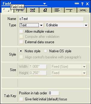
Table 4.4. Field Types
| Editable Properties | Purpose |
|---|---|
| Editable |
The default for fields, editable by users and stored in a document. The value can be assigned when the document is first created by writing a formula in the Default event. |
| Computed | Value created by formula. Stored in a document. |
| Computed for display | Value created by formula. Not stored in a document. |
| Computed when composed | Value created by a formula when a document is first composed. Stored in a document. |
NOTE
A rich-text field can be only editable or computed.
Regardless of whether the field you create is single-use or shared, multivalue or single-value, editable or computed, a specific data type must be chosen for each field. The default field type is text.
Release 6 has extended the available field types. You can choose from a number of data types in the following list; each type has a distinct appearance on the form to help you tell them apart without opening the properties box.
Text
Date/Time
Number
Dialog List
Check Box
Radio Button
List Box
Combo Box
Rich Text
Authors
Names
Readers
Password
Formula
Time Zone
Rich Text Lite
Color
Multivalue fields are a very powerful feature of Notes that allows a list of values to be stored in a single field. To borrow terminology from other programming languages, Domino is basically storing an array in a field. All types of fields except radio buttons , combo boxes, rich text, passwords, Rich Text Lite, time zone, and color fields can be multivalue. To create a multivalue field, just click the Allow Multiple Values check box under the Type field. When you do this, additional display options become available on the Control and Advanced tabs of the Field properties box.
Working with Text Fields
Text fields are the default field type. Text fields in Notes are different from text fields in other databases, in that they do not have a fixed width. They can store up to 32KB of data. Text fields can be used in field and view formulas and can contain numbers , letters , punctuation, and spaces. Text fields cannot be used in numeric calculations, although the function @TextToNumber converts text values to numbers, which can then be used in calculations. Similarly, text fields can be converted to dates using @TextToTime . Formatting in text fields is fixed at the form level by the developer and cannot be altered by the user.
Working with Date/Time Fields
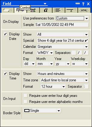
Date/time fields can contain date and time, date, or time values. When you select Date/Time, the Style section of the Field Info tab displays Notes Style and Calendar/Time Control. The default is Notes Style, which displays a standard text-based entry field. The Calendar/Time control selection lets you display either a graphic calendar or graphic time slider. You can further define the characteristics of a date/time field on the Control tab of the Field properties box, which has extensive settings for date/time fields (see Figure 4.23).
The display options for date/time fields on the Format tab are extensive. As you can see in Figure 4.23, there are numerous display rules in the following sections:
- On Display You can choose Use Preferences from User's Settings or Custom. Selecting Custom displays more options in the Display Date and Display Time sections.
- Display Date When Display Date is checked, you can use the Show and Special fields to determine the display. Show allows you to specify which date parts to display, whereas Special has settings for how years are displayed, and whether today or tomorrow are shown. You can also choose from the Gregorian (default) calendar or the Hijri calendar. If Custom is selected for Use Preference From, additional formatting options appear, including date separators and day, month, year, and weekday options.
- Display Time When Display Time is checked, you can use the Show and Time Zone fields to determine the display. Show allows you to specify which time parts to display, and Time Zone lets you determine how to handle times from different time zones. If Custom is selected for Use Preference From, additional formatting options appear, including 12- and 24- hour formats and a time separator.
- On Input You can require users to enter four-digit years, which is useful for Year 2000 compliance. You can also require users to enter alphabetic months.
- Border Style Selections in this section are different when Notes Style or Calendar/Time Control is chosen. If Notes Style is chosen, Border Style consists of a single check box: Show Field Delimiters. When checked, the familiar corner brackets appear. If Calendar/Time Control is selected, you can choose from None, Single, and Inset for Border Style.
Figure 4.23. The Control tab for date/time fields enables you to set many display options. This field has Custom preferences selected.
NOTE
Have your users ever been frustrated with Notes's insistence that dates and times be entered in specific formats? Notes and Domino 6 is less restrictive and attempts to interpret any input in a date/time field. Only when Notes cannot determine a date/time value from the input does the user receive an error message. Now you can type a single number in a date field, such as 9 , and Notes will use it to construct a date.
When displaying dates, each of the date parts and separators can be further defined by choosing a Show option. For example, you can set the display to show a date such as Saturday October 5, 2002 or Sat October 5, 2002 by customizing the date display options. Each time you change the format options, the Sample field changes to display the effects of your choices.
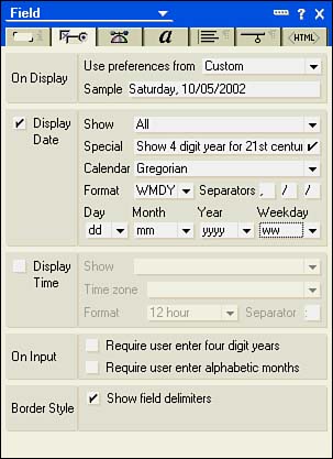
For example, to display the date in the format Saturday October 5, 2002 , take the following steps:
- Click the Field Info tab, and make sure the style is set to Notes Style.
- Click the Control tab, and select Custom in the Use Preferences From field.
- Change the Show field to All.
- Leave the default format at WMDY.
- Add a comma and a space to the first separator field, and leave the other separator boxes as is.
- Leave the Month box at mm.
- Leave the Day box at dd.
- Set the Year box to yyyy.
- Change the Weekday display box to ww (see Figure 4.24).
Figure 4.24. The completed Control tab that causes dates to display in the format weekday, month, day, and then year.
The Display Time section consists of a Show field, a Time Zone field, and, if Custom is chosen, Format and Separator fields. Like the Show field in the Display Date section, the Show field for time enables you to specify which time parts are used. The Time Zone field enables you to determine how Notes interacts with the time zone attribute of a time value. The Format field enables you to switch between 12- and 24-hour formats. The Separator field defaults to a colon . If you want to change it, type a new character in the box.
NOTE
Display options can be set in view columns . You can also control the display of dates and times with the @Text function, which has several formatting strings to define the appearance.
You can use the Calendar/Time control setting on the Field Info tab to display and enter dates and times graphically. Times are entered with a slider graphic control, and dates are entered with a calendar graphic control.
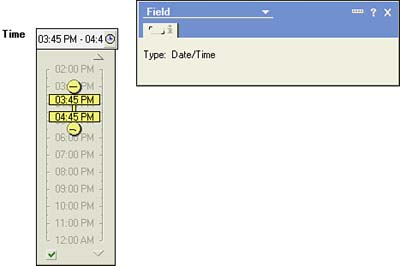
Time sliders created with a multivalue field enable the user to specify a time range; the beginning and ending time controls can be moved independently or the entire slider control can be moved as a unit. If you do not specify a multivalue field, the slider displays with a single control, allowing the user to select a specific time instead of a range. Figure 4.25 shows a time slider with a time range. To access the Time control, click the Clock button next to the field.
Figure 4.25. A multivalue time control lets the users graphically enter start and end times.
To access the calendar control when the form is in edit, click the Calendar button next to the field. Figure 4.26 shows a calendar control. To create a field that displays a calendar control, click Calendar/Time control style on the Form Info tab of the Field properties box, and deselect Allow Multiple Values. The control functions easilythe user can click a specific day in the calendar format and can use the arrows to move forward and backward through the months.
Figure 4.26. The calendar control presents a visual way to enter a date that is easy to use.

CAUTION
These controls work only with a Notes clientthey are not available to a Web client.
Working with Number Fields
Figure 4.27 shows the Control tab for a number field.
Figure 4.27. The Control tab has numerous options for numeric fields.
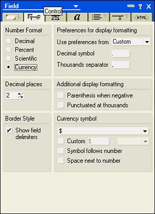
The Control tab for numbers contains the following six sections:
- Number Format
- Preferences for Display Formatting
- Decimal Places
- Additional Display Formatting
- Border Style
- Currency Symbol
The radio buttons in the Number Format section define four numeric types: decimal, percent, scientific, and currency. Decimal places can be set with a control in the Decimal Places section. To enable the Decimal Places spinner for decimal and percent types, you must deselect the Varying field. Otherwise, the spinner for Decimal Places is not available, and it is also not available for the scientific or currency types.
Similar to display options for a date/time field, you can switch between custom settings and user settings in the Use Preferences From field. When Custom is selected, you can determine the decimal symbol and thousands separator. The defaults are a period and a comma, respectively. Additional Display Formatting options enclose a number in parentheses when it is negative and punctuate numbers at the thousands place. Border Style lets you turn field delimiters on and off for Notes style and to choose from None, Single, and Inset for Native OS Style (set on the Field Info tab). Currency Symbol settings are available when the number format is currency and Use Preferences From is set to Custom. If Custom is not chosen, the currency symbol defaults to the country that is configured for the user. When Custom is chosen, you can choose the country, specify a custom currency character, and select Symbol Follows Number ( 6,000$ ) or Space Next to Number ( $ 6,000 ).
Number fields can contain the digits through 9 , plus the sign ( + or - ), and E or e for scientific notation. Number fields are used whenever calculations must be performed on the field. Note that even though telephone numbers and ZIP codes are numeric, it doesn't make any sense to store them as numbers. Why? You don't need to do any mathematical calculations on ZIP codes or telephone numbers.
Using Keyword Fields
Keyword fields are special fields that present lists of choices. There are five types of keyword fields: a dialog list, check box, radio button, list box, and combo box. Figure 4.28 shows the Control tab of a keyword field.
Figure 4.28. You define the contents of a keyword field in the Choices box of the Control tab for a keyword field either by direct entry, as in this example, or with a formula.
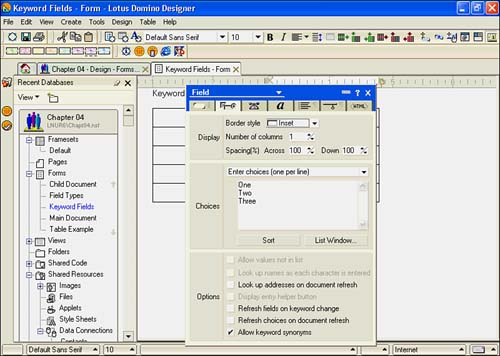
The Control tab has three sections, some of which have subsections:
- Display This displays Border and other settings for all fields except dialog lists. For dialog lists, it controls the display of field delimiters. For check boxes and radio buttons, you can change the number of columns (1 is the default) and control the spacing across and down. For example, you might want a radio button to have three choices: Yes, No, and N/A. If you set the Number of Columns spinner to 3, the radio buttons display horizontally.
- Choices In this section, you define the choices that appear in the field. With the exception of the dialog list, all types have two choices, direct entry, and formula. Dialog lists have many more selections. Choices include the following:
- Enter Choices (One Per Line) This is the default, and it enables the developer to type values directly into the window.
- Use Formula for Choices This is perhaps the most commonly used choice. It allows the developer to use a formula to determine the list of keywords. Typically, the formulas use @DbColumn or @DbLookup . @DbColumn returns a list of values from a column in a view. @DbLookup also returns a list of values from a view column, but it allows you to pass a value to filter those values with a key.
- Use Address Dialog for Choices This presents the familiar Address Book dialog box. If the field is multivalue, you will be able to choose more than one name; if not, you can choose only a single name . This is similar to @PickList when you specify the [Name] keyword.
- Use Access Control List for Choices This allows choices to be made from the ACL for the current database.
- Use View Dialog for Choices When this option is selected, you can select not only a view, but also a database from which the view can be chosen. This is similar in function to @PickList .
- Options Some options are always available, and some are conditionally displayed, depending on the field type and the setting in Choices. Options are as follows:
- Allow Values Not in List This option lets the user type a new entry into the field. It is available for dialog lists and combo boxes.
- Look Up Names as Each Character Is Entered This option is available for dialog lists that use the Address dialog box for choices.
- Display Entry Helper Button This is available only for dialog lists. When checked, a small gray button (the entry helper) appears beside the field in edit mode. Clicking the button opens the dialog box.
- Refresh Fields on Keyword Change When checked, if the contents of the keyword field change, the document is refreshed. If any field values depend on the value of this field, they are updated. This is often used in tandem with the next option.
- Refresh Choices on Document Refresh When checked, if the document is refreshed (perhaps as the result of a change in another keyword field), the choices in the keyword field are refreshed. You can use this option with Refresh Fields on Keyword Change to dynamically change the contents of lists by entering the value in one field and using the value chosen as a keyword to filter a view lookup with @DbLookup , for example.
Display Options
The Display section is available for all keyword types. For dialog lists, you can only turn the border on and off. For the remaining types, you can set the border style of the field and the number of columns to be displayed. The border styles are the following:
- None Presents a check box or radio button with no background or border.
- Single Presents a check box or radio button with a border.
- Inset Displays a standard Windows-style frame with a gray background. This style is useful in layout regions or in forms with a gray background.
NOTE
Radio buttons are used when only one choice is possible. If you change the display to a radio button, you will notice that there is no longer a multiple-value check box available. Check boxes, on the other hand, are used to allow multiple choices. It is important to adhere to this interface standard; in fact, Domino Designer enforces this by selecting Allow Multiple Values on the Field Info tab for check boxes. The option is then grayed out so that it cannot be changed.
When you choose display styles, bear in mind that radio buttons and check boxes are not well suited to lengthy lists.
CAUTION
When a user has clicked a radio button, it cannot be unclicked. It is sometimes useful to provide a choice of N/A or Unknown choice so that incorrect data is not stored.
Keyword Field Choices
You can create keyword lists by typing them directly into the field, by creating a formula, or by using one of the other dialog choices. Methods of populating keyword lists using @DbLookup , @DbColumn() , @Picklist() , and other formulas are discussed in Chapter 12.
The remaining choices, Use Address Dialog, Use Access Control List, and Use View Dialog, all present dialog boxes from which the user can make choices.
Options for Keyword Fields
If you check Allow Values Not in List, you can dynamically build lists of lookup values. In other words, the keyword field can become self-referencing. You do this by building the keyword list with a formula such as @DbLookup() or @DbColumn() against a view that contains the keyword field as the first sorted and categorized column. When a user creates and saves a document with a new value, it automatically adds it to the keyword list. The view should be sorted and categorized so that unique values are returned.
CAUTION
By default, @DbColumn() and @DbLookup() cache the values returned. This means that a user could add a new value and save the document, but it won't show up in a keyword field. If you specify NoCache , the values won't be stored and the list will be refreshed each time. This causes an impact on performance that depends on the number of documents in the view, so you must weigh the application's needs against its performance. The performance impact will be minimal as long as the list remains relatively small, but if the formula returns thousands of items, you will definitely see an impact. The impact will be greater or lesser depending on the server and client hardware as well.
A workaround to this is to use the Use View dialog box for choices or @PickList . However, this doesn't provide a nice, tidy list.
TIP
If you elect to build keyword lists from a view with @DbColumn() or @DbLookup() , use a hidden view as the target. This enables you to build a view consisting of one or more columns that the user doesn't see. Many times views such as this have no real value to an end user, and hiding them is a good idea. You can hide a view by enclosing its name in parentheses.
Look Up Names as Each Character Is Entered is available only for dialog lists that use the Address Book. If you check this setting, you can use type-ahead to locate names in the Domino directory.
Display Entry Helper Button is self-explanatory, but the two Refresh options merit further discussion. For example, assume that you have a database of cities, states, and ZIP codes. Users first select a state, and then a city, and finally a postal code. After selecting a state, wouldn't it be nice to display only cities from that state? And after selecting a city, to display only postal codes in that city so that users can more easily pick the right one? This is an example of a cascaded lookup. The choices displayed in the city and postal code fields depend on the values in other keyword fields. To accomplish this in Notes ( assuming that the city database was already created), create a form with the three fields set up as keyword fields. Use @DbColumn() to retrieve the list of states, and mark the option Refresh Fields on Keyword Change. For the cities, use @DbLookup() with a key of the state field. Mark the options for the city field Refresh Fields on Keyword Change and Refresh Choices on Document Refresh. This will cause the city field to restrict the list of cities to those within the state chosen. The postal code field can be set up with @DbLookup() using the city as the key. In this case, only Refresh Choices on Document Refresh needs to be set because no other keywords depend on the value of the postal code field. This is a powerful technique for presenting targeted lists.
Working with Rich-Text Fields
Rich-text fields can be thought of as bit buckets because you can put nearly anything into them: file attachments, OLE objects, images, entire documents, and so forth. Unlike with other types of fields, the user can change the format of text in a rich-text field. Rich-text fields can contain the following (and this is not even an all-inclusive list):
- Objects, such as images, cut and pasted, added from image resources, or imported from the file system
- Hotspots, whether graphic, pushbutton, or text-added
- Multiple file attachments
- Entire documents (the Reply with History option in Notes mail is an example of this)
- Multiple text-formatting styles
- OLE objects
- Java applets
- Embedded objects such as outlines, folder panes, and navigators
- Sections
- Tables
- Computed text
- Pass-thru HTML
A rich-text field is similar to a word-processing document. Rich-text field limits are almost absurdly high; they are limited only by disk space and can be up to 1GB. The maximum size of a single paragraph in a rich-text field is 64MB. Just as in a Rich Text Lite field, you cannot use a rich-text field on a layout region.
Before you decide to use a rich-text field, be aware that you cannot easily access the contents of a rich-text field in a formula, nor can they be directly displayed in a view. Using the Formula language, you can use @Text to return the text content of the field. In LotusScript, you can use the GetFormattedText method of the NotesRichTextItem . You can also access certain properties of a rich-text field with @Functions such as @Attachments , @AttachmentNames , and @AttachmentLength , which return information about any file attachments. You can find out whether the field is available with @IsAvailable . LotusScript and Java have extensive support for rich-text fields.
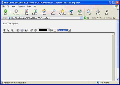
If you are presenting the form to a Web client, you have a very powerful display option at your disposal. On the Field Info tab is a section titled On Web Access. Set it to Use Java Applet, and the Editor applet is enabled, as shown in Figure 4.29. You'll notice that several buttons can be used to control the format of the text and to create links. There is a slight drawback, however, in that it takes a short period of time to load the Java applet.
Figure 4.29. Using a Java applet to display a rich-text field gives a Web client access to powerful formatting options not available with standard HTML.
Working with Rich Text Lite Fields
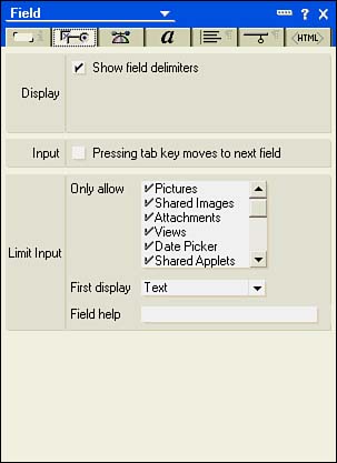
Rich Text Lite Fields include two entry helper buttons when accessed with a Notes client. Clicking the down arrow on the right and selecting an option from the list changes the helper icon on the left to a corresponding image. For example, the default selection is text, so a capital T appears on the button. If you select Picture from the list, another helper icon appears. When you click the helper icon, other options appear. For example, for text, you can choose the format and style. For shared images, you can select an image from the image resources. You cannot insert anything other than the choices available from the entry helper buttons into a Rich Text Lite field. These choices can be set on the Control tab of the Field properties box (see Figure 4.35). If a Rich Text Lite field is presented to a Web browser, it behaves just like a rich-text field. Just as with a rich-text field, you cannot use a Rich Text Lite field on a layout region.
Figure 4.35. The Control tab can change significantly based on the field type, style, and other settings.
Working with Readers, Authors, and Names Fields
Readers, Authors, and Names fields work with usernames. Readers and Authors fields enable you and the user to control access to documents in conjunction with the ACL. Readers fields limit read access to documents. If the document has a Readers field and you are not listed in it, you will not even know that the document exists. Authors fields control editor access to documents. Names fields display names as they appear on user IDs and are used for security.
You can place usernames, groups, or roles in Readers and Authors fields. By controlling the value of Readers and Authors fields, you can control who can read and edit the document. This is a very useful technique in workflow applications, where you might base the value of both Authors and Readers fields on the status of the document.
Readers and Authors fields only modify the database ACL; they do not replace it. For example, if you have Reader access to a database, even if you are listed in an Authors field of a document, you cannot edit the document. If you have Editor access to a database, you can edit a document even if you are not listed in an Authors field. However, if you are not listed in the Readers field, even if you have Manager access to the database, you won't be able to see the document.
TIP
It is always a good idea to leave yourself a back door into a document. You can do this by using a role and placing the role into the Reader or Authors fields. By assigning yourself to this role in the database ACL, you can always access any documents. Remember, even if you are a Manager of the database and can edit any document, if you are not in the Readers list, you will not even know that the document exists. You should also include the LocalDomainServers group in both Readers and Authors fields.
Working with Password and Formula Fields
These two field types were introduced in Release 5. Password fields allow you to create a field that accepts alphanumeric entry but displays only asterisks . However, although a password field can protect a user's entry from prying eyes, if you save the field, it is not secure and can be viewed in the Fields tab of the Document properties box. As a workaround, you can clear the value of the field before it is saved.
Formula fields are intended for use with database subscriptions. You can add a subscription form to any database. For an example, see the Headlines database $Subscription form. When users subscribe to databases, they are notified when a document that meets their criteria is entered into the database. Essentially, the formula field is a selection statement that the server uses to determine whether a notification is necessary.
Working with Time Zone Fields
Time zone fields automatically contain a list of time zones throughout the world, expressed as an offset of Greenwich Mean Time (GMT). For example, in the eastern United States, it is GMT 5. You can also find in the list certain cities, such as Bogot, Columbia, under Eastern Time.
Working with Color Fields
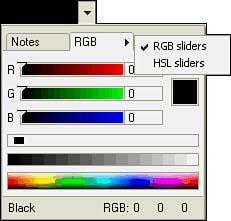
Color fields display a tabbed color picker. One tab contains Notes colors, from which you can choose Notes Palette or Web Palette (see Figure 4.30). The other tab displays an RGB mixer, from which you can select RGB Sliders or HSL Sliders (see Figure 4.31). The chosen color is stored as a hexadecimal RGB value in the field; for example, black is stored as 00000000 and white is stored as 00FFFFFF . Color fields can be used to control colors in views. For example, Domino 6 mail uses Color fields to change the colors of rows in folders and views based on criteria you supply in Mail Preferences.
Figure 4.30. The Notes Color Picker tab can use the Notes or Web palettes.
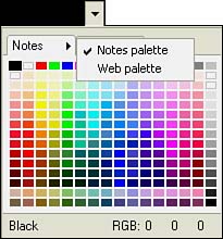
Figure 4.31. The RGB Color Picker tab has settings for RGB and HSL. You can also click the color bars at the bottom to select a color.
Adding Fields to a Form
Adding simple data-entry fields to a form is nearly as easy as adding text to the form. To add a field to a form, position the cursor at the desired location. Click the Create Field SmartIcon on the toolbar, or choose Create, Field from the menu. Figure 4.32 shows the properties box for a new field.
Figure 4.32. Fields are named in the Field Info tab of the Field properties box.
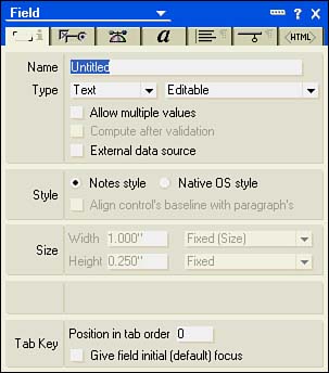
As soon as you create a new field, the Field properties box is opened to the Field Info tab. Note that a new field is always Untitled (see Figure 4.32), so you must change the name of the field. New fields always default to an editable, single-value text field. To change the type of field or its editable properties, simply change the values of the two Type drop-down lists.
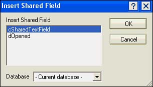
You can also insert shared fields from the Create menu (Create, Insert Shared Field) or from the SmartIcons toolbar. After you choose to insert a shared field, you are presented with a list of shared fields in the database (see Figure 4.33). In this case, you don't have to define the field because the field already is named and defined. In fact, you cannot change the attributes of a shared field from a formyou must do so from the Shared CodeFields view of the Design list. Shared fields are distinguishable from other fields by the thick black border that surrounds the field in design. You can share an existing single-use field by choosing Design, Share This Field from the menu.
Figure 4.33. The Insert Shared Field dialog box lists shared fields available for insertion into the current form.
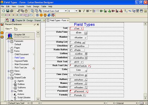
Symbols in the Field box in design identify the type of field. For example, a text field has the letter T on the right, whereas a rich-text field has an italicized T. Figure 4.34 shows each field type.
Figure 4.34. This form shows each field typenote the symbols in each field box indicating its type.
Several tabs appear on the Field properties box for all fields, regardless of type. These are the Field Info, Control, Advanced, Font, Paragraph Alignment, Paragraph Hide When, and the Field Extra HTML tabs.
Using the Field Info Tab
The settings on this tab vary based on the field type. The Field Info tab is used to name a field, choose its type, and determine its editable status. There are sections for Name and Type, Style, Size, Web Access (for rich text and Rich Text Lite only), and Tab Key. The following are the sections on the Field Info tab of the Field properties box:
- Name and Type You specify the field name and type in this section. Two check boxes, Allow Multiple Values and Compute After Validation, are enabled based on the field type. External Data Source specifies that the field is populated from an external source.
- Style This section contains a radio button with two choices: Notes Style and Native OS Style or Calendar/Time Control. This setting is conditionally available, as is the check box Align Control's Baseline with Paragraph's.
- Size This property is conditionally available for certain field types and styles settings. You can specify width to a fixed size in inches or characters, and you can set the height to a fixed size in inches or to a proportional size.
- Web Access This section is completely blank for all fields except rich text and Rich Text Lite; the section title does not even appear. You can choose to display rich-text fields using HTML (the default) or using a Java applet.
- Tab Key You can enter a number for the tab order in Position in Tab Order. Unfortunately, there is no way to dynamically specify the tab order; you simply have to type a number. When you specify a tab order by entering a number, a number appears in the field on the form. Check Give This Field Initial (Default) Focus if you want the user moved to this field when a document using this form is opened for editing.
Using the Control Tab
The Control tab is illustrated in Figure 4.35. The Control tab contains display and input settings for fields. Many different settings might be presentpresenting a comprehensive list of settings that appear on this tab for each field type and style is beyond the scope of this chapter.
Using the Advanced Tab
The Advanced tab has several sections: Help Description, Field Hint, Multivalue Options, Security Options, and Special Event Options (not shown). Figure 4.36 shows help text for a date field, including a field hint, 10/05/2002 . When a document is initially composed, the field hint appears in the field. Once the field has focus, the field hint disappears. Field hints are new to Notes and Domino 6.
Figure 4.36. Multivalue Options for this field are disabled.
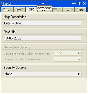
Field-level help is entered in the Help Description field. Field-level help appears at the bottom of the document window, as long as it is enabled. Multivalue Options are activated for multivalue fields. They define the way data appears when entered and when it is displayed. Choices for separators are Space, Comma, Semicolon, New Line, and Blank Line. You can have different separators for entry and display.
The Security Options section includes the following:
- None
- Sign If Mailed or Saved in Section
- Enable Encryption for This Field
- Must Have at Least Editor Access to Use
Special Event Options appear only for date/time fields, keyword fields, and time zone fieldsand, even then, only under certain conditions. This section consists of a single check box: Run Exiting/OnChange Events After Value Change. Code in the Exiting or OnChange events of the field executes when the contents change.
Using the Font, Alignment, and Hide When Tabs
These tabs are exactly the same as the tabs for the Text properties box discussed in earlier sections. For more information on these tabs, see the sections "Using Font, Alignment, Margins, and Borders Settings" and "Using the Paragraph Hide When Tab," earlier in this chapter.
Using the Field Extra HTML Tab
This tab has two sections: Name and HTML Tags (see Figure 4.37). The Name section is displayed but is not available for editing. The HTML Tags section enables you to specify certain HTML attributes for a field. There are five fields on this tab:
- ID
- Class
- Style
- Title
- Other
Figure 4.37. The Field Extra HTML tab of the Field properties box.
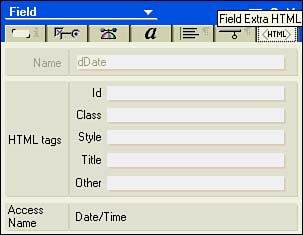
You can use the ID field to further identify a field to JavaScript or a Cascading Style Sheet. Class and Style are used with Cascading Style Sheets. Text entered in the Title field appears as a floating text box when the mouse hovers over the field in a Web browser. You can enter HTML tags in the Other field. Access Name displays the field type in Domino Designer.
Part I. Introduction to Release 6
Whats New in Release 6?
- Whats New in Release 6?
- A Brief History of Lotus Notes
- Major Features of Lotus Notes
- Types of Applications
- Whats New in Domino Designer?
- New Design Element Features
- New Language Features
The Release 6 Object Store
- The Release 6 Object Store
- Defining a Domino Database
- Understanding the Database Structure
- Creating a Database
- Working with Database Properties
- Understanding Design Templates
- Creating Your Own Templates
- Inheriting Designs from Templates
- Using Templates to Replicate Design Changes
- Using Templates as Design Libraries
- Archiving Versions with Templates
The Integrated Development Environment
- The Integrated Development Environment
- Working in the Application Design Environment
- Working with the Properties Box
- Understanding the Work Pane
- Using the Programmers Pane
- Understanding the Info List
- Understanding the Action Pane
- Customizing the Tools Menu
- Printing Source Code
- Using the HTML Editor
- Locking Design Elements
Part II. Foundations of Application Design
Forms Design
- Forms Design
- Designing Forms
- Setting Form Properties
- Working with Text Properties
- Working with Fields
- Writing Formulas in Fields
Advanced Form Design
- Advanced Form Design
- Working with Tables
- Using Graphic Objects on Forms
- Working with Form-Level Events
- Using Form Actions
- Working with Hotspots
- Understanding Sections and Section Properties
- Using Layout Regions
- Working with Special Forms
- Creating Reusable Design Objects
- Using Embedded Elements
- Using the Form Design Document
Designing Views
- Designing Views
- Defining the Elements of a View
- Creating a View
- Setting View Properties
- Creating Advanced View Selections
- Adding and Editing View Columns
- Using View Column Properties
- Adding Actions to a View
- Creating Calendar Views
- Understanding Folders
Using Shared Resources in Domino Applications
- Shared Resources
- Sharing Images Within a Database
- Creating Shared Files
- Creating Shared Applets
- Shared Code
- Creating Subforms
- Creating Shared Fields
- Creating Shared Actions
- Script Libraries
- Database Resources
Using the Page Designer
- Using the Page Designer
- Understanding Pages
- Working with the Page Properties Box
- Using the Page Designer
- Adding Layers to Your Pages
Creating Outlines
- Creating Outlines
- Creating an Outline
- Working with Outline Entries
- Embedding Outlines
- Adding an Outline to a Frameset
Adding Framesets to Domino Applications
- Adding Framesets to Domino Applications
- Creating a Frameset
- Using the Frameset Designer
- Working with Frames
- Viewing the HTML Source of Your Frameset
- Launching the Frameset
Automating Your Application with Agents
- Automating Your Application with Agents
- Working with Agents
- Creating an Agent
- Working in the Agent Builder Design Window
- Using @Commands in Agents
- Putting Your Agent to Work
- Creating a Complex Agent
- Using LotusScript in Agents
- Creating Web Agents Using Formulas and LotusScript
- Using Java in Agents
- Testing and Debugging Agents, the Agent Log, and Agent Properties
- Agent Properties via the Agent InfoBox
Part III. Programming Domino Applications
Using the Formula Language
- Using the Formula Language
- Overview of the Formula Language
- Knowing Where to Use @Functions and @Commands
- Formula Syntax
- Limitations of the Formula Language
- Working with Statements
- Using Logical @Functions
- Working with Date and Time @Functions
- Working with Strings
- Getting Session and User Information
- Working with Documents
- Retrieving Data with @DbColumn and @DbLookup
- Working with Lists
- Getting User Input
- Controlling the Flow of a Formula
- Error Handling
Real-World Examples Using the Formula Language
- Real-World Examples Using the Formula Language
- Programming Practices
- Using Formulas in Forms and Subforms
- Writing Field Formulas
- Writing View Formulas
- Using Hide When Formulas
- Working with Forms, Views, and Shared Actions
Writing LotusScript for Domino Applications
- Writing LotusScript for Domino Applications
- Software Construction
- Fundamental Elements of LotusScript
- New Technologies and LotusScript
Real-World LotusScript Examples
- Real-World LotusScript Examples
- Real-World Example 1: Importing a Delimited Text File
- Real-World Example 2: Delete a Parent Document and All Its Children: DeleteParentAndChildren
- Real-World Example 3: Schedule an Agent Robot to Refresh All the Documents in a View: Robot-DailyRefreshAllDocs
- Real-World Example 4: Return a Web User to the Place Where He Started After a Document Is Submitted: WebQuerySave-DocSubmit
Writing JavaScript for Domino Applications
- Writing JavaScript for Domino Applications
- What Is JavaScript?
- JavaScript Is Not Java
- JavaScript and the Domino IDE
- The Document Object Model
- JavaScript Support in Domino 6
- When to Use JavaScript
- A Look at JavaScript in Domino
- JavaScript Libraries in Domino
- JavaScript Principles 101
- Syntax and Command Blocks
- Statements
- Output
- Functions
- Objects
- Input Validation
- Validating Check Boxes
- Validating Radio Buttons
- Validating Selection Lists
- Calculations
- JavaScript Application
Real-World JavaScript Examples
- Real-World JavaScript Examples
- Real-World Example 1: Dynamic Drop-Down Lists on the Web
- Real-World Example 2: Dialog Boxes and window. opener on the Web
- Real-World Example 3: Dynamic Tables
- Real-World Example 4: Useful JavaScript Utilities
Writing Java for Domino Applications
- Writing Java for Domino Applications
- Introduction to Java
- Choosing a Java Solution in Domino
- Understanding the Notes Object Interface
- Writing Java Agents
- Using Other Java IDEs
- Other Uses for Java
Real-World Java Examples
Enhancing Domino Applications for the Web
- Enhancing Domino Applications for the Web
- Whats New in Designer 6
- Understanding the Domino Web Application Server
- Understanding the Basics of HTML
- Using HTML in Domino Designer
- Adding Power with Domino URLs
- Views and Forms Working Together on the Web
- Incorporating Flash into Your Web Pages
- What Its All About: XML Exposed
- How Does Domino Use XML?
Part IV. Advanced Design Topics
Accessing Data with XML
Accessing Data with DECS and DCRs
- Accessing Data with DECS and DCRs
- What Is DECS?
- The External Data Source
- DECS Administrator
- Creating the Activity
- Accessing the Application
- DECS Summary
- Data Connection Resources
- DCR Example
- Tips on External Data Access
Security and Domino Applications
- Security and Domino Applications
- How Does Domino Security Work?
- Enabling Physical Security
- Setting Server Access
- Database Access Control Lists
- The Role of the Domino Directory in Application Security
- ACL Privileges
- Enabling Database Encryption
- Using Roles
- Implementing View-Level Security
- Implementing Form-Level Security
- Implementing Document-Level Security
- Applying Field-Level Security
- Hiding the Design of Your Application
Creating Workflow Applications
- Creating Workflow Applications
- The Evolution of Groupware
- Introducing Workflow
- Creating Mail-Enabled Applications
- Using Triggers to Send Email
- Sending Mail with LotusScript
Analyzing Domino Applications
Part V. Appendices
Appendix A. HTML Reference
Appendix B. Domino URL Reference
EAN: 2147483647
Pages: 288
- Challenging the Unpredictable: Changeable Order Management Systems
- ERP System Acquisition: A Process Model and Results From an Austrian Survey
- Enterprise Application Integration: New Solutions for a Solved Problem or a Challenging Research Field?
- Data Mining for Business Process Reengineering
- A Hybrid Clustering Technique to Improve Patient Data Quality
