Using Embedded Elements
You can add a number of embedded elements to a form by choosing Create, Embedded Element, Element. Many of these are the same elements that can be embedded on a page; many times, a page is a better choice for an embedded element than a form. You can embed the following elements on a form:
- Outline
- View
- Navigator
- Import navigator
- Date picker
- Editor
- Scheduler
- Folder pane
- File upload control
All but the editor, scheduler, and file upload control can be added to a page; these are covered in Chapter 8.
Using Embedded Editors
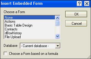
Embedded editors are new to Designer 6, and they can be created for forms but not for pages. You can include forms within a form using an embedded editor, and you can link them to embedded views. You add embedded editors to a form by choosing Create, Embedded Element, Editor from the menu (see Figure 5.49). You can choose a form from the current database or another database, or you can use a formula to specify a form. When you select None in the dialog box, you can later paste a link to a document or anchor link into the editor.
Figure 5.49. The first selection in the Insert Embedded Form dialog box is None.
When you embed a specific form, it appears in a preview window on the form. If you choose None or click Choose a Form Based on a Formula, a rectangular preview pane appears on the form (see Figure 5.50).
Figure 5.50. A blank preview area appears if a specific form is not selected. The Embedded Editor properties box is open to the Info tab.

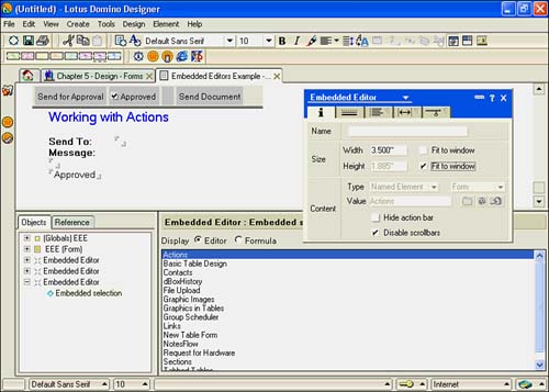
To open the properties box, right-click the preview area and then choose Editor Properties from the context menu (see Figure 5.51). The properties box opens to the Info tab. The Info tab of the Embedded Editor properties box has three sections: Name, Size and Content. Name is optional, unless you're working with a linked view. The size of the preview area is initially the same, even if a form is selected in the Insert Editor dialog window. To resize it, you can enter a new width and height, or you can click Fit to Window for width and height. The remaining tabs, Border, Paragraph Alignment, Paragraph Margins, and Paragraph Hide When, have all been covered already.
Figure 5.51. The Embedded Editor properties box displays Named Element in the Type field when a specific form is selected.
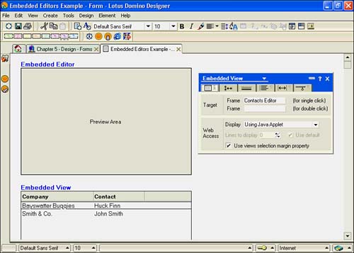
To use an embedded editor with a view, you need to name the editor and also embed a view. Choose Create, Embedded Element, View from the menu. Once the view is embedded, enter the name of the embedded editor in Target Frame for Single Click on the Info tab of the Embedded View properties box. See Figure 5.52.
Figure 5.52. This embedded editor is shown in design above an embedded view. The Embedded View properties box is visible on the left, with the Contacts Editor in the Target Frame field.
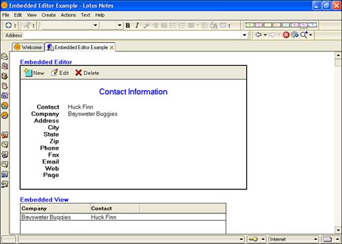
Test your new form and make any adjustments necessary. For example, Figure 5.52 has a border for each embedded element and has had the size adjusted for better display (see Figure 5.53).
Figure 5.53. The contents of the embedded Contact Information document appears above the embedded view, and changes as you move through the view.
Using a File Upload Control
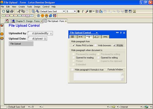
A file upload control allows Web clients to attach files to a document. To create an upload control, choose Create, Embedded Element, File Upload Control from the menu. A gray rectangular button is inserted into the form at the cursor's location labeled File Upload (see Figure 5.54). The File Upload has a properties box, and the tabs are the standard Paragraph Alignment, Paragraph Margins, Paragraph Hide-When, Paragraph Styles, and Upload Extra HTML tabs. Of course, this design element is not needed for a Notes client, so you'll want to hide it from Notes and mobile clients by checking Hide Paragraph from Notes R4.6 or Later and Mobile on the Paragraph Hide-When tab. For the file upload control to work, your server administrator must have a temp directory specified on the Domino server.
Figure 5.54. The file upload control works only for Web clients.
Working with the Embedded Scheduler
The Embedded Scheduler can be embedded only in forms and subforms. More than one scheduler can be included. You cannot embed a scheduler on a page because the Embedded Scheduler requires at least three pieces of information from the underlying document: The first contains the members of the group , the second stores the start time for the grid, and the field stores the number of hours to display for each day.
Creating a form to contain a group scheduler can be fairly involved, depending upon your needs. You can look at the ( GroupCalendar ) form in the Notes and Domino 6 mail database for a good example. Here, I'll take a simple approach to give you an idea of what can be accomplished. First, add the Embedded Scheduler to your form by choosing Create, Embedded Element, Scheduler from the menu (see Figure 5.55).
Figure 5.55. The Group Scheduler has many new events added in Designer 6. The Required People item has the cMembers field added in quotes.
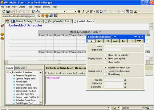
When the scheduler is embedded, look in the object list in the Programmer's pane, and you'll notice a number of events. At a minimum, you must program Required People Items, Grid Start Time Item, and Display Hours Per Day Item. All three events need to have the name of the corresponding field from your form entered in the Script area. Use quotes to surround the field names , as in Figure 5.55.
The Group Scheduler properties box has several tabs: Info, Font, Colors, Border, Layout, Paragraph Margins, and Paragraph Hide When. The Border Tab, Paragraph Margins, and Paragraph Hide When tabs are the same tabs you've already seen for other objects, and they aren't covered in this section. The Info tab shown in Figure 5.55 has settings for Name, Target Frame, and Display Options Content Options, as well as four Title fields at the bottom.
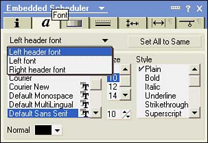
The Font tab has options for three different areas: Left Header Font, Left Font, and Right Header Font, as shown in Figure 5.56. You can make all fonts the same by clicking the Set All to Same button.
Figure 5.56. The Font tab has settings for different types of text.
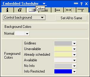
The Colors tab (see Figure 5.57) contains numerous settings for the colors of the calendar control itself (foreground and background) and settings for Gridlines, Unavailable, Already Scheduled, Available, and Info Restricted. These colors can be seen in the legend also.
Figure 5.57. The Colors tab has many different settings for different areas of the calendar control.
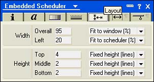
The Layout tab (see Figure 5.58) has settings for width and height. There are two width and three height settings. Overall Width can be expressed in Fit to Window (%) or as a fixed width in inches. Left Width can be set to Fit to Scheduler and Fixed. The three Height settings, Top, Middle, and Bottom, can be set to Fixed Height (Lines), Fit to Content, or None.
Figure 5.58. The Designer 6 Layout tab has expanded options to size the control.
TIP
To keep the edge of the scheduler from going too far to the right, set the Overall Width option to Fit to Window (%) and set it to something less than 100%.
Part I. Introduction to Release 6
Whats New in Release 6?
- Whats New in Release 6?
- A Brief History of Lotus Notes
- Major Features of Lotus Notes
- Types of Applications
- Whats New in Domino Designer?
- New Design Element Features
- New Language Features
The Release 6 Object Store
- The Release 6 Object Store
- Defining a Domino Database
- Understanding the Database Structure
- Creating a Database
- Working with Database Properties
- Understanding Design Templates
- Creating Your Own Templates
- Inheriting Designs from Templates
- Using Templates to Replicate Design Changes
- Using Templates as Design Libraries
- Archiving Versions with Templates
The Integrated Development Environment
- The Integrated Development Environment
- Working in the Application Design Environment
- Working with the Properties Box
- Understanding the Work Pane
- Using the Programmers Pane
- Understanding the Info List
- Understanding the Action Pane
- Customizing the Tools Menu
- Printing Source Code
- Using the HTML Editor
- Locking Design Elements
Part II. Foundations of Application Design
Forms Design
- Forms Design
- Designing Forms
- Setting Form Properties
- Working with Text Properties
- Working with Fields
- Writing Formulas in Fields
Advanced Form Design
- Advanced Form Design
- Working with Tables
- Using Graphic Objects on Forms
- Working with Form-Level Events
- Using Form Actions
- Working with Hotspots
- Understanding Sections and Section Properties
- Using Layout Regions
- Working with Special Forms
- Creating Reusable Design Objects
- Using Embedded Elements
- Using the Form Design Document
Designing Views
- Designing Views
- Defining the Elements of a View
- Creating a View
- Setting View Properties
- Creating Advanced View Selections
- Adding and Editing View Columns
- Using View Column Properties
- Adding Actions to a View
- Creating Calendar Views
- Understanding Folders
Using Shared Resources in Domino Applications
- Shared Resources
- Sharing Images Within a Database
- Creating Shared Files
- Creating Shared Applets
- Shared Code
- Creating Subforms
- Creating Shared Fields
- Creating Shared Actions
- Script Libraries
- Database Resources
Using the Page Designer
- Using the Page Designer
- Understanding Pages
- Working with the Page Properties Box
- Using the Page Designer
- Adding Layers to Your Pages
Creating Outlines
- Creating Outlines
- Creating an Outline
- Working with Outline Entries
- Embedding Outlines
- Adding an Outline to a Frameset
Adding Framesets to Domino Applications
- Adding Framesets to Domino Applications
- Creating a Frameset
- Using the Frameset Designer
- Working with Frames
- Viewing the HTML Source of Your Frameset
- Launching the Frameset
Automating Your Application with Agents
- Automating Your Application with Agents
- Working with Agents
- Creating an Agent
- Working in the Agent Builder Design Window
- Using @Commands in Agents
- Putting Your Agent to Work
- Creating a Complex Agent
- Using LotusScript in Agents
- Creating Web Agents Using Formulas and LotusScript
- Using Java in Agents
- Testing and Debugging Agents, the Agent Log, and Agent Properties
- Agent Properties via the Agent InfoBox
Part III. Programming Domino Applications
Using the Formula Language
- Using the Formula Language
- Overview of the Formula Language
- Knowing Where to Use @Functions and @Commands
- Formula Syntax
- Limitations of the Formula Language
- Working with Statements
- Using Logical @Functions
- Working with Date and Time @Functions
- Working with Strings
- Getting Session and User Information
- Working with Documents
- Retrieving Data with @DbColumn and @DbLookup
- Working with Lists
- Getting User Input
- Controlling the Flow of a Formula
- Error Handling
Real-World Examples Using the Formula Language
- Real-World Examples Using the Formula Language
- Programming Practices
- Using Formulas in Forms and Subforms
- Writing Field Formulas
- Writing View Formulas
- Using Hide When Formulas
- Working with Forms, Views, and Shared Actions
Writing LotusScript for Domino Applications
- Writing LotusScript for Domino Applications
- Software Construction
- Fundamental Elements of LotusScript
- New Technologies and LotusScript
Real-World LotusScript Examples
- Real-World LotusScript Examples
- Real-World Example 1: Importing a Delimited Text File
- Real-World Example 2: Delete a Parent Document and All Its Children: DeleteParentAndChildren
- Real-World Example 3: Schedule an Agent Robot to Refresh All the Documents in a View: Robot-DailyRefreshAllDocs
- Real-World Example 4: Return a Web User to the Place Where He Started After a Document Is Submitted: WebQuerySave-DocSubmit
Writing JavaScript for Domino Applications
- Writing JavaScript for Domino Applications
- What Is JavaScript?
- JavaScript Is Not Java
- JavaScript and the Domino IDE
- The Document Object Model
- JavaScript Support in Domino 6
- When to Use JavaScript
- A Look at JavaScript in Domino
- JavaScript Libraries in Domino
- JavaScript Principles 101
- Syntax and Command Blocks
- Statements
- Output
- Functions
- Objects
- Input Validation
- Validating Check Boxes
- Validating Radio Buttons
- Validating Selection Lists
- Calculations
- JavaScript Application
Real-World JavaScript Examples
- Real-World JavaScript Examples
- Real-World Example 1: Dynamic Drop-Down Lists on the Web
- Real-World Example 2: Dialog Boxes and window. opener on the Web
- Real-World Example 3: Dynamic Tables
- Real-World Example 4: Useful JavaScript Utilities
Writing Java for Domino Applications
- Writing Java for Domino Applications
- Introduction to Java
- Choosing a Java Solution in Domino
- Understanding the Notes Object Interface
- Writing Java Agents
- Using Other Java IDEs
- Other Uses for Java
Real-World Java Examples
Enhancing Domino Applications for the Web
- Enhancing Domino Applications for the Web
- Whats New in Designer 6
- Understanding the Domino Web Application Server
- Understanding the Basics of HTML
- Using HTML in Domino Designer
- Adding Power with Domino URLs
- Views and Forms Working Together on the Web
- Incorporating Flash into Your Web Pages
- What Its All About: XML Exposed
- How Does Domino Use XML?
Part IV. Advanced Design Topics
Accessing Data with XML
Accessing Data with DECS and DCRs
- Accessing Data with DECS and DCRs
- What Is DECS?
- The External Data Source
- DECS Administrator
- Creating the Activity
- Accessing the Application
- DECS Summary
- Data Connection Resources
- DCR Example
- Tips on External Data Access
Security and Domino Applications
- Security and Domino Applications
- How Does Domino Security Work?
- Enabling Physical Security
- Setting Server Access
- Database Access Control Lists
- The Role of the Domino Directory in Application Security
- ACL Privileges
- Enabling Database Encryption
- Using Roles
- Implementing View-Level Security
- Implementing Form-Level Security
- Implementing Document-Level Security
- Applying Field-Level Security
- Hiding the Design of Your Application
Creating Workflow Applications
- Creating Workflow Applications
- The Evolution of Groupware
- Introducing Workflow
- Creating Mail-Enabled Applications
- Using Triggers to Send Email
- Sending Mail with LotusScript
Analyzing Domino Applications
Part V. Appendices
Appendix A. HTML Reference
Appendix B. Domino URL Reference
EAN: 2147483647
Pages: 288
