Embedding Outlines
You can embed an outline in two ways. First, you can embed it in a page by clicking the Use Outline button from the outline Work pane. Second, to embed it in an existing page, form, or document, you can choose Create, Embedded Element, Outline from the menu in Domino Designer. Most often, you will embed an outline in a page and then use the page in a frameset. This section deals with embedding outlines in pages because it is the most common use, but the same principles apply to other objects.
The first thing you'll notice when you embed an outline in a page is that it doesn't necessarily include all the elements in the outline (see Figure 9.10). To change this effect, you'll need to work with the properties of an embedded outline. Embedded outline properties are independent of the outline design object itself. The properties box has a number of tabs described in the following sections:
- Info ” Contains settings that set the name and control the style and appearance of the outline
- Font ” Defines settings for the font of each outline level, as well as colors for each of the three states: Normal, Selected, and Moused
- Background ” Sets background colors or images for each outline level
- Layout ” Defines the height, offset, and alignment properties for the entry, the entry's label, and the associated image (if any) for each outline level
- Border ” Sets the outline border style, color , effects, and thickness
- Paragraph Margins ” Contains standard settings that include sections for margins, tab stops, and pagination
- Paragraph Hide When ” Contains standard settings, including hiding the paragraph by client type (note that Mobile is new to Notes and Domino 6), by document state, and by formula
Figure 9.10. Clicking the Use Outline button in the outline Work pane embeds an outline in a new page.

The Border, Paragraph Margins, and Paragraph Hide When tabs should be familiar enough to you by now that they don't need to be covered here.
The Info Tab
The Info tab has settings that control the appearance of the outline (see Figure 9.11). For example, to change the appearance of the outline in Figure 9.10, you change the Height and Width properties. Embedded outlines default to a fixed height of 1 inch, which frequently doesn't display the entire outline. To change the default settings, choose Fit to Content in both the Height and Width fields of the Outline Size section of the properties box.
Figure 9.11. The Info tab of the Outline properties box ”note that the Height setting has been changed to Fit to Content.
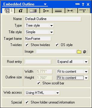
Five sections on the Info tab control the display of the embedded outline. The first section enables you to name the object and set the type, title style, target frame, and control twisties. The second section specifies a root entry and whether the object is displayed as saved, expanded, or collapsed . The third section enables you to determine the size of the embedded outline, and the fourth section specifies how the outline works on the Web. The fifth and last section shows the number of unread documents in parentheses beside the outline entry and sets the font style to bold.
NOTE
Remember that changing the properties of an embedded outline in no way affects the outline design element itself; it just changes this particular use of the outline.
The Type field has two options: Tree Style (the default) and Flat Style. If you choose Tree Style, the outline displays in a hierarchical fashion. Figure 9.10 shows an outline using Tree Style. When Tree Style is selected, a check box is available to turn twisties on or off. Another check box, OS Style, controls the type of twistie. If OS Style is checked, the twisties appear in Windows platforms as small squares with either plus or minus signs (collapsed or expanded). If OS Style is not checked, standard Notes twisties appear. You can also choose an image resource for a twistie or use a formula to determine which image to use. A Flat Style outline displays only the top level of the hierarchy; when you click an entry that is expandable, the next level rolls out under the entry. Flat outlines can be displayed either vertically or horizontally. You make this choice from the drop-down list that appears next to the Type field when you choose Flat Style. Displaying the outline horizontally lists the images associated with the entries across the top of the page.
NOTE
You can affect the display of a horizontal outline by working with the Height setting on the Layout tab. The Layout tab is discussed later in this chapter in the section "The Layout Tab."
You can choose between Simple and Hide (the default) for the Title setting. If you choose to display the title, you can set various background and font properties on other tabs for the title.
TIP
If you choose Flat Style, be sure to choose Simple for the title. If you leave Title at the default (Hide), users will not be able to navigate back up the hierarchy. Setting the title to Simple displays the next higher level in the hierarchy as the title. Clicking the title navigates up one level.
The last setting to cover in the topmost section is Target Frame. In this field, you can specify the frame in which the outline displays when used in a frameset.
The Root Entry section contains a field in which you can enter a category entry in the outline. Note that you must use the alias of the entry, not the entry label. When you specify a root entry, only the entries that fall in or below the root are displayed. The field next to Root Entry lets you determine how a hierarchical view displays. If you choose Flat Style, this field automatically defaults to Collapse All, but if you select Tree Style, you can choose from the following options:
- Expand All ” Expands all entries in the outline to all levels
- Expand First ” Expands only the first-level entries
- Display as Saved (the default) ” Displays the outline as you saved it
- Collapse All ” Collapses the outline to the topmost entries in the hierarchy
The Outline Size section has settings for Width, Height, and Show Scrollbar. Contrary to what you might expect, even if you set a fixed width and height, there is only a vertical scrollbar. For Width, you can choose from the default Fit to Window (%), Fit to Content, Fixed (Chars), and Fixed Width. For Height, you can choose from Fixed Height (the default), Fit to Window, and Fit to Content.
The Web Access field consists of two settings: Using HTML (the default) and Using Java Applet. If you use the Using Java Applet setting to generate the outline, you get a much snappier interface, including background colors, mouseover color settings for the outline entries, and much better graphics. In general, it is preferable to Using HTML.
NOTE
If you choose Using Java Applet, you must have Use JavaScript When Generating Pages set as a database property. If you don't, when you select Using Java Applet, Domino Designer prompts you to make the setting.
The Font Tab
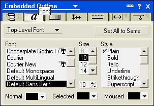
The Font tab enables you to specify the fonts for three different levels: Title, Top-Level, and Sublevel (see Figure 9.12). The Font tab has the standard choices for the font, size, and style. Additional settings are located at the bottom of the properties box for color settings based on the state of the text. The Title setting has two color settings: Normal and Moused. Because a title cannot be selected, the Selected Color list does not appear. The Level settings have three choices: Normal, Selected, and Moused.
Figure 9.12. The Font tab enables you to set font properties for three levels ”note the three color settings at the bottom of the properties box.
NOTE
The Title setting appears only when the Title setting of Simple is made in the Info tab. Also, setting the font style to Shadow, Emboss, or Extrude has no effect on the Web, even if Using Java Applet is enabled.
Clicking any one of these settings opens the Domino color palette. Normal is the color you see when the text is not selected or moused. When you click an outline entry, the color changes to the choice you made for Selected; when the mouse passes over the text, the color changes to that selection. Note that these settings don't work on the Web unless you choose Using Java Applet in the Web Access field.
The Background Tab
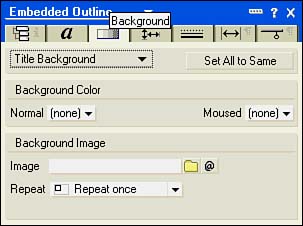
The Background tab has settings for background colors and images. You can set these properties for the entire control, the title, top-level entries, and sublevel entries. Depending on the element, you can choose background colors for Normal, Selected, and Moused. The control background has just one color choice, but the title background has choices for Normal and Moused. The top-level and sublevel entries have choices for Normal, Selected, and Moused colors (see Figure 9.13).
Figure 9.13. The Background tab has color settings for each level, from the entire control to individual entries in the Outline ”note the Normal and Moused color palettes available for the Title background setting.
TIP
If you want to use the same settings for the colors (Normal, Selected, and Moused), you can click the Set All to Same button. This button is also available for the Layout tab.
You can also add an image to any one of the levels, from Control through Sublevel. Images must be stored as image resources to be used in an embedded outline. After you add an image to a level, you can set it to display in one of the following modes:
- Repeat Once ” Displays the image once
- Repeat Vertically ” Tiles the image vertically until the viewing area is filled
- Repeat Horizontally ” Tiles the image horizontally until the viewing area is filled
- Tile ” Tiles the image vertically and horizontally until the viewing area is filled
- Size to Fit ” Sizes the image to fit the viewing area
NOTE
If you apply an image to an entry in the Outline Designer, it will still appear in an embedded outline. The images in the embedded outline are background images. Any entry image appears over the background image setting.
The Layout Tab
Settings on the Layout tab determine the positioning of the entry, the entry label, and any image associated with the entry. You can affect three levels: Title Layout, Top-Level Layout, and Sublevel Layout. Title Layout only has two sections, Entry and Entry Label. The remaining two layouts have three sections, Entry, Entry Label, and Entry Image (see Figure 9.14).
Figure 9.14. The Layout tab is set to Top-Level Layout, exposing all three sections.
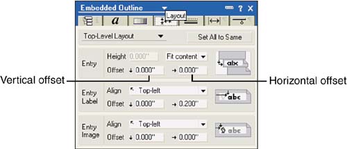
Two types of settings exist in each section: Alignment and Offset. In the Entry section, the only alignment that you can affect is the height because the Entry section controls the layout of the entire entry as a block. You can control the height by selecting Fit to Content (the default) or Fixed. If you select Fixed, you can specify the height of the entry. The Entry Label and Entry Image sections have extensive alignment settings available. Each of the three sections has two offset fields available, Vertical and Horizontal, as shown in Figure 9.14. You can move the entry, the entry label, and the entry image vertically or horizontally with these settings by entering an offset in inches. As the arrows next to the fields indicate , entering a value in the vertical offset pushes the entry down; entering a value in the horizontal offset pushes the entry to the right.
TIP
If you are using an outline with a horizontal flat style, you can control the width of the entries with the horizontal offsets.
Part I. Introduction to Release 6
Whats New in Release 6?
- Whats New in Release 6?
- A Brief History of Lotus Notes
- Major Features of Lotus Notes
- Types of Applications
- Whats New in Domino Designer?
- New Design Element Features
- New Language Features
The Release 6 Object Store
- The Release 6 Object Store
- Defining a Domino Database
- Understanding the Database Structure
- Creating a Database
- Working with Database Properties
- Understanding Design Templates
- Creating Your Own Templates
- Inheriting Designs from Templates
- Using Templates to Replicate Design Changes
- Using Templates as Design Libraries
- Archiving Versions with Templates
The Integrated Development Environment
- The Integrated Development Environment
- Working in the Application Design Environment
- Working with the Properties Box
- Understanding the Work Pane
- Using the Programmers Pane
- Understanding the Info List
- Understanding the Action Pane
- Customizing the Tools Menu
- Printing Source Code
- Using the HTML Editor
- Locking Design Elements
Part II. Foundations of Application Design
Forms Design
- Forms Design
- Designing Forms
- Setting Form Properties
- Working with Text Properties
- Working with Fields
- Writing Formulas in Fields
Advanced Form Design
- Advanced Form Design
- Working with Tables
- Using Graphic Objects on Forms
- Working with Form-Level Events
- Using Form Actions
- Working with Hotspots
- Understanding Sections and Section Properties
- Using Layout Regions
- Working with Special Forms
- Creating Reusable Design Objects
- Using Embedded Elements
- Using the Form Design Document
Designing Views
- Designing Views
- Defining the Elements of a View
- Creating a View
- Setting View Properties
- Creating Advanced View Selections
- Adding and Editing View Columns
- Using View Column Properties
- Adding Actions to a View
- Creating Calendar Views
- Understanding Folders
Using Shared Resources in Domino Applications
- Shared Resources
- Sharing Images Within a Database
- Creating Shared Files
- Creating Shared Applets
- Shared Code
- Creating Subforms
- Creating Shared Fields
- Creating Shared Actions
- Script Libraries
- Database Resources
Using the Page Designer
- Using the Page Designer
- Understanding Pages
- Working with the Page Properties Box
- Using the Page Designer
- Adding Layers to Your Pages
Creating Outlines
- Creating Outlines
- Creating an Outline
- Working with Outline Entries
- Embedding Outlines
- Adding an Outline to a Frameset
Adding Framesets to Domino Applications
- Adding Framesets to Domino Applications
- Creating a Frameset
- Using the Frameset Designer
- Working with Frames
- Viewing the HTML Source of Your Frameset
- Launching the Frameset
Automating Your Application with Agents
- Automating Your Application with Agents
- Working with Agents
- Creating an Agent
- Working in the Agent Builder Design Window
- Using @Commands in Agents
- Putting Your Agent to Work
- Creating a Complex Agent
- Using LotusScript in Agents
- Creating Web Agents Using Formulas and LotusScript
- Using Java in Agents
- Testing and Debugging Agents, the Agent Log, and Agent Properties
- Agent Properties via the Agent InfoBox
Part III. Programming Domino Applications
Using the Formula Language
- Using the Formula Language
- Overview of the Formula Language
- Knowing Where to Use @Functions and @Commands
- Formula Syntax
- Limitations of the Formula Language
- Working with Statements
- Using Logical @Functions
- Working with Date and Time @Functions
- Working with Strings
- Getting Session and User Information
- Working with Documents
- Retrieving Data with @DbColumn and @DbLookup
- Working with Lists
- Getting User Input
- Controlling the Flow of a Formula
- Error Handling
Real-World Examples Using the Formula Language
- Real-World Examples Using the Formula Language
- Programming Practices
- Using Formulas in Forms and Subforms
- Writing Field Formulas
- Writing View Formulas
- Using Hide When Formulas
- Working with Forms, Views, and Shared Actions
Writing LotusScript for Domino Applications
- Writing LotusScript for Domino Applications
- Software Construction
- Fundamental Elements of LotusScript
- New Technologies and LotusScript
Real-World LotusScript Examples
- Real-World LotusScript Examples
- Real-World Example 1: Importing a Delimited Text File
- Real-World Example 2: Delete a Parent Document and All Its Children: DeleteParentAndChildren
- Real-World Example 3: Schedule an Agent Robot to Refresh All the Documents in a View: Robot-DailyRefreshAllDocs
- Real-World Example 4: Return a Web User to the Place Where He Started After a Document Is Submitted: WebQuerySave-DocSubmit
Writing JavaScript for Domino Applications
- Writing JavaScript for Domino Applications
- What Is JavaScript?
- JavaScript Is Not Java
- JavaScript and the Domino IDE
- The Document Object Model
- JavaScript Support in Domino 6
- When to Use JavaScript
- A Look at JavaScript in Domino
- JavaScript Libraries in Domino
- JavaScript Principles 101
- Syntax and Command Blocks
- Statements
- Output
- Functions
- Objects
- Input Validation
- Validating Check Boxes
- Validating Radio Buttons
- Validating Selection Lists
- Calculations
- JavaScript Application
Real-World JavaScript Examples
- Real-World JavaScript Examples
- Real-World Example 1: Dynamic Drop-Down Lists on the Web
- Real-World Example 2: Dialog Boxes and window. opener on the Web
- Real-World Example 3: Dynamic Tables
- Real-World Example 4: Useful JavaScript Utilities
Writing Java for Domino Applications
- Writing Java for Domino Applications
- Introduction to Java
- Choosing a Java Solution in Domino
- Understanding the Notes Object Interface
- Writing Java Agents
- Using Other Java IDEs
- Other Uses for Java
Real-World Java Examples
Enhancing Domino Applications for the Web
- Enhancing Domino Applications for the Web
- Whats New in Designer 6
- Understanding the Domino Web Application Server
- Understanding the Basics of HTML
- Using HTML in Domino Designer
- Adding Power with Domino URLs
- Views and Forms Working Together on the Web
- Incorporating Flash into Your Web Pages
- What Its All About: XML Exposed
- How Does Domino Use XML?
Part IV. Advanced Design Topics
Accessing Data with XML
Accessing Data with DECS and DCRs
- Accessing Data with DECS and DCRs
- What Is DECS?
- The External Data Source
- DECS Administrator
- Creating the Activity
- Accessing the Application
- DECS Summary
- Data Connection Resources
- DCR Example
- Tips on External Data Access
Security and Domino Applications
- Security and Domino Applications
- How Does Domino Security Work?
- Enabling Physical Security
- Setting Server Access
- Database Access Control Lists
- The Role of the Domino Directory in Application Security
- ACL Privileges
- Enabling Database Encryption
- Using Roles
- Implementing View-Level Security
- Implementing Form-Level Security
- Implementing Document-Level Security
- Applying Field-Level Security
- Hiding the Design of Your Application
Creating Workflow Applications
- Creating Workflow Applications
- The Evolution of Groupware
- Introducing Workflow
- Creating Mail-Enabled Applications
- Using Triggers to Send Email
- Sending Mail with LotusScript
Analyzing Domino Applications
Part V. Appendices
Appendix A. HTML Reference
Appendix B. Domino URL Reference
EAN: 2147483647
Pages: 288
