Working with Frames
Most of the work done with a frame is through the Frame properties box. The properties box has five tabs: Basics, Frame Size , Frame Border, Advanced, and Additional HTML. On the Basics tab, you name the frame, define the contents, and set the target frame, if appropriate. The Frame Size tab lets you control the size of the frame, the type of scrolling, whether you allow resizing of the frame, and whether the frame has initial focus for Notes clients . The Frame Border tab has settings for the style and color of the frame borders and border caption. In the Advanced tab, you can set frame spacing and margin height and width. The Additional HTML tab has settings for HTML tags.
TIP
You should use a name that is unique across all framesets in a database for each frame. Because elements such as pages can launch into named frames, having two frames with the same name in two separate framesets could cause unpredictable results. It is also important to avoid the use of the reserved frame names : _top, _self, _parent, and _blank. One naming technique is to use a reference to the frameset name, perhaps the alias, as a prefix to the frame name.
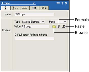
EX1 is the alias of the Example frameset. Figure 10.7 shows the Basics tab of the properties box for the EX1Logo frame.
Figure 10.7. The Basics tab of the Frame properties box has two sections: Name and Content.
Adding Content to Frames
The contents of a frame can come from a link, a named element, or a URL. To add content, you can click the Type drop-down box and choose one of the three types. When you change types, the Browse, Formula, and Paste buttons are conditionally displayed. For example, for a link, only the Paste button appears; for URLs, only the Formula and Paste buttons appear. When you've specified the contents for the frame, a text description of the contents appears next to Content Value in the frame when Show Frame Content is turned off. If you use a formula, Computed appears next to Content Value.
TIP
If you have a link or URL copied to the Clipboard, you can click the Paste button from any setting for Type. The Type setting changes to the appropriate one, and the Value field is set for you.
Links can be view links, document links, or anchor links; they must first be copied to the Clipboard and then pasted into the Content section using the Paste button. Note that you cannot copy a database link into a frame.
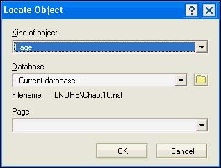
Using a named element gives designers access to pages, forms, framesets, views, folders, and navigators. To select a named element from the list of available objects, click the Browse button. When you do so, the Locate Object dialog box opens. This dialog box has three fields: Kind of Object, Database, and Object. The name of the last field changes to the type of object selected in the Kind of Object field. Figure 10.8 shows the Locate Object dialog box.
Figure 10.8. The Locate Object dialog box is easy to use and gives you access to a wide variety of objects.
Pages are frequently used in framesets because you can embed other elements in them and combine those elements with text and graphics. Because of this feature, using a page to display design elements is often better than simply using the object itself. For example, you can add a view to a frame, and it will display properly. However, you can also add a view to a page, include graphics, text, and additional objects on the page, and then place the page in a frame. You can read more about pages in Chapter 8, "Using the Page Designer."
When you enter a URL by pasting it into the Content area, by typing it in directly, or by using a formula, you must use the full URL syntax, starting with http:// . If you paste it using the Paste button, the Type field automatically changes to URL and the URL appears in the Value field.
For both URLs and named elements, you can determine the contents of a frame with a formula. To enter a formula, click the Formula button; the Formula window opens. The formula must evaluate to a URL or the name or alias of a named element. In addition, you must select the appropriate type of named element or URL. For more information on writing formulas, see Chapter 12, "Using the Formula Language."
The last field on the Basics tab of the Frame properties box is the Default target for links in frame. This is useful when you have a frame containing an element that provides navigation, such as a page of links, a navigator, an outline, a view, or a folder pane. A navigational pane often occupies a smaller frame and, when the links are clicked, the linked content appears in a larger pane. In the example used in this chapter, the navigation frame is on the left and the content frame is on the right. This is where the naming of frames is important. In this example, the navigational frame is named EX1Nav, and the default target for links in this frame is the content frame, EX1Content.
As an example, let's return to the four-paned frameset and add content and navigational capability. First, you need to create several pages to populate the frames. The database for this chapter can be found on the Web, and has several ready-made pages:
- R6Logo ” Contains the shared image resource, R6.jpg
- Banner ” Contains a page for the Banner frame
- View Navigator ” Contains an embedded outline
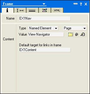
The R6Logo page goes in the EX1Logo frame in the upper-left corner as a named element. The Banner page goes in the EX1Banner frame in the top right. The View Navigator page goes in the EX1Nav frame on the left, underneath the EX1Logo frame. The links in the EX1Nav frame must point to the EX1Content frame, so in the properties box for the EX1Nav frame, specify EX1Content as the default target for links in this frame (see Figure 10.9).
Figure 10.9. The target for the EX1Nav frame is the EX1Content frame.
For content frames, you normally specify a "default" link so that the user doesn't see a blank area when the frameset is initially displayed. For example, you might choose the By Category view to display. See Figure 10.10, which shows the properties box for the EX1Content frame.
Figure 10.10. The properties box for the content frame is set to a default view. Note the additional properties for view or folder appearance.
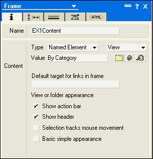
When you use a view as a named element, four check boxes appear in the Frame properties box under the View or Folder Appearance heading. All but the Basic Simple Appearance check box are new to Notes and Domino 6. Show Action Bar and Show Header are checked by default and display the view's action bar and column header. Selection tracks mouse movement and selects the documents in the view as the mouse moves over them. The Basic Simple Appearance check box enables the following settings when checked:
- Uses strikethrough text for deleted documents
- Uses a simple grid for a calendar view
- Defaults calendar views to a single day
- Keeps the scrollbar visible
- Stops the mouse from extending document selections in the view selection margin
You might recall that you can specify a target for some design elements, such as pages and forms. When you do this and you open the element, it opens to the frameset in which the frame exists. In other words, the target frame for the design element takes precedence over the target frames in a frameset. If you experience unexpected results in your framesets, check the target frames of the elements.
Controlling Frame Size, Scrolling, Resizing, and Focus
When you've mastered setting content and links for frames, you can move on to setting the properties for frame size and scrolling. You can do a lot by dragging the borders of frames in the Frameset Designer, but for really precise control, you can turn to the Frame Size tab of the Frame properties box (see Figure 10.11).
Figure 10.11. The Frame Size tab of the properties box for this frame uses percent to calculate the size of the frame.
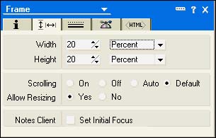
For Width and Height, you can choose from Relative, Percent, or Pixels. When you initially set up a frameset, Domino Designer uses percentages to split the frameset into frames. For example, in the original three-paned frameset, the leftmost frame had a width of 20% and the frame on the rightmost frame had a width of 80%. Similarly, the top frame had a height of 20% and the lower frames had a height of 80%. Using Percent is handy because you can't control the display resolution of clients. Sometimes you need more control, however. In that case, you can switch to Relative or Pixels.
You can use Relative to set either the width or the height relative to an adjacent frame. For example, if you set the left and top frames to a specific width and height using pixels, you can set the width and height of the lower-right frame to Relative. When you do this, the value in the Percent spinner has no effect on the size of the frame. As a case in point, R6TextLogo.gif, which is used in the EX1Logo frame via a page, doesn't fit into the 80%/20% scheme very well. If you open the GIF itself in a good graphics program, you can find the dimensions of the image. In this case, it's 140 pixels wide by 61 pixels high. You can set the width and height to these dimensions in the Frame Size tab.
Notice that when you do this, the other frames don't exactly line up. First, go to the EX1Nav frame and set the width to 140 pixels. Set the height to Relative. Next, go to the EX1Banner frame. Set the height to 61 pixels and set the width to Relative. In EX1Content, set both the width and height to Relative. When you're finished, you'll notice that the borders of all four frames again line up. However, when you preview the frameset, you'll see scrollbars, both vertical and horizontal, in the EX1Logo frame. This is not quite what you want, and you can remove them easily. From the properties box for the EX1Logo frame, set Scrolling to Off and set Allow Resizing to No, as shown in Figure 10.12. The finished product is visible in Figure 10.13.
Figure 10.12. The Frame Size tab for the EX1Logo frame has scrolling and resizing turned off.
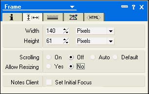
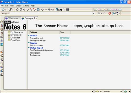
Figure 10.13. The completed Example 1 frameset neatly displays the Notes and Domino 6 logo without scrollbars.
Scrollbars can be set to On, Off, Auto, or Default. Auto is the default; when set, scrollbars appear only when needed. On sets the scrollbars permanently on, and Off sets them permanently off. Resizing can be turned off or on. When you set Allow Resizing to Yes, either a Web or a Notes user can resize the frames by clicking and dragging the borders.
Working with Borders and Margins
The Frame Border tab lets you manipulate the border style for individual frames or the entire frameset. You can turn 3D borders on and off; if you want to apply the change to all frames in the frameset, click the Apply to All Frames button.
The settings for the second Border Style section, which includes border color and width, apply to the entire frameset (see Figure 10.14).
Figure 10.14. Settings in the Frame Border tab control the border style, color, and width.
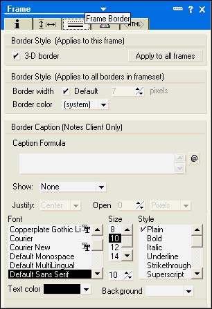
If you uncheck Default, you can change the width of the border by clicking the spinner to the desired number of pixels. You can even turn the border off by reducing the number of pixels to 0. You can also choose a border color.
TIP
If you change colors from the system color and want to return to the system color, open the color picker. Look just to the left of the RGB color button (a colored circle in the upper right), and you'll see another button that looks like a monitor. This button returns you to the system color.
The Border Caption section is new to Notes and Domino 6 and is for Notes clients only. In this section, you create collapsible sections. You can create a border caption in the Caption Formula window; this can be text enclosed in quotes or a formula written using the Formula language. The Show list contains four settings: None, Caption Only, Arrows Only, and Both. If you choose Arrows Only or Both, clicking the arrows displays the frame. Changing the values of the Show field toggles the display of additional fields.
- Caption Only ” Displays the Align and Justify fields. The Align settings are Top and Bottom. The Justify settings are Left, Right, and Center.
- Arrows Only ” Displays the Align, Justify, and Open fields. The settings for Align are Left, Right, Top, and Bottom. The Justify settings are the same as the Caption Only setting. The Open field is a spinner that can be set to either Pixels or Percent. This field defines the size of the frame when the frameset is opened.
- Both ” Displays the same settings as for Arrows Only. The only difference is that both the arrow and the caption will appear in the frame border.
The font face, size, style, text color, and background are standard and won't be discussed here.
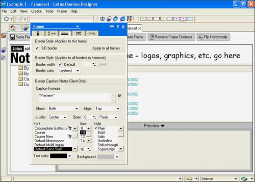
An example of a collapsible frame can be found in the welcome page of the Bookmarks database and in the inbox of your mail. It is relatively easy to set up a preview frame. Let's return to the Example 1 frameset and add a preview frame. First, split the EX1Content frame into two rows by selecting the frame and clicking the Split into Rows button. Set the default target for links to EX1Preview (which you'll create in a moment). Change focus to the new frame, name it EX1Preview, and leave the other settings on the Basics tab alone. Open the Frame properties box to the Frame Border tab, and enter "Preview" with quotation marks in the Border Caption window. Change Show to Both, and set Open to 0 pixels. You can leave the remaining settings alone. When you preview the modified frameset, the new frame appears at the bottom with the word Preview next to an arrow. Clicking the arrow opens or closes the frame, depending on its state. When opened, the document selected in the EX1Content frame appears in the preview frame. See Figure 10.15.
Figure 10.15. This properties box contains settings for a collapsible frame. Note the caption text, the preview, and the arrow in the Caption Title bar.
TIP
If you don't set a background color for the caption, and there are scrollbars for the frame's content, a gap appears between the scrollbars and the caption title bar.
NOTE
Collapsible frames are not currently supported on the Web. The frame will appear in a Web browser and can be resized, but there is no caption or arrow.
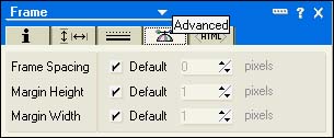
The Advanced tab has the settings Frame Spacing, Margin Height, and Margin Width. These are all checked as Default. To access the spinner, uncheck the Default setting, and you can then change the property (see Figure 10.16). Frame Spacing affects all frames in the frameset and has the same effect as setting the border width on the Frame Borders tab. The Margin Height and Margin Width settings affect specific frames.
Figure 10.16. The Advanced tab lets you change the frame spacing, the margin height, and the margin width.
Part I. Introduction to Release 6
Whats New in Release 6?
- Whats New in Release 6?
- A Brief History of Lotus Notes
- Major Features of Lotus Notes
- Types of Applications
- Whats New in Domino Designer?
- New Design Element Features
- New Language Features
The Release 6 Object Store
- The Release 6 Object Store
- Defining a Domino Database
- Understanding the Database Structure
- Creating a Database
- Working with Database Properties
- Understanding Design Templates
- Creating Your Own Templates
- Inheriting Designs from Templates
- Using Templates to Replicate Design Changes
- Using Templates as Design Libraries
- Archiving Versions with Templates
The Integrated Development Environment
- The Integrated Development Environment
- Working in the Application Design Environment
- Working with the Properties Box
- Understanding the Work Pane
- Using the Programmers Pane
- Understanding the Info List
- Understanding the Action Pane
- Customizing the Tools Menu
- Printing Source Code
- Using the HTML Editor
- Locking Design Elements
Part II. Foundations of Application Design
Forms Design
- Forms Design
- Designing Forms
- Setting Form Properties
- Working with Text Properties
- Working with Fields
- Writing Formulas in Fields
Advanced Form Design
- Advanced Form Design
- Working with Tables
- Using Graphic Objects on Forms
- Working with Form-Level Events
- Using Form Actions
- Working with Hotspots
- Understanding Sections and Section Properties
- Using Layout Regions
- Working with Special Forms
- Creating Reusable Design Objects
- Using Embedded Elements
- Using the Form Design Document
Designing Views
- Designing Views
- Defining the Elements of a View
- Creating a View
- Setting View Properties
- Creating Advanced View Selections
- Adding and Editing View Columns
- Using View Column Properties
- Adding Actions to a View
- Creating Calendar Views
- Understanding Folders
Using Shared Resources in Domino Applications
- Shared Resources
- Sharing Images Within a Database
- Creating Shared Files
- Creating Shared Applets
- Shared Code
- Creating Subforms
- Creating Shared Fields
- Creating Shared Actions
- Script Libraries
- Database Resources
Using the Page Designer
- Using the Page Designer
- Understanding Pages
- Working with the Page Properties Box
- Using the Page Designer
- Adding Layers to Your Pages
Creating Outlines
- Creating Outlines
- Creating an Outline
- Working with Outline Entries
- Embedding Outlines
- Adding an Outline to a Frameset
Adding Framesets to Domino Applications
- Adding Framesets to Domino Applications
- Creating a Frameset
- Using the Frameset Designer
- Working with Frames
- Viewing the HTML Source of Your Frameset
- Launching the Frameset
Automating Your Application with Agents
- Automating Your Application with Agents
- Working with Agents
- Creating an Agent
- Working in the Agent Builder Design Window
- Using @Commands in Agents
- Putting Your Agent to Work
- Creating a Complex Agent
- Using LotusScript in Agents
- Creating Web Agents Using Formulas and LotusScript
- Using Java in Agents
- Testing and Debugging Agents, the Agent Log, and Agent Properties
- Agent Properties via the Agent InfoBox
Part III. Programming Domino Applications
Using the Formula Language
- Using the Formula Language
- Overview of the Formula Language
- Knowing Where to Use @Functions and @Commands
- Formula Syntax
- Limitations of the Formula Language
- Working with Statements
- Using Logical @Functions
- Working with Date and Time @Functions
- Working with Strings
- Getting Session and User Information
- Working with Documents
- Retrieving Data with @DbColumn and @DbLookup
- Working with Lists
- Getting User Input
- Controlling the Flow of a Formula
- Error Handling
Real-World Examples Using the Formula Language
- Real-World Examples Using the Formula Language
- Programming Practices
- Using Formulas in Forms and Subforms
- Writing Field Formulas
- Writing View Formulas
- Using Hide When Formulas
- Working with Forms, Views, and Shared Actions
Writing LotusScript for Domino Applications
- Writing LotusScript for Domino Applications
- Software Construction
- Fundamental Elements of LotusScript
- New Technologies and LotusScript
Real-World LotusScript Examples
- Real-World LotusScript Examples
- Real-World Example 1: Importing a Delimited Text File
- Real-World Example 2: Delete a Parent Document and All Its Children: DeleteParentAndChildren
- Real-World Example 3: Schedule an Agent Robot to Refresh All the Documents in a View: Robot-DailyRefreshAllDocs
- Real-World Example 4: Return a Web User to the Place Where He Started After a Document Is Submitted: WebQuerySave-DocSubmit
Writing JavaScript for Domino Applications
- Writing JavaScript for Domino Applications
- What Is JavaScript?
- JavaScript Is Not Java
- JavaScript and the Domino IDE
- The Document Object Model
- JavaScript Support in Domino 6
- When to Use JavaScript
- A Look at JavaScript in Domino
- JavaScript Libraries in Domino
- JavaScript Principles 101
- Syntax and Command Blocks
- Statements
- Output
- Functions
- Objects
- Input Validation
- Validating Check Boxes
- Validating Radio Buttons
- Validating Selection Lists
- Calculations
- JavaScript Application
Real-World JavaScript Examples
- Real-World JavaScript Examples
- Real-World Example 1: Dynamic Drop-Down Lists on the Web
- Real-World Example 2: Dialog Boxes and window. opener on the Web
- Real-World Example 3: Dynamic Tables
- Real-World Example 4: Useful JavaScript Utilities
Writing Java for Domino Applications
- Writing Java for Domino Applications
- Introduction to Java
- Choosing a Java Solution in Domino
- Understanding the Notes Object Interface
- Writing Java Agents
- Using Other Java IDEs
- Other Uses for Java
Real-World Java Examples
Enhancing Domino Applications for the Web
- Enhancing Domino Applications for the Web
- Whats New in Designer 6
- Understanding the Domino Web Application Server
- Understanding the Basics of HTML
- Using HTML in Domino Designer
- Adding Power with Domino URLs
- Views and Forms Working Together on the Web
- Incorporating Flash into Your Web Pages
- What Its All About: XML Exposed
- How Does Domino Use XML?
Part IV. Advanced Design Topics
Accessing Data with XML
Accessing Data with DECS and DCRs
- Accessing Data with DECS and DCRs
- What Is DECS?
- The External Data Source
- DECS Administrator
- Creating the Activity
- Accessing the Application
- DECS Summary
- Data Connection Resources
- DCR Example
- Tips on External Data Access
Security and Domino Applications
- Security and Domino Applications
- How Does Domino Security Work?
- Enabling Physical Security
- Setting Server Access
- Database Access Control Lists
- The Role of the Domino Directory in Application Security
- ACL Privileges
- Enabling Database Encryption
- Using Roles
- Implementing View-Level Security
- Implementing Form-Level Security
- Implementing Document-Level Security
- Applying Field-Level Security
- Hiding the Design of Your Application
Creating Workflow Applications
- Creating Workflow Applications
- The Evolution of Groupware
- Introducing Workflow
- Creating Mail-Enabled Applications
- Using Triggers to Send Email
- Sending Mail with LotusScript
Analyzing Domino Applications
Part V. Appendices
Appendix A. HTML Reference
Appendix B. Domino URL Reference
EAN: 2147483647
Pages: 288
