Adding Actions to a View
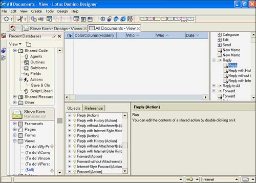
Actions can be added to forms, subforms, pages, folders, and views. They are used to automate tasks , including creating new documents, editing documents, deleting documents, and changing the status of a document without opening it. To display the View Action pane, click the Action Pane toolbar button, drag the Action pane into view with the mouse by grabbing the separator bar, or click View, Action pane. Double-clicking the separator bar also shows or hides the Action pane. Figure 6.22 shows the Action pane for the ($All) view for Notes and Domino 6 mail.
Figure 6.22. The actions with the circular marks at the lower right are shared actions. Note that actions with children (subactions) can be opened and closed in the Action pane.
NOTE
In earlier releases of Domino, six default system actions could not be removed from the Action pane. In Notes and Domino 6, the Action pane is not populated by default. If you want to use a system action, you have to specifically insert it into the Action pane. You do this by choosing Create, Action, Insert System Actions from the menu. System actions do not work for Web clients , so it is usually better to write your own formulas for actions.
Two types of actions exist: shared and single-use. Shared actions are discussed in Chapter 7, "Using Shared Resources in Domino Applications." If shared actions are available, they can be inserted into a view. Alternatively, you can create a single-use action. In addition, multiple actions can be stacked under a single Action bar button by invoking Create, Action, Action with Subaction from the menu.
All actions are inserted into the view (or other design elements, for that matter) from the Create, Actions menu. Four choices are available: Action, Action with Subaction, Insert System Actions, and Insert Shared Actions.
Figure 6.23 illustrates the Action properties box. You name an action on this tab; in general, keep the names short and simple. Remember, they appear in the View header. In Notes and Domino 6, you can now create a label dynamically in the Label field. By clicking the Formula button (with the @ sign label) next to the Label field, you can add a formula to determine the action label.
Figure 6.23. The Action properties box's Action Info tab has new features in Notes and Domino 6, including Label, Type, and Value.
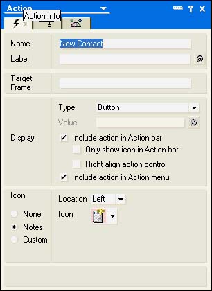
The target frame is for use with framesets. For example, if you want to open a page with the Action button and have it appear in a specific frame ”say, the Content frame ”you would enter Content in this field.
Type and Value are new to Notes and Domino 6. The Type field has three choices: Button, Check Box, and Menu Separator. If you choose Check Box, the Value field opens for edit. You enter the value for the check box in that field. Although they are perhaps not very applicable for views, check box actions can be used on pages or forms.
You can also choose where to display the action ”on the Action bar, on the Action menu, or on both. You can also elect to display only the icon and right-align the Action button. When an action is displayed on the button bar, you can select an icon from the Notes palette, choose Custom, or select None. If you choose Custom, you can select an image resource by clicking the folder icon, or you can enter a formula to determine the image by clicking the Formula button. The Location list positions the selected icon to the right or to the left of the button label.
NOTE
In R5, a spinner titled Position was available to assist in positioning the actions appropriately. The spinner is no longer available, but it is very simple to move an action. Simply click the action in the Action pane and drag it to the proper location.
A typical single-use action button that you create for a view is one that creates a new document from a form. The reason this is often a single-use action is that you must specify the name of the form to use when creating a new document. Use the alias name for the form in quotation marks rather than the full name of the form. For instance, if the name of the form is Request for Information and the alias is RI, the formula for the New button would look like this:
@Command([Compose]; "RI")
NOTE
When you insert a shared action (Create, Action, Insert Shared Action), the properties box is available but all tabs are grayed out. If you want to alter the properties of the shared action, you must edit the shared action itself. You can do so from the Shared Code, Actions entry in the Design pane, or you can double-click the action from a design element.
Using Hide-When Attributes with View Actions
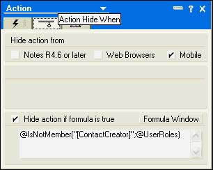
You use the Action Hide When tab of the Action properties box to hide an action. This can be accomplished in two ways. First, selecting the type of client, R4.6 or later, Web, or Mobile, hides the action. Second, you can use formulas created with Notes' @Function Formula language, as shown in Figure 6.24. To use a formula, click the Hide Action If Formula Is True check box and enter a formula. For example, you might want to keep the New action from the view if the user is not allowed to create a new document with a particular form. You first create a role in the ACL of the database and include the role in the formula:
@IsNotMember("[]";@UserRoles)
Figure 6.24. The Action Hide When tab of the Action properties box allows formulas only.
NOTE
Another tab in the Action properties box is the NotesFlow Publishing tab. NotesFlow Publishing is covered in Chapter 5, "Advanced Form Design."
Working with the Action Bar Properties
The Action bar has display properties that you can set. Many new properties have been added to Notes and Domino 6. The Action Bar properties box is available only if the Action pane is visible; it can be accessed by clicking Design, Action Bar Properties from the menu or by choosing Action Bar from the drop-down list in the properties box.
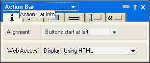
Using the Action Bar Info Tab
The Action Bar Info tab has two settings. You can set the location of the buttons starting from the left or right with the Alignment option. The Web Access setting determines whether the Domino view applet is used to display to Web users. If you want to use the view applet, select Using Java Applet. With this enabled, Web clients can scroll the Action bar and use pull-down lists.
Figure 6.25. The Action bar properties box controls the style of the Action bar.
You can change the default gray background color from the Color drop-down list. The Use System Color If Customized check box is checked by default. If unchecked, the color remains at the color chosen , regardless of the system colors. The Action bar has a default black line of single thickness that extends to the width of the window. The Bottom Border radio button has four choices: None, Fit to Window (the default), Under Buttons Only, and Fixed Width. You can set the color of the line with the style of the line from the drop-down lists on the right. I have found it unnecessary to change the default settings because they are aesthetically pleasing enough.
Using the Action Bar Size Tab
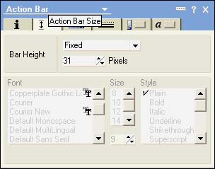
This Action Bar Size tab lets you size the button bar (see Figure 6.26). The Bar Height field has three choices, Default, Exs, and Fixed. If you use the Default setting, Notes sizes the bar automatically. If you choose Exs, the bar is set to three times the height of the lowercase characters in the font you use. You can enter a specific height in pixels if you choose Fixed.
Figure 6.26. The Action bar height can be changed on the Action Bar Size tab.
Using the Action Bar Background Tab
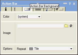
Using settings on the Action Bar Background tab (see Figure 6.27), you can change the background of a button is displayed. You can select a color or an image resource. If you select an image, you can select from the Repeat Options at the bottom of the tab.
Figure 6.27. An Action bar background can be set to a color or an image.
Using the Action Bar Border Tab
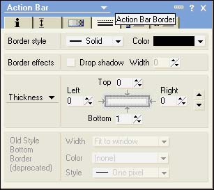
The Action Bar Border tab (see Figure 6.28) is very similar to the Border tab for Table Properties. The same settings are present: Style, Color, Effects, and Thickness. The bottom section, Old Style, can be enabled by selecting None for the border style. Notice, however, that this setting is deprecated, so it is not advisable to use it. It is here for backward compatibility.
Figure 6.28. Using the settings on the Action Bar Border tab, you can give buttons a sophisticated look.
Using the Action Bar Button Properties Tab
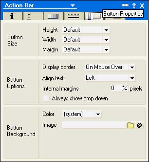
On the Button Properties tab, you can set the size of the button's height, width, and margin (see Figure 6.29). In the Button Options section, you determine how and when the border is displayed, and in the Button Background section, you set the color or image for the background.
Figure 6.29. Using the settings for button properties, you can add many features.
The Button Font tab displays the standard Notes Font tab and isn't covered here.
Part I. Introduction to Release 6
Whats New in Release 6?
- Whats New in Release 6?
- A Brief History of Lotus Notes
- Major Features of Lotus Notes
- Types of Applications
- Whats New in Domino Designer?
- New Design Element Features
- New Language Features
The Release 6 Object Store
- The Release 6 Object Store
- Defining a Domino Database
- Understanding the Database Structure
- Creating a Database
- Working with Database Properties
- Understanding Design Templates
- Creating Your Own Templates
- Inheriting Designs from Templates
- Using Templates to Replicate Design Changes
- Using Templates as Design Libraries
- Archiving Versions with Templates
The Integrated Development Environment
- The Integrated Development Environment
- Working in the Application Design Environment
- Working with the Properties Box
- Understanding the Work Pane
- Using the Programmers Pane
- Understanding the Info List
- Understanding the Action Pane
- Customizing the Tools Menu
- Printing Source Code
- Using the HTML Editor
- Locking Design Elements
Part II. Foundations of Application Design
Forms Design
- Forms Design
- Designing Forms
- Setting Form Properties
- Working with Text Properties
- Working with Fields
- Writing Formulas in Fields
Advanced Form Design
- Advanced Form Design
- Working with Tables
- Using Graphic Objects on Forms
- Working with Form-Level Events
- Using Form Actions
- Working with Hotspots
- Understanding Sections and Section Properties
- Using Layout Regions
- Working with Special Forms
- Creating Reusable Design Objects
- Using Embedded Elements
- Using the Form Design Document
Designing Views
- Designing Views
- Defining the Elements of a View
- Creating a View
- Setting View Properties
- Creating Advanced View Selections
- Adding and Editing View Columns
- Using View Column Properties
- Adding Actions to a View
- Creating Calendar Views
- Understanding Folders
Using Shared Resources in Domino Applications
- Shared Resources
- Sharing Images Within a Database
- Creating Shared Files
- Creating Shared Applets
- Shared Code
- Creating Subforms
- Creating Shared Fields
- Creating Shared Actions
- Script Libraries
- Database Resources
Using the Page Designer
- Using the Page Designer
- Understanding Pages
- Working with the Page Properties Box
- Using the Page Designer
- Adding Layers to Your Pages
Creating Outlines
- Creating Outlines
- Creating an Outline
- Working with Outline Entries
- Embedding Outlines
- Adding an Outline to a Frameset
Adding Framesets to Domino Applications
- Adding Framesets to Domino Applications
- Creating a Frameset
- Using the Frameset Designer
- Working with Frames
- Viewing the HTML Source of Your Frameset
- Launching the Frameset
Automating Your Application with Agents
- Automating Your Application with Agents
- Working with Agents
- Creating an Agent
- Working in the Agent Builder Design Window
- Using @Commands in Agents
- Putting Your Agent to Work
- Creating a Complex Agent
- Using LotusScript in Agents
- Creating Web Agents Using Formulas and LotusScript
- Using Java in Agents
- Testing and Debugging Agents, the Agent Log, and Agent Properties
- Agent Properties via the Agent InfoBox
Part III. Programming Domino Applications
Using the Formula Language
- Using the Formula Language
- Overview of the Formula Language
- Knowing Where to Use @Functions and @Commands
- Formula Syntax
- Limitations of the Formula Language
- Working with Statements
- Using Logical @Functions
- Working with Date and Time @Functions
- Working with Strings
- Getting Session and User Information
- Working with Documents
- Retrieving Data with @DbColumn and @DbLookup
- Working with Lists
- Getting User Input
- Controlling the Flow of a Formula
- Error Handling
Real-World Examples Using the Formula Language
- Real-World Examples Using the Formula Language
- Programming Practices
- Using Formulas in Forms and Subforms
- Writing Field Formulas
- Writing View Formulas
- Using Hide When Formulas
- Working with Forms, Views, and Shared Actions
Writing LotusScript for Domino Applications
- Writing LotusScript for Domino Applications
- Software Construction
- Fundamental Elements of LotusScript
- New Technologies and LotusScript
Real-World LotusScript Examples
- Real-World LotusScript Examples
- Real-World Example 1: Importing a Delimited Text File
- Real-World Example 2: Delete a Parent Document and All Its Children: DeleteParentAndChildren
- Real-World Example 3: Schedule an Agent Robot to Refresh All the Documents in a View: Robot-DailyRefreshAllDocs
- Real-World Example 4: Return a Web User to the Place Where He Started After a Document Is Submitted: WebQuerySave-DocSubmit
Writing JavaScript for Domino Applications
- Writing JavaScript for Domino Applications
- What Is JavaScript?
- JavaScript Is Not Java
- JavaScript and the Domino IDE
- The Document Object Model
- JavaScript Support in Domino 6
- When to Use JavaScript
- A Look at JavaScript in Domino
- JavaScript Libraries in Domino
- JavaScript Principles 101
- Syntax and Command Blocks
- Statements
- Output
- Functions
- Objects
- Input Validation
- Validating Check Boxes
- Validating Radio Buttons
- Validating Selection Lists
- Calculations
- JavaScript Application
Real-World JavaScript Examples
- Real-World JavaScript Examples
- Real-World Example 1: Dynamic Drop-Down Lists on the Web
- Real-World Example 2: Dialog Boxes and window. opener on the Web
- Real-World Example 3: Dynamic Tables
- Real-World Example 4: Useful JavaScript Utilities
Writing Java for Domino Applications
- Writing Java for Domino Applications
- Introduction to Java
- Choosing a Java Solution in Domino
- Understanding the Notes Object Interface
- Writing Java Agents
- Using Other Java IDEs
- Other Uses for Java
Real-World Java Examples
Enhancing Domino Applications for the Web
- Enhancing Domino Applications for the Web
- Whats New in Designer 6
- Understanding the Domino Web Application Server
- Understanding the Basics of HTML
- Using HTML in Domino Designer
- Adding Power with Domino URLs
- Views and Forms Working Together on the Web
- Incorporating Flash into Your Web Pages
- What Its All About: XML Exposed
- How Does Domino Use XML?
Part IV. Advanced Design Topics
Accessing Data with XML
Accessing Data with DECS and DCRs
- Accessing Data with DECS and DCRs
- What Is DECS?
- The External Data Source
- DECS Administrator
- Creating the Activity
- Accessing the Application
- DECS Summary
- Data Connection Resources
- DCR Example
- Tips on External Data Access
Security and Domino Applications
- Security and Domino Applications
- How Does Domino Security Work?
- Enabling Physical Security
- Setting Server Access
- Database Access Control Lists
- The Role of the Domino Directory in Application Security
- ACL Privileges
- Enabling Database Encryption
- Using Roles
- Implementing View-Level Security
- Implementing Form-Level Security
- Implementing Document-Level Security
- Applying Field-Level Security
- Hiding the Design of Your Application
Creating Workflow Applications
- Creating Workflow Applications
- The Evolution of Groupware
- Introducing Workflow
- Creating Mail-Enabled Applications
- Using Triggers to Send Email
- Sending Mail with LotusScript
Analyzing Domino Applications
Part V. Appendices
Appendix A. HTML Reference
Appendix B. Domino URL Reference
EAN: 2147483647
Pages: 288
