Identifying and Verifying Causes
Overview
Purpose of these tools
To increase the chances that you can identify the true root causes of problems, which can then be targeted for improvement.
The tools in this chapter fall into two very different categories:
- Tools for identifying potential causes (starts below) are techniques for sparking creative thinking about the causes of observed problems. The emphasis is on thinking broadly about what's going on in your process.
- Tools for verifying potential causes (starts on p. 149) are at the opposite end of the spectrum. Here the emphasis is on rigorous data analysis or specific statistical tests used to verify whether a cause-and-effect relationship exists and how strong it is.
A Identifying potential causes
Purpose of these tools
To help you consider a wide range of potential causes when trying to find explanations for patterns in your data.
They will help you…
- Propose Critical Xs—Suggest ideas (hypotheses) about factors (Xs) that are contributing to problems in a targeted process, product, or service
- Prioritize Critical Xs—Identify the most likely causes that should be investigated further
Be sure to check the tools in part B to validate the suspected Xs.
Deciding which tool to use
This guide covers two types of tools used to identify potential causes:
- Data displays: Many basic tools covered elsewhere in this guide (time series plots, control charts, histograms, etc.) may spark your thinking about potential causes. Your team should simply review any of those charts created as part of your investigative efforts. One addition tool covered here is…
- Pareto charts (below): specialized bar charts that help you focus on the "vital few" sources of trouble. You can then focus your cause-identification efforts on the areas where your work will have the biggest impact.
- Cause-focused brainstorming tools: All three of these tools are variations on brainstorming.
- 5 Whys (p. 145): A basic technique used to push your thinking about a potential cause down to the root level. Very quick and focused.
- Fishbone diagram (cause-and-effect diagrams or Ishikawa diagrams, p. 146): A format that helps you arrange and organize many potential causes. Encourages broad thinking.
- C&E Matrix (p. 148): A table that forces you to think about how specific process inputs may affect outputs (and how the outputs relate to customer requirements). Similar in function to a fishbone diagram, but more targeted in showing the input-output linkages.
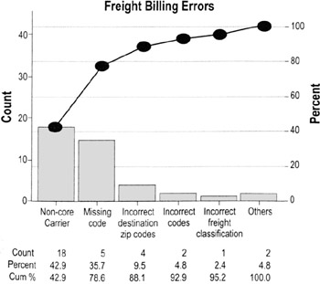
Pareto charts
Highlights
- Pareto charts are a type of bar chart in which the horizontal axis represents categories rather than a continuous scale
- The categories are often defects, errors or sources (causes) of defects/errors
- The height of the bars can represent a count or percent of errors/defects or their impact in terms of delays, rework, cost, etc.
- By arranging the bars from largest to smallest, a Pareto chart can help you determine which categories will yield the biggest gains if addressed, and which are only minor contributors to the problem
To create a Pareto chart…
- Collect data on different types or categories of problems.
- Tabulate the scores. Determine the total number of problems observed and/or the total impact. Also determine the counts or impact for each category.
- If there are a lot of small or infrequent problems, consider adding them together into an "other" category
- Sort the problems by frequency or by level of impact.
- Draw a vertical axis and divide into increments equal to the total number you observed.
- In the example here, the total number of problems was 42, so the vertical axis on the left goes to 42
- People often mistakenly make the vertical axis only as tall as the tallest bar, which can overemphasize the importance of the tall bars and lead to false conclusions
- Draw bars for each category, starting with the largest and working down.
- The "other" category always goes last even if it is not the shortest bar
- OPTIONAL: Add in the cumulative percentage line. (Convert the raw counts to percentages of the total, then draw a vertical axis on the right that represents percentage. Plot a point above the first bar at the percentage represented by that bar, then another above the second bar representing the combined percentage, and so on. Connect the points.)
- Interpret the results (see next page).
Interpreting a Pareto chart
- Clear Pareto effect
- This pattern shows that just a few categories of the problem account for the most occurrences or impact
- Focus your improvement efforts on those categories
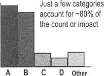
Just a few categories account for ~80% of the count or impact
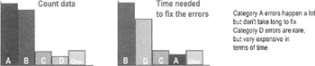
- No Pareto effect
- This pattern shows that no cause you've identified is more important than any other
- If working with counts or percentages, convert to an "impact" Pareto by calculating impacts such as "cost to fix" or "time to fix"
- A pattern often shows up in impact that is not apparent by count or percentage alone
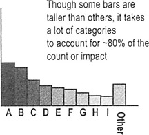
Though some bars are taller than others, it takes a lot of categories to account for ~80% of the count or impact
- This pattern shows that no cause you've identified is more important than any other
- Revisit your fishbone diagram or list of potential causes, then…
- Ask which factors could be contributing to all of the potential causes you've identified
- Think about other stratification factors you may not have considered; collect additional data if necessary and create another Pareto based on the new stratification factor
| Tip |
|
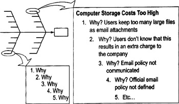
Whys
Highlights
- Method for pushing people to think about root causes
- Prevents a team from being satisfied with superficial solutions that won't fix the problem in the long run
To use 5 Whys…
- Select any cause (from a cause-and-effect diagram, or a tall bar on a Pareto chart). Make sure everyone has a common understanding of what that cause means. ("Why 1")
- Ask "why does this outcome occur"? (Why 2)
- Select one of the reasons for Why 2 and ask "why does that occur"? (Why 3)
- Continue in this way until you feel you've reached a potential root cause.
| Tips |
|
Cause and effect diagrams (fishbone or Ishikawa diagrams)
Purpose
- To help teams push beyond symptoms to uncover potential root causes
- To provide structure to cause identification effort
- To ensure that a balanced list of ideas have been generated during brainstorming or that major possible causes are not overlooked
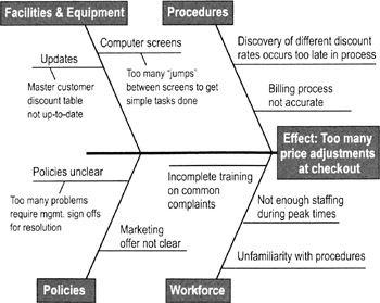
When to use cause and effect diagrams
- Best used for cause identification once you have a focused definition of the problem (which may not happen until Analyze or Improve)
- Can also be used as a cause—prevention tool by brainstorming ways to maintain or prevent future problems (include in planning efforts in Improve or Control)
How to create and use a cause and effect diagram
- Name the problem or effect of interest. Be as specific as possible.
- Write the problem at the head of a fishbone "skeleton"
- Decide the major categories for causes and create the basic diagram on a flip chart or whiteboard.
- Typical categories include the 6 Ms: manpower (personnel), machines, materials, methods, measurements, and Mother Nature (or environment)
- Brainstorm for more detailed causes and create the diagram.
- Option 1: Work through each category, brainstorming potential causes and asking "why" each major cause happens. (See 5 Whys, p. 145).
- Option 2: Do silent or open brainstorming (people come up with ideas in any order).
- Write suggestions onto self-stick notes and arrange in the fishbone format, placing each idea under the appropriate categories.
- Review the diagram for completeness.
- Eliminate causes that do not apply
- Brainstorm for more ideas in categories that contain fewer items (this will help you avoid the "groupthink" effect that can sometimes limit creativity)
- Discuss the final diagram. Identify causes you think are most critical for follow-up investigation.
- OK to rely on people's instincts or experience (you still need to collect data before taking action).
- Mark the causes you plan to investigate. (This will help you keep track of team decisions and explain them to your sponsor or other advisors.)
- Develop plans for confirming that the potential causes are actual causes. DO NOT GENERATE ACTION PLANS until you've verified the cause.
C E Matrix
Purpose
To identify the few key process input variables that must be addressed to improve the key process output variable(s).
When to use a C E matrix
- Similar in purpose to a fishbone diagram, but allows you to see what effect various inputs and outputs have on ranked customer priorities
- Use in Improve to pinpoint the focus of improvement efforts
|
Temp of Coffee |
Taste |
Strength |
Process Outputs |
|||
|---|---|---|---|---|---|---|
|
Importance |
8 |
10 |
6 |
|||
|
Process Steps |
Process Inputs |
Correlation of Input to Output |
Total |
|||
|
0 |
||||||
|
Clean Carafe |
[blank] |
3 |
1 |
36 |
||
|
Fill Carafe with Water |
9 |
9 |
144 |
|||
|
Pour Water into Maker |
1 |
1 |
16 |
|||
|
Place Filter in Maker |
3 |
1 |
36 |
|||
How to create a C E matrix
- Identify key customer requirements (outputs) from the process map or Voice of the Customer (VOC) studies. (This should be a relatively small number, say 5 or fewer outputs.) List the outputs across the top of a matrix.
- Assign a priority score to each output according to importance to the customer.
- Usually on a 1 to 10 scale, with 10 being most important
- If available, review existing customer surveys or other customer data to make sure your scores reflect customer needs and priorities
- Identify all process steps and key inputs from the process map. List down the side of the matrix.
- Rate each input against each output based on the strength of their relationship:
Blank = no correlation
1 = remote correlation
3 = moderate correlation
9 = strong correlation
Tip At least 50% to 60% of the cells should be blank. If you have too many filled-in cells, you are likely forcing relationships that don't exist.
- Cross-multiply correlation scores with priority scores and add across for each input.
Ex: Clean carafe = (3*10) + (1 * 6) = 30 + 6 = 36
- Create a Pareto chart and focus on the variables relationships with the highest total scores. Especially focus on those where there are acknowledged performance gaps (shortfalls).
B Confirming causal effects and results
Purpose of these tools
To confirm whether a potential cause contributes to the problem. The tools in this section will help you confirm a cause-and-effect relationship and quantify the magnitude of the effect.
Deciding between these tools
Often in the early stages of improvement, the problems are so obvious or dramatic that you don't need sophisticated tools to verify the impact. In such cases, try confirming the effect by creating stratified data plots (p. 150) or scatter plots (p. 154) of cause variables vs. the outcome of interest, or by testing quick fixes/obvious solutions (seeing what happens if you remove or change the potential cause, p. 152).
However, there are times when more rigor, precision, or sophistication is needed. The options are:
- Basic hypothesis testing principles and techniques (p. 156). The basic statistical calculations for determining whether two values are statistically different within a certain range of probability.
- Specific cause-and-effect (hypothesis) testing techniques. The choice depends in part on what kinds of data you have (see table below).
Dependent Variable (Y)
Independent Variable (X)
Continuous Attribute
Continuous
Attribute
Regression (p. 167)
Logistic Regression (not covered in this book)
ANOVA (p. 173)
Chi-Square (χ2) Test (p. 182)
- Design of Experiments (pp. 184 to 194), a discipline of planned experimentation that allows investigation of multiple potential causes. It is an excellent choice whenever there are a number of factors that may be affecting the outcome of interest, or when you suspect there are interactions between different causal factors.
Stratified data charts
Highlights
- Simple technique for visually displaying the source of data points
- Allows you to discover patterns that can narrow your improvement focus and/or point towards potential causes
To use stratified data charts…
- Before collecting data, identify factors that you think may affect the impact or frequency of problems
- Typical factors include: work shift, supplier, time of day, type of customer, type of order. See stratification factors, p. 75, for details.
- Collect the stratification information at the same time as you collect the basic data
- During analysis, visually distinguish the "strata" or categories on the chart (see examples)
Option 1 Create different charts for each strata
|
Facility A |
Facility B |
Facility C |
||
|---|---|---|---|---|
|
Time (in mins) |
0-9 |
xxx |
x |
xx |
|
10-19 |
xxxxx |
xxxx |
xxxxx |
|
|
20-29 |
xxxx |
xxxx |
xxxxxxx |
|
|
30-39 |
xxxxxx |
xxxxx |
xxxxxxxx |
|
|
40-49 |
xxxx |
xxxxxxx |
xxxx |
|
|
50-59 |
xxxx |
xxxxxx |
xx |
|
|
60-69 |
xx |
xxxx |
x |
|
|
70-79 |
x |
xx |
x |
|
|
These stratified dot plots show the differences in delivery times in three locations. You'd need to use hypothesis testing to find out if the differences are statistically significant. |
||||
Option 2 Color code or use symbols for different strata
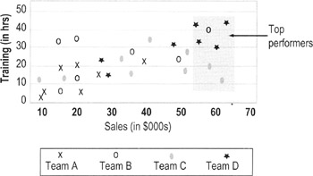
This chart uses symbols to show performance differences between people from different work teams. Training seems to have paid off for Team D (all its top performers are in the upper right corner); Team C has high performers who received little training (they are in the lower right corner).
Testing quick fixes or obvious solutions
Purpose
- To confirm cause-and-effect relationships and prevent unanticipated problems from obvious "quick fixes"
Why test quick fixes
- Your team may stumble on what you think are quick fixes or obvious solutions. On the one hand, you don't want to exhaustively test every idea that comes along (doing so can delay the gains from good ideas). But you also don't want to plunge into making changes without any planning (that's why so many "solutions" do nothing to reduce or eliminate problems). Testing the quick fix/obvious solution provides some structure to help you take advantage of good ideas while minimizing the risks.
When to test quick fixes
- Done only when experimental changes can be done safely:
- No or minimal disruption to the workplace and customers
- No chance that defective output can reach customers
- Relatively quick feedback loop (so you can quickly judge the impact of changes)
- Done in limited circumstances where it may be difficult or impossible to verify suspected causes without making changes
- Ex: Changing a job application form to see if a new design reduces the number of errors (it would be difficult to verify that "form design" was a causal factor unless you tested several alternative forms)
- Ex: Changing labeling on materials to see if that reduces cross-contamination or mixing errors (difficult to verify "poor labeling" as a cause by other means)
How to test quick fixes
- Confirm the potential cause you want to experiment with, and document the expected impact on the process output.
- Develop a plan for the experiment.
- What change you will make
- What data you will be measuring to evaluate the effect on the outcome
- Who will collect data
- How long the experiment will be run
- Who will be involved (which team members, process staff, work areas, types of work items, etc.)
- How you can make sure that the disruption to the workplace is minimal and that customers will not feel any effects from the experiment
- Present your plan to the process owner and get approval for conducting the experiment.
- Train data collectors. Alert process staff of the impending experiment; get their involvement if possible.
- Conduct the experiment and gather data.
- Analyze results and develop a plan for the next steps.
- Did you conduct the experiment as planned?
- Did making the process change have the desired impact on the outcome? Were problems reduced or eliminated?
- If the problem was reduced, make plans for trying the changes on a larger scale (see pilot testing, p. 273)
| Tips |
|
Scatter plots
Highlights
- A graph showing a relationship (or correlation) between two factors or variables
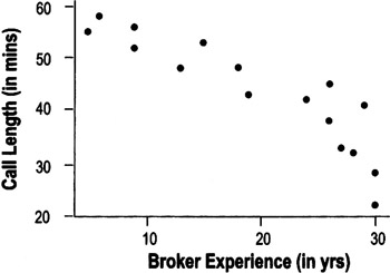
- Lets you see patterns in data
- Helps support or refute theories about the data
- Helps create or refine hypotheses
- Predicts effects under other circumstances
- The width or tightness of scatter reflects the strength of the relationship
-
Caution seeing a relationship in the pattern does not guarantee that there is a cause-and-effect relationship between the variables (see p. 165)
To use scatter plots…
- Collect paired data
To create a scatter plot, you must have two measurements for each observation point or item
- Ex: in the chart above, the team needed to know both the call length and the broker's experience to determine where each point should go on the plot
- Determine appropriate measures and increments for the axes on the plot
- Mark units for the suspected cause (input) on the horizontal X-axis
- Mark the units for the output (Y) on the vertical Y-axis
- Plot the points on the chart
Interpreting scatter plot patterns
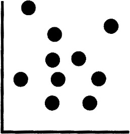
No pattern. Data points are scattered randomly in the chart.
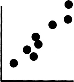
Positive correlation (line slopes from bottom left to top right). Larger values of one variable are associated with larger values of the other variable.
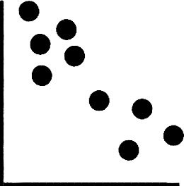
Negative correlation (line slopes from upper left down to lower right). Larger values of one variable are associated with smaller values of the other variable.
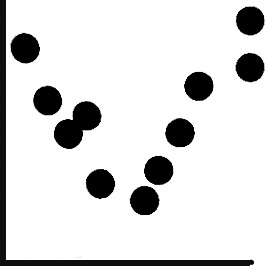
Complex patterns. These often occur when there is some other factor at work that interacts with one of the factors. Multiple regression or design of experiments can help you discover the source of these patterns.
| Tips |
|
Hypothesis testing overview
Highlights
- Hypothesis testing is a branch of statistics that specifically determines whether a particular value of interest is contained within a calculated range (= confidence interval)
- The hypothesis test calculates the probability that your conclusion is wrong
- A common application of hypothesis testing is to see if two means are equal
- Because of variation, no two data sets will ever be exactly the same even if they come from the same population
- Hypothesis testing will tell you if differences you observe are likely due to true differences in the underlying populations or to random variation
Hypothesis testing terms and concepts
- The null hypothesis (H0) is a statement being testing to determine whether or not it is true. It is usually expressed as an equation, such as this one:

- This notation means the null hypothesis is that the means from two sets of data are the same. (If that's true, then subtracting one mean from the other gives you 0.)
- We assume the null hypothesis is true, unless we have enough evidence to prove otherwise
- If we can prove otherwise, then we reject the null hypothesis
- The alternative hypothesis (Ha) is a statement that represents reality if there is enough evidence to reject H0. Ex:

- This notation means the alternative hypothesis is that the means from these two populations are not the same.
- If we reject the null hypothesis then practically speaking we accept the alternative hypothesis
-
Note From a statistician's viewpoint, we can never accept or prove a null hypothesis—we can only fail to reject the null based on certain probability. Similarly, we never accept or prove that the alternative is right—we reject the null. To the layperson, this kind of language can be confusing. So this book uses the language of rejecting/accepting hypotheses.
Uses for hypothesis testing
- Allows us to determine statistically whether or not a value is cause for alarm
- Tells us whether or not two sets of data are truly different (with a certain level of confidence)
- Tells us whether or not a statistical parameter (mean, standard deviation, etc.) is different from a value of interest
- Allows us to assess the "strength" of our conclusion (our probability of being correct or wrong)
Assumptions of hypothesis tests
- Independence between and within samples
- Random samples
- Normally distributed data
- Unknown Variance
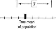
Confidence intervals
- Rarely will any value (such as a mean or standard deviation) that we calculate from a sample of data be exactly the same as the true value of the population (or of another sample)
- A confidence interval is a range of values, calculated from a data set, that gives us an assigned probability that the true value lies within that range
- Usually, confidence intervals have an additive uncertainty:
Estimate ± margin of error
- Ex: Saying that a 95% confidence interval for the mean is 35 ± 2, means that we are 95% certain that the true mean of the population lies somewhere at or between 33 to 37.
Calculating confidence intervals
The formulas for calculating confidence intervals are not included in this book because most people get them automatically from statistical software. What you may want to know is that the Z (normal) distribution is used when the standard deviation is known. Since that is rarely the case, more often the intervals are calculated from what's called a t—distribution. The t—distribution "relaxes" or "expands" the confidence intervals to allow for the uncertainty associated with having to use an estimate of the mean. (So a 95% confidence interval calculated with an unknown standard deviation will be wider than one where the standard deviation is known.)
Type I and Type II errors, Confidence, Power, and p values
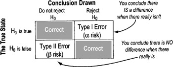
Type I Error: Alpha (α) Risk or Producer risk
- Rejecting the null when you should not
- You've "discovered" something that isn't really there
Ex: If the null hypothesis is that two samples are the same, you would wrongly conclude they are different ("rejecting the null") even though they are the same
- Impact of Alpha errors: You will reach wrong conclusions and likely implement wrong solutions
Type II Error: Beta (β) Risk or Consumer Risk
- Description: Do not reject the null when you should
- You've missed a significant effect
Ex: If the null hypothesis is that two samples are the same, you would wrongly conclude that they are the same ("NOT rejecting the null") when, in fact, they are different
- Impact of Beta errors: You will treat solution options as identical even though they aren't
- Type II error is determined from the circumstances of the situation
Balancing Alpha and Beta risks
- You select upfront how much Type I error you are willing to accept (that's the alpha value you choose).
- Confidence level = 1 − α
- Often an alpha level of 0.05 is chosen, which leads to a 95% confidence interval. Selecting an alpha of 0.10 (increasing the chances of rejecting the null when you should accept it) would lead to 90% confidence intervals.
- If alpha is made very small, then beta increases (all else being equal).
- If you require overwhelming evidence to reject the null, that will increase the chances of a Type II error (not rejecting it even when you should)
- Power = 1 − β (Power is the probability of rejecting the null hypothesis when it is false); power can also be described as the ability of the test to detect an effect of a given magnitude.
- If two populations truly have different means, but only by a very small amount, then you are more likely to conclude they are the same. This means that the beta risk is greater.
- Beta comes into play only if the null hypothesis truly is false. The "more" false it is, the greater your chances of detecting it, and the lower your beta risk.
p values
- If we reject the null hypothesis, the p-value is the probability of being wrong
- The p-value is the probability of making a Type I error
- It is the critical alpha value at which the null hypothesis is rejected
- If we don't want alpha to be more than 0.05, then we simply reject the null hypothesis when the p-value is 0.05 or less
Confidence intervals and sample size
There is a direct correlation between sample size and confidence
- Larger samples increase our confidence level
- If you can live with less confidence, smaller sample sizes are OK
Narrow confidence intervals give you a smaller chance (less confidence) of encompassing the true mean
Wide confidence intervals give you a bigger chance (more confidence) of encompassing the true mean
- To minimize beta risk at a given alpha level, increase sample size
- All of these translate into a specific confidence interval for a given parameter, set of data, confidence level and sample size
- They also translate into what types of conclusions result from hypothesis tests
- Testing for larger differences (delta, Δ) between the samples reduces the required sample size
t test Overview
Highlights
- A statistical test that allows us to make judgments about the average of a process or population
- The judgment is whether the null hypothesis is likely to be true (see p. 156 for more on basic hypothesis testing)
- We calculate a t—statistic and determine probabilities comparing the statistic to a t—distribution (see below)
- In cases where you know the standard deviation of a population you should use a Z-statistic not a t—statistic. Z-distributions are not covered in this book since they are rarely used in practice.
- The data should be normally distributed. However, because of the Central Limit Theorem (p. 114) concerning the distribution of averages, this assumption is not as critical here as it is with other tests
- Used in two situations:
- Comparing a sample to a point of interest (a 1-sample t—test) or
- Comparing a sample to another sample (a 2-sample t—test)
t Distribution
- The t—distribution is actually a family of distributions
- They are similar in shape to the normal distribution (symmetric and bell-shaped), although wider and flatter in the tails.
- How wide and flat depends on the sample size. The smaller the sample size, the wider and flatter the distribution tails (that means intervals between confidence levels get broader and broader)
- As sample size increases, the t—distribution approaches the exact shape of the normal distribution
- Most statistical packages (such as Minitab) will automatically report the t—statistic and probability values to you. On the following pages, we show how these calculations are done. Refer to any good statistics textbook for t—distribution tables.
Sample t test
- Tells us whether or not a statistical parameter (average, standard deviation, etc.) is different from a value of interest
- Allows us to assess the "strength" of our conclusion (our probability of being correct)
- The hypotheses take the basic form:

The null hypothesis is that the sample mean is equal to a target value.

(choose one symbol for the alternative hypothesis indicating whether you think the mean is bigger than, less than, or simply not equal to the target value)
- Here is the equation for calculating the t—test statistic:
- Δ0 (delta) is the hypothesized difference between the two population means.
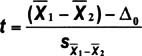
- The methods for determining the factor in the denominator varies depending on whether you can assume that the new data has the same variation as the known standard (this affects what options you check in Minitab).
- Details on calculating s are beyond the scope of this book (and besides, is usually done automatically if you use a statistics program). Refer to any good statistics text if you need to do these calculations by hand.
- Δ0 (delta) is the hypothesized difference between the two population means.
An automobile manufacturer has a target length for camshafts of 599.5 mm., with an allowable range of ± 2.5 mm (= 597.0 mm to 602.0 mm). Here are data on the lengths of camshafts from Supplier 2:
|
mean = 600.23 |
std. dev. = 1.87 |
|
95% CI for mean is 599.86 to 600.60 |
|
The null hypothesis in plain English: the camshafts from Supplier 2 are the same as the target value. Printouts from Minitab showing the results of this hypothesis test are shown on the next page.
One-Sample T: Supp2
|
Test of mu = 599.5 vs. not 599.5 |
|||||||
|---|---|---|---|---|---|---|---|
|
Variable |
N |
Mean |
StDev |
SE Mean |
95% CI |
T |
P |
|
Supp2 |
100 |
600.230 |
1.874 |
0.187 |
(599.858, 600.602) |
3.90 |
0.000 |
|
Confidence Intervals, Hypothesis Tests and Power |
|||||||
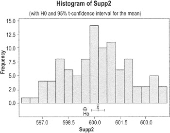
Results
Clues that we should reject the null hypothesis (which, for practical purposes, means the same as concluding that camshafts from Supplier 2 are not on target):
- On the histogram, the circle marking the target mean value is outside the confidence interval for the mean from the data
- The p-value is 0.00 (which is less than the alpha of 0.05)
Sample t test
Highlights
- The 2-Sample t is used to test whether or not the means of two samples are the same
Using a 2 sample t test
- The null hypothesis for a 2-sample t is

(the mean of population 1 is the same as the mean of population 2)
- The alternative hypothesis is a statement that represents reality if there is enough evidence to reject H0
- Here is the alternative hypothesis for this situation:

- If we reject the null hypothesis then we accept ("do not reject") the alternative hypothesis
Sample t test example
The same automobile manufacturer has data on another supplier and wants to compare the two:
- Supplier 1: mean = 599.55, std. dev = .62 (95% CI for mean is 599.43 to 599.67)
- Supplier 2: mean = 600.23, std. dev. = 1.87 (95% CI for mean is 599.86 to 600.60)
The null hypothesis in plain English: the mean length of camshafts from Supplier 1 is the same as the mean length of camshafts from Supplier 2. Here is the printout from Minitab along with a boxplot:
Two-Sample T-Test and CI: Supp1, Supp2
|
Two-sample T for Supp1 vs Supp2 |
||||
|---|---|---|---|---|
|
N |
Mean |
StDev |
SE Mean |
|
|
Supp1 |
100 |
599.548 |
0.619 |
0.062 |
|
Supp2 |
100 |
600.23 |
1.87 |
0.19 |
|
Difference = mu (Supp1) − mu (Supp2) |
||||
|
Estimate for difference:−0.682000 |
||||
|
95% CI for difference: (−1.072751, −0.291249) |
||||
|
T-Test of difference = 0 (vs not =) : T-Value = −3.46 P-Value = 0.001 DF = 120 |
||||
|
Confidence Intervals, Hypothesis Tests and Power |
||||
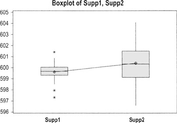
Results
There are two indicators in these results that we have to reject the null hypothesis (which, in practice, means concluding that the two suppliers are statistically different):
- The 95% CI for the difference does NOT encompass "0" (both values are negative)
- The p-value 0.001 (we usually reject a null if p ≤.05)
(Given the spread of values displayed on this boxplot, you may also want to test for equal variances.)
Overview of correlation
Highlights
- Correlation is a term used to indicate whether there is a relationship between the values of different measurements
- A positive correlation means that higher values of one measurement are associated with higher values of the other measurement (both rise together)
- A negative correlation means that higher values of one measurement are associated with lower values of another (as one goes up, the other goes down)
- Correlation itself does not imply a cause-and-effect relationship!
- Sometimes an apparent correlation can be coincidence
- Other times, the two cause-and-effect variables are both related to an underlying cause—called a lurking variable—that is not included in your analysis
- In the example shown here, the lurking variable is the weight of the car
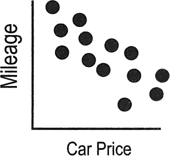
The price of automobiles shows a negative correlation to gas mileage (meaning as price goes up, mileage goes down). But higher prices do not CAUSE lower mileage, nor does lower mileage cause higher car prices.
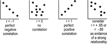
Correlation statistics (coefficients)
Regression analysis and other types of hypothesis tests generate correlation coefficients that indicate the strength of the relationship between the two variables you are studying. These coefficients are used to determine whether the relationship is statistically significant (translation: whether you can conclude that the observed relationships are not merely happening by chance). For example:
- The Pearson correlation coefficient (designated as r) reflects the strength and the direction of the relationship
- r2 [r-squared], the square of the Pearson correlation coefficient, tells us the percentage of variation in Y that is attributable to the independent variable X ("r" can be positive or negative; r2 is always positive)
Interpreting correlation coefficients
- r falls on or between −1 and 1
- Use to calculate r2
- r2 is on or between 0 and 1
Regression overview
Highlights
Regression Analysis is used in conjunction with correlation calculations and scatter plots to predict future performance based on past results.
- Regression defines the relationship more precisely than correlation coefficients alone
- Regression analysis is a tool that uses data on relevant variables to develop a prediction equation, or model [Y = f(x)]
Overview of regression analysis
- Plan data collection
- What inputs or potential causes will you study?
- Also called predictor variables or independent variables
- Best if the variables are continuous, but they can be count or categorical
- What output variable(s) are key?
- Also called response or dependent variables
- Best if the variables are continuous, but they can be count or categorical
- How can you get data? How much data do you need?
- What inputs or potential causes will you study?
- Perform analysis and eliminate unimportant variables
- Collect the data and generate a regression equation:
- Which input variables have the biggest effect on the response variable?
- What factor or combination of factors is the best predictors of output?
- Remember to perform residuals analysis (p. 195) to check if you can properly interpret the results
- Collect the data and generate a regression equation:
- Select and refine model
- Delete unimportant factors from the model.
- Should end up with to 2 or 3 factors still in the model
- Validate model
Collect new data to see how well the model is able to predict actual performance
Simple linear regression
Highlights
- In Simple Linear Regression, a single input variable (X) is used to define/predict a single output (Y)
- The output you'll get from the analysis will include an equation in the form of:
Y = B1 + [B2 *X] + E
- B1 is the intercept point on the y-axis (think of this as the average minimum value of the output)
- B2 is the constant that tells you how and how much the X variable affects the output
- A "+" sign for the factor means the more of X there is, the more of Y there will be
- A "−" sign means that the more of X there is, the less of Y there will be
- E is the amount of error or "noise"
Interpreting simple regression numbers
| Caution |
Be sure to perform residuals analysis (p. 195) as part of your work to verify the validity of the regression. If the residuals show unusual patterns, you cannot trust the results. |
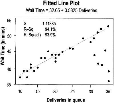
The graph shown on the previous page was generated to depict how the number of pizza deliveries affected how long customers had to wait. The form of the simple regression equation is:

The actual data showed

This means that, on average, customers have to wait about 32 minutes even when there are no deliveries in queue, and that (within the range of the study) each new delivery in queue adds just over half a minute (0.58 min) to the waiting time. The company can use this equation to predict wait time for customers. For example, if there are 30 deliveries in queue, the predicted wait time would be:

- Amount of variation in the data that is explained by the model = R-Sq = .970 * .970 = 94.1
Multiple regression
Highlights
- Same principles as simple regression except you're studying the impact of multiple Xs (predictor variables) on one output (Y)
- Using more predictors often helps to improve the accuracy of the predictor equation ("the model")
- The equation form is…

- Y is what we are looking to predict
- Xs are our input variables
- The Bs are the constants that we are trying to find—they tell us how much, and in what way, the inputs affect the output
Interpreting multiple regression results
Below is the Minitab session output. The predictor equation proceeds the same as for simple regression (p. 168).
|
The regression equation is |
||||
|
Delivery Time = 30.5 + 0.343 Total Pizzas + 0.113 Defects − 0.010 Incorrect Order |
||||
|
Predictor |
Coef |
SE Coef |
T |
P |
|
Constant |
30.4663 |
0.7932 |
38.41 |
0.000 |
|
Total Pizzas |
0.34256 |
0.0340 |
10.06 |
0.000 |
|
Defects |
0.11307 |
0.0412 |
2.75 |
0.012 |
|
Incorrect Order |
−0.0097 |
0.2133 |
−0.05 |
0.964 |
|
S = 1.102 |
R-Sq = 94.8% |
R-Sq(adj) = 94.1% |
||
The factors here mean:
- The minimum average delivery time is 30.5 mins
- Each additional pizza adds 0.343 mins to delivery
- Each error in creating the pizzas adds 0.113 min
- Each incorrect order subtracts 0.01 mins—which means that incorrect orders do not have much of an effect on delivery time or that including "incorrect orders" in the equation is just adding random variation to the model (see p-value, below)
R-squared is the amount of variation that is explained by the model. This model explains 94.8% of the variability in Pizza Delivery Time.
R-squared(adj) is the amount of variation that is explained by the model adjusted for the number of terms in the model and the size of the sample (more factors and smaller sample sizes increase uncertainty). In Multiple regression, you will use R-Sq(adj) as the amount of variation explained by the model.
S is the estimate of the standard deviation about the regression model. We want S to be as small as possible.
The P-values tell us that this must have been a hypothesis test.
H0: No correlation Ha: Correlation
If p < 0.05, then the term is significant (there is a correlation).
If a p-value is greater than 0.10, the term is removed from the model. A practitioner might leave the term in the model if the p-value is within the gray region between these two probability levels.
Output charts: Matrix plot and correlation matrix
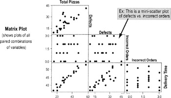
- Delivery Time appears to increase when there's an increasing number of Total Pizzas and Defects
- Incorrect Order appears to have no effect
- Total Pizzas and Defects appear to be related, as well
These observations are confirmed by the correlation matrix (below). In the following example, the table shows the relationship between different pairs of factors (correlations tested among Total Pizzas, Defects, Incorrect Order, Delivery Time on a pairwise basis).
|
Total Pizzas |
Defects |
Incorrect Order |
|
|---|---|---|---|
|
Defects |
0.769 |
||
|
0.000 |
|||
|
Incorrect |
0.082 |
0.051 |
|
|
Order |
0.695 |
0.807 |
|
|
Delivery |
0.964 |
0.829 |
−0.057 |
|
0.000 |
0.000 |
0.787 |
In each pair of numbers:
- The top number is the Pearson Coefficient of Correlation, r
- Look for r > 0.65 or r < −0.65 to indicate correlation
- The bottom number is the p-value
- Look for p-values ≤0.05 to indicate correlation at the 95% confidence level
| Caution |
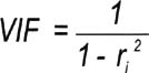
Use a metric called Variance Inflation Factor (VIF) to check for multicollinearity:
Rule of Thumb:
If two predictor variables show multicollinearity, you need to remove one of them from the model. |
| Tips |
|
ANOVA (ANalysis Of VAriance)
Purpose
To compare three or more samples to each other to see if any of the sample means is statistically different from the others.
- An ANOVA is used to analyze the relationships between several categorical inputs (KPIVs) and one continuous output (KPOV)
When to use ANOVA
- Use in Analyze to confirm the impact of variables
- Use in Improve to help select the best option from several alternatives
Overview of ANOVA
In the statistical world, inputs are sometimes referred to as factors. The samples may be drawn from several different sources or under several different circumstances. These are referred to as levels.
- Ex: We might want to compare on-time delivery performance at three different facilities (A, B, and C). "Facility" is considered to be a factor in the ANOVA, and A, B, and C are the "levels."
To tell whether the three or more options are statistically different, ANOVA looks at three sources of variability…
- Total—Total variability among all observations
- Between—Variation between subgroup means (factor)
- Within—Random (chance) variation within each subgroup (noise, or statistical error)
In One-Way ANOVA (below), we look at how different levels of a single factor affect a response variable.
In Two-Way ANOVA (p. 180), we examine how different levels of two factors and the interaction between those two factors affect a response variable.
One way ANOVA
A one-way ANOVA (involving just one factor) tests whether the mean (average) result of any alternative is different from the others. It does not tell us which one(s) is different. You'll need to supplement ANOVA with multiple comparison procedures to determine which means differ. A common approach for accomplishing this is to use Tukey's Pairwise comparison tests. (See p. 178)
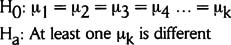
Form of the hypotheses:
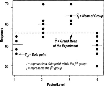
The comparisons are done through "sum of squares" calculations (shown here and depicted in the graph on the next page):
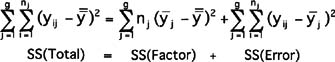
- SS (Total) = Total Sum of Squares of the Experiment (individual values − grand mean)
- SS (Factor) = Sum of Squares of the Factor (Group mean − Grand mean)
- SS (Error) = Sum of Squares within the Group (Individual values − Group mean)
One way ANOVA Steps
- Select a sample size and factor levels.
- Randomly conduct your trials and collect the data.
- Conduct the ANOVA analysis (typically done through statistical software; see below for interpretation of results).
- Follow up with pairwise comparisons, if needed. If the ANOVA shows that at least one of the means is different, pairwise comparisons are done to show which ones are different.
- Examine the residuals, variance and normality assumptions.
- Generate main effects plots, interval plots, etc.
- Draw conclusions.
One way ANOVA reports
By comparing the Sums of Squares, we can tell if the observed difference is due to a true difference or random chance.
- If the factor we are interested in has little or no effect on the average response then these two estimates ("Between" and "Within") should be almost equal and we will conclude all subgroups could have come from one larger population
- If the "Between" variation becomes larger than the "Within" variation, that can indicate a significant difference in the means of the subgroups
Interpreting the F-ratio
- The F-ratio compares the denominator to the numerator
- The denominator is calculated to establish the amount of variation we would normally expect. It becomes a sort of standard of variability that other values are checked against.
- The numerator is the "others" that are being checked.
- When the F-ratio value is small (close to 1), the value of the numerator is close to the value of the denominator, and you cannot reject the null hypothesis that the two are the same
- A larger F-ratio indicates that the value of the numerator is substantially different than that of the denominator (MS Error), and we reject the null hypothesis
Checking for outliers
- Outliers in the data set can affect both the variability of a subgroup and its mean—and that affects the results of the F-ratio (perhaps causing faulty conclusions)
- The smaller the sample size, the greater the impact an outlier will have
- When performing ANOVA, examine the raw data to see if any values are far away from the main cluster of values
| Tip |
|
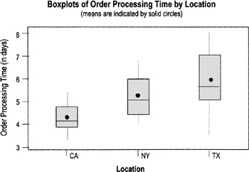
Invoice processing cycle time by Facility (One-way ANOVA)
|
One-way ANOVA: Order Processing Cycle Time versus Location |
|||||
|---|---|---|---|---|---|
|
Analysis of Variance for Order Pr |
|||||
|
Source |
DF |
SS |
MS |
F |
P |
|
Location |
2 |
13.404 |
6.702 |
6.89 |
0.004 |
|
Error |
27 |
26.261 |
0.973 |
||
|
Total |
29 |
39.665 |
|||
|
Individual 95% CIs For Mean Based on Pooled StDev |
|||||||
|---|---|---|---|---|---|---|---|
|
Level |
N |
Mean |
StDev |
—+ |
—+ |
—+ |
—+ |
|
CA |
10 |
4.2914 |
0.6703 |
(—*—) |
|||
|
NY |
10 |
5.2304 |
0.8715 |
(—*—) |
|||
|
TX |
10 |
5.9225 |
1.3074 |
(—*—) |
|||
|
—+ |
—+ |
—+ |
—+ |
||||
|
Pooled StDev = 0.9862 |
4.00 |
4.80 |
5.60 |
6.40 |
|||
Conclusion: Because the p-value is 0.004, we can conclude that at least one of the facilities is statistically significantly different from the others, a message visually confirmed by the boxplot.
To tell which of the facilities is different, perform a Tukey Pairwise Comparisons, which provides confidence intervals for the difference between the tabulated pairs. Alpha is determined by the individual error rate—and will be less for the individual test than the alpha for the family. (See chart on next page.)
Tukey's pairwise comparisons
Family error rate = 0.0500
Individual error rate = 0.0196
Critical value = 3.51
Intervals for (column level mean) − (row level mean)
|
CA |
NY |
|
|
NY |
−2.0337 |
|
|
0.1556 |
||
|
TX |
−2.7258 |
−1.7867 |
|
−0.5364 |
0.4026 |
- The two numbers describe the end points of the confidence interval for the difference between each pair of factors. (Top number in each set is the lower limit; bottom number is the upper limit). If the range encompasses," we have to accept ("not reject") the hypothesis that the two means are the same.
- In this example, we can conclude that NY is not statistically different from CA or from NY because the CI ranges for those pairs both encompass 0. But it appears that CA is statistically different from TX—both numbers in the CI range are negative.
Degrees of Freedom
The number of independent data that go into an estimate of a parameter is called degrees of freedom (df), which is equal to the number of independent data that go into the estimate minus the number of parameters estimated. All intermediate steps in the estimation of the parameter must be included.
- We earn a degree of freedom for every data point we collect.
- We spend a degree of freedom for each parameter we estimate
In ANOVA, the degrees of freedom are determined as follows:
- dftotal = N − 1 = # of observations − 1
- dffactor = L − 1 = # of levels − 1
- dfinteraction = dffactorA * dffactorB
- dferror = dftotal − dfeverything else
ANOVA assumptions
- Model errors are assumed to be normally distributed with a mean of zero, and are to be randomly distributed
- The samples are assumed to come from normally distributed populations. Test this with residuals plots (see p. 195).
- Variance is assumed approximately constant for all factor levels
- Minitab and other statistical software packages will perform both the Bartlet's (if data is normal) or Levine tests (if cannot assume normality) under options labeled Test for Equal Variances
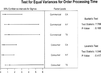
In this example, the p-values are very high, so we cannot reject the hypothesis that variance is the same for all the factors
- Minitab and other statistical software packages will perform both the Bartlet's (if data is normal) or Levine tests (if cannot assume normality) under options labeled Test for Equal Variances
| Practical Note |
Balanced designs (consistent sample size for all the different factor levels) are, in the language of statisticians, said to be "very robust to the constant variance assumption." That means the results will be valid even if variance is not perfectly constant. Still, make a habit of checking for constant variances. It is an opportunity to learn if factor levels have different amounts of variability, which is useful information. |
Two way ANOVA
Same principles as one-way ANOVA, and similar Minitab output (see below):
- The factors can take on many levels; you are not limited to two levels for each
- Total variability is represented as:

- SST is the total sum of squares,
- SSA is the sum of squares for factor A,
- SSB is the sum of squares for factor B,
- SSAB is the sum of squares due to the interaction between factor A and factor B
- SSe is the sum of squares from error
Two Way ANOVA Reports
- Session window output
Analysis of Variance for Order Processing time
Source
DF
SS
MS
F
P
OrderTy
1
3.968
3.968
4.34
0.048
Location
2
13.404
6.702
7.34
0.003
Interaction
2
0.364
0.182
0.20
0.821
Error
24
21.929
0.914
Total
29
39.665
As with other hypothesis tests, look at the p-values to make a judgment based on your chosen alpha level (typically .05 or .10) as to whether the levels of the factors make a significant difference.
- Main effects plots
- These plots show the average or mean values for the individual factors being compared (you'll have one plot for every factor)
- Differences between the factor levels will show up in "non-flat" lines: slopes going up or down or zig-zagging up and down
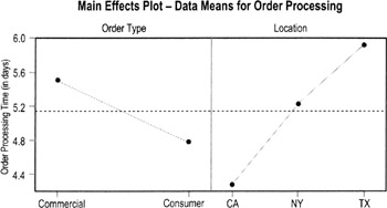
- For example, the left side of the chart above shows that consumer orders process faster than commercial orders. The right side shows a difference in times between the three locations (California, New York, and Texas).
- Look at p-values (in the Minitab session output, previous page) to determine if these differences are significant.
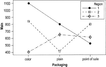
- Interaction plots
- Show the mean for different combinations of factors
- The example below, taken from a standard Minitab data set, shows a different pattern for each region (meaning the factors "act differently" at different locations:
- In Region 1, color and plain packaging driver higher sales than point-of-sale displays
- In Region 2, color and point-of-sale promotions have higher sales than color
- Region 3 has lower overall sales; unlike in Region 1 and Region 2, color alone does not improves sales
Chi square test
Highlights
- A hypothesis testing method when both the contributing factor (X) and result (Y) are categorical/attribute data
- Ex: Does customer location affect products/services ordered?
- Ex: Does supplier affect whether end product passes performance tests
- The Greek letter χ or chi (pronounced "kye"—rhymes with "eye") is used to represent the statistic (the final figure is "squared" before interpretation, hence the "chi-square" label)
- Chi-square is the sum of the "squared differences" between the expected and observed number of observations in each category
Form of the hypothesis
With the chi-square test for independence, statisticians assume most variables in life are independent, therefore:
- H0: data is independent (not related)
- Ha: data is dependent (related)
If the p-value is < .05, then reject Ho
How to calculate chi square
- Identify different levels of both the X and Y variables
- Ex: Supplier A vs. Supplier B, Pass or Fail
- Collect the data
- Summarize results in an observations table
- Include totals for each column and row
- The table here shows data on whether age (X) affected if a candidate was hired (Y)
Hired
Not Hired
Total
Old
30
150
180
Young
45
230
275
Totals
75
380
455
- Develop an expected frequency table
- For each cell in the table, multiply the column total by the Row total, then divide by the total number of observations
Ex: in the table above, the "Old, Hired" cell has an expected frequency of: (75 * 180)/455 = 29.6%
- For each cell, subtract the Actual number of observations from the expected frequency
Ex: in the table above, the "Old, Hired" cell would be: 30 − 29.6 = 0.4
- For each cell in the table, multiply the column total by the Row total, then divide by the total number of observations
- Compute the relative squared differences
- Square each figure in the table (negative numbers will become positive)
Ex: 0.4 * 0.4 = 0.16
- Divide by the expected number of observances for that cell
Ex: 0.16/29.6 = .005
- Square each figure in the table (negative numbers will become positive)
- Add together all the relative squared differences to get chi-square
Ex: in the table on the previous page:
Chi-square = x2 = 0.004 + 0.001 + 0.002 + 0.000 = 0.007
- Determine and interpret the p-value
For this example: df = 1, p-value = 0.932
| Note |
Minitab or other statistical software will generate the table and compute the chi-square and p-values once you enter the data. All you need to do is interpret the p-value. |
| Tip |
|
Design of Experiments (DOE) notation and terms
Response Variable—An output which is measured or observed.
Factor—A controlled or uncontrolled input variable.
Fractional Factorial DOE—Looks at only a fraction of all the possible combinations contained in a full factorial. If many factors are being investigated, information can be obtained with smaller investment. See p. 190 for notation.
Full Factorial DOE—Full factorials examine every possible combination of factors at the levels tested. The full factorial design is an experimental strategy that allows us to answer most questions completely. The general notation for a full factorial design run at 2 levels is: 2k = # Runs.
Level—A specific value or setting of a factor.
Effect—The change in the response variable that occurs as experimental conditions change.
Interaction—Occurs when the effect of one factor on the response depends on the setting of another factor.
Repetition—Running several samples during one experimental setup run.
Replication—Replicating (duplicating) the entire experiment in a time sequence with different setups between each run.
Randomization—A technique used to spread the effect of nuisance variables across the entire experimental region. Use random numbers to determine the order of the experimental runs or the assignment of experimental units to the different factor-level combinations.
Resolution—how much sensitivity the results have to different levels of interactions.
Run—A single setup in a DOE from which data is gathered. A 3-factor full factorial DOE run at 2 levels has 23 = 8 runs.
Trial—See Run
Treatment Combination—See Run
Design terminology
In most software programs, each factor in the experiment will automatically be assigned a letter: A, B, C, etc.
- Any results labeled with one letter refer to that variable only
Interaction effects are labeled with the letters of the corresponding factors:
- "Two-way" interactions (second-order effects)
- AB, AC, AC, BC, etc…
- "Three-way" interactions (third-order effects)
- ABC, ACD, BCD, BCG, etc.
| Tip |
It's common to find main effects and second-order effects (the interaction of one factor with another) and not unusual to find third-order effects in certain types of experiments (such as chemical processes). However, it's rare that interactions at a higher order are significant (this is referred to as "Sparsity of Effects"). Minitab and other programs can calculate the higher-order effects, but generally such effects are of little importance and are ignored in the analysis. |
Planning a designed experiment
Design of Experiments is one of the most powerful tools for understanding and reducing variation in any process. DOE is useful whenever you want to:
- Find optimal process settings that produce the best results at lowest cost
- Identify and quantify the factors that have the biggest impact on the output
- Identify factors that do not have a big impact on quality or time (and therefore can be set at the most convenient and/or least costly levels)
- Quickly screen a large number of factors to determine the most important ones
- Reduce the time and number of experiments needed to test multiple factors
Developing an experimental plan
- Define the problem in business terms, such as cost, response time, customer satisfaction, service level.
- Identify a measurable objective that you can quantify as a response variable. (see p. 187)
- Ex: Improve the yield of a process by 20%
- Ex: Achieve a quarterly target in quality or service level
- Identify input variables and their levels (see p. 187).
- Determine the experimental strategy to be used:
- Determine if you will do a few medium to large experiments or several smaller experiments that will allow quick cycles of learning
- Determine whether you will do a full factorial or fractional factorial design (see p. 189)
- Use a software program such as Minitab or other references to help you identify the combinations of factors to be tested and the order in which they will be tested (the "run order")
- Plan the execution of all phases (including a confirmation experiment):
- What is the plan for randomization? replication? repetition?
- What if any restrictions are there on randomization (factors that are difficult/impossible to randomize)?
- Have we talked to internal customers about this?
- How long will it take? What resources will it take?
- How are we going to analyze the data?
- Have we planned a pilot run?
- Make sure sufficient resources are allocated for data collection and analysis
- Perform an experiment and analyze the results. What was learned? What is the next course of action? Carry out more experimentation or apply knowledge gained and stabilize the process at the new level of performance.
Defining response variables
- Is the output qualitative or quantitative? (Quantitative is much preferred)
- Try for outputs tied to customer requirements and preferences, and aligned with or linked to your business strategy (not just factors that are easy to measure)
- What effect would you like to see in the response variable (retargeting, centering, variation reduction, or all three?)
- What is the baseline? (Mean and standard deviation?)
- Is the output under statistical control?
- Does the output vary over time?
- How much change in the output do you want to detect?
- How will you measure the output?
- Is the measurement system adequate?
- What is the anticipated range of the output?
- What are the priorities for these?
Identifying input variables
Review your process map or SIPOC diagram and/or use cause identification methods (see pp. 145 to 155) to identify factors that likely have an impact on the response variable. Classify each as one of the following:
- Controllable factor (X)—Factors that can be manipulated to see their effect on the outputs.
- Ex: Quantitative (continuous): temperature, pressure, time, speed
- Ex: Qualitative (categorical): supplier, color, type, method, line, machine, catalyst, material grade/type
- Constant (C) or Standard Operating Procedure (SOP)—Procedures that describe how the process is run and identify certain factors which will be held constant, monitored, and maintained during the experiment.
- Noise factor (N)—Factors that are uncontrollable, difficult or too costly to control, or preferably not controlled. Decide how to address these in your plans (see details below).
- Ex: weather, shift, supplier, user, machine age, etc.
Selecting factors
Consider factors in the context of whether or not they are:
- Practical
- Does it make sense to change the factor level? Will it require excessive effort or cost? Would it be something you would be willing to implement and live with?
- Ex: Don't test a slower line speed than would be acceptable for actual production operations
- Ex: Be cautious in testing changes in a service factor that you know customers are happy with
- Does it make sense to change the factor level? Will it require excessive effort or cost? Would it be something you would be willing to implement and live with?
- Feasible
- Is it physically possible to change the factor?
- Ex: Don't test temperature levels in the lab that you know can't be achieved in the factory
- Is it physically possible to change the factor?
- Measurable
- Can you measure (and repeat) factor level settings?
- Ex: Operator skill level in a manufacturing process
- Ex: Friendliness of a customer service rep
- Can you measure (and repeat) factor level settings?
| Tips for treating noise factors |
A noise (or nuisance) factor is a factor beyond our control that affects the response variable of interest.
|
| Tips for selecting factors |
|
DOE Full factorial vs Fractional factorials (and notations)
Full factorial experiments
- Examine every possible combination of factors and levels
- Enable us to:
- Determine main effects that the manipulated factors will have on response variables
- Determine effects that factor interactions will have on response variables
- Estimate levels to set factors at for best results
- Advantages
- Provides a mathematical model to predict results
- Provides information about all main effects
- Provides information about all interactions
- Quantifies the Y=f(x) relationship
- Limitations
- Requires more time and resources than fractional factorials
- Sometimes labeled as optimizing designs because they allow you to determine which factor and setting combination will give the best result within the ranges tested. They are conservative, since information about all main effects and variables can be determined.
- Most common are 2-level designs because they provide a lot of information, but require fewer trials than would studying 3 or more levels.
- The general notation for a 2-level full factorial design is:

- 2 is the number of levels for each factor
- k is the number of factors to be investigated
- This is the minimum number of tests required for a full factorial
Fractional factorial experiments
- Look at only selected subsets of the possible combinations contained in a full factorial
- Advantages:
- Allows you to screen many factors—separate significant from not-significant factors—with smaller investment in research time and costs
- Resources necessary to complete a fractional factorial are manageable (economy of time, money, and personnel)
- Limitations/drawbacks
- Not all interactions will be discovered/known
- These tests are more complicated statistically and require expert input
- General notation to designate a 2-level fractional factorial design is:
- 2 is the number of levels for each factor
- k is the number of factors to be investigated
- 2-p is the size of the fraction (p = 1 is a 1/2 fraction, p = 2 is a 1/4 fraction, etc.)
- 2k-p is the number of runs
- R is the resolution, an indicator of what levels of effects and interactions are confounded, meaning you can't separate them in your analysis
Loss of resolution with fractional factorials
- When using a fractional factorial design, you cannot estimate all of the interactions
- The amount that we are able to estimate is indicated by the resolution of an experiment
- The higher the resolution, the more interactions you can determine

This experiment will test 4 factors at each of 2 levels, in a half-fraction factorial (24 would be 16 runs, this experiment is the equivalent of 23 = 8 runs).
The resolution of IV means:
- Main effects are confounded with 3-way interactions (1 + 3 = 4). You have to acknowledge that any measured main effects could be influenced by 3-way interactions. Since 3-way interactions are relatively rare, attributing the measured differences to the main effects only is most often a safe assumption.
- 2-way interactions are confounded with each other (2 + 2 = 4). This design would not be a good way to estimate 2-way interactions.
Interpreting DOE results
Most statistical software packages will give you results for main effects, interactions, and standard deviations.
- Main effects plots for mean
- Interpretation of slopes is all relative. Lines with steeper slopes (up or down) have a bigger impact on the output means than lines with little or no slope (flat or almost flat lines).
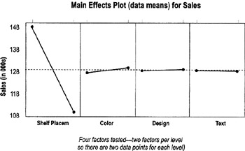
- In this example, the line for shelf placement slopes much more steeply than the others—meaning it has a bigger effect on sales than the other factors. The other lines seem flat or almost flat, so the main effects are less likely to be significant.
- Interpretation of slopes is all relative. Lines with steeper slopes (up or down) have a bigger impact on the output means than lines with little or no slope (flat or almost flat lines).
- Main effects plots for standard deviation
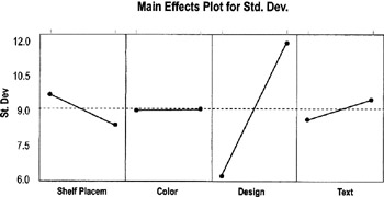
- These plots tell you whether variation changes or is the same between factor levels.
- Again, you want to compare slopes in comparison to each other. Here, Design has much more variation one level than at the factors (so you can expect it to have much more variation at one level than at the other level).
- Pareto chart of the means for main factor effects and higher-order interactions
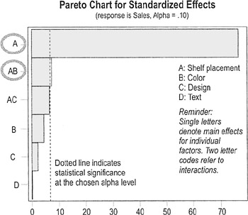
- You're looking for individual factors (labeled with a single letter) and interactions (labeled with multiple letters) that have bars that extend beyond the "significance line"
- Here, main factor A and interaction AB have significant effects, meaning placement, and interaction of placement and color have the biggest impact on sales (compare to the "main effects plot for mean," previous page).
- Pareto chart on the standard deviation of factors and interactions
- Same principle as the Pareto chart on means
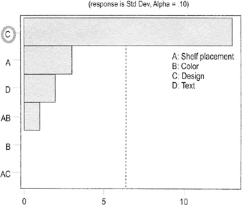
- Here, only Factor C (Design) shows a significant change in variation between levels
- Same principle as the Pareto chart on means
- Minitab session window reports
- Shelf Placement and the Shelf Placement* Color interactions are the only significant factors at a 90% confidence internal (if alpha were 0.05 instead of 0.10, only placement would be significant)
Fractional Factorial Fit: Sales versus Shelf Placem, Color, Design, Text
Term
Effect
Coef
SE Coef
T
P
Constant
128.50
0.2500
514.00
0.001
Shelf PI
−38.50
−19.25
0.2500
−77.00
0.008
Color
2.00
1.00
0.2500
4.00
0.156
Design
0.50
0.25
0.2500
1.00
0.500
Text
−0.00
−0.00
0.2500
−0.00
1.000
Shelf PI*Color
3.50
1.75
0.2500
7.00
0.090
Shelf PI*Design
−3.00
−1.50
0.2500
−6.00
0.105
Analysis of Variance for Sales (coded units)
Source
DF
Seq SS
Adj SS
Adj MS
F
P
Main Effects
4
2973.00
2973.00
743.250
1E+03
0.019
2-Way Interactions
2
42.50
42.50
21.250
42.50
0.108
Residual Error
1
0.50
0.50
0.500
Total
7
3016.00
- Design is the only factor that has a significant effect on variation at the 90% confidence level
Fractional Factorial Fit: Std Dev versus Shelf Placement, Color,…
Term
Effect
Coef
SE Coef
T
P
Constant
9.0000
0.2500
36.00
0.018
Shelf PI
−1.5000
−0.7500
0.2500
−3.00
0.205
Color
−0.0000
−0.0000
0.2500
−0.00
1.000
Design
6.5000
3.2500
0.2500
13.00
0.049
Text
1.0000
0.5000
0.2500
2.00
0.295
Shelf PI*Color
0.5000
0.2500
0.2500
1.00
0.500
Shelf PI*Design
0.0000
0.0000
0.2500
0.00
1.000
Analysis of Variance for Std (coded units)
Source
DF
Seq SS
Adj SS
Adj MS
F
P
Main Effects
4
91.0000
91.0000
22.7500
45.50
0.111
2-Way Interactions
2
0.5000
0.5000
0.2500
0.50
0.707
Residual Error
1
0.5000
0.5000
0.5000
Total
7
92.0000
- Shelf Placement and the Shelf Placement* Color interactions are the only significant factors at a 90% confidence internal (if alpha were 0.05 instead of 0.10, only placement would be significant)
Residual analysis in hypothesis testing
Highlights
- Residual analysis is a standard part of assessing model adequacy any time a mathematical model is generated because residuals are the best estimate of error
- Perform this analysis any time you use ANOVA, regression analysis, or DOE
- See further guidance on the next page
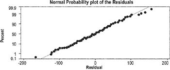
If data points hug the diagonal line, the data are normally distributed
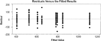
Want to see a similar spread of points across all values (which indicates equal variance)
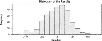
Histograms provide a visual check of normality
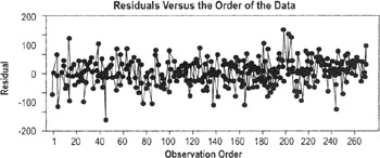
The number of data points here makes this chart difficult to analyze, but the principles are the same as those for time series plots
Interpreting the results
The plots are usually generated in Minitab or other statistical package. The interpretation is based on the following assumptions:
- Errors will all have the same variance (constant variance)
- Residuals should be independent, normally distributed, with a mean equal to 0
- Residual plots should show no pattern relative to any factor
- Residuals should sum to 0
Examine the plots as you would any plot of the varying styles (regression plot, histogram, scatter plot, etc.).
| Practical Note |
Moderate departures from normality of the residuals are of little concern. We always want to check the residuals, though, because they are an opportunity to learn more about the data. |
The Lean Six Sigma Pocket Toolbook A Quick Reference Guide to Nearly 100 Tools for Improving Process Quality, Speed, and Complexity
- Using DMAIC to Improve Speed, Quality, and Cost
- Working with Ideas
- Value Stream Mapping and Process Flow Tools
- Voice of the Customer (VOC)
- Data Collection
- Descriptive Statistics and Data Displays
- Variation Analysis
- Identifying and Verifying Causes
- Reducing Lead Time and Non-Value-Add Cost
- Complexity Value Stream Mapping and Complexity Analysis
- Selecting and Testing Solutions
EAN: N/A
Pages: 185
