Assessing Goodness of Fit
Problem
You need to assess how well an equation fits the underlying data.
Solution
If you're simply fitting a curve through some data so you can conveniently interpolate the data, then choose whichever model best replicates your data. In this case you're not so concerned with smoothing the data or with statistical rigor. You can plot your data along with estimates using the fit curve and eyeball them to see how well they compare. You can also plot the residualsdifferences between your actual y-value and the estimated y-valueand examine them to assess how well your data is represented or to determine if the residuals exhibit some unexpected structure. You can compute percentage differences to gauge how well your data is replicated. Further, you should examine how the trendline behaves between data points used to generate the trendline to make sure there are no unrealistic oscillations between data points. This can happen when you try to fit a higher-order polynomial trendline.
If you're interested in modeling the data from a statistical standpoint, or are trying to gain insight into a physical process, then you can perform some standard statistical calculations to help assess your trendline. Moreover, you should consider what your data represents. If your data represents some physical process, then let physics be your guide and choose a model that best represents the physical relationship between the variables underlying the data, if it is indeed known. In the discussion to follow, I show you how to perform several standard calculations for assessing goodness of fit in Excel.
Discussion
As already mentioned, one way to see how well your equation fits the underlying data is to plot the fit equation over the data and observe how well it appears to capture the relationship between the variables considered. The correlation coefficient is a quantitative way to assess how well your equation models the relationship between the underlying variables.
Any standard text on statistical analysis that covers regression and correlation theory can provide details on the derivation of the correlation coefficient. In a nutshell, the correlation coefficient is a ratio of variations between the variables estimated using the fit equation and the actual variables. The basic formula for correlation coefficient is:
The term in the denominator under the radical is called the total variation of Y. It's a measure of the deviations of Y from the mean value of Y in the dataset. Total variation is composed of two components: the explained variation and the unexplained variation. Explained variation is a measure of the deviations of the estimated Y values (those predicted from the fit curve) from the mean value of Y in the dataset. Unexplained variation is a measure of the deviations of the estimated Y value from the actual or measured Y value. These variations are assumed random and it's these variations you aim to minimize when fitting a curve to a set of data.
|

As you can see from the formula shown a moment ago, the correlation coefficient is the ratio of the explained variation to the total variation. The greater the explained variation, the smaller the unexplained variation, and therefore the closer the correlation coefficient approaches a value of ±1. The R-squared value is just the square of the correlation coefficient. Therefore, the closer R-squared is to a value of 1, the smaller the unexplained variation and the better the fit. Excel's curve fit and trendline functions compute the R-squared value, which is also called the coefficient of determination . I've mentioned this R-squared value several times in other recipes already. The closer the R-squared value is to 1, the better the equation fits the underlying data.
|
For illustration purposes, I prepared a dataset that exhibits a linear relationship and had Excel compute various trendlines, including one linear and three nonlinear trendlines. The results are shown in Figure 8-13.
The equations, along with the corresponding R-squared values, are also shown on the chart. The linear trendline best fits the data, as expected, with an R-squared value of 0.997. The next best fit is from the power fit, with an R-squared value of 0.9749, which is still not a bad fit. The other two trendlinesthe log and exponential
Figure 8-13. Various trendlines
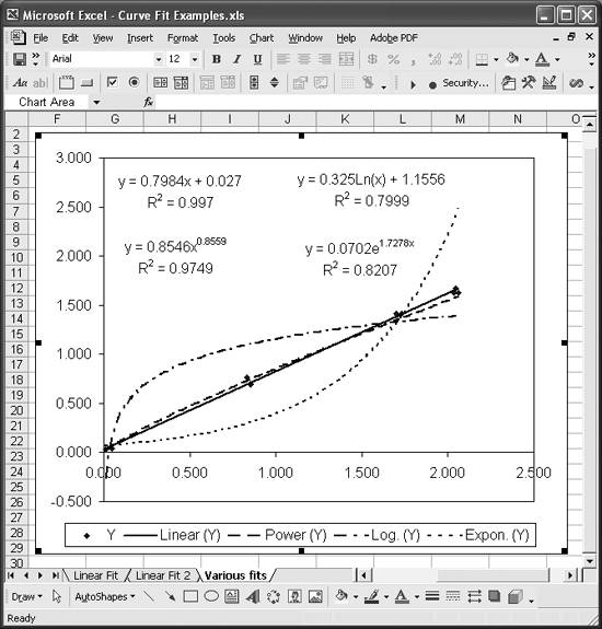
trendlinesexhibit poor fits, with R-squared values of 0.7999 and 0.8207, respectively. You can also visually see that the log and exponential fits poorly represent the data under consideration.
Examining these results brings up a point of concern. Say you initially fit a power curve to the data shown here. You might reasonably assume the power curve is the best-fit curve, given the resulting R-squared value of 0.9749. However, we happen to know a little something about the physical phenomenon this data represents and know that this is a linear problem. A linear fit indeed shows a better fit, with an R-squared value of 0.997. These results reinforce the importance of the need to use your judgment and understanding of the problem being analyzed when choosing an appropriate model.
As a further check on how well a model equation fits the data, you can plot the residuals. (See Recipe 8.6 for an example showing how to compute residuals.) These represent the unexplained variation between the estimated y-values and the given y-values. Unexplained variations are supposed to be random, and the residuals, when plotted, should confirm this behavior. If you plot the residuals and see some structure to the residual plot that does not appear random, you should take a closer look at your assumed model.
As an illustrative example, consider the data shown in Figure 8-12 along with the linear and exponential trendlines. The residuals between the linear fit and the exponential fit are plotted in Figure 8-14.
Figure 8-14. Residual plot
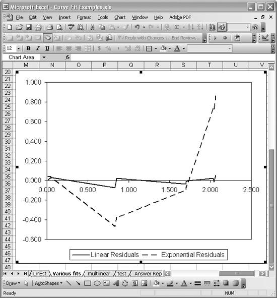
The residual curve from the linear fit does seem to exhibit a random pattern. On the other hand, the residual curve from the exponential fit exhibits a very distinct pattern, resembling an exponential curve that's sort of been shifted down a bit. Such a structure in the residual plot indicates a fundamental misrepresentation of the underlying data. This is an exaggerated example, as we already knew the exponential curve was a poor fit. However, the point is that examining the residual plot can give you some insight into the goodness of the fit.
Another check on how well a model represents a set of data is known as the F-test . This test comes from a technique known as analysis of variance (ANOVA) developed by R. A. Fisher. The formal details of this test can be found in standard statistical texts that cover ANOVA.
Excel makes it easy to perform this F-test because its regression functions, such as LINEST, return the statistics required for this test, and Excel also contains other required probability-related functions. The F-test basically involves computing a statistic known as the F-statistic and comparing that value to a critical value obtained from the standard F-distribution using Excel's built-in functions. If the computed F-statistic is greater than the critical statistic, then you can conclude the fit is a good one or, more formally, statistically significant.
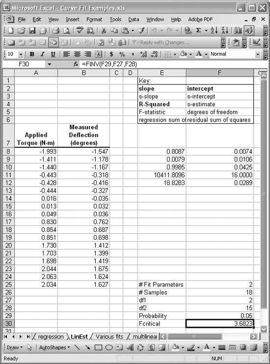
Figure 8-15 shows an example linear curve fit using Excel's LINEST function (see Recipe 8.3). The results of using LINEST on the given dataset are contained in the cell range E8:F12. I've included a key explaining what each returned value represents. The value in cell E11 is the F-statistic computed by LINEST.
Cells F25 to F30 contain calculations I added to compute the critical F-value for comparison. Cell F25 contains the number of parameters in the regression equation; 2 in this case, since it's linear. Cell F26 contains the number of samples. I used =COUNT(A8:A25) to determine the number of samples (of course, for this small dataset they can be easily counted manually). Cell F27 contains the numerator degrees of freedom required for computing F-critical; this value is equal to the number of parameters in the regression equation. Cell F28 contains the denominator degrees of freedom, which is equal to n - (k + 1), where n is the number of samples and k is the number of regression parameters. Cell F29 contains the probability of significance for which we're interested in computing F-critical. F-critical is computed using the formula =FINV(F29,F27,F28). In this case, we get an F-critical value of 3.6823, which is far lower than the F-statistic computed for the curve fit. This indicates that curve fit is significant and useful in representing the underlying data.
|
See Also
Assessing goodness of fit is certainly not limited to the techniques I've discussed here. I'm sure a professional statistician could easily explain a half-dozen more statistical tests that could be used to validate a particular curve fit.
Figure 8-15. F-test example
Using Excel
- Introduction
- Navigating the Interface
- Entering Data
- Setting Cell Data Types
- Selecting More Than a Single Cell
- Entering Formulas
- Exploring the R1C1 Cell Reference Style
- Referring to More Than a Single Cell
- Understanding Operator Precedence
- Using Exponents in Formulas
- Exploring Functions
- Formatting Your Spreadsheets
- Defining Custom Format Styles
- Leveraging Copy, Cut, Paste, and Paste Special
- Using Cell Names (Like Programming Variables)
- Validating Data
- Taking Advantage of Macros
- Adding Comments and Equation Notes
- Getting Help
Getting Acquainted with Visual Basic for Applications
- Introduction
- Navigating the VBA Editor
- Writing Functions and Subroutines
- Working with Data Types
- Defining Variables
- Defining Constants
- Using Arrays
- Commenting Code
- Spanning Long Statements over Multiple Lines
- Using Conditional Statements
- Using Loops
- Debugging VBA Code
- Exploring VBAs Built-in Functions
- Exploring Excel Objects
- Creating Your Own Objects in VBA
- VBA Help
Collecting and Cleaning Up Data
- Introduction
- Importing Data from Text Files
- Importing Data from Delimited Text Files
- Importing Data Using Drag-and-Drop
- Importing Data from Access Databases
- Importing Data from Web Pages
- Parsing Data
- Removing Weird Characters from Imported Text
- Converting Units
- Sorting Data
- Filtering Data
- Looking Up Values in Tables
- Retrieving Data from XML Files
Charting
- Introduction
- Creating Simple Charts
- Exploring Chart Styles
- Formatting Charts
- Customizing Chart Axes
- Setting Log or Semilog Scales
- Using Multiple Axes
- Changing the Type of an Existing Chart
- Combining Chart Types
- Building 3D Surface Plots
- Preparing Contour Plots
- Annotating Charts
- Saving Custom Chart Types
- Copying Charts to Word
- Recipe 4-14. Displaying Error Bars
Statistical Analysis
- Introduction
- Computing Summary Statistics
- Plotting Frequency Distributions
- Calculating Confidence Intervals
- Correlating Data
- Ranking and Percentiles
- Performing Statistical Tests
- Conducting ANOVA
- Generating Random Numbers
- Sampling Data
Time Series Analysis
- Introduction
- Plotting Time Series Data
- Adding Trendlines
- Computing Moving Averages
- Smoothing Data Using Weighted Averages
- Centering Data
- Detrending a Time Series
- Estimating Seasonal Indices
- Deseasonalization of a Time Series
- Forecasting
- Applying Discrete Fourier Transforms
Mathematical Functions
- Introduction
- Using Summation Functions
- Delving into Division
- Mastering Multiplication
- Exploring Exponential and Logarithmic Functions
- Using Trigonometry Functions
- Seeing Signs
- Getting to the Root of Things
- Rounding and Truncating Numbers
- Converting Between Number Systems
- Manipulating Matrices
- Building Support for Vectors
- Using Spreadsheet Functions in VBA Code
- Dealing with Complex Numbers
Curve Fitting and Regression
- Introduction
- Performing Linear Curve Fitting Using Excel Charts
- Constructing Your Own Linear Fit Using Spreadsheet Functions
- Using a Single Spreadsheet Function for Linear Curve Fitting
- Performing Multiple Linear Regression
- Generating Nonlinear Curve Fits Using Excel Charts
- Fitting Nonlinear Curves Using Solver
- Assessing Goodness of Fit
- Computing Confidence Intervals
Solving Equations
- Introduction
- Finding Roots Graphically
- Solving Nonlinear Equations Iteratively
- Automating Tedious Problems with VBA
- Solving Linear Systems
- Tackling Nonlinear Systems of Equations
- Using Classical Methods for Solving Equations
Numerical Integration and Differentiation
- Introduction
- Integrating a Definite Integral
- Implementing the Trapezoidal Rule in VBA
- Computing the Center of an Area Using Numerical Integration
- Calculating the Second Moment of an Area
- Dealing with Double Integrals
- Numerical Differentiation
Solving Ordinary Differential Equations
- Introduction
- Solving First-Order Initial Value Problems
- Applying the Runge-Kutta Method to Second-Order Initial Value Problems
- Tackling Coupled Equations
- Shooting Boundary Value Problems
Solving Partial Differential Equations
- Introduction
- Leveraging Excel to Directly Solve Finite Difference Equations
- Recruiting Solver to Iteratively Solve Finite Difference Equations
- Solving Initial Value Problems
- Using Excel to Help Solve Problems Formulated Using the Finite Element Method
Performing Optimization Analyses in Excel
- Introduction
- Using Excel for Traditional Linear Programming
- Exploring Resource Allocation Optimization Problems
- Getting More Realistic Results with Integer Constraints
- Tackling Troublesome Problems
- Optimizing Engineering Design Problems
- Understanding Solver Reports
- Programming a Genetic Algorithm for Optimization
Introduction to Financial Calculations
- Introduction
- Computing Present Value
- Calculating Future Value
- Figuring Out Required Rate of Return
- Doubling Your Money
- Determining Monthly Payments
- Considering Cash Flow Alternatives
- Achieving a Certain Future Value
- Assessing Net Present Worth
- Estimating Rate of Return
- Solving Inverse Problems
- Figuring a Break-Even Point
Index
EAN: 2147483647
Pages: 206
