Using Multiple Axes
Problem
You've plotted several series on a chart, but one of them consists of values much larger than the others; when it is plotted on the same scale, you can barely discern the smaller values. Thus, you'd like to plot multiple data series on a single chart but with different scales.
Solution
You can use multiple scales. Excel has built-in support for secondary axes . This allows you to plot, for example, one data series using a primary y-axis and another data series using a secondary y-axis. To specify the axis for a data series, select the series and then select Format images/U2192.jpg border=0> Selected Data Series...from the main menu bar to open the Format Data Series dialog box . Click the Axis tab and then click either "Primary axis" or "Secondary axis" to specify the axis. Press OK when you're done, and Excel will automatically set up another axis and rescale your series.
Discussion
Figure 4-14 shows an example of two data series with very different scales plotted on the same chart.
Figure 4-14. Two data series with very different scales
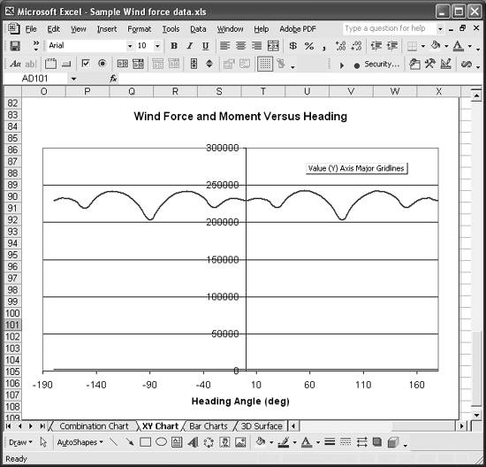
The scales of these two sets of data are so different that when they are plotted on the same chart, you can barely even see one of the data series; it's almost coincident with the x-axis.
Changing the axis of this series so that it's plotted on a secondary y-axis (as described earlier) results in the chart shown in Figure 4-15.
Figure 4-15. Chart using a secondary y-axis
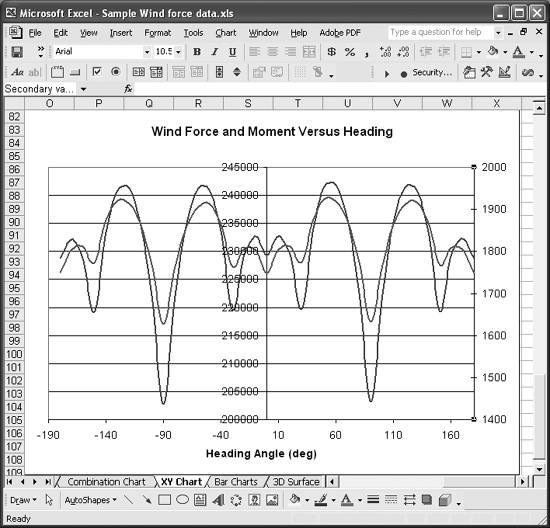
This version of the chart is far more readable than the original, and shows how useful secondary axes are. You can adjust the position of each series relative to the other by changing the minimum and maximum values of the primary or secondary axes.
You can, of course, plot more than one series relative to either the primary or secondary axes. Unfortunately, Excel does not support more than one secondary axis. While this isn't the end of the world, there are times when more than one secondary axis would be useful. In these cases, there are a couple of workarounds you can try.
The easiest thing to try is to scale your data. For example, multiply (or divide) a data series by 10, 100, 1,000, or some other appropriate value and then plot it against the primary or secondary axis. Be sure to label the series properly so readers of your chart can clearly see that the data is scaled.
Another trick you might find useful is to fake another axis by using a specifically crafted dummy series. Let's say we wanted to plot another series on the chart shown in Figure 4-15, but the values of this new series ranged from about 100 to 150. Clearly such a series would get buried by the scale of values for the other two series.
The solution is to multiply the values in this new series by an appropriate scale factor, say 10, and then plot it against the primary axis. This would make the values range from about 1,000 to 1,500, which would be clearly visible on the chart. Confusion may arise, however, if the scale is not annotated to indicate the new series has been scaled. To get around this, you can create a fake scale using a dummy series. Figure 4-16 shows just such a fake scale.
Figure 4-16. Fake scale
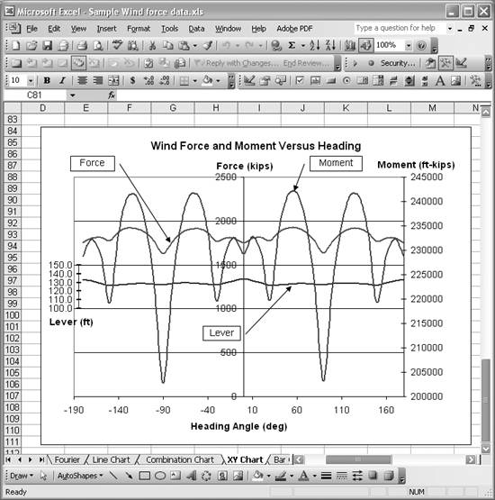
The series labeled Lever is the new, scaled series plotted against the primary y-axis (the center one). The fake axis is the short axis to the left, labeled Lever. This technique allows all of these series to be plotted on the same chart, even though the series values vary widely in magnitude.
To create the fake axis, you need to create and add a dummy series. The dummy series I created for this example is shown in Figure 4-17.
Figure 4-17. Fake series data
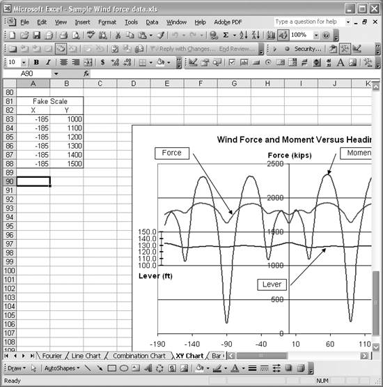
The key to using a series to represent an axis is to make one of the coordinates constant. In this case, since I want the series to represent a vertical axis, I set the x-value for the series to a constant. I used -185 to position the series all the way to the left of the chart. The y-values are simply selected to capture an appropriate range of values. Once the series data is prepared, you can add the series to the chart as discussed in Recipe 4.1. You'll also want to turn on Y-labels for the dummy series. You can turn on Y-labels by opening the Format Data Series dialog box and selecting the Data Labels tab. Upon doing so, you'll notice a little hiccup that you have to correct.
The default Y-Labels for the dummy series displays the actual y-values. The problem is that these values represent the scaled values for the series we wanted to use the fake axis for in the first place. This isn't what we want, so you must edit each data label manually to display the appropriate values. Click the series labels once to select all of the labels. Then click once again on the specific label you want to modify. This will put the label in edit mode, where you can change the label to whatever you desire. Make the changes to all of the labels and you'll end up with something like the chart shown in Figure 4-16.
|

Using Excel
- Introduction
- Navigating the Interface
- Entering Data
- Setting Cell Data Types
- Selecting More Than a Single Cell
- Entering Formulas
- Exploring the R1C1 Cell Reference Style
- Referring to More Than a Single Cell
- Understanding Operator Precedence
- Using Exponents in Formulas
- Exploring Functions
- Formatting Your Spreadsheets
- Defining Custom Format Styles
- Leveraging Copy, Cut, Paste, and Paste Special
- Using Cell Names (Like Programming Variables)
- Validating Data
- Taking Advantage of Macros
- Adding Comments and Equation Notes
- Getting Help
Getting Acquainted with Visual Basic for Applications
- Introduction
- Navigating the VBA Editor
- Writing Functions and Subroutines
- Working with Data Types
- Defining Variables
- Defining Constants
- Using Arrays
- Commenting Code
- Spanning Long Statements over Multiple Lines
- Using Conditional Statements
- Using Loops
- Debugging VBA Code
- Exploring VBAs Built-in Functions
- Exploring Excel Objects
- Creating Your Own Objects in VBA
- VBA Help
Collecting and Cleaning Up Data
- Introduction
- Importing Data from Text Files
- Importing Data from Delimited Text Files
- Importing Data Using Drag-and-Drop
- Importing Data from Access Databases
- Importing Data from Web Pages
- Parsing Data
- Removing Weird Characters from Imported Text
- Converting Units
- Sorting Data
- Filtering Data
- Looking Up Values in Tables
- Retrieving Data from XML Files
Charting
- Introduction
- Creating Simple Charts
- Exploring Chart Styles
- Formatting Charts
- Customizing Chart Axes
- Setting Log or Semilog Scales
- Using Multiple Axes
- Changing the Type of an Existing Chart
- Combining Chart Types
- Building 3D Surface Plots
- Preparing Contour Plots
- Annotating Charts
- Saving Custom Chart Types
- Copying Charts to Word
- Recipe 4-14. Displaying Error Bars
Statistical Analysis
- Introduction
- Computing Summary Statistics
- Plotting Frequency Distributions
- Calculating Confidence Intervals
- Correlating Data
- Ranking and Percentiles
- Performing Statistical Tests
- Conducting ANOVA
- Generating Random Numbers
- Sampling Data
Time Series Analysis
- Introduction
- Plotting Time Series Data
- Adding Trendlines
- Computing Moving Averages
- Smoothing Data Using Weighted Averages
- Centering Data
- Detrending a Time Series
- Estimating Seasonal Indices
- Deseasonalization of a Time Series
- Forecasting
- Applying Discrete Fourier Transforms
Mathematical Functions
- Introduction
- Using Summation Functions
- Delving into Division
- Mastering Multiplication
- Exploring Exponential and Logarithmic Functions
- Using Trigonometry Functions
- Seeing Signs
- Getting to the Root of Things
- Rounding and Truncating Numbers
- Converting Between Number Systems
- Manipulating Matrices
- Building Support for Vectors
- Using Spreadsheet Functions in VBA Code
- Dealing with Complex Numbers
Curve Fitting and Regression
- Introduction
- Performing Linear Curve Fitting Using Excel Charts
- Constructing Your Own Linear Fit Using Spreadsheet Functions
- Using a Single Spreadsheet Function for Linear Curve Fitting
- Performing Multiple Linear Regression
- Generating Nonlinear Curve Fits Using Excel Charts
- Fitting Nonlinear Curves Using Solver
- Assessing Goodness of Fit
- Computing Confidence Intervals
Solving Equations
- Introduction
- Finding Roots Graphically
- Solving Nonlinear Equations Iteratively
- Automating Tedious Problems with VBA
- Solving Linear Systems
- Tackling Nonlinear Systems of Equations
- Using Classical Methods for Solving Equations
Numerical Integration and Differentiation
- Introduction
- Integrating a Definite Integral
- Implementing the Trapezoidal Rule in VBA
- Computing the Center of an Area Using Numerical Integration
- Calculating the Second Moment of an Area
- Dealing with Double Integrals
- Numerical Differentiation
Solving Ordinary Differential Equations
- Introduction
- Solving First-Order Initial Value Problems
- Applying the Runge-Kutta Method to Second-Order Initial Value Problems
- Tackling Coupled Equations
- Shooting Boundary Value Problems
Solving Partial Differential Equations
- Introduction
- Leveraging Excel to Directly Solve Finite Difference Equations
- Recruiting Solver to Iteratively Solve Finite Difference Equations
- Solving Initial Value Problems
- Using Excel to Help Solve Problems Formulated Using the Finite Element Method
Performing Optimization Analyses in Excel
- Introduction
- Using Excel for Traditional Linear Programming
- Exploring Resource Allocation Optimization Problems
- Getting More Realistic Results with Integer Constraints
- Tackling Troublesome Problems
- Optimizing Engineering Design Problems
- Understanding Solver Reports
- Programming a Genetic Algorithm for Optimization
Introduction to Financial Calculations
- Introduction
- Computing Present Value
- Calculating Future Value
- Figuring Out Required Rate of Return
- Doubling Your Money
- Determining Monthly Payments
- Considering Cash Flow Alternatives
- Achieving a Certain Future Value
- Assessing Net Present Worth
- Estimating Rate of Return
- Solving Inverse Problems
- Figuring a Break-Even Point
Index
EAN: 2147483647
Pages: 206
