Customizing Chart Axes
Problem
While Excel automatically sets chart axis scales, they aren't always what you desire; therefore, you'd like to customize the axes to suit your needs.
Solution
To format an axis, right-click on it and select Format Axis from the pop-up menu. This launches the Format Axis dialog box , allowing you to format many aspects of the selected axis.
Discussion
Right-clicking on an axis to select it can be difficult at times, especially when the chart is a little cluttered. Take a look at the chart in Figure 4-9, whcih shows angular vibration samples taken during a laboratory experiment.
Figure 4-9. Dense chart
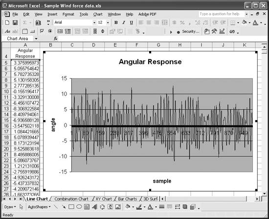
This is a standard Line chart with sample numbers (Excel calls them categories) shown on the horizontal axis. By default, Excel places tick marks along this axis, one at every other sample. With a thousand samples as shown here, the axis is quite cluttered. Indeed, the density of samples plotted makes selecting the axis with the mouse difficult.
An alternative way to select chart elements for formatting is to first select the chart itself by clicking anywhere on it, and then use the arrow keys to cycle through, selecting each chart element. The name of the currently selected element is displayed in the Name box to the left of the formula bar. In this case, we're looking for Category Axis. After selecting the chart axis in this manner, you can launch the Format Axis dialog by selecting Format images/U2192.jpg border=0> Selected Axis...(Ctrl-1) from the main menu bar.
Figure 4-10 shows the Format Axis dialog box with the Scale tab selected.
Figure 4-10. Format Axis dialog box
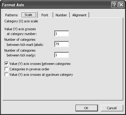
To make the horizontal axis a bit more readable you could set the number of categories between tick marks and tick-mark labels to, say, 100. You could also go to the Font tab and change the font size of the axis labels to make them larger and more readable. The Font tab also allows you to change the font type, style, and color, among other settings.
If you'd prefer to have your category labels oriented vertically, you can go to the Alignment tab and alter their orientation. The Number tab allows you to format the labels just as you might format numbers or text in a cell. For example, you could have numbers displayed in scientific notation, as percentages, or as fractions.
In addition to formatting axis labels, you can change the appearance of the axis line itself by using the format controls on the Patterns tab. For example, you could change the thickness, line style, and color of the axis line, as well the appearance of tick marks.
The Scale tab contains different controls depending on the type of data plotted along the axis. The horizontal axis in this case shows categories or numbers that are evenly spaced. An XY scatter chart's x-axis shows real numbers with arbitrary spacing. The vertical axes in both chart types also show arbitrary real numbers. Figure 4-11 shows the scale controls available for axes that display arbitrary real numbers.
The controls on this tab allow you to specify the minimum and maximum values (i.e., the range of values shown along the axis). You can also specify the major and minor units, which control how often labels and gridlines are displayed. And you can specify where the x-axis intersects the y-axis, in case you want to shift the x-axis out of the way for clarity.
Figure 4-11. Format Axis dialog box with different scale controls
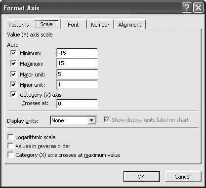
By default, all of these controls are set to Auto, which means Excel will attempt to determine suitable values for you. For the most part, Excel does an OK job at this. However, there are several reasons why you'd want to set these controls manually. One reason is that you may not want to view the entire range of data on the chart, but instead would rather focus in on a specific subrange. You can set the minimum and maximum values to a suitable range for this purpose. Another reason is that you may want specific scale divisions shown rather than those selected by Excel. For example, Excel may automatically set the major unit to 2 and the minor unit to 1; however, for your particular data you may prefer a major unit of 10 and a minor unit of 2.
As you can see from Figure 4-11, Excel also allows you to specify a logarithmic scale (see Recipe 4.5 for an example). You can even reverse the order of values along the axis or specify the x-axis crossing point at the maximum value, whatever that may be.
Using Excel
- Introduction
- Navigating the Interface
- Entering Data
- Setting Cell Data Types
- Selecting More Than a Single Cell
- Entering Formulas
- Exploring the R1C1 Cell Reference Style
- Referring to More Than a Single Cell
- Understanding Operator Precedence
- Using Exponents in Formulas
- Exploring Functions
- Formatting Your Spreadsheets
- Defining Custom Format Styles
- Leveraging Copy, Cut, Paste, and Paste Special
- Using Cell Names (Like Programming Variables)
- Validating Data
- Taking Advantage of Macros
- Adding Comments and Equation Notes
- Getting Help
Getting Acquainted with Visual Basic for Applications
- Introduction
- Navigating the VBA Editor
- Writing Functions and Subroutines
- Working with Data Types
- Defining Variables
- Defining Constants
- Using Arrays
- Commenting Code
- Spanning Long Statements over Multiple Lines
- Using Conditional Statements
- Using Loops
- Debugging VBA Code
- Exploring VBAs Built-in Functions
- Exploring Excel Objects
- Creating Your Own Objects in VBA
- VBA Help
Collecting and Cleaning Up Data
- Introduction
- Importing Data from Text Files
- Importing Data from Delimited Text Files
- Importing Data Using Drag-and-Drop
- Importing Data from Access Databases
- Importing Data from Web Pages
- Parsing Data
- Removing Weird Characters from Imported Text
- Converting Units
- Sorting Data
- Filtering Data
- Looking Up Values in Tables
- Retrieving Data from XML Files
Charting
- Introduction
- Creating Simple Charts
- Exploring Chart Styles
- Formatting Charts
- Customizing Chart Axes
- Setting Log or Semilog Scales
- Using Multiple Axes
- Changing the Type of an Existing Chart
- Combining Chart Types
- Building 3D Surface Plots
- Preparing Contour Plots
- Annotating Charts
- Saving Custom Chart Types
- Copying Charts to Word
- Recipe 4-14. Displaying Error Bars
Statistical Analysis
- Introduction
- Computing Summary Statistics
- Plotting Frequency Distributions
- Calculating Confidence Intervals
- Correlating Data
- Ranking and Percentiles
- Performing Statistical Tests
- Conducting ANOVA
- Generating Random Numbers
- Sampling Data
Time Series Analysis
- Introduction
- Plotting Time Series Data
- Adding Trendlines
- Computing Moving Averages
- Smoothing Data Using Weighted Averages
- Centering Data
- Detrending a Time Series
- Estimating Seasonal Indices
- Deseasonalization of a Time Series
- Forecasting
- Applying Discrete Fourier Transforms
Mathematical Functions
- Introduction
- Using Summation Functions
- Delving into Division
- Mastering Multiplication
- Exploring Exponential and Logarithmic Functions
- Using Trigonometry Functions
- Seeing Signs
- Getting to the Root of Things
- Rounding and Truncating Numbers
- Converting Between Number Systems
- Manipulating Matrices
- Building Support for Vectors
- Using Spreadsheet Functions in VBA Code
- Dealing with Complex Numbers
Curve Fitting and Regression
- Introduction
- Performing Linear Curve Fitting Using Excel Charts
- Constructing Your Own Linear Fit Using Spreadsheet Functions
- Using a Single Spreadsheet Function for Linear Curve Fitting
- Performing Multiple Linear Regression
- Generating Nonlinear Curve Fits Using Excel Charts
- Fitting Nonlinear Curves Using Solver
- Assessing Goodness of Fit
- Computing Confidence Intervals
Solving Equations
- Introduction
- Finding Roots Graphically
- Solving Nonlinear Equations Iteratively
- Automating Tedious Problems with VBA
- Solving Linear Systems
- Tackling Nonlinear Systems of Equations
- Using Classical Methods for Solving Equations
Numerical Integration and Differentiation
- Introduction
- Integrating a Definite Integral
- Implementing the Trapezoidal Rule in VBA
- Computing the Center of an Area Using Numerical Integration
- Calculating the Second Moment of an Area
- Dealing with Double Integrals
- Numerical Differentiation
Solving Ordinary Differential Equations
- Introduction
- Solving First-Order Initial Value Problems
- Applying the Runge-Kutta Method to Second-Order Initial Value Problems
- Tackling Coupled Equations
- Shooting Boundary Value Problems
Solving Partial Differential Equations
- Introduction
- Leveraging Excel to Directly Solve Finite Difference Equations
- Recruiting Solver to Iteratively Solve Finite Difference Equations
- Solving Initial Value Problems
- Using Excel to Help Solve Problems Formulated Using the Finite Element Method
Performing Optimization Analyses in Excel
- Introduction
- Using Excel for Traditional Linear Programming
- Exploring Resource Allocation Optimization Problems
- Getting More Realistic Results with Integer Constraints
- Tackling Troublesome Problems
- Optimizing Engineering Design Problems
- Understanding Solver Reports
- Programming a Genetic Algorithm for Optimization
Introduction to Financial Calculations
- Introduction
- Computing Present Value
- Calculating Future Value
- Figuring Out Required Rate of Return
- Doubling Your Money
- Determining Monthly Payments
- Considering Cash Flow Alternatives
- Achieving a Certain Future Value
- Assessing Net Present Worth
- Estimating Rate of Return
- Solving Inverse Problems
- Figuring a Break-Even Point
Index
EAN: 2147483647
Pages: 206
