Annotating Charts
Problem
You'd like to embellish your charts with annotations (for example, to add emphasis or provide notes for viewers of your charts).
Solution
Use Excel's drawing tools to draw directly on your charts.
Discussion
The callouts (text boxes with arrows) on the chart shown in Figure 4-16 in Recipe 4.8 were added using Excel's drawing tools. You need to display the Drawing toolbar if it isn't already visible. Select View  Toolbars
 images/U2192.jpg border=0> Drawing from the main menu bar. Figure 4-16 shows the Drawing toolbar docked in the lower left of Excels window.
The drawing toolbar contains all sorts of tools, allowing you to add text notes, callouts, arrows, shapes, and many other elements to your charts. There are also tools that allow you to format your annotations. For example, you can edit line style and thickness, color, and fill pattern, among other attributes. The 3D style buttons even allow you to create 3D effects to really make your annotations stand out. There are also tools that allow you to change the depth order, spacing, and alignment of your annotations.
To draw on your chart, simply select your chart and then click on the desired element from the drawing toolbar. Now start drawing on your chart. For example, to add a line to your chart, click the chart, then click the line button on the drawing toolbar, then click and drag on your chart to add the line. You can change the position of the line after it has been drawn by clicking and dragging it. You can also edit the line endpoints by clicking and dragging the endpoint handles (little circles).
|
Figure 4-29 shows an example chart that I embellished using Excel's drawing tools.
This chart illustrates results of a standard beam analysis. The results include load, shear, and bending moment curves, as well as calculated reactions at each support. To create this chart, I prepared a table of data including the load, shear, and bending moment values at various locations along the beam. I plotted this data on a standard XY scatter chart using the procedure outlined in Recipe 4.1. I formatted the primary and secondary axes to display specific ranges with minimum and maximum units, as described in Recipe 4.4. For the primary y-axis, I specified the crossing point for the x-axis as -800. I did this to force the x-axis toward the bottom of the chart.
After setting up the curves and axes, I labeled the bending moment and shear curves using Callout text boxes with leader arrows, which are accessible from the Drawing toolbar's Autoshapes Callouts menu. To represent the beam, I added a basic rectangle shape and manually positioned it where the
 |
Right-click on any drawing element you add to a chart or spreadsheet and select Format Autoshape from the menu to format the shape (or press Ctrl-1). You can also using the formatting tools displayed on the Drawing toolbar. |
Figure 4-29. Annotated chart
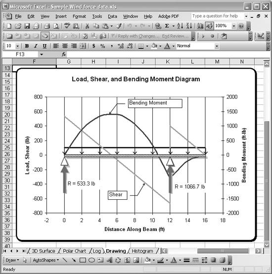
I used small triangle shapes to represent standard, simple supports for the beam. I added these by accessing the Autoshapes Basic Shapes menu from the Drawing toolbar. I manually positioned them at the proper images/U2192.jpg border=0> Block Arrows menu on the Drawing toolbar. I formatted these with a red fill color. Further, I added a couple of text boxes (also accessible from the Drawing toolbar) to indicate the calculated reaction forces. I formatted the beam, support, and reaction shapes with a faint drop shadow for a little depth effect. I used the Shadow Style tool (the button with a rectangle and drop shadow, second from the right) from the Drawing toolbar to format the drop shadow.
These are just a few examples of the sort of embellishments you can add to your technical charts to make them more meaningful, readable, and attractive. Excel's drawing tools are far more extensive than has been demonstrated here. You can add 3D text and shapes, draw smooth lines and edit their points, and prepare flow charts, among many other drawing tasks. I encourage you to explore the drawing tools more.
See Also
Do a search in Excel's help using the keywords "drawing" or "autoshapes" to find help topics specifically related to drawing in Excel.
Using Excel
- Introduction
- Navigating the Interface
- Entering Data
- Setting Cell Data Types
- Selecting More Than a Single Cell
- Entering Formulas
- Exploring the R1C1 Cell Reference Style
- Referring to More Than a Single Cell
- Understanding Operator Precedence
- Using Exponents in Formulas
- Exploring Functions
- Formatting Your Spreadsheets
- Defining Custom Format Styles
- Leveraging Copy, Cut, Paste, and Paste Special
- Using Cell Names (Like Programming Variables)
- Validating Data
- Taking Advantage of Macros
- Adding Comments and Equation Notes
- Getting Help
Getting Acquainted with Visual Basic for Applications
- Introduction
- Navigating the VBA Editor
- Writing Functions and Subroutines
- Working with Data Types
- Defining Variables
- Defining Constants
- Using Arrays
- Commenting Code
- Spanning Long Statements over Multiple Lines
- Using Conditional Statements
- Using Loops
- Debugging VBA Code
- Exploring VBAs Built-in Functions
- Exploring Excel Objects
- Creating Your Own Objects in VBA
- VBA Help
Collecting and Cleaning Up Data
- Introduction
- Importing Data from Text Files
- Importing Data from Delimited Text Files
- Importing Data Using Drag-and-Drop
- Importing Data from Access Databases
- Importing Data from Web Pages
- Parsing Data
- Removing Weird Characters from Imported Text
- Converting Units
- Sorting Data
- Filtering Data
- Looking Up Values in Tables
- Retrieving Data from XML Files
Charting
- Introduction
- Creating Simple Charts
- Exploring Chart Styles
- Formatting Charts
- Customizing Chart Axes
- Setting Log or Semilog Scales
- Using Multiple Axes
- Changing the Type of an Existing Chart
- Combining Chart Types
- Building 3D Surface Plots
- Preparing Contour Plots
- Annotating Charts
- Saving Custom Chart Types
- Copying Charts to Word
- Recipe 4-14. Displaying Error Bars
Statistical Analysis
- Introduction
- Computing Summary Statistics
- Plotting Frequency Distributions
- Calculating Confidence Intervals
- Correlating Data
- Ranking and Percentiles
- Performing Statistical Tests
- Conducting ANOVA
- Generating Random Numbers
- Sampling Data
Time Series Analysis
- Introduction
- Plotting Time Series Data
- Adding Trendlines
- Computing Moving Averages
- Smoothing Data Using Weighted Averages
- Centering Data
- Detrending a Time Series
- Estimating Seasonal Indices
- Deseasonalization of a Time Series
- Forecasting
- Applying Discrete Fourier Transforms
Mathematical Functions
- Introduction
- Using Summation Functions
- Delving into Division
- Mastering Multiplication
- Exploring Exponential and Logarithmic Functions
- Using Trigonometry Functions
- Seeing Signs
- Getting to the Root of Things
- Rounding and Truncating Numbers
- Converting Between Number Systems
- Manipulating Matrices
- Building Support for Vectors
- Using Spreadsheet Functions in VBA Code
- Dealing with Complex Numbers
Curve Fitting and Regression
- Introduction
- Performing Linear Curve Fitting Using Excel Charts
- Constructing Your Own Linear Fit Using Spreadsheet Functions
- Using a Single Spreadsheet Function for Linear Curve Fitting
- Performing Multiple Linear Regression
- Generating Nonlinear Curve Fits Using Excel Charts
- Fitting Nonlinear Curves Using Solver
- Assessing Goodness of Fit
- Computing Confidence Intervals
Solving Equations
- Introduction
- Finding Roots Graphically
- Solving Nonlinear Equations Iteratively
- Automating Tedious Problems with VBA
- Solving Linear Systems
- Tackling Nonlinear Systems of Equations
- Using Classical Methods for Solving Equations
Numerical Integration and Differentiation
- Introduction
- Integrating a Definite Integral
- Implementing the Trapezoidal Rule in VBA
- Computing the Center of an Area Using Numerical Integration
- Calculating the Second Moment of an Area
- Dealing with Double Integrals
- Numerical Differentiation
Solving Ordinary Differential Equations
- Introduction
- Solving First-Order Initial Value Problems
- Applying the Runge-Kutta Method to Second-Order Initial Value Problems
- Tackling Coupled Equations
- Shooting Boundary Value Problems
Solving Partial Differential Equations
- Introduction
- Leveraging Excel to Directly Solve Finite Difference Equations
- Recruiting Solver to Iteratively Solve Finite Difference Equations
- Solving Initial Value Problems
- Using Excel to Help Solve Problems Formulated Using the Finite Element Method
Performing Optimization Analyses in Excel
- Introduction
- Using Excel for Traditional Linear Programming
- Exploring Resource Allocation Optimization Problems
- Getting More Realistic Results with Integer Constraints
- Tackling Troublesome Problems
- Optimizing Engineering Design Problems
- Understanding Solver Reports
- Programming a Genetic Algorithm for Optimization
Introduction to Financial Calculations
- Introduction
- Computing Present Value
- Calculating Future Value
- Figuring Out Required Rate of Return
- Doubling Your Money
- Determining Monthly Payments
- Considering Cash Flow Alternatives
- Achieving a Certain Future Value
- Assessing Net Present Worth
- Estimating Rate of Return
- Solving Inverse Problems
- Figuring a Break-Even Point
Index
EAN: 2147483647
Pages: 206
