Building 3D Surface Plots
Problem
You want to create a 3D surface plot in Excel (e.g., to present results on a multidimensional optimization study or perhaps to present topographic data).
Solution
Use Excel's built-in Surface chart type.
Discussion
Excel's Surface chart allows you to create plots that can be viewed from various angles.
In Excel, surface plots are like a collection of line plots that get connected to form a surface. Thus, they suffer from some of the limitations of line plots. In particular, the values to be plotted (we'll call these the z-data) must be uniformly spaced along the x- and y-axes. You can't have arbitrarily spaced data as you can in XY scatter plots.
Figure 4-21 shows some sample data in the proper form for a 3D surface plot. The sample data shown here represents results from a 1D finite element simulation of nonlinear, non-Newtonian fluid flowing through a porous material.
Figure 4-21. 3D surface plot data
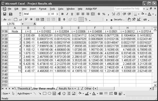
The Node column represents the finite element node at which data was calculated. This column also represents values (or categories) that will be displayed on one of the chart axes. The row of text showing t=0, t=0.01002, and so on represents the other axis; more precisely, these are labels to be displayed on the other axis. Excel will display these labels (for both axes) uniformly spaced on the chart, so I purposely extracted data at regular time intervals so the chart would make sense.
The values in the cell range starting at B3137 and ending in the lower-right corner represent the z-values to be plotted as functions of node and time. These values represent the velocity of the fluid flowing through the porous material in this example.
To create the plot, select the entire range of cell data, including the label column and row (i.e., the Node column and the row containing the elapsed time labels). In this example, the complete range is A3136:AD3147. After selecting the data, click the Chart Wizard button and go through the Chart Wizard as discussed in Recipe 4.1; however, this time select Surface for the chart type. The results are shown in Figure 4-22.
Figure 4-22. 3-D Surface chart
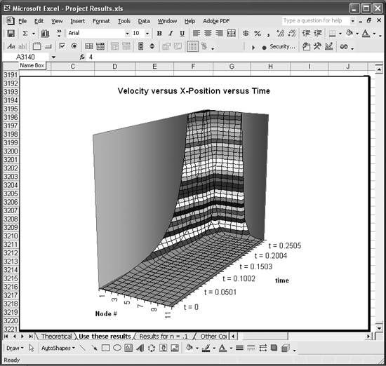
Here you can see that one axis on the horizontal plane contains node number labels, while the other contains the elapsed time labels. The surface represents fluid flow velocity at each node over time. The surface clearly shows a lot of information in a concise fashion, facilitating interpretation of the results.
The colors shown on the surface represent values within small ranges; you can set these to control the number of different colors used on the plot. To do this, you need to format the legend's scale in much the same way as you would adjust the scale of an axis as discussed in Recipe 4.4. Specifically, you can adjust the major and minor units (see Figure 4-11) to control the number of colors used to represent small ranges of values in the plot.
To format the legend's scale, you'll first have to display it. Right-click on the chart and select Chart Options from the menu to display the Chart Options dialog box. Click the Legend tab and then check the Show Legend control.
After closing the Chart Options dialog box, select the legend and press Ctrl-1 to open the Format Legend dialog box. Click the Scale tab to reveal scale controls like those shown in Figure 4-11. Adjust the scale to suit your needs.
Figure 4-23 shows a new version of the chart from Figure 4-22, with a reduced number of colors.
Figure 4-23. 3-D Surface chart with adjusted legend scale
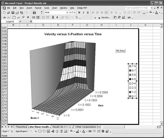
If you set the major and minor units too small, you could end up with a large number of colors and items in the legend. This may make the legend too big to display on your chart. If you want to keep such a large number of colors, then you'll probably want to hide the legend.
You can format the legend and data series even further. After selecting the legend, click on any legend entry to select it (you'll see selection handles around it). Right-click on it and select Format Legend Entry from the pop-up menu. You'll then be able to change the formatting of the legend entry font. With a legend entry selected, click on its legend keythe little colored square next to the legend entry text. Now right-click on the key and select Format Legend Key from the pop-up menu. You'll then be able to change the formatting of the legend key. For example, you can change its color or fill pattern, which also affects the chart. This allows you to set specific colors for the values displayed in the chart. In the Format Legend Key dialog box, you'll also find an Options tab. Click it to reveal additional formatting options that affect the entire chart. For example, you can change the depth of the chart or set a 3D shading effect, giving the chart more of a 3D look.
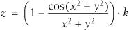
3-D Surface charts can also be useful for plotting 3D analytic functions to visualize their form. For example, the plot of the function
looks like that shown in Figure 4-24.
Figure 4-24. 3-D Surface chart of sample analytic function
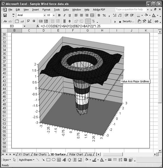
Notice that the x- and y-axes (in the horizontal plane) show real numbers. These resemble axes in an XY scatter plot, but they are still just category labels here. The trick to pulling this sort of plot off is to make sure you perform your calculations at uniformly spaced x- and y-values.
Excel's Surface chart type also gives you the option of displaying wireframe representations of surfaces such as that shown in Figure 4-25.
Figure 4-25. Wireframe 3-D Surface chart of sample analytic function
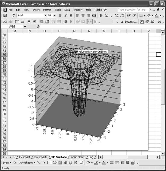
Sometimes, wireframe views are more effective in revealing the structure of such a surface without the distraction of all the colors.
|

Using Excel
- Introduction
- Navigating the Interface
- Entering Data
- Setting Cell Data Types
- Selecting More Than a Single Cell
- Entering Formulas
- Exploring the R1C1 Cell Reference Style
- Referring to More Than a Single Cell
- Understanding Operator Precedence
- Using Exponents in Formulas
- Exploring Functions
- Formatting Your Spreadsheets
- Defining Custom Format Styles
- Leveraging Copy, Cut, Paste, and Paste Special
- Using Cell Names (Like Programming Variables)
- Validating Data
- Taking Advantage of Macros
- Adding Comments and Equation Notes
- Getting Help
Getting Acquainted with Visual Basic for Applications
- Introduction
- Navigating the VBA Editor
- Writing Functions and Subroutines
- Working with Data Types
- Defining Variables
- Defining Constants
- Using Arrays
- Commenting Code
- Spanning Long Statements over Multiple Lines
- Using Conditional Statements
- Using Loops
- Debugging VBA Code
- Exploring VBAs Built-in Functions
- Exploring Excel Objects
- Creating Your Own Objects in VBA
- VBA Help
Collecting and Cleaning Up Data
- Introduction
- Importing Data from Text Files
- Importing Data from Delimited Text Files
- Importing Data Using Drag-and-Drop
- Importing Data from Access Databases
- Importing Data from Web Pages
- Parsing Data
- Removing Weird Characters from Imported Text
- Converting Units
- Sorting Data
- Filtering Data
- Looking Up Values in Tables
- Retrieving Data from XML Files
Charting
- Introduction
- Creating Simple Charts
- Exploring Chart Styles
- Formatting Charts
- Customizing Chart Axes
- Setting Log or Semilog Scales
- Using Multiple Axes
- Changing the Type of an Existing Chart
- Combining Chart Types
- Building 3D Surface Plots
- Preparing Contour Plots
- Annotating Charts
- Saving Custom Chart Types
- Copying Charts to Word
- Recipe 4-14. Displaying Error Bars
Statistical Analysis
- Introduction
- Computing Summary Statistics
- Plotting Frequency Distributions
- Calculating Confidence Intervals
- Correlating Data
- Ranking and Percentiles
- Performing Statistical Tests
- Conducting ANOVA
- Generating Random Numbers
- Sampling Data
Time Series Analysis
- Introduction
- Plotting Time Series Data
- Adding Trendlines
- Computing Moving Averages
- Smoothing Data Using Weighted Averages
- Centering Data
- Detrending a Time Series
- Estimating Seasonal Indices
- Deseasonalization of a Time Series
- Forecasting
- Applying Discrete Fourier Transforms
Mathematical Functions
- Introduction
- Using Summation Functions
- Delving into Division
- Mastering Multiplication
- Exploring Exponential and Logarithmic Functions
- Using Trigonometry Functions
- Seeing Signs
- Getting to the Root of Things
- Rounding and Truncating Numbers
- Converting Between Number Systems
- Manipulating Matrices
- Building Support for Vectors
- Using Spreadsheet Functions in VBA Code
- Dealing with Complex Numbers
Curve Fitting and Regression
- Introduction
- Performing Linear Curve Fitting Using Excel Charts
- Constructing Your Own Linear Fit Using Spreadsheet Functions
- Using a Single Spreadsheet Function for Linear Curve Fitting
- Performing Multiple Linear Regression
- Generating Nonlinear Curve Fits Using Excel Charts
- Fitting Nonlinear Curves Using Solver
- Assessing Goodness of Fit
- Computing Confidence Intervals
Solving Equations
- Introduction
- Finding Roots Graphically
- Solving Nonlinear Equations Iteratively
- Automating Tedious Problems with VBA
- Solving Linear Systems
- Tackling Nonlinear Systems of Equations
- Using Classical Methods for Solving Equations
Numerical Integration and Differentiation
- Introduction
- Integrating a Definite Integral
- Implementing the Trapezoidal Rule in VBA
- Computing the Center of an Area Using Numerical Integration
- Calculating the Second Moment of an Area
- Dealing with Double Integrals
- Numerical Differentiation
Solving Ordinary Differential Equations
- Introduction
- Solving First-Order Initial Value Problems
- Applying the Runge-Kutta Method to Second-Order Initial Value Problems
- Tackling Coupled Equations
- Shooting Boundary Value Problems
Solving Partial Differential Equations
- Introduction
- Leveraging Excel to Directly Solve Finite Difference Equations
- Recruiting Solver to Iteratively Solve Finite Difference Equations
- Solving Initial Value Problems
- Using Excel to Help Solve Problems Formulated Using the Finite Element Method
Performing Optimization Analyses in Excel
- Introduction
- Using Excel for Traditional Linear Programming
- Exploring Resource Allocation Optimization Problems
- Getting More Realistic Results with Integer Constraints
- Tackling Troublesome Problems
- Optimizing Engineering Design Problems
- Understanding Solver Reports
- Programming a Genetic Algorithm for Optimization
Introduction to Financial Calculations
- Introduction
- Computing Present Value
- Calculating Future Value
- Figuring Out Required Rate of Return
- Doubling Your Money
- Determining Monthly Payments
- Considering Cash Flow Alternatives
- Achieving a Certain Future Value
- Assessing Net Present Worth
- Estimating Rate of Return
- Solving Inverse Problems
- Figuring a Break-Even Point
Index
EAN: 2147483647
Pages: 206
