Web Forms User Controls
Overview
Divide and rule, a sound motto. Unite and lead, a better one.
-Wolfgang Goethe
While designing the new version of ASP, Microsoft spent a considerable amount of time developing a powerful and effective extensibility model. As a result, the old ASP was completely redesigned and made fully component-based. In doing this, Microsoft killed two birds with a single stone. For one thing, they could easily integrate the new Web platform—ASP.NET—with the surrounding and emerging .NET Framework. In addition, they came up with a stable and consolidated extensibility model based on inheritance and other object-oriented programming techniques. Enter ASP.NET and its families of controls.
At the highest level of abstraction, ASP.NET provides two types of component-based extensibility—custom controls and user controls. With custom controls, you create a new control inheriting from a base class (for example, WebControl or Control) or extend an existing class. A custom control is primarily a class built to behave like a control and provide a given set of functionalities—for example, a text box or a drop-down list. The user interface is a secondary aspect and is often created programmatically and rendered by concatenating HTML text. (We'll devote the entire Part V of the book to custom controls.) With user controls, you group a few controls together in a sort of embeddable child Web form. Although user controls can appear to be not particularly object-oriented at first, the class you come up with is built on top of a base class—the UserControl class.
What s a User Control, Anyway?
A user control is primarily a Web form made of any combination of server and client controls sewn together with server and client script code. A user control has a rich user interface, even though you can also program it as if it were an encapsulated component. As with Microsoft Visual Basic ActiveX controls, all constituent controls are protected and inaccessible if not made available through a public programming interface.
My favorite definition to describe a user control is that it's an embeddable Web form. The similarity between user controls and pages is not coincidental. (By the way, one of the first names assigned to this technology was pagelets.) You create a user control in much the same way you create a Web form. When you're done with code and layout, you give the resulting file a mandatory .ascx extension and then you can use the control with any ASP.NET page. Pages see the new control as a monolithic component and work with it as with any other built-in Web control. If you're familiar with Dynamic HTML (DHTML) scriptlets, look at user controls just as you look at their ASP.NET counterpart. Creating a Web user control is simpler and faster than creating a custom control.
The UserControl Class
User controls are server files with an .ascx extension that are referenced from within ASP.NET pages. They offer Web developers an easy way to capture and reuse common pieces of the user interface. Web user controls are compiled when first requested and cached in ways similar to Page objects. As with a page, you can develop them using code-behind or inline code. Unlike pages, though, user controls cannot be called independently. Internet Information Services (IIS), in fact, is configured to block and deny any requests directed at .ascx URLs. As a result, user controls can be called only from .aspx pages or other user controls that contain them.
| Note |
In their simplest form, user controls can be seen as a more flexible alternative to server-side includes (SSI). However, thinking of user controls only as a smarter form of SSI is highly reductive. User controls can expose their own object model instead of copying a piece of static HTML text. They're live objects and can be used just like any other ASP.NET server control. |
UserControl is the .NET Framework class that represents an .ascx file when called from within an .aspx file. It inherits from TemplateControl, which is the base abstract class that provides a base set of functionality to both Page and UserControl. (This set of relationships is another element that marks the structural affinity between Web pages and user controls.)
public class UserControl : TemplateControl, IAttributeAccessor
The TemplateControl class implements the INamingContainer interface and adds to the programming interface of the Control class a few methods such as LoadControl, LoadTemplate, and ParseControl. The first two methods load a user control and a template from an external .ascx file. The ParseControl method parses an input string into an instance of a control or user control as appropriate.
Base Properties of User Controls
Table 10-1 lists the properties of the UserControl class, but it doesn't include those inherited from TemplateControl.
|
Property |
Description |
|---|---|
|
Application |
Gets the HttpApplicationState object for the current request. |
|
Attributes |
Gets the collection of all attributes declared in the user control tag. |
|
Cache |
Gets the Cache object associated with the current application. |
|
IsPostBack |
Gets whether the user control is being loaded for the first time or in response to a postback event. |
|
Request |
Gets the HttpRequest object for the current request. |
|
Response |
Gets the HttpResponse object for the current request. |
|
Server |
Gets the HttpServerUtility object for the current request. |
|
Session |
Gets the HttpSessionState object for the current request. |
|
Trace |
Gets the TraceContext object for the current request. |
As you can see, the class provides properties to access all the intrinsic objects of an ASP.NET application plus the IsPostBack value, which is critical information to all ASP.NET components. A user control features all the various flavors of ID properties (ID, ClientID, and UniqueID) and acts as a naming container for all its child controls. As usual, the list of child controls is accessible via the Controls collection.
Base Methods of User Controls
The UserControl class features only a few methods in addition to those inherited from base classes. Inherited methods include commonly used functions such as DataBind, FindControl, and LoadTemplate. The methods of the UserControl class appear in Table 10-2.
|
Property |
Description |
|---|---|
|
DesignerInitialize |
Performs any initialization steps on the user control that are required by RAD designers. |
|
InitializeAsUserControl |
Completes the initialization of the UserControl object that has been created declaratively. |
|
MapPath |
Returns the physical file path that corresponds to the given virtual path. Note that the method maps the path from the .ascx file's location, not the page's location. |
The DesignerInitialize and InitializeAsUserControl methods are rarely used in normal pages and are there mostly for internal use by the .NET Framework. In particular, the InitializeAsUserControl method makes sure the user control is initialized properly. The most important thing it does is hook up automatic event handlers. In other words, this method ensures methods named Page_Load or Page_Init, if present, are invoked during the control's Load and Init events. Table 10-3 shows the list of automatic event handlers that are supported.
|
Event Handler |
Description |
|---|---|
|
OnTransactionAbort, Page_AbortTransaction |
Event AbortTransaction, occurs when a user aborts a transaction. |
|
OnTransactionCommit, Page_CommitTransaction |
Event CommitTransaction, occurs when a user commits a transaction in a transacted page. (See Chapter 1.) |
|
Page_DataBind |
Event DataBind, occurs when the control binds to a data source. |
|
Page_Error |
Event Error, occurs when an unhandled exception is thrown. |
|
Page_Init |
Event Init, occurs when the control is initialized. |
|
Page_Load |
Event Load, occurs when the control is loaded into the page. |
|
Page_PreRender |
Event PreRender, occurs when the control is about to render its contents. |
|
Page_Unload |
Event Unload, occurs when the control is going to be unloaded from memory. |
The events listed in this table are also the events supported by all user controls.
Converting Pages into User Controls
User controls and pages have so much in common that transforming one into the other is no big deal. However, in most cases you need to convert a page into a user control. As we'll see in a moment, it's a simple operation that takes only a few steps.
To start, make sure the user control does not contain any of the following tags:
,
. Eliminating such tags will help to avoid conflicts, because the layout of the control will be merged with the layout of the hosting page and tags like
and must be unique in the final page. As for the tag, you can have as many form elements as needed, but only one can be marked with the runat attribute. So remove from the original page any reference you might have to a element. If you have HTML forms, on the other hand, leave them on. (An HTML form is the tag without the runat attribute.)
Once any offending HTML tags have been removed, rename the file with an .ascx extension. This is the key that will enable special treatment on the file. Furthermore, if the page you're converting contains an @Page directive, change it to an @Control directive.
The @Control Directive
The @Control and @Page directives share several attributes. The list of attributes supported by user controls is shown in Table 10-4.
|
Attribute |
Description |
|---|---|
|
AutoEventWireup |
Indicates whether the control's events are automatically bound to methods with a particular name. The default is true. |
|
ClassName |
Indicates an alias for the name of the class that will be created to render the user control. This value can be any valid class name, but it should not include a namespace. |
|
CompilerOptions |
A sequence of compiler command-line switches used to compile the control's class. |
|
Debug |
Indicates whether the control should be compiled with debug symbols. If true, the source code of the class is not deleted and can be retrieved as discussed in Chapter 2. |
|
Description |
Provides a text description of the control. |
|
EnableViewState |
Indicates whether view state for the user control is maintained across page requests. The default is true. |
|
Explicit |
Determines whether the page is compiled using the Visual Basic Option Explicit mode. Ignored by languages other than Visual Basic .NET. False by default. |
|
Inherits |
Defines a code-behind class for the user control to inherit. Can be any class derived from UserControl. |
|
Language |
Specifies the language used throughout the control. |
|
Strict |
Determines whether the page is compiled using the Visual Basic Option Strict mode. Ignored by languages other than Visual Basic .NET. False by default. |
|
Src |
Specifies the source file name of the code-behind class to dynamically compile when the user control is requested. |
|
WarningLevel |
Indicates the compiler warning level at which you want the compiler to abort compilation for the user control. |
From within a control, you cannot set any property that affects the overall behavior of the page. For example, you cannot enable or disable tracing, nor can you enable or disable session-state management.
You use the Src attribute of the @Control directive to develop the control using a code-behind schema. The Src attribute points to the C# or Visual Basic .NET class that contains the logic of the component. You should note, though, that the Src attribute is not recognized and supported by RAD designers such as Microsoft Visual Studio .NET. If you develop the control with Visual Studio .NET, in fact, the code-behind class is bound to the source file in a different way. The code of the class is compiled in the project assembly and made available to the ASP.NET runtime through the Inherits attribute. For editing purposes only, Visual Studio .NET tracks the name of the code-behind file using the custom attribute CodeBehind. If you use another editor, say Web Matrix, the Src attribute can be used to let the ASP.NET runtime know where the code of the component should be read from and dynamically compiled.
| Note |
The @Control directive makes it possible to use different languages for the user control and the page. For example, you can use Visual Basic .NET in the user control and C# in the calling page. The interaction between the two occurs at the level of compiled classes and therefore uses the common intermediate language (IL). |
Finally, note that giving a user control an alias by using the ClassName attribute is not strictly necessary but is highly recommended. The ClassName attribute allows the user control to be strongly typed when it is added to a container programmatically.
Fragment Output Caching
User controls also provide an optimized version of a performance-related feature specific to Web Forms pages—output caching. We'll cover page output caching in great detail in Chapter 14, "ASP.NET State Management." Output caching is an ASP.NET system feature that caches the response of a page so that subsequent requests to the same URL can be satisfied without executing the page but simply by returning the cached output. (By the way, note that IIS 6.0 supports this feature at the Web-server level, thus supporting all types of Web applications.)
Output caching can take place at two levels—for the entire page or for a portion of a page. User controls are the smallest unit of a page whose output is cacheable. To make the entire page cacheable, you place an @OutputCache directive within the .aspx file. As a result, the whole output of the page will be cached according to the parameters you specify. To cache only a portion of the page, you first isolate that portion in a user control and then declare the @OutputCache directive in the .ascx file.
When caching the output of a user control, you must set at least a couple of attributes—Duration and VaryByParam. The following code snippet caches the output of the user control for 60 seconds:
<% @OutputCache Duration="60" VaryByParam="None" %>
Page and control output caching is smart enough to let you save distinct output, even output based on the parameters in a GET query string. See Chapter 14 for more details.
| Important |
Custom controls and user controls are two different and distinct ways to create user-defined controls for ASP.NET applications. Both have pros and cons, and each have advantages in particular scenarios. User controls are ideal if you have to encapsulate a rich and complex user interface and keep it separate from the page. A user control can also be separated into two files—the .ascx file representing the layout, and the file with the code (either a source file or an assembly). Custom controls are implemented in an assembly and expose both the user interface and the object model programmatically. Unlike user controls, custom controls better leverage the power of object-oriented programming (OOP) in the sense that they can be built from existing classes and new classes can be derived from them. Although user controls could technically be derived from existing controls, the presence of a distinct layout file makes inheritance a bit more problematic. |
Developing User Controls
The structure of a user control is not much different than that of a regular Web page. It is composed of a directive section, inline code, and the graphical layout of the control. The inline code—that is, the
Many Web sites have pieces of the user interface that must be repeated in a large number of pages. Typical examples are: headers and footers, login and search forms, menus and panels. A login form doesn't need a complex object model and often doesn't need one at all. In other situations, you need to add a layer of logic on top of the control and make it programmable from within the host page. To start with user controls, let's see how to build a tab-strip control with a relatively simple object model.
Building a TabStrip User Control
A typical tab-strip control is made of a series of buttons laid out in a single row. When users click on a tab, the control selects the particular tab and fires an event to the host page. The page will in turn update and refresh its own user interface. Figure 10-1 shows the final form.
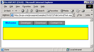
Figure 10-1: The TabStrip control in action within a sample page.
The user interface of the control is generated using a Repeater control and consists of a single-row HTML table in which each cell contains a button. Just below the table, an empty, tiny panel separates the tab strip from the rest of the page. The control acts as a simple selector and doesn't include any smart code to process the click event. Whenever the user clicks any of the tabs, a postback event is generated back to the page. The page is also responsible for creating the tabs to display. In this example, we represent a tab with a simple string. In more real-world scenarios, you might want to use an ad hoc class to describe a tab and include a key value, a ToolTip, a Boolean state (enabled/disabled), or maybe a URL.
<%@ Control Language="C#" ClassName="TabStrip" %>
<%@ Import Namespace="System.Drawing" %>
The Tabs array contains the string to display as the caption of each tab. The object is initialized in the control's Page_Init event and consumed during the rendering phase of the control. The caller page typically populates the Tabs collection in its Page_Load event.
Before taking the TabStrip user control to the next level, let's see what's needed to include a user control in a Web page.
Including a User Control in a Page
A user control is inserted in a Web page by using a custom tag marked with the runat attribute. The control instance has an ID and can be programmed using that name. The server tag is divided in two parts—a tag prefix and a tag name. In the following code snippet, the tag prefix is mspo and the tag name is tabstrip.
If you give the control the asp prefix, or no prefix at all, the ASP.NET runtime will look for the needed class only in the System.Web assembly. Because the user control is not implemented there, an exception is thrown. How do you register a tag name and prefix for a user control? And how do you bind both with an .ascx file?
The @Register Directive
The @Register directive associates aliases with namespaces and class names to provide a concise notation to reference custom and user controls within Web pages. Table 10-5 details the attributes of the directive.
|
Attribute |
Description |
|---|---|
|
Assembly |
The assembly in which the namespace associated with the tag prefix resides. The assembly name does not include a file extension. |
|
Namespace |
The namespace to associate with the tag prefix. |
|
Src |
The relative or absolute location of the user control file to associate with the tag prefix and name. The file name must include the .ascx extension. |
|
TagName |
A tag name to alias the custom or user control. (It is tabstrip in the code snippet shown previously.) |
|
TagPrefix |
A tag prefix to alias the namespace of the control, if any. (It is mspo in the code snippet shown previously.) |
You use the @Register directive in one of two ways. The first way is to register a custom control—that is, a server control that you write as a class—and you use the following syntax:
<%@ Register tagprefix="..." namespace="..." assembly="..." %>
The second way is to register a user control. To do this, you use the following syntax:
<%@ Register tagprefix="..." tagname="..." src="books/2/371/1/html/2/..." %>
A server control is represented by two parts—a prefix and a tag name. The prefix identifies a namespace and subsequently the assembly in which the code for the user control is located. For user controls, the namespace defaults to ASP and the class name is the value of the control's ClassName attribute. For example, it is ASP.TabStrip for the sample code we just discussed. The assembly is dynamically created the first time the ASP.NET runtime accesses the resource. The tag name is any unique name you use to refer to the user control within a client page. Different pages can use different tag names for the same user control.
For a custom control, you indicate the namespace and assembly and specify any namespace prefix you like better. The tag name, on the other hand, is fixed and must match the custom control class name.
Setting Up a User Control
Although absolute path names can be used to register a user control, you should always use relative names. However, you should be aware that any code within a user control is always executed taking the URL of the control as the base URL. This means that if the user control needs to access an image in the application's Images folder, you can't just use a relative path like the following one:
To address the right location, you could either move one or more folders back or, better yet, indicate a relative path that begins from the root. In the former case, you use .. to move one level up in the virtual Web space; in the latter case, you use the tilde (~) character to indirectly refer the root directory of the application.
To register the TabStrip control, you use the following registration directive:
<%@ Register TagPrefix="mspo" TagName="TabStrip" src="books/2/371/1/html/2/tabstrip.ascx" %>
An instance of the user control is created upon page loading. Just as for Web pages, a class that represents the control is created on the fly and cached in the ASP.NET temporary folders. Any updates to the source code of the .ascx file (or the code-behind class) are immediately detected and invalidate the existing assembly. In no case do you need to compile the user control to make it available to the page. (To sum it up, there's just one case in which you need to compile it first—when the control is included in code-behind pages. I'll say more about this in the "Getting Serious About User Controls" section later in this chapter.)
Building a User Control Object Model
When running, a user control is an instance of a dynamically created class. The class derives from UserControl and belongs to the ASP namespace. The actual name of the user control class depends on whether or not you set the ClassName attribute in the @Control directive. If a class name was not specified, the ASP.NET runtime generates a default name based on the .ascx file name. For example, a user control defined in a sample .ascx file generates a class named ASP.sample_ascx.
For a user control, as well as for Web pages, every property or method that is marked as public is externally callable and, as such, part of the control's object model. The following code snippet declares a couple of read/write properties that represent the background and foreground color of the unselected tabs:
The qualifier public is essential to make the property (or the method) externally visible and callable.
| Note |
To make sure the contents of a property are retrieved when the page posts back, you should store it in the control's ViewState collection. Basically, you use a slot in the ViewState as the storage medium of the property. However, note that if you're simply exposing at the user-control level the property of an embedded control, you don't need to resort to the view state. In that case, in fact, the embedded control takes care of the variable persistence. |
Adding Properties
At a minimum, the TabStrip control should expose properties to let you add tabs, track the current index, and set background and foreground colors for selected and unselected tabs.
A property on a user control is any publicly accessible variable. If you need to perform special tasks when reading or writing the value of the property, you can define get and set accessors. A get accessor is a special procedure that returns the value of the property. Likewise, the set accessor is a method that sets the value of the property. The lack of an accessor automatically disables the corresponding function, thus making the property read-only or write-only. In the preceding code, the CurrentTabIndex property is read-only.
All the properties except Tabs use accessors and persist their value to the control's view state. The contents of the Tabs collection are lost and must be rebuilt whenever the page posts back. As we'll see in more detail in Chapter 14, the view state might affect the download time of the page. All the information you store in the ViewState collection, in fact, is encoded as Base64 and transmitted back and forth between the Web server and the browser. Information that is not strictly tied to choices made by the user should not be stored in the view state. Following this guideline will keep Web pages lean and mean.
| Note |
According to the aforementioned guideline, color properties should not be stored in the view state because the page author is the only one responsible for their values. As such, you can explicitly hard-code the colors to use in the control's declaration within the host page. The same can't be said for the CurrentTabIndex property, whose value depends on what the user does. |
User control properties can be set both declaratively and programmatically. If you opt for a declarative approach, the name of the property is used as a tag attribute.
In this case, you can use strings only to specify the value. To set the background color, you use a string that represents the desired color. ASP.NET will attempt to convert the assigned string into a valid value of the expected type. On the other hand, if you set a property programmatically, you must pass values of the correct type.
void Page_Load(object sender, EventArgs e)
{
 // Since the Tabs collection is not stored in the view state,
 // you must populate it each time the page posts back. This code
 // must be placed outside the IsPostBack branch.
 menu.Tabs.Add("Welcome");
 menu.Tabs.Add("Developer");
 menu.Tabs.Add("Download");
 menu.Tabs.Add("Contact Us");

 if (!IsPostBack)
 {
 // Do here all the things that need to be done only the
 // first time the control is loaded in the page.
 // For example, select here the page to be displayed
 // by default.

 }

 // Set colors programmatically
 menu.SelectedBackColor = Color.Green;
 menu.SelectedForeColor = Color.White;
 menu.BackColor = Color.LightGray;
 menu.ForeColor = Color.Black;
}
}
// Set colors programmatically
menu.SelectedBackColor = Color.Green;
menu.SelectedForeColor = Color.White;
menu.BackColor = Color.LightGray;
menu.ForeColor = Color.Black;
}
The instance of the user control is identified using the ID of the control. If you're handling properties that do not rely on the view state, you should configure them each time the page posts back, without distinguishing between the first load and postbacks.
The selected tab is rendered with different colors, which are applied through data-bound expressions, as shown here:
The SetXXX functions are internal members that compare the current tab index with the index of the item being created and decide which color to apply.
private Color SetBackColor(object elem)
{
 RepeaterItem item = (RepeaterItem) elem;
 if (item.ItemIndex == CurrentTabIndex)
 return SelectedBackColor;
 return BackColor;
}
Initializing the User Control
When you create a user control with inline code—as we're doing here—you can't write code that executes in the user control class constructor. If you just add some code for the default constructor, you get a compile error because the ASP.NET runtime has already defined a constructor with the same parameter types.
public TabStrip()
{

}
Any constructor overloads you define will be ignored by the ASP.NET runtime. However, you can use such overloads if you create the user control dynamically. (We'll discuss this later in the section "Loading Controls Dynamically".) If the user control is developed with a code-behind, the constructor can be successfully managed. So what's the issue if you can't execute your own code in the default constructor?
Suppose you have a few properties that should take default values. Normally, you would initialize these values in the class constructor and set them to default values. In the case we're considering, we need to instantiate the ArrayList object that implements the Tabs collection and set the default page index and colors. If the properties do not make use of accessors, you simply assign a default value when declaring them.
public ArrayList Tabs = new ArrayList();
This is not possible, though, if you need accessors.
The Page_Init event is the first piece of the control's code in which you can insert your own instructions.
private void Page_Init(object sender, EventArgs e)
{
 // Check to see if defined declaratively or in
 // the page's Init event
 if (ViewState["SelectedBackColor"] == null)
 SelectedBackColor = Color.White;
 if (ViewState["SelectedForeColor"] == null)
 SelectedForeColor = Color.Blue;
 if (ViewState["BackColor"] == null)
 BackColor = Color.Gray;
 if (ViewState["ForeColor"] == null)
 ForeColor = Color.White;
 if (ViewState["CurrentTabIndex"] == null)
 ViewState["CurrentTabIndex"] = 0;
}
Note, though, that the control's Page_Init event fires when the ASP.NET runtime already did a lot of work constructing the page. In particular, it comes after the user control has been instantiated and configured with the properties declaratively set in the page layout. The Init event of the control precedes the page Init event. In contrast, the page Load event comes earlier than the Load event on child controls.
In short, you can't simply treat the Page_Init event of the control as a replacement for the constructor. If you do so, you'll overwrite any settings defined in the control's tag. So how can you assign default values to all properties without overwriting any values that might have been set declaratively? You should set the default value only if the property is unassigned. The way in which you detect that the property is unassigned is application specific. For example, if the property is part of the view state, you can check the ViewState collection against null.
Adding Methods
The next step in the process of building a functional and reusable tab-strip control is adding a method to programmatically select a particular tab. So far, in fact, the selection can only be triggered by the user when she clicks a button. The Select method will do that programmatically. Here is the prototype of the Select method:
public void Select(int index)
The method takes an integer argument, which is the 0-based index of the tab to select. Internally, it sets the current tab index and rebinds the data.
public void Select(int index) {
 // Ensure the index is a valid value, otherwise select the first
 if (index <0 || index >Tabs.Count)
 index = 0;

 // Updates the current index. Must write to the view state
 // because the CurrentTabIndex property is read-only
 ViewState["CurrentTabIndex"] = index;

 // Ensure the bottom panel is of the selected color
 __theSep.BackColor = SelectedBackColor;

 // Refresh the user interface
 BindData();
}
A method on a user control is simply a public method defined either as inline code or in the code-behind class. Note that the Select method can't set the current tab index by using the public property. The reason is that the property is read-only (that is, it lacks a set accessor), and subsequently no code within the class can set it explicitly. The workaround is to directly access the ViewState, where the values of the property are actually stored.
The sample page can now offer some user-interface elements to let users select tabs programmatically. The following code snippet shows a text box in which you can type the index of the tab to select and a link button to execute the code:
The OnSelectTab event handler simply calls the Select method on the user control, as Figure 10-2 demonstrates.
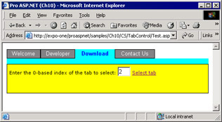
Figure 10-2: A new link button commands the selection of a particular tab.
void OnSelectTab(object sender, EventArgs e) {
 menu.Select(Convert.ToInt32(tabIndex.Text));
}
The Select method acts as the set accessor of the CurrentTabIndex property. If you want to read the index of the current tab, you use the property; if you want to programmatically set a particular tab, you use the method.
Handling User Control Events
So far we've built a user control that displays its own user interface and allows users to select tabs. For a control such as the TabStrip, though, the key feature has not been implemented yet. How can a page that hosts the control be notified of a user's clickings? A tab strip makes sense if the page can detect the selection changed event and properly refresh. For example, the page could generate different content according to the selected tab; alternatively, it can redirect the user to a child page within a frame or simply jump to a new URL. To let the page know about the selection, we must add an event to the user control.
Adding the SelectionChanged Event
Within the TabStrip control, the selection changes whenever the user clicks the buttons or when the page calls the Select method. Let's define an event named SelectionChanged.
public event SelectionChangedEventHandler SelectionChanged;
An event is a special property bound to a delegate. A delegate is a reference to a method signature. An instance of a delegate is actually a pointer to a function with a well-known signature. The .NET Framework provides a general-purpose delegate for event handlers—the EventHandler class. Here is the prototype of such event handlers:
public delegate void EventHandler(object sender, EventArgs e);
The EventHandler delegate represents all methods that take an object and an EventArgs argument and return void. This predefined delegate is good as long as you don't need to pass custom data back to the caller. You should use it only for events that work as simple notifications of some server-side event. In this case, we need to pass at least the index of the selected tab. So let's define a custom delegate and a custom event data structure.
public delegate void SelectionChangedEventHandler(
 object sender, SelectionChangedEventArgs e);
A custom delegate for the event differs from EventHandler for the custom data structure used to carry event arguments. The common naming convention for events entails using the name of the event (SelectionChanged in this case) to prefix both the delegate and the data structure name.
public class SelectionChangedEventArgs : EventArgs
{
 public int Position; // 0-based index of the selected tab
}
The SelectionChangedEventArgs structure inherits from EventArgs and adds an integer property that represents the 0-based index of the selected tab. An instance of this data structure will be created and initialized when the event occurs within the user control.
Firing a Custom Event
To better handle custom events, you might want to define a helper routine like the one shown at the end of this paragraph. The name you choose for this routine is unimportant. Likewise, the method qualifiers (protected, virtual) are subject to your personal preferences. Let's say that declaring such a helper routine as protected and overridable is considered a best programming practice that is widely employed in the .NET Framework itself. My suggestion is that either you declare it as protected and virtual or don't declare it at all.
// Helper function that fires the event by executing user-defined code
protected virtual void OnSelectionChanged(SelectionChangedEventArgs e)
{
 // SelectionChanged is the event property. Check if the user defined it
 if (SelectionChanged != null)
 SelectionChanged(this, e);
}
The routine doesn't do much—it just ensures the event property is not null and makes the call. However, it adds an extra layer of code that, if made overridable, can help derived classes to customize the behavior more easily and effectively.
At this point, firing the event becomes simply a matter of initializing the data structure and calling the helper function. The event is fired by the Select method.
public void Select(int index) {
 // Ensure the index is a valid value
 if (index <0 || index >Tabs.Count)
 index = 0;

 // Updates the current index. Must write to the view state
 // because the CurrentTabIndex property is read-only
 ViewState["CurrentTabIndex"] = index;

 // Ensure the bottom panel is of the selected color
 __theSep.BackColor = SelectedBackColor;

 // Refresh the UI
 BindData();

// Fire the event to the client
SelectionChangedEventArgs ev = new SelectionChangedEventArgs();
ev.Position = CurrentTabIndex;
OnSelectionChanged(ev);
}
When the user clicks on the tabs, the underlying Repeater control we used to create the control's user interface fires an ItemCommand event. The embedded handler for the ItemCommand event just calls into Select.
private void ItemCommand(object sender, RepeaterCommandEventArgs e)
{
 // Select the tab that corresponds to the clicked button
 Select(e.Item.ItemIndex);
}
Now that the user control fires an event, let's see what's needed on the caller page to detect and handle it.
Handling a Custom Event
A .NET component that wants to sink events emitted by controls must write a handler whose prototype matches that of the event delegate. How you bind the handler with the event on a particular instance of the component is language specific. For example, in C#, you create a new instance of the event handler class and add it to the component's event property.
// YourHandler is the actual name of the handler in your code
menu.SelectionChanged += new SelectionChangedEventHandler(YourHandler);
In Visual Basic .NET, you can use the AddHandler keyword, as shown here:
' YourHandler is the actual name of the handler in your code
AddHandler menu.SelectionChanged, AddressOf YourHandler
This technique is not always necessary in ASP.NET applications. In ASP.NET, in fact, you can also register event handlers declaratively using the OnXXX attribute, where XXX stands for the actual name of the event property.
OnSelectionChanged="SelectionChanged" />
Here is the SelectionChanged event handler:
void SelectionChanged(object sender, TabStrip.SelectionChangedEventArgs e)
{
 msg.Text = "Selected tab #" + e.Position.ToString();
}
Note that the name of the custom event data class must be prefixed with the name of the user control class. The reason for this requirement is that the event data class is defined within the user control class. Figure 10-3 shows the TabStrip user control, which includes a SelectionChanged event handler.
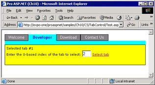
Figure 10-3: The user selects the second tab, and the application detects the change and properly refreshes.
Getting Serious About User Controls
In Chapter 9, "ASP.NET Iterative Controls," we created quite complex user interfaces by combining iterative controls and HTML advanced features such as text overflow. That code addresses common needs and, therefore, might be employed in other pages or applications. Unfortunately, as we wrote it, it's hardly reusable. To work around this issue, let's try to rewrite as a user control some of the Repeater-based code we discussed in Chapter 9. In doing so, we'll also address an interesting and real-world aspect of control development—data binding. Incidentally, data binding is also a reasonable next step for the user control we have just built. A data-bound version of the TabStrip user control would use the results of a SQL query to automatically generate the tabs.
Earlier in this chapter, we mentioned that user controls can be developed using inline code as well as a code-behind. For the sake of completeness, in the next sample, we'll use and examine the code-behind approach.
Building Data Bound User Controls
In most cases, a data-bound user control is not really different than a data-free control. The only relevant difference is that a data-bound control features a few properties that bind it to an ICollection-based data source object—mostly, but not necessarily, an ADO.NET object. In Chapter 9, we used a Repeater control to build a list of buttons, each with a letter name. Such neat and handy functionality clashes with all the boilerplate code that is needed to set it up. With their powerful mix of user-interface and back-end code, user controls seem to be the right tool to leverage for reaching a satisfactory solution.
The ButtonList User Control
The ButtonList control is made of an .ascx file and a code-behind file. Its link is set in the @Control directive. The layout of the .ascx file is fairly simple and contains a Repeater control to enumerate all the bound items and create a push button for each. In addition, a thin one-row table is placed below the Repeater for a better graphical effect.
<%@ Control Language="C#" ClassName="ButtonList"
 Inherits="ProAspNet.CS.Ch10.ButtonList"
 src="books/2/371/1/html/2/ButtonList.ascx.cs" %>
Because the control is developed using a code-behind, you must use the Inherits attribute on the @Control directive. It tells the ASP.NET runtime what the base class is from which the dynamic control class is to be derived. You set Inherits with the fully qualified name of the code-behind class. If you use Visual Studio .NET, this happens by default; if you use Web Matrix, on the other hand, remember to set it yourself. If you omit the Inherits attribute, the ASP.NET runtime would ignore your code-behind class and use UserControl instead. In addition to using Inherits, you can specify Src to let ASP.NET know about the location of the source code to compile. If Src is omitted, ASP.NET assumes that the needed assembly is already available in one of the common paths and complains if the needed assembly isn't found.
The .ascx file contains only the skeleton of the control's user interface. As you can see, there's no data-binding expression and no event handlers. When you work with code-behind classes, isolating all executable code in the source file is considered a best practice because it guarantees full separation between code and layout.
The Programming Interface of the ButtonList Control
The ButtonList control exposes a few properties, as listed in Table 10-6. These properties are primarily related to the data-binding mechanism, which leverages the data binding of the underlying Repeater control.
|
Property |
Description |
|---|---|
|
ButtonWidth |
Integer that indicates the width in pixels of the buttons |
|
CurrentButtonCommand |
Gets the command name of the currently selected button |
|
CurrentButtonIndex |
Gets the 0-based index of the currently selected button |
|
DataSource |
Indicates the data source used to populate the control |
|
DataTextField |
Indicates the name of the data source column used to render the caption of the buttons |
|
DataValueField |
Indicates the name of the data-source column used to express the command associated with the buttons |
The DataSource property plays the same role as in other data-bound controls. It provides a collection of data items the control will use to populate its own user interface. A couple of columns from this data source are used to render the caption and the command name of each button. The command name of a Button object is a string that uniquely identifies that button and is used to detect events. When binding data to this control, you should set DataValueField to a column with unique values. Note that the value will be converted into a string, so be sure you choose a column that maintains unique values after being converted into a string. All the properties except DataSource are cached in the view state.
The contents of the DataSource are cached internally in the ASP.NET Cache object. This shouldn't be a big issue because the number of records bound to the ButtonList control is not expected to be high.
public object DataSource {
 get {return Cache[DataSourceName];}
 set {Cache[DataSourceName] = value;}
}
The data source is cached in a slot with a unique name. The name is determined using the ID of the control. This guarantees that multiple controls in the same page work correctly and without conflicts. As mentioned, all the other properties are cached in the control's view state, which, in turn, is flushed in the page's view state.
public string DataTextField {
 get {return (string) ViewState["DataTextField"];}
 set {ViewState["DataTextField"] = value;}
}
The view state is specific to the individual control, so there's no need to figure out a scheme for unique names. When writing a get accessor for a property, you should always make sure the value you read is not null. This is especially true if you deal with objects such as Cache, Session or ViewState.
The overall data-binding mechanism of the ButtonList control mirrors the data-binding engine of the Repeater control. In particular, the DataBind method is nothing more than a wrapper.
private void DataBind() {
 __theMenu.DataSource = DataSource;
 __theMenu.DataBind();
}
The ButtonClicked event completes the programming interface of the control. The event fires whenever the user clicks a button. The client page receives a custom structure containing the index and the command of the button. We'll return to this in the next section, "Generating the Output." The implementation of the event is identical to the event we discussed for the TabStrip user control earlier in this chapter.
| Note |
The slots in the Cache object are subject to be emptied if the system runs low on memory. It's a good practice to make sure you always check against null all the properties that depend on Cache. If the slot is null, your code should be smart enough to restore the correct value. |
Generating the Output
When the control is initialized—that is, after the constructor is called—it hooks up its own set of events. In this case, we need to register handlers for some events fired by the embedded Repeater control.
private void HookUpEvents() {
 __theMenu.ItemCommand += new RepeaterCommandEventHandler(ItemCommand);
 __theMenu.ItemCreated += new RepeaterItemEventHandler(ItemCreated);
 __theMenu.ItemDataBound += new RepeaterItemEventHandler(ItemBound);
}
During the ItemCreated event, we take care of the appearance of each button and decide about colors, borders, and size. In particular, the selected button is larger than others and highlighted.
protected void ItemCreated(object sender, RepeaterItemEventArgs e)
{
 if (e.Item.ItemType != ListItemType.Item &&
 e.Item.ItemType != ListItemType.AlternatingItem)
 return;

 // Retrieve the item being created
 RepeaterItem item = e.Item;
 bool isSelected = IsSelectedItem(item);
 Button btn = (Button) item.FindControl("TheButton");

 // Customize the appearance
 if (isSelected) {
 btn.BackColor = SelectedBackColor;
 btn.ForeColor = SelectedForeColor;
 btn.Height = Unit.Pixel(23);
 btn.Width = Unit.Pixel(ButtonWidth*150/100);
 }
 else
 {
 btn.BackColor = BackColor;
 btn.ForeColor = ForeColor;
 btn.Height = Unit.Pixel(20);
 btn.Width = Unit.Pixel(ButtonWidth);
 }
}
Note that although the colors are not exposed as public properties, they are used as if they were. (If you want to enhance the ButtonList control, this feature shouldn't be too hard to add, especially in light of your previous experience with the TabStrip control.) Pay attention to the type of the item being created, and exit the ItemCreated event handler if the Repeater is not creating an item of type Item or AlternatingItem.
When ItemCreated fires, the item has not yet been bound to data. So, to adjust the caption and the command name for the button, we need to wait for the ItemDataBound event.
protected void ItemBound(object sender, RepeaterItemEventArgs e)
{
 if (e.Item.ItemType != ListItemType.Item &&
 e.Item.ItemType != ListItemType.AlternatingItem)
 return;

 // Retrieve the item being bound to data
 RepeaterItem item = e.Item;
 Button btn = (Button) item.FindControl("TheButton");

 // Bind to data
 btn.Text = DataBinder.Eval(item.DataItem,
 DataTextField).ToString();
 btn.CommandName = DataBinder.Eval(item.DataItem,
 DataValueField).ToString();
}
The DataBinder class is used to bind properties with data. Note that the code-behind class (from which all this code is excerpted) doesn't know anything about ADO.NET and doesn't even import the System.Data namespace.
Finally, when the user clicks one of the buttons, the Repeater fires the ItemCommand event.
protected void ItemCommand(object sender, RepeaterCommandEventArgs e)
{
 // Update the internal state
 CurrentButtonCommand = e.CommandName;
 CurrentButtonIndex = e.Item.ItemIndex;

 // Refresh the UI
 DataBind();

 // Fire the ButtonClicked event to the client
 ButtonClickedEventArgs ev = new ButtonClickedEventArgs();
 ev.ButtonCommand = CurrentButtonCommand;
 ev.ButtonIndex = CurrentButtonIndex;
 OnButtonClicked(ev);
}
The RepeaterCommandEventArgs class contains both the index of the clicked item and its command name. These two pieces of information are packed into a ButtonClickedEventArgs structure and passed to the client's handler, if any.
Setting Up a Client Page
So much for the ButtonList control, let's see how to set up a client page that intends to use the control. The following directive registers the control for use within the page:
<%@ Register TagPrefix="mspo"
TagName="ButtonList" src="books/2/371/1/html/2/buttonlist.ascx" %>
Once more, note that you can change at will the content of the TagName and TagPrefix attributes. If the control has been developed using code-behind, chances are you have to also import the namespace of the control. This namespace might be needed to access any public element that is included in the package, such as enumeration and related classes. If you use code-behind, you can control the location of each public element in the namespace. If inline code is used, everything is the child of the user control class. Let's consider the following code snippet, which reflects the structure of the code-behind class:
namespace ProAspNet.CS.Ch10
{
 public class ButtonClickedEventArgs : EventArgs
 {
 public string ButtonCommand;
 public int ButtonIndex;
 }

 public class ButtonList : UserControl
 {

 }
}
In this case, the ButtonClickedEventArgs class is not a child of ButtonList. With inline code, the overall structure of the code would have been slightly different.
namespace ASP
{
 public class ButtonList : UserControl
 {


 public class ButtonClickedEventArgs : EventArgs
 {

 }
 }
}
Defining the ButtonClickedEventArgs class outside the user control class is just a matter of preference. If you want, you can certainly move that code as a subclass within the ButtonList definition. If you do this, there's no need to import the ProAspNet.CS.Ch10 namespace, but you should prefix the class name with ButtonList. The following code declares a couple of ButtonList controls sharing the same handler for the ButtonClicked event:
The page is responsible for downloading data from a data source and binding it to the controls.
void Page_Load(object sender, EventArgs e) {
 if (!IsPostBack) {
 BindInitials();
 BindYears();
 }
}
In the sample code we're considering, BindInitials and BindYears execute the following queries:
-- Get the first letter of all customer names
SELECT DISTINCT substring(companyname, 1, 1) AS Initial FROM customers
-- Get the years for which at least an order exists
SELECT DISTINCT year(orderdate) AS year FROM orders
The ButtonList controls are initialized with the following code:
initialStrip.DataSource = _data.Tables["Initials"];
initialStrip.DataTextField = "Initial";
initialStrip.DataValueField = "Initial";
initialStrip.DataBind();
Figure 10-4 shows the final results.
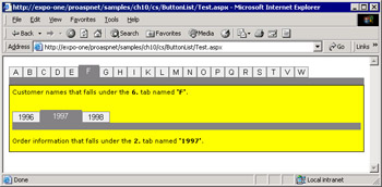
Figure 10-4: Two ButtonList controls in action within the same page.
The code that handles the ButtonClicked event for both controls is as follows:
// Namespace "ProAspNet.CS.Ch10" imported
void ButtonClicked(object sender, ButtonClickedEventArgs e)
{
 string t1 = "Customer names that falls under the {0}. " +
 "tab named '{1}'.";
 string t2 = "Order information that falls under the {0}. " +
 "tab named '{1}'."

 // Recognize the sender and update a label control
 if (sender.Equals(initialStrip))
 msg1.Text = String.Format(t1, 1 + e.ButtonIndex, e.ButtonCommand);
 else
 msg2.Text = String.Format(t2, 1 + e.ButtonIndex, e.ButtonCommand);
}
Loading Controls Dynamically
Just like any other ASP.NET server controls, user controls can be created programmatically. Unlike server controls, though, you normally don't use the new operator to instantiate user controls but resort to the LoadControl method on the containing page.
Control ctl = LoadControl("ButtonList.ascx");
LoadControl returns a generic reference to a Control object, so you need to cast the reference to the appropriate strong type to be able to set individual properties and use the control at its fullest. The ClassName attribute in the @Control directive represents the only means you have to name the user control class in a way that is both easy to remember and consistent with the expected behavior.
To cast an object to a user-control strong type, you need to have a reference to the assembly that contains the compiled code of the control. Doing this is precisely the role of the @Reference directive.
The @Reference Directive
When you create the user control programmatically, the strong type for the user control is available to the page only after you have created a reference to it. The following code creates a reference to the ButtonList user control created in the buttonlist.ascx file:
<%@ Reference Control="buttonlist.ascx" %>
The net effect of this directive is to make available in the context of the Web Forms page a reference to a type that represents the specified control. The type is named ASP.buttonlist_ascx if the user control doesn't contain a ClassName attribute; otherwise, it is named ASP.XXX, in which XXX is the content of the ClassName attribute.
The @Reference directive declaratively indicates that another user control or page should be dynamically compiled and linked against the current page or control. The directive supports only two, mutually exclusive, attributes—Page and Control. Both point to a URL and identify the Web element to bind to the current page or control. Once you hold a reference to the .ascx file, you can create instances of the user control programmatically.
ButtonList btn = (ButtonList) LoadControl("buttonlist.ascx");
In general, you use the @Register directive to register user controls that are declared in the page layout and instantiated by the system. You use the @Reference directive if you create the controls programmatically.
| Note |
If the uer control has been developed using inline code, you need @Reference to reference to its strong type. However, if the user control has been authored using a code-behind class, @Register would also suffice. If both the caller page and the user control apply the code-behind model, yet another change is needed. We'll discuss this change later in the "Referencing User Controls from Code-Behind Pages" section. |
Adding Dynamically Created Controls to the Page
Creating and casting the user control is only the first step. After setting all the individual properties you need to customize, you have the problem of adding the control to the container page. Doing this is as easy as adding the control to the Controls collection of the page.
ButtonList btn = (ButtonList) LoadControl("buttonlist.ascx");
// customize the ButtonList control
Page.Controls.Add(btn);
However, there's a more reliable approach to ensure the dynamically created control is placed exactly where you decided. You put a PlaceHolder marker control where you want the user control to display and then add the dynamic instance to the Controls collection of the PlaceHolder.
At the beginning of the section, we mentioned that you normally don't use the new operator to instantiate user controls. This is only a common practice; no technical limitation forces you to do so. The following code demonstrates how to create a ButtonList control and bind it to a placeholder:
// Global variable
ButtonList yearStrip;

// Execute after the constructor when all declared controls
// have been initialized
public void Page_Init(object sender, EventArgs e)
{
 // Instantiate the user control. Might use a more
 // specialized constructor, if any
 yearStrip = new ButtonList();

 // Complete the initialization by adding default handlers
 yearStrip.InitializeAsUserControl(Page);

 // Set the ID of the control
 yearStrip.ID = "yearstrip";

 // Set some custom properties
 yearStrip.ButtonWidth = 70;

 // Add a handler for the user control's ButtonClicked event
 yearStrip.ButtonClicked += new ButtonClickedEventHandler(BtnClicked);

 // Must use a placeholder to make sure the control is added
 // within a runat=server area
 YearStripPlace.Controls.Add(yearStrip);
}
The AddHandler operator in Visual Basic .NET and the += operator in C# provide a way for you to add event handlers to control instances dynamically.
Referencing User Controls from Code-Behind Pages
To include a user control in a Web page, you must first register it so that the ASP.NET runtime can locate and dynamically bind the needed assembly to the page. In doing so, you also obtain a strong reference to the user control class that allows for programmatic creation of controls. However, so far we've been making decisions based on creating simple Web pages—that is, Web pages that don't have a code-behind class.
Examining things from a pure ASP.NET perspective, the situation in which both the page and the user control are written in code-behind mode is a special one and requires a little more care. Amazingly enough, though, if you always develop your ASP.NET applications with Visual Studio .NET, you'll probably never run into this gotcha.
The @Register and @Reference directives configure the runtime environment so that all the needed assemblies are linked to the ASP.NET page that contains a user control. As a result, any reference to the user control, even a strong-typed one, can be successfully resolved. Can we say the same for a C# class or a Visual Basic .NET class? When the caller is a code-behind page, you write all its code in, say, a C# class. How can you reference the ButtonList type from here? The C# language has no special construct that emulates the behavior of the ASP.NET directives. As a result, any reference to ButtonList in the class is destined to raise a compiler error.
To work around this obstacle, you must also write the user control in code-behind mode. When you're done, compile the class that represents the user control into an assembly. In practice, instead of relying on the ASP.NET runtime for a dynamic compilation, you deploy the control as a precompiled unit that C# classes can easily locate.
<%@ Control Language="C#"
 Classname="ButtonList"
 Inherits="ProAspNet.CS.Ch10.ButtonList" %>
Be aware that in this case the Src attribute in the @Control directive is redundant and even harmful and must be removed. As the declaration just shown indicates, the code of the ButtonList control is contained in the specified class implemented in one of the available assemblies. If you leave the Src attribute, the compiler raises an error because it finds two assemblies with the same set of public symbols—the one you created and the one ASP.NET creates on the fly while processing the Src attribute. In general, the Inherits and Src attributes can work together, but not if both represent the same class.
| Note |
Because Visual Studio .NET always uses the code-behind model for whatever ASP.NET component it creates, this issue passes unnoticed because it doesn't cause problems and doesn't require special care. There's a caveat though. If you, being unaware of the internal structure of the Visual Studio user controls, copy the source files of a running application into another virtual directory, it doesn't work until you also copy the binaries. |
Conclusion
User controls are a type of ASP.NET server control you can easily create by using the same techniques you've learned for common Web pages. Little code is normally required for building a user control, but in some cases Web Forms user controls can also be codeless. However, there's no technical limitation to what a user control can do, and the amount and complexity of the embedded code depends only on the functionality you want to obtain.
User controls offer an easy way to partition and reuse common user-interface elements across applications. They are ideal whenever the reuse of layout and graphical functionality is critical. You can top off this component with some code that gets compiled on the fly like a Web page; however, quick and effective reuse of user-interface functionality is the primary objective of Web Forms user controls. Like pages, user controls can be developed with inline code as well as code-behind classes. User controls are not the ideal tool to leverage if you need to build a hierarchy of controls according to a pure object-oriented model. Although not impossible to obtain, inheritance is not the goal of user controls. Just the presence of a fair quantity of layout code makes user-control inheritance harder. You can stuff the code of a user control into a class and reuse it; but the associated layout information remains a separate entity that's a bit harder to manage programmatically. If you're going to build a control others can inherit from, you should drop user controls in favor of more flexible custom controls. We'll cover custom controls in Part V.
We started this chapter by building an interactive control just to emphasize how the user control technology can help you to reuse common pieces of a Web site. Next, we built an object model on top of it. The summation of an advanced user interface with a layer of business logic constitutes a powerful model that can be helpful in any scenario in which you need rich and reusable components.
In Chapter 11, "ASP.NET Mobile Controls," we'll complete our overview of ASP.NET controls by taking a look at mobile controls. The ASP.NET mobile controls are a set of ASP.NET server controls that can generate Wireless Markup Language (WML), compact HTML, and HTML content for a variety of devices. Note that the ASP.NET mobile controls have been integrated with the .NET Framework only since version 1.1.
Resources
- KB 316370—Visual Studio .NET Does Not Generate a Code-Behind Declaration for Web User Controls
- KB 308378—Perform Fragment Caching in ASP.NET by Using Visual C# .NET
- Creating a File-Upload User Control with ASP.NET (http://www.15seconds.com/issue/010504.htm)
- Create Localizable Web User Controls (http://www.fawcette.com/vsm/2002_09/online/villeda)
- Event Handling between Custom User Controls that are loaded at Run Time (http://www.asptoday.com/catalogue/aspcontent/20021211_01.html)
Chapter 11 ASP NET Mobile Controls
Part I - Building an ASP.NET Page
Part II - Adding Data in an ASP.NET Site
- The ADO.NET Object Model
- Creating Bindable Grids of Data
- Paging Through Data Sources
- Real-World Data Access
Part III - ASP.NET Controls
Part IV - ASP.NET Application Essentials
- Configuration and Deployment
- The HTTP Request Context
- ASP.NET State Management
- ASP.NET Security
- Working with the File System
- Working with Web Services
Part V - Custom ASP.NET Controls
- Extending Existing ASP.NET Controls
- Creating New ASP.NET Controls
- Data-Bound and Templated Controls
- Design-Time Support for Custom Controls
Part VI - Advanced Topics
Index
EAN: 2147483647
Pages: 209
