|
Implements the outer table container. Equivalent to the HTML
| element. |
|
TableCell
|
A table cell; is equivalent to the HTML
|
element. |
|
TableRow
|
A table row; is equivalent to the HTML
|
| element. |
|
TextBox
|
Implements a text box using the or tag as appropriate and according to the requested text mode. Can work in single-line, multiline, or password mode.
|
The Table class and its related classes allow you to build and configure an HTML table using the same abstract object model used for building other Web controls. The power of the Table class, though, is particularly evident when it comes to building tables programmatically with dynamic contents. No matter how complex the programming model is, all Web controls produce HTML for both up-level and down- level browsers.
Images and Image Buttons
The Image control displays an image on the Web page. The path to the image is set through the ImageUrl property. Image URLs can be either relative or absolute, with most programmers showing a clear preference for relative URLs, which make a Web site inherently easier to move. You can also specify alternate text to display when the image is not available. The property to use in this case is AlternateText. The image alignment with respect to other elements on the page is set by using the ImageAlign property. Feasible values are taken from the homonymous enum type.
The Image control is not a clickable component and is simply limited to displaying an image. If you need to capture mouse clicks on the image, use the ImageButton control instead. The ImageButton class descends from Image and extends it with a couple of events—Click and Command—that are raised when the control is clicked. The OnClick event handler provides you with an ImageClickEventArgs data structure that contains information about the coordinates for the location at which the image is clicked.
The OnCommand event handler makes the ImageButton control behave like a command button. A command button has an associated name that you can control through the CommandName property. If you have multiple ImageButton controls on the same page, the command name allows you to distinguish which one is actually clicked. The CommandArgument property can be used to pass additional information about the command and the control.
Check Boxes and Radio Buttons
Check boxes and radio buttons are implemented through the tag and the type attribute set to checkbox or radio. Unlike using the HTML control versions, the Web control versions of check boxes and radio buttons let you specify the associated text as a property. The HTML elements and the corresponding HTML controls lack an attribute whose content becomes the text near the check box or radio button. In HTML, to make the text near the check box or radio button clickable, you have to resort to the tag with the for attribute.
Check me
Neither the HtmlInputCheckBox nor the HtmlInputRadioButton control add a label, which leaves you responsible for doing that. These Web controls counterpart, on the other hand, are not bound to the HTML syntax and do precisely that—they automatically add a Text property, which results in an appropriate tag. For example, consider the following ASP.NET code:
It results in the following HTML code:
Check me
HyperLinks
The HyperLink control creates a link to another Web page and is typically displayed through the text stored in the Text property. Alternatively, the hyperlink can be displayed as an image; in this case, the URL of the image is stored in the ImageUrl property. Note that if both the Text and ImageUrl properties are set, the ImageUrl property takes precedence. In this case, the content of the Text property is displayed as a ToolTip when the mouse hovers over the control's area.
The NavigateUrl property indicates the URL the hyperlink is pointing to. The Target property is the name of the window or frame that will contain the output of the target URL.
Miscellaneous Web Controls
The WebControls namespace also includes a few controls that provide useful functionality that is common in Web applications. In particular, we'll examine the AdRotator control, which works like an advertisement banner, and the Calendar control, which is a flexible and highly interactive control used to specify a date.
The AdRotator Control
Abstractly speaking, the AdRotator control displays an automatically sized image button and updates both the image and the URL each time the page refreshes. The image to display and other information is read from an XML file written according to a specific schema. More concretely, you use the AdRotator control to create an advertisement banner on a Web Forms page. The control actually inserts an image and hyperlink in the page and makes them point to the advertisement page selected. The image is sized by the browser to the dimensions of the AdRotator control, regardless of its actual size. The following code shows a typical XML advertisement file:
 6235.gif
 www.microsoft.com/MSPress/books/6235.asp
 Applied XML Programming with .NET
 50


 5727.gif
 www.microsoft.com/MSPress/books/5727.asp
 Building Web Solutions with ASP.NET
 50
The root node contains multiple elements, one per each image to show. The syntax of the AdRotator control is as follows:
Pro ASP.NET (Ch03)
Dino Esposito's Books
In the XML advertisement file, you use the node to indicate the image to load and the node to specify where to go in case of a click. The node indicates the alternate text to use if the image is unavailable. Finally, indicates how often an image should be displayed in relation to other images in the advertisement file.
Once per roundtrip, the AdRotator control fires the server-side AdCreated event. The event occurs before the page is rendered. The event handler receives an argument of type AdCreatedEventArgs, which contains information about the image, the navigation URL, and the alternate text. The AdRotator control exposes a few custom properties, including Target to set the target of the hyperlink and AdvertisementFile to set the file with image names.
The Calendar Control
The Calendar control displays a one-month calendar and allows you to choose dates and navigate backward and forward through the months of the year. The control is highly customizable both for appearance and functionality. For example, by setting the SelectionMode property, you can decide what the user can select—that is, whether a single date, week, or month can be selected. Figure 3-3 provides a view of the Calendar control.
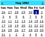
Figure 3-3: The Calendar control in action.
The VisibleDate property sets a date that must be visible in the calendar, while SelectedDate sets with a different style the date that is rendered as selected. The control also fires three ad hoc events: DayRender, SelectionChanged, and VisibleMonthChanged. The DayRender event signals that the control has just created a new day cell. You can hook the event if you think you need to customize the cell output. The SelectionChanged event fires when the selected date changes, while VisibleMonthChanged is raised whenever the user moves to another month using the control's selector buttons.
The Calendar control originates a roundtrip for each selection you make. Although it is cool and powerful on its own, for better performance you might also want to provide a plain text box for manually typing dates.
The Xml Control
The Xml control, defined by the tag, is used to output the content of an XML document directly into an ASP.NET page. The control can display the source XML as-is or as the results of an XSL transformation (XSLT). The Xml control is a sort of declarative counterpart for the XslTransform class and can make use of the .NET Framework XSLT transform class internally.
You use the Xml control when you need to embed XML documents in a Web page. For example, the control is extremely handy when you need to create XML data islands for the client to consume. The control lets you specify a document to work with and, optionally, a transformation to apply. The XML document can be specified in a variety of formats—an XML document object model, string, or file name. The XSLT transformation can be defined through either an already configured instance of the .NET Framework XslTransform class or a file name.
If you're going to apply some transformation to the XML data, you could also embed it inline between the opening and closing tags of the control. The control also makes it easier to accomplish a common ASP task: apply browser-dependent transformations to portions of the page expressed in an XML meta language. In this case, you exploit the programming interface of the control as follows:
In the Page_Load event, you just check the browser capabilities and decide which transformation should be applied.
void Page_Load(object sender, EventArgs e) {
 if (IsInternetExplorer(Request.Browser))
 theXml.TransformSource = "ie5.xsl";
 else
 theXml.TransformSource = "downlevel.xsl";
}
The PlaceHolder Control
The PlaceHolder control is one of the few controls in the WebControls namespace that isn't derived from the WebControl class. It inherits from Control and is used only as a container for other controls in the page. The PlaceHolder control does not produce visible output of its own and is limited to containing child controls dynamically added through the Controls collection. The following code shows how to embed the PlaceHolder control in a Web page:
Once you have a placeholder, you can add controls to it. As mentioned, the placeholder does not add extra functionality, but it provides for grouping and easy and direct identification of a group of related controls. The following code demonstrates how to create a new button and add it to an existing placeholder:
btn = new Button();
btn.Text = "Click me";
theToolbar.Controls.Add(btn);
The PlaceHolder control reserves a location in the control tree and can be extremely helpful in identifying specific areas of the page to customize and extend by adding controls programmatically.
Validation Controls
A key rule for writing more secure applications is to get the data right before you use it. Getting the data right requires you to apply a validation step to any external input. In ASP.NET, validator controls are used to verify the input of the form fields within a Web page. Validation controls provide an easy-to-use mechanism to perform a variety of validation tasks, including testing for valid types, values within a given range, or required fields.
The validator controls are Web server controls and inherit from the BaseValidator class which, in turn, descends from Label. All validator controls defined on a page are automatically grouped in the Validators collection of the Page class. You can validate them all in a single shot using the Validate method in the Page class or individually by calling the Validate method on each validator. The Validate method sets the IsValid property both on the page and on the individual validator. The IsValid property indicates whether the user's entries match the requirements of the validators.
| |
Note |
The Validate method on the validator control performs any needed checks on the associated control and, as a result, updates the control's IsValid property. The Validate method, when called on the page, cumulatively validates all validation controls defined within the page. The page's IsValid property is the logical AND of the values of IsValid on all embedded validation controls.
|
Other than explicitly using the Validate method, the user's entry is also automatically validated whenever the page posts back. In this case, validation is performed when a button control is clicked. The button controls that can automatically apply validation are Button, HtmlButton, HtmlInputButton, HtmlInputImage, ImageButton, and LinkButton. You can enable or disable a button's validation capability by using the CausesValidation Boolean property.
The .NET Framework also provides complete client-side implementation for validation controls. This allows Dynamic HTML–enabled browsers (such as Internet Explorer version 4.0 and later) to perform validation on the client as soon as the user tabs out of a monitored input field.
Types of Validation Controls
Each validation control references an input control located elsewhere on the page. When the page is going to be submitted, the contents of the monitored server control is passed to the validator for further processing. Each validator would perform a different type of verification. Table 3-10 shows the types of validation supported by the .NET Framework.
Table 3-10: Validator Controls in the .NET Framework
|
Validator
|
Description
|
|
CompareValidator
|
Compares the user's entry against a fixed value by using a comparison operator such as LessThan, Equal, or GreaterThan. Can also compare against the value of a property in another control on the same page.
|
|
CustomValidator
|
Employs a programmatically defined validation logic to check the validity of the user's entry. You use this validator when the other validators cannot perform the necessary validation and you want to provide custom code that validates the input.
|
|
RangeValidator
|
Ensures that the user's entry falls within a specified range. Lower and upper boundaries can be expressed as numbers, strings or dates.
|
|
RegularExpressionValidator
|
Validates the user's entry only if it matches a pattern defined by a regular expression.
|
|
RequiredFieldValidator
|
Ensures that the user specifies a value for the field.
|
Multiple validation controls can be used with an individual input control to validate according to different criteria. For example, you can apply multiple validation controls on a text box that is expected to contain an e-mail address. In particular, you can impose that the field is not skipped (RequiredFieldValidator) and that its content matches the typical format of e-mail addresses (RegularExpressionValidator).
Table 3-10 lacks a reference to the ValidationSummary control. The control does not perform validation tasks itself. It displays a label to summarize all the validation error messages found on a Web page as the effect of other validators. We'll cover the ValidationSummary control later in the chapter.
The BaseValidator Class
Figure 3-4 shows the relationship between the various validation controls and their parent classes.
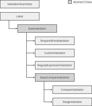
Figure 3-4: Diagram of validation controls in ASP.NET. Gray boxes represent abstract classes.
Table 3-11 details the specific properties of validation controls. Some properties, such as ForeColor, Enabled, and Text, are overridden versions of base properties on base classes.
Table 3-11: Basic Properties of Validators
|
Property
|
Description
|
|
ControlToValidate
|
Gets or sets the input control to validate. The control is identified by name—that is, by using the value of the ID attribute.
|
|
Display
|
If client-side validation is supported and enabled, gets or sets how the space for the error message should be allocated—either statically or dynamically. In case of server-side validation, this property is ignored. A Static display is possible only if the browser supports the display CSS style. The default is Dynamic.
|
|
EnableClientScript
|
True by default; gets or sets whether client-side validation is enabled.
|
|
Enabled
|
Gets or sets whether the validation control is enabled.
|
|
ErrorMessage
|
Gets or sets the text for the error message.
|
|
ForeColor
|
Gets or sets the color of the message displayed when validation fails.
|
|
IsValid
|
Gets or sets whether the associated input control passes validation.
|
|
Text
|
Gets or sets the description displayed for the validator in lieu of the error message. Note, though, this text does not replace the contents of ErrorMessage in the summary text.
|
All validation controls inherit from the BaseValidator class except for compare validators, for which a further intermediate class—the BaseCompareValidator class—exists. The BaseCompareValidator class serves as the foundation for validators that perform typed comparisons. An ad hoc property, named Type, is used to specify the data type the values are converted to before being compared. The CanConvert static method determines whether the user's entry can be converted to the specified data type. Supported types includes string, integer, double, date, and currency. As shown in Figure 3-4, the classes acting as compare validators are RangeValidator and CompareValidator.
Associating Validators with Input Controls
The link between each validator and its associated input control is established through the ControlToValidate property. The property must be set to the ID of the input control. If you do not specify a valid input control, an exception will be thrown when the page is rendered. The association validator/control is between two controls within the same container—be it a page, user control, or template.
Not all server controls can be validated. Those which can be validated specify their validation property through an attribute named [ValidationPropertyAttribute]. The attribute takes the name of the property that contains the user's entry. For example, the validation property for a TextBox is Text and is indicated as follows:
[ValidationPropertyAttribute("Text")]
public class TextBox : WebControl {

}
}
The standard list of validating controls include TextBox, DropDownList, HtmlInputFile, HtmlInputText, HtmlSelect, HtmlTextArea, ListBox, and RadioButtonList. Custom controls can be validated too, as long as they are marked with the aforementioned ValidationPropertyAttribute attribute.
| |
Note |
If the validation property of the associated input control is left empty, all validators accept the value and pass the test. The RequiredFieldValidator control represents a rather natural exception to this rule, as it has been specifically designed to detect fields the user skipped and left blank.
|
The CompareValidator Control
The CompareValidator control lets you compare the value entered by the user with a constant value or the value specified in another control in the same naming container. The behavior of the control is characterized by the following additional properties:
- ControlToCompare Represents the ID of the control to compare with the current user's entry. You should avoid setting the ControlToCompare and ValueToCompare properties at the same time. They are considered mutually exclusive; if you set both, the ControlToCompare property takes precedence.
- Operator Specifies the comparison operation to perform. The list of feasible operations is defined in the ValidationCompareOperator enumeration. The default operator is Equal. Other operators are NotEqual, LessThan, GreaterThan, GreaterThanEqual, LessThanEqual, and DataTypeCheck. The last operator in particular is useful when you want to make sure certain input data can be converted to a certain type. When the DataTypeCheck operator is specified, both ValueToCompare and ControlToCompare are ignored. In this case, the test is made on the type of the input data and returns true if the specified data can be converted to the expected type. Supported types are expressed through the following keywords: String, Integer, Double, Date, and Currency (decimal).
- ValueToCompare Indicates the value to compare the user's input against. If the Type property is set, the ValueToCompare attribute must comply with it.
The following code demonstrates the typical markup of the CompareValidator control when the control is called to validate an integer input from a text box representing someone's age:
The CustomValidator Control
The CustomValidator control is a generic and totally user-defined validator that uses custom validation logic to accomplish its task. You typically resort to this control when none of the other validators seems appropriate or, more simply, when you need to execute your own code in addition to that of the standard validators.
To set up a custom validator, you need to indicate a client-side function through the ClientValidationFunction property. If client-side validation is disabled or not supported, simply omit this setting. Alternatively, or in addition to client validation, you can define some managed code to execute on the server. You do this by defining a handler for the ServerValidate event. The code will be executed when the page is posted back in response to a click on a button control. The following code snippet shows how to configure a custom validator to check the value of a text box against an array of feasible values.
If specified, the client validation function takes a mandatory signature and looks like this:
function CheckMembership(source, arguments)
{ ... }
The source argument references the HTML tag that represents the validator control—usually, a tag. The arguments parameter references an object with two properties, IsValid and Value. The Value property is the value stored in the input control to be validated. The IsValid property must be set to false or true according to the result of the validation. The CustomValidator control is not associated in all cases with a single input control in the current naming container. For this type of validator, setting the ControlToValidate property is not mandatory. For example, if the control has to validate the contents of multiple input fields, you just don't set the ControlToValidate property and the arguments.Value variable evaluates to the empty string. In this case, you write the validation logic so that any needed values are dynamically retrieved. With client-side script code, this can be done by accessing the members of the document's form, as shown in the following code:
function CheckMembership(source, arguments) {
 // Retrieve the current value of the element
 // with the specified ID
 var membership = document.forms[0]["membership"].value;

}
Setting only a client-side validation code opens a security hole because an attacker could work around the validation logic and manage to have invalid or malicious data sent to the server. By defining a server event handler, you have one more chance to validate data before applying changes to the back-end system. To define a server-side handler for a custom validator, use the ServerValidate event.
void ServerValidation(object source, ServerValidateEventArgs e) {

}
The ServerValidateEventArgs structure contains two properties—IsValid and Value—with the same meaning and goal as in the client validation function. If the control is not bound to a particular input field, the Value property is empty and you retrieve any needed value using the ASP.NET object model. For example, the following code shows how to check the status of a check box on the server:
void ServerValidation (object source, ServerValidateEventArgs e) {
 e.IsValid = (CheckBox1.Checked == true);
}
Note that the CheckBox control (as well as HtmlInputCheckBox) cannot be validated using the standard validators and the CustomValidator control is the only option.
The RegularExpressionValidator Control
Regular expressions are an effective way to ensure that a predictable and well-known sequence of characters form the user's entry. For example, using regular expressions you can validate the format of zip codes, Social Security numbers, client codes, e-mail addresses, telephone numbers, and so on. When using the RegularExpressionValidator control, you set the ValidationExpression property with the regular expression, which will be used to validate the input. (For more information about regular expressions, see the Visual Studio .NET documentation or the MSDN online documentation.)
The following code snippet shows a regular expression validator that ensures the user's entry is an e-mail address:
The regular expression just shown specifies that valid e-mail addresses are formed by two nonzero sequences of letters, digits, dashes, and dots separated by an @ symbol and followed by a dot (.) and an alphabetic string. (This might not be the perfect regular expression for e-mail addresses, but it certainly incorporates the majority of e-mail address formats.)
| |
Note |
The regular expression validation syntax is slightly different on the client than on the server. The RegularExpressionValidator control uses JScript regular expressions on the client and the .NET Framework Regex object on the server. Be aware that the JScript regular expression syntax is a subset of the Regex model. Whenever possible, try to use the regular expression syntax supported by JScript so that the same result is obtained for both the client and server.
|
The RangeValidator Control
The RangeValidator control lets you verify that a given value falls within a specified range. The type of the values involved in the check is specified dynamically and picked from a short list that includes strings, numbers, and dates. The following code shows how to use a range validator control. The key properties are MinimumValue and MaximumValue, which together clearly denote the lower and upper boundaries of the interval.
Note that an exception is thrown if the strings assigned MinimumValue or MaximumValue cannot be converted to the numbers or dates according to the value of the Type property.
If the type is set to Date, but no specific culture is set for the application, you should specify dates using a culture-neutral format, such as yyyy/MM/dd. If you don't do so, the chances are good that the values will not be interpreted correctly. Also bear in mind that the RangeValidator control just extends the capabilities of the more basic CompareValidator control by checking for a value in a fixed interval. In light of this, the RangeValidator control might raise an exception if either MinimumValue or MaximumValue is omitted. Whether the exception is thrown or not depends on the type chosen and its inherent ability to interpret the empty string. For example, an empty string on a Date type causes an exception.
If you want to operate on an unbound interval—whether lower or upper unbound—either you resort to the GreaterThan (or LessThan) operator on the CompareValidator control or simply use a virtually infinite value such as the 9999-12-31 date.
| |
Note |
Properties on the validation controls can be configured programmatically—for example, in the Page_Load event. In particular, if you're going to define the boundaries of a RangeValidator control at run time, be aware that both MinimumValue and MaximumValue are string properties.
|
The RequiredFieldValidator Control
To catch when a user skips a mandatory field in an input form, you use the RequiredFieldValidator control to show an appropriate error message.
As long as you're using an up-level browser and client-side scripting is enabled for each validator, which is the default, invalid input will display error messages without performing a postback. Note that just tabbing through the controls is not a condition that raises an error; the validator gets involved only if you type blanks or if the field is blank when the page is posted back.
The control that requires input does not automatically display an asterisk or other character near the control to emphasize that it's required. Marking the field so that it stands out from the others is a good programming practice, but it is left up to the programmer to make controls that require input to stand out from the others.
How can you determine whether a certain field is really empty? In many cases, the empty string just pays the bill, but this is not a rule. The InitialValue property specifies the initial value of the input control. The validation fails only if the value of the control equals InitialValue upon losing focus. By default, InitialValue is initialized with the empty string.
Setting Up a Data Entry Page
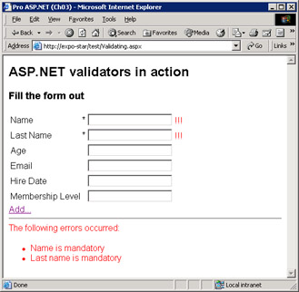
Let's see how to build a form that makes intensive use of validators to ensure that the input is always well-formed. The following page contains a couple of mandatory text fields to specify first and last name. Both are associated with an instance of the RequiredFieldValidator control. Other controls are expected to accept a minimum age and a date. For them, we'll use CompareValidator and RangeValidator. An e- mail address is entered and validated using a RegularExpressionValidator. Finally, a membership level is validated using a CustomValidator.
Fill the form out
| Name |
* |
|
| Last Name |
* |
|
| Age |
|
|
| Email |
|
|
| Hire Date |
|
|
| Membership Level |
|
|
By default, if the page runs on an up-level browser such as Internet Explorer 6.0, the validation is automatically enabled on the client as well. As you tab out of each form field, some automatically created Javascript code runs and checks the user input before it is sent to the server.
In the page just listed, each validator control is rendered to the right of the input field so that in case of an error, the error message is displayed to the right of the input field, as shown in Figure 3-5.
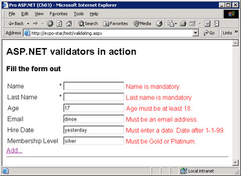
Figure 3-5: The input form with error messages signaled by validation controls.
If the client script support is disabled or the browser doesn't provide for it, no validation takes place until the page is posted back. In this case, nothing happens as you tab in and out of input fields, but after a postback the page is served with the proper error messages.
Displaying Error Information
The ErrorMessage property determines the static message that each validation control will display in case of error. Note that if the Text property is also set, it would take precedence over ErrorMessage. Text is designed to display inline where the validation control is located; ErrorMessage is designed to display in the validation summary. (Strategies for using Text and ErrorMessage will be discussed more in the next section, "The ValidationSummary Control.") Because all validation controls are labels, no other support or helper controls are needed to display any message. The message will be displayed in the body of the validation controls and, subsequently, wherever the validation control is actually placed. The error message is displayed as HTML, so it can contain any HTML formatting attribute.
Validators that work in client mode can create the tag for the message either statically or dynamically. You can control this setting by using the Display property. When the display mode is set to Static (the default), the element is given the following style:
style="color:Red;visibility:hidden;"
The CSS visibility style attribute, when set to Hidden, causes the browser not to display the element but reserves space for it. If the Display property contains Dynamic, the style string changes as follows:
style="color:Red;display:none;"
The CSS display attribute, when set to none, simply hides the element, which will take up space on the page only if displayed. The value of the Display property becomes critical when you have multiple validators associated with the same input control. For example, consider the following code excerpted from the previously considered page:
The value of the hired text box is first validated to ensure it contains a valid date and then to verify the specified date is later than 1-1-1999. If the Display property is set to Static and the date is outside the specified range, you get a page like the one shown in Figure 3-6.
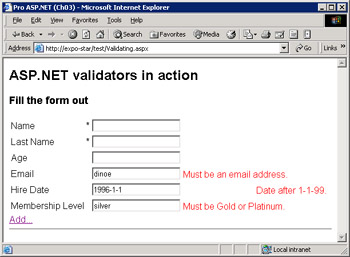
Figure 3-6: The first error message is not displayed, but it takes up space.
The ValidationSummary Control
The ValidationSummary control is a label that summarizes and displays all the validation error messages found on a Web page. The summary is displayed in a single location formatted in a variety of ways. The DisplayMode property sets the output format, which can be a list, a bulleted list, or a plain text paragraph. By default, it is a bulleted list. The feasible values are grouped in the ValidationSummaryDisplayMode enumeration.
Whatever the format is, the summary can be displayed as text in the page, in a message box, or in both. The Boolean properties ShowSummary and ShowMessageBox let you decide. The output of the ValidationSummary control is not displayed until the page posts back no matter what the value of the EnableClientScript property is. The HeaderText property defines the text that is displayed atop the summary.
This code snippet originates the screen shown in Figure 3-7.
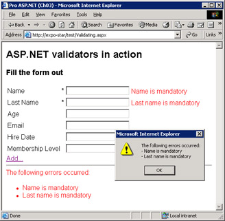
Figure 3-7: After the page posts back, the validation summary is updated and a message box pops up to inform the user.
The validation summary is displayed only if there's at least one pending error. Note that, in the default case, the labels near the input controls are updated anyway, along with the summary text. You can control the error information in the following ways:
Validating for Multiple Conditions
As mentioned earlier, you can associate multiple validators with a single input control. The validation takes place in order, and each validation control generates and displays its own error message. The content of the input control is considered valid if all the validators return true.
If an input control has multiple valid patterns—for example, an ID field can take the form of a Social Security number or a VAT number—you can either validate by using custom code or regular expressions.
Client Side Validation
As mentioned earlier, the verification normally takes place on the server either after the Validate method is called or as the result of a postback event. If the browser supports Dynamic HTML, though, you can also activate the validation process on the client, with a significant gain in responsiveness. To be precise, ASP.NET automatically enables client-side validation if it detects a browser with enough capabilities.
If client-side validation is turned on, the page won't post back until all the input fields contain valid data. To run secure code and prevent malicious and underhanded attacks, you might want to validate data on the server too. Consider also that not all types of validation can be accomplished on the client. In fact, if you need to validate against a database, there's no other option than posting back to the server.
Enabling Client Validation
Client validation can be controlled on a per-validation control basis by using the EnableClientScript Boolean property. By default, the property is set to true, meaning client validation is enabled as long as the browser supports it. If you want to control the client validation at the page level, resort to the ClientTarget attribute on the @Page directive. The following code disables client validation by specifying that any code in the page should target a down-level browser:
The ClientTarget attribute—also available as a property on the Page class—overrides the type of browser that ASP.NET should target when generating the page. If the ClientTarget attribute is set, ASP.NET doesn't detect the actual browser's capabilities but loads the capabilities for the specified browser from the machine.config file. Feasible values for the ClientTarget attribute include any value defined in the configuration section. The standard content is as follows:
If ClientTarget is not set, the browser's capabilities are detected through Request.Browser property. The BaseValidator class determines whether the browser is up-level or not. Only if the browser is considered up-level, will the client validation be implemented. Browsers and client devices that are considered up-level support at least the following:
- ECMAScript (including JScript and JavaScript) version 1.2
- HTML version 4.0
- The Microsoft Document Object Model
- Cascading style sheets
For down-level browsers, the only requirement is HTML version 3.2.
Implementing Client Validation
For situations in which validation can be applied on the client, a lot of JavaScript code is silently injected in the page. Let's consider a simple page like the following one:
This page contains a single text box with a required field validator. When viewed through an up-level browser, the HTML output looks like the following code. The code in bold represents specific extensions due to the client validation.
language="javascript" onsubmit="ValidatorOnSubmit();">
When the page loads up, the ValidatorOnLoad JavaScript function executes and populates the Page_Validators array with instances of the JavaScript objects that represent the active validators. Another change to notice is the onsubmit client event handler that has been added to the
element. When the HTML form is going to be submitted, a piece of script code runs and checks the validity of all input fields. The onsubmit handler allows the actual post only when all the validators agree to commit.
All the client script functions are imported in the page from a well-known JavaScript file located under the Web server's root:
/aspnet_client/system_web/1_x_xxxx_0/WebUIValidation.js
The path of this file is controlled by the section of the machine.config file.
Another interesting change to observe in the ASP.NET code when client validation is enabled is the insertion of extra attributes in the tag that represents the validator. The preceding code reveals a couple of custom attributes named evaluationfunction and initialvalue. The former refers to the JavaScript function that performs the client-side validation. The function is defined in the WebUIValidation.js file. The other attribute, specific to the required field validator, refers to the value to check against—the empty string in this case. The script validator functions receive one argument, that being the JavaScript object representing the validator. Custom attributes are an effective way to pass external data to script objects based on HTML tags. The following code snippet from WebUIValidation.js shows the script implementation of the required field validator:
function ValidatorTrim(s) {
 var m = s.match(/^s*(S+(s+S+)*)s*$/);
 return (m == null) ? "" : m[1];
}
function RequiredFieldValidatorEvaluateIsValid(val) {
 var t = ValidatorTrim(ValidatorGetValue(val.controltovalidate);
 return (t != ValidatorTrim(val.initialvalue))
}
Internet Explorer WebControls
Although they're not officially part of the .NET Framework and aren't included in the Web controls namespace, other Web controls have been around for some time to address the needs of developers who do a lot of client-side, Internet Explorer–specific Web programming. Unlike controls in the ASP.NET namespace, these controls extensively exploit the Dynamic HTML object model of Internet Explorer 5.x and newer versions. They perform a lot of tasks on the client and make provisions for Web versions of typical desktop controls such as the TreeView or TabStrip. You can download some of these controls from the control gallery at http://www.asp.net. Microsoft has released the following controls:
- IE TreeView Facilitates rendering of hierarchical data, folder views, and other similar data structures. The control includes support for data binding and rich DHTML behaviors in Internet Explorer 5.5 and newer.
- IE Toolbar Web counterpart of the toolbar control commonly used in Microsoft Windows desktop applications.

- IE TabStrip Simplifies the authoring of tabbed menus, and is particularly useful for authoring user-interface elements that navigate site content.
- IE MultiPage Enables the definition of collections of child page elements. As in a desktop Windows tab control, the control lets you define the content of pages that are navigated.
All Internet Explorer WebControls are tailored for both down-level browsers and up-level browsers and renders their advanced functionalities using client-side behaviors when the browser allows for that. In the same gallery of controls on the http://www.asp.net portal, you'll also find links to similar third-party products.
Data Bound Controls
Web applications are, for the most part, just data-driven applications. For this reason, the ability to bind HTML elements like drop-down lists or tables to structured data represents a key feature for a development platform. Data-bound controls are the ASP.NET answer to the growing demand for automatic binding between data sources and graphical elements. Data binding is the process that retrieves data from a fixed source and dynamically associates this data to properties on server controls. Valid target controls are those that have been specifically designed to support data binding. Data-bound controls are not yet another family of controls. Data-bound controls are simply server controls that feature a few well-known data-related properties, including Text, DataSource, DataTextField, and DataValueField.
The DataSource property, in particular, lets you specify the data source object the control is linked to. Note that this link is logical and does not result in any overhead or underlying operation until you explicitly order to bind the data to the control. Not all properties in the Web control programming interface are data bindable. You activate data binding on a control by calling the DataBind method. When this method executes, the control actually loads data from the associated data source, evaluates the data-bound properties, and redraws its user interface to reflect changes.
Feasible Data Binding Sources
Many .NET classes can be used as data sources—and not just those that have to do with database contents. In general, any object that exposes the ICollection interface is a valid bindable data source. The ICollection interface defines size, enumerators, and synchronization methods for all .NET collections. In particular, you can bind a Web control to the following classes:
- DataTable, DataView, and DataSet
- Data readers
- Dictionaries and arrays
In ASP.NET 1.1, XML documents are not directly bindable unless you load their content in one of the previously mentioned classes. You can do this by loading the XML document into a DataSet and then binding to the DataSet.
To be honest, I should note that the DataSet and DataTable classes don't implement ICollection or any other interface that inherit from it (for example, IList). However, both classes do store collections of data internally. These collections are accessed using the methods of an intermediate interface—IListSource—which performs the trick of making the DataSet and DataTable classes look like they implement a collection. In Chapter 20, we'll discuss in detail the mechanism that makes such ADO.NET objects bindable.
ADO.NET Classes
As we'll see in greater detail in Chapter 5, ADO.NET—and in particular the System.Data namespace—provides a bunch of data container classes that can be filled with any sort of data, including database information. Classes in the System.Data namespace are just in-memory caches of data and work disconnected from any database server. The data reader class, on the other hand, is specific to a managed provider and, as such, is tightly bound to a particular data source such as Oracle or Microsoft SQL Server.
Note that the DataSet class can contain more than one table; however, only one table can be associated with a data-bound control. In this case, you should assign the DataSet object to the DataSource property and the selected DataTable object to another property acting as a selector—the DataMember property.
Collection-Based Classes
At the highest level of abstraction, a collection serves as a container for instances of other classes. All collection classes implement the ICollection interface, which in turn implements the IEnumerable interface. As a result, all collection classes provide a basic set of functionalities.
All collection classes have a Count property to return the number of cached items; they have a CopyTo method to copy their items, in their entirety or in part, to an external array; they have a GetEnumerator method that instantiates an enumerator object to loop through the child items. GetEnumerator is the method behind the curtain whenever you call the foreach statement in C# and the For...Each statement in Visual Basic .NET.
IList and IDictionary are two interfaces that extend ICollection, giving a more precise characterization to the resultant collection class. ICollection provides only basic and minimal functionality for a collection. For example, ICollection does not have any methods to add or remove items. Add and remove functions are exactly what the IList interface provides. In the IList interface, the Add and Insert methods place new items at the bottom of the collection or at the specified index. The Remove and RemoveAt methods remove items, while Clear empties the collection. Finally, Contains verifies whether an item with a given value belongs to the collection, and IndexOf returns the index of the specified item. Commonly used container classes that implement both ICollection and IList are Array, ArrayList, and StringCollection. Previously mentioned ADO.NET classes—such as the DataView class—support data binding via the ICollection interface.
The IDictionary interface defines the API that represents a collection of key/ value pairs. The interface exposes methods similar to IList, but with different signatures. Dictionary classes also feature two extra properties, Keys and Values. They return collections of keys and values, respectively, found in the dictionary. Typical dictionary classes are ListDictionary, Hashtable, and SortedList.
Simple Data Binding
In ASP.NET, there are two types of data binding—simple and complex. A simple binding is a connection between one piece of data and a server control property. It is established through a special expression and is evaluated when the code in the page calls the DataBind method either on the Page object or the control.
A data binding expression is any text wrapped by and prefixed by the symbol #. You can use data-binding expressions to set the value of an attribute in the opening tag of a server control. A data-binding expression is programmatically managed via an instance of the DataBoundLiteralControl class. The following code snippet shows how to set the text of a label with the current time:
Within the delimiters, you can invoke user-defined page methods, static methods, and properties and methods of any other page components. The following code demonstrates a label bound to the name of the currently selected element in a drop-down list control:
Note that if you're going to use quotes within the expression, you should wrap the expression itself with single quotes. The data-binding expression can accept a minimal set of operators, mostly for concatenating subexpressions. If you need more advanced processing and use external arguments, resort to a user-defined method. The only requirement is that the method must be callable within the page. If the code of the page is not resident in the .aspx page (for example, you're using code- behind), make sure the method is declared public or protected.
Simple Data Binding in Action
In the following example, you'll see how to use simple data binding with text boxes to arrange a form-based record viewer. The user interface of the page supplies three text boxes, one for each of the retrieved fields. The data source is the Employees table of the Northwind database in Microsoft SQL Server 2000. The query that is run against the database selects three fields: employeeid, firstname, and lastname. The binding takes place between the text boxes and the fields. Only one record at a time is displayed, and Previous and Next buttons let you move through the data. You can see what the application looks like in Figure 3-9.
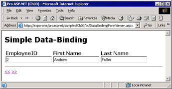
Figure 3-9: The text boxes in the figure are bound to fields in the Employees table from the SQL Server 2000 Northwind sample database.
The binding expression makes use of a user-defined method named GetBoundData.
The method takes the name of the field to display and retrieves the position of the current record from the ASP.NET Session object. It then reads the corresponding value and passes it to the ASP.NET runtime for actual rendering.
public string GetBoundData(String fieldName)
{
 DataSet ds = (DataSet) Session["MyData"];
 DataTable dt = ds.Tables["EmpTable"];
 int nRowPos = (int) Session["CurrentRecord"];

 String buf = dt.Rows[nRowPos][fieldName].ToString();
 return buf;
}
Implementation of Data-Bound Expressions
What really happens when a data-bound expression is found in a Web page? How does the ASP.NET runtime process it? Let's consider the following base code:
While compiling the source code for the page, the ASP.NET runtime writes a handler for the DataBinding event of the control—a Label in this case. The following pseudocode shown illustrates the generation of the label in the underlying class. (See Chapter 2 for more details on the compilation of the page.)
private Control __BuildControltoday() {
 Label __ctrl = new Label();
 this.today = __ctrl;
 __ctrl.ID = "today";


__ctrl.DataBinding += new EventHandler(this.__DataBindtoday);
 return __ctrl;
}
Basically, the data-binding handler assigns the verbatim expression to the control's property.
public void __DataBindtoday(object sender, EventArgs e) {
 Label target;
 target = (Label) sender;
target.Text = Convert.ToString(DateTime.Now.ToString());
}
The value returned by the data-binding expression must be convertible to a string. The code in the event handler does not change if the expression points to another control. The ASP.NET runtime assumes the control exists and is instantiated—which is true by design.
Complex Data Binding
Complex data binding occurs when you bind a list control or an iterative control to one or more columns of data. List controls include the DropDownList, CheckBoxList, RadioButtonList, and ListBox. Iterative controls are the Repeater, DataList, and DataGrid controls.
List controls have a more complex and richer user interface than labels and text boxes. They display (or at least need to have in memory) more items at the same time. That's the reason you should associate them explicitly with a collection of data—the data source. Depending on its expected behavior, the control will pick the needed items from memory and properly format and display them.
Iterative controls take a data source, loop through the items, and iteratively apply HTML templates to each row. This basic behavior is common to all three ASP.NET iterators. Beyond that, they differ in terms of layout capabilities and functionality they support. We'll cover iterative controls from various perspectives in Chapter 6 and Chapter 9.
Let's see how complex forms of data binding apply to key list controls. All list controls inherit from the base ListControl class.
The DropDownList Control
The DropDownList control enables users to select one item from a single-selection drop-down list. You can specify the size of the control by setting its height and width in pixels, but you can't control the number of items displayed when the list drops down. The DropDownList control can be filled through data binding. The following code provides an example:
You can assign a data binding expression to the DataSource property but not to the DataTextField and DataValueField properties. Their value must match exactly the name of one of the columns in the data source. The properties specific to the DropDownList control are shown in Table 3-12.
Table 3-12: Properties of the DropDownList Control
|
Property
|
Description
|
|
AutoPostBack
|
Gets or sets whether the control should automatically post back to the server when the user changes the selection
|
|
DataMember
|
Gets or sets the name of the table in the DataSource to bind
|
|
DataSource
|
Gets or sets the data source that populates the items of the list
|
|
DataTextField
|
Gets or sets the name of the column in the data source that provides the text content of the list items
|
|
DataTextFormatString
|
Gets or sets the formatting string used to control how data bound to the list is displayed
|
|
DataValueField
|
Gets or sets the field of the data source that provides the value of each list item
|
|
Items
|
Gets the collection of items in the list control
|
|
SelectedIndex
|
Gets or sets the index of the selected item in the list
|
|
SelectedItem
|
Gets the selected item in the list
|
The programming interface of the DropDownList also features three properties to configure the border of the drop-down list—the BorderColor, BorderStyle, and BorderWidth properties. Although the properties are correctly transformed by style properties, most browsers won't use them to change the appearance of the drop-down list.
The DataTextField and DataValueField properties don't accept expressions, only plain column names. To combine two or more fields of the data source, you can use a calculated column. You can either use a column computed by the database or exploit the power of the ADO.NET object model (as explained in Chapter 5) and add an in-memory column. The following SQL query returns a column obtained by concatenating lastname and firstname.
SELECT lastname + ', ' + firstname AS 'EmployeeName'
FROM Employees
The same result can also be obtained, more efficiently, without the involvement of the database. Once you've filled a DataTable object with the result of the query, you add a new column to its Columns collection. The content of the column is based on an expression. The following code adds an EmployeeName column to the data source that concatenates the last name and first name:
dataTable.Columns.Add("EmployeeName",
 typeof(string),
 "lastname + ', ' + firstname");
An expression-based column does not need to be filled explicitly. The values for all the cells in the column are calculated and cached when the column is added to the table. The table tracks any dependencies and updates the calculated column whenever any of the constituent columns are updated.
The CheckBoxList Control
The CheckBoxList control is a single monolithic control that groups a collection of checkable list items, each of which is rendered through an individual CheckBox control. The properties of the child check boxes are set by reading the associated data source. You insert a check box list in a page as follows:
Table 3-13 lists the specific properties of the CheckBoxList control.
Table 3-13: Properties of the CheckBoxList Control
|
Property
|
Description
|
|
AutoPostBack
|
Gets or sets whether the control should automatically post back to the server when the user changes the selection
|
|
CellPadding
|
Gets or sets the pixels between the border and contents of the cell
|
|
CellSpacing
|
Gets or sets the pixels between cells
|
|
DataMember
|
Gets or sets the name of the table in the DataSource to bind
|
|
DataSource
|
Gets or sets the data source that populates the items of the list
|
|
DataTextField
|
Gets or sets the name of the column in the data source that provides the text content of the list items
|
|
DataTextFormatString
|
Gets or sets the formatting string used to control how data bound to the list is displayed
|
|
DataValueField
|
Gets or sets the field of the data source that provides the value of each list item
|
|
Items
|
Gets the collection of items in the list control
|
|
RepeatColumns
|
Gets or sets the number of columns to display in the control
|
|
RepeatDirection
|
Gets or sets a value that indicates whether the control displays vertically or horizontally
|
|
RepeatLayout
|
Gets or sets the layout of the check boxes (table or flow)
|
|
SelectedIndex
|
Gets or sets the index of the selected item in the list
|
|
SelectedItem
|
Gets the selected item in the list
|
|
TextAlign
|
Gets or sets the text alignment for the check boxes
|
Unlike the DropDownList control, the CheckBoxList does not supply any properties that know which items have been selected. But this aspect is vital for any Web application that utilizes checkable elements. The CheckBoxList can have any number of items selected, but how can you retrieve them?
Any list control has an Items property that contains the collection of the child items. The Items property is implemented through the ListItemCollection class and makes each contained item accessible via a ListItem object. The following code loops through the items stored in a CheckBoxList control and checks the Selected property of each of them:
foreach(ListItem item in chkList.Items)
{
 if (item.Selected) {
 // this item is selected
 }
}
The RadioButtonList Control
The RadioButtonList control acts as the parent control for a collection of radio buttons. Each of the child items is rendered through a RadioButton control. By design, a RadioButtonList can have zero or one item selected. The SelectedItem property returns the selected element as a ListItem object. Note, though, that there is nothing to guarantee that only one item is selected at any time. For this reason, be extremely careful when you access the SelectedItem of a RadioButtonList control—it could be null.
The contents of the control can be fetched from a data source as follows:
The control supports the same set of properties as the CheckBoxList control and, just like it, accepts some layout directives. In particular, you can control the rendering process of the list with the RepeatLayout and RepeatDirection properties. By default, the list items are rendered within a table, which ensures the vertical alignment of the companion text. The property that governs the layout is RepeatLayout. The alternative is displaying the items as free HTML text, using blanks and breaks to guarantee some sort of minimal structure. RepeatDirection is the property that controls the direction in which, with or without a tabular structure, the items flow. Feasible values are Vertical (the default) and Horizontal. RepeatColumns is the property that determines how many columns the list should have. By default the value is 0, which means all the items will be displayed in a single row, vertical or horizontal according to the value of RepeatDirection.
The ListBox Control
The ListBox control represents a vertical sequence of items displayed in a scrollable window. The ListBox control allows single-item or multiple-item selection and exposes its contents through the usual Items collection, as shown in the following code:
You can decide the height of the control through the Rows property. The height is measured in number of rows rather than pixels or percentages. When it comes to data binding, the ListBox control behaves like the controls discussed earlier in the chapter. It supports properties such as DataSource and DataMember, and it can be bound to a data source and show its contents.
Two properties make this control slightly different than other list controls—the Rows property, which represents the number of visible rows in the control, and the SelectionMode property, which determines whether one or multiple items can be selected. The following code demonstrates how to write a comma-separated string with the values of the selected items:
public void ShowSelectedItems(object sender, EventArgs e)
{
 StringBuilder sb = new StringBuilder("");
 for (int i=0; i < theList.Items.Count; i++)
 {
 if (theList.Items[i].Selected)
 {
 sb.Append(theList.Items[i].Text);
 sb.Append(", ");
 }
 }
 Response.Write(sb.ToString());
}
This code is nearly identical to the one you would write to accomplish the same operation on a CheckBoxList control. The programming interface of the list box also contains a SelectedItem property that makes little sense when you work with a multiselection control. In this case, the SelectedItem property returns the selected item with the lowest index.
| |
Note |
All list controls support the SelectedIndexChanged event, which is raised when the selection from the list changes and the page posts back to the server. You can use this event to execute server-side code whenever a control is checked or unchecked.
|
Conclusion
In ASP.NET pages, server controls are vital components. Server-side controls alone—no matter their capabilities and flavors—constitute a huge difference between ASP and ASP.NET. Server-side controls transform the programming model of ASP.NET from a mere factory of HTML strings to a more modern and effective component-based model.
ASP.NET features a long list of control classes. Looking at the namespaces involved, we should conclude that only two families of controls exist—HTML and Web controls. Controls in the former group simply mirror the set of elements in the HTML syntax. Each constituent control has as many properties as there are attributes in the corresponding HTML tag. Names and behavior have been kept as faithful to the originals as possible. The ultimate goal of the designers of HTML controls is to make the transition from ASP to ASP.NET as seamless as possible—just add runat="server" and refresh the page.
The overall design of Web controls is more abstract and much less tied to HTML. In general Web controls do not provide a strict one-to-one correspondence between controls and HTML tags. However, the capabilities of Web and HTML controls overlap. All ASP.NET server controls render in HTML, but Web controls render to more complex HTML representation than HTML controls.
In the family of Web controls, we can identify interesting and powerful subsets of controls—for example, validators, list controls, and iterative controls. Data- bound controls, including list and iterative controls, represent a key enhancement in the ASP.NET programming model. The ability to bind data sources to controls—especially to disconnected and in-memory sources—adds spice to an already powerful model and significantly increases speed and productivity. Just consider the following example. Do you remember the typical check box and radio button code that countless ASP pages implemented? The code walks its way through all the records in a result set and generates a check box or radio button at each step. With this old model, state maintenance is in the care of the programmer, code has to be written over and over again, and extensibility and reusability is a mere dream. In ASP.NET—thanks to server controls—control list generation is as easy as using ad hoc data- bound list controls.
Resources
- Internet Explorer WebControls (http://msdn.microsoft.com/workshop/webcontrols/overview/overview.asp)
- Detect Control Changes (http://www.aspnetpro.com/features/2003/03/asp200303de_f/asp200303de_f.asp)
- ASP.NET Validation in Depth (http://msdn.microsoft.com/library/en-us/dnaspp/html/aspplusvalid.asp)
- Using the Internet Explorer WebControls (http://msdn.microsoft.com/msdnmag/issues/03/02/ASPColumn).
Chapter 4 Working with the Page
|
