Design-Time Support for Custom Controls
Overview
What you cannot enforce, do not command.
-Sophocles
A server control has two distinct sets of functionality—run-time and design-time capabilities. The run-time capabilities show up when the control is embedded in a page and served to the browser. The design-time capabilities integrate with a visual designer such as Microsoft Visual Studio .NET and let the programmer configure the appearance and behavior of the control in a declarative manner. ASP.NET custom controls can be architected to integrate with the designer just like standard and built-in controls.
A control inherits some basic design-time capabilities from the base class Control. All controls can be dragged from the toolbox and dropped onto a Web Form, and all controls, when selected within the designer, cause their properties to display in the Properties window. The design-time behavior of a control can be enhanced in three ways: setting predefined attributes, defining custom editors for properties, and creating custom designers. We'll review the characteristics and the caveats of these three types of extensions in the context of a sample control.
Before going any further, though, it's important to remark that adding design-time features to a server control is optional. The Control class, from which all controls inherit directly or indirectly, already provides a base set of capabilities. These features are enough to make controls usable within a visual designer, but they're not necessarily enough to provide a rich user experience and to make the controls look like professional components.
The Design Time Architecture in NET
In the .NET Framework, a designable component is a class that implements the IComponent interface—for example, the Control class. The IComponent interface has just one property—named Site—which corresponds to an object that implements the ISite interface. Sites bind a component to a container and enable communication between them. In addition, a site provides a way for the container to manage its components and acts as a repository for container-specific, per-component information, such as the component name and attributes.
Components, Sites, Containers, and Controls
The Component class in the System.ComponentModel namespace implements the IComponent interface and acts as the base for all managed components. Generally speaking, a component is a reusable, black-box object that can interact and communicate with other objects. The definition has been extended a bit in the .NET Framework. A .NET Framework component can also control the life cycle of external resources and provide design-time support.
The IComponent interface extends the IDisposable interface and implements the Dispose method. The Dispose method is available to components to release external resources explicitly. Note that the Dispose method represents a deterministic way to free resources, in contrast to the default nondeterministic cleanup performed by the garbage collector. Design-time support for classes that implement the IComponent interface is built into the .NET Framework and makes it possible for the classes to be manipulated on a design surface.
The design-time support basically consists of the component's ability to be hosted in a container. When hosted in a site, the component interacts with the container through the methods of the ISite interface. The component can access the services that the container publishes through the site. Table 21-1 lists the members of the ISite interface.
|
Property |
Description |
|---|---|
|
Component |
Gets the component associated with the class that implements the ISite interface. |
|
Container |
Gets the IContainer object associated with the class that implements the ISite interface. |
|
DesignMode |
Gets whether the component is in design mode. |
|
Name |
Gets or sets the name of the component associated with the site. |
A control is a designable component that provides its own user interface (UI). This definition applies to both Windows Forms and ASP.NET server controls. In particular, the ASP.NET Control class implements IComponent and provides the infrastructure atop of which the user interface is added. Note that a control is always a component; a component, on the other hand, is not necessarily a control.
The container for ASP.NET server controls is the visual designer. At design time, the designer offers services to controls and controls consume these services through the site's interface.
Controls and Designers
The Visual Studio .NET design-time architecture is designed according to a guideline that establishes an important difference with earlier environments. In the .NET Framework, the design-time capabilities of a control are not implemented within the control but in separate classes. Design-time classes and controls are then declaratively linked using attributes.
Keeping run-time and design-time code separate has two advantages. First, the code that makes the control has a smaller footprint and makes the control itself more manageable at run time. Second, insulating design-time functionality in external classes results in a much more flexible and easily extensible architecture.
You can extend the base design-time support for controls in various ways, the simplest of which is mostly declarative and consists of setting a few metadata attributes. More advanced design-time support requires additional work. First, you need to import the System.ComponentModel namespace. Next you need to include the creation of components such as type converters, UI type editors, designers, and component designers. The various types of design-time functionality are summarized in Table 21-2.
|
Function |
Description |
|---|---|
|
Designer |
Class that takes care of the appearance and behavior of the control when hosted in a .NET visual designer. |
|
Editor |
Class that provides a convenient way of editing the properties of the associated control. For example, a component editor is associated with the AutoFormat button that appears when you drop a DataGrid control on a Web Form. |
|
Type Converter |
Class that performs conversions to represent values of arbitrary types as strings. Used by the Properties window. |
|
UI Type Editor |
Class that provides a convenient way of editing the values of a certain type. For example, a UI type editor is used to select a color from a palette. |
| Note |
The design-time mechanism we'll discuss here for ASP.NET server controls is just an instance of the more general design-time mechanism available in the .NET Framework. In ASP.NET, the designable components are classes that inherit from Control hosted by a class that derives from ControlDesigner. Generally, the container is a class that implements IDesigner and the designable component is any class that implements IComponent. |
The GraphicPanel Control
To see the design-time functionality of the .NET Framework in action in a realistic scenario, let's begin by building a custom control that contains many of the features that justify extensive use of design-time features. We'll create a panel-like control completely from scratch, making use of templates, enumerated types, colors, and custom types. The control derives from WebControl and works like a Panel control, except that it surrounds all its contents with a thin border mimicking the Microsoft Windows XP group boxes.
public class GraphicPanel : WebControl
{

}
}
Figure 21-1 shows the control in the Visual Studio .NET designer.
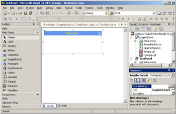
Figure 21-1: The GraphicPanel control in action in a sample project.
The control has a template property named ItemTemplate, which defines the contents of the panel. This content can be generated in various ways. The user can just specify controls declaratively or provide a data source. If a data source is provided, the control can arrange for a couple of specialized views such as a bullet list or a list of hyperlinks. The following listing shows the constructor and the properties of the control. The output for the control is generated within the Render method.
public class GraphicPanel : WebControl
{
 public GraphicPanel() : base()
 {
 BackColor = Color.SkyBlue;
 ForeColor = Color.Black;
 Font.Name = "verdana";
 Font.Size = FontUnit.Point(8);
 PanelStyle = GraphicPanelStyle.FreeForm;
 ItemTemplate = null;
 }

 public GraphicPanelStyle PanelStyle
 {
 get {return (GraphicPanelStyle) ViewState["PanelStyle"];}
 set {ViewState["PanelStyle"] = value;}
 }

 public string HeaderText
 {
 get {return Convert.ToString(ViewState["HeaderText"]);}
 set {ViewState["HeaderText"] = value;}
 }

 public ITemplate ItemTemplate
 {
 get {return __itemTemplate;}
 set {__itemTemplate = value;}
 }


}
The PanelStyle property contains values taken from the following enumeration:
public enum GraphicPanelStyle : int
{
 FreeForm = 0,
 HyperLinkList = 1,
 BulletList = 2
}
By default, all properties are browsable and the control provides minimal support for design-time use. If you select the control in Visual Studio .NET, you'll be able to see all properties in the Properties window and set values declaratively.
When you drop a custom control onto a Web Form, the designer generates some markup code. In particular, it first registers the control by using the @Register directive and next adds a tag to the .aspx source file. The new tag must have a tag prefix and a tag name. By default, the name of the control class is used to name the tag and cc1 is used as the prefix.
<%@ Register TagPrefix="cc1"
 Namespace="ProAspNet.CS.Ch21"
 Assembly="GraphicPanel" %>
The name and prefix can certainly be changed manually; however, some design-time attributes let you configure what names should be used for a given control. In particular, the ToolboxData attribute on the class declaration sets the tag name and any default setting you might want to indicate.
[ToolboxData("<{0}:GraphicPanel runat=server>")]
public class GraphicPanel : WebControl
{

}
When a control is added to the toolbox, it's given the default icon. However, the control can provide a custom icon by following some simple steps. The control project must include a bitmap file with the same name as the control class—say, GraphicPanel.bmp. The bitmap file must have a 16-by-16 size, and the 0-by-0 pixel (lower-left corner) determines its transparent color. This bitmap file must be embedded as a resource in the project. This can be achieved by selecting the bitmap item in the Solution Explorer and setting the Build Action property to Embedded Resource, as shown in Figure 21-2.
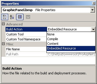
Figure 21-2: Setting the Build Action property to embed a bitmap into an assembly.
To get the custom icon to display, you might also have to specify the namespace to locate the bitmap. You can specify namespace a couple of ways. You can set the default namespace in the project properties or you can name the bitmap using the namespace (for example, ProAspNet.CS.Ch21.GraphicPanel.bmp).
Design Time Attributes
Generally speaking, metadata attributes are additional descriptive elements that modify the run-time behavior of types and members. In particular, though, the information contained in certain metadata attributes is also queried by design-time tools such as Visual Studio .NET. Metadata attributes are used to drive the representation and programmability of controls when sited in visual designers.
By convention, the name of a class that represents an attribute ends with the word Attribute, such as BrowsableAttribute and DefaultValueAttribute. When declaring an attribute in the control's source code, the suffix Attribute is normally omitted.
As we talk about attributes for controls, we should distinguish between design-time and run-time attributes. Both types of attributes can be applied to ASP.NET server controls—and should be used in real-world scenarios—but with different goals and outcomes. Run-time attributes affect the way in which the control works within the ASP.NET environment and, in particular, can modify the request/ response cycle. Design-time attributes have no impact on the run-time behavior of the control but simplify the control configuration in Visual Studio .NET.
Using Design Time Attributes
Table 21-3 details the design-time attributes for a control. In most cases, attributes can be assigned to properties, events, or both. Some attributes, though, are specific to the control class.
|
Attribute |
Description |
|---|---|
|
Bindable |
Indicates whether a property can be bound to data. |
|
Browsable |
Indicates whether a property or an event should be displayed in the Properties window. |
|
Category |
Provides the name of the category in which a property or an event belongs. This allows for logical grouping of properties and events. |
|
DefaultEvent |
Indicates the default event for the control. This is the event that is handled when users double-click the control in the designer. |
|
DefaultProperty |
Indicates the default property for the control. The default property is selected in the Properties window when users click the control in the designer. |
|
DefaultValue |
Used to provide a default value for a control property. If the property doesn't have a simple type, a type converter is needed. |
|
Description |
Provides a description of a property or an event. The text is displayed at the bottom of the Properties window when the user selects a property or event. |
|
Editor |
Specifies the editor to use for modifying a property in a visual designer. |
|
Localizable |
Indicates that a property can be localized. Any properties that have this attribute are automatically persisted into the resources file when a user chooses to localize a form. |
|
TypeConverter |
Indicates the type converter class to use to convert the type of the property to text. |
The Bindable attribute tells the designer whether or not the property can be bound to data. Note that the attribute, which takes a Boolean value, doesn't really control the data-binding capabilities of the property but simply marks it for display in the DataBindings dialog box. Properties with the Bindable attribute set to false can still be associated with data sources programmatically using data-bound expressions.
A Commonly Used Set of Attributes
The DefaultProperty and DefaultEvent attributes apply to the control class rather than an individual property or event. The default property attribute, in particular, refers to the property that gets selected in the Properties window when the user clicks to select the control in the design surface. Likewise, the default event attribute indicates the event that is handled when users double-click the control in the designer, as shown in Figure 21-3.
Figure 21-3: When users double-click the control in the designer, a handler for the default event is created.
 [
DefaultProperty("HeaderText"),
DefaultEvent("PanelCreated"),
ToolboxData("<{0}:GraphicPanel runat=server>")
]
public class MyPanel : WebControl
{

}
As mentioned earlier, all properties are browsable until you explicitly disable the feature by setting the Browsable attribute to false. Unless you have good reasons not to permit design-time editing of a property, you shouldn't touch the Browsable attribute. You might want to set it to false for read-only properties, however.
[Browsable(false)]
public int Count
{
 get {return _count;}
}
Category and Description are other attributes you normally set for each property or event. The Category attribute indicates the category to which the property logically belongs; the Description attribute provides short descriptive text to display at the bottom of the Properties window. The category information is used only if the user selects Categorized View in the Properties window (shown in Figure 21-4). Default categories are Appearance, Behavior, Data, Layout, and Misc. If you indicate a different name, a new category is created. By default, custom properties go under the Misc category.
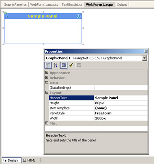
Figure 21-4: Categorized view of the Properties window in which the HeaderText property displays its own description under the Layout category.
 [
 Bindable(true)
 Browsable(true),
Category("Layout"),
Description("Gets and sets the title of the panel"),
]
public string HeaderText {

}
Enumeration and Color Types
In addition to primitive types and strings, the design-time environment provides special support also for a few extra types—colors and enumerations. A property of type Color automatically supports using a color palette. (See Figure 21-5.)
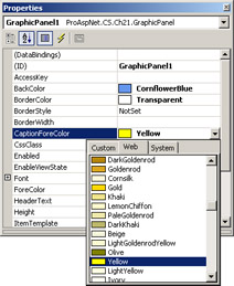
Figure 21-5: Properties of type Color can be edited using a color palette window.
Likewise, properties whose type is an enumeration can be edited using a drop-down list with all possible enumeration values. To achieve this capability, you don't have to make any extra effort. Everything is built into the visual designer. Figure 21-6 shows how to edit the PanelStyle enumeration property of the GraphicPanel control.
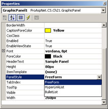
Figure 21-6: The values for the PanelStyle enumeration property are available in a drop-down list.
Attributes that Affect Run-Time Behavior
When developing a server control, you normally use attributes to indicate design-time functionality. However, there are a few attributes that, although used with design-time attributes, affect the run-time behavior of the control. These attributes instruct the page parser how to proceed during the examination of the .aspx source code. These attributes are listed in the Table 21-4.
|
Attribute |
Description |
|---|---|
|
ControlBuilder |
Indicates the control builder class for a given control. We demonstrated a custom control builder class in Chapter 20, "Data-Bound and Templated Controls." |
|
ParseChildren |
Tells the ASP.NET runtime how to parse the nested content of a control. The attributes takes a Boolean value that indicates whether the nested content should be parsed as properties or child controls. |
|
TemplateContainer |
Indicates the container class that wraps a given template. (See Chapter 20.) |
Extending IntelliSense Support
Once the control has been dropped on a Web Form and configured via the Properties window, you can write some code that handles events or calls into its methods. In doing so, you take full advantage of IntelliSense and are shown handy lists of methods, events, and values whenever you're completing a statement. However, it often passes unnoticed that you get IntelliSense support only while writing C# or Visual Basic .NET in the code-behind class. What if you want IntelliSense to help also when typing markup text manually in the HTML view of the .aspx page?
The IntelliSense features you enjoy in code-behind mode are rooted in the reflection technology and exploit information stored in referenced assemblies. In other words, in code-behind mode the schema information is easily accessible. The same can't be said when you edit the page in HTML view mode. For IntelliSense to provide the same, enormously helpful support you need to bring some schema information in.
Writing the Schema of a Control
If you switch to the HTML view of a Web Forms page, IntelliSense recognizes all ASP.NET standard controls and properly provides attribute lists and auto-completion. The same doesn't happen if custom controls are involved. The problem lies in the fact that in HTML edit mode, the IntelliSense engine has no way to access the run-time code of the control and reflect its programming interface. To add IntelliSense support to the HTML view of the visual designer, you need to provide the schema of the control—an XSD file.
This XSD file must define the markup interface of the control and specify how many attributes it supports, their name and type, child elements, events, and enumerations. The following listing shows a sample XSD file for the GraphicPanel:
targetNamespace='http://schemas.microsoft.com/proaspnet'
 elementFormDefault='qualified'
 xmlns:xsd='http://www.w3.org/2001/XMLSchema'
 xmlns:vs='http://schemas.microsoft.com/Visual-Studio-Intellisense'
xmlns='http://schemas.microsoft.com/proaspnet'
vs:defaultnsprefix='expo'
 vs:ishtmlschema='false'
 vs:iscasesensitive='false'
 vs:friendlyname='Graphic Panel Control'
 vs:requireattributequotes='true'>

 GraphicPanel Control
The schema file contains three pieces of information that need further explanation. First, the schema file targets a namespace and a default prefix. In this case, we used http://schemas.microsoft.com/proaspnet and expo as the prefix. This information is important because it represents the link between this file and any page within Visual Studio .NET.
The attribute groups named WebControlAttributes and ControlAttributes are standard blocks that represent the schema of the WebControl and Control classes. They define the schema of the properties the GraphicPanel control inherits from the base classes.
Finally, the third block of code represents the specific properties and child tags of the GraphicPanel control.
Registering a Custom Schema with Visual Studio .NET
The trick to getting IntelliSense support for custom controls is making the just-created XSD file visible to Visual Studio .NET. This operation requires two steps. First, you copy the XSD file in the root of the Web application; next, you link the target namespace of the schema to the ASP.NET page.
The following line binds the namespace of the XSD file to the page. The prefix of the control's tag must match the prefix of the namespace.
Figure 21-7 shows the list of properties and events you can set as attributes in the markup code of a GraphicPanel control.
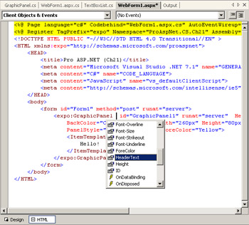
Figure 21-7: Attributes of the GraphicPanel control available through IntelliSense.
Also the child tags of the GraphicPanel control are available through IntelliSense. As Figure 21-8 demonstrates, the XSD schema informs IntelliSense that only ItemTemplate is a valid child tag for the GraphicPanel element.
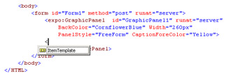
Figure 21-8: Creating the child elements of the GraphicPanel control.
If you omit the namespace declaration or don't create the XSD file for the control, users of your control will experience a warning, as shown in Figure 21-9.
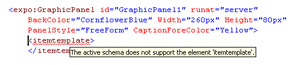
Figure 21-9: Without schema information, Visual Studio .NET doesn't recognize the because it's not part of the default schema.
If you can place the XSD file in the root folder of the Web application, it will affect only that application. Generally, if you want to use that schema for all applications you develop, you can copy it in the following folder under the Visual Studio .NET installation:
C:Program FilesMicrosoft Visual Studio .NET 2003 Common7
 Packagesschemasxml
If you snoop around this folder, you'll find a schema file named asp.xsd. That rather large file contains schema information for all standard ASP.NET controls. If you're going to write an XSD file for a control, you can paste common pieces from there.
Rendering Types
Any information you enter in the Properties window is persisted to disk as attributes of the control. This serialization mechanism works seamlessly as long as strings and primitive types are involved. However, not all information persisted in a block of markup code is really a string. Let's consider the Width property of a control.
The value of the width attribute looks definitely like a string—200px—but the type of the underlying control property—the Width property—is not String. The Width property, in fact, is declared of type Unit. So what happens to make the string 200px understandable by the control?
The page parser makes use of special modules—known as type converters—to convert to and from other types into a given type. In this case, the UnitConverter class transforms strings into Unit values and serializes Unit values into a string.
Implementing a Type Converter
To write a type converter, you derive a class from TypeConverter and override a few methods. Let's see how it works for a property named Caption and implemented through the PanelCaption class. The Caption property groups some attributes that relate to the title bar of the panel.
public class PanelCaption {
 private string _text;
 private Color _backColor;
 private Color _foreColor;
 private int _cellSpacing;
 private int _cellPadding;

 public PanelCaption() {
 Text = "Panel";
 BackColor = Color.DodgerBlue;
 ForeColor = Color.Yellow;
 CellPadding = 1;
 CellSpacing = 0;
 }

 [Description("Title of the caption")]
 public string Text {
 get {return _text;}
 set {_text = value;}
 }

 [Description("Background color of the caption")]
 public Color BackColor {
 get {return _backColor;}
 set {_backColor = value;}
 }

 [Description("Foreground color of the caption")]
 public Color ForeColor {
 get {return _foreColor;}
 set {_foreColor = value;}
 }

 [Description("Pixels used to space the caption")]
 public int CellSpacing {
 get {return _cellSpacing;}
 set {_cellSpacing = value;}
 }

 [Description("Pixels used to pad the caption")]
 public int CellPadding {
 get {return _cellPadding;}
 set {_cellPadding = value;}
 }
}
As you can see, these properties are not persisted to the view state. Because these attributes are created to be set at design-time, you will reasonably give them default values and change these values programmatically. So, in this context, not using the view state just represents a form of optimization.
Deriving from TypeConverter
A type converter needs to override a few members of its base class. In particular, the converter must declare whether the conversion is permitted to and from a given type (for example, string). The members you override for this goal are CanConvertTo and CanConvertFrom. They simply check the destination and the source type with the list of types the converter supports. The list of supported types includes at least the type string.
Other members to override are ConvertFrom and ConvertTo. As the names suggest, the methods perform the actual transformation from PanelCaption to string and vice versa. Typically, the serialization process consists of creating a comma-separated string in which the value of each property is rendered as a string. The way in which each property is serialized is completely up to the programmer.
The following listing shows the full implementation of the type converter:
public class PanelCaptionConverter : TypeConverter
{
 public PanelCaptionConverter()
 {
 }

 public override bool CanConvertFrom(ITypeDescriptorContext
 context, Type sourceType)
 {
 if (sourceType == typeof(string))
 return true;

 return base.CanConvertFrom (context, sourceType);
 }

 public override bool CanConvertTo(ITypeDescriptorContext context,
 Type destinationType)
 {

 if (destinationType == typeof(string))
 return true;

 return base.CanConvertTo (context, destinationType);
 }

 public override object ConvertFrom(ITypeDescriptorContext context,
 CultureInfo culture, object value)
 {
 if (value == null)
 return new PanelCaption();

 // Deserialize from a string representation
 if (value is string)
 {
 // Get the source string
 string data = (string) value;

 if (data.Length == 0)
 return new PanelCaption();


 // Split the string into parts
 // (must be 5 parts--one per each property)
 string[] parts;
 parts = data.Split(culture.TextInfo.ListSeparator[0]);
 if (parts.Length != 5)
 throw new ArgumentException("Invalid object", "value");

 // Create a new PanelCaption object
 PanelCaption caption = new PanelCaption();

 // Part 0 is a string representing the Text property
 caption.Text = parts[0];

 // Part 1-2 represent the BackColor and ForeColor properties
 TypeConverter colorConv;
 colorConv = TypeDescriptor.GetConverter(typeof(Color));
 Color c = (Color) colorConv.ConvertFromString(context,
 culture, parts[1]);
 caption.BackColor = c;
 c = (Color) colorConv.ConvertFromString(context,
 culture, parts[2]);
 caption.ForeColor = c;

 // Part 3-4 represent CellPadding and CellSpacing properties
 TypeConverter intConv;
 IntConv = TypeDescriptor.GetConverter(typeof(int));
 int pixel = (int) intConv.ConvertFromString(context,
 culture, parts[3]);
 caption.CellSpacing = pixel;
 pixel = (int) intConv.ConvertFromString(context,
 culture, parts[4]);
 caption.CellPadding = pixel;

 return caption;
 }

 return base.ConvertFrom (context, culture, value);
 }

 public override object ConvertTo(ITypeDescriptorContext context,
 CultureInfo culture, object value, Type destinationType)
 {
 // Ensure the value is a PanelCaption object
 if (value != null) {
 if (!(value is PanelCaption))
 throw new ArgumentException("Invalid object", "value");
 }

 // If null, return the empty string
 if (destinationType == typeof(string))
 {
 if (value == null)
 return String.Empty;

 // Get the object to serialize and necessary converters
 PanelCaption caption = (PanelCaption) value;
 TypeConverter intConv;
 intConv = TypeDescriptor.GetConverter(typeof(int));
 TypeConverter colorConv;
 colorConv = TypeDescriptor.GetConverter(typeof(Color));

 // Create the string
 string[] parts = new string[5];
 parts[0] = caption.Text;
 parts[1] = caption.BackColor.ToArgb().ToString();
 parts[2] = caption.ForeColor.ToArgb().ToString();
 parts[3] = caption.CellSpacing.ToString();
 parts[4] = caption.CellPadding.ToString();
 return String.Join(culture.TextInfo.ListSeparator, parts);
 }

 return base.ConvertTo (context, culture, value, destinationType);
 }
}
The converter is not effective until you associate it with the PanelCaption class.
[TypeConverter(typeof(PanelCaptionConverter))]
public class PanelCaption
{

}
The Properties window now displays an entry for the Caption property. The value of the property is a list of strings, as shown in the following code. The colors, in particular, are rendered with an integer that indicates the RGB representation of the color.
// colors are CadetBlue and AliceBlue
Sample Panel,-10510688,-984833,0,3
To edit properties, you must type the new value directly in the text box. Admittedly, this is not very practical and indeed a more user-friendly solution exists. However, before we discuss a better solution, let's examine how the values of the convertible properties are serialized. You control the serialization and deserialization of properties by using metadata and a bunch of new attributes.
Serialization Attributes
The attributes in Table 21-5 tell the designer how to serialize the control and its properties. The serialization process is important because it governs the creation of the HTML code for the control.
|
Attribute |
Description |
|---|---|
|
DesignerSerializationVisibility |
Specifies whether (and how) a property displayed in the Properties window should be persisted into code. |
|
NotifyParentProperty |
Specifies whether or not changes to subproperties should be bubbled up to the parent property. This attribute is used when the converted property is derived from ExpandableObjectConverter. (We'll discuss ExpandableObjectConverter later in the "Deriving from ExpandableObjectConverter" section.) |
|
PersistChildrenAttribute |
Indicates whether the nested contents of a control should be interpreted as properties or child controls. |
|
PersistenceMode |
Specifies whether a property should be persisted as an attribute on the control's tag or as nested content. |
The DesignerSerializationVisibility attribute can take any of the values listed in Table 21-6:
|
Value |
Description |
|---|---|
|
Content |
This option causes the contents of the property (for example, Caption) to be serialized as a whole. All subproperties will be serialized using an ad hoc naming convention. The subproperties of a property are the child members of a complex type. For example, Text and BackColor are subproperties of the property Caption. For the Text subproperty, an attribute named Caption-Text will be created. |
|
Hidden |
This option hides the property from serialization. The property will simply not be persisted in the markup code of the control. |
|
Visible |
Default value, causes the top-level property to be serialized. When this option is set, the Caption property will be serialized as a comma-separated list of child values. All subproperties will not be saved individually but within a unique, all-encompassing attribute named Caption. |
The PersistChildren attribute is set to false for a control derived from WebControl and to true if the control inherits from Control. When set to false, the nested contents of a control are handled as properties. Each child tag is mapped to a property with the same name as the tag. For example, a child tag named must have a corresponding ItemTemplate property. If this automatic mapping is disabled—that is, if PersistChildren is true—the child tag is considered an HTML element and a custom builder is required to properly handle its content. We examined this case in Chapter 20.
The PersistenceMode attribute indicates how to persist the content of a property. You can decide whether you want a given property to be serialized as a tag level attribute or as a child tag. Acceptable values for the attribute are listed in Table 21-7.
|
Value |
Description |
|---|---|
|
Attribute |
The property is persisted as a tag's attribute. This is the default option. |
|
EncodedInnerDefaultProperty |
The property is persisted as the only content of the tag. The content is HTML encoded. |
|
InnerDefaultProperty |
The property is persisted as the only content of the tag. The content is not encoded. |
|
InnerProperty |
The property is persisted as a child tag along with any other properties of the control. |
If your control has template properties, you should change the default value of the PersistenceMode attribute to prevent the designer from wiping out any nested contents whenever a property in the Properties window is saved.
[
 TemplateContainer(typeof(ItemTemplateContainer)),
 Description("Defines the contents of the panel"),
 DefaultValue(null),
PersistenceMode(PersistenceMode.InnerProperty),
 Category("Layout")
]
public ITemplate ItemTemplate {
 get {return __itemTemplate;}
 set {__itemTemplate = value;}
}
The preceding code indicates that the ItemTemplate property must be saved as a nested tag with all the other properties of the control.
Deriving from ExpandableObjectConverter
In Figure 21-10, you see the Caption property selected in the Properties. Like Caption, the Font property—defined on the WebControl class—is also an expression of a complex type. The type in question is FontInfo. The representation of the type in the Properties window is different, however.
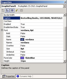
Figure 21-10: The Caption and Font properties in the Properties window.
The Font property is expandable and exposes all its subproperties as individual properties in the same window. How can we obtain the same behavior for a custom property? The type converter for the property must inherit from a more specialized base class. The new base class is ExpandableObjectConverter.
The ExpandableObjectConverter class inherits from TypeConverter and provides a couple of additional overrides—GetProperties and GetPropertiesSupported. By simply replacing the base class, the type converter code shown previously in the "Deriving from TypeConverter" section provides a behavior identical to that of the Font property. This is demonstrated in Figure 21-11.
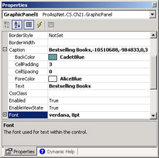
Figure 21-11: The Caption property just made expandable.
Each property in the expandable class should also be marked with the NotifyParentProperty attribute to notify the parent property (for example, Caption) of any changes. The following code snippet illustrates the metadata for the Text subproperty:
[NotifyParentProperty(true), Description("Title of the caption")]
public string Text {
 get {return _text;}
 set {_text = value;}
}
Creating a Type Editor
The Properties window doesn't provide much flexibility for editing values. If a text box is not ideal for editing the value of your properties, you can create a made-to-measure editor and link it to the designer. The base class for type editors is UITypeEditor. You define a custom type editor class and use metadata attributes to inform the designer that a given property must be edited through the specified form. A type editor is a Windows Forms dialog box managed through an interface. The dialog box supplies controls and facilities to make data editing as seamless as possible, and it fills a buffer with the string value for the Properties window.
Let's examine a simple case—an About dialog box.
The About Property Editor
To start, you define a read-only property named About. The following code shows how to proceed:
[Editor(typeof(AboutEditor), typeof(UITypeEditor)), Category("About")]
public string About {
 get {return "Courtesy of Programming ASP.NET";}
}
The Editor attribute indicates the dialog box to use to edit the value of the specified property. In this case, we're going to use the AboutEditor class. The second argument to the attribute is the type of the base class for the editor. The .NET Framework defines several editor classes from which you can choose the predefined one that already provides the features you're looking for.
The UITypeEditor class is a base class that can be extended to provide custom editing capabilities for a particular property. Other built-in editors exist for collections, URLs, colors, and dates, just to name a few.
When a property is marked with the Editor attribute, the designer shows an ellipsis button close to the default text box (shown in Figure 21-12). By clicking that button, the user-defined dialog box shows up and the user can edit the value using a more comfortable user interface. The About property is a particularly simple case in that it doesn't need real editing. However, the infrastructure you have to set up for this custom editor is in no way different than that of a more realistic scenario.
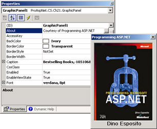
Figure 21-12: The About property and the ellipsis button that brings up the custom editor.
Designing a Custom Type Editor
To create a custom type editor, you start by deriving a new class from UITypeEditor or from any other type editor. Next, you add a form class to the project and define the user interface of the dialog box. In doing so, you'll probably need to import one or more namespaces that relate to Windows Forms. For example, you'll certainly reference the following namespace:
using System.Windows.Forms.Design;
Referencing Windows Forms classes, even from within an ASP.NET Web control project, is necessary to extend the user interface of the visual designer. A type editor class will at least override the GetEditStyle and EditValue methods. The GetEditStyle method indicates the style of the editing required. Acceptable values are DropDown and Modal. The EditValue method takes care of displaying the dialog box and retrieves the value to pass on to the Properties window. The following listing details the code for the AboutEditor class:
public class AboutEditor : UITypeEditor
{
 public override UITypeEditorEditStyle GetEditStyle(
 ITypeDescriptorContext context)
 {
 return UITypeEditorEditStyle.Modal;
 }

 public override object EditValue(ITypeDescriptorContext context,
 IServiceProvider provider, object value)
 {
 // Show the custom dialog box
 About dlg = new About();
 dlg.ShowDialog();

// Set the value to return to the Properties window
value = "Courtesy of 'Programming ASP.NET'";

return value;
 }
}
If the GetEditStyle method returns the UITypeEditorEditStyle.DropDown value, the designer gets ready to display the specified control just below the property text box. If the modal style is set, the designer expects to have a modal dialog box to display. The EditValue method is called to enable editing. In the preceding code, a new dialog window is created and displayed. When the window is dismissed, you can use global fields on the dialog class to retrieve user information and store that to an internal variable. The value returned from the EditValue method is assigned to the property.
If you opt for a drop-down user interface, you must use the methods of the IWindowsFormsEditorService interface to display a custom control in the Properties window. In this case, a down-arrow button is displayed instead of an ellipsis.
public override object EditValue(ITypeDescriptorContext context,
 IServiceProvider provider, object value)
{
 object o = provider.GetService(typeof(IWindowsFormsEditorService));
 IWindowsFormsEditorService srv = (IWindowsFormsEditorService) o;
 if (srv != null) {
// Display a custom control and retrieve the value
MyControl myCtl = new MyControl(value);
srv.DropDownControl(myCtl);
 }
}
You can also implement an owner-drawn mechanism by overriding the GetPaintValueSupported and PaintValue methods. The GetPaintValueSupported method just returns a Boolean value; the PaintValue method is passed a rectangle that represents the area of the Properties window where a representation of the value is to be drawn. The PaintValue method also receives a Graphics object and can use all the power of GDI+ to create owner-drawn output.
Writing Custom Designers
The appearance of the control in the visual environment is decided by the control's designer. Every control in ASP.NET has its own designer that provides a sort of preview of the control hosted in the page. The base class for a Web control designer is ControlDesigner and is located in the System.Web.UI.Design namespace. The class defines a common behavior for designers and supplies methods that the design-time environment can call for a variety of purposes. ControlDesigner is the first concrete class in the hierarchy that you can use in your code. All designers for ASP.NET controls actually inherit from an abstract class named HtmlControlDesigner, which marks the difference between Web and Windows control designers.
HTML Control Designers
When hosted in a visual environment, a Web server control is not very interactive, does not fire postback events, and is limited to generating HTML output. If you want the control to provide a truly what-you-see-is-what-you-get (WYSIWYG) view, you should implement the rendering engine of the control directly in the Render method. Only this method, in fact, is called from within the visual designer to obtain the HTML of the control. If you create a hierarchy of child controls overriding the CreateChildControls method, the control will work great at run time but not at design time. In the designer, the sequence of calls is different and, in the end, a control structured in this way returns an empty HTML string to the designer.
| Note |
You can detect whether a component is running in design mode by using the DesignMode property on the ISite interface.
if(this.Site.DesignMode) {
 // design mode
}
You should note that a component's site is not available at run time; therefore, the Site property always returns null. |
To control the appearance of the control in the visual designer, you can override a few methods, such as GetDesignTimeHtml. Writing a custom designer for a control is the most effective and efficient way to provide special design-time features without affecting the run-time behavior. As mentioned earlier, in the .NET Framework, design-time and run-time functions are neatly separated and implemented in separate classes. Because design-time classes are never invoked at run time, you should insulate all functions that relate to the composition of the Web Forms.
Creating a Control Designer
A typical control designer derives from ControlDesigner and overrides a few methods to control the HTML code displayed in the designer.
- GetDesignTimeHtml This method returns the HTML markup code that is used to represent the control at design time. By default, the method returns the output generated by the Render method. By overriding this method, you can enhance that string or even provide a fixed representation for the control.
- GetEmptyDesignTimeHtml This protected overridable method gets the HTML markup code that is used to represent an empty control at design time. The base implementation of this method returns a string that contains the name of the control class and the ID.
- GetErrorDesignTimeHtml This protected overridable method provides the HTML markup code that is displayed when a design-time error occurs in the control. The returned text typically provides information about the specific exception.
Other methods you can override or use in a custom control designer class are AllowResize and CreatePlaceHolderDesignTimeHtml. The AllowResize method returns a Boolean value that informs the designer about the availability of the control to be resized. Normally, there's no reason not to make a control resizable. However, in some situations you might decide for a fixed size—for example, when a templated control has an empty template.
The CreatePlaceHolderDesignTimeHtml method takes a message string and returns a block of HTML text with a look and feel consistent with that of standard ASP.NET controls. For example, you can use the method to provide an error message, as shown in the following code snippet (and in Figure 21-13):
protected override string GetErrorDesignTimeHtml(Exception e)
{
 return CreatePlaceHolderDesignTimeHtml("There was an error");
}
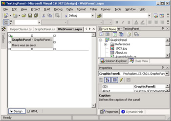
Figure 21-13: A design-time error message for a control.
If you don't like the standard user interface or you just want to customize it further, you can simply return ad hoc HTML code, as discussed in the following example.
Generating Design-Time HTML
The following listing shows a sample implementation of a designer for the GraphicPanel control. The class overrides three methods—GetDesignTimeHtml, GetEmptyDesignTimeHtml, and GetErrorDesignTimeHtml. The GetDesignTimeHtml method takes the output of the control and inserts it in a table along with a copyright note. The same extra table with copyright information is maintained for error messages and for the standard, empty user interface.
public class GraphicPanelDesigner : ControlDesigner {
 public override string GetDesignTimeHtml() {
 string designTimeHtml = null;

 try {
 StringBuilder sb = new StringBuilder("");
 sb.Append("
| "); // The default design-time HTML code sb.Append(base.GetDesignTimeHtml()); sb.Append(" |
| "); sb.Append(""); sb.Append("Switch to HTML view to edit the template. "); sb.Append("Courtesy of Programming ASP.NET"); sb.Append(" |
"); designTimeHtml = sb.ToString(); } catch (Exception ex) { designTimeHtml = GetErrorDesignTimeHtml(ex); } if (designTimeHtml == null || designTimeHtml.Length==0) designTimeHtml = GetEmptyDesignTimeHtml(); return designTimeHtml; } protected override string GetEmptyDesignTimeHtml() { StringBuilder sb = new StringBuilder(""); sb.Append("
| "); sb.Append("This is a GraphicPanel control"); sb.Append(" |
| "); sb.Append(""); sb.Append("Courtesy of Programming ASP.NET"); sb.Append(" |
"); return sb.ToString(); } protected override string GetErrorDesignTimeHtml(Exception e) { StringBuilder sb = new StringBuilder(""); sb.Append("
| "); sb.Append("This is a GraphicPanel control"); sb.Append(" |
| "); sb.Append(""); sb.Append(e.Message); sb.Append(" |
| "); sb.Append(""); sb.Append("Courtesy of Programming ASP.NET"); sb.Append(" |
"); return sb.ToString(); } }
Figure 12-14 shows the GraphicPanel control in the Visual Studio .NET designer.
Note that the design-time HTML is composed of two parts—the effective output of the control and a part with information and copyright. The information and copyright will not show up at run time.
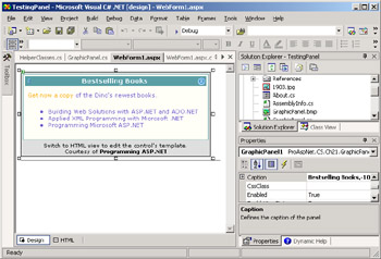
Figure 21-14: The GraphicPanel control in action sited in the Visual Studio .NET environment.
As mentioned, the GetEmptyDesignTimeHtml method is invoked whenever the design-time HTML for the control is empty. Figure 21-15 shows the results in this case.
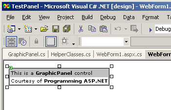
Figure 21-15: The design-time output of the GraphicPanel control displayed in lieu of the empty string.
The GetErrorDesignTimeHtml method is helpful to display friendly messages in case of design-time errors. The designer traps any exceptions and displays messages like the one shown in Figure 21-16.
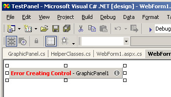
Figure 21-16: The standard error message displayed by the designer.
By overriding the GetErrorDesignTimeHtml method, you can format the HTML to look different and provide more information, as shown in Figure 21-17.
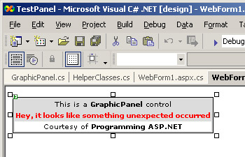
Figure 21-17: A customized error message displayed by the custom designer of the GraphicPanel control.
You associate a custom designer with a control using the Designer attribute, as shown in the following code snippet:
[Designer(typeof(GraphicPanelDesigner))]
public class GraphicPanel : WebControl {

}
The designer class will be loaded when the control is dropped onto a Web Form and its methods are called back by the visual designer.
Conclusion
Applications written for the .NET Framework are for the most part component-based applications. ASP.NET applications are no exceptions, and several controls can be found working under the hood of Web pages. If you choose Visual Studio .NET as your development environment, you end up assembling pages by using a visual designer. Controls are picked from a palette and dropped onto a design surface. Once instantiated, controls can be configured declaratively through the Properties window. ASP.NET controls know how to integrate themselves into this environment, but their behavior can be further enhanced by resorting to a number of extensions.
In this chapter, we discussed three ways to improve the design-time capabilities of ASP.NET controls. You can assign a few metadata attributes to each property so that the property displays with an ad hoc description and in the most appropriate category. Setting attributes works great if the property value is of a simple type, such as string, integer, or enumeration types.
Properties with custom types need more work and possibly a type converter. A type converter is a sort of special serializer that renders the state of a class as a string. Normally, a type converter returns a comma-separated string in which each token is the value of a public property. A property associated with a converter can be rendered as an expandable object in the Properties window. To achieve that, you simply need to inherit the custom type converter from a more specialized class such as ExpandableObjectConverter.
In all these cases, though, the user interface employed for editing properties consists of a simple text box control. If a plain text box is inadequate for your values, you can create a type or even a component editor. Editors are Windows Forms classes that are bound to the Properties window and shown when the user chooses to edit the value. A type editor class edits a particular property, whereas a component editor looks like a property page for the control and provides a single user interface to edit all properties in a more convenient way.
Finally, to control the aspect of the component in the designer, you can create a made-to-measure designer class. A designer class consists of a few overrides aimed at controlling the HTML text being displayed in the environment for the control. By default, the design-time aspect of the control is nearly identical to its run-time look. However, there might be situations in which you want the control to provide a different output that is not a function of the current properties. In these cases, using a custom designer can do the trick.
Resources
- Developing Microsoft ASP.NET Server Controls and Components, by Nikhil Kothari and Vandana Datye (Microsoft Press, 2002)
Part I - Building an ASP.NET Page
Part II - Adding Data in an ASP.NET Site
- The ADO.NET Object Model
- Creating Bindable Grids of Data
- Paging Through Data Sources
- Real-World Data Access
Part III - ASP.NET Controls
Part IV - ASP.NET Application Essentials
- Configuration and Deployment
- The HTTP Request Context
- ASP.NET State Management
- ASP.NET Security
- Working with the File System
- Working with Web Services
Part V - Custom ASP.NET Controls
- Extending Existing ASP.NET Controls
- Creating New ASP.NET Controls
- Data-Bound and Templated Controls
- Design-Time Support for Custom Controls
Part VI - Advanced Topics
Index
EAN: 2147483647
Pages: 209
