Extending Existing ASP.NET Controls
Overview
Nothing in all the world is more dangerous than sincere ignorance and conscientious stupidity.
-Martin Luther King
ASP.NET custom controls are compiled, server-side components that encapsulate user-interface and other functionality into reusable packages. Custom controls are no different than standard ASP.NET server controls except that they are bound to a different tag prefix and must be registered and deployed explicitly. Aside from that, custom controls can have their own object model, fire events, and support all the design-time features of Microsoft Visual Studio .NET, such as the Properties window, the visual designer, property builders, and the Toolbox.
Custom controls are not to be confused with Web user controls that we covered in Chapter 10. Web user controls are dynamic-compile components and cannot be added to the Toolbox. For the same reason, their design-time support is limited and so is their visual feedback when added to a page, where user controls simply display with a placeholder glyph. In addition, user controls, even if precompiled, cannot be separate from the .ascx source file that contains the layout. As a result, the only way to share the user control between applications is to put a separate copy in each application, which makes maintenance and deployment a little harder.
ASP.NET custom controls are compiled code. However, once you have compiled the control, you can add it to the Toolbox and take advantage of the rich visual environment of Visual Studio .NET. Because of their compiled nature, custom controls can be installed in a single copy in the global assembly cache (GAC) and be available to all applications, or deployed to the Bin directory for a single application.
There are basically two ways of creating custom controls. If you find that an existing control meets your requirements only partially and lacks some key features, the simplest thing you can do is extend the control by deriving a new class from it. You can override specific properties, methods, and events as well as add new features. This is the approach we'll examine in this chapter. Another derived approach that we'll extensively examine in the next chapter entails the creation of composite controls. A composite control is a new control created by combining other existing controls.
If none of the existing Web server controls meet your requirements, consider creating a custom control from scratch by deriving from one of the base control classes—Control and WebControl. These classes provide all the basic functionality of ASP.NET server controls, so you can focus on just programming the extended features. Note that ASP.NET controls are limited in their overall functionality by the target markup language. For Web pages, the HTML language and HTML object model of the browser delimit the upper bound of implementable functionality. When you need a certain functionality that no existing control provides, you should first ask whether that functionality can be obtained from an HTML environment at all and what support it expects from the browser. For example, there's no standard ASP.NET control that provides a drop-down menu la Windows Forms; however, while this feature can be implemented—and, indeed, several third-party vendors do it—it requires a rich Dynamic HTML (DHTML) object model on the client.
In this chapter, we'll dig around techniques that extend the standard features provided by existing controls. In the next chapter, we'll discuss how to create a new control from the ground up. The first control candidate to receive some sort of "genetic" manipulation is the simplest of all—the Label control.
A Better Label Control
The ASP.NET Label control provides a way to display text programmatically in a Web Forms page. The use of this control is a bit controversial in the sense that, if overused, it can slightly slow down the performance of the application. You should note that you don't always need a server control to display text. Static text within a server page, in fact, can be presented using plain HTML, resulting in more lightweight code. Also using Response.Write can be a more effective way of outputting dynamically generated text. Compared to Response.Write, a Label control provides a great deal of flexibility, more functionality, and encapsulation that makes it preferable in the majority of cases.
The main characteristic of the Label control—which also should be used to determine whether or not it is needed—is that it provides the ability of formatting and displaying text dynamically. The control displays HTML text, meaning that any HTML tag you put in the text is recognized and properly handled. The downside of this is that you are responsible for embedding any formatting tags you might need. This can quickly become quite boring, especially if you want to add hyperlinks. Once you've finished the job, wouldn't it be best if you could use it over and over again? I'm sure I know your answer.
The LinkLabel Server Control
The Windows Forms namespace defines a rather interesting control named the LinkLabel. It's similar to a Label control except that it can display multiple hyperlinks. The control works by letting you indicate one or more substrings in the bound text that must be rendered as hyperlinks. The control takes care of associating those substrings with URLs and fires an event each time the user clicks on one. Each hyperlink can perform a different task within an application. In Web Forms, it would be even easier to code and still just as helpful to developers.
We'll build the ASP.NET LinkLabel control, deriving it from Label and overriding its Text property to accommodate hyperlinks. In particular, whenever the Text property is assigned, we'll look into the specified value and search for URL-sensitive substrings to wrap in anchor tags. In doing so, we'll use regular expressions to do pattern matching.
Setting Up the New LinkLabel Class
As mentioned, the LinkLabel derives from Label and overrides the Text property. In particular, we want hyperlinking features be totally transparent to users. Users should be able to get and set the text as usual; therefore, rich text will be cached internally into a new protected field and used only at rendering time. To accomplish this, we need to override the Text property to generate the rich text whenever the text of the label is assigned. Furthermore, the RenderControl protected method, responsible for rendering the output of the control, must be overridden so that it can actually write the rich text. Finally, like icing on the cake, we could also expose a new property to let interested users know about the rich text being used.
The following listing details the core code of the new LinkLabel control:
namespace ProAspNet.CS.Ch18
{
 public class LinkLabel : Label
 {
 // Overrides the Text property
 public override string Text
 {
 get {
 return base.Text;
 }
 set {
 base.Text = value;
 RichText = ActivateHyperLinks(value);
 }
 }

 // Expose the rich text
 protected string RichText
 {
 get {
 string richText = (string) ViewState["RichText"];
 return (richText!= null ? richText :String.Empty);
 }
 set {
 ViewState["RichText"] = value;
 }
 }

 // Overrides the RenderContents method
 protected override void RenderContents(HtmlTextWriter writer) {
 writer.Write(RichText);
 }
 }
}
The key event in the life of the LinkLabel control is when the inherited Text property is assigned. In general, you can catch this moment for any public property in any public class by overriding the property in a derived class. In the property's set accessor, you use the value keyword to reference the value being assigned and refer to the parent property through the base keyword in C# and the MyBase keyword in Microsoft Visual Basic .NET.
| Note |
An alternative to overriding a property is to choose to replace the property of the base class with a new one that has the same name and type. You would normally do this when you want to restrict or enlarge the visibility of the property—for example, when exposing a read/write property as read-only. To shadow a base property, use the new keyword instead of override. In Visual Basic .NET, you use Shadows instead of Overrides. |
The Text property of the LinkLabel control works like its parent when it is being read. When a client attempts to read the property, the control simply invokes the get accessor of its parent Label class. When a client assigns a new value to the Text property, the first thing the LinkLabel control does is invoke the parent's set accessor. In this way, it ensures that the Text property is managed as usual. In particular, this means the view state is correctly updated to reflect the new value. After that, the LinkLabel control calls an internal method—ActivateHyperLinks—and saves its return value to the new RichText property.
| Caution |
Note that overriding the Text property is not necessarily the most efficient model. If you set the property several times in the same request, you pay the extra cost of a few unnecessary operations. A better model for implementing the LinkLabel control would be calculating the rich text whenever the output is rendered or whenever the RichText property is set. |
The ActivateHyperLinks method takes the value of Text and inserts as many anchor tags as there are URLs in the text. The new richly formatted string is assigned to a protected member named RichText. Because this rich text is just what the control will show, we need to make this piece of state persistent. The view state is the most obvious and effective solution.
protected string RichText
{
 get {
 string buf = (string) ViewState["RichText"];
 return (buf != null ?buf :String.Empty);
 }
 set {
 ViewState["RichText"] = value;
 }
}
In the sample code, we declared the RichText property as protected. However, this is a totally arbitrary choice. Public or private would have worked as well. In general, if you mark a property as protected, you anticipate that developers who extend the class will want to override the particular property. If this is not the case, mark the property as private.
The formatted text is then cached and used when the control is requested to render its output.
How Controls Render Their Output
For Web controls, the entry point in the rendering process is the RenderControl method. The RenderControl method is declared public in the Control class and inherited by all ASP.NET controls. The method outputs the content of the control to a provided HtmlTextWriter object and, if tracing is enabled, stores tracing information about the control.
public void RenderControl(HtmlTextWriter writer);
The ASP.NET rendering mechanism is extremely layered and involves several methods at various levels. Figure 18-1 summarizes the process and the involved methods.
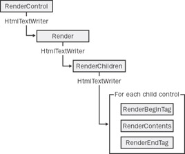
Figure 18-1: Architecture of the rendering mechanism for ASP.NET controls.
The base implementation of the RenderControl method calls a protected overridable method named Render. In the base implementation that provides the Control class, the Render method calls into another protected member named RenderChildren. As the name suggests, RenderChildren loops through the contents of the control's Controls collection and calls the RenderControl method on any child controls.
The WebControl class, which is a first-level child of Control, overrides RenderControl and implements it in three steps that recall the structure of the final HTML output—begin tag, contents, and end tag.
As a result, if you want to modify the output of a control, you should look at RenderContents and override it. If you need to handle the creation of the text for the opening and closing tags, override the RenderBeginTag and RenderEndTag methods. Unlike RenderContents, which is protected, RenderBeginTag and RenderEndTag are declared public (other than overridable). They render the opening and ending tags of the HTML text for the control.
| Note |
RenderBeginTag, RenderContents, and RenderEndTag are not available if you derive your custom control from Control. The methods, in fact, are defined by the WebControl class. |
The LinkLabel control must modify the base rendering mechanism by replacing the text being written—that is, using RichText instead of Text. We don't need to change the way in which the opening and closing tags are rendered, so let's focus on RenderContents.
protected override void RenderContents(HtmlTextWriter writer)
{
 writer.Write(RichText);
}
As you can see, the output generated by a Label control is not particularly complex.
Finding Web-Sensitive Elements
The ActivateHyperLinks function takes the text assigned to the label for display and expands all the fragments that lend themselves to be e-mail addresses or Web sites. The method works by scanning the text and wrapping any Web-sensitive elements within an tag. Regular expressions are used to quickly identify matching elements.
The method defines a couple of pattern strings that describe e-mail addresses and Web sites (URLs). I couldn't swear that all possible e-mail addresses and Web sites are included, but it will certainly work for most cases.
private string ActivateHyperLinks(string theText)
{
 Regex re;
 string buf = theText;

 // Handle email addresses
 string emailPattern = @"[a-zA-Z_0-9.-]+@[a-zA-Z_0-9.-]+.w+";
 re = new Regex(emailPattern);
 if (re.IsMatch(buf))
 buf = re.Replace(buf, new MatchEvaluator(EmailMatchEvaluator));

 // Handle Web sites
 string websitePattern = @"w*[://]*w+.w+.w+[/w+]*[.w+]*";
 re = new Regex(websitePattern);
 if (re.IsMatch(buf))
 buf = re.Replace(buf, new MatchEvaluator(WebSiteMatchEvaluator));

 return buf;
}
Defined in the System.Text.RegularExpressions namespace, the Regex object is an evaluator of regular expressions. You instantiate it by passing the desired pattern string. The IsMatch method indicates whether the regular expression finds a match in the input string. All matching substrings are replaced with the text supplied by the MatchEvaluator delegate.
public delegate string MatchEvaluator(Match match);
The Replace method has several overloads to replace all the substrings in the expression that comply with the pattern. The overload based on a MatchEvaluator delegate is the most flexible of all, as it lets you replace matching text with dynamically generated text. Let's see the source code for the evaluators that replace Web site names and e-mail addresses with related HTML anchors.
private string EmailMatchEvaluator(Match m)
{
 string format = "<a href="mailto:{0}">{0}</a>";
 return String.Format(format, m.Value);
}

private string WebSiteMatchEvaluator(Match m)
{
 string format = "<a href="{0}">{0}</a>";
 return String.Format(format, m.Value);
}
The Match class represents the results from a single regular expression match. Its Value property contains the effective text that matches the pattern. The net effect of the two routines just shown is illustrated by the following example. Suppose that you assign the following text to the LinkLabel control:
Contact Dino at dinoe@wintellect.com.
The e-mail pattern string will isolate the e-mail address in the text and pass it, wrapped in a Match class, to the EmailMatchEvaluator function. As a result, the original text is formatted as follows:
Contact Dino at <a href="mailto:dinoe@wintellect.com">dinoe@wintellect.com</a>.
Similar operations are performed when the text contains URL-like strings.
Using the LinkLabel Control
As we've seen in Chapter 10, a custom ASP.NET control must be registered with the page by using the @Register directive. Unlike Web user controls, a custom ASP.NET control can be deployed only through an assembly copied in the Bin directory of the virtual folder or to the GAC.
<%@ Register TagPrefix="mspo" Namespace="ProAspNet.CS.Ch18"
 Assembly="LinkLabel" %>
While registering a custom control, you set the TagPrefix attribute as a shortcut for the specified namespace.
The TagName attribute is not used here because for custom controls it defaults to the name of the class. So for a LinkLabel control, the name of the tag can only be linklabel—whatever case you use.
Configuring the Control at Design-Time
The LinkLabel can be added to the Toolbox and dragged and dropped onto the designer. Within the designer, the behavior of the LinkLabel control is nearly identical to that of the parent Label control. The Web form displayed in Figure 18-2 contains two instances of the LinkLabel control.
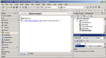
Figure 18-2: Using the LinkLabel control within Visual Studio .NET.
To let you experiment with the control (and possibly figure out bugs in the regular expressions used), let's create a more interactive application, like the one shown in Figure 18-3.
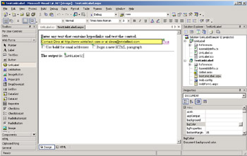
Figure 18-3: Type any text, click the button, and see whether the control detects any Web-sensitive elements.
When you click the Test link button, the following code executes:
private void LinkButton1_Click(object sender, System.EventArgs e)
{
 LinkLabel1.UseBoldForEmail = CheckBox1.Checked;
 LinkLabel1.BeginNewParagraph = CheckBox2.Checked;
 LinkLabel1.Text = TextBox1.Text;
}
As you can see, the preceding code contains a couple of new properties we haven't discussed yet—UseBoldForEmail and BeginNewParagraph.
Want to Be Spammed?
All tags that appear in HTML pages are potential victims of Web robots that scan sites to see whether they have e-mail addresses embedded. Robots locate the tag in the page being analyzed, look for the mailto prefix, and grab the attached e-mail address. You understand that a control like LinkLabel certainly doesn't do much to slow down spammers.
The UseBoldForEmail property is a Boolean property that affects the way in which the e-mail match evaluator works. If the UseBoldForEmail property is set to true, the evaluator formats the e-mail address as boldface text rather than as a hyperlink, which could potentially limit spam.
private string EmailMatchEvaluator(Match m) {
 string format = "<a href="mailto:{0}">{0}</a>";
 if (UseBoldForEmail)
 format = "{0}";

 return String.Format(format, m.Value);
}
Figure 18-4 shows how the LinkLabel control looks when the UseBoldForEmail property is set to true.
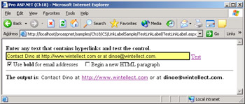
Figure 18-4: The LinkLabel control can render e-mail addresses in bold.
Modifying the Opening Tag
The Label control renders the text wrapped in a tag. All the graphical properties you can set (for example, font and colors) are converted to cascading style sheet (CSS) properties and bound to the style attribute. The opening tag and the style properties are set up during the RenderBeginTag method. In HTML, the tag flows with the rest of the text in the page. This means that if you want to display a label on the next row of text, you must add a
tag or something like that.
The
tag has characteristics similar to the tag and acts as a generic HTML container. Unlike the tag, though, represents a distinct block within the page and breaks the flow of the HTML text. In other words, if we could render the LinkLabel using ainstead of the default tag, the text would be displayed below the existing output. The BeginNewParagraph property just specifies whether aor tag should be used. By overwriting the RenderBeginTag method, we can also add this feature to the LinkLabel control.
public override void RenderBeginTag(HtmlTextWriter writer)
{
 if(!BeginNewParagraph) {
 // Go the default way
 base.RenderBeginTag(writer);
 return;
 }

 // Write attributes
 AddAttributesToRender(writer);

 // Write the opening tag
 writer.RenderBeginTag("div");

 // The closing tag is automatically managed by the writer
}
The AddAttributesToRender method is a protected member included with all Web controls. The method adds HTML attributes and styles that need to be rendered to the specified HTML writer. The RenderBeginTag method on the writer writes the opening tag using the specified tag. The use of the BeginNewParagraph property is shown in Figure 18-5.
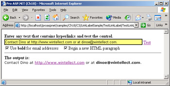
Figure 18-5: The HTML text generated by the LinkLabel is now wrapped by a
tag and begins on a new line.
| Caution |
At design time in Visual Studio .NET, the code always runs fully trusted. This means that the custom control might work properly when you are testing it on your own computer, but it might fail in a production environment because it lacks adequate permissions (for example, it could be called by a partially trusted client). Be sure to test your controls in the security context in which they will run in real-world applications. |
A Better DataGrid Control
In Chapter 6 and Chapter 7, we worked to demonstrate a variety of features of the DataGrid control, including pagination, sorting, templates, and in-place editing. Even though the DataGrid is one of the most powerful ASP.NET controls, the amount of relatively boilerplate code you have to write in real-world scenarios is still significant. The control is designed to help developers display data in a way that's more productive for them and more enjoyable for users. The DataGrid control, though, is not supposed to be the ultimate grid, one that's good for everybody. By design, the control provides a rich and effective infrastructure, but it leaves developers responsible for fleshing it out with application-specific and scenario-specific code.
Technically speaking, it's not entirely true that the DataGrid supports paging or sorting. The control supplies an infrastructure that makes it simple for developers to build applications capable of paging and sorting data. The fact is that to fully set up these features, you need to write code. The code for paging or sorting cuts across the problem domain, so you need it regardless of what the logic is behind the data you're paging or sorting through.
One good reason to customize the DataGrid control, therefore, is the need to make it fit into a particular scenario—not just paging or sorting but also master/ details views, two-way data-binding, selection, searching, and filtering. Incidentally, this is also the direction that Microsoft is geared toward for the next version of the .NET Framework. The second good reason to extend the DataGrid control is just to make the control work better and look nicer.
In this section, we'll consider a custom DataGrid control with an enhanced engine for pagination.
Improving the Pager Bar
The pager bar of a DataGrid supports two working modes, NextPrev and NumericPages. In NextPrev mode, two link buttons are displayed that move you one page back or forth. In NumericPages mode, each page boasts its own link button, up to a maximum number of page buttons. Both pager bars have pros and cons, and both can be customized at will by hooking the ItemCreated event. (See Chapter 7 for details.)
When a DataGrid pages in NextPrev mode, there's no visual feedback about the current page. I confess that I didn't notice it until one of my most attentive users raised the issue. The user can move back and forth, but nothing in the default user interface of the control tells her what portion of the data she's scrolled already. In addition, there's no way to jump to the first or last page in a single shot, a very desirable feature in many applications. Let's see how to extend the DataGrid to incorporate these features. In the past few months, I've developed so many types of custom grids that I've exhausted all the possible fancy names for it. Names like PowerGrid, SuperGrid, MyDataGrid, DataGridEx all look repetitive. So let's just maintain the original name but, of course, change the namespace.
Refining the NextPrev Mode
As mentioned, when working in NextPrev mode, the DataGrid control displays only a couple of link buttons to move to the next and previous pages. The two link buttons are created during the initialization step of the grid. Before the HTML output of the grid is generated, the programmer is given a chance to modify something in the item's layout. In Chapter 6, we already discussed many aspects of the ItemCreated event. In this chapter, what remains to do is simply incorporate the aforementioned tricks into an all-encompassing, reusable control.
Our DataGrid class derives from the ASP.NET DataGrid control and registers an internal handler for the ItemCreated event.
public class DataGrid : System.Web.UI.WebControls.DataGrid
{
 // Class constructor
 public DataGrid() : base()
 {
 ItemCreated += new DataGridItemEventHandler(DataGrid_ItemCreated);
 }

 // Handler of the ItemCreated event
 void DataGrid_ItemCreated(object sender, DataGridItemEventArgs e)
 {
 // Creating the pager
 if (e.Item.ItemType == ListItemType.Pager)
 SetupNextPrevPager(e);

 // Creating the footer
 if (e.Item.ItemType == ListItemType.Footer)
 SetupFooter(e);
 }
}
At this point, any feature that we discussed in previous chapters can be easily plugged in and made reusable. The SetupNextPrevPager method creates a new Label control and places it in between the two link buttons.
private void SetupNextPrevPager(DataGridItemEventArgs e)
{
 // Only if the pager mode is NextPrev
 if (this.PagerStyle.Mode != PagerMode.NextPrev)
 return;

 // Grab a reference to the pager (the first and unique cell of the row)
 TableCell pager = e.Item.Cells[0];

 // Create and configure a new label
 Label ctl = new Label();
 ctl.Font.Name = "verdana";
 ctl.Font.Size = PagerStyle.Font.Size;
 ctl.ForeColor = PagerStyle.ForeColor;
 ctl.Text = String.Format("Page {0}", 1 + CurrentPageIndex);

 // Add after the first control
 pager.Controls.AddAt(1, ctl);
}
Because the new feature of the control is set up at run time, the Visual Studio .NET designer can't handle it. For this reason, if you look at the new DataGrid at design time in a sample application, you won't notice any new features, as you can see in Figure 18-6.
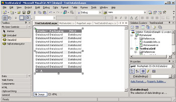
Figure 18-6: The new DataGrid control doesn't show any new special features when viewed through the Visual Studio .NET designer.
The dynamically created label shows up once the page that contains the grid is sent to the browser. Note that the Label control should have its own font to avoid unpleasant results if the font of the pager is set to Webdings or similar font families. The font size and colors, on the other hand, should be copied from the PagerStyle object of the parent grid. Figure 18-7 shows the DataGrid control in NextPrev mode.
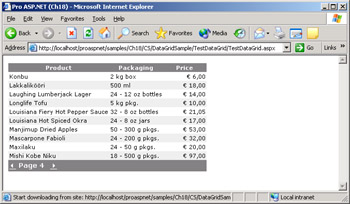
Figure 18-7: When working in NextPrev mode, the new DataGrid control displays the index of the currently selected page.
A Tab-Style Pager
In Chapter 7, we discussed how to extend the DataGrid control to make it support variable-length pages. In doing so, we also slightly modified the pager so that page numbers would display as tabs. Let's take that approach a little further by making it a configurable property of our new DataGrid control.
Let's add a couple of properties—AllowTabbedPager and UnselectedTabColor. The AllowTabbedPager property enables the new tabbed pager mode; the UnselectedTabColor property indicates the background color of unselected tabs. For the sake of simplicity only, we'll make the foreground color of unselected tabs default to the foreground color of the pager.
What's exactly a tab in this context? A tab is a control in the table row that represents the pager bar. To give the pager a tab-style look and feel, we simply need to adapt colors and borders a little bit. No change is needed in the built-in logic of the grid navigation.
public bool AllowTabbedPager
{
 get {return Convert.ToBoolean(ViewState["AllowTabbedPager"]);}
 set
 {
 ViewState["AllowTabbedPager"] = value;
 if (value)
 {
 // Force some layout properties
 CellSpacing = 0;
 CellPadding = 0;

 // Force the pager to be numeric and stay on top
 PagerStyle.Mode = PagerMode.NumericPages;
 PagerStyle.Position = PagerPosition.Top;
 }
 }
}

public Color UnselectedTabColor
{
 get {return (Color) ViewState["UnselectedTabColor"];}
 set {ViewState["UnselectedTabColor"] = value;}
}
When setting the AllowTabbedPager property, we need to force some settings on other properties. In particular, the pager mode must be NumericPages and the pager must be in top position. Furthermore, we also need zero cell padding and spacing for better graphical results. Because cell padding and spacing are properties that work throughout the grid, if you have them set to non-null values, the AllowTabbedPager might raise graphical issues. You can try to partially make up for it by using width, height, and margin style properties on individual columns.
Supporting the new pager style also implies some slight changes in the ItemCreated event handler.
private void DataGrid_ItemCreated(object sender, DataGridItemEventArgs e)
{
 if (e.Item.ItemType == ListItemType.Pager)
 CustomizePager(e);
 if (e.Item.ItemType == ListItemType.Footer)
 SetupFooter(e);
}

private void CustomizePager(DataGridItemEventArgs e)
{
 if (this.PagerStyle.Mode == PagerMode.NextPrev) {
 SetupNextPrevPager(e);
 return;
 }

 if (this.AllowTabbedPager) {
 SetupTabbedPager(e);
 return;
 }
}
The core of the code that transforms the numeric pager bar into a tab strip is located in the SetupTabbedPager method, as shown in the following code:
private void SetupTabbedPager(DataGridItemEventArgs e)
{
 TableCell pager = (TableCell) e.Item.Controls[0];

 // Enumerates all the items in the pager...
 for (int i=0; iPage " +="" "";

 // Modify styles
 lb.BorderWidth = Unit.Pixel(1);
 lb.BorderColor = Color.White;
 lb.BackColor = UnselectedTabColor;
 lb.BorderStyle = BorderStyle.Outset;

 // Use hard-coded height (should be changed!)
 lb.Height = Unit.Pixel(18);
 }
 else
 {
 // Selected tab
 if (o is Label) {
 Label l = (Label) o;

 // Modify text
 l.Text = "Page " + l.Text +
 "";

 // Modify styles
 l.Font.Bold = true;
 l.BackColor = HeaderStyle.BackColor;
 l.BorderWidth = Unit.Pixel(1);

 // Must express a .NET color as an HTML string
 string htmlColor = HeaderStyle.BackColor.Name;
 if (htmlColor.StartsWith("ff"))
 htmlColor = htmlColor.Replace("ff", "#");

 // Draw border around the selected page
 string borderString = htmlColor + " outset 1px";
 l.Style["border-top"] = borderString;
 l.Style["border-left"] = borderString;
 l.Style["border-right"] = borderString;
 l.Style["border-bottom-color"] = htmlColor;

 // Use hard-coded height (should be changed!)
 // Make the current tag slightly taller
 l.Height = Unit.Pixel(20);
 }
 else
 {
 if (o is LiteralControl)
 {
 // Remove unneeded spacing
 LiteralControl lc = (LiteralControl) o;
 lc.Text = "";
 }
 }
 }
 }
}
The SetupTabbedPager method loops through all the child controls of the unique element that represents the pager of a DataGrid control. The Controls collection can contain controls of three different types—LinkButton, Label, and LiteralControl. In particular, we'll have as many LinkButton objects as there are pages to visit (all but the current one); one Label control representing the currently selected page; blank literal controls to separate other controls. We render link buttons as unselected tabs and change the text of literal controls to the empty string to keep tabs closer for a nicer output.
A little caveat worth noting has to do with HTML color strings. To make the selected tab look like a real tab, we need to create a continuous region including the DataGrid header and the selected tab. However, because they are different HTML elements, a trick is required. We draw the bottom border of the tag representing the label with the same background color of the header. Working the ASP.NET way, though, there's no way for us to set the bottom border style of a control. We must resort to CSS settings in the Style collection. The rub is that the background color of the header is a .NET Framework class named Color. If a conventional color is used, we can easily convert it to a string usable with HTML browsers. However, if the background color has been specified using RGB factors—a #rrggbb string—the string returned by Color.Name property has the following format: ffrrggbb. As is, the string is not understood by browsers, so we need to strip the ff prefix off. Figure 18-8 shows the DataGrid in tab-style mode.
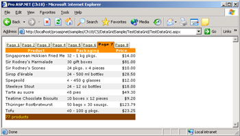
Figure 18-8: The tab-style pager of our DataGrid control.
Improving the Footer
The original DataGrid control doesn't display the footer by default. To make it appear, you must toggle the ShowFooter property on. The footer is displayed immediately after the last row of the page and above the pager, if any. A footer bar doesn't make sense in all cases. In particular, you might want to use it if you have some sort of summary data to display.
The DataGrid footer bar, though, is a simple extra table row being displayed with custom and customizable settings. The control doesn't provide any support for the implementation of subtotals and counters. The footer can be given any layout and doesn't necessarily need to have the same structure as preceding columns. By hooking up the ItemCreated event, you can modify both the structure of the footer (adding or removing cells) and populate the cells with freshly computed data.
Computing Expressions Dynamically
As mentioned in Chapter 5, the DataTable class of the ADO.NET namespace provides an extremely handy method—Compute—to calculate totals, subtotals, and other functions on a group of in-memory columns. The most interesting aspect of Compute, though, is that it supports a simple but functional and effective language for expressions.
By means of this internal language, you can count the rows that support a certain condition, sum up values in a column, or calculate the average number in a succession of values. If you're going to display the details of an order, you probably want to count the items as well as provide the total of the order. No controls in .NET Framework support summary rows; however, by intercepting the creation of the footer row and leveraging the power of ADO.NET objects, you can succeed as demonstrated in Chapter 6. How can we add support for summary rows in our new DataGrid control?
A programmable footer requires three types of information: the expression to compute, the position where the summary value should be displayed, and a formatting string. At first glance, it seems that the most complicated part of the puzzle is the expression. However, in ADO.NET an expression to compute is a plain string like the following ones:
sum(price)
count(itemID)
avg(price)
More important is the fact that the Compute method works only if the data source of the grid is a DataTable object. In light of this, the internal method called from within the ItemCreated handler to set up the footer must first check the type of the grid's data source.
private void SetupFooter(DataGridItemEventArgs e)
{
 if (!(this.DataSource is DataTable))
 return;

 DataTable data = (DataTable) this.DataSource;


 return;
}
return;
}
| Note |
You can still compute a total on the items of an array or a generic collection. However, in this case the burden of looping and summing values is entirely your own. The DataTable class, conversely, provides a ready-to-use method. If you're going to use subtotaling footers in a real-world control, spending some time adapting the present solution to a more general case would certainly pay off. |
The following code illustrates how the ItemCreated handler reads the DataTable object and computes the subtotals:
void DataGrid_ItemCreated(object sender, DataGridItemEventArgs e) {
 if (e.Item.ItemType == ListItemType.Footer)
 SetupFooter(e);
}

void SetupFooter(DataGridItemEventArgs e) {
 if (!(this.DataSource is DataTable))
 return;

 DataTable data = (DataTable) this.DataSource;

 foreach(FooterColumnData fcd in this.FooterItems)
 {
 decimal num;
 num = Convert.ToDecimal(data.Compute(fcd.Expression, ""));
 string buf = String.Format(fcd.FormatString, num);
 e.Item.Cells[fcd.ColumnPosition].Text = buf;
 }
 return;
}
The Programming Interface of the Footer
All the information that you need to pass to create a summary cell is described in the following classes:
public class FooterColumnData
{
 public int ColumnPosition;
 public string Expression;
 public string FormatString;
}

public class FooterColumnDataCollection : ArrayList
{
}
The FooterColumnData class represents a cell on the footer destined to contain a total. It needs to know the 0-based position of the cell to fill, the expression to use to calculate the total, and the needed formatting settings to render the total. Because in general you can have more than one summary cell, let's define a collection of FooterColumnData objects. For brevity, our collection class simply derives from ArrayList. In a real-world scenario, consider creating a more effective strong-typed collection class.
The property that gathers all the summary cells is named FooterItems and is implemented as follows:
public DataGrid() : base()
{
 FooterItems = new FooterColumnDataCollection();

 // Event handlers
 this.ItemCreated += new DataGridItemEventHandler(DataGrid_ItemCreated);
}

public FooterColumnDataCollection FooterItems
{
 get {return (FooterColumnDataCollection) ViewState["FooterItems"];}
 set {ViewState["FooterItems"] = value; }
}
To use a footer with summary information, a client page has just one thing to do—populate the FooterItems collection with as many FooterColumnData objects as there are summary cells to display.
The following code snippet, excerpted from the ItemCreated event handler, illustrates how the control manages the information about the footer:
foreach(FooterColumnData fcd in this.FooterItems)
{
 decimal num = Convert.ToDecimal(data.Compute(fcd.Expression, ""));
 string buf = String.Format(fcd.FormatString, num);
 e.Item.Cells[fcd.ColumnPosition].Text = buf;
}
Note that internally all the calculations are done using decimals. The format string determines how the data should be displayed.
A DataGrid with Summary Information
In the following code snippet, you see how to configure the footer of the new DataGrid control so that it automatically computes and displays totals:
private void Configure()
{
 FooterColumnData fcd = new FooterColumnData();
 fcd.ColumnPosition = 0;
 fcd.Expression = "count(productname)";
 fcd.FormatString = "{0} products";
 grid.FooterItems.Add(fcd);

}
The result of the code, shown in Figure 18-9, is that the summary cell will be displayed at the bottom of the first column and formatted as {0} products. In this case, the expression simply counts the rows in the data source.
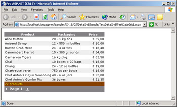
Figure 18-9: The DataGrid in action with its programmable footer.
| Note |
The built-in functions you can use within ADO.NET expressions accept only one field name. To work around the issue, you could either add a dynamic column to the data source, formatted as needed, or use an expression of expressions. |
Another interesting scenario for extending controls is represented by control containers—that is, ASP.NET server-side controls that contain child controls. The most popular, because it's required by all nontrivial Web Forms pages, is the HtmlForm control.
A Better Server Side Form Control
In Chapter 4, we dug out many capabilities of the HtmlForm control, paying particular attention to the single-form programming model of ASP.NET. By design, an ASP.NET page can host exactly one server form, although you can add any number of HTML
tags without the runat="server" attribute.
If you place two or more server forms in a page, you won't get any error at compile time. The request for the page is processed as usual, and the temporary class for the page is generated, successfully compiled, and finally loaded. Next, the ASP.NET runtime begins processing the page request and regularly fires the Init, Load, and PreRender events. All these events are handled seamlessly. After that, the page enters its rendering phase, which is where the murder will out.
Supporting Multiple Server Forms
Let's briefly review the rendering process of Web pages to understand why multiple server forms are not permitted. The ASP.NET Page class calls the RenderControl method on all the controls it contains. So the first block is successfully processed and rendered. After that, the page class sets an internal flag to track that one form object has been processed for the page. Can you guess what happens next?
Whenever a block is found, the page first verifies that no other similar block has been processed earlier. If the aforementioned internal flag is set, an HttpException exception is thrown. As of ASP.NET 1.1, there's no compile-time control on multiple server-side forms. You could include as many server-side forms as you need in a Web Forms page, as long as you ensure that at most one is visible at any time. In practice, if you set the Visible attribute of all server-side forms but one to false, the page will render just fine.
It goes without saying that you can control the Visible attribute of forms programmatically and decide which one to show based on run-time conditions. Incidentally, a similar approach is comparable to that of ASP.NET mobile forms (as seen in Chapter 11), in which multiple server-side forms can be defined but only one at a time is visible.
Generally speaking, giving up multiple forms is not a big sacrifice. However, multiple forms are sometimes useful—although probably not as frequently as one might think. A scenario in which you would find multiple server forms helpful is when you implement a form-based functionality in a large number of pages—typically, search and login pages.
Devising Logical Forms
Some pages need to have multiple logical forms. A logical form is not necessarily a form as we normally define it based on the common HTML definition. A logical form is simply a logically related group of input controls whose contents can be submitted in a single shot to a piece of code that can handle it. Using the familiar tag is only the simplest way to obtain these results. ASP.NET doesn't let you use multiple server-side tags. However, you can figure out alternative ways to implement a "logical form."
One possibility is to embed logical forms within panels or Web user controls and include them in the same ASP.NET page. Some glue code will then take care of hiding and showing the blocks according to the particular state of the page. Within these logical forms, you can easily add link buttons that transfer execution to external pages, thus emulating the functionality of a true HTML form. The key advantage in this case is that you still exploit the state maintenance services of ASP.NET.
| Note |
In ASP.NET, you should think in terms of classes and functionality rather than in terms of HTML forms. However, especially if you're engaged in the migration of a complex Web site (for example, a portal), resorting to multiple forms might be the fastest way to be on time and on budget. In many cases, making better use of the power of ASP.NET will allow you to rearchitect the application without multiple HTML forms. |
In Chapter 4, we demonstrated this architecture with plain inline code that looks similar to the following code snippet:
Register
Login
In this code, OnRegister and OnLogin methods transfer control to external pages in much the same way the browser does when processing the submission of a form. Instead of using plain
tags as containers, you can use Web user controls, as in the following code snippet:
An ever cleaner and more elegant solution would be defining a base class for these user controls. The base class will provide a basic set of properties such as the Action property. The big drawback of Web user controls is that they require an external .ascx page to hold the layout. This means that you can't define the contents of a user control inline in the host page as if it were a
or tag.
What's needed to build a logical form that is authorable like a true form? Let's derive a new class from the ASP.NET control that represents the
tag and make it expose an Action property and a Submit method.
A Control Representing a Logical Form
The
tag has the built-in capability of parsing any child tags. By deriving a new class, you can acquire the same capability. Thetag is represented on the server through a generic class named HtmlGenericControl. This class is generic because it doesn't provide a programming interface tailor-made to the features of thecontrol.
ASP.NET utilizes the HtmlGenericControl to render a handful of HTML tags when these are used with the runat attribute. Generic HTML controls include the
, , , and
elements. By default, the constructor of the HtmlGenericControl class generates a tag. If you want it to create another HTML container, use the proper constructor overload. The following code snippet shows the blueprint of a custom Form class that can be used any number of times within an ASP.NET server form:
public class Form : HtmlGenericControl, INamingContainer
{
 public Form(string tag) : base("div")
 {...}

}
The new Form control can contain any combination of HTML text and ASP.NET controls. It exposes the Action property to let you indicate the page to jump to when a submit button within the control is clicked. The submit button of this Form control is any button or link button that is bound to the Submit method of the Form class. The following listing shows the source code of the Form class that inherits from HtmlGenericControl:
namespace ProAspNet.CS.Ch18
{
 public class Form : HtmlGenericControl, INamingContainer
 {
 public Form(string tag) : base("div")
 {
 }

 // Indicate the URL to jump tp
 public string Action;

 // The Request.Form members that relate to the controls in the
 // form are packed in the HttpContext of the request
 public virtual void Submit(object sender, EventArgs e)
 {
 foreach(object o in Page.Request.Form)
 {
 string ctlName = o.ToString();
 if (!ctlName.StartsWith(UniqueID + ":"))
 continue;

 // Split the ID in two parts, prefix:rest_of_the_ID
 string[] parts = ctlName.Split(':');
 Context.Items[parts[1]] = Page.Request.Form[ctlName];
 }

 Page.Server.Transfer(Action);
 }
 }
}
When the user clicks on the submit button of the logical form, a predefined Submit method executes. The method has a delicate task—making the contents of the logical form available to the action page.
Packing the Form's Contents
When the submit button is clicked, it passes the control to the action page using the Server.Transfer method. By default, the Transfer method clears the Form collection associated with the current request before yielding. We could override this behavior, and leave the Form collection intact by calling the overload of the Transfer method that accepts a Boolean value. (It's important to see Chapter 13 for more information about the Transfer method.)
// Preserve the contents of the Form collection
// and the query string
Page.Server.Transfer(Action, true);
However, if we leave the Form collection intact, the action page would receive the whole collection and not just the controls specific of the logical form. The Submit method looks up all the input controls in the logical form and copies their values in the HTTP context. To easily identify the correct subset of controls, we look at the prefix of the controls ID and select only the controls whose ID starts with the ID of the Form control. To implement this feature, the role of the INamingContainer interface is essential.
INamingContainer is a marker interface that exposes no methods but enjoys special treatment from the ASP.NET framework. In particular, child controls included in a naming container have their UniqueID property automatically prefixed with the ID of the parent.
Creating Multiple Form Like Controls
Let's see how to employ our Form control in a test Web page. The control doesn't require any special treatment, and you actually work with it the usual way. You first register it and then create elements prefixed with the specified tag name.
<%@ Register tagprefix="mspo" Namespace="ProAspNet.CS.Ch18"
 Assembly="MyForm" %>
Pages with Multiple Forms
The following code snippet illustrates the structure of a page that includes one regular server-side form and as many logical server-side forms as needed:
 Register


 Login
If you click on the submit buttons of logical forms, the control passes to the specified action page, giving the illusion of a true multiform server page. In this way, you write pages and forms exploiting the full potential of ASP.NET without sacrificing functionalities or giving up any features.
Retrieving Form Values
In pure HTML, when a form submits its contents, the browser collects current values from all input controls. These values are packed into a POST or GET command and forwarded to the server. From the browser perspective, the ASP.NET page is made of a unique, all-encompassing form. The custom Form control gets into the game when the page posts back, retrieves its own subset of input values, copies them into the HttpContext object, and transfers the control to the action page.
How can the action page retrieve the values sent by the caller form? These values are no longer available through the Request.Form collection because that collection is cleared before transferring the control. The page gets input data by reading from the context of the request.
User <%= Context.Items["RegUserName"] %> has been registered. Password is <%= Context.Items["RegPassword"] %>.
In terms of programming style, you use Context.Items in much the same way you used Request.Form in ASP pages. Context is more efficient than Session because it doesn't persist longer than the page instance. Context.Items is an effective and quite generic way of passing parameters to pages that are run using Server.Transfer or Server.Execute.
| Note |
A control derived from HtmlGenericControl cannot be added to the Visual Studio .NET toolbox. This in no way jeopardizes the usability of the control in an ASP.NET application. The control must be registered and added manually to the Web Forms page. |
Composite Controls
So far in this chapter, we emphasized the concept of reusability and customization obtained through inheritance. However, you can author new controls by combining existing controls and thus exploiting aggregation instead of inheritance. A composite control can extend its own object model by mirroring the properties of its child controls and handle events raised by its child controls. A composite control must meet a couple of requirements. First, authors of composite controls must override the protected CreateChildControls method. The method is exposed from Control and must be used to create instances of the child controls and add them to the new control's Controls collection.
The second requirement is that the control implement the INamingContainer interface to create a new naming scope for its children. You do not have to override the Render method because child controls provide the rendering logic. By overriding Render, you can inadvertently override the constituent controls too. We'll see more about composite controls in the next chapter.
Conclusion
ASP.NET comes with a full suite of goodies for developers. A large part of these goodies relate to controls and control development. Although the .NET Framework deploys a significant number of controls, there might be situations in which you need controls that do not exist. Sometimes the ideal control must be built from scratch, assembling pieces of HTML code under the umbrella of an object model. In many other situations, though, what you need is simply a slightly enhanced version of an existing control. A pageable DataList, a more specialized grid, and a rich textbox are examples of controls not defined within the .NET Framework but that can be built on top of existing controls.
To build new custom controls, you can use two well-known techniques-inheritance and aggregation. Composite controls are the result of aggregation and basically consist of various controls combined by using class composition. Functionally speaking, composite controls are similar to Web user controls, which we thoroughly examined in Chapter 10. However, many key differences exist under the hood, the first of which is that composite controls can be deployed only through assemblies. In the next chapter, we'll cover composite controls in detail.
In this chapter, though, we mostly focused on custom controls built by exploiting inheritance. You create a class that inherits from an existing ASP.NET control class and add functionality by overriding existing members or by creating new properties, methods, and events. Inheriting from existing controls cuts development time and increases productivity and the quality of the code. When a good base exists for the control you have in mind, it's easy to think bigger and devise functionality better and from a wider perspective.
As the three examples discussed in this chapter prove—LinkLabel, DataGrid and SubForm—to get the most out of control inheritance a deep knowledge of the surrounding framework is required. Inheritance supplies a control that works, but modifying the default behavior might not be straightforward. You must know very well the guts of the control and have a good understanding of any protected and overridable members. Also when building controls from scratch, keep in mind that not all controls lend themselves well to being used as a base for new controls. Inheritance can decrease your development time when used across projects, but it's a quick-sharpening, double-edged sword.
In the next chapter, we'll continue our exploration of ASP.NET custom controls by looking at completely new controls that you write from the ground up and which inherit from the base class Control.
Resources
- Developing Microsoft ASP.NET Server Controls and Components, by Nikhil Kothari and Vandana Datye (Microsoft Press, 2002)
- Post Multiple Forms from a Single Page (http://www.aspnetpro.com/features/2003/04/asp200304pw_f/asp200304pw_f.asp)
- ASP.NET Control Gallery (http://www.asp.net/ControlGallery/default.aspx?tabindex=2)
- In-depth: Creating Custom ASP.NET Controls in VS.NET (http://www.dotnet247.com/247reference/articles/0/2019.aspx)
Part I - Building an ASP.NET Page
Part II - Adding Data in an ASP.NET Site
- The ADO.NET Object Model
- Creating Bindable Grids of Data
- Paging Through Data Sources
- Real-World Data Access
Part III - ASP.NET Controls
Part IV - ASP.NET Application Essentials
- Configuration and Deployment
- The HTTP Request Context
- ASP.NET State Management
- ASP.NET Security
- Working with the File System
- Working with Web Services
Part V - Custom ASP.NET Controls
- Extending Existing ASP.NET Controls
- Creating New ASP.NET Controls
- Data-Bound and Templated Controls
- Design-Time Support for Custom Controls
Part VI - Advanced Topics
Index
EAN: 2147483647
Pages: 209
