Creating Bindable Grids of Data
Overview
Imagination is more important than knowledge.
-Albert Einstein
Data-bound controls play a key role in the development of ASP.NET applications. Data-driven controls allow you to associate the whole interface, or individual properties, with one or more columns read out of a .NET-compliant data source. We already mentioned data-bound controls in Chapter 3 and reviewed their basics. In this chapter, we'll delve into the details of an extremely versatile data-bound control that is a fixed presence in any real-world ASP.NET application—the DataGrid control.
The DataGrid control renders a multicolumn, fully templated grid and provides a highly customizable, Microsoft Excel–like user interface. In spite of the rather advanced programming interface and the extremely rich set of attributes, the DataGrid simply generates an HTML table with interspersed hyperlinks to provide interactive functionalities such as sorting, paging, selection, and in-place editing.
According to the naming convention set in Chapter 3, the DataGrid control is said to be an iterative control and displays a list of records according to a given graphical template. Unlike other iterative controls, such as the Repeater and DataList controls that we'll dig out in Chapter 9, the DataGrid features a relatively rigid and inflexible graphical model. The data bound to a DataGrid is always rendered like a table, therefore, in terms of rows and columns. As we'll see later in the chapter, though, the contents of the cells in a column can be customizable to some extent using system-provided as well as user-defined templates.
The DataGrid Control
The DataGrid is a column-based control that supports various types of data-bound columns, including text columns, templated columns, and command columns. You associate the control with a data source by using the DataSource property. Just as for other data-bound controls, no data will be physically loaded and bound until the DataBind method is called. The simplest way of displaying a table of data using the ASP.NET grid is as follows:
Once the control has been placed into the page, you bind it to the data source and display the resulting HTML code.
string connString = "SERVER=localhost;DATABASE=northwind;UID=sa;";
string cmdText = "SELECT firstname, lastname, title FROM employees";

void Page_Load(object sender, EventArgs e)
{
 // Run the query and get some data to display
 DataTable data = ExecuteQuery(cmdText, connString);

 // Bind the data to the grid
 grid.DataSource = data;
 grid.DataBind();
}

DataTable ExecuteQuery(string cmdText, string connString)
{
 SqlDataAdapter adapter = new SqlDataAdapter(cmdText, connString);
 DataTable data = new DataTable();
 adapter.Fill(data);
 return data;
}
Although it's effective in terms of retrieval and display, the preceding code is hardly usable in real applications because it's too minimal. Figure 6-1 shows the output.
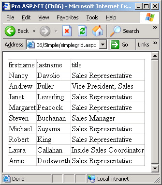
Figure 6-1: A too simple and minimal DataGrid control in action.
This simple DataGrid sample has the following drawbacks:
- Poor user interface A grid of data rows is aimed at the end user to make as seamless as possible her interaction with the application. For this reason, a clear and graceful combination of colors, styles, and fonts is an absolute must.
- Data binding and caching Performance-wise, the simple application just shown runs the query whenever the page is invoked. By design, the DataGrid control needs to be re-bound to its data at each request. Getting data repeatedly from the database is a necessity when the data gets stale frequently, but it's relatively ineffective in other situations. In this case, server-side caching techniques can make the difference.
- Column mapping In this sample, all the columns in the query are mapped to the grid and all have the same settings. A real-world grid, on the other hand, would bind each column independently using different settings and an individual user-interface pattern.
- Scrolling and navigation All the rows in the query resultset are included in the view regardless of the total number. In a more realistic scenario, only a relatively small number of rows are retrieved or just displayed. An effective support for data paging is essential for real-world grids.
- Sorting and page interaction Rarely is a grid of data read-only and completely static. More likely, you'll need to implement row selection and then drill-down and sort the records in various ways. None of these functionalities are supported in the sample code we've considered so far.
The DataGrid is a powerful and versatile control. Frankly, I admit that I have yet to find anything that can't be accomplished with an appropriate mix of methods and event handlers. Let's review the programming interface of the control.
Properties of the DataGrid Control
The DataGrid control inherits from the BaseDataList class and implements the INamingContainer interface. The BaseDataList abstract class provides a common set of functionality for all data listing controls, including DataList and DataGrid. As we saw in Chapter 2, the INamingContainer interface is a marker interface that doesn't require the implementation of any methods but only indicates that the class has some features. In particular, the interface marks the class as a naming container.
Table 6-1 lists the properties of the DataGrid class, but it doesn't include properties the control inherits from Control and WebControl.
|
Property |
Description |
|---|---|
|
AllowCustomPaging |
Sets custom paging, or indicates whether it is enabled. AllowPaging must be set to true for this setting to work. |
|
AllowPaging |
Sets paging, or indicates whether paging is enabled. |
|
AllowSorting |
Sets sorting, or indicates whether sorting is enabled. |
|
AlternatingItemStyle |
Gets the style properties for alternating rows. |
|
AutoGenerateColumns |
Sets column objects to be automatically created and displayed for each field in the data source, or indicates whether this option is enabled. True by default. |
|
BackImageUrl |
Gets or sets the URL of the image to display as the background of the control. |
|
CellPadding |
Sets the space (in pixels) to remain between the cell's border and the embedded text, or indicates how much space remains. |
|
CellSpacing |
Sets the space (in pixels) to remain, both horizontally and vertically, between two consecutive cells, or indicates how much space remains. |
|
Columns |
Gets a collection of DataGridColumn objects that represent the columns in the DataGrid control. |
|
Controls |
Gets a collection of all the child controls in the grid. |
|
CurrentPageIndex |
Gets or sets the index of the currently displayed page. |
|
DataKeyField |
Gets or sets the key field in the bound data source. |
|
DataKeys |
Gets a collection that stores the key values of all records displayed as a row in the grid. The column used as the key is defined by the DataKeyField property. |
|
DataMember |
Gets or sets a string that indicates the specific table in a multimember data source to bind to the grid. The property works in conjunction with DataSource. If DataSource is a DataSet object, DataMember contains the name of the particular table to bind. |
|
DataSource |
Gets or sets the data source object that contains the values to populate the control. |
|
EditItemIndex |
Gets or sets the index of the grid's item to edit. |
|
EditItemStyle |
Gets the style properties for the item being edited. |
|
FooterStyle |
Gets the style properties for the footer section of the grid. |
|
GridLines |
Sets whether all cells must have the border drawn. |
|
HeaderStyle |
Gets the style properties for the heading section of the grid. |
|
HorizontalAlign |
Gets or sets the horizontal alignment of the text in the grid. |
|
Items |
Gets the collection of the currently displayed items. |
|
ItemStyle |
Gets the style properties for the items in the grid. |
|
PageCount |
Gets the number of pages required to display all bound items. |
|
PagerStyle |
Gets the style properties for the paging section of the grid. |
|
PageSize |
Gets or sets the number of items to display on a single page. |
|
SelectedIndex |
Gets or sets the index of the currently selected item. |
|
SelectedItem |
Gets a DataGridItem object that represents the selected item. |
|
SelectedItemStyle |
Gets the style properties for the currently selected item. |
|
ShowFooter |
Sets whether the footer is displayed. False by default. |
|
ShowHeader |
Sets whether the header is displayed. |
|
VirtualItemCount |
Gets or sets the virtual number of items in the DataGrid control when custom paging is used. |
The characteristic traits of the DataGrid control are the Columns and Items collections, the xxxStyle properties, and the data-binding properties. All columns in the grid are represented by an object with its own set of properties and methods. Several types of columns are available to implement the most common tasks. In general, not all rows in the bound data source are included in the HTML code for the client. The Items collection returns only the displayed rows.
The DataGrid properties allow you to improve the grid's look and feel. You can set properties both declaratively through attributes set in the ASP.NET page layout and programmatically through properties set on the DataGrid control. When setting attributes, you can either set the property individually at the level or group related properties on a per-item basis. For example, suppose you want to set the background color of the column headers to a particular color. You can do that through the headerstyle-backcolor attribute at the root level, as shown here:
However, you can also define the child node within the declaration and set its BackColor attribute:
The effect is the same, but the second option looks more elegant and is easier to maintain. This is also the type of code that Microsoft Visual Studio .NET generates when you drop a DataGrid control on a Web form. The following schema illustrates the ASP.NET layout of the control:
Constituent Elements of a DataGrid
The output of a DataGrid control is made of several constituent elements grouped in the ListItemType enumeration. Each element plays a clear role and has a precise location in the user interface of the control, as Figure 6-2 shows.

Figure 6-2: The layout of a DataGrid control.
The DataGrid user interface comprises the logical elements listed in Table 6-2. Each element has its own style property—that is, the set of graphical settings that are automatically applied by the control.
|
Item Type |
Description |
|---|---|
|
AlternatingItem |
Represents a data-bound row placed in an odd position. Useful if you want to use different styles for alternating rows. AlternatingItemStyle is the property that lets you control the look and feel of the element. |
|
EditItem |
Represents the item, or alternating item, currently displayed in edit mode. EditItemStyle lets you control the look and feel of the element. |
|
Footer |
Represents the grid's footer. The element can't be bound to a data source and is styled using the settings in the FooterStyle property. |
|
Header |
Represents the grid's header. The element can't be bound to a data source and is styled using the settings in the HeaderStyle property. |
|
Item |
Represents a data-bound row placed in an even position. Styled through the ItemStyle property. |
|
Pager |
Represents the pager element you use to scroll between pages. The element can't be bound to a data source and is styled using the settings in the PagerStyle property. The pager can be placed at the top or bottom of the grid's table and even in both places. |
|
SelectedItem |
Represents the item, or alternating item, currently selected. The property that defines its look and feel is SelectedItemStyle. |
Each time one of the constituent elements is about to be created, the grid fires an ItemCreated event for you to perform some application-specific tasks. We'll examine the use of the ItemCreated event later in the chapter.
Data Source Rows and Displayed Rows
By design, the DataGrid control displays the data stored in a data source object. Each row in the data source is potentially a row in the grid. However, this one-to-one mapping doesn't always correspond to reality. The DataSource property contains the ICollection-based binding object; the Items property contains a collection of objects representing the rows of the grid. The Items collection is automatically filled when the DataBind method is called. Each element in the Items collection supplies a DataItem property that is set with the object that corresponds to the row in the data source. An item object is an instance of the DataGridItem class that inherits from TableRow.
The Items collection doesn't provide methods to add or remove items to the collection. However, the ItemCreated event provides a way for you to control when an item is added and determine its contents and configuration. Note that only bindable items are contained in the Items collection. The header, footer, and pager are not included in the collection.
The index properties of the DataGrid refer to the rows displayed rather than to the underlying data source. When the item with an index of 1 is selected, the second displayed item is selected, but this piece of information says nothing about the position of the corresponding source record. The data-source index for the item object is stored in the DataSetIndex property on the DataGridItem class. DataSetIndex returns the absolute position in the overall data source of the record represented by the current item. Although functional, this method isn't especially handy in some common scenarios, such as when you want to select a row and retrieve a bunch of associated records. In such a case, you need to know the value of the key field in the underlying data source row.
The DataKeys collection and the DataKeyField property provide an effective shortcut designed specifically to work in similar situations. When you configure a DataGrid control, you can store the name of a key field in the DataKeyField property. During the data-binding phase, the control extracts from the data source the values for the specified key field that correspond to the rows being displayed. As a result, the index of the selected row in the Items collection can be used with DataKeys to get the key value for the underlying data-source row. Let's consider the following declaration, which refers to a grid that displays information about the employees of a company:
To get the ID of the selected employee—to be used to implement, say, a drill-down view—you simply use the following code:
int empID = grid.DataKeys[grid.SelectedIndex];
The DataKeys collection is automatically filled by the control based on the value of the DataKeyField property and the bound data source.
Events of the DataGrid Control
The DataGrid control has no specific methods worth mentioning. The control programming interface features a variety of methods, but all of them are inherited from various base classes—Control, WebControl, and BaseDataList. Table 6-3 lists the events that the control fires during its lifecycle.
|
Event |
Description |
|---|---|
|
CancelCommand |
The user clicked to cancel any updates made on the current item being edited. |
|
DeleteCommand |
The user clicked to start a delete operation on the current item. |
|
EditCommand |
The user clicked to put the current item in edit mode. |
|
ItemCommand |
The user clicked any command button within the grid control. |
|
ItemCreated |
The DataGrid control has created a new item during its initialization process. |
|
ItemDataBound |
This occurs after a grid item is bound to data. |
|
PageIndexChanged |
The user clicked to see a new page of data. |
|
SelectedIndexChanged |
The user clicked to select a different item. |
|
SortCommand |
The user clicked to start a sort operation on a column. |
|
UpdateCommand |
The user clicked to save any updates made on the item currently being edited. |
The CancelCommand and UpdateCommand events are fired under special circumstances—that is, when an item is being edited. (We'll cover the DataGrid in-place editing capability later in the chapter.) The CancelCommand event signals that the user clicked the Cancel button to cancel all pending changes. The UpdateCommand event denotes the user's intention to persist all the changes. Note that any code necessary to update the underlying data source must be manually written by the programmer.
The other command events—EditCommand, DeleteCommand, and SortCommand—indicate that the user required a particular action by clicking on command buttons within the user interface of the grid. Typically, the user will click a link in the heading section to sort by a particular column and a row-specific button to delete or edit that row. If the grid contains multiple pages, PageIndexChanged signals when the user selects a new page. Note that all these events describe situations that the ASP.NET code is called to handle after a postback. For example, the PageIndexChanged event occurs when the user clicks and the page posts back to the server.
| Note |
In addition to the events just listed, the DataGrid control fires all the standard events of Web controls including Load, Init, PreRender, and DataBinding. In particular, you might want to write a handler for PreRender if you need to modify the HTML code generated for the grid. The DataBinding event, on the other hand, is the entry point in the grid's binding process. The event, in fact, is fired from within the DataBind method as the first step before the whole binding process begins. |
The DataGridItem Object
A DataGridItem object represents a table row within a DataGrid control. A data grid item can be a data row, but it can also be the heading section, footer, or pager. All the data-bound items of a DataGrid control are grouped in a DataGridItemCollection and are programmatically accessed via the Items property. The programming interface of a data grid data item is the DataGridItem class. The class is characterized by the properties listed in Table 6-4.
|
Property |
Description |
|---|---|
|
DataItem |
Gets or sets the data item behind the row within the DataGrid control. |
|
DataSetIndex |
Gets the index number that characterized the object stored in the DataItem property in the bound data source. |
|
ItemIndex |
Gets the index of the item represented by the DataGridItem object in the Items collection of the DataGrid control. |
|
ItemType |
Gets the type of the item represented by the DataGridItem object in the DataGrid control. |
Note that the table includes only the properties specific to the class. All properties inherited from parent classes haven't been listed.
The Data-Binding Process for the DataGrid Control
The data-binding process for a DataGrid control begins when the DataBind method is called. The DataGrid class doesn't really override the method but exploits the method as supplied by the BaseDataList class. This implementation is pretty simple and doesn't do more than raise the DataBinding event for the class. The internal handler of the BaseDataList class first clears all the child controls and the view state and then calls a protected method named CreateControlHierarchy, as in the following pseudo-code:
protected virtual void OnDataBinding(EventArgs e)
{
 // call the parent's event handler
 base.OnDataBinding(e);

 // Clear the collection of child controls
 Controls.Clear();

 // Clear the view state container
 ClearChildViewState();

 // Build the grid
 CreateControlHierarchy();

 // Monitor the view state for changes
 TrackViewState();
}
The CreateControlHierarchy method is responsible for setting up the hierarchy of controls and HTML code that actually makes up the final grid. The most important thing that happens within the body of CreateControlHierarchy is the creation of the various grid items. For each created item, a pair of correlated events are raised—ItemCreated and ItemDataBound.
ItemCreated and ItemDataBound Events
Whenever a new DataGrid item is created, an ItemCreated event is sent to applications. The event is fired immediately after the DataGridItem object is created and before it is added to the resulting HTML table. (The output of a DataGrid control is always a plain old HTML table.) The following delegate illustrates the prototype of the event handlers:
public delegate void DataGridItemEventHandler(
 object sender,
 DataGridItemEventArgs e
);
The event handler receives an argument of type DataGridItemEventArgs, which contains data related to the involved item. The DataGridItemEventArgs class features an extra Item property initialized with the freshly created DataGridItem object. When the ItemCreated event is raised, the binding between the underlying data row and the grid's row has not yet been set. The data binding takes place only when the ItemDataBound event reaches the application. The initialization step occurs in the following order:
- DataGridItem creation The new grid item object is created and initialized. At this point, it is a stand-alone object not bound yet to the grid and data.
- ItemCreated event The ItemCreated event is fired to let applications know that a new item has been created. The event data includes information about the new item. Once the event handler terminates, the item is added to the HTML table being generated.
- Data binding If the DataGrid item supports data binding, the underlying row is associated with the table row. The DataItem property on the new grid item object is set correctly.
- ItemDataBound event The ItemDataBound event is fired, and applications can read the actual values bound to normal and alternating rows.
Note that if you define a handler for the ItemDataBound event, it will also be called for the creation of nonbindable items, such as the header or footer. In this case, the DataItem property on the DataGridItem object is null, as expected.
Why Is ItemCreated Raised Twice?
When a page that includes a DataGrid control posts back, the ItemCreated event is raised twice. The event is first raised during the restoration of the page view state. The DataGrid control, in fact, stores its data row objects in the view state. When the view state is re-created, all items are instantiated and reinitialized.
Note that in this case, ItemCreated is raised for all the items stored in the view state, and therefore, for all the items displayed in the previous page. For example, suppose that the grid displays ten rows and you click to view another page. Suppose also that the new page would display, say, three rows. While processing the page request, the DataGrid control first fires ItemCreated ten times, one for each item cached in the view state that is restored. Next, while generating the output for the new page, the DataGrid fires the pair ItemCreated and ItemDataBound for each item to be displayed in the new page—three times only.
The second notification arrives when the page is being built and the DataGrid output code is ready to be generated. In this case only, ItemCreated is followed by an ItemDataBound event. Figure 6-3 shows the two moments in which the event is fired.
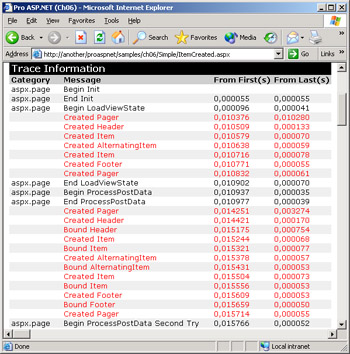
Figure 6-3: Tracing the events raised during the binding process of the DataGrid.
How can you avoid having your event handler called during the view-state restoration phase? The rub is that there's no specific information available with the event data structure that allows you to detect this situation. A possible trick is using a global state variable—a Boolean flag—to track whether the code is entered in the data-binding phase or not. If the ItemCreated is called when this flag is set to false, the call is because of view-state restoration. The beginning of the data-binding phase is signaled by the DataBinding event.
The handler of the DataBinding event has a simple structure, as shown below:
void TraceDataBinding(object sender, EventArgs e) {
 m_isBindingData = true;
 Trace.Warn("Data binding...");
}
void ItemCreated(object sender, DataGridItemEventArgs e) {
 if (m_isBindingData)
 Trace.Warn("Created " + e.Item.ItemType.ToString());
}
Finally, note that the footer and header items are always created regardless of the setting of the ShowFooter and ShowHeader properties. The pager object, on the other hand, is created only if the AllowPaging property is set to true. It is interesting to note that the grid is composed of two pager objects—one on the first row and one on the last row. Using the PagerStyle property, you can decide how many pagers, or which one, are actually displayed. If needed, a DataGrid can also have two pager objects that work in synchronization. In any case, bear in mind that two ItemCreated events are fired for pagers.
Binding Data to the Grid
A DataGrid control is formed by data-bindable columns. By default, the control includes all the data-source columns in the view. You can change this behavior by setting the AutoGenerateColumns property to false. In this case, only the columns explicitly listed in the Columns collection are displayed. The DataGrid control supports a variety of column types, which differ from one another mostly in how each represents the data. You are required to indicate the type of the column if you add it to the Columns collection; otherwise, if automatic generation is used, all columns are of the simplest type—the BoundColumn column type. As Table 6-5 shows, a BoundColumn object displays the contents of the corresponding data source field by using labels.
|
Column Type |
Description |
|---|---|
|
BoundColumn |
The contents of the column are bound to a field in a data source. Each cell displays as plain text. |
|
ButtonColumn |
This type displays a command button for each item in the column. The text of the button can be data-bound. The command name of the button must be common to all the items in the column. You can control the graphical style of the button—push button or link button. |
|
EditColumn |
This is a particular type of button column associated with a command named Edit. When in edit mode, the whole row is drawn using text boxes rather than literals. |
|
HyperLinkColumn |
This type displays the contents of each item in the column as a hyperlink. The text of the hyperlink can be bound to a column in the data source or it can be static text. The target URL can be data-bound too. Clicking a hyperlink column causes the browser to jump to the specified URL. Supports target frames. |
|
TemplateColumn |
This type displays each cell of the column following a specified ASP.NET template. It also allows you to provide custom behaviors. |
Note that the AutoGenerateColumns property and the Columns collection are not mutually exclusive. If both properties are set to true and the collection is not empty, the DataGrid will first show the user-defined columns and then all the ones that autogeneration would produce.
You normally bind columns using the tag in the body of the server control, as the following code demonstrates:
Alternatively, you can create a new column of the desired class, fill its member properly, and then add the class instance to the Columns collection. Here is some code to add a BoundColumn object to a grid:
BoundColumn bc = new BoundColumn();
bc.DataField = "firstname";
bc.HeaderText = "First Name";
grid.Columns.Add(bc);
The order of the columns in the collection determines the order in which the columns are displayed in the DataGrid control.
Data Bound Columns
All grid column types inherit from the DataGridColumn class and have a few common properties such as the header text, footer and item style, and visibility flag. Table 6-6 details the properties shared by all types of columns.
|
Property |
Description |
|---|---|
|
FooterStyle |
Gets the style properties for the footer of the column. |
|
FooterText |
Gets or sets the static text displayed in the footer of the column. |
|
HeaderImageUrl |
Gets or sets the URL of an image to display in the header. |
|
HeaderStyle |
Gets the style properties for the header of the column. |
|
HeaderText |
Gets or sets the static text displayed in the header of the column. |
|
ItemStyle |
Gets the style properties for the item cells of the column. |
|
SortExpression |
Gets or sets the expression to pass to the OnSortCommand method when a column is selected for sorting. |
|
Visible |
Sets whether the column is visible in the DataGrid control. |
The BoundColumn class represents a DataGrid column type that is bound to a data field. The specific properties available on the class are listed in Table 6-7.
|
Property |
Description |
|---|---|
|
DataField |
Gets or sets the data-source column to bind to. |
|
DataFormatString |
Gets or sets the string that specifies the display format for the cells in the column. |
|
ReadOnly |
Sets whether the items in the column can be edited. False by default. |
The key properties to set up a grid column are DataField, which represents the name of the column to bind, and DataFormatString, which allows you to format the displayed text to some extent. The ReadOnly property has effect only if an edit command column is added to the grid. In this case, the cells in the column are switched to edit mode according to the value of the property.
The following code snippet adds two columns and specifies for each the header text and the source column. In addition, the second column is given a format string to make it look like a currency value with right alignment.
Note that graphical settings for a column must be specified using a child style tag.
Configuring the Column Footer
As mentioned, the footer in a DataGrid control is hidden by default. To turn it on, you must set the ShowFooter property to true. As usual, you can do that either declaratively or programmatically. The footer style can be fully modified through the FooterStyle property at the grid level or on a per-column basis.
The footer, though, is not a bindable element and doesn't supply system-provided aggregate functions (for example, Count, Sum). The footer also doesn't provide a predefined way to modify its structure. The footer is rendered through an empty row, so it maintains the same column structure as other rows. If this suits you, use the column's FooterText property to assign it HTML content. If you want a footer with a different number of columns, write a handler for ItemCreated and hook up the moment in which the footer is created. The following code snippet shows how to make the footer display a single cell that spans the entire grid width:
void ItemCreated(Object sender, DataGridItemEventArgs e) { ListItemType elemType = e.Item.ItemType; if (elemType == ListItemType.Footer) { // Remove all the cells but one TableCellCollection tcc = e.Item.Cells; int nTotalCols = tcc.Count; for (int i=0; i
The footer is a DataGridItem object and, as such, a special type of table row. The Cells collection provides access to all the row cells you can modify at will as a TableCell object.
Using Cascading Style Sheets Styles
When creating a DataGrid control, you inevitably need to tune up some of its visual settings for a more user-friendly result. This normally means that you change the font family, font size, and width and color of the text and borders. The code necessary to obtain the desired graphical effect might be replicated for several other pages in the same application. Because many visual settings of a Web control are actually rendered as cascading style sheets (CSS)–style properties, you can group all of them into a CSS class. Next, you reference the style from the control (including DataGrid controls) by using the CssClass property.
Another, slightly more elegant, way to solve the issue is by deriving from the DataGrid a new control that simply uses the specified settings as the new default settings.
HyperLink Columns
The HyperLinkColumn class is a column type that contains a hyperlink for each cell. The programmer can control the text of the hyperlink and the URL to navigate. In particular, both fields can be bound to a column in the data source. Table 6-8 details the properties specific to the class.
|
Property |
Description |
||
|---|---|---|---|
|
DataNavigateUrlField |
Gets or sets the data source column to bind to the URL of the hyperlinks in the column. |
||
|
DataNavigateUrlFormatString |
Gets or sets a parametric structure for the URL. |
||
|
DataTextField |
Gets or sets the data source column to bind to the text caption of the hyperlinks. |
||
|
DataTextFormatString |
Gets or sets the display format for the hyperlinks text. |
||
|
NavigateUrl |
Gets or sets the static URL to link to when a hyperlink in the column is clicked. |
||
|
Target |
Gets or sets the name of the target window or frame in which the linked page will be displayed. |
||
|
Text |
Gets or sets the static text caption to display for the hyperlinks in the column. |
||
Note that if you set the Text property, the NavigateUrl property, or both, all hyperlinks in the column will share the same caption and URL. Use the DataTextField and DataNavigateUrlField properties to associate the text and URL of the hyperlink with columns in the database. Finally, note that if DataNavigateUrlField and NavigateUrl are both set at the same time, the DataNavigateUrlField takes precedence.
The following code snippet demonstrates how to create a column of product names that, if clicked, displays a product information page in a frame. The DataTextField property indicates the source column for the hyperlink caption. The DataNavigateUrlFormatString property defines the format of the URL to use. The final URL is the productinfo.aspx page with a query string in which the ID argument is automatically set with the information read from the DataNavigateUrlField property—that is, productid in the following code:
The color of the hyperlinks can be controlled using CSS styles. In particular, you can set up a hover color with the following style block:
Formatting URLs and Column Names
There are some limitations in the use of column and URL names in DataGrid programming. In particular, the DataField and DataTextField properties don't allow you to combine more field names. Because of this restriction, you can have a single column displaying first and last name only if such a column is included in the underlying data source.
Even though the DataField and DataTextField properties don't support expressions, you can resort to dynamically created expression-based columns to work around the issue. In Chapter 5, we saw how to create such columns. The following code adds a FullName column to a DataTable object:
table.Columns.Add("FullName", typeof(string),
 "lastname + ', ' + firstname");
The newly created FullName column is then bound to the desired DataGrid column as you would do with any other column. This solution might be more effective than having the database management system (DBMS) return a calculated column. Later in the chapter, we'll examine an even more effective trick based on templated columns.
By using the DataTextField and DataNavigateUrlField properties together, you can make the URL of the hyperlink parametric. However, by default you are limited to just one parameter—the value bound to the DataNavigateUrlField field. To use a hyperlink bound to any number of arguments, you should resort to templated columns, as we'll see later in the section "Templated Columns."
Using Frames
When the cell of a hyperlink column is clicked, the browser jumps to the specified URL and displays the linked contents in the window specified by the Target property. Allowable values for the Target property are a few special names like _self, _blank, _top, _parent, and any name that individuates a frame window both inline and located in a frameset. If no target has been set, the current page is refreshed.
The following code shows how to display in an Internet Explorer inline frame window the output of a hyperlink column:
The various code snippets considered so far are all excerpts from the sample application shown in Figure 6-4.
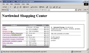
Figure 6-4: A realistic DataGrid control in action.
The white box on the right of the grid is an inline frame with a modified border named ProductView. Note that the name of the frame must begin with a letter and is case insensitive. The frame is refreshed whenever a hyperlink is clicked in the column.
| Note |
The tag is part of the HTML 4.0 specification and is supported by Internet Explorer 4.0 and later. Downlevel Netscape browsers don't support it. Netscape 4.x browsers support a similar tag instead. The name of this browser-specific tag is . |
Bindable ToolTips
As you can see in Figure 6-4, a ToolTip appears when the mouse hovers over the hyperlink. The ToolTip is not a bindable element in any type of column. However, with a relatively simple piece of code, you can make it bindable and use it to display extra fields on demand. In Figure 6-4, in fact, the ToolTip displays information about the number of items in stock for a given product.
To bind a data-source column to the ToolTip property of a Web control, you need a handler for the ItemDataBound event:
void ItemDataBound(object sender, DataGridItemEventArgs e) {
 ListItemType itemType = e.Item.ItemType;
 if (itemType == ListItemType.Item ||
 itemType == ListItemType.AlternatingItem)
 {
 DataRowView drv = (DataRowView) e.Item.DataItem;

 // Extract the first control in the first cell of the row
 WebControl webCtl = (WebControl) e.Item.Cells[0].Controls[0];
 WebCtl.ToolTip = drv["unitsinstock"] + " units in stock" ;
 }
}
In the handler, you first verify the type of the item being bound and then access the DataItem property. The test on the ItemType property serves to filter out the cases in which a selected or edited item is being bound to data. The DataItem property refers to the data object behind the particular row the grid is processing. As long as you use ADO.NET objects as the data source, the DataItem can be successfully cast to a DataRowView object.
| Note |
The DataItem property is set to a non-null object only during the ItemDataBound event. The same code won't work if attached to the ItemCreated event because at that time the DataItem property would be uninitialized. |
You use the contents of the DataItem property to prepare a row-specific string and bind it to the ToolTip property of a particular control located anywhere in the row. In particular, the previous code snippet associates the ToolTip with the first control in the first cell—the tag representing the hyperlink.
Command Columns
The ButtonColumn class represents a command column and contains a user-defined button for each cell in the column. Functionally similar to hyperlink columns, button columns are different because they generate a postback event on the same URL. To handle the click on a button, you write the ItemCommand event handler and check the CommandName property of the column button. Although the caption of each button can be bound to a data-source column, more often than not a button column has static text displayed through all the cells. Table 6-9 shows the properties that characterize the ButtonColumn class.
|
Property |
Description |
|---|---|
|
ButtonType |
Gets or sets the type of button to display in the column—a link button or push button. |
|
CommandName |
Gets or sets a string that represents the command to perform during the postback after a button in the column is clicked. |
|
DataTextField |
Gets or sets a source column to bind to the caption of the button. |
|
DataTextFormatString |
Gets or sets the string that specifies the display format for the caption in each command button. |
|
Text |
Gets or sets the caption displayed in the buttons of the column. |
The idea behind the button column is that you execute a particular action after the user clicks on a row. All buttons in the column are associated with some script code that posts the page back and executes the ItemCommand server-side procedure. Within that procedure, you use the command name to distinguish between multiple button columns and you use the ItemIndex property of the DataGridItem class to know about the particular row that was clicked.
| Caution |
Unlike what happens with other actions related to button controls in ASP.NET pages, validation is not performed when buttons in a ButtonColumn are clicked. To perform validation in a ButtonColumn, use a templated column and add a Button or LinkButton control to it. |
Handling a User's Clicking
To handle the user's clicking on the buttons in a ButtonColumn, you write a handler for the DataGrid's ItemCommand event. The handler requires the following prototype:
void ItemCommandHandler(
 object sender,
 DataGridCommandEventArgs e);
The DataGridCommandEventArgs structure makes available three key properties: Item, which represents the grid item where the click occurred, plus CommandName and CommandSource. The CommandName property is the name of the command associated with the clicked button, whereas CommandSource is the button object that raised the click event. A fourth property is mentioned in the documentation—CommandArgument, which represents an argument for the command. This property, though, is not defined in the programming interface of the ButtonColumn class and subsequently is not used in the ItemCommand event handler.
The following code illustrates the typical structure of the ItemCommand handler:
void ItemCommand(object sender, DataGridCommandEventArgs e) {
 switch(e.CommandName)
 {
 case "AddToCart":
 AddToCart(e.Item.ItemIndex);
 break;

 }
}
}
}
In this sample, the AddToCart method is passed the ordinal position of the clicked item. In other cases, you might want to use that information to retrieve the key associated with the clicked row. As mentioned earlier, the DataKeys collection on the DataGrid does just that for you.
You can use a picture to define the caption of the button. The following code shows how to accomplish this by simply using an HTML string that includes a static tag. This trick can be used, and works, with any type of column. However, it does not work if you change the button type from the default linkbutton to pushbutton.
Figure 6-5 shows a grid with a button column that represents the user interface of a simple shopping cart.
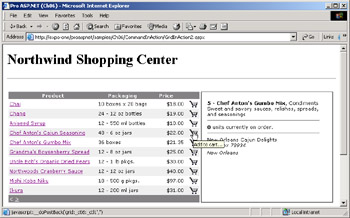
Figure 6-5: A DataGrid with a button column.
Implementing a Simple Shopping Cart
When the user clicks on the shopping cart button, the page posts back and requests the execution of the method, if any, associated with the DataGrid's ItemCommand event. In the previous code snippet, this method is AddToCart. It takes the index of the clicked row, retrieves some information from the underlying data item, and then adds a new row to a memory-resident DataTable object. This data table is the effective shopping cart and is stored in Session to survive across page requests.
The shopping cart is set up the first time the page is accessed—that is, when IsPostBack returns false—and is retrieved from Session for successive requests. The underlying DataTable object contains three fields—ProductName, Quantity, and Price—and is bound to a second grid to let users view the current list of orders. As you can see in Figure 6-6, the shopping cart DataGrid shows a footer section in which the number of ordered items and the total price are computed and displayed. To make such calculations, we use the Compute method on the DataTable object.
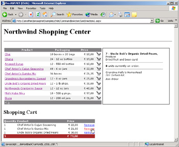
Figure 6-6: A simple shopping cart in action implemented using DataGrid controls.
// m_cart is the DataTable that contains the shopping cart
int totalItems = Convert.ToInt32(m_cart.Compute("Count(quantity)", ""));
int totalPrice = Convert.ToInt32(m_cart.Compute("Sum(price)", ""));

// Write the total number of items in the cart
e.Item.Cells[0].Text = totalItems.ToString();

// Write the total amount for the items in the cart
e.Item.Cells[2].HorizontalAlign = HorizontalAlign.Right;
e.Item.Cells[2].Text = String.Format("{0:c}", totalPrice);
The shopping cart grid also features a button column to remove an item from the cart. The associated code removes the clicked row from the DataTable that represents the shopping cart.
The Select Button Column
A special type of button column is the select column. It is a normal ButtonColumn with a command name of select. When you click on such a column, the DataGrid automatically redraws the selected row using a different class of settings—those defined under the node. There is no need for you to write an ItemCommand handler; the described behavior is built in.
The style of the selected row—at most one at a time—is set using the SelectedItemStyle property. It can be as easy as the following code:
The text of the button column can be replaced with a picture, as discussed earlier for the shopping cart. The change of the selected item is signaled with the SelectedIndexChanged event. However, before this event is fired, the application can handle the related ItemCommand. Note that the value of the DataGrid's SelectedIndex property has not been changed yet when ItemCommand arrives. It is set to the new index when SelectedIndexChanged reaches the application.
This characteristic alone allows you to implement a nice feature—deselecting the item after two consecutive clicks. In this case, you first cache the old selected item in the ItemCommand event handler; then you compare this index with the new selected index within the SelectedIndexChanged event. If the two match, you're clicking on a selected item, which will then be unselected. To unselect a selected item, you set the SelectedIndex property to -1.
void ItemCommand(object sender, DataGridCommandEventArgs e) {
 // Command names ARE case-sensitive
 switch(e.CommandName) {
 case "select":
 m_currentSelectedIndex = grid.SelectedIndex;
 break;

 }
}
void SelectedIndexChanged(object sender, EventArgs e) {
 if (m_currentSelectedIndex == grid.SelectedIndex) {
 grid.SelectedIndex = -1;
 return;
 }

}
| Note |
The comparison of command names made within a switch statement is case-sensitive and must perfectly match the name of the command as specified in the column declaration. This said, the select command in the column declaration can be specified with any case and is understood by the DataGrid engine in a case-insensitive way. |
If you want the clicked item to appear with the selected style while displaying the product information in a separate frame, you should switch to a button column instead of the hyperlink column.
When the SelectedIndexChanged fires, you change the Src attribute of the frame component and make it point to the given URL. You retrieve the key value associated with the selected row by using the DataKeys collection:
void SelectIndexChanged(object sender, EventArgs e)
{
 int productID = (int) grid.DataKeys[grid.SelectedIndex];
 string url = String.Format("productinfo.aspx?id={0}", productID);
 ProductView.Attributes["Src"] = url;
}
Note, though, that to programmatically configure the frame you must mark it as runat=server, as in the following code:
Figure 6-7 shows the final result.
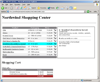
Figure 6-7: A shopping cart application in which the item being added or viewed is displayed with a selected style.
| Caution |
The selected item can be changed programmatically by setting the SelectedIndex property of the DataGrid control. Note, though, that if you select a new item through code, the SelectedIndexChanged code is not automatically executed. As long as that code is important, you should add an explicit call in the method. |
Enhancing the DataGrid
So far, we assumed that the DataGrid control was large enough to contain and display all the items in the data source. In a real-world scenario, though, a couple of additional functions are often needed—paging and sorting. The DataGrid control provides good built-in support for both functions. Also, the code you are required to write to implement these functions is limited and, more importantly, can be easily embedded in derived controls.
In this section, I'll focus the discussion on how to page and sort data through the grid. However, I'll do that paying particular attention to the programming interface of the control and blissfully skip over important aspects of data-driven applications, such as scalability and performance. Chapter 7 will be entirely devoted to rewriting the same application discussed here, but with more realistic considerations and optimization in mind. The content of this section focuses on the set of methods and events you can leverage on the DataGrid control.
Paging the Grid Content
In real-world scenarios, the size of a data source easily exceeds the real estate of the page. Data paging is the contrivance that many applications adopt to both gain in scalability and present a more helpful page to the user. Especially on the Web, displaying only a few rows at a time is a more effective approach than downloading hundreds of records that stay hidden most of the time. Setting up a data-paging mechanism requires a certain amount of work from both the control and the page side.
The DataGrid control provides some built-in facilities to let the programmer easily switch to a new page according to the user's clicking. The control needs to know how many items should be displayed per page, what type of functionality is required for the pager, and the data source to page through. In return for this, the control tracks the current page index, extracts the rows that fit into the particular page, and refreshes the user interface. Whenever the page index changes, an event is fired to the application—the PageIndexChanged event.
Caching the Data Source
The DataGrid control supports two types of paged data sources—built-in paging and custom paging. The standard way of paging is based on the assumption that all the records to scroll through are memory resident. The DataGrid is bound to the source all the time and extracts only the rows to display in each particular page. Note that the data source is not saved with the page's view state, so you are responsible for rebinding the data source at each postback.
Because the data source is lost at each response, caching is vital for effective standard paging. You download all the data the first time the page is accessed, store the data set into the application's Cache object or the session memory, and rebind until the application is closed or the session is over. In real-world applications, data caching is a double-edged sword. On one hand, it significantly speeds up data retrieval; on the other hand, it taxes the Web server's memory and potentially affects the overall scalability of the application. The scope of the data is another factor to consider carefully. If the data is shared by all sessions and doesn't get stale often, you can store it once in a global object. If you need to store a distinct copy of the data for each session, standard paging is probably not the smartest approach you can take, as it requires a lot of memory and, even worse, pushes an application architecture that doesn't scale really well. We'll delve much deeper into this topic in Chapter 7 when we'll introduce and discuss the second paging mechanism available—custom paging. For now, let's assume all the data is downloaded once and stored in the application's Cache object.
void Page_Load(object sender, EventArgs e) {
 if (!IsPostBack) {
 LoadDataFromDatabase();

 }

 BindData();
}
void LoadDataFromDatabase() {
 DataTable data = ExecuteQuery(cmdText, connString);
 Cache["AppData"] = data;
}
void BindData() {
 DataTable data = (DataTable) Cache["AppData"];

 grid.DataSource = data;
 grid.DataBind();
}
As this code demonstrates, the data is loaded only once and cached in memory. Whenever the page posts back, data is retrieved from the cache and bound to the DataGrid control.
Built-In Paging Support
To enable paging in a DataGrid control, you must set the AllowPaging property to true. When the property is turned on, the control user interface automatically acquires an extra component—the grid pager. The pager is a built-in toolbar with links to move from one page to the next or the previous. You normally configure the pager declaratively by specifying the working mode and a few visual settings. The maintenance of the component is in the care of the DataGrid control. The PageSize property lets you control the number of rows each page should contain. By default, this value is set to 10.
After turning the pager on, you're only halfway done. The pager is displayed and updated, but it's not functional until you write and register a handler for the DataGrid's PageIndexChanged event.
The delegate for the PageIndexChanged event is shown below. It passes down to the handler a data structure of type DataGridPageChangedEventArgs.
public delegate void DataGridPageChangedEventHandler(
 object source,
 DataGridPageChangedEventArgs e
);
The class inherits from EventArgs and features two extra properties—CommandSource and NewPageIndex. The former represents the source of the event. Because the event is fired only when a button in the pager is clicked, the event source is nothing more than the pager itself—a DataGridItem object. The NewPageIndex property contains the updated index of the page to show. The DataGrid internal engine calculates the correct index of the new page based on the button the user actually clicked.
The following code shows the typical (and minimal) page-changed handler for a DataGrid control. It sets the grid's CurrentPageIndex property with the new page index and rebinds to the data.
void PageIndexChanged(object sender, DataGridPageChangedEventArgs e) {
 grid.CurrentPageIndex = e.NewPageIndex;
 BindData();
}
When the DataGrid's DataBind method executes, the control extracts from the data source the subset of rows that fits into the current page. Those records are loaded into the Items collection and are used to generate the HTML output for the control.
Just as with row selection, you can programmatically change the page by updating the value of the CurrentPageIndex property. However, also in this case no related event is ever fired to the application. Another little gotcha you might want to be aware of occurs when you page a grid with a selected row or a row that is currently being edited. Changing the page doesn't reset the value of SelectedIndex and EditItemIndex properties. As a result, if you have selected, say, the third item on a page and move to the next page, the third item will also be selected on the new page. To avoid this, you can reset the SelectedIndex property to -1 in the PageIndexChanged event handler.
void PageIndexChanged(object sender, DataGridPageChangedEventArgs e) {
 // Cancels the selection
 grid.SelectedIndex = -1;
 ProductView.Attributes["Src"] = "about:blank";

 grid.CurrentPageIndex = e.NewPageIndex;
 BindData();
}
The preceding code clears the selection index and frame upon page changes.
Customizing the Pager Component
The pager component is a table row made of a single cell that spans the whole width of the grid. You can obtain a reference to the pager in two ways—either through the CommandSource member of the DataGridPageChangedEventArgs data structure during the PageIndexChanged event or through the event data available within the ItemCreated event. In particular, the ItemCreated event is useful because it allows you to customize the pager structure beyond imagination. For example, you could add ToolTips to existing links, insert new link buttons, and even embed a completely user-defined pager. I'll demonstrate this in Chapter 7.
The DataGrid control provides some built-in properties to also let you declaratively customize the pager bar. In particular, you can choose between two display modes—numeric pages and next-prev mode. By default, the pager is made of two link buttons: one pointing to the previous page and one pointing to the next page. The default text that is associated with these links is < for the previous button and > for the next button. You can change the text for each link using the PrevPageText and NextPageText properties. The text replacement can occur both declaratively and programmatically. In the latter case, you do it through the PagerStyle property of the DataGrid control. The following code, on the other hand, shows how to proceed declaratively:
The font of the pager is set to Webdings, in which the strings 3 and 4 are equivalent to the characters 3 and 4
The display mode of the pager is controlled by the Mode property, whose acceptable values are NumericPages and NextPrev. The Mode property takes its values from the PagerMode enumeration. The default setting is NextPrev and results in two buttons, one to move to the previous page and one to jump to the next page. The DataGrid control automatically enables and disables the links according to the current page.
When working in numeric pages mode, the pager displays as many links as there are pages in the data source. The PageCount read-only property informs you about the total number of available pages. Figure 6-8 shows the two pager modes.
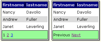
Figure 6-8: The two pager modes, face to face.
In numeric pages mode, the pager shows the index of the current page as plain, nonclickable text. On the other hand, there's no explicit information about the current page index in the default mode. This information can be added manually using the advanced customization mechanism supplied by the ItemCreated event. The following code inserts a new label control with page information between the page links:
if (e.Item.ItemType == ListItemType.Pager) {
 if (cartGrid.PagerStyle.Mode == PagerMode.NextPrev) {
 TableCell pager = e.Item.Cells[0];
 Label ctl = new Label();
 ctl.Font.Name = "verdana";
 ctl.Font.Size = FontUnit.Point(8);
 ctl.Text = String.Format(" Page {0} ",
 1 + cartGrid.CurrentPageIndex);
 pager.Controls.AddAt(1, ctl);
 }
}
The final results are shown in Figure 6-9.
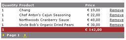
Figure 6-9: Page information dynamically inserted between the links of a pager.
Sorting the Data
To enable the DataGrid's sorting capabilities, you set the AllowSorting property to true. When sorting is enabled, the DataGrid gains the ability of rendering the header text of columns as links. You can associate each column with a sorting expression by using the SortExpression property. A sorting expression is any comma-separated sequence of column names. Each column name can be enriched with an order qualifier such as DESC or ASC. DESC indicates a descending order, while ASC denotes the ascending order. The ASC qualifier is the default; if omitted, the column is sorted ascendingly. The following code sets up the DataGrid column for sorting on the productname data source column:
As Figure 6-10 shows, the header of the column is rendered as a link.
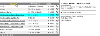
Figure 6-10: A DataGrid with a couple of sortable columns.
When you click the header of the column, the page posts back and runs the code associated with the SortCommand event.
The DataGridSortCommandEventArgs structure contains an extra property named SortExpression, which contains the sort expression of the column.
void SortCommand(object sender, DataGridSortCommandEventArgs e)
{
 // sort the data source
 // bind the data source
}
The event handler must accomplish two tasks—sorting the source and binding the data back to the grid. The sorting can take place in any way that is suitable to your application. Typically, if you're working with cached data (as we're doing now), you use the sorting capabilities of the ADO.NET objects. Otherwise, you can run another query against the DBMS and obtain a properly sorted recordset.
Let's modify the BindData method to make it capable of supporting sorted views of data. The code first retrieves the data from the Cache object and then sorts it using a DataView object. (See Chapter 5.)
void SortCommand(object sender, DataGridSortCommandEventArgs e) {
 ViewState["DataSortExpression"] = e.SortExpression;
 BindData();
}
void BindData() {
 DataTable data = (DataTable) Cache["AppData"];
 DataView dv = data.DefaultView;
 dv.Sort = (string) ViewState["DataSortExpression"];
 grid.DataSource = dv;
 grid.DataBind();
}
We need to pass the sort expression from the SortCommand method to the BindData method, which will actually prepare and bind the sorted view of data to the grid. Judging from the preceding code, there would be no need to use the view state. (As we'll discuss in more detail in Chapter 14, minimizing the use of the view state is a key factor in ASP.NET optimization.) You could actually pass the sort expression as an argument to the BindData method, but that would work only to sort data after a user click. If you don't save the sort expression in some sort of persistent location (Session is fine as well), that information would get lost with the next postback. In particular, you lose the sort as soon as you move to the next page.
| Caution |
Caching a DataView to feed the DataGrid's built-in paging engine will not work because the DataView class does not store any data. Storing a DataView would simply cache the indexes of an underlying DataTable object. Unfortunately, though, there will be no track of that table across postbacks if you don't cache it too! |
Auto-Reverse Sorting
Although functional, the sorting mechanism discussed so far is too simplistic and unusable for real-world applications. First, the user has no feedback about the column the data is sorted by. Second, users might want to reverse the order of the data while maintaining the same sort expression. Auto-reverse sorting is a feature that automatically switches from ascending to descending order, and vice versa, when you click a column that is already sorted.
The ViewState-based sorting mechanism we discussed earlier already provides a firm infrastructure to build auto-reverse sorting.
void SortCommand(object sender, DataGridSortCommandEventArgs e)
{
 // Cache the column sort expression
 string newExpr = e.SortExpression;

 // Compare the new and the cached sort expression. If the two
 // match, then a DESC qualifier is silently appended.
 string oldExpr = (string) ViewState["DataSortExpression"];
 if (oldExpr == newExpr)
 ViewState["DataSortExpression"] = newExpr + " DESC";
 else
 ViewState["DataSortExpression"] = newExpr;

 // Bind the data
 BindData();
}
Any information stored in the page's ViewState persists across two successive requests for the same page. In light of this, the current sort expression is available while processing the next request along with the expression associated with the clicked column. If the two expressions match, you're clicking on an already sorted column. This behavior is normally a prelude to reversing the order of the sort.
The code just shown does exactly that, at least in a good number of circumstances. There's an implicit assumption in the preceding listing. It tacitly assumes no sort expression in any columns would ever use the (redundant) keyword ASC to denote an ascending order; it also assumes no descending order is requested. As long as any sort expression is made of a single column name with no order qualifier, the code would work perfectly in providing auto-reverse sorting.
| Caution |
The sorting infrastructure described here needs some improvement to work in all cases regardless of the sort expressions used. In particular, it has a couple of shortcomings. It doesn't work well if multicolumn sorting is used and if a column must be sorted in a descending way by default. A more general approach entails writing a function to parse all the columns in the expression and invert the order for each of them. This approach is described in detail in my book BuildingWeb Solutions with ASP.NET and ADO.NET (Microsoft Press, 2002). |
Providing Feedback About Sorting
To give some feedback to the user about the sorted column, you need to programmatically modify the header of the column. You hook up the creation of the header by writing an ItemCreated event handler.
void ItemCreated(object sender, DataGridItemEventArgs e) { switch(e.Item.ItemType) { case ListItemType.Header: SetupHeader(e); break; } } void SetupHeader(DataGridItemEventArgs e) { // Is the current sort expression descending? string sortExpr = (string) ViewState["DataSortExpression"]; bool isDesc = sortExpr.EndsWith(m_DESC); // Remove the DESC keyword from the sort expression string pureSortExpr = sortExpr.Replace(m_DESC, ""); // Loop through columns to find a matching expression for (int i=0; i
The label added alongside the header text is a webding glyph that represents a triangle pointed up (as in Figure 6-11) or down.
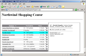 Figure 6-11: An auto-reverse DataGrid providing feedback about the current sort.
| Note |
How can you return to the original sort once you sorted the data source by clicking on column headers? To restore the original sort, you simply clear the current expression and refresh the data. |
|||
Templated Columns
Templated columns allow you to create combinations of HTML text and server controls to design a custom layout for any column. The controls within a templated column can be bound to any combination of fields in the data source. In particular, you can group more fields in a single expression and even embellish the expression with HTML attributes such as boldface or italic style. Templates are column-specific and cannot be applied to autogenerated columns. If you want more columns to share the same template, you can duplicate the code only in the ASP.NET page for each column.
A templated column is recognized by the tag and rendered by the TemplateColumn class. The body of the tag can contain up to four different templates: ItemTemplate, EditItemTemplate, HeaderTemplate, and FooterTemplate. Just as any other column type, a templated column can have a header text and a sort expression. Templated columns, though, do not have an explicit data source field to bind. To bind a template column to one or more data fields, you use a data-binding expression and the DataBinder class. The DataBinder class provides a simpler syntax than data-binding expressions, but it doesn't let you obtain more than single-value data binding. In particular, you use the DataBinder's Eval method to evaluate data-bound expressions at run time and return the value properly cast. For example, the following code snippet shows a templated column that mimics the behavior of a BoundColumn object associated with the lastname column:
By using DataBinder.Eval, you can access any number of fields in the currently bound data source. In addition, you can combine them in any order to obtain any sort of expression, which is otherwise impossible using a simpler bound or button column.
Available Templates
ItemTemplate is the property that lets you define the layout and content of each cell in the column. Other available templates would let you define the structure of the column header (HeaderTemplate) and footer (FooterTemplate). Furthermore, you can decide the behavior and appearance of the column when a cell is being edited through the EditItemTemplate template. I'll have more to say about column in-place editing in the later section "DataGrid In-Place Editing." Table 6-10 summarizes the available column templates and gives a hint about their usage.
|
Template Name |
Usage |
|---|---|
|
ItemTemplate |
Contains the template for the items in a DataGrid column. You can use any combination of HTML text and ASP.NET controls to populate the column. |
|
EditItemTemplate |
Controls the contents of the item selected for editing in the column of the DataGrid control. Places the controls you need for editing the cell between the opening and closing tags. |
|
HeaderTemplate |
Contains the template for the heading section. If you omit this template, the column header is rendered with a label, or with a hyperlink if sorting is enabled. By specifying a custom template, you make yourself responsible to provide the user interface needed to enable sorting on the column. |
|
FooterTemplate |
Contains the template for the footer section of the column. The default value is a null reference. The footer is displayed only if the ShowFooter property of the DataGrid is set to true. |
The template properties in the table are exposed by the TemplateColumn class as data members of a type that inherits from the ITemplate interface. Template-based properties are declaratively set with plain text in the layout of ASP.NET pages. You can programmatically define a template property by writing and instantiating a class that implements the ITemplate interface.
In addition to templates, the TemplateColumn class provides a few style properties—ItemStyle, HeaderStyle, and FooterStyle—that you use to customize the appearance of items on a per-column basis. The usage of these properties is nearly identical to the same properties seen for other types of columns.
Combining Multiple-Source Columns
A template column is typically used to combine multiple data-source columns into a single DataGrid column. A template column allows you to bind, say, the last and first name of an employee to the same column using some HTML styles to make it even more compelling. The following code snippet demonstrates how to concatenate the first and last name:
 <%# "" + DataBinder.Eval(Container.DataItem, "lastname") +
 ", " + DataBinder.Eval(Container.DataItem, "firstname") %>
The DataBinder.Eval method takes two arguments, the second of which is the name of the data-source column. The first argument is the data object bound to the particular row being processed. The Container.DataItem expression returns the DataItem property on the underlying DataGrid item.
The item template can be described in terms of plain ASP.NET text as well as resorting to some ASP.NET layout code. The following code snippet rewrites the same code discussed a moment ago, but it uses a Label control and sets the ToolTip property:
As you can see, the DataBinder.Eval method features a third argument, which is the format string for the bound value. The output generated by the code is shown in Figure 6-12.
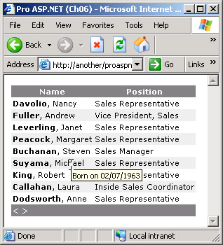
Figure 6-12: A templated column employs custom styles and bound ToolTips.
Using Multiple Arguments with HyperLink Columns
As we saw earlier, the HyperLinkColumn class can navigate to parametric and data-bound URLs. The column expands arguments automatically but doesn't let you specify more than one argument per URL. More often than not, you'll find this limitation too restrictive. Is there a way to have a hyperlink column with a URL that embeds multiple arguments? Templated columns make this possible. The HTML output of a HyperLinkColumn cell is an tag. If you create a templated column and make it output an anchor element, you can closely control the structure of the resultant hyperlink and specify as many data-bound arguments as needed.
The following code defines a DataGrid templated column that provides the same functionality as a hyperlink column but supports up to four URL arguments:
 <a href="<%# "moreinfo.aspx" +
 "?employeeid") +
 "&first=" + DataBinder.Eval(Container.DataItem, "firstname") +
 "&last=" + DataBinder.Eval(Container.DataItem, "lastname") +
 "&position=" + DataBinder.Eval(Container.DataItem, "title")
 %>" target="frInfo">More...
 </a>
The structure of the template is extremely simple and just builds up an anchor tag in which the href attribute and the text are data bound to as many fields as needed. Figure 6-13 shows the final results.
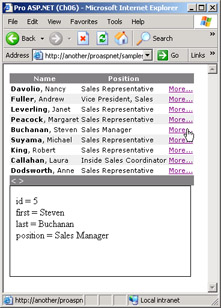
Figure 6-13: A templated column that acts as a multiparameter hyperlink column.
| Note |
To some extent, templated columns are functionally similar to hooking up the ItemCreated event and can modify the DataGrid items on the fly. Templates are extremely flexible, but with them you pay parsing costs that make them less efficient overall than hooking an event. Although the difference is not always relevant, you should avoid templates if you have another way to accomplish the same task. |
Enhancing the Shopping Cart Application
A templated column allows you to enhance the shopping cart by adding the possibility of specifying how many items of a given product will be purchased. The idea is to replace the button column used for adding items to the shopping cart with a template column in which the button is preceded by a text box, as in Figure 6-14.
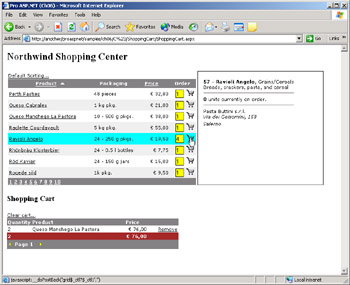
Figure 6-14: Using a templated column to enhance the shopping cart application.
The source code of the template looks like the following:
The template is composed of a text box and link button whose text is a static tag. The procedure to handle the click doesn't need to change. Reading the value entered in the text box when the page posts back to add to the shopping cart is a bit more tricky. You must retrieve the text-box control in the subtree of controls rooted in the templated cell. You can do that either by index or by name. To find a control by name in its proper naming container, you use the FindControl method. Be sure the FindControl method is called on the DataGrid item object, not on the page or anywhere else. The following code shows how to rewrite the AddToCart method to add the specified number of items:
void AddToCart(DataGridItem item, int rowIndex)
{

 int defaultQuantity = 1;
 TextBox ctl = (TextBox) item.FindControl("qty");
 if (ctl != null)
 defaultQuantity = Convert.ToInt32(ctl.Text);

 row["quantity"]= defaultQuantity;
 row["productname"] = tableRow["productname"];
 row["price"] = (decimal) (defaultQuantity *
 Convert.ToDecimal(tableRow["unitprice"]));
 m_cart.Rows.Add(row);

}
The DataGridItem object that gets passed to AddToCart is the e.Item object taken from the event data:
void ItemCommand(object sender, DataGridCommandEventArgs e)
{
 // Command names ARE case-sensitive
 switch(e.CommandName)
 {
 case "AddToCart":
 AddToCart(e.Item, e.Item.ItemIndex);
 break;

 }
}
DataGrid In Place Editing
A DataGrid control displays mostly read-only data. If editing is needed, you select the row to update and post a request for another page. The new page contains an edit form with input fields and links to persist or reject the changes. This is probably the most effective pattern for editing data over the Web and certainly the pattern that provides the highest level of flexibility. With DataGrid controls, though, another simpler, but just as effective, model of data editing is possible. The new model is known as in-place editing and mimics the behavior of an Excel worksheet. When you trigger the event that begins the editing phase, the visible part of the grid is redrawn and-like cells in Excel—the row selected for editing is rendered in a different way, using text-box controls instead of literals and labels. At the same time, the DataGrid control completes its own user interface with a couple of button links to allow you to commit or rollback changes.
In-place editing doesn't require much work to be completely set up but, at the same time, is not appropriate for all types of applications and not functional in all operating contexts. All in all, if you have to edit the content of single and relatively small tables that have no special validation or business logic to apply, in-place editing is extremely handy and powerful.
Configuring the Built In Edit Engine
The key object for in-place editing is the EditCommandColumn class. The column adds a link button to all rows of the grid. When the link is clicked, the page posts back and the cells of the row are drawn in edit mode. How a column behaves in edit mode depends on the column type. For example, button and hyperlink columns are completely ignored in edit mode. Bound and templated columns, on the other hand, change their rendering when the row is being edited. In particular, bound columns are rendered using text boxes in place of literals, whereas templated columns display the contents of the section, if any. Here is a typical declaration for an edit column:
The properties specific to the EditCommandColumn class are listed in Table 6-11.
|
Property |
Description |
|---|---|
|
ButtonType |
Gets or sets the button type for the column. Acceptable values are defined in the ButtonType enumeration. Default is LinkButton. |
|
CancelText |
Gets or sets the text to display for the Cancel command button when the row is being edited. |
|
EditText |
Gets or sets the button text to display to let the user click and edit the contents of the row. |
|
UpdateText |
Gets or sets the text to display for the Update command button when the row is being edited. |
The edit column initially displays a link (or a push) button to click to enter in the edit mode. The text displayed in each cell of the column is not data-bound but can only be a literal string (for example, Edit) or anything else you can define through HTML tags (for example, an image). The text to use is read through the EditText property. When the row enters in edit mode, the EditItemIndex property is automatically set to the 0-based index of the row, the cells are rendered using text boxes, and the Edit button is replaced with two new buttons—one to save the changes and one to cancel. The text for these two buttons can be controlled using the UpdateText and CancelText properties.
Clicking any edit buttons fires an ad hoc event—EditCommand, UpdateCommand, or CancelCommand—for which programmers should provide handlers.
The DataGrid control provides a built-in mechanism for editing rows, but the programmer is still responsible for supplying the actual code that updates the underlying data source. Likewise, the programmer is responsible for any start-up or clean-up operation that needs to be accomplished when the editing begins or is canceled. The following code snippet shows typical event handlers for in-place editing:
void EditCommand(object sender, DataGridCommandEventArgs e) {
 // Set the current item to edit mode
 grid.EditItemIndex = e.Item.ItemIndex;

 // Refresh the grid
 BindData();
}

void CancelCommand(object sender, DataGridCommandEventArgs e) {
 // Cancel edit mode for the row
 grid.EditItemIndex = -1;

 // Refresh the grid
 BindData();
}

void UpdateCommand(object sender, DataGridCommandEventArgs e) {
 // Cancel edit mode for the row
 grid.EditItemIndex = -1;

 // Update the data source
 // *** do something here

 // Refresh the grid
 BindData();
}
Figure 6-15 shows the two phases of the row-editing process.
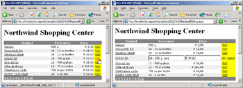
Figure 6-15: The in-place editing process in action.
Setting Up the Template of the Row
As you can see in Figure 6-15, there's a significant difference in the style of the row before and during the editing. Any visual setting you apply to the row in read mode is lost when the row enters the edit mode. To obtain a consistent user interface, there's no other way than intervening when the row is created—that is, when the ItemCreated event fires for an item of type EditItem.
void ItemCreated(object sender, DataGridItemEventArgs e) {
 ListItemType itemType = e.Item.ItemType;
 switch(itemType)
 {
 case ListItemType.EditItem:
 SetupEditItem(e);
 break;

 }
}
In this case, the DataGridItem is the table row that contains the row to edit. You can walk your way through the various cells and modify font and styles at your convenience. For example, the following code changes the style of the all text boxes:
void SetupEditItem(DataGridItemEventArgs e) {
 foreach(TableCell cell in e.Item.Cells)
 {
 // Skip if a readonly cell is found
 if (cell.Controls.Count <=0)
 continue;

 Control ctl = cell.Controls[0];
 if (ctl is TextBox)
 {
 TextBox t = (TextBox) ctl;
 t.BackColor = Color.Yellow;
 t.BorderStyle = BorderStyle.Outset;
 t.BorderColor = Color.BlueViolet;
 t.BorderWidth = Unit.Point(1);
 t.Width = Unit.Percentage(100);
 t.Font.Name = "verdana";
 t.Font.Size = FontUnit.Point(8);
 }
 }
}
The text that characterizes the link buttons can be made of HTML-rich text and include formatting and images as well. For example, the following code uses a GIF file for the edit text:
EditText=""
The final results are shown in Figure 6-16.
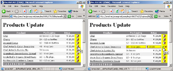
Figure 6-16: The in-place editing process in action after applying cosmetic changes.
Not all cells in a row are actually editable. As mentioned, cells belonging to hyperlink and button columns cannot be edited and cells of bound columns are editable by default. The BoundColumn class has a Readonly attribute that if set to true (false is the default) would make the cell read-only and leave it unaffected by the editing mode. By contrast, cells of templated columns are read-only by default and enter into edit mode only if you explicitly define an edit template.
| Note |
Just as for the row selection, the row editing mode is persisted across page changes. For example, suppose you are editing the third row on a page. If you jump to another page, the third row would automatically display in edit mode too. This happens because the EditItemIndex property—the property that determines which row is being edited—is never reset during the page changed postback. To avoid this behavior, reset the EditItemIndex property to -1 in your own PageIndexChanged event handler. |
Validation and Edit Templates
The in-place editing, as we've built it so far, is simple and easy but comes with quite a long list of shortcomings. In particular, only the visible fields are updateable and the initial text of the text boxes defaults to the display text of the cell. As you can see in Figure 6-16, this is a bit impractical if you have formatting rules applied or computed columns. In addition, the use of automatically generated edit controls forces you to use indexes to retrieve the new values from text boxes and no validation or special input policies are possible. For example, you can't check whether a date or a ZIP code is really entered or figure out a way to force users to pick up values from a closed list.
All these issues are solved at the root if you don't use DataGrid in-place editing and resort to a more traditional approach based on ad hoc pages or user controls. However, by also using edit templates, the DataGrid in-place editing can be enhanced to some extent. Let's see how to edit the price of a product without formatting text and making sure that a valid price is entered.
The first step in accomplishing this is turning the unit price column into a templated column. The following code would do the job:
<%# DataBinder.Eval(Container.DataItem, "unitprice", "{0:c}")%>
Replacing the original bound column with this one doesn't change the appearance of the page but produces one relevant effect—the Price column is no longer editable. Templated columns, in fact, are read-only by default. To make the price editable, we need to add an edit template, as shown here:
The column's edit template includes a text-box server control that we can configure as needed for fonts and styles. Not a minor point is the fact that we can now also explicitly set the ID of the control. The default text of the text box is set using the DataBinder.Eval method, for which we can choose the formatting rules that best apply. For example, {0:N} indicates that the price is displayed as a standard number with thousand separators and two decimal digits. Note that with templated columns, the ItemCreated trick we set up earlier for customizing the look and feel of the text box doesn't work any longer. If you want to control the visual settings of the text box, you can work on the control declaration in the template.
If validation is required, you simply add the validation control that best suits your needs. For example, you add a RangeValidator if you want to make sure the new value falls in a specified range:
The type of the data in the control is set to Currency to allow for currency characters to be entered if needed. The MinimumValue and MaximumValue properties define the range of allowed values. As we saw in Chapter 3, the Text property indicates the short text to display alongside the text-box control should the validation not be successful. You normally set the Text property to an asterisk, an exclamation mark, or any expression that might serve to capture the user's attention. You might also set it to descriptive text, but this is sometimes impractical for space constraints. In this case, you store a short alert expression into Text and set the ErrorMessage property to a full description. ErrorMessage would be displayed only in the validation summary of the page, if any.
A smart trick to get the best of both solutions is associating an HTML ToolTip with the short alert text in the Text property. To obtain that, you can wrap the text in a tag and set the title attribute as needed. When using a validation control in a DataGrid cell, you should always set the Display property to Dynamic to ensure that the label with the error message is created in the page only if strictly needed. This contrivance normally produces a better graphical result. Figure 6-17 shows the validation control in action.
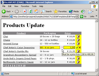
Figure 6-17: Validating the input values in a DataGrid control.
Note that validation on the page is performed only when the update command button is clicked.
Persisting Changes
The final step of in-place editing is persisting the changes to the underlying data source. Before performing the physical update, though, you must first retrieve the new values from the text boxes or drop-down lists in the editing cells. The code you use to retrieve values differs depending on whether the default or a custom edit template is used. When the user clicks to save the changes, the page posts back and executes any code associated with the UpdateCommand event.
To start out, the event handler resets to -1 the index of the row being edited and cancels the editing mode. Next, it retrieves the new values and prepares the commands needed to update the underlying data source. For Web applications, direct SQL commands are probably the fastest way to persist changes, at least when data conflicts are not critical events. On the other hand, when the logic of the application requires that the code update the same record read (that is, a record that has not been modified in the time between your reading and writing), then resorting to ADO.NET batch update allows you to exploit the framework facilities for data conflicts. (We covered batch updates in Chapter 5.)
Retrieving Input Values
To read the input values, you retrieve the instances of the corresponding controls and extract their contents. When the in-place editing feature is implemented in the default way—that is, without edit templates—the preferred way to retrieve the involved text boxes is by position.
// Retrieve the second column of the row
// (e is the event data (DataGridCommandEventArgs class))
Control = e.Item.Cells[1].Controls[0];
if (ctl == null)
 return;
string packaging = ((TextBox) ctl).Text;
The preceding code shows how to retrieve the value of the text box in the second column of the row. The index of the Cells collection is the 0-based position of the edited column. The index is absolute and doesn't consider any read-only column in the middle. Of the specified cell, you then take the first control, which is a TextBox control by design. Note that the value read out of the text box must be converted to the destination type—that is, the type of the corresponding source column. This feature alone makes it significantly more complex than using the default editing template with formatted columns. In fact, you must be able to read the column's value free of all formatting text (for example, the currency symbol).
You must identify input controls by position also because the text boxes are created by the DataGrid control and are given a predefined ID that you can only guess or determine empirically. All text boxes are created by the time the ItemCreated event fires, however. So by writing such an event handler, you could change the text-box ID on the fly and use a custom but unambiguous name. The following code snippet slightly enhances the code we discussed earlier to customize the style of the editing text boxes:
foreach(TableCell cell in e.Item.Cells)
{
 // Skip if a readonly cell is found
 if (cell.Controls.Count <=0)
 continue;

 Control ctl = cell.Controls[0];
 if (ctl is TextBox) {
 TextBox t = (TextBox) ctl;
 t.ID = "MyTextBox";

 }
}
The name of the underlying database column is a good (and unique) replacement for the system-provided ID.
If you use edit templates, things are easier because you use your own text boxes and give them your own IDs, which are fixed and unique. In this case, retrieving the input values is as easy as the following code:
// priceBox is the ID of the textbox in the edit template
ctl = item.FindControl("priceBox");
if (ctl == null)
 return;
double price = Convert.ToDouble(((TextBox) ctl).Text);
Using FindControl is easier to code and more readable, but slower than just using indexes and position-based access.
Updating the Data Source
Once you hold all the new data, updating the underlying data source is simply a matter of preparing and executing a SQL command. Using parameters makes code more clear and also constitutes an extra line of defense against malicious SQL attacks. Command parameters, in fact, are strongly typed and match exactly the database type. If you set up the command using parameters, a string would never be passed in place of a number, which is one of the typical ways SQL injections occur. (More on this in Chapter 15.)
// Prepare the command
string updText = "UPDATE products " +
 "SET quantityperunit=@packaging, " +
 "unitprice=@price WHERE productid=@productid";
SqlConnection cnn = new SqlConnection(connString);
SqlCommand cmd = new SqlCommand(updText, cnn);
cmd.Parameters.Add("@productID", SqlDbType.Int).Value = productID;
cmd.Parameters.Add("@packaging", SqlDbType.NVarChar).Value = packaging;
cmd.Parameters.Add("@price", SqlDbType.Money).Value = price;

// Execute the command
cnn.Open();
cmd.ExecuteNonQuery();
cnn.Close();
The command executes during the postback event that originates from the user's clicking of the Update link. After that, the data source must be re-bound to the DataGrid control for display purposes. However, an extra step might be needed this time. If you configured the grid to use cached data (as we did in this chapter), for the changes to show up you must invalidate and refresh the current cache. As a result, the complete code for the UpdateCommand event looks like the following:
void UpdateCommand(object sender, DataGridCommandEventArgs e)
{
 // Cancel edit mode for the row
 grid.EditItemIndex = -1;

 // Update the data source
 UpdateDataSource((int) grid.DataKeys[e.Item.ItemIndex], e.Item);

 // Reload the data and refresh the grid
 LoadDataFromDatabase();
 BindData();
}
The DataGrid in-place editing is quick and effective, but it also has the drawback of allowing for only one row at a time to be edited. If you want a full-page edit grid control, you must define all template columns and configure them to use data-bound text boxes rather than literals. If you do so, though, the update mechanism is entirely your own, but it doesn't require code different from the solutions we examined in this chapter.
Conclusion
In this chapter, we examined the DataGrid ASP.NET control, which is a type of component that all Web applications need to employ in one shape or another. All Web applications, in fact, at a certain point in their life cycle are called to display data. More often than not, this data is in tabular format.
As long as the data to display can be articulated in rows and columns, the DataGrid control is ideal to display it. The control provides facilities to select and edit single rows, page through a bound data source, and sort and filter views. In addition, you can customize all the cells in a column by using any data-bound template made of any combination of HTML and ASP.NET text. To top it off, a fair number of events signal to user applications the key events in the control's lifecycle. Good examples of such events are ItemCreated and ItemDataBound, just to name those that provide for the deepest types of customization. Other events such as SelectedIndexChanged, ItemCommand, and PageIndexChanged are more specific but equally useful.
The in-place editing feature is a piece of cake, as it is easy to configure and powerful to exploit. We could discuss the fact that this type of editing—designed to resemble Excel worksheets—is not appropriate for all applications and pages. However, as long as you can functionally afford the feature, in-place editing can save you a lot of coding and increase productivity by at least one order of magnitude.
So what should your opinion be about the DataGrid control after this chapter? The control is definitely the richest and most powerful of all ASP.NET Web controls. However, if you look at the amount of code we've put in all the pages we've built in this chapter, you can't help but have doubts. If the DataGrid is so powerful and feature-rich, why do we need to write all that code? The answer is not simple and probably touches Microsoft policies for public controls. Although incredibly rich with functions and settings, the DataGrid is only a small portion of a real-world control. For paging, editing, and sorting, it provides only an easily extensible infrastructure for which you have to write the missing, application-specific code.
Although the DataGrid control could be even richer than it is today in ASP.NET 1.1, no general-purpose control would ever be so perfect as to need virtually no customization code. The reason is that all applications have a grid of data to display, but all applications need their own grid. As a result, applications either use a generic grid to configure and customize programmatically or employ a tailor-made control in which extensions have been hard-coded once and for all. Fortunately, though, the DataGrid is part of an object-oriented framework, so deriving new classes is easier than ever before. Finally, note that we've used inline code for all the samples we developed in this chapter. Given the amount of code we had to write, a page code-behind class wouldn't have been a bad idea.
While introducing the chapter, we mentioned that the DataGrid is not the most flexible of all iterative data-bound controls. After that, we didn't do anything else but emphasize the flexibility of the control. What's up with that? The DataGrid is an extremely flexible control, but it can only display tables of data. Other components—the DataList and the Repeater—let you gain more precise control over the binding process and even produce a nontabular output. We'll examine other iterative controls in Chapter 9.
In the next chapter, we'll discuss ways to paginate and navigate through large amounts of data in a Web application. In particular, we'll focus on the importance of writing ad hoc SQL code to balance various contrasting requirements, such as minimizing the data to transfer, maximizing performance, and improving scalability.
Resources
- Building Web Solutions with ASP.NET and ADO.NET (Microsoft Press, 2002)
- Alternate by value (http://www.aspnetpro.com/features/2003/02/asp200302de_f/asp200302de_f.asp)
- Sort Data on the Fly (http://www.aspnetpro.com/features/2002/12/asp200212wf_f/asp200212wf_f.asp)
- Keep Your DataGrid Position (http://www.aspnetpro.com/features/2002/12/asp200212ht_f/asp200212ht_f.asp)
- Summary Rows in DataGrid Controls (http://msdn.microsoft.com/library/en-us/dndive/html/data01102002.asp)
Part I - Building an ASP.NET Page
Part II - Adding Data in an ASP.NET Site
- The ADO.NET Object Model
- Creating Bindable Grids of Data
- Paging Through Data Sources
- Real-World Data Access
Part III - ASP.NET Controls
Part IV - ASP.NET Application Essentials
- Configuration and Deployment
- The HTTP Request Context
- ASP.NET State Management
- ASP.NET Security
- Working with the File System
- Working with Web Services
Part V - Custom ASP.NET Controls
- Extending Existing ASP.NET Controls
- Creating New ASP.NET Controls
- Data-Bound and Templated Controls
- Design-Time Support for Custom Controls
Part VI - Advanced Topics
Index
EAN: 2147483647
Pages: 209
