Data-Bound and Templated Controls
Overview
Life grants nothing to us mortals without hard work.
-Horace
In the previous chapter, we built a few controls completely from scratch—that is, not inheriting from existing Web controls, but simply using the base class for ASP.NET server controls as a starting point. Although they are effective and functional, both the GaugeBar and BarChart controls lack a few key features. More often than not, real-world controls need to be data-bindable and support templates. The importance of being a data-bindable control surfaced clearly in Chapter 6 ("Creating Bindable Grids of Data") and Chapter 9 ("ASP.NET Iterative Controls"), in which we thoroughly discussed and explored the DataGrid, Repeater, and DataList controls.
For an ASP.NET programmer, a control that can be bound to a collection of data is an essential aid that smooths development and significantly increases both personal and team productivity. Similarly helpful is built-in support for templates, which makes the control much more flexible and reduces by an order of magnitude the need for further customization. It's not infrequent, even when you buy a third-party control, that you're not completely satisfied with its user interface and overall set of capabilities and functions. Many software houses buy only components that come with full (and commented) source code primarily so that they can solve any issues that derive from the integration between the component and the core application. Templates provide a way to customize controls. Templates don't ensure that you'll never want something more or different from a component; however, templates have been introduced mainly as a way to make portions of the user interface as generic and parametric as possible. To fully understand the power of templates, think of templates as placeholders for a combination of child controls that the programmer defines and the ASP.NET runtime transparently manages and displays.
In this chapter, we'll take the BarChart control introduced in Chapter 19, "Creating New ASP.NET Controls," to the next level. In particular, we'll first add data binding capabilities to it and then extend its user interface with a couple of templates. To top off the chapter, and the more general topic of controls development, we'll take a look at control builders. Control builders support the ASP.NET page parser in building an instance of a server control from the declarative markup in the .aspx source and the child controls it contains.
Designing a Data Bound Control
A data-bound control is mainly characterized by a data-source property of type ICollection or IEnumerable. In addition, the control provides its own override of the DataBind method and a few satellite properties to let developers better configure the mapping between data and control properties. The number and the type of these properties depend on the specific control features you're implementing.
When overriding the DataBind method, a data-bound control must call the base implementation on the parent class, import data from the source, and prepare for rendering. The same method is called to a more delicate role if the control you're developing is also based on templates. In this case, your own override must also clear the collection of child controls and the view state of child controls, and it must create the hierarchy of controls as needed. As long as you limit yourself to building data-bindable controls, probably the most tricky part of development will not be in how you bind data but more in how you resolve the data-source type.
Let's see how to modify the BarChart control we've developed in Chapter 19 to make it work like a data-bound control.
Making the BarChart Control Data Bound
As we've designed it in Chapter 19, the BarChart control is not purely data bindable. It can be configured to display virtually any data and from any data source, but the process of binding is manual and must be coded explicitly. For example, in the following code snippet, we link some data to the control, but the association is done on a per-record basis:
void Button1_Click(object sender, System.EventArgs e) {
 BarChart1.Maximum = 8;
 BarChart1.Add("Rome", 4);
 BarChart1.Add("Sydney", 2.5f);
 BarChart1.Add("London", 7);
}
Instead of using constant data, we could populate the control with data coming from a database query. However, in this case, the binding occurs through repeated calls to the Add method rather than being accomplished through a data-source property. As long as you build yourself a loop, you are filling or populating the control with data rather than binding it to a data source.
Data population and data binding can happily coexist, and there's no need for you to drop direct filling in favor of data binding. Providing two interfaces for managing data makes the control more useful without adding significant overhead. Furthermore, consider that depending on how you actually implement the two data features, they could also work together and allow programmers to bind a data source and then add explicit records.
Defining Data-Bound Properties
The typical name for the property that contains the data source is DataSource. Bear in mind that this is only a naming convention; no syntax rules ever dictate that you do this. The DataSource property represents the collection of data you want to display through the control. You can force it to be of any particular type that suits your needs; however, to comply with the .NET Framework standard, you should allow users to use an instance of a type that implements the IEnumerable or ICollection interface, an array, or a type that exposes the ITypedList or IListSource interface.
Admittedly, this definition might sound as if it's in conflict with definitions we provided in earlier chapters, in which we identified ADO.NET objects and collections of data as the only feasible data sources. This definition is correct overall, but it's not very precise. The definition we presented in the previous paragraph reflects much more closely the way in which the .NET Framework really works to resolve data sources. (More on this later.)
To add data-binding capabilities to the BarChart control, we add the properties listed in Table 20-1.
|
Property |
Description |
|---|---|
|
DataSource |
Represents the data source object bound to the control |
|
DataTextField |
Name of the field in the data source that will be used to render the label of each bar |
|
DataValueField |
Name of the field in the data source that will be used to render the value of each bar |
In the .NET Framework, some data-bound controls cache the data source in the view state and some do not. The choice can depend on a number of factors; one of the most important is the expected size of the data source. A control such as the DropDownList is rarely called to display a large number of elements. For this reason, it caches the data source in the view state. The DataGrid control, conversely, doesn't cache the data source and requires you to always rebind it after each postback. You should note that this is only the default behavior and that you can change it at your convenience. You could, for instance, disable the view state for the drop-down list (by using the EnableViewState property) or override the DataGrid control to make it persist the data source.
The BarChart control is more like the drop-down list control than the data grid. The expected number of bars is limited for the simple reason that a bar chart is useful as long as users can see it quickly and without scrolling or paging. The following code shows the implementation details of data-binding properties in the BarChart control:
private object __dataSource;
public object DataSource {
 get {return __dataSource;}
 set {__dataSource = value;}
}

public string DataTextField {
 get {return Convert.ToString(ViewState["DataTextField"]);}
 set {ViewState["DataTextField"] = value;}
}

public string DataValueField {
 get {return Convert.ToString(ViewState["DataValueField"]);}
 set {ViewState["DataValueField"] = value;}
}
Unlike DataTextField and DataValueField, the DataSource property is not stored in view-state. The reason is that our goal is to link the property to the existing rendering engine so that we can both reuse as much code as possible and, more importantly, make the DataSource property and the back-end data store of the Add method work together.
Overriding the DataBind Method
The DataBind method represents the entry point in the binding mechanism of ASP.NET. The method is responsible for firing the DataBinding event and for preparing the control for rendering. To make sure the DataBinding event is properly raised, you only have to issue a call to the base method.
public override void DataBind()
{
 // Call the base method
 base.DataBind();

 // Import bound data into internal structures
 LoadBarChartData();
}
The LoadBarChartData method imports the bound data into the internal structure where the Render method expects to find it. This trick alone lets us save development time and combine two programming interfaces for binding data.
protected virtual void LoadBarChartData()
{
 // Obtain a generic object reference to manage the data source
 IEnumerable data = ResolveDataSource(DataSource, "");
 if (data == null)
 return;

 // Enumerate the data items
 IEnumerator e = data.GetEnumerator();
 while (e.MoveNext()) {
 object dataItem = e.Current;
 string theLabel = (string) DataBinder.Eval(dataItem,
 DataTextField);
 float theValue = Convert.ToSingle(DataBinder.Eval(dataItem,
 DataValueField));
 Add(theLabel, theValue);
 }
}
The ResolveDataSource method (which we'll discuss more in a moment) returns a generic object reference to let the code manage data through a common programming interface. As we briefly discussed in Chapter 9, the actual objects you can use for binding can be quite different objects indeed—arrays, collections, DataSet, DataTable, and DataView. The DataSet object, for instance, doesn't implement the IEnumerable interface, yet it contains data that can be enumerated and processed as a collection. The same can be said for the DataTable class. The DataView object, on the other hand, is a collection of data and can be referenced as an IEnumerable component.
The call to ResolveDataSource normalizes all possible differences between the feasible data sources and gives the data-bound control a chance to process data in a uniform manner. The code of the method gets an enumerator for the data source and walks its way through the data.
Information from individual records is extracted using the DataBinder.Eval method. The values of the DataTextField and DataValueField properties are used at this time to obtain the label and the value for the bar. The two objects are then passed to the Add method and copied into an internal ArrayList persisted to the view state. (See Chapter 19.)
Resolving Data Sources
The algorithm that resolves a data-source object to an IEnumerable object reference can be written in many ways. The difference between implementations would be given by the order in which you check for types. Here's a possible way of proceeding:
IEnumerable ResolveDataSource(object dataSource) {
 IListSource listSource;
 IList list;

 if (dataSource == null)
 return null;

 // First try: IListSource (i.e., DataSet, DataTable)
 listSource = (dataSource as IListSource);
 if (listSource != null)
 {
 // Get an object that represent the list
 list = listSource.GetList();
 return list;
 }

 // Does the source implement IEnumerable?
 // (i.e., DataView, array, collections)

 if ((dataSource as IEnumerable) != null)
 return (IEnumerable) dataSource;
 return null;
}
The code first attempts to cast the data source object to IListSource. The interface is designed to allow objects that do not implement ICollection to return a bindable list of data for data-bound controls. In the entire .NET Framework, only two classes implement this interface. They are DataSet and DataTable.
Objects that implement IListSource provide a method named GetList. The method returns the internal list of data that makes the object a bindable source. The DataSet returns the contents of its DataViewManager property; the DataTable returns its default view, which is the contents of the DefaultView property.
| Note |
In general, the GetList method can return a collection of IList objects. This is the case when a DataSet object is used as the data source and a data-member property indicates which table is to be used. The ContainsListCollection Boolean property specifies whether the IList object is a simple list or a collection of lists. If IList is a collection of lists, more work is needed to match the member name with the contained tables. |
The DataView objects, as well as arrays and collections, are cast directly to IEnumerable. Note the use of the C# as operator. The as operator is like a cast except that it returns null if the conversion can't be accomplished, instead of raising an exception. A similar operator doesn't exist in Microsoft Visual Basic .NET, but can be simulated using the TypeOf..Is construct.
Using the Data Bound BarChart Control
You can now execute a query against a Microsoft SQL Server database and bind the results to the new BarChart control. Let's consider the following SQL query:
SELECT e.lastname AS Employee, SUM(price) AS Sales FROM
 SELECT o.employeeid, od.orderid, SUM(od.quantity*od.unitprice) AS price
 FROM Orders o, [Order Details] od
 WHERE Year(o.orderdate)=@TheYear AND od.orderid=o.orderid
 GROUP BY o.employeeid, od.orderid ) AS t1
 INNER JOIN Employees e ON t1.employeeid=e.employeeid
 GROUP BY t1.employeeid, e.lastname
This SQL query returns a result set made of two columns—Employee and Sales. The Employee column contains the last name of the employee; the Sales column stores the amount of dollars sold in a given year by the employee. The following code binds this result set to the BarChart control:
private void Button2_Click(object sender, System.EventArgs e)
{
 // Configure the control
 BarChart1.Maximum = 150000;
 BarChart1.Caption = "Northwind Sales";
 BarChart1.SubTitle = "(Year 1997)";

 // Execute the query
 DataTable data = ExecuteQuery(1997);

 // Bind the data
 BarChart1.DataSource = data;
 BarChart1.DataTextField = "Employee";
 BarChart1.DataValueField = "Sales";
 BarChart1.DataBind();
}
The DataSource property is set with the DataTable that results from the query execution. The DataTextField and DataValueField properties are set with the names of the fields to use for the label and the value. Make sure you set the Maximum property with a value capable of providing a good representation of the quantities. Figure 20-1 shows a test page in action.
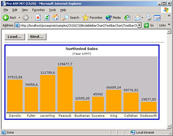
Figure 20-1: The BarChart control now supports data binding.
| Note |
The two ways of binding data can be combined. For example, you could first bind to a data source and then add a few records manually; or vice versa. Here's how to proceed:
BarChart1.DataSource = data;
BarChart1.DataTextField = "Employee";
BarChart1.DataValueField = "Sales";
BarChart1.DataBind();
BarChart1.Add("Esposito", 100000);
The last item will be added at the end of the collection. If you place the call before the call to DataBind, the record will display as the first record. |
Just by looking at sample charts like the one in Figure 20-1, you can see the importance of text formatting. Wouldn't the picture look better if the values on top of the bars were properly formatted? By adding a couple of extra properties—DataTextFormatString and DataValueFormatString—you can easily implement this feature too.
public string DataTextFormatString {
 get {return Convert.ToString(ViewState["DataTextFormatString"]);}
 set {ViewState["DataTextFormatString"] = value;}
}

public string DataValueFormatString {
 get {return Convert.ToString(ViewState["DataValueFormatString"]);}
 set {ViewState["DataValueFormatString"] = value;}
}
You use both properties within the Render method in conjunction with the String.Format method.
// Displays the value on top of the bar
cell.Text = String.Format(DataValueFormatString, theValue);
Similar code is needed to format the label. Note that you can initialize both properties to {0} in the control constructor. The following code and Figure 20-2 illustrate the new look of the control:
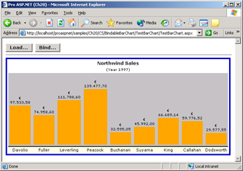
Figure 20-2: The BarChart control now supports data binding and text formatting.
BarChart1.DataValueFormatString = "{0:c}";
Note that you can make use of any HTML tag within the format string.
Designing a Templated Control
Format strings are helpful in many cases but are a limited tool. You can enrich the format string with HTML tags, but in the long run, this would result in hardly manageable code. A much better approach for deep customizations of the user interface are templates.
In ASP.NET, you can import templates in two ways—through properties of type ITemplate or by dynamically loading user controls. As we've seen in Chapter 10, "Web Forms User Controls," a Web user control is a custom component that can be used wherever a server control is valid. You can import such a user-defined control into the layout of the main control and make the interface more flexible and generic. You put a PlaceHolder control in the location in which you want custom contents to be injected, and then at run time you create an instance of the user control and add it to the Controls collection of the placeholder.
placeHolder.Controls.Add(Page.LoadControl("usercontrol.ascx"));
The right time to call this code is early in the control life cycle—that is, in an Init event handler. When you use the LoadControl method, the code of the template is insulated in a separate file. This can be a good thing or a bad thing, depending on the context. If the template you want to implement is complex, keeping it off the main page is positive. Otherwise, it would certainly add a layer of unnecessary complexity. Having the template directly available in the source code of the page makes authoring the page much more intuitive and fast because you don't have to follow code into a separate file. There's a sort of compromise between the two approaches. You could define an ITemplate property and set it using the contents of an .ascx file.
Suppose the main control has a template property named HeaderTemplate. You can set this property with a dynamically generated template using the page's LoadTemplate method.
myCtl.HeaderTemplate = Page.LoadTemplate("usercontrol.ascx");
Let's see how to implement a templated property for an ASP.NET server control.
A Templated BarChart Control
Adding templates to the BarChart control would help us to more effectively customize some parts of the user interface for which different users might have different and conflicting requirements. The alternative is offering up dozens of properties that fit all the user scenarios—definitely not an enticing scenario.
By default, the BarChart control contains a header and a footer with standard formats. The header is made of text displayed in two rows with slightly different settings for font and size. The footer is limited to displaying the labels at the base of each bar. If you want a richer caption bar, or you want to add information that helps people to read the chart, the BarChart control can't be of much help.
The problem has little to do with the BarChart control itself, but more with the fact that different users might have different needs and even the same user can require different behaviors at different times. In the BarChart control, there are a few parts of the user interface that should be customized on a per-usage basis. This is just the context where templates fit in.
General Rules for Templated Controls
A templated control must follow a few practical rules. First, it must implement the INamingContainer interface so that any child controls can be given a unique name and thereby have their postback data handled properly. A second aspect to consider for template-based control is the ParseChildrenAttribute attribute. You should apply the ParseChildrenAttribute attribute to your control so that the page parser knows that all child tags are to be parsed.
[ParseChildren(ChildrenAsProperties = true)]
public class MyTemplatedControl : Control, INamingContainer
{

}
}
However, if you derive the control from WebControl, using the ParseChildrenAttribute is unnecessary because the WebControl class is already marked with this attribute.
A templated control must have one or more properties of type ITemplate. As we've seen in Chapter 9, for system-provided template controls these properties can be programmatically set using an instance of a class that implements the interface or a user control loaded by the page's LoadTemplate method. A template property, though, can also be set declaratively, which is exactly our main interest here.
A template property represents a collection of text and controls that is hosted within a container. The container is also responsible for exposing properties that page authors can use to create data-bound expressions. The following code snippet shows how to define a template property named CaptionTemplate:
[TemplateContainer(typeof(ChartTemplateContainer))]
public ITemplate CaptionTemplate {...}
The argument of the TemplateContainer attribute is the name of the class that represents the logical container of the template. The container control is a control other than the templated control you are building. It makes some of the templated control properties available to the child controls that form the template. A container that is independent from the main templated control lets you iterate the template many times using different data. The template container must be a naming container too. All the public properties of the template container can be called from within data-bound expressions. We'll discuss the ChartTemplateContainer class for the BarChart control later in the "The Template Container Class" section.
Finally, a templated control should override CreateChildControls and instantiate at this time the template within the container. The container class is then added to the root control. A local event handler for the DataBinding event is also necessary to ensure that all child controls are created before the ASP.NET runtime attempts to process data-bound expressions. Again, note that overriding CreateChildControls is not mandatory but certainly represents a best programming practice.
Parsing Nested Tags
The ParseChildrenAttribute is a metadata attribute that applies to control classes. It enables a control to specify how the page parser should interpret any nested elements within the control's declaration in an ASP.NET page. The attribute supports two properties—ChildrenAsProperties and PropertyName. The ChildrenAsProperties property represents a Boolean value; the PropertyName property is a string and represents the name of a control's property.
When ChildrenAsProperties is set to true (the default setting), the parser expects that any nested elements correspond to a public property of the control, and generates an error otherwise. When ChildrenAsProperties is false, the page parser assumes that child tags are ASP.NET server controls. The page parser creates the child controls and calls the AddParsedSubObject method on the control. Controls can override the default implementation of AddParsedSubObject—a protected overridable method of Control. By default, the method adds the child controls to the Controls collection of the parent. Literal text found between tags is parsed as instances of the LiteralControl class.
| Note |
As we'll see in the final section of this chapter, if a control is bound to a control builder class, the default logic for parsing child tags can be completely redefined in the custom implementation of the control builder class. |
The Section
The BarChart control defines two template properties—CaptionTemplate and FooterTemplate. The CaptionTemplate property is aimed at providing a custom representation of the top-most part of chart; the FooterTemplate property provides the same capability for the bottom part of the table. If no templates are specified, the caption is composed using the values of the Caption and SubTitle properties; the footer is empty.
The CaptionTemplate property is declared and implemented as follows:
private ITemplate __captionTemplate = null;
[TemplateContainer(typeof(ChartTemplateContainer))]
public ITemplate CaptionTemplate
{
 get {return __captionTemplate;}
 set {__captionTemplate = value;}
}
The instantiation of the template takes place in the CreateChildControls overridden method.
// Declare the template container (defined later)
private ChartTemplateContainer _captionTemplateContainer;
protected override void CreateChildControls()
{
 // Instantiate the template in the container and add the
 // container to the Controls collection of the templated control
 if (CaptionTemplate != null) {
 _captionTemplateContainer = new ChartTemplateContainer(this);
 CaptionTemplate.InstantiateIn(_captionTemplateContainer);
 Controls.Add(_captionTemplateContainer);
 }
}
The method creates a new instance of the container and instantiates the template within. Next, the container is added to the Controls collection of the BarChart control.
When the control is ready for rendering, the just-created instance of the template container class is linked to its physical container—the table cell just above the bars.
protected virtual void CreateTemplatedCaption(Table parent)
{
 TableRow captionRow = new TableRow();
 TableCell captionCell = new TableCell();
 captionCell.ColumnSpan = BarCount;

 // Bind the template to the table cell for display
 if (CaptionTemplate != null)
 captionCell.Controls.Add(_captionTemplateContainer);

 // Insert the cell with the template into the main table
 captionRow.Cells.Add(captionCell);
 parent.Rows.Add(captionRow);
}
The CreateTemplatedSection method is invoked from within the Render method and links the template container class with the chart table.
The final item to note is in regard to the DataBinding event, which issues a call to another protected method of the Control class—EnsureChildControls. As the name suggests, the method just verifies that all child controls have been created.
protected override void OnDataBinding(EventArgs e) {
 EnsureChildControls();
 base.OnDataBinding(e);
}
Before we see how to use templates with the BarChart control, let's quickly create another template to make the control more usable and powerful than ever.
The Section
The footer template is the area of the BarChart control that is displayed just below the labels. For a real-world usage of the control, that area is important because you could place specific information there that help people read the chart. You could, for instance, create a legend in the footer area. For example, if you're using the BarChart control to display a sales report, you could display bars of different colors indicating whether the employee met or missed her sales goal. In doing so, you need an area around the chart to tell the user that, say, the color red is used to indicate the sales for a given employee are short of her goal.
In terms of implementation, the FooterTemplate property is in no way different than CaptionTemplate. We don't need to define yet another container class; instead, we can use the same one as above—the ChartTemplateContainer class. The footer template is instantiated within the CreateChildControls method.
private ChartTemplateContainer _captionTemplateContainer;
private ChartTemplateContainer _footerTemplateContainer;
protected override void CreateChildControls()
{
 if (CaptionTemplate != null)
 {
 _captionTemplateContainer = new ChartTemplateContainer(this);
 CaptionTemplate.InstantiateIn(__captionTemplateContainer);
 Controls.Add(__captionTemplateContainer);
 }

 if (FooterTemplate != null) {
 _footerTemplateContainer = new ChartTemplateContainer(this);
 FooterTemplate.InstantiateIn(_footerTemplateContainer);
 Controls.Add(_footerTemplateContainer);
 }
}
The template is bound to the rest of the BarChart control when the Render method is called to produce the HTML output for the control.
protected virtual void CreateFooterSection(Table parent)
{
 // Add an extra templated row (mostly for information)
 if (FooterTemplate != null)
 {
 TableRow rowInfo = new TableRow();
 rowInfo.VerticalAlign = VerticalAlign.Bottom;
 TableCell infoCell = new TableCell();
 infoCell.Font.Name = parent.Font.Name;
 infoCell.Font.Size = FontUnit.Smaller;


 infoCell.ColumnSpan = BarCount;
 infoCell.Controls.Add(_footerTemplateContainer);
 rowInfo.Cells.Add(infoCell);
 parent.Rows.Add(rowInfo);
 }
}
The templates, both caption and footer, are inserted in the existing framework that generates the output of the BarChart control. Because the final structure is extensively based on HTML tables, both templates end up actually being hosted within table cells and rows.
The Template Container Class
The template container is a wrapper control class used to decouple the root templated control—the BarChart in this case—from the template classes behind template properties. Instead of instantiating the template directly within the root control, you use this intermediate class—the template container. In doing so, you gain the ability to repeat the template multiple times with different data.
In a relatively simple case like that of the BarChart control, there's no real need for iterating templates. In other scenarios, though, you can have repeated templates that can't just be handled without a container class. For example, imagine the following List control:
 ...
 ...
 ...
Even if it's not strictly required by the circumstances, using a template container class is considered a best practice. The following listing shows the source code of the ChartTemplateContainer class that we're using for both the CaptionTemplate and FooterTemplate properties:
public class ChartTemplateContainer : WebControl, INamingContainer
{
 private BarChart __parent;
 public ChartTemplateContainer(BarChart parent) {
 __parent = parent;
 }
 public BarChart BarChart {
 get {return __parent;}
 }
}
You should derive the template container class from WebControl and make it implement the INamingContainer interface. (Note that making it a naming container is strictly necessary only if you're hosting multiple templates of the same type.) The structure of the class is completely up to you. Let's say that a reasonable structure is that which we just depicted. The constructor takes a reference to the parent control— the BarChart in this case—and exposes another ad hoc public property that represents the templated control in its entirety or simply mirrors some of its properties.
Only the public properties of the container class can be callable from the data-bound expressions you might use within the templates. Keep this in mind when implementing your own container classes.
Using the Templated BarChart Control
Using the templated BarChart control within a Web page is not much more complicated than it was before. You drop the control onto the form and edit the ASP.NET markup that the control generates for you. Unless the control provides its own template editor, Microsoft Visual Studio .NET doesn't let you visually edit the contents of the control. So you must switch to the HTML view to create your own templates.
The following code demonstrates how simple it is to create a custom header for a BarChart control:
I'm a BarChart Control
The output is shown in Figure 20-3.
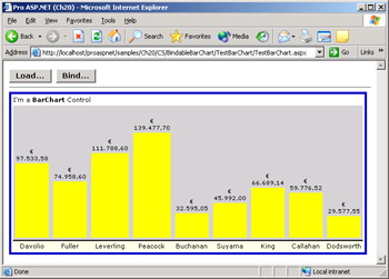
Figure 20-3: The BarChart control with a custom header.
Note that the CaptionTemplate property takes precedence over the Caption property. This behavior is consistent with ASP.NET controls and is considered a best practice. However, it is totally arbitrary and can be freely modified in alternative implementations. If the FooterTemplate is not specified, the extra row that will contain it is not added to the main table that represents the chart.
Within the tag, you can place virtually anything. All the markup code found is instantiated within the table cell that represents the table caption. The following example shows a caption that's a bit more complicated, made of a single row table with two cells. Furthermore, the content of the cells isn't constant but is determined by data-bound expressions.
| <%# "" + Container.BarChart.Caption + " " + Container.BarChart.SubTitle %> | <%# "Scale Factor " + Container.BarChart.Maximum + ""%> | |||
The first cell displays the contents of the Caption and SubTitle properties; the second cell is right-aligned and indicates the maximum displayable value—the Maximum property.
You use the Container property of the template to return the instance of the ChartTemplateContainer class. Any public properties exposed by the class can be used in data-bound expressions. The ChartTemplateContainer class exposes only a BarChart property that represents the parent control. As a result, you can use a Container.BarChart expression to access any public properties of the hosting control. Figure 20-4 shows the results.
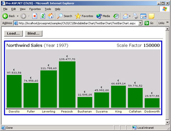 Figure 20-4: A more complex, and data-bound, custom header for the BarChart control.
Using the FooterTemplate is easy, too. The following ASP.NET fragment demonstrates how to create a footer that explains what each bar color indicates:
|
|
|
|
Note that by default, all the bars have the same color when you obtain them from a data source. On the other hand, when you create the bar chart using direct data passed through the Add method, you can also indicate the color on a per-column basis. If you need to decide the color based on run-time conditions, define a BarChartItemCreated event (discussed in Chapter 19), as follows. The following event handler uses different colors depending on whether the employee sold over or below his or her goal. The colors employed are used to create the legend in the footer template.
void BarChart1_ChartTableCreated(object sender,
 ProAspNet.CS.Ch20.BarChartEventArgs e)
{
 if (e.IsBarChartCreated)
 {
 if (e.Item.Value > 80000)
 e.BarChart.BackColor = Color.Green;

 if (e.Item.Value < 50000)
 e.BarChart.BackColor = Color.Red;
 }
}
The final results are shown in Figure 20-5.
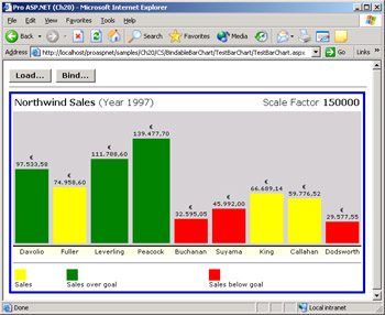
Figure 20-5: The BarChart control with custom header and footer.
The Control Builder Class
By default, every control on a page is associated with a default control builder class. A control builder works side by side with the page parser and helps to analyze the markup for the control and to build all the necessary child controls. The control builder class is responsible for handling any child markup element that the main tag of a control contains. The base class for control builders is ControlBuilder.
The default ControlBuilder class adds a child control to the Controls collection for every nested element it encounters within the control's tags. In addition, it creates literal controls for the text located between nested control tags. Custom controls are processed by the default control builder. If you don't like the way in which the ControlBuilder class works, replace the default control builder with a custom one. In most cases, you'll use a custom control builder if the control has a complex layout or contains child tags that require ad hoc parsing.
The control builder class is automatically replaced when you apply the ControlBuilder attribute to a custom control, as follows:
[ControlBuilderAttribute(typeof(ControlBuilderType))]
public class MyControl
{

}
Let's see how to write a custom control that can include custom child tags. In doing so, we'll build a custom control builder to handle the otherwise unknown layout.
Designing the TextBoxList Control
Especially when I'm building quick or test pages, I often have the need to display a few text boxes with a descriptive label. So I normally define an HTML table, add as many rows as there are text boxes to display, and create two cells in each row—one for the label and one for the editable text. The solution is neat, works great, and has no drawbacks. So what's wrong with this approach? Nothing is wrong, I simply find it tiresome!
In Chapter 19, we created the LabelTextBox control, which is obtained simply by composing a Label control with a TextBox control. Can we simply use a collection of such controls? We could do it that way, but the results wouldn't be particularly attractive. The difficulty lies in the fact that the LabelTextBox control is a juxtaposition of two controls separated with non-breaking spaces. Using non-breaking spaces would not provide a perfectly aligned table. To obtain the same results we would get using a plain old
tag, we must use a custom schema and modify the way in which the control is parsed. The following pseudo-code represents a possible good schema for such a control:
The TextBoxList control is rendered as an HTML table in which each FormField element generates a row with two cells.
Implementing the TextBoxList Control
To implement a control in accordance with the schema just mentioned, three classes are needed—the TextBoxList class for the control, the FormField class for the child element, and the control builder class to control the page parser. You can code them in the same file or in distinct files and possibly under the same namespace.
The Custom Control Builder Class
The control builder class is rarely a very complex piece of code. Its structure is extremely simple and agile and basically consists of a series of overrides. The only method you absolutely need to override for a significant and functional implementation is GetChildControlType.
The GetChildControlType method returns the type of the control's children tags. The default implementation of the base class simply returns null. The method takes two arguments: the name of the child tag found, and its collection of attributes. What programmers should do to implement the method depends mostly on the schema they have in mind. The method is responsible for getting the type that a particular child tag represents. If you need to map the nested markup to some custom structures, the GetChildControlType method is critical.
In our control builder, the GetChildControlType method should take into account any tag named and force the run time to create an instance of the FormField type.
public class TextBoxListControlBuilder : ControlBuilder
{
 public override Type GetChildControlType(string tagName,
 IDictionary attributes)
 {
 if (tagName.ToLower() == "formfield")
 return typeof(ProAspNet.CS.Ch20.FormField);

 return null;
 }
}
The previous implementation and ones similar to it will handle only recognized tags. All other tags will be treated by the page parser as literal markup and converted to literal controls that are added to the control's child control tree. Note that this implementation matches the tag name in a case-insensitive manner.
The TextBoxList Class
The TextBoxList control has a rather simple programming interface that consists of a public property—named HeaderText—and an internal array of FormField instances. A couple of overrides and a few event handlers complete the structure of the class.
[ControlBuilderAttribute(typeof(TextBoxListControlBuilder))]
[ParseChildrenAttribute(false)]
public class TextBoxList : WebControl
{
 // Contains the instances of the FormField control class
 private ArrayList m_formFields = new ArrayList();
 public ArrayList Items {
 get {return m_formFields;}
 }

}
The ControlBuilderAttribute attribute indicates the type of the control builder that must be used for this control. The ParseChildrenAttribute attribute explicitly states that the general rule that child tags map to properties is not true in this case. Earlier in this chapter, we said that the ParseChildrenAttribute attribute defaults to true for all controls that inherit from WebControl. This means that, unless the attribute is disabled, the ASP.NET runtime will try to resolve any tags to a FormField property on the control. If you use Control as the base class, you don't need to set the ParseChildrenAttribute attribute, but you'll lose some useful base style properties such as BackColor, Width, and Height.
The following code shows the rest of the code for the TextBoxList control:
public TextBoxList() : base() {
 Font.Name = "verdana";
 Font.Size = FontUnit.Point(8);
}

public string HeaderText {
 get {return Convert.ToString(ViewState["HeaderText"]);}
 set {ViewState["HeaderText"] = value;}
}

protected override void AddParsedSubObject(object obj) {
 if (obj is ProAspNet.CS.Ch20.FormField)
 m_formFields.Add(obj);
}
The constructor simply sets some font properties, and the HeaderText property gets and sets a string destined to be the title of the resulting table. More critical is the role played by the AddParsedSubObject method. Any tag that the GetChildControlType method recognizes is transformed into a living instance of the specified type. This object is then passed to the AddParsedSubObject method for further processing. If the object is of the correct type, it's added to the internal collection of FormField objects. At this point, once the FormField class is defined, the control is ready for rendering.
The FormField Class
The FormField class is another control class that gathers information about the text boxes to create within the main control. The class features a couple of string properties named Label and Text. The Label property indicates the text for the label; the Text property indicates the default text for the text box. The text box is created and configured when the FormField class is instantiated.
namespace ProAspNet.CS.Ch20
{
 public class FormField : Control
 {
 private TextBox __theTextBox;
 public FormField() {
 __theTextBox = new TextBox();


 __theTextBox.ID = this.ID;
 Controls.Add(__theTextBox);
 }

 public string Label {
 get { return Convert.ToString(ViewState["Label"]); }
 set { ViewState["Label"] = value; }
 }

 public string Text {
 get {return __theTextBox.Text;}
 set {__theTextBox.Text = value;}
 }
 }
}
The control is arbitrarily given the same ID of the FormField class and added to the collection of controls. The Label property is stored in the view state, whereas the Text property is implemented around the Text property of the text box.
Rendering the Control
The TextBoxList control is a composite control, and it overrides the CreateChildControls method to build the hierarchy of its constituent controls. The HTML output of the TextBoxList control is structured like a table with as many rows as there are tags. The table might have an extra, surrounding row if the HeaderText property has been set to a nonblank value.
protected override void CreateChildControls()
{
 // Create the main table
 Table t = new Table();
 t.BackColor = BackColor;
 t.BorderWidth = BorderWidth;
 t.BorderStyle = BorderStyle;
 t.BorderColor = BorderColor;
 t.Width = Width;
 t.Font.Name = Font.Name;
 t.Font.Size = Font.Size;

 // Add the header row if any caption has been specified
 if (HeaderText != "") {
 TableRow row = new TableRow();

 TableCell cell = new TableCell();
 cell.ColumnSpan = 2;
 cell.HorizontalAlign = HorizontalAlign.Center;
 cell.Font.Name = Font.Name;
 cell.Font.Size = FontUnit.Larger;
 cell.Font.Bold = true;
 cell.Text = HeaderText;
 row.Cells.Add(cell);

 t.Rows.Add(row);
 }

 // Loops through the FormField(s) children and adds TR/TD tags
 foreach(FormField ff in m_formFields) {
 TableRow row = new TableRow();

 // Create the Label cell
 TableCell cellLabel = new TableCell();
 cellLabel.VerticalAlign = VerticalAlign.Top;
 cellLabel.Text = "" + ff.Label + "";
 row.Cells.Add(cellLabel);

 // Create the TextBox cell
 TableCell cellTextBox = new TableCell();
 cellTextBox.Width = Unit.Percentage(75);
 cellTextBox.VerticalAlign = VerticalAlign.Top;

 // Import the TextBox defined within the FormField control
 TextBox txt = ff.Controls[0];
 txt.Font.Name = Font.Name;
 txt.Font.Size = Font.Size;
 txt.Width = Unit.Percentage(100);
 txt.ID = ff.ID;
 txt.BorderWidth = 1;
 txt.BorderStyle = BorderStyle.Solid;
 txt.BorderColor = Color.Black;
 cellTextBox.Controls.Add(txt);
 row.Cells.Add(cellTextBox);

 // Add the row to the parent table
 t.Rows.Add(row);
 }

 // Add the table to the Controls collection of the
 // TextBoxList control so that it can be rendered
 Controls.Add(t);
}
The table inherits some visual styles from the parent control. The text box is given a fixed one-pixel solid border, and the label is always rendered in boldface type. The header text is centered in the table and drawn using a larger font. Finally, it's important to notice that each TextBox control is given the same ID as the FormField component. That ID is the only way to retrieve the text box from client code.
The Render method is limited to rendering the children of the TextBoxList control.
protected override void Render(HtmlTextWriter output) {
 this.RenderChildren(output);
}
Using the TextBoxList Control
Once successfully compiled, the TextBoxList control can be placed in the Visual Studio .NET toolbox and dragged on a new Web Forms page. By default, the Visual Studio .NET control designer does not give you much support for this type of control. However, the RAD designer could do much better if only we tell it about the right schema and specify the right attributes. (We'll learn how to configure the control designer in Chapter 21, "Design-Time Support for Custom Controls.")
In particular, the designer doesn't recognize the schema of the control and warns about the use of the tag. The currently active schema for the markup language doesn't include —and with good reason because nobody ever told it about the tag. (See Figure 20-6.) In addition, and always for the same reason, the designer doesn't prompt us with suggestions when we try to edit the source code of the control in the HTML designer. This is indeed a common problem that affects all the custom controls we developed so far. As mentioned, this problem will find its solution in Chapter 21.
Figure 20-6: The Visual Studio .NET designer doesn't recognize the tag.
As long as you type the code manually, you can use the TextBoxList control with no particular worries. Also pay attention not to set control attributes through the Properties window. With the current configuration, if you do so, all the nested tags will be deleted. The following code declares a TextBoxList control:
Figure 20-7 shows the control in action in a sample page.
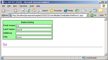
Figure 20-7: The TextBoxList control in action.
In the code-behind file, you need to manually declare the FormField members you want to code against. If needed, you can also set some of the text boxes at run time within the Page_Load event.
using ProAspNet.CS.Ch20;
If you click the Test link in Figure 20-7, the page with the TextBoxList control posts back. To retrieve the posted data, you use the ID of the various FormField elements or a 0-based index on the Items collection. The following listing shows the source code, and Figure 20-8 shows the results.
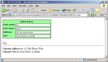
Figure 20-8: The TextBoxList control after a post back.
private void Linkbutton1_Click(object sender, System.EventArgs e)
{
 msg.Text = "Current Address is  " + ffAddress.Text;
 msg.Text += "
Current City is  ";

 // City is the 4th item
 msg.Text += ((FormField)TextBoxList1.Items[3]).Text;
}
As you might have noticed, we have implemented the Items collection as an ArrayList—that is, a simple collection of objects. As a result, we need to cast the object to FormField before we can access any properties. Using a strong-typed array, or collection, would solve this issue.
Conclusion
The development of real-life controls is a task made easier by the wonders of the .NET Framework and Visual Studio .NET. Several aspects of developing a control will determine the quality of your work, the usability of the control, and its effective power.
Real-world controls must be data bound or, at least, must be able to accept data in a variety of formats. In addition, controls must be flexible enough to let people customize the user interface. These goals can be accomplished either through a rich set of properties or, better yet, through templates.
Finally, not all controls express their full potential using a single tag or free-form templates. In some cases, you want a rigid syntax and a well-known schema. In other words, you need to replace ASP.NET in parsing the source markup code of those controls. Here is where control builders fit in. A control builder lets you govern and monitor several aspects of the embryonic life of a control—that is, what happens before the control is actually created and enters into the HTTP runtime pipeline.
However, once you've learned about data-bound and templated controls— and even about control builders—you realize that all the powerful programmatic features you might have cooked into the control count for little if there's no decent support from the Visual Studio .NET design-time environment. Setting up a control for declarative programming is the next (and final) step in server control development and is the topic of the next chapter.
Resources
- Developing Microsoft ASP.NET Server Controls and Components, by Nikhil Kothari and Vandana Datye (Microsoft Press, 2002)
Design Time Support for Custom Controls
Part I - Building an ASP.NET Page
Part II - Adding Data in an ASP.NET Site
- The ADO.NET Object Model
- Creating Bindable Grids of Data
- Paging Through Data Sources
- Real-World Data Access
Part III - ASP.NET Controls
Part IV - ASP.NET Application Essentials
- Configuration and Deployment
- The HTTP Request Context
- ASP.NET State Management
- ASP.NET Security
- Working with the File System
- Working with Web Services
Part V - Custom ASP.NET Controls
- Extending Existing ASP.NET Controls
- Creating New ASP.NET Controls
- Data-Bound and Templated Controls
- Design-Time Support for Custom Controls
Part VI - Advanced Topics
Index
EAN: 2147483647
Pages: 209
