Building Windows Forms User Interfaces
Overview
Windows Forms is the name of the new forms package used in Microsoft Visual Basic .NET. As in Visual Basic 6.0, the basic unit of functionality is still the Form. As in Visual Basic 6.0, Windows Forms have properties, fields, events, and methods. However, unlike previous versions of Visual Basic, Visual Basic .NET forms are full- fledged classes that support visual inheritance.
Creating a Windows Forms application in Visual Basic .NET is as easy as it was in previous versions of Visual Basic: simply drag and drop controls onto your form, change their settings in the Properties window, add code behind the events, press F5, and go. Many of the controls you’re familiar with in Visual Basic 6.0 are also present in Windows Forms: Labels, TextBoxes, Menus, Toolbars, TreeViews, StatusBars, and so on. Although they’re similar, sometimes they work a little different, as in the case of the ListBox and ComboBox controls. In other cases, the controls are still there but are organized differently. For example, in Visual Basic 6.0, you had a single CommonDialog control, which encapsulated many different dialog windows. In Visual Basic .NET, these common dialog boxes have been better organized into separate controls, such as the OpenFileDialog, SaveFileDialog, ColorDialog, and FontDialog. In addition, many new controls have been added to the Visual Basic programmer’s toolbox, including the Splitter, NotifyIcon, ErrorProvider, and PrintPreviewDialog controls.
All these topics, including visual inheritance, will be covered in this chapter.
Application #29 Use the ListBox and ComboBox
This sample shows you how to use the ListBox and ComboBox controls. It covers the basic functionality inherent in each control, as well as some improvements and new features available with these controls in Microsoft Visual Basic .NET.
As Figure 4-1 illustrates, the sample application consists of a single form with five tab pages. Each tab page covers a different topic related to the ListBox or ComboBox control. The Add Items tab demonstrates how to add items to a ListBox control from a list of objects. The Bind To DataTable tab populates a data table with a list of all files on the C: drive of your PC. That data table is then bound to a ListBox control. The Selection Mode tab allows you to test different styles of multiselect list boxes. The Bind To Array tab will bind a ListBox control to an array of objects representing all processes currently running on the machine. The final tab demonstrates a number of features of the ComboBox control, including how to bind to an ADO.NET DataTable object using the Northwind database.
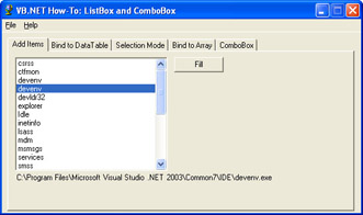
Figure 4-1: Sample application with the Add Items tab selected.
Building Upon…
Application #12: Using a DataSet and DataView
Application #15: Bind Data to a ComboBox
Application #16: Data Binding with Navigation
Application #20: Build a Data-Entry Form
New Concepts
If you’ve done any Visual Basic coding previous to .NET, you’re most likely familiar with using ListBox and ComboBox controls, but there are a few new things to cover.
The Items Collection
Perhaps the most important new concept with the ListBox and ComboBox controls in .NET is that of the Items collection. In previous versions of Visual Basic, you could add only strings as an item. In Visual Basic .NET, however, items can be any type of object, not just strings. For example, if your application contains a set of customer objects, you can actually add these customer objects directly to a ListBox or ComboBox control. This lets you access each property and method of your customer objects directly from the ListBox or ComboBox control.
What’s more, items are now a full-fledged collection, which gives you all the advantages inherent in using a collection. For example, to add a new item to the Items collection, simply call the Items.Add method. To remove a particular item from the Items collection, call the Items.Remove method. You can even determine whether an item exists by using the Contains method. Like any other collection, you can use a For/Each loop to iterate on the members and the Count property to determine the total number of items in the control.
Using ListBox and ComboBox Controls
The ListBox control allows you to display a list of items to the user. It is best suited for situations in which users need to see a large number of items at once or be able to select more than one item from a list. The SelectionMode property is used to enable the user to select multiple items.
The ComboBox control is essentially a ListBox control with the added benefit of a text box. To make a selection, the user can either choose an existing item from the list or enter text into the text box. This control is especially useful when screen real estate is limited, because you can set the list to drop down only when the user clicks the arrow button. The DropDownStyle property contains options to determine whether or not the list is displayed automatically and whether the text box is editable. If the list is always displayed and the text field is not editable, use a ListBox control instead.
Populating ListBox and ComboBox Controls
In Windows Forms applications, there are two basic ways of populating ListBox and ComboBox controls with data. The first way is to manually populate the Items collection using the Add method. The second way is to use data binding via the DataSource, DisplayMember, and ValueMember properties. Data sources include any objects instantiated from classes that implement the IList interface, such as the Array class, Collection class, and DataView class.
New Search Capabilities
Two new features that have been added to the ListBox and ComboBox controls in Visual Basic .NET are the FindString and FindStringExact methods. If you want to perform a search for a particular item, rather than manually looping through all the items, you can simply use the FindString and FindStringExact methods. The FindString method finds the first item that starts with a particular string, whereas FindStringExact searches for an exact match.
Code Walkthrough
This application contains five tabs for demonstrating the methods and properties of the ListBox and ComboBox controls. Each tab contains a Fill button, which populates the corresponding control with data. The five main topics covered include:
- Adding items to a ListBox control by using the Items collection
- Binding a ListBox control to a data table by using the DataSource property
- Using the SelectionMode property to change the style of a multiselect ListBox control
- Binding a ListBox control to an array of objects
- Binding a ComboBox control to a data source, and changing its properties to manipulate the control’s behavior
Adding Items
In the AddItems subroutine, the ListBox control is cleared and populated from an array of Process objects by using the Add method. The DisplayMember property of the ListBox control is used to indicate which member of the Process object should be displayed in the control. Last, the items in the control are sorted by setting the Sorted property to True.
lstProcessesAddItem.Items.Clear()
lstProcessesAddItem.DisplayMember= "ProcessName"
ForEachprcInProcess.GetProcesses()
lstProcessesAddItem.Items.Add(prc)
Next
lstProcessesAddItem.Sorted=True
Bind to DataTable
Earlier, it was mentioned that a second way of populating a ListBox control with data was to use data binding via the DataSource, DisplayMember, and ValueMember properties. Here, the DataTable object is populated with file names and bound to the ListBox control. (This data could have also come from a database table.) Again, the DisplayMember property indicates which field in the DataTable object will be displayed in the ListBox control. The ValueMember property dictates which item from the data table is used for the underlying value of each item. Finally, the DataSource property is set to the name of the data table.
DimdtAsDataTable=FillTable("C:")
IfNot(dtIsNothing)Then
WithlstFiles
.DisplayMember= "FileName"
.ValueMember= "Length"
.DataSource=dt
EndWith
EndIf
In the SelectedIndexChanged event, the value associated with the selected item from the SelectedValue property is retrieved and displayed on the form. Remember, this value came from the ValueMember property indicated during the data binding process.
lblFileInfo.Text= "Length: " &lstFiles.SelectedValue.ToString
Selection Mode
In this Selection Mode tab, the ListBox control is populated from a file list, similar to the method used in the Bind To DataTable tab. The SelectionMode property is used to control how many items the user can select and how those items can be selected:
lstMultiSelect.SelectionMode=_
CType(System.Enum.Parse(GetType(SelectionMode),_
cboSelectionMode.Text),SelectionMode)
There are three ways with which a user can select items from a ListBox control. SelectionMode.One indicates that only a single item can be selected. SelectionMode.MultiSimple lets the user select one or more items using the mouse or Spacebar. Finally, SelectionMode.MultiExtended allows the user to select multiple items using the Shift key.
A great new feature of Visual Basic .NET is the ability to speed up the rendering of a control by preventing it from redrawing itself every time an item is added to it. This is done via the BeginUpdate and EndUpdate methods:
WithlstSelectedItems
.Items.Clear()
.BeginUpdate()
DimfiAsFileInfo
ForEachfiInlstMultiSelect.SelectedItems
Items.Add(fi.Name)
Next
.EndUpdate()
EndWith
When an item is chosen from the lstMultiSelect control, the corresponding data for the selected item is added to the Selected Items ListBox control. This requires that the control be cleared and that all the selected items be re-added to it. Calling the BeginUpdate method just before adding the items back to the control prevents it from rendering each time an item is added. Once all the selected items have been added, the EndUpdate method is called and the control is rendered on the form.
Bind to an Array
Binding a control to an array is the simplest method of data binding. Just set the DataSource property of the control to the array and optionally specify a value for DisplayMember:
DimprcAsProcess
WithlstProcessesDataSource
.ValueMember= "MainModule"
.DisplayMember= "ProcessName"
.DataSource=Process.GetProcesses()
EndWith
Because the ValueMember property was set, you can retrieve the SelectedValue property of the control. Here, the Process Module for the selected file is displayed:
lblFileName2.Text=CType(lstProcessesDataSource.SelectedValue,_
ProcessModule).FileName
The ComboBox Tab
The ComboBox tab covers several important features of the ComboBox control in Visual Basic .NET. First, an ADO.NET DataSet object is populated from the Northwind database and the ComboBox control is bound to it:
DimdsAsNewDataSet()
SqlDataAdapter1.Fill(ds)
cboDemo.ValueMember= "ProductID"
cboDemo.DisplayMember= "ProductName"
cboDemo.DataSource=ds.Tables(0)
Once the ComboBox is filled, the cboDropDownStyle control is used to select the DropDownStyle of the ComboBox control. Selecting Simple causes the drop- down list to display only a single value, and the text portion is editable. If DropDown is selected, the text portion is editable and the user can click the arrow button to display the list portion. The style DropDownList allows the user to click the arrow button to display the list portion, but the text box is not editable:
cboDemo.DropDownStyle=_
CType(System.Enum.Parse(GetType(ComboBoxStyle),_
cboDropDownStyle.Text),ComboBoxStyle)
In the nudDropDownItems_ValueChanged and nudDropDownWidth_ValueChanged event procedures, the maximum number of drop-down items and the width of the ComboBox control are set. The MaxDropDownItems property refers to the maximum number of items to be shown in the drop-down portion of the ComboBox control. The user would need to scroll with the arrows to see any items that are not within the visible portion of the drop-down list. The DropDownWidth property refers to how wide the drop-down portion of the ComboBox control is. You can specify this value to be larger than the width of the ComboBox control. This comes in handy when items in the drop-down list are expected to be long, but room for the ComboBox control is limited:
PrivateSubnudDropDownItems_ValueChanged(ByValsenderAsObject,_
ByValeAsSystem.EventArgs)HandlesnudDropDownItems.ValueChang ed
cboDemo.MaxDropDownItems=CInt(nudDropDownItems.Value)
EndSub


PrivateSubnudDropDownWidth_ValueChanged(ByValsenderAs_
System.Object,ByValeAsSystem.EventArgs)Handles_
nudDropDownWidth.ValueChanged
cboDemo.DropDownWidth=CInt(nudDropDownWidth.Value)
EndSub
Conclusion
This has been a fairly quick overview of how to use ListBox and ComboBox controls in a Windows Forms application. Although the basics of using these two controls are already familiar to most Visual Basic programmers, there are some key new features to be aware of:
- Items collectionBoth controls now use full-fledged collections for their items.
- SearchingYou can perform a search for a particular string value on the items in either control.
- Data bindingThese controls can be populated from a number of data sources, including arrays, collections, and ADO.NET DataTables objects.
Application #30 Use Common Dialog Boxes
This sample shows you how to use the OpenFileDialog, SaveFileDialog, ColorDialog, and FontDialog controls within your Windows Forms applications. These dialog boxes are standard to Microsoft Windows operating systems, and they give your applications a common look and feel with which users will instantly be familiar. The sample application consists of a single form with two tab pages, as shown in Figure 4-2.
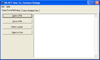
Figure 4-2: Common Dialogs sample application.
The first tab page lets the user select a text file by using the OpenFileDialog control. Once the user selects a text file, the file is opened and displayed in the TextBox control to the right. The user can then change how the text is displayed in the TextBox control. Clicking the Select A Color button brings up the ColorDialog control. Users can select whatever color they want, and the text box will be updated accordingly. Clicking the Select A Font button displays the FontDialog control. Here, the user is presented with a list of fonts currently installed on her machine. The text in the text box changes to the color that the user selects. Of course, the user is given the option of canceling out of these dialog boxes without any changes being made.
This sample application also uses the SaveFileDialog control to save the contents of the TextBox control to a new file.
The second tab page demonstrates how to use the OpenFileDialog control to let the user select multiple files.
New Concepts
In previous versions of Visual Basic, the open file, save file, font, and color dialog boxes were incorporated into a single ActiveX control named the Microsoft Common Dialog Control (Comdlg32.ocx). In Visual Basic .NET, each of these dialog boxes is its own control. This is part of the .NET emphasis on object-oriented design. To display a file-open dialog box, use the OpenFileDialog control; to display a font dialog box, use the FontDialog control. This simplifies coding because each control represents a single entity.
Also, these controls are now intrinsic parts of the .NET Framework. There is no need to distribute a separate file to use these controls. Visual Basic 6.0 required an additional file, Comdlg32.ocx, to be distributed and registered on each client machine. With Visual Basic .NET, there are no additional requirements (other than that the .NET Framework be installed).
Ready-Made Functionality
There are two big advantages to using the common dialog controls in your applications. First, they are already done. There’s no need for you to roll your own or re-create the wheel. Because you don’t have to create these dialog controls from scratch, you spend less time on design, development, and testing.
Easier for Users
The second major advantage to using common dialog controls is that they are standard parts of the Windows operating system. Everything from word processors to graphics programs to MP3 players use these same common dialog controls. Users are instantly familiar with them and know how to use them. This makes your program easier to use.
DialogResult
Each of these common dialog controls uses the DialogResult enumeration. DialogResult enumerations are a set of predefined constants used to indicate how the user closes a dialog box. Table 4-1 lists the eight possible values, most of which are self- explanatory.
|
Constant |
Value |
|---|---|
|
Abort |
The user aborted the dialog box, usually by clicking a button labeled Abort. |
|
Cancel |
The user canceled the dialog box, usually by clicking a button labeled Cancel. |
|
Ignore |
The user chose to ignore the dialog box, usually by clicking a button labeled Ignore. |
|
No |
The user responded in the negative, usually by clicking a button labeled No. |
|
None |
The user has not yet closed the dialog box. |
|
OK |
The user has a selection and is ready to proceed. In general, this button is labeled OK, but in the OpenFileDialog this button is labeled Open and in the SaveFileDialog it is labeled Save. |
|
Retry |
The user has chosen to retry the operation, usually by clicking a button labeled Retry. |
|
Yes |
The user responded in the affirmative, usually by clicking a button labeled Yes. |
Code Walkthrough
The following sections describe, in some detail, the sample application’s code for instantiating and using common dialog controls.
OpenFileDialog
The btnOpenTextFile_Click subroutine, which handles the Open A File button’s Click event, begins by setting up the FileOpenDialog:
WithodlgTextFile
.CheckFileExists=True
To simplify coding, a With/End With block is used. The OpenFileDialog exposes a number of properties that allow you to customize it to suit your particular needs. CheckFileExists ensures that the user enters a file that actually exists. If the user were to enter a nonexistent file, the OpenFileDialog control would display a warning message box when the Open button is clicked. As long as this property is set to True, it’s impossible for the user to enter a nonexistent file. This saves you the trouble of manually validating the file’s existence.
.CheckPathExists=True
The CheckPathExists property works exactly the same for paths as CheckFileExists does for files. It should be noted that there is no need to set this property to True because, by definition, if a file exists its path must also exist.
.DefaultExt= "txt"
The DefaultExt property simply means that if the user fails to enter a file extension, the OpenFileDialog will automatically add one.
.DereferenceLinks=True
The DereferenceLinks property is useful for situations in which the user selects a shortcut (.lnk file) instead of a regular file. If this property is set to True, the file referenced by the shortcut is returned instead of the actual shortcut.
.Filter= "Textfiles(*.txt)|*.txt|Allfiles|*.*"
The Filter property determines the items in the Files of type combo box. Each item consists of a pair of values separated by a vertical bar (|). The first part of each pair is a textual description of the file type. The second part of each pair is the actual file filter.
.Multiselect=False
The Multiselect property allows the user to select more than one file. For the Open A File button, this is set to False, but for the Retrieve Filenames button, this is set to True.
.RestoreDirectory=True
The RestoreDirectory property determines whether the dialog box should restore the current directory when the user closes the dialog box. By default, this is set to True.
.ShowHelp=True
The ShowHelp property indicates whether the Help button should be visible on the dialog box. If this is set to True and the user clicks the Help button, a HelpRequested event is raised where you can implement your own customized help.
.ShowReadOnly=False
The ShowReadOnly property indicates whether the Open As Read-Only check box should be visible on the dialog box.
.Title= "Selectafiletoopen"
The Title property simply sets the caption that appears in the dialog box title bar.
.ValidateNames=True
The ValidateNames property ensures that the user enters only valid Win32 file names.
Once the OpenFileDialog object has been set up, the ShowDialog method is used to display the dialog box on the screen. If the user clicks the Open button, represented here by DialogResult.OK, the selected file’s pathname is retrieved using the Filename property. Then the file’s contents are read into a StreamReader object. Finally, the StreamReader object is used to fill the TextBox:
If.ShowDialog()=DialogResult.OKThen
FileName=.FileName
ts=NewStreamReader(.OpenFile)
txtFileContents.Text=ts.ReadToEnd()
EndIf
Figure 4-3 shows the dialog box that the OpenFileDialog object presents when the ShowDialog method is called.
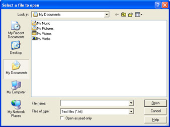
Figure 4-3: The OpenFileDialog object displays a dialog that allows the user to open a file.
ColorDialog
The btnSelectColor_Click subroutine, which handles the Select A Color button’s Click event, begins by setting up the ColorDialog. First an array of integers is declared to store the user’s custom colors:
StaticCustomColors()AsInteger=_
{RGB(255,0,0),RGB(0,255,0),RGB(0,0,255)}
The array is initialized with a set of default values.
The next block of code is contained within a With/End With statement. Here, the ColorDialog object is initialized with a set of default values.
WithcdlgText
.Color=txtFileContents.ForeColor
The Color property represents the currently selected color. Here, the dialog box is set to match the color currently used by the TextBox control.
.CustomColors=CustomColors
The CustomColors property stores a set of custom colors as a set of ARGB (alpha, red, green, and blue) components.
.AllowFullOpen=True
The AllowFullOpen property expands the ColorDialog to reveal a section where the user can create custom colors. This can be set to False if you don’t want to enable this functionality.
.AnyColor=True
The AnyColor property determines whether the dialog box displays all available colors in the set of basic colors.
.FullOpen=False
The FullOpen property determines whether the ColorDialog object’s dialog box starts out expanded, revealing the custom colors section.
.SolidColorOnly=True
The SolidColorOnly property restricts the user to solid colors only. The default is False.
.ShowHelp=True
The ShowHelp property for the ColorDialog class works the same as it does for the OpenFileDialog class: the property determines whether the Help button is visible on the dialog box. If this is set to True and the user clicks the Help button, a HelpRequested event is raised, allowing you to implement your own custom help.
If.ShowDialog()=DialogResult.OKThen
txtFileContents.ForeColor=.Color
CustomColors=.CustomColors
EndIf
cdlgText.Reset()
EndWith
Once the ColorDialog object has been set up, the ShowDialog method is used to display the dialog box (shown in Figure 4-4) on the screen. If the user presses OK, the foreground color of the TextBox control is changed to the color the user selected. The custom colors are then stored in the static array declared earlier.
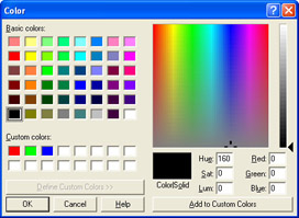
Figure 4-4: The ColorDialog object’s ShowDialog method displays a Color dialog box that allows the user to specify a color.
FontDialog
The btnSelectFont_Click subroutine handles the Select A Font button’s Click event. As with the previous two dialog boxes, this routine begins by setting up the various properties of the dialog box within a With/End With block:
WithfdlgText
.Font=txtFileContents.Font
The Font property simply sets the default font shown in the dialog box. Here it’s initialized to the current font of the TextBox control.
.Color=txtFileContents.ForeColor
The Color property sets the default font color shown in the dialog box. Again, it’s initialized to the current color of the TextBox control.
.ShowColor=True
The ShowColor property controls whether the user can select the font’s color.
.ShowApply=True
The ShowApply property determines whether the Apply button on the FontDialog object is displayed. If this is set to True and the user clicks the Apply button, the FontDialog object raises an Apply event.
.ShowEffects=True
The ShowEffects property determines whether the strikethrough, underline, and text color options are available to the user.
.AllowScriptChange=True
The FontDialog has a combo box that lists the available language scripts for the specified font. When the user selects a different language script, the character set for that language becomes available for multilingual documents. The AllowScriptChange property determines whether the user can change the script in this combo box.
.AllowVectorFonts=False
The AllowVectorFonts property simply determines whether the FontDialog allows the user to select a vector font.
.AllowVerticalFonts=False
The AllowVerticalFonts property determines whether the dialog box displays vertical fonts. If this is set to False, only horizontal fonts are displayed.
.FixedPitchOnly=False
The FixedPitchOnly property determines whether the dialog box displays only mono-spaced fonts such as Courier New.
.FontMustExist=True
The FontMustExist property ensures that the user selects only an existing font. If the user tries to select a nonexistent font, an error message is displayed.
.MaxSize=48
.MinSize=8
The MaxSize and MinSize properties determine the upper and lower bounds for the size of the selected font. If the user selects a font size outside this range, the FontDialog object will display an error message.
If.ShowDialog=DialogResult.OKThen
ApplyFontAndColor()
EndIf
EndWith
Finally, once all the FontDialog properties have been set, the ShowDialog method is used to display the dialog box (shown in Figure 4-5). If the user clicks the OK button, the selected font is applied to the TextBox control.
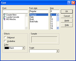
Figure 4-5: The FontDialog object represents a Font dialog box the user can use to select a font.
Conclusion
This sample covered how to use the OpenFileDialog, SaveFileDialog, ColorDialog, and FontDialog controls. There are two main advantages to using these common dialog controls. First, they are reusable components you can drag and drop onto your Windows Forms, saving you the time and trouble of re-creating them from scratch. Second, because they are standard functions of the Windows operating systems, users will be instantly familiar with how to use them, making your programs more user friendly.
Application #31 Validate Text Boxes
This sample demonstrates a technique for performing data validation on text boxes. Along the way, you’ll see how to use regular expressions to perform data validation and how to create new user controls using inheritance. The sample application, shown in Figure 4-6, presents the user with five text boxes to enter the following data:
- ZIP Code (U.S.)
- E-Mail Address
- IP Address
- Social Security Number
- Phone Number (U.S.)
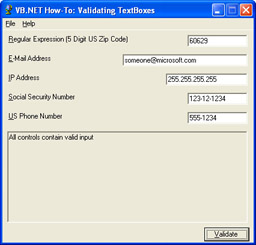
Figure 4-6: The Validating TextBoxes sample application demonstrates a technique for performing data validation on text boxes.
What makes this application unique is that each text box is self-validating. That is, all data validation is performed by the control itself. This makes creating your user interfaces much easier because you can drag and drop these controls right onto the form you’re creating. Finding out whether the user entered valid data is as simple as checking the control’s IsValid property. As an added touch, if the user enters invalid data, the text box will turn red (or whatever color you choose).
Building Upon…
Application #7: Object-Oriented Features
Application #8: Scoping, Overloading, Overriding
New Concepts
There are two new concepts that need to be explained before proceeding. The first concept is that of regular expressions. The second concept is how to take an existing control and use inheritance to create a brand new control.
Regular Expressions
Visual Basic has always been known as a great language for string handling. In fact, Visual Basic provides so many different string-handling features—all built into the language—that Visual Basic programmers sometimes take this ease of use for granted. For example, some languages, such as C, don’t even have strings. Instead, C programmers use arrays of single characters to mimic strings. Regular expressions are a new feature in Visual Basic that provide powerful string-handling capabilities and require very little code.
So, what is a regular expression? A regular expression is a pattern of text used to search or perform matches against a string. In a sense, you might have already used a form of regular expressions when you used the *.* pattern when searching for a file on a computer using the Windows Search tool or the command-line dir. Regular expressions, however, provide a stricter, more powerful syntax.
For example, the regular expression to match a three-digit number is ^d{3}$. At first that might seem a little confusing, so let’s take it apart and examine it one step at a time. The ^ indicates the beginning of a string. The d matches a digit character, 0 through 9. The {3} is a subexpression that indicates the digit must occur three times. Finally, the $indicates the end of the string. So, to match a four-digit number, simply use this: ^d{4)$. To match a two-digit number, use ^d{2)$.
Let’s take a look at another regular expression: ^d{3}-d{2}-d{4}$. What does this do? Again, let’s take it apart one piece at a time. The first part, ^d{3}, you’ve already seen before. This was the example used in the preceding paragraph that matched a three-digit number. The next part, -, simply means that a dash should come next in the string. The d{2} indicates a two-digit number. The next part, -, indicates that a dash should come next. The d{4} indicates a four-digit number. Finally, the $ indicates the end of the string. So, to put ^d{3}-d{2}-d{4}$ into English, this regular expression matches a string that begins with a three-digit number, followed by a dash, followed by a two-digit number, followed by a second dash, and finally a four-digit number. For example, 123-12-1234 would correctly match this pattern. In case you haven’t guessed, this is a regular expression to match a Social Security number, and it’s used to perform data validation on the Social Security number text box used in the sample application.
Regular expressions are quite powerful and allow you to do things that might otherwise take many lines of code. In fact, regular expressions are a language in and of themselves. An entire chapter or book could easily be written to explain all the possibilities. This has just been an introduction. As you delve deeper and deeper into regular expressions, you’ll realize there are many different situations where you can use regular expressions. In addition to validating Social Security numbers, the sample application uses regular expressions to validate ZIP Codes, phone numbers, e- mail addresses, and IP addresses.
Creating a New UserControl Class by Using Inheritance
Inheritance has been one of the most requested features to be added to the Visual Basic language, and for good reason. Inheritance allows you to do things that otherwise would be impossible, or at least very difficult, and might require thousands of lines of code to accomplish. One area in particular where inheritance really stands out is in creating user controls. In previous versions of Visual Basic, to create a new control based on an existing control could require literally thousands of lines of code. This is because each property, method, and event of the control would have to be manually delegated from the new control to the original base control. Visual Basic .NET allows you to replace all this boilerplate code with just a couple lines of code:
PublicClassRegExTextBox
InheritsTextBox
The first line of code simply indicates the name of the user control. In Visual Basic .NET, a user control is a class. The second line indicates that this class inherits from the TextBox control. That’s all there is to creating a new user control. Once these two lines of code are in place, you’re ready to add properties, methods, or events to suit your particular needs. The sample application uses six different user controls.
Code Walkthrough
The file, RegExTextBox.vb, combines the two concepts of user controls and regular expressions to create a new user control. The RegExTextBox control inherits from the Windows Forms TextBox control and adds four new properties. The most important is the ValidationExpression property:
PublicPropertyValidationExpression()AsString
Get
ReturnvalidationPattern
EndGet
Set(ByValValueAsString)
mValidationExpression=NewRegex(Value)
validationPattern=Value
EndSet
EndProperty
This property lets the developer specify the regular expression (as a string) that will be used to validate the text in the TextBox control. The Regex class is part of the .NET Framework, and it represents a regular expression.
The next most important property is the IsValid property:
PublicReadOnlyPropertyIsValid()AsBoolean
Get
IfNotmValidationExpressionIsNothingThen
ReturnmValidationExpression.IsMatch(Me.Text)
Else
ReturnTrue
EndIf
EndGet
EndProperty
IsValid is quite simple. It returns True if the data matches the regular expression (or if no regular expression is supplied). Otherwise, it returns False.
The RegExTextBox control also has properties to set the error message and error color.
If the user enters invalid data, RegExTextBox changes its foreground color to red to alert the user that the data is invalid. To do this, RegExTextBox overrides the TextBox class’s Validated event:
ProtectedOverridesSubOnValidated(ByValeAsSystem.EventArgs)
IfNotMe.IsValidThen
Me.ForeColor=mErrorColor
Else
Me.ForeColor=Me.DefaultForeColor
EndIf


MyBase.OnValidated(e)
EndSub
OnValidated works by calling the IsValid property. If IsValid returns False, it changes the value of the ForeColor property to red (or whatever color the user chooses). If IsValid returns True, the ForeColor property is reset to its normal color. Note that the final line of code inside this subroutine calls the base class OnValidated method. This is a good practice because it ensures that the base class, the original TextBox class, also receives the Validated event.
One of the great things about inheritance is that not only can you create a new user control based on an existing control, you can also create a second user control based on the first one. A class can inherit from another class, which inherits from another class, which inherits from another class, etc. In other words, you can have more than one level of inheritance. Of course, if the inheritance tree becomes too large, this can be unwieldy, so use this feature sparingly. The sample application uses RegExTextBox as the base control to create four more user controls: EMailTextBox, IPAddressTextBox, PhoneTextBox, and SsnTextBox.
Let’s take a look at the PhoneTextBox:
PublicClassPhoneTextBox
InheritsRegExTextBox


PublicSubNew()
MyBase.New()


Me.ValidationExpression= "^(((d{3})?)|(d{3}-))?d{3}- d{4}$"
Me.ErrorMessage= "Thephonenumbermustbe " &_
 "intheformof(555)555-1212or555-555-1212."


EndSub
EndClass
The Window Forms Designer code was removed from the listing. First, PhoneTextBox inherits from RegExTextBox. Inside the New method, default values are set for the ValidationExpression and the ErrorMessage. As you can see, this class is quite simple.
Now, let’s look at frmMain. The Click event procedure for the Validate button performs all the data validation for the form. First, two variables are declared:
DimgenericControlAsControl
DimvalidationMessageAsString
The variable genericControl is used to loop through the form’s Controls collection using a For Each loop. The String variable, validationMessage, is used to build an error message that contains the error messages for all the controls on the form.
Because each user control has an IsValid property (from RegExTextBox), performing data validation is simple and elegant. The For Each loop is used to iterate on all the controls on the form. If the control is a RegExTextBox, the IsValid property is called:
ForEachgenericControlInControls
IfTypeOfgenericControlIsRegExTextBoxThen
DimregExControlAsRegExTextBox=_
CType(genericControl,RegExTextBox)


IfNotregExControl.IsValidThen
validationMessage&=regExControl.Name& ":" &_
regExControl.ErrorMessage&vbCrLf
EndIf
EndIf
Next
The only line of code that needs explaining is the one with the CType statement. CType is used to cast the genericControl variable to a RegExTextBox object. This allows you to check the IsValid property.
Outside the loop, the text in validationMessage is checked to see whether it’s empty. If it’s not, the text in validationMessage is displayed on the form. If it’s valid, “All controls contain valid input” is displayed:
IfvalidationMessage<> "" Then
txtInvalidControls.Text= "Thefollowingcontrols " _
& "haveinvalidvalues: " _
&vbCrLf&validationMessage
Else
txtInvalidControls.Text= "Allcontrolscontainvalidinput"
EndIf
Conclusion
This sample presented one technique for validating text boxes. Regular expressions are patterns of text used to search or perform matches against strings. Inheritance allows you to create new user controls with a minimal amount of code. By combining regular expressions and user controls, you can create self-validating text boxes. Once these user controls have been created, you can drag and drop them onto any form you choose and greatly simplify the creation of your user interfaces.
Application #32 Use Format Codes to Format Data
Visual Basic .NET has many features that allow you to work with dates, times, and currencies of other cultures. This sample application shows how to display numeric, date-time, and enumeration values as strings, using a variety of standard and custom culture-specific format codes. The application, shown in Figure 4-7, consists of a main form with a three-tab control.
The first tab, Numeric, displays a number in currency, scientific (exponential), percent, number, fixed-point, and hexadecimal format. A combo box to the right lets the user choose a specific culture, such as “English - New Zealand” or “Portuguese - Brazil.” The number is formatted to suit the particular culture the user selects. For example, in the United States, a period is used as a decimal separator, but in some nations a comma is used as a decimal separator. The second tab, Date-Time, works the same way as the first tab except it displays date-time values formatted to a user- selected culture. The third tab, Enumeration, displays the system enumeration DayOfWeek.Friday.
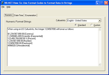
Figure 4-7: The Use Format Codes sample application.
Building Upon…
Application #7: Object-Oriented Features
Application #8: Scoping, Overloading, Overriding
Application #15: Bind Data to a ComboBox
Application #29: Use the ListBox and ComboBox
New Concepts
The sample application makes use of the CultureInfo class and the ArrayList class, which are discussed in the following sections.
CultureInfo
The CultureInfo class is part of the System.Globalization namespace, and it contains information about a particular culture. This includes the name of the culture, the calendar, and the writing system used. It also gives you access to culture-specific classes. These classes provide additional functions such as formatting dates and sorting strings. Culture names follow a standard convention consisting of a lowercase, two-letter abbreviation indicating the language followed by an uppercase, two-letter abbreviation indicating region. For example, en-US indicates the English language and the United States of America as the region, and pt-BR indicates the Portuguese language and Brazil as the region. Only the language is required; the region is optional. For example, fr simply means the French language without a specific region. Also, some culture names have prefixes that specify the script. For example, Cy-sr-SP indicates the Serbian language in the Serbia region using the Cyrillic script. Most culture names, however, do not have a script prefix. The .NET Framework documentation has a complete list of all culture names available.
ArrayList
One of the supporting classes used in the sample application is the ArrayList class. The ArrayList class is a specialized form of a collection that automatically grows and shrinks as you add and remove items. Part of the System.Collections namespace, the ArrayList provides advanced functionality beyond what you get with conventional Visual Basic arrays. For example, the ArrayList has a Sort method that sorts all the items in order. The Contains method determines whether a particular item exists. For searching capabilities, the BinarySearch method uses a binary search algorithm to locate a particular item in the ArrayList and returns its index if found. Finally, to erase the entire contents of the ArrayList, the Clear method is used.
Code Walkthrough
Inside frmMain is a user-defined class named Culture. This class simply exists to store a culture’s name (ID) and description:
PublicClassCulture
Private_IDAsString
Private_descAsString


SubNew(ByValstrDescAsString,ByValstrIDAsString)
_ID=strID
_desc=strDesc
EndSub


PublicReadOnlyPropertyID()AsString
Get
Return_ID
EndGet
EndProperty


PublicReadOnlyPropertyDescription()AsString
Get
Return_desc
EndGet
EndProperty
EndClass
The New method is the class’s constructor, and it allows you to pass the culture’s name and description as the object is instantiated.
Inside the frmMain_Load event procedure, an ArrayList object is declared and populated with Culture objects:
DimarlCultureInfoAsNewArrayList()
WitharlCultureInfo
.Add(NewCulture("English-UnitedStates", "en-US"))
.Add(NewCulture("English-UnitedKingdom", "en-GB"))
.Add(NewCulture("English-NewZealand", "en-NZ"))
.Add(NewCulture("German-Germany", "de-DE"))
.Add(NewCulture("Spanish-Spain", "es-ES"))
.Add(NewCulture("French-France", "fr-FR"))
.Add(NewCulture("Portuguese-Brazil", "pt-BR"))
.Add(NewCulture("Malay-Malaysia", "ms-MY"))
.Add(NewCulture("Afrikaans-SouthAfrica", "af-ZA"))
EndWith
Because an ArrayList object is used, there is no need to redimension the array as new items are added.
After the array is populated, data binding is used to bind the ArrayList object to the two combo boxes that are located on the first two tabs:
'comboboxonfirsttab
cboCultureInfoDateTime.DataSource=arlCultureInfo
cboCultureInfoDateTime.DisplayMember= "Description"
cboCultureInfoDateTime.ValueMember= "ID"


'comboboxonsecondtab
cboCultureInfoNumeric.DataSource=arlCultureInfo
cboCultureInfoNumeric.DisplayMember= "Description"
cboCultureInfoNumeric.ValueMember= "ID"
The combo boxes let the user change the current culture for the application. As the culture changes, the display is updated to reflect the new culture. Formatting numbers and dates to a specific culture is surprisingly easy. This is because the ToString method is overloaded to be culturally aware. Consider the following code snippet from the LoadNumericFormats subroutine. LoadNumericFormats is called whenever the user changes the culture in one of the combo boxes:
Withsb
.Append(intNumber.ToString("C"))
.Append(" [Currency]")
.Append(crlf)
.Append(intNumber.ToString("E"))
.Append(" [Scientific(Exponential)]")
.Append(crlf)
.Append(intNumber.ToString("P"))
.Append(" [Percent]")
.Append(crlf)
.Append(intNumber.ToString("N"))
.Append(" [Number]")
.Append(crlf)
.Append(intNumber.ToString("F"))
.Append(" [Fixed-point]")
.Append(crlf)
.Append(intNumber.ToString("X"))
.Append(" [Hexadecimal]")
.Append(crlf)
EndWith
sb is a StringBuilder object that allows for extremely fast string concatenations. intNumber is an integer that is set to a value of 1234567890. crlf is a string variable used to create line breaks within the string. When the intNumber ToString method is called, you can optionally set a format string. C indicates the currency format. E indicates exponential (or scientific) notation. X indicates hexadecimal format. The .NET Framework documentation has a complete list of all format codes that are available.
Changing the application’s culture is also very easy, and it can be accomplished with just one line of code:
Thread.CurrentThread.CurrentCulture=NewCultureInfo("en-US")
Conclusion
This sample application shows how to format numeric, date-time, and enumeration values to different cultures. As companies grow and expand into an increasingly global marketplace, creating applications that are globalized is becoming more important. This sample application provides only an introduction to the broader topic of globalization.
Application #33 Format a DataGrid
This sample shows how to display and format data in a DataGrid control. The data is retrieved from a SQL Server/MSDE database using ADO.NET. The data is loaded into a DataSet object, and the DataGrid control is populated by binding to this DataSet object. The controls on this form use anchoring so that the form resizes intelligently without the developer having to write any code. There are four button controls on the form, which is shown in Figure 4-8. Formatting the appearance of the DataGrid is accomplished using code in each button’s Click event procedure. The buttons are named as follows (ranked in order of increasing control over formatting):
- Default: Only default DataGrid formatting is used.
- Grid Properties: Only DataGrid formatting properties are used.
- Table Style: A DataGridTableStyle object is used to format the DataGrid object.
- Column Styles: DataGridColumnStyle objects are added to the DataGridTableStyle object.
The formatting code implemented in each button’s event procedure builds on the previous button.
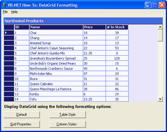
Figure 4-8: The DataGrid Formatting sample application as it appears after the Column Styles button has been clicked.
Building Upon…
Application #12: Use a DataSet and DataView
Application #18: Build a Master-Details Windows Form
Application #32: Use Format Codes to Format Data
New Concepts
This sample application introduces the DataGrid control and the DataGridTableStyle and DataGridTextBoxColumn classes. Each of these classes is discussed in more detail in the following sections.
Introducing the Windows Forms DataGrid Control
The DataGrid control is new to Visual Basic .NET. Part of the Windows.Forms namespace, a DataGrid presents data in a tabular or grid format similar to that of a worksheet in Microsoft Excel. The key to using the DataGrid is the DataSource property. The DataSource property specifies the source of data for the grid. A data source can be a DataTable object, a DataView object, a DataSet object, or a DataViewManager object. A data source can also be any other object that implements the IList or IListSource interfaces, such an ArrayList object or a ListItemCollection object. One thing to remember about the DataGrid control is that data must be bound in order to be displayed. That is, the DataGrid control does not support an add item mode or the ability to manually populate the grid row by row.
DataGridTableStyle
The DataGridTableStyle class represents the grid of a DataGrid control. Its function is to allow programmers to control the appearance of the DataGrid control. Using the DataGridTableStyle class is fairly straightforward. It exposes a set of properties you can set to control a DataGrid object’s visual style. For example, the BackColor and ForeColor properties allow you to change the background and foreground color of the grid, respectively. The AlternatingBackColor property is great for making it easy for users to scan the grid at a glance by setting the background color of alternating rows. Every DataGrid object has a header row that shows the names of each column displayed. The HeaderFont, HeaderBackColor, and HeaderForeColor properties allow you to customize how the header row looks.
The MappingName property is key to using the DataGridTableStyle class in an application. The MappingName property indicates the name of the data source. This is needed because a DataSet can contain multiple resultsets. The MappingName identifies which resultset to use.
What’s more, a DataGrid object can have multiple DataGridTableStyle objects, which are stored in the DataGrid object’s TableStyles collection.
DataGridTextBoxColumn
The DataGridTextBoxColumn class hosts a DataGridTextBox control in a cell of a DataGrid object for editing strings. The DataGridTextBoxColumn and DataGridTextBox classes work together to allow users to directly edit values in the cells of a DataGrid object’s column. The DataGridTextBoxColumn class allows you to customize how a DataGridTextBox object functions. For example, the Format property specifies how values should be displayed in the column using the format codes mentioned earlier in the chapter. (See the section “Application #32: Use Format Codes to Format Data.”) The application’s current CultureInfo setting is used to determine how to display the data correctly. You can also specify values for the HeaderText and Width properties of DataGridTextBoxColumn.
Code Walkthrough
Each of the buttons in the main form of the sample application demonstrates a way of formatting data in the DataGrid control.
The Default Button
The Default button populates the DataGrid control using the DataGrid control’s default formatting properties. It simply connects to the database and does not change any settings of the DataGrid control:
PrivateSubbtnDefaultFormatting_Click(_
ByValsenderAsSystem.Object,_
ByValeAsSystem.EventArgs)_
HandlesbtnDefaultFormatting.Click
ResetDemo()
BindDataGrid()
EndSub
ResetDemo is a subroutine that restores the default settings of the DataGrid object. BindDataGrid is a subroutine that connects to the database server, fetches the data, and binds the data to the DataGrid control. Note that either Microsoft SQL Server or Microsoft Data Engine (MSDE) must be installed, and that the Northwind database must be present for the sample application to work. The ResetDemo and BindDataGrid subroutines are called for each button to ensure that everything is reset properly.
The Grid Properties Button
The Grid Properties button formats the DataGrid using only the DataGrid base property settings:
WithgrdProducts
.AlternatingBackColor=Color.GhostWhite
.BackColor=Color.GhostWhite
.BackgroundColor=Color.Lavender
.BorderStyle=BorderStyle.None
.CaptionBackColor=Color.RoyalBlue
.CaptionFont=NewFont("Tahoma",10.0!,FontStyle.Bold)
.CaptionForeColor=Color.Bisque
.CaptionText= "NorthwindProducts"
.Font=NewFont("Tahoma",8.0!)
.ForeColor=Color.MidnightBlue
.GridLineColor=Color.RoyalBlue
.HeaderBackColor=Color.MidnightBlue
.HeaderFont=NewFont("Tahoma",8.0!,FontStyle.Bold)
.HeaderForeColor=Color.Lavender
.ParentRowsBackColor=Color.Lavender
.ParentRowsForeColor=Color.MidnightBlue
.SelectionBackColor=Color.Teal
.SelectionForeColor=Color.PaleGreen
EndWith
Most of these properties should be self-explanatory. One thing you see repeatedly is the Color enumeration. Color is a part of the System.Drawing namespace, and it represents an ARGB color. ARGB stands for Alpha, Red, Green, and Blue. This is a 32-bit number that specifies a particular color. Fortunately, it’s not necessary to know or memorize every color’s ARGB number. Color is an enumeration that lets you specify a color’s name rather than the actual number—for example, Color.RoyalBlue or Color.PaleGreen.
The Table Style Button
As with the previous two buttons, the Table Style button begins by calling the ResetDemo and BindDataGrid subroutines to ensure the DataGrid is properly re-initialized to default values. Then it sets some DataGrid properties directly, but only those that are not covered by DataGridTableStyle properties. Of particular interest here is the code that uses DataGridTableStyle. It begins by creating a new instance of the DataGridTableStyle class:
DimgrdTableStyle1AsNewDataGridTableStyle()
After grdTableStyle1 has been instantiated, its properties are set within a With/ End With block:
WithgrdTableStyle1
.AlternatingBackColor=Color.GhostWhite
.BackColor=Color.GhostWhite
.ForeColor=Color.MidnightBlue
.GridLineColor=Color.RoyalBlue
.HeaderBackColor=Color.MidnightBlue
.HeaderFont=NewFont("Tahoma",8.0!,FontStyle.Bold)
.HeaderForeColor=Color.Lavender
.SelectionBackColor=Color.Teal
.SelectionForeColor=Color.PaleGreen
.MappingName=PRODUCT_TABLE_NAME
.PreferredColumnWidth=125
.PreferredRowHeight=15
EndWith
Again, these properties should be self-explanatory. Once grdTableStyle1 has been set up with the desired settings, it’s added to the DataGrid TableStyles collection by using the Add method:
grdProducts.TableStyles.Add(grdTableStyle1)
The Column Style Button
After calling the ResetDemo and BindDataGrid subroutines, the Column Style button sets certain DataGrid properties directly, but only those that are not covered by DataGridTableStyle properties. Then a DataGridTableStyle object is created and populated. This part of the code is similar to the code for the Table Style button.
Next, four DataGridTextBoxColumn objects are created—one for each column of the DataGrid object. Because the code for each column is repetitive, let’s just examine the code to create the first column:
DimgrdColStyle1AsNewDataGridTextBoxColumn()
WithgrdColStyle1
.HeaderText= "ID"
.MappingName= "ProductID"
.Width=50
EndWith
The DataGridTextBoxColumn object allows you to format each column that you want to appear in the DataGrid control. In most cases, the DataGridTextBoxColumn class is appropriate. Notice that the column style properties available to you are more limited than those for the table style. For example, you cannot change the color of an individual column but you’re allowed to change the width on a per-column basis. The HeaderText property specifies the name of the column, and the MappingName property maps the data of the column to a specific field in the DataSource object.
Finally, the four DataGridTextBoxColumn objects are added to the GridColumnStyles collection of the DataGrid control by using the AddRange method:
grdTableStyle1.GridColumnStyles.AddRange_
(NewDataGridColumnStyle()_
{grdColStyle1,grdColStyle2,grdColStyle3,grdColStyle4})
Conclusion
The Windows Forms DataGrid is a data-bindable control that displays data in a grid format. Many different objects can be used as data sources, including DataTables, DataViews, DataSets, DataViewManagers, or any other objects that implement the IList or IListSource interfaces. The DataGridTableStyle class represents the visual style of the grid itself. The DataGridTextBoxColumn class allows you to control the appearance and behavior of a column. The DataGrid control can be quite powerful, and by combining the DataGrid control’s base properties with the DataGridTableStyle and DataGridTextBoxColumn classes, it’s highly customizable as well.
Application #34 DataGrid Sorting and Filtering
This sample demonstrates how to sort and filter data being displayed in a Windows Forms DataGrid control. First ADO.NET is used to retrieve product information from a SQL Server (or MSDE) database. The data is loaded into a DataSet object, and the grid is populated by binding it to the DataSet object. ADO.NET is also used to filter the data. When the user clicks the Filter button, a DataView object is used to show only specified rows in the DataGrid control. The user can sort the data by clicking any column heading in the DataGrid control. Figure 4-9 shows the DataGrid Sorting and Filtering application running, after the user has clicked the Filter button.
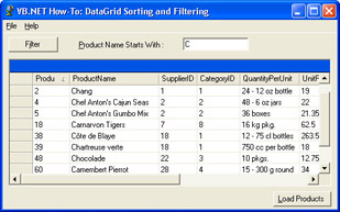
Figure 4-9: DataGrid Sorting and Filtering application.
Building Upon…
Application #7: Object-Oriented Features
Application #12: Use a DataSet and DataView
Application #33: Format a Data Grid
New Concepts
The next two sections explain how the sample code sorts and filters the data in the DataGrid control.
Sorting the DataGrid
Once a DataGrid control has been populated, sorting the data is extremely easy and requires absolutely no code. To sort a DataGrid control by a particular field, the user simply clicks the column header for that field. The data for the entire grid will be sorted in ascending order by that column. Clicking the same column header a second time will sort the grid in descending order. The user can toggle between ascending and descending order by clicking the same column header. This functionality is built into the DataGrid control itself; no actual code is required. If you would like to disable this feature, set the DataGrid object’s AllowSorting property to False. By default, AllowSorting is set to True. A DataGrid control can also be sorted programmatically using the Sort property of the DataView object of the Table object to which the DataGrid control is bound. The DataView object is introduced in the next section.
Filtering the DataGrid
Unlike sorting, filtering a DataGrid control requires some code, but overall the process is fairly easy. To filter a DataGrid control, the sample application uses the DataView object. A DataView object is a data-bindable, customized view of a DataTable object that can be used not only for filtering, but also for sorting, searching, editing, and navigation. The key property used to filter data on a DataView object is RowFilter. The RowFilter property specifies the conditions for which data should be filtered. In a sense, the RowFilter property works in a manner similar to the WHERE clause in Structured Query Language (SQL). For example,
myDataView.RowFilter= "Age=31"
would filter out all rows where Age isn’t 31.
You can also use compound conditions. For example,
myDataView.RowFilter= "Age=31ANDGender='Male'"
would filter out all rows where Age isn’t 31 and Gender isn’t Male. As part of ADO.NET, DataView objects can be used for both Windows Forms and Web Forms development. To simplify coding, each Table object of a DataSet object includes a DataView object built in by default. This object is named DefaultView. Therefore, to filter a DataGrid, simply use the DefaultView property of the DataSet table that is bound to the DataGrid control. The code walkthrough will show an example of how this done.
Code Walkthrough
The declarations section of frmMain contains several module-level variables and constants that will be used throughout the form. Among the module-level variables is ProductData, a DataSet that holds order information returned from the database. PRODUCT_TABLE_NAME is a constant that holds the name of the table of information in the ProductData DataSet:
ProtectedProductDataAsNewDataSet()
ProtectedConstPRODUCT_TABLE_NAMEAsString= "Products"
Load Button
When the user clicks the Load button, a connection is established to SQL Server (or MSDE):
DimnorthwindConnectionAsNewSqlConnection(connectionString)
Next, a SqlDataAdapter object is used to move data from the database to the DataSet object:
DimProductAdapterAsNewSqlDataAdapter(_
 "select*fromproducts",_
northwindConnection)
The DataSet object is cleared and populated with the information from the products table of the Northwind database. Because a DataSet object can hold multiple result sets, you should name the result set when you populate the DataSet object. In this case, the result set is named using the PRODUCT_TABLE_NAMES constant:
ProductData.Clear()
ProductAdapter.Fill(ProductData,PRODUCT_TABLE_NAME)
Remember that ProductData is declared as a module-level variable in the frmMain declarations section.
Next, the DataGrid is bound to the products table in the DataSet by using the grid’s DataSource property:
grdProducts.DataSource=ProductData.Tables(PRODUCT_TABLE_NAME)
Filter Button
Looking at the code from the top down, a With/End With block is used on the ProductData.Tables(PRODUCT_TABLE_NAME) object. Again, ProductData is the DataSet that holds the information retrieved from the database. The RowFilter property of the DefaultView object is used to filter the data so that only the product names starting with a specified string are shown. If no rows match the filter, a message box is displayed informing the user there are no matching rows. Finally, the DataGrid object is bound to the DataView object.
WithProductData.Tables(PRODUCT_TABLE_NAME)
.DefaultView.RowFilter= "ProductNamelike'" &txtFilter.Text& "%'"


If.DefaultView.Count=0Then
MessageBox.Show("Nomatchingrows.",_
MESSAGEBOX_CAPTION,_
MessageBoxButtons.OK,_
MessageBoxIcon.Information)
EndIf


grdProducts.DataSource=.DefaultView
EndWith
Conclusion
This sample application demonstrates how to sort and filter data in a Windows Forms DataGrid control. The ability to sort data is provided automatically to the users when they click the column header of the column they want to sort by. A DataGrid control can also be sorted programmatically using the Sort property of the DefaultView property. DefaultView is a DataView object that is built in to every DataSet object. To filter a DataGrid control, use the Filter property of the DefaultView property of the DataSet object.
Application #35 Create an Explorer Style Application
This sample application demonstrates how to create an application that uses the Windows Explorer–style interface. Windows Explorer–style applications came into popularity when Windows 95 introduced Windows Explorer, the 32-bit replacement for File Manager. Sporting a tree view to the left and a list view to the right, Windows Explorer introduced a new standard for user interfaces. The tree view was used to display the computer’s drives. When you clicked a drive, it would expand to reveal its subdirectories. When you clicked a subdirectory, it too would expand to reveal its subdirectories. On the right was a list view control that displayed each directory’s contents. As the directory selected on the left changed, the list view to the right changed accordingly. Best of all, the whole form was resizable. You could even resize the tree view and list view controls with a drag of the mouse. It was a model of simplicity and ease of use.
The sample application demonstrates how to create this type of interface, and what better example to use than a program that mimics the original Windows Explorer itself? The sample application does exactly that. It’s a simplified version of the original Windows Explorer that lets you view the drives, directories, and files on your computer. It won’t be as full featured, but it will definitely provide a great introduction to creating Windows Explorer–style interfaces.
Figure 4-10 shows what the sample application looks like.
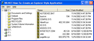
Figure 4-10: The Create A Windows Explorer-Style Application interface.
Building Upon…
Application #1: Use Arrays
Application #3: String Manipulation
Application #11: Key Visual Basic .NET Benefits
Application #32: Use Format Codes to Format Data
Application #37: Use Menus
New Concepts
This sample application describes the use of three new controls: the TreeView control, ListView control, and Splitter control.
The TreeView Control
The TreeView control displays items as a hierarchical collection of TreeNode objects. Each TreeNode object itself contains another collection of TreeNode objects. Each node has a Text property and can be associated with two bitmap images. The first bitmap image is for when the node is selected, and the second is for when the node is not selected. These images are kept in an ImageList control. The sample application demonstrates how to populate a TreeView control and associate images with each node.
The ListView Control
The ListView control is used for displaying lists of data. One advantage of using the ListView control is the flexibility in how the list is displayed. That is, there are four styles for displaying a list: SmallIcon, LargeIcon, List, and Details. In the sample application, the View menu is used to change how the ListView is displayed. Each list view item can have two bitmap images associated with it, a large icon and a small icon. What’s more, each item can have subitems, which appear as columns in the ListView control, but these are displayed only when the View property is set to Details. In the sample application, the ListView control is used to display the files contained in the currently selected directory of the TreeView control.
The Splitter Control
The Splitter control is new to Visual Basic .NET. It allows the user to resize docked controls at run time. In the sample application, the Splitter control resides between the TreeView and ListView controls. When the user drags the Splitter control across the form, the TreeView and ListView controls resize accordingly. That is, as the TreeView expands, the ListView shrinks, and vice versa. This makes it easy for the user to resize the controls at run time to suit his particular needs.
To create a Windows Explorer–style interface, the following steps are used:
- Add a TreeView to the form, and set its Docking property to Left.
- Add a Splitter control to the form (to the right of the TreeView control).
- Add a ListView control to the form, and set its Docking property to Fill.
Code Walkthrough
When the sample application starts, the first thing that needs to be done is populate the TreeView control with a list of drives on the user’s machine. This work is performed by the FillTreeView subroutine. The first two lines of code inside this routine get this list of drives and store them in an array of Strings:
DimstrDrives()AsString
strDrives=System.Environment.GetLogicalDrives()
Once you have the list of drives, you can begin to populate the TreeView control. Remember that a TreeView control contains a collection of TreeNode objects. This collection is named Nodes, and each drive is added as a node to this Nodes collection:
TreeView1.BeginUpdate()
DimxAsInteger
Forx=0TostrDrives.Length-1
DimobjTreeNodeAsNewTreeNode()
objTreeNode.Text=strDrives(x)
SelectCaseGetDriveType(strDrives(x))
CaseDRIVE_REMOVABLE
objTreeNode.ImageIndex=0
objTreeNode.SelectedImageIndex=0
CaseDRIVE_FIXED
objTreeNode.ImageIndex=1
objTreeNode.SelectedImageIndex=1
CaseDRIVE_CDROM
objTreeNode.ImageIndex=2
objTreeNode.SelectedImageIndex=2
CaseElse
objTreeNode.ImageIndex=0
objTreeNode.SelectedImageIndex=0
EndSelect
TreeView1.Nodes.Add(objTreeNode)
Nextx
TreeView1.EndUpdate()
The preceding code requires a little more explanation. GetDriveType is a Win32 API function that returns an integer indicating the type of drive. This information is useful because the bitmap image used depends on whether the drive is a floppy disk, hard disk, or CD-ROM drive. A Select Case/End Select block uses the value returned from GetDriveType to determine which bitmap image to use. The BeginUpdate method is used to improve performance by preventing the control from repainting itself each time a new node is added. Calling the EndUpdate method enables redrawing of the control. Finally, note that when the form is first loaded, only the drives are loaded into the TreeView, not any directories. Loading individual directories is deferred to the point where the user clicks on the drive node. This delay is done intentionally because reading every single directory on every drive can be a very time-consuming process. By loading only directories that are needed, the application’s perceived performance increases.
Therefore, when the user clicks on a node, its subdirectories must be loaded. This work is performed in the TreeView control AfterSelect event. The first thing to do inside this event is determine the full path of the currently selected directory. This is a little trickier than you might expect because the tree nodes are a hierarchy, and you have to account for how deep you are into the tree. This is where the GetPathFromNode function comes into play. It uses a Do/Loop Until loop to recursively determine the full path of the selected node:
PrivateFunctionGetPathFromNode(ByValMyTreeNode_
AsTreeNode)AsString


DimobjParentAsTreeNode=MyTreeNode
DimstrTempAsNewSystem.Text.StringBuilder()
DimblnTopNodeAsBoolean


Do
strTemp.Insert(0,AppendDirSlash(objParent.Text))
IfTypeOfobjParent.ParentIsTreeNodeThen
objParent=CType(objParent.Parent,TreeNode)
Else
blnTopNode=True
EndIf
LoopUntilblnTopNode


ReturnstrTemp.ToString
EndFunction
Once you know the full path of the selected directory, getting its subdirectories is fairly straightforward and mirrors the technique used in the FillTreeView routine explained earlier:
TreeView1.SelectedNode.Nodes.Clear()
TreeView1.BeginUpdate()
DimstrFolders()AsString
strFolders=Directory.GetDirectories(strFullPath)
DimxAsInteger
Forx=0TostrFolders.Length-1
DimobjTreeNodeAsNewTreeNode()
objTreeNode.Text=Path.GetFileName(strFolders(x))
objTreeNode.ImageIndex=4
objTreeNode.SelectedImageIndex=5

TreeView1.SelectedNode.Nodes.Add(objTreeNode)
Nextx
e.Node.Expand()
TreeView1.EndUpdate()
However, there are a few differences. First, the TreeView control SelectedNode.Nodes.Clear method is called to clear the contents of the selected node’s Nodes collection. This is done in case the user has previously selected this directory. To get a list of the full pathnames of the node’s subdirectories, the Directory.GetDirectories method is used. Path.GetFileName is used to strip off the path of these subdirectories so that only the name of the subdirectory is displayed in the TreeView control. As before, the BeginUpdate and EndUpdate methods are used for the sake of performance.
After the TreeView has been populated with the selected node’s subdirectories, the final step is to populate the ListView control with all the files in the selected directory:
ListView1.BeginUpdate()
ListView1.Items.Clear()
DimstrFiles()AsString
strFiles=Directory.GetFiles(strFullPath)
Forx=0TostrFiles.Length-1
DimobjListViewItemAsNewListViewItem()
WithobjListViewItem
.Text=Path.GetFileName(strFiles(x))
.ImageIndex=6
.StateImageIndex=6
.SubItems.Add(Format(FileLen((strFiles(x))),_
 "###,###,###,###"))
.SubItems.Add(CStr(File.GetLastWriteTime(strFiles(x))))
EndWith
ListView1.Items.Add(objListViewItem)
Nextx
ListView1.EndUpdate()
In many ways, the ListView control is programmatically similar to the TreeView control. Instead of having a Nodes collection, it has an Items collection. Instead of having TreeNode objects, the collection contains ListViewItem objects. To add a new item to the collection, call the Add method. To re-initialize this collection, call the Clear method. When adding items, you can use the BeginUpdate and EndUpdate methods to improve performance. One key difference, however, is that ListViewItems have a SubItems collection. The objects in the SubItems collection correspond to the columns shown when the ListView control View property is set to Details. For the sample application, these subitems are the file’s size in bytes and the date-time stamp of when the file was last modified.
Conclusion
The advantage of using the Windows Explorer–style interface is that it makes it very easy for the user to navigate and view information in a hierarchical fashion. Using the Splitter control, docked controls such as the TreeView and ListView controls are completely resizable, letting the user customize the application to her own preferences. This sample application should give you all you need to get started creating Windows Explorer–style applications.
Application #36 Create a System Tray Icon
A common task in Windows programming is adding an icon to the Windows system tray. In Visual Basic 6.0, there was no such built-in functionality. Developers either had to resort to using Win32 APIs or a third-party control. With the release of Visual Basic .NET, Visual Basic developers were finally able to use the system tray—right out of the box. This sample application demonstrates how to do exactly that: create an application that displays a notification icon in the system tray. Various properties and events will be demonstrated, including the ability to associate a context-sensitive menu with the icon. To make things a bit more interesting, the context-sensitive menu will be used to provide an introduction to the System.Environment class. Its menu items give the user access to selected functions, such as getting the current operating system version and the length of time since the user’s computer was booted, using the System.Environment class. Figure 4-11 shows the simple form that the sample application displays when it starts.
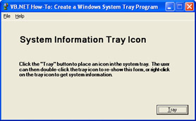
Figure 4-11: The sample application displays a dialog box that allows the user to place an icon in the system tray.
Building Upon…
Application #2: Use DateTimes
Application #7: Object-Oriented Features
New Concepts
This application introduces two new classes: The NotifyIcon class and the System.Environment class. These two classes are discussed in the sections that follow.
The NotifyIcon Control
The NotifyIcon control is a Windows Forms control that can be dragged and dropped onto any Windows Form. The NotifyIcon control is displayed in the component tray, which is part of the Windows Forms Designer and is located beneath the form. The component tray is used for any component that is part of a form but does not provide a visible surface at design time. At run time, the NotifyIcon control is displayed in the system tray. By default, the system tray is located at the bottom, far right of the Windows taskbar, although the user can change the location by moving the Windows taskbar. Programs such as antivirus software and the Windows Volume Control use this area for notification purposes or to provide users an easy way to access commonly used functionality.
The NotifyIcon control has only a handful of properties and methods. Among these is the Icon property. This is the icon that is displayed in the system tray. The Text property is the text that is displayed as a ToolTip when the user hovers the mouse over the icon. The Visible property is used to show and hide the icon. Finally, the ContextMenu property is used to associate a context menu with the control. This is the menu that pops up when the user right-clicks the icon in the system tray. The application starts with a simple form, shown in Figure 4-11, that contains a Tray button and some text. Clicking the Tray button causes the form to disappear and the application to display an icon in the system tray, as seen in Figure 4-12.

Figure 4-12: The NotifyIcon control appears in the Windows system tray at run time.
Accessing Machine Information via the Environment Namespace
The System.Environment is a static class that provides access to the current environment and platform. The sample application uses System.Environment to:
- Get the length of time elapsed since the user’s machine was booted
- Get the version of the .NET Framework
- Get the version of the operating system
In addition, the System.Environment class can be used to get command-line arguments, set an exit code, and perform other useful tasks.
Code Walkthrough
Normally, the Windows Forms Designer–generated code is not something you need to worry about. However, in this instance, it’s useful to examine this code to get a feel for how the NotifyIcon control works. All these properties were set at design time using the Properties window:
Me.ntfSystemInfo.ContextMenu=Me.mnuCtx
This line associates a context menu with the NotifyIcon control. It is this menu that pops up when the user right-clicks the icon in the system tray.
Me.ntfSystemInfo.Icon=_
CType(resources.GetObject("ntfSystemInfo.Icon"),_
System.Drawing.Icon)
This line sets the icon that will be displayed in the system tray.
Me.ntfSystemInfo.Text=_
resources.GetString("ntfSystemInfo.Text")
This line sets the Text property of the NotifyIcon. This is the text that appears as a ToolTip when the user hovers the mouse over the icon in the system tray.
Me.ntfSystemInfo.Visible=_
CType(resources.GetObject("ntfSystemInfo.Visible"),Boolean)
This line simply indicates whether the icon in the system tray should be visible or not. Again, all these properties were set using the Properties window. The point of going through the Windows Forms Designer–generated code was to get a better feel for what happens behind the scenes to get the NotifyIcon control to work.
The sample application is designed so that the notification icon is displayed only when the form is hidden. When the form is visible, the icon is not. Therefore, during the form’s Load event, the Visible property of the NotifyIcon is set to False:
PrivateSubfrmMain_Load(ByValsenderAsSystem.Object,_
ByValeAsSystem.EventArgs)HandlesMyBase.Load

ntfSystemInfo.Visible=False
EndSub
Clicking the form’s Tray button hides the form and displays the notification icon in the system tray:
PrivateSubbtnTray_Click(ByValsenderAsSystem.Object,_
ByValeAsSystem.EventArgs)HandlesbtnTray.Click
Me.Hide()
ntfSystemInfo.Visible=True
ntfSystemInfo.Text= "SystemInformation"
EndSub
Conversely, double-clicking the icon in the system tray hides the icon and displays the form:
PrivateSubntfSystemInfo_DoubleClick(ByValsenderAsObject,_
ByValeAsSystem.EventArgs)_
HandlesntfSystemInfo.DoubleClick

ntfSystemInfo.Visible=False
Me.Show()
EndSub
When the user right-clicks the icon in the system tray, a context menu is displayed. The only thing you need to do to associate the context menu with the NotifyIcon control is simply set the ContextMenu property of the NotifyIcon control. No additional code is required. The context menu gives the user six choices:
- Current Date
- Current Time
- Time since last Restart
- Framework Version
- Current OS Version
- Exit
To get the current date, the sample application simply calls the Now method of the DateTime class. The date is displayed in long date format:
MessageBox.Show("Today'sDateis: " +_
DateTime.Now.ToLongDateString(), "Date",_
MessageBoxButtons.OK,_
MessageBoxIcon.Information)
To determine the current time zone, the sample application calls the IsDaylightSavingTime method of the TimeZone.CurrentTimeZone class. This method returns True or False. The DaylightName and StandardName properties are used to determine the actual name of the time zone:
If(TimeZone.CurrentTimeZone.IsDaylightSavingTime(DateTime.Now))The n
MessageBox.Show(_
 "Thecurrenttimezoneis: " +_
TimeZone.CurrentTimeZone.DaylightName,_
 "TimeZone",_
MessageBoxButtons.OK,_
MessageBoxIcon.Information)
Else
MessageBox.Show(_
 "Thecurrenttimezoneis: " +_
TimeZone.CurrentTimeZone.StandardName,_
 "TimeZone",_
MessageBoxButtons.OK,_
MessageBoxIcon.Information)
EndIf
The Time Since Last Restart menu displays the length of time in minutes since the user’s computer was last rebooted. The TickCount method of the Environment class returns the number of milliseconds elapsed since the system started. This number is then converted to minutes:
DimtimeSinceLastRebootMinutesAsDouble=_
((Environment.TickCount/1000)/60)
The Framework Version menu displays the version number of the .NET Framework. The System.Environment makes this easy to do. Simply call the Version property:
MessageBox.Show("FrameworkVersion: " +_
Environment.Version.ToString(),_
 ".NETFrameworkVersion",_
MessageBoxButtons.OK,_
MessageBoxIcon.Information)
Finally, the Current OS Version menu displays the name and version number of the underlying operating system:
MessageBox.Show("FrameworkVersion: " +_
Environment.Version.ToString(),_
 ".NETFrameworkVersion",_
MessageBoxButtons.OK,_
MessageBoxIcon.Information)
Conclusion
In previous versions of Visual Basic, there was no built-in support for displaying an icon in the system tray. Most developers resorted to using the Win32 API or third- party controls. With the release of Visual Basic .NET, this ability is conveniently built into the .NET Framework with the NotifyIcon control.
Application #37 Use Menus
This sample application demonstrates how to use the MainMenu control, one of the most commonly used controls in Windows Forms. Various events are demonstrated, including the Popup, Select, and Click events. The sample applications also demonstrates how to use the MdiList, RadioCheck, and Checked properties. What’s more, as you can see in Figure 4-13, the sample application uses the MDI paradigm for its interface. This provides an excellent opportunity to introduce how to create MDI applications in Visual Basic .NET. A few things have changed since Visual Basic 6.0, so this will explain some of the differences.
The sample application is a simple text editor that consists of two forms (not counting the About form). The first form, named frmMain, is the main form of the application and serves as the MDI parent form. The second form, named frmEdit, is the MDI child form. As is standard with MDI applications, there is one instance of the main form but there can be multiple instances of the child form open at the same time.
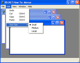
Figure 4-13: The Menus application in action.
Both frmMain and frmEdit use a MainMenu control. On frmMain, there are four top-level menu items: File, View, Window, and Help. Selecting New from the File menu creates a new instance of frmEdit where the user can enter and edit text. The View menu allows the user to toggle on and off a status bar displayed at the bottom of the form. The Window menu allows the user to tile the MDI child forms, either horizontally or vertically. The user can also cascade the child forms or even select a particular child form by using the MdiList property. Finally, selecting About from the Help menu brings up a standard About box. To exit the program, select Exit from the File menu.
frmEdit also has its own set of menus, which can be accessed by using a second MainMenu control. Its File menu allows the user to save and print files, and the Edit menu provides standard editing functions such as cut, copy, paste, and undo. The Text Size menu has a submenu that allows the user to change the size of text to small, medium, and large. At run time, the frmEdit menus are merged with the frmMain menus.
New Concepts
This sample application introduces the MainMenu control and MDI forms.
The MainMenu Control
The MainMenu control allows you to add menus to your Windows Forms. Simply drag and drop a MainMenu control from the toolbox to the design surface of your form. Then use the In-Place Menu Editor, shown in Figure 4-14, to add menus to your form.
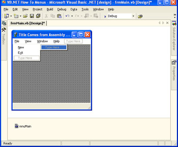
Figure 4-14: The In-Place Menu Editor.
MDI Forms
Multiple Document Interface (MDI) applications provide a methodology for creating a document-centric type of interface. MDI applications have a single container form that serves as the background for the application. As the user opens and creates new documents, each document is shown within its own child form. A user can have many documents open at the same time, or none at all. If the parent form is moved around the screen, all child forms move with the parent. Child forms can even be tiled or cascaded for ease of use. The multiple document interface is often used by text editing, word processing, and spreadsheet programs. Microsoft Visual Studio .NET, for example, uses MDI.
Code Walkthrough
Most of the code for this application is contained in frmMain and fmEdit. Both of these classes will be discussed in the sections that follow.
frmMain
As mentioned previously, frmMain is the container, or parent form, for the application. When the user selects a menu, the first handled event is the Select event. The Select event is useful for displaying a help string for the currently selected menu item in an application’s status bar:
DimstrTextAsString


IfsenderIsmnuStatusBarThen
strText= "Toggledisplayofthestatusbar"
ElseIfsenderIsmnuAboutThen
strText= "DisplaytheAboutdialogbox"
ElseIfsenderIsmnuCascadeThen
strText= "Cascadechildwindows"
ElseIfsenderIsmnuExitThen
strText= "Exitdemonstration"
ElseIfsenderIsmnuNewThen
strText= "Createnewchildwindow"
ElseIfsenderIsmnuTileHorizontalThen
strText= "Tilewindowshorizontally"
ElseIfsenderIsmnuTileVerticalThen
strText= "Tilewindowsvertically"
Else
strText=String.Empty
EndIf


WriteToStatusBar(strText)
The WriteToStatusBar subroutine simply sets the Text property of the StatusBar control.
The Popup event occurs when a list of menu items is about to be displayed. This event is often used for enabling/disabling, checking/unchecking, or even adding/removing menu items before the list of menu items is displayed. The View menu, for example, uses the Popup event to determine whether the Status Bar menu item should be checked or unchecked:
PrivateSubmnuView_Popup(ByValsenderAsObject,_
ByValeAsSystem.EventArgs)HandlesmnuView.Popup

mnuStatusBar.Checked=sbarEdit.Visible
EndSub
When the user clicks the New menu item, a new instance of frmEdit is created. Remember that multiple instances of frmEdit can be created. Here’s the code to do that:
Try
DimfrmAsNewfrmEdit()
StaticintChildAsInteger


intChild+=1
frm.MdiParent=Me
frm.Text= "Child " &intChild
frm.Show()
CatchexpAsException
MessageBox.Show(exp.Message,Me.Text)
EndTry
If you look past the error handling and the intChild code, you’ll see that creating a new child form requires only three lines of code. The first line creates a new instance of frmEdit. The second line sets the parent form for the new instance of frmEdit. This is what the MdiParent property is for. Finally, to actually display frmEdit, call the Show method. What happens if you accidentally forget to set the MdiParent property? The form is still created and displayed, but not as an MDI child. Instead, frmEdit is displayed outside the parent container form. It cannot be tiled or cascaded, and if the parent form is moved, frmEdit doesn’t move with it.
As for the intChild code, intChild is simply a static variable that counts the total number of times a new instance of frmEdit is created. This count is displayed in the title bar of frmMain.
The Window menu allows the user to rearrange all the child forms that are open in the application. The code to do this is extremely simple. All you have to do is set the frmMain LayoutMdi method. To arrange the child forms in cascade order, use MdiLayout.Cascade:
Me.LayoutMdi(MdiLayout.Cascade)
To tile the child forms horizontally, use MdiLayout.TileHorizontal:
Me.LayoutMdi(MdiLayout.TileHorizontal)
To tile the child forms vertically, use MdiLayout.TileVertical:
Me.LayoutMdi(MdiLayout.TileVertical)
It’s that simple.
frmEdit
frmEdit is used as the application’s child form and consists of a single MainMenu control and TextBox control. When an MDI child is displayed on screen, the child’s menus are merged with the parent form’s menus. This merging process can get a little complicated. In particular, there are two properties of the MainMenu control that need to be set properly.
The first property is MergeType. There are four possible values that it can be set to: Add, Replace, MergeItems, and Remove. In the sample application, the File menu MergeType property is set to MergeItems. This way, the File menu on frmMain merges with the items on the File menu of frmEdit when it has the focus. On the other hand, the Edit menu on frmEdit has its MergeType property set to Add. This way, when it has the focus, its Edit menu gets added to the menus of its parent form.
The second property is MergeOrder. This property is used to determine the order in which menu items are merged with each other. The values in this property are relative. That is, the actual values don’t matter, except in relation to other items. On frmMain’s File menu, the New menu item’s MergeOrder is 0 and the Exit menu item’s MergeOrder is 10. On frmEdit’s File menu, the Save menu item is set to 2 and the Print menu item is set to 3. The top and bottom dividers are set to 1 and 4. When you select New from the main form’s File menu, the child form appears and its menus merge into the File menu on the main form. The same issues apply to the Edit menu of frmEdit. The top-level menu items on frmMain have their MergeOrder properties set to 0, 10, 20, 30, and 40. The Edit menu on frmEdit has its MergeOrder property set to 5. When an instance of frmEdit has the focus, its Edit menu appears between the first two menus on frmMain (because 5 is between 0 and 10).
Both MergeType and MergeOrder can be set directly in code or by using the Properties window. In the sample application, the Properties window was used, so this code can be found in the Windows Form Designer–generated code region. For frmEdit, here is the code for mnuFile and mnuEdit:
Me.mnuFile.MergeType=_
System.Windows.Forms.MenuMerge.MergeItems
Me.mnuEdit.MergeOrder=5
Note that the default value for MergeType is Add and for MergeOrder it is 0. To save space, the Windows Forms Designer creates only lines of code where the value is not the default.
Conclusion
The MainMenu control is one of the most commonly used controls in Windows Forms development. With the in-place menu editor, it’s also one of the easiest to use. As you create more advanced Visual Basic .NET programs, you’ll want to use the Multiple Document Interface (MDI) as the model for some of your applications, particularly if they are document-centric. Text editors and word processors make for great uses of MDI.
Application #38 Use Owner Drawn Menus
This sample application demonstrates how to create an owner-drawn menu. An owner-drawn menu is one where you, as the programmer, override the default drawing behavior of a menu to add some sort of custom font or graphical effect. Specifically, this sample application creates an owner-drawn menu that displays an icon. To do this, a custom control is created, inheriting from the MenuItem control. Many newer applications, such as Microsoft Visual Studio .NET and Microsoft Office XP, display icons in their menus. By incorporating into your programs owner-drawn menus that display icons, your applications will have a more polished and professional look. The sample application shown in Figure 4-15 displays icons in its menu.
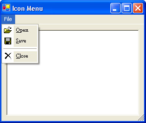
Figure 4-15: The sample application, Use Owner-Drawn Menus, uses owner-drawn menus to display menu items with an icon.
The sample application presents a simple text editor. Because the focus of this sample application is on how to create owner-drawn menus rather than how to create a text editor, the text editor itself doesn’t do much beyond allowing the user to enter plain text. However, the text editor form has a File menu that uses a custom control named IconMenuItem. This is where most of the interesting code is located and is therefore the focus of this section.
Building Upon…
Application #7: Object-Oriented Features
Application #8: Scoping, Overloading, Overriding
Application #31: Validate Text Boxes
Application #37: Use Menus
New Concepts
This application introduces the concept of owner-drawn menus. Owner-drawn menus are objects derived from the MenuItem control that have their OwnerDraw property set to True and that override the base class’s OnDrawItem method.
The MenuItem Control
The MenuItem control represents a submenu of a MainMenu control. As you know, adding a menu to a Visual Basic .NET Windows Forms involves adding a MainMenu control. Each submenu of this MainMenu control is a MenuItem control. Each MenuItem control in turn can have multiple submenu items. For example, the text editor form of the application contains File and Help submenus. These are actually implemented as MenuItem objects of the MainMenu control. The File MenuItem object has an Exit MenuItem object. The first release of Visual Basic .NET added many new exciting features to the language and integrated development environment (IDE). One of the most exciting improvements was the introduction of a great new menu editor. However, one feature that was left out of Windows Forms is the ability to associate an icon to a menu item. The owner-drawn feature of menus is used to add this ability to the sample application.
The OwnerDraw Property
OwnerDraw is a property of the MenuItem control that indicates whether the menu should be drawn by Windows or whether the application will programmatically draw the menu itself. By default, this property is set to False. When OwnerDraw is set to True, this tells .NET that you want to handle all the drawing yourself by overriding the OnDrawItem procedure. Place whatever custom code you want in the OnDrawItem event handler. The event argument for OnDrawItem includes a Graphics object. Use this Graphics object to manipulate the graphics displayed on screen.
Code Walkthrough
IconMenuItem is a custom control that inherits from the MenuItem control:
PublicClassIconMenuItem
InheritsMenuItem
Inside IconMenuItem are two module-level variables. Of particular significance is the m_Icon variable, which stores the icon to be displayed in the menu:
Privatem_IconAsIcon
Privatem_FontAsNewFont("TimesNewRoman",8)
The m_Icon variable is set in the IconMenuItem constructor:
PublicSubNew(ByValTextAsString,ByValIconAsIcon,_
ByValonClickAsEventHandler)
MyBase.New(text,onClick)
m_Icon=Icon
MyBase.OwnerDraw=True
EndSub
The user passes the Icon to the constructor when the MenuItem is instantiated. Also, note that the constructor sets the OwnerDraw property to True. Again, this tells Windows that you’ll supply the code to render the menu item yourself.
The next step in creating an owner-drawn menu is to override the OnDrawItem event handler:
ProtectedOverridesSubOnDrawItem(ByValeAsDrawItemEventArgs)
The first line inside the OnDrawItem procedure calls the base class’s OnDrawItem method. This begins the drawing process:
MyBase.OnDrawItem(e)
The OnDrawItem procedure has just one argument, DrawItemEventArgs, but it has several useful properties. The most important is the Graphics object. This represents a GDI+ drawing surface. The Graphics object provides various methods for drawing objects to a display device. For this particular sample application, the Graphics object will be used to draw the icon on the menu:
IfNotm_IconIsNothingThen
e.Graphics.DrawIcon(m_Icon,e.Bounds.Left+2,e.Bounds.Top+2)
EndIf


DimmyRectAsRectangle=e.Bounds
myRect.X+=22


DimmyBrushAsBrush=SystemBrushes.Control


e.Graphics.FillRectangle(myBrush,myRect)
Note that m_Icon is checked to make sure it’s not Nothing. This is to verify that m_Icon was properly set when it was passed into the IconMenuItem constructor. If m_Icon is Nothing, this code would still continue to work.
After the icon has been drawn, the next step is drawing the menu item’s text. The next two lines are used to determine the length of space to leave for the accelerator key:
DimmyStrFormatAsStringFormat=NewStringFormat()
myStrFormat.HotkeyPrefix=System.Drawing.Text.HotkeyPrefix.Show
Finally, draw the menu text on the screen by using the SolidBrush object. SolidBrush is part of the System.Drawing namespace and simply defines a brush of a single color:
myBrush=NewSolidBrush(e.ForeColor)
e.Graphics.DrawString(Me.Text(),m_Font,myBrush,_
e.Bounds.Left+25,e.Bounds.Top+2,myStrFormat)
As mentioned previously, the Graphics object contains many useful properties and methods for drawing on a GDI+ design surface. Here, you see the DrawString method is used to draw the menu item’s text on the Graphics object.
There’s one final step before completing the IconMenuItem control. Before drawing the menu on the screen, you first need to know the size of a menu item. That’s where the OnMeasureItem event comes into play. By overriding OnMeasureItem, you can measure the string in the MenuItem Text property and use it to set the size of the menu item:
ProtectedOverridesSubOnMeasureItem(ByValeAsMeasureItemEventArg s)
DimmyStrFormatAsNewStringFormat()
myStrFormat.HotkeyPrefix=System.Drawing.Text.HotkeyPrefix.Show
MyBase.OnMeasureItem(e)
e.ItemHeight=22
e.ItemWidth=CInt(e.Graphics.MeasureString(Me.Text(),_
m_Font,10000,myStrFormat).Width)+10
EndSub
e is the argument passed into the OnMeasureItem routine. It has ItemHeight and ItemWidth properties, which contain the size of the menu item.
There are a couple of new objects used in this code. StringFormat contains text layout information, such as alignment and line spacing. StringFormat is part of the System.Drawing namespace. HotkeyPrefix is an enumeration that specifies the type of display for hot-key prefixes for menu items.
Finally, the MeasureString method of the Graphics object is used to measure the width of the string to be displayed. Note that the font of the string is passed in as one of the parameters.
Conclusion
Owner-drawn menus are a powerful feature of Visual Basic .NET. They allow the developer to control how the menu-drawing process works. This adds a new level of flexibility that in the past had eluded Visual Basic developers. In this sample application, a custom control was created that displays icons in menu items. This is, undoubtedly, one of the more popular uses of owner-drawn menus in Visual Basic .NET. Using the technique presented in this sample application, you can create your own owner-drawn menus that perform custom actions, such as changing the color or font of a menu item or drawing a gradient.
Application #39 Use the Clipboard
Most applications for Windows support cutting or copying data to the Windows Clipboard and then pasting that data from the Clipboard into another application. The data formats of the copied information can vary depending on the task. This sample application, shown in Figure 4-16, demonstrates how to use the Windows Clipboard with data in multiple formats. It also demonstrates the primary classes, properties, and methods used when programming against the Clipboard.
The sample application uses a simple interface that has a series of menus for copying and pasting data within the application, and three controls that serve as containers for pasted data. A single image and some simple text (in several formats) are provided for copying. These items can be sent to the Clipboard in a single format or in multiple formats. Likewise, the user also has the ability to paste an item in a number of formats. These formats are determined dynamically according to the format or formats of the data that was copied in.
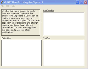
Figure 4-16: The main window of the Use The Clipboard application.
Building Upon…
Application #1: Use Arrays
Application #4: Try/Catch/Finally
Application #8: Scoping, Overloading, Overriding
Application #37: Use Menus
New Concepts
This application introduces the Clipboard class and describes how to use the class to copy data to the Windows clipboard.
The Clipboard Object
The Clipboard class resides in the System.Windows.Forms namespace, is NotInheritable, and has no public constructors. It is a simple class that represents the Windows clipboard and that has only two methods, which are used for sending and retrieving clipboard data. These methods are SetDataObject and GetDataObject. SetDataObject copies data to the clipboard. GetDataObject returns the data stored in the clipboard. This returned data is represented as an object that implements the IDataObject interface. What is IDataObject? IDataObject is an interface that provides a format-independent mechanism for transferring data. The data being transferred could be text, a bitmap, a wave audio file, or several other formats. The DataFormats class contains a list of predefined formats directly supported by the .NET Framework.
The IDataObject interface has four overloaded methods that are used when transferring data to and from the clipboard. The SetData method is used to store data in a specified format (such as text or bitmap). The GetDataPresent method is used to verify that the data in the clipboard is already in, or can be converted to, a given format. To retrieve data associated with a specified format, use the GetData method. Lastly, the GetFormats method returns a list of all formats the data is associated with, including formats the data can be converted to.
Copying Text to and from the Clipboard
Copying text items to and from the clipboard can be simple, as in the case of copying a string from one place in a document to another, or it can be as complex as copying text from a Web browser to another application that might or might not handle HTML tags. The latter situation makes it necessary to set data on the clipboard in several formats at once. The SetData method can be used to store multiple formats of a piece of data in the DataObject instance before it’s moved to the clipboard. The GetFormats method discussed earlier can then be used to list the data formats available as the data is being retrieved, so that the application can use the most appropriate format before using the data. Be aware that no validation is done to ensure that an item being stored as HTML or RTF is truly in that format. The application receiving the data should not assume that the item being retrieved is necessarily in the format it was supposed to be in.
Copying Images to and from the Clipboard
Using images with the clipboard is done in a manner similar to using text. The same methods are used for populating, querying, and retrieving data from the clipboard. Multiple formats of an image can be copied for use by another application. Some data formats that can be used for images include Bitmap, DeviceIndependentBitmap, MetafilePict, EnhancedMetafile, and TaggedImageFileFormat.
Code Walkthrough
When frmMain is instantiated, five variables are initialized with values that will later be copied to and from the clipboard. These values will represent data items that contain a string, HTML, RTF, XML, and a bitmap.
DimstrText,strHTML,strRTF,strXMLAsString
DimmyImageAsSystem.Drawing.Bitmap
mnuCopyTextAsRTF_Click
The Edit menu contains different submenus for moving information to and from the clipboard. There is a Copy Text As menu for copying a text item as Text, HTML, RTF, XML, and All Formats. Another menu, Copy Image As, copies an image as a bitmap. The Paste As menu item is used to paste the contents of the clipboard to the controls on the form. The formats available here will depend on the type of data that was copied in. Copying text to the clipboard as RTF is handled by the following lines of code:
DimmyDataObjectAsNewDataObject()
myDataObject.SetData(DataFormats.Rtf,strRTF)
Clipboard.SetDataObject(myDataObject,True)
First a DataObject is created. Then the text is added to it with the proper format using SetData. The first parameter specifies the format of the data being stored, DataFormats.RTF. The second parameter is the data itself. Next, the SetDataObject method is used to copy the data object to the clipboard. Here the data object is passed in along with a Boolean value indicating whether or not the data should be retained once the application is closed.
mnuEdit_Popup
When this data is pasted, only the Rich Text Format menu is shown. This menu is actually populated based on the type of data that was copied to the clipboard. If the clipboard is not empty when the Edit menu is clicked, a list of supported formats is obtained using the GetFormats method of the DataObject:
IfNot(Clipboard.GetDataObject()IsNothing)Then
strArray=Clipboard.GetDataObject().GetFormats()
Next, an array of these format types is created and populated. Each format type becomes a menu item that will be displayed when the user selects Paste As from the Edit menu.
ReDimmyTypes(strArray.Length-1)
Fori=0TostrArray.Length-1
myTypes(i)=NewMenuItem(strArray(i),_
NewSystem.EventHandler(AddressOfPasteAsMenuEventHandler))
Nexti
Each menu item is set to point at a common routine, PasteAsMenuEventHandler, for handling paste events. This will be discussed next.
PasteAsMenuEventHandler
In PasteAsMenuEventHandler, variables are defined for retrieving the data from the clipboard and clearing the controls that will display the data. The selected format of the data is then determined and saved to a variable as a string:
strType=CType(sender,MenuItem).Text
The data object is inspected to determine whether the selected format is available in the clipboard:
IfClipboard.GetDataObject().GetDataPresent(strType)Then
The data is retrieved using the GetData method of the data object and is then saved to a local variable in the requested format:
obj=Clipboard.GetDataObject().GetData(strType)
If the data was retrieved successfully, it’s copied to the first output control, a RichTextBox control using the control’s Paste method:
IfNotobjIsNothingThen
Me.rtbPaste.Paste(DataFormats.GetFormat(strType))
If there is a textual representation of the data in the clipboard, it can be pasted to the TextBox control as well. The GetType method of the retrieved object can be used to determine whether data can be pasted to a control:
Ifobj.GetType().ToString()= "System.String" Then
Me.txtPaste.AppendText(CType(obj,String))
Else
Me.txtPaste.AppendText(obj.GetType.ToString())
EndIf
Notice that the data is tested to see whether it’s a System.String. This will determine whether or not the contents of the object need to be converted before being displayed in the TextBox control.
Conclusion
Most Windows applications support cutting or copying data to and from the Windows Clipboard. These applications might use different formats such as bitmap, RTF, and HTML. This sample application shows how the Clipboard class can be used to handle data in multiple formats by using the IDataObject interface.
Application #40 Use Drag and Drop
Previous versions of Visual Basic had two different and incompatible methods of adding drag-and-drop functionality to applications. The first method was known as standard drag-and-drop, and it was designed to support drag-and-drop operations between controls within a single application. While simple to code, standard drag- and-drop didn’t work across multiple applications. The second method was known as OLE drag-and-drop. OLE drag-and-drop was slightly more complicated, but it worked across multiple applications. Unfortunately, OLE drag-and-drop was incompatible with standard drag-and-drop.
Visual Basic .NET simplifies all of this by settling on a single, standard way of performing drag-and-drop operations that works within a single application and across multiple applications. If you previously used OLE drag-and-drop, Visual Basic .NET drag-and-drop will seem very familiar.
The sample application demonstrates how to add drag-and-drop functionality to your programs. It consists of a main form with a two-paged tab control. The first tab page shows how to drag-and-drop items (as text) back and forth between two ListBox controls, as pictured in Figure 4-17.
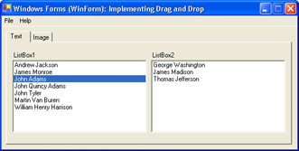
Figure 4-17: Application interface – Text tab.
The second tab page shows how to move an image back and forth between two PictureBox controls using drag-and-drop, as pictured in Figure 4-18.
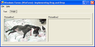
Figure 4-18: Application interface – Image tab.
Building Upon…
Application #29: Use the ListBox and ComboBox
Application #39: Use the Clipboard
New Concepts
Drag-and-drop in Visual Basic .NET is similar to OLE drag-and-drop in Visual Basic 6.0, although some of the names of methods and properties have changed.
The first step in enabling drag-and-drop in your application is to set each destination control’s AllowDrop property to True. Generally, this is done in the Form Load event procedure or constructor. To begin an actual drag-and-drop operation, call the DoDragDrop method of the source control. Generally, the DoDragDrop method is called within the MouseDown event procedure. The DoDragDrop method accepts two parameters. The first parameter, data, is the object or data to be dragged. In the sample application, data is the text of a ListBox item (first tab) or a bitmap image (second tab). The second parameter, allowedEffects, is a bit field and is represented by the DragDropEffects enumeration. There are a total of six possible drag-and-drop effects:
|
Constant |
Value |
|---|---|
|
All |
The data is copied, removed from the drag source, and scrolled in the drop destination. |
|
Copy |
The data is copied to the drop destination. |
|
Link |
The data is linked to the drop destination. |
|
Move |
The data is moved to the drop destination. |
|
None |
The drop destination does not accept the data. |
|
Scroll |
The drop destination will scroll. |
The DoDragDrop method begins the drag-and-drop operation. The next step is to code the destination control DragEnter event procedure. The DragEnter event occurs when the user first drags the mouse over a possible destination control. This event is used to set which DragDropEffects the destination control will allow.
The final step to implementing drag-and-drop functionality in Visual Basic .NET is to handle the destination control DragDrop event. This event occurs when the user drags the mouse to the destination control and releases the mouse button. Use this event to place the dragged data into the destination control. The section that follows will walk you through this process step by step.
Code Walkthrough
The code walkthrough for this application focuses on four event procedures: frmMain_Load, ListBox_MouseDown, ListBox_DragEnter, and ListBox_DragDrop. The following sections discuss these event handlers in detail.
frmMain_Load
The first step to implementing endrange drag-and-drop functionality in Visual Basic .NET is to set each destination control’s AllowDrop property to True. This property cannot be set at design time, so the form’s Load event procedure is used:
PrivateSubfrmMain_Load(ByValsenderAsSystem.Object,_
ByValeAsSystem.EventArgs)HandlesMyBase.Load


ListBox1.AllowDrop=True
ListBox2.AllowDrop=True
PictureBox1.AllowDrop=True
PictureBox2.AllowDrop=True


FillListBoxWithPresidents(ListBox1)


PictureBox1.Image=Image.FromFile("..SleepingDogs.jpg")
EndSub
Note that both list boxes and both picture boxes have their AllowDrop properties set to True. This allows the user to drag-and-drop items from the first control to the second, and vice versa. Next, the first list box is populated with some sample data by calling the FillListBoxWithPresidents routine. Finally, the first picture box is populated with a sample image.
ListBox_MouseDown
Now that the form has been properly initialized, the source control MouseDown event procedure is used to begin the drag-and-drop operation. Because the code for dragging items from one list box to another is similar to dragging images to and from picture boxes, this walkthrough will focus on dragging and dropping items from the ListBox controls. First, examine the ListBox_MouseDown event procedure:
PrivateSubListBox_MouseDown(ByValsenderAsObject,_
ByValeAsSystem.Windows.Forms.MouseEventArgs)_
HandlesListBox1.MouseDown,ListBox2.MouseDown
Note that the Handles clause specifies two events. This helps eliminate redundant code because it allows ListBox1 and ListBox2 to share the same event procedures.
Drag-and-drop operations begin when the user holds down the left mouse button while the mouse is hovering over a source control. The next line of code checks to makes sure the user clicked the left mouse button:
Ife.Button=MouseButtons.LeftThen
Then the generic sender object is cast to a ListBox object. Remember that both ListBox1 and ListBox2 will call this event procedure, so this also allows the same code to run for both controls:
DimmyListBoxAsListBox=CType(sender,ListBox)
The next line of code makes sure that the user selected an item from the ListBox:
IfmyListBox.SelectedIndex>-1Then
In the declarations section of frmMain, a variable named m_SourceControl was declared. This variable is used to keep track of which ListBox is the source for the current drag-and-drop operation. This variable is set in the MouseDown event procedure:
m_SourceControl=myListBox
Finally, the DoDragDrop method of the source ListBox is called:
myListBox.DoDragDrop(myListBox.Items(myListBox.SelectedIndex),_
DragDropEffects.Move)
The first parameter is the text of the selected ListBox item. The second parameter indicates that this is a move operation.
ListBox_DragEnter
The ListBox_DragEnter routine sets the type of drag-and-drop effect for the destination list box. For this particular application, only Move is allowed, but other effects could be used, such as Copy, Link, and Scroll:
PrivateSubListBox_DragEnter(ByValsenderAsObject,_
ByValeAsSystem.Windows.Forms.DragEventArgs)_
HandlesListBox1.DragEnter,ListBox2.DragEnter


Ife.Data.GetDataPresent(DataFormats.Text)=TrueThen
e.Effect=DragDropEffects.Move
Else
e.Effect=DragDropEffects.None
EndIf
EndSub
Again, note that the Handles clause specifies two events. This allows ListBox1 and ListBox2 to share the same event procedures. The GetDataPresent method is used to determine whether the data being dragged is text. This is done to ensure that the destination control can properly handle the data. If the dragged data was, for example, audio or a bitmap image, there would be no way for a normal ListBox to handle it.
ListBox_DragDrop
The ListBox_DragDrop event procedure completes the drag-and-drop process for the ListBox controls. It moves the selected item from the source list box to the destination list box:
PrivateSubListBox_DragDrop(ByValsenderAsObject,_
ByValeAsSystem.Windows.Forms.DragEventArgs)_
HandlesListBox1.DragDrop,ListBox2.DragDrop


DimmyListBoxAsListBox=CType(sender,ListBox)


DimmyTextAsString


myText=e.Data.GetData(GetType(System.String)).ToString
RemoveItemFromListBox(myText,CType(m_SourceControl,ListBox))
myListBox.Items.Add(myText)
EndSub
The first few lines should be familiar, such as the Handles clause and casting the generic sender object to a specific type. Of particular importance is the GetData method of the e.Data object. The e.Data object is an argument passed into the DragDrop routine. GetData simply gets the data that has been dragged into the control. In this particular case, the data is text. The selected Item object is removed from the source list box and added to the destination list box.
Conclusion
The first step to adding drag-and-drop functionality to Visual Basic .NET programs is to set the AllowDrop property to True for each control that is to serve as a destination control. Then code the MouseDown, DragEnter, and DragDrop event procedures. The drag-and-drop metaphor is often used in Windows applications as a way to make it easier for users to interface with a program. Developers who used older versions of Visual Basic probably remember that Visual Basic had two different, and incompatible, ways of adding drag-and-drop functionality to their applications. Visual Basic .NET simplifies this by standardizing a single, yet robust method for implementing drag-and-drop.
Application #41 Simple Printing
This sample application demonstrates how to print from a Visual Basic .NET program. The main class that all .NET printing revolves around is known as the PrintDocument class. In addition to providing the PrintDocument class, Visual Basic .NET also provides PrintPreviewDialog, PrintDialog, and PageSetupDialog classes. With these classes, you can add professional-quality printing support to your applications.
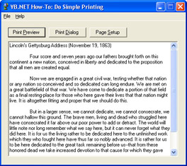
Figure 4-19: Main form of the sample application.
The sample application, shown in Figure 4-19, consists of a main form with a text box and three command buttons. When the form loads, the text box is populated with Abraham Lincoln’s famous Gettysburg Address as sample data. The first button, Print Preview, will use the PrintPreviewDialog class to display a print preview of the document before it’s sent to the printer. The second button, Print Dialog, will use the PrintDialog class to print the document. Finally, the Page Setup button will use the PageSetupDialog class to allow the user to change various page settings.
Building Upon…
Application #30: Use Common Dialog Boxes
Application #38: Use Owner-Drawn Menus
New Concepts
This sample application introduces the classes that the .NET Framework provides for adding print support to your application. The sample application’s use of these classes, the PrintDocument, PrintPreviewDialog, PrintDialog, and PageSetupDialog classes, is described in the following sections.
The PrintDocument Class
As part of the System.Drawing.Printing namespace, the PrintDocument class is used to facilitate printing in Visual Basic .NET. To begin the printing process, the Print method of the PrintDocument object is called. This causes the PrintDocument to generate a PrintPage event. Inside the PrintPage event handler, include whatever code is needed to print the document using the Graphics object that is passed in as one of the arguments. Depending on what is to be printed, the code inside the PrintPage event handler can be very simple or very complex. Each time a new page is printed, a new PrintPage event occurs. Also passed into the PrintPage event handler is a flag named HasMorePages. When the document is done printing, this flag should be set to False to indicate that the print job is complete.
The PrintPreviewDialog Class
The PrintPreviewDialog class is used to display how a document will look when it’s sent to the printer. This dialog control is fully featured and requires very little code to set up. To use it, simply set its Document property to the PrintDocument object that is to be printed, and call the ShowDialog method. The Print Preview dialog box, shown in Figure 4-20, displays on screen and allows the user to examine every page of the document, zoom in and out, and preview multiple pages at the same time. The user can choose to either close the dialog box or print directly from the preview dialog box.
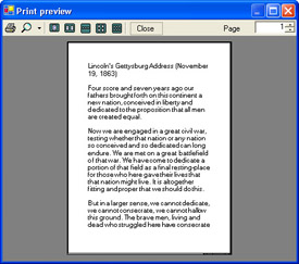
Figure 4-20: PrintPreviewDialog displaying the Gettysburg Address text from the sample application.
The PrintDialog Class
The PrintDialog class is used to display the standard Windows Print dialog box. This dialog box allows the user to change printers, select a print range, and set the number of copies to be printed. The user can click the OK button to send the document to the printer or click Cancel to exit the dialog box. Clicking the Properties button will display a second dialog box, the Printer Properties dialog box (seen in Figure 4-21), which is also standard in Windows. In the Printer Properties dialog box, the user can select myriad settings for the selected printer, such as layout and print quality. Like PrintPreviewDialog, PrintDialog is easy to use and requires very little code. Simply set its Document property to the PrintDocument object that is to be printed, and call the ShowDialog method. If the user clicks OK, the ShowDialog method will return DialogResult.OK. If the user clicks Cancel, the ShowDialog method will return DialogResult.Cancel.
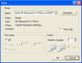
Figure 4-21: The standard Windows Print dialog box.
The PageSetupDialog Class
The PageSetupDialog class works in a manner similar to the previously explained print dialog boxes. Calling the ShowDialog method displays the Page Setup dialog box (shown in Figure 4-22). The ShowDialog method returns DialogResult.OK if the user clicks the OK button or DialogResult.Cancel if the user clicks the Cancel button. How is the PageSetupDialog different from the other dialogs? PageSetupDialog allows the user to change various settings related to how a page of a print document is to be printed. For example, the user can change the left, right, top, and bottom margins of a page or select the page size (legal, letter, envelope, index card, and so forth). The results of the user’s selections are placed in a property named PageSettings. Use the PageSettings property to determine how the page should be printed.
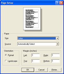
Figure 4-22: The Page Setup dialog box.
Code Walkthrough
The first thing the sample application does to enable print support is add an Imports statement to the System.Drawing.Printing namespace. Then a module-level variable is declared of type PrintDocument. These will be used to print the text in the TextBox control on the form:
ImportsSystem.Drawing.Printing


PublicClassfrmMain
InheritsSystem.Windows.Forms.Form


PrivateWithEventspdocAsNewPrintDocument()
btnPrintPreview_Click
The code to show the Print Preview dialog box is simple. First an instance of the PrintPreviewDialog class is instantiated. Then the PrintPreviewDialog Document property is set to the module-level PrintDocument object that was declared in the frmMain declarations section. Finally, the ShowDialog method is called to display the dialog box. Note that a Try/Catch/End Try block is used to catch any errors. This is needed in case a printer is not installed:
PrivateSubbtnPrintPreview_Click(ByValsenderAsSystem.Object,_
ByValeAsSystem.EventArgs)HandlesbtnPrintPreview.Click

DimppdAsNewPrintPreviewDialog()
Try
ppd.Document=pdoc
ppd.ShowDialog()
CatchexpAsException
MessageBox.Show("Anerroroccurredwhiletryingtoloadthe " &_
"documentforPrintPreview.Makesureyoucurrentlyhav e " &_
"accesstoaprinter.Aprintermustbeconnectedand " &_
"accessibleforPrintPreviewtowork.",Me.Text,_
MessageBoxButtons.OK,MessageBoxIcon.Error)
EndTry
EndSub
btnPrintDialog_Click
The PrintDialog class allows the user to select the printer they want to print to, as well as other printing options. To show the Print dialog box, simply create an instance of the PrintDialog class, tell it the document it is to print using the Document property, and call the ShowDialog method. If the user clicks the OK button, the document is printed by calling the PrintDocument Print method. Remember that the Print method will trigger a PrintPage event. The code to handle this event will be shown later.
PrivateSubbtnPrintDialog_Click(ByValsenderAsSystem.Object,_
ByValeAsSystem.EventArgs)HandlesbtnPrintDialog.Click


DimdialogAsNewPrintDialog()
dialog.Document=pdoc


Ifdialog.ShowDialog=DialogResult.OKThen
pdoc.Print()
EndIf
EndSub
btnPrintPageSetup_Click
The PageSetupDialog class lets the user alter settings such as the page size and orientation. To use PageSetupDialog, an instance of the PageSetupDialog class is created. Two of the PageSetupDialog object’s properties are set before the ShowDialog method is called. First, the Document property is set to the PrintDocument that is to be printed. Again, this variable was declared in the frmMain declarations section. Second, the PageSettings property is set to the DefaultPageSettings of the PrintDocument. Then the ShowDialog method is called. If the user clicks the OK button on the Page Setup dialog box, the user’s selections are copied to the PrintDocument DefaultPageSettings property:
PrivateSubbtnPageSetup_Click(ByValsenderAsSystem.Object,_
ByValeAsSystem.EventArgs)HandlesbtnPageSetup.Click


DimpsdAsNewPageSetupDialog()
Withpsd
.Document=pdoc
.PageSettings=pdoc.DefaultPageSettings
EndWith


Ifpsd.ShowDialog=DialogResult.OKThen
pdoc.DefaultPageSettings=psd.PageSettings
EndIf
EndSub
pdoc_PrintPage
Until now, the code for the sample application has been very straightforward. The code for the PrintPage event, however, is more involved. This is because the PrintPage event handler contains all the actual printing code. For the sample application, pdoc_PrintPage was designed to be very fast for printing plain text. MeasureString is used to calculate the text that can be fitted on an entire page. The PrintPage event handler begins by declaring two local variables. The first, intCurrentChar, holds the position of the last printed character. Remember that the PrintPage event occurs for every page that is printed. This variable is declared as static so that subsequent PrintPage events can use its value. The second variable, font, is the font that is to be used for printing:
PrivateSubpdoc_PrintPage(ByValsenderAsObject,_
ByValeAsSystem.Drawing.Printing.PrintPageEventArgs)_
Handlespdoc.PrintPage

StaticintCurrentCharAsInt32
DimfontAsNewfont("MicrosoftSansSerif",24)
Next, four more local variables are declared, intPrintAreaHeight, intPrintAreaWidth, marginLeft, and marginTop. These contain the bounds of the printing area rectangle:
DimintPrintAreaHeight,intPrintAreaWidth,marginLeft,marginTopAs Int32
Withpdoc.DefaultPageSettings
intPrintAreaHeight=.PaperSize.Height-.Margins.Top- .Margins.Bottom
intPrintAreaWidth=.PaperSize.Width-.Margins.Left- .Margins.Right
marginLeft=.Margins.Left'Xcoordinate
marginTop=.Margins.Top'Ycoordinate
EndWith
If the user selects landscape mode, the printing area for height and width need to be swapped:
Ifpdoc.DefaultPageSettings.LandscapeThen
DimintTempAsInt32
intTemp=intPrintAreaHeight
intPrintAreaHeight=intPrintAreaWidth
intPrintAreaWidth=intTemp
EndIf
Next, the total number of lines in the document is calculated based on the height of the printing area and the height of the font:
DimintLineCountAsInt32=CInt(intPrintAreaHeight/font.Height)
Then a rectangle structure that defines the printing area is created:
DimrectPrintingAreaAsNewRectangleF(marginLeft,marginTop,_
intPrintAreaWidth,intPrintAreaHeight)
The StringFormat class encapsulates text layout information (such as alignment and line spacing), display manipulations (such as ellipsis insertion and national digit substitution), and OpenType features. The use of StringFormat causes MeasureString and DrawString to use only an integer number of lines when printing each page, ignoring partial lines that would otherwise likely be printed if the number of lines per page did not divide up cleanly for each page (which is usually the case):
DimfmtAsNewStringFormat(StringFormatFlags.LineLimit)
MeasureString is used to determine the number of characters that will fit in the printing area rectangle. intCharFitted is passed ByRef and used later when calculating intCurrentChar and HasMorePages. intLinesFilled isn’t really needed for this sample except that it must be passed when passing intCharsFitted. Mid is used to pass the segment of remaining text left off of the previous page of printing:
DimintLinesFilled,intCharsFittedAsInt32
e.Graphics.MeasureString(Mid(txtDocument.Text,intCurrentChar+1), font,_
NewSizeF(intPrintAreaWidth,intPrintAreaHeight),fmt,_
intCharsFitted,intLinesFilled)
Finally, the text is printed to the page using the DrawString method of the Graphics object:
e.Graphics.DrawString(Mid(txtDocument.Text,intCurrentChar+1),fon t,_
Brushes.Black,rectPrintingArea,fmt)
Before finishing, a few more things need to be done. First, intCurrentChar needs to be updated to include the number of characters that have been printed thus far. Because intCurrentChar is a static variable, its value is retained for the next PrintPage event:
intCurrentChar+=intCharsFitted
Second, HasMorePages needs to be set to indicate whether the print document is complete. Remember that the PrintPage event will continue to fire until HasMorePages is set to False. Also, because intCurrentChar is a static variable, it must be explicitly reset in case there’s another print job:
IfintCurrentChare.HasMorePages=True
Else
e.HasMorePages=False
intCurrentChar=0
EndIf
EndSub
Conclusion
This sample application covered a lot of material. To review, the PrintDocument class is used to send a document to the printer. When adding print support to your applications, the PrintDocument object should be declared as a module-level variable in the declarations section of the Windows Form. To begin the printing process, the PrintDocument Print method is called and the PrintPage event is raised for each page that is to be printed. The PrintPage event handler contains all the code that is necessary to print. In addition to providing the PrintDocument class, Visual Basic .NET also provides PrintPreviewDialog, PrintDialog, and PageSetupDialog classes. The PrintPreviewDialog displays what the document will look like before it’s sent to the printer. The PrintDialog class displays the standard Windows Print dialog box that allows the user to change printers, select a print range, and set the number of copies to be printed. Finally, the PageSetupDialog lets the user change various settings related to the printed page. This sample application only showed how to print simple text, but many other types of documents can be printed, such as reports, charts, and graphics. As you dig deeper into the System.Drawing namespace, you’ll discover that printing with Visual Basic .NET is very powerful and that this sample only scratches the surface of what is possible.
Application #42 Associate Help with an Application
One of the most important things that developers can do for their end users is to provide them with a competent and easy-to-use help system for their applications. A number of controls are provided by the .NET Framework for building a help system. Among these are the ToolTip, HelpProvider, and ErrorProvider controls. This sample application, shown in Figure 4-23, will demonstrate how to use these controls to create a more helpful and user-friendly environment in a Windows Forms application.
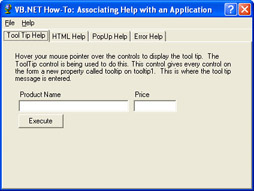
Figure 4-23: The main screen of Application #42, which demonstrates how to provide users of an application with an effective help system.
The sample application uses a simple interface that has a series of tab pages for demonstrating different methods of providing help to the user. Each tab page contains a number of controls along with one or more help features tied to them. The first tab page will demonstrate how the ToolTip class can be used to clarify the purpose of controls when the user hovers the mouse over them. The second tab uses the HelpProvider control to pop up messages for each control on the form as they are clicked. The third tab shows the ability of the HelpProvider control to provide links to compiled help documents or basic HTML help pages. The last tab demonstrates how the ErrorProvider control can be used to notify a user of invalid input.
New Concepts
This sample application introduces the ToolTip control, the HelpProvider control, and the ErrorProvider control. The following sections discuss these controls in more detail.
The ToolTip Control
The ToolTip control displays text to a user as a ToolTip when the user hovers the mouse over a control. A ToolTip can be associated with any control on a form (Button, TextBox, PictureBox, and so on) and should provide a short but meaningful explanation of the purpose of the control. A ToolTip control can handle multiple controls, so only one ToolTip control is needed for all items on a form.
The two main methods of the ToolTip control are SetToolTip and GetToolTip. The SetToolTip method is used to set the help text displayed for each control. GetToolTip retrieves the text associated with a specified control. The ToolTip control also has several properties that allow the developer to customize its behavior. For example, the Active property allows you to toggle the ToolTips on or off. The InitialDelay property is used to set the amount of time that the user must hover the mouse over a control before the ToolTip will appear. The AutoPopDelay property sets the length of time the ToolTip is shown. To change how long it takes for subsequent ToolTip windows to appear as the user moves the mouse from one control to the next, use the ReshowDelay property.
The HelpProvider Control
The HelpProvider control is used to associate help files with an application. The HelpNamespace property of the HelpProvider control indicates the path of a help document. As previously mentioned, these help files can be either compiled help documents (.chm) or HTML pages (.htm). The Help object is part of the System.Windows.Forms namespace and represents the HTML Help engine. It works in tandem with the HelpProvider control to provide help functionality to an application. The Help object has several shared methods that are used to launch the help files associated with the application.
There are several ways that the HelpProvider control can be used to provide help to an end user. First, context-sensitive help can be associated with individual controls on a Windows Form. Second, context-sensitive help can also be provided for a dialog box or controls within it. Finally, a help file can be opened at a specific location within the file, such as a table of contents or search area. The sample application demonstrates the first method.
The ErrorProvider Control
The ErrorProvider control provides an effective means of providing visual feedback during data validation. The ErrorProvider control will display an error icon next to each control that contains invalid data. The first advantage of using this control is that the error is displayed to the user until the invalid data has been corrected. The second, even more important advantage is that the ErrorProvider control in no way interrupts users as they enter data. This contrasts strongly with the older, more conventional technique of displaying an error message in a message box. A message box is easy to code, but it has the unfortunate consequence of interrupting whatever the user might be doing. What’s more, a user cannot proceed until the message box is dismissed. The ErrorProvider control does not have these drawbacks. Plus, as Figure 4-24 shows, the ErrorProvider control shows the error message whenever the user hovers the mouse pointer over the error icon.
The most important properties of the ErrorProvider control are the ContainerControl and Icon properties. The ContainerControl property is set to the container that holds the controls to be validated, generally a Windows Form. The Icon property indicates the image that should be shown when an error needs to be communicated to the user. The SetError method is used to specify the error message to be displayed and where the icon should appear.
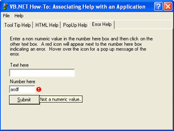
Figure 4-24: ErrorProvider control in action.
Code Walkthrough
This code walkthrough discusses the code for each of the sample application’s tabs: Tool Tip Help, HTML Help, PopUp Help, and Error Help.
Tool Tip Help
The properties of the ToolTip control were set at design time, so the following code is found in the Windows Form Designer generated code:
Me.ToolTip1.SetToolTip(Me.btnExecute, "ExecutetheQuery")
Me.ToolTip1.SetToolTip(Me.txtPrice, "Enteraprice.")
Me.ToolTip1.SetToolTip(Me.txtProductName, "Enteraproductname.")
The SetToolTip method is used to associate ToolTip messages with each control on the ToolTip Help tab.
HTML Help
As previously mentioned, the HelpProvider control and Help object work together to display .chm and .htm Help files to the user. First, the ShowHelp method is used in the mnuContentsHelp_Click event handler to display the contents of a help file:
Help.ShowHelp(Me,hpAdvancedCHM.HelpNamespace)
The first parameter indicates the parent control of the Help window. The second parameter is the HelpNamespace property of the HelpProvider control. This property specifies the URL of the Help file. Next, ShowHelpIndex is used in the mnuIndexHelp_Click event handler to display the index for the Help file. These parameters are the same as for the ShowHelp method:
Help.ShowHelpIndex(Me,hpAdvancedCHM.HelpNamespace)
Finally, ShowHelp is again called, but this time two additional parameters are given. The following code is found in the mnuSearchHelp_Click event handler:
Help.ShowHelp(Me,hpAdvancedCHM.HelpNamespace,_
HelpNavigator.Find, "")
The third parameter can be any one of the HelpNavigator enumerations. This enumeration specifies constants indicating which elements of the Help file to display and include TableOfContents, Find, Index, and Topic. HelpNavigator.Find indicates that the search page of the URL should be displayed. The last parameter references an object that contains the value of the specific topic within the Help file to display. If a HelpNavigator enumeration is supplied, this parameter should be empty.
Popup Help
The SetHelpString method of the HelpProvider control is used to associate a help string with a specified control. This string is displayed in a pop-up window when the user presses the F1 key while the specified control has focus. Again, inspect the Windows Form Designer–generated code:
Me.hpAdvancedCHM.SetHelpString(Me.rtbTextEntry, "Thisisthetext " &_
"entryarea.Usethisareatoentertextwhichcanbesavedto " &_
"anrtffile.")
Me.hpAdvancedCHM.SetShowHelp(Me.rtbTextEntry,True)
The SetShowHelp method is used to indicate whether or not a help message should be displayed for a given control. Pass in True to specify that the message should be shown and False to turn off the context-sensitive help feature.
Error Help
The last tab is the Error Help tab. Here, the value of txtNumberValue is validated at run time when focus is given to the txtTextValue text-box control. The ErrorProvider control is used to alert the user when invalid data is entered. In the txtNumberValue_Validating event handler, the value in the txtNumberValue text box is checked. Only numeric values are valid.
IfNotIsNumeric(txtNumberValue.Text)Then
ErrorProvider1.SetError(txtNumberValue,_
 "Notanumericvalue.")
If the value entered is not numeric, the error message string is populated, causing the error icon to be displayed to the user. The string becomes a ToolTip for the error icon on the form. If the value is valid, the error message string is cleared, causing the icon to be hidden:
Else
ErrorProvider1.SetError(txtNumberValue, "")
Conclusion
Windows applications should provide a means of giving help to the end users. This help can come in many forms. This sample demonstrated various ways that help features can be added to a Windows Forms application using the ErrorProvider, HelpProvider, and ToolTip controls. The ToolTip control provides ToolTips for controls on the form. The HelpProvider control supplies links to the help documents related to the application. Finally, the ErrorProvider control displays user-friendly error information to aid users in entering data.
Application #43 XP Theme Support
Windows XP introduced the concept of themes to the Windows user-interface experience. A theme is a set of icons, fonts, colors, and other elements that give a user’s desktop a distinctive and unified appearance. Not only does this include a new look for the Start button and taskbar, it also changes the look of many standard Windows controls, such as the Button, ComboBox, Radio, and TextBox controls. As a Visual Basic .NET programmer, you might want to take advantage of Windows XP themes in your programs. This sample application will show you how to enable support for Windows XP themes by using Visual Basic .NET. Figure 4-25 shows how applications look without Windows XP themes enabled. Figure 4-26 shows how applications look with Windows XP themes enabled.
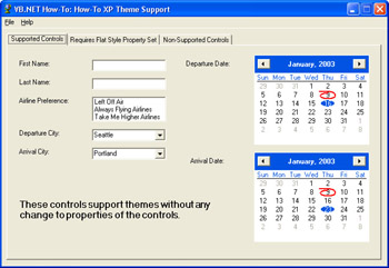
Figure 4-25: Application interface without Windows XP themes enabled.
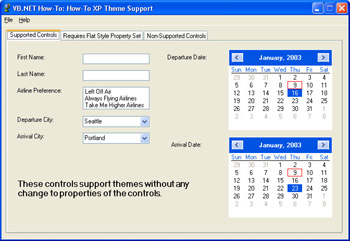
Figure 4-26: Application interface with Windows XP themes enabled.
Building Upon…
Application #28: Work with XML DOM
Application #29: Use the ListBox and ComboBox
New Concepts
This sample application shows you how to add support for Windows XP themes to your Visual Basic .NET applications. Adding this support is easy to do. In fact, there are only two steps required:
- Set each control’s FlatStyle property to FlatStyle.System.
- Create a manifest file for the application.
The following sections discuss in more detail how to accomplish these tasks.
Setting FlatStyle to FlatStyle.System
The first step to enabling Windows XP theme support in Visual Basic .NET is to set every control that has a FlatStyle property to FlatStyle.System. This indicates that the operating system should use the default system style for each control, as illustrated in Figure 4-27.
Not all Windows Forms controls have a FlatStyle property—for example, the TextBox control doesn’t have one. For these controls, you need to do nothing special.
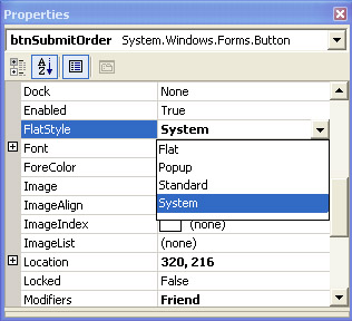
Figure 4-27: Set the FlatStyle property to System.
You might be wondering why FlatStyle.System isn’t the default for Windows Forms controls. The reason is that Windows Forms controls support additional features not available in the system default style. Certain properties such as background colors and background images cannot be used when FlatStyle is set to FlatStyle.System. Making FlatStyle.Standard the default value of the FlatStyle property allows you to use these properties out of the box.
Creating the Manifest File
The second step to enabling Windows XP theme support in Visual Basic .NET applications is to create a manifest file for your application. The manifest file is a simple text file that is used at run time by the operating system to enable Windows XP theme support. The manifest file should go into the same directory as the compiled application and should have the same name as the EXE plus a .manifest extension. For example, if an application’s name is MyApp.exe, the manifest file should be named MyApp.exe.manifest. Only one manifest file is required per application, even if it consists of multiple dynamic-link libraries (DLLs).
Code Walkthrough
Because control properties are generally set at design time using the Properties window, there is very little code to walk through. So the code walkthrough for this sample application will focus on the manifest file. Here are the complete contents of the sample application’s manifest file:
version="1.0.0.0"
processorArchitecture="X86"
name="Microsoft.Winweb.MantaRay" type="win32"
/>

VB.NETHow-ToXPThemeSupport


type="win32"
name="Microsoft.Windows.Common-Controls"
version="6.0.0.0"
processorArchitecture="X86"
publicKeyToken="6595b64144ccf1df"
language="*"
/>
The first and most obvious thing to note is that the manifest file is a standard text file containing XML. A manifest file contains run-time information about an application. It is used to indicate whether an application should bind to a certain version of a dependent file. This information is contained within the <dependentAssembly> tag. Note that the sample’s manifest file says that the application should use Microsoft.Windows.Common-Controls, version 6.0.0.0. This is no coincidence, as this is the version that introduced support for Windows XP themes.
Also, this same manifest file will work with any Visual Basic .NET application for which Windows XP theme support is to be enabled. All you need to do is make sure the manifest is named properly and is in the correct directory. Again, the name of the manifest file should be the same as the executable with .manifest appended to it. For example, the sample application’s executable filename is “VB.NET How- To XP Theme Support.exe” and the manifest filename is “VB.NET How-To XP Theme Support.exe.manifest”. Both the executable and manifest files should reside in the same directory. By following these two steps, you can add Windows XP theme support to all your applications.
Conclusion
Enabling support for Windows XP themes is easy to do with Visual Basic .NET. First, for every control that has a FlatStyle property, simply change its value to FlatStyle.System. Second, create a manifest file and place it in the same directory as your application’s executable file. You can copy the one supplied with the sample application for use in your program. All you have to do is make sure the manifest file is named correctly and is in the same directory as the executable. At run time, your application will automatically use the information contained in the manifest file to enable Windows XP theme support.
Application #44 Inherited Windows Forms
When designing an application that contains a large number of forms, it’s often desirable to keep those forms consistent. Using forms inheritance can help to ensure that cross-project consistency is attained. It can also cut down on development time during your initial development phase and while maintaining and enhancing the application. Because a form is really just a class, a base form can be designed that will serve as a basis for all the forms in an application. Logos, menus, and standard command buttons can be coded once and then propagated throughout an application with very little effort. This sample application, shown in Figure 4-28, will demonstrate how visual inheritance is used with Windows Forms.

Figure 4-28: Application interface – Main Form.
The sample application includes several forms. The main form has two command buttons on it. The first button, ShowDataGrid Form, brings up a form that displays database information in a DataGrid control, as Figure 4-29 illustrates.
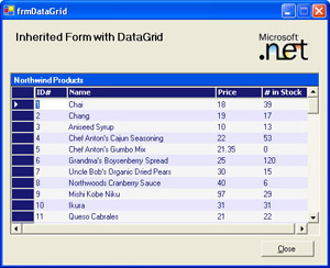
Figure 4-29: Inherited form with DataGrid control.
The second button, Show RichTextBox Form, brings up a form that displays the same database information as the first form, but uses a RichTextBox control, as shown in Figure 4-30.
Figure 4-30: Inherited form with RichTextBox control.
Both forms inherit from a single base form named frmBase. This base form includes a Button control and several Label controls, has several properties set to customize its appearance, and includes a function for returning a DataSet object. The base form also has an empty area reserved so that it can be populated with database information by the derived forms.
Building Upon…
Application #7: Object-Oriented Features
Application #12: Use a DataSet and DataView
New Concepts
Visual inheritance can be thought of as the implementation inheritance of a visual object. This might seem complicated, but the idea is roughly similar to using an ActiveX control on a Visual Basic 6 form. The difference is that you now have reusability at the form level.
Inheriting forms allows for standardization across entire projects, a task that would have been difficult in the days of Visual Basic 6. This is a powerful new feature. Now, common elements of your forms can be encapsulated in a single base class that derives from System.Windows.Forms.Form. Forms that inherit from this base class are “born” with controls, properties, and functionality without the developer having to write any additional code. In addition, as changes are proposed for the common portions of your forms, they need to be changed in only one place rather than in all the forms in your application. Simply make the changes in the base class and recompile the application.
Creating a base class for a form is just like creating any other base class. Start with a Visual Basic Windows Application Project. Add to the base form any controls, functions, and property values that will be common throughout the application. Keep in mind that if the derived forms need to be able to change any inherited items, those items should be defined as Protected (or Public) in the base class. Private functions, properties, and controls will be inherited but cannot be altered by a derived class.
Once the base class has been defined, use the Inherits keyword to create a derived form. From within the derived form, you can modify and access all the public and protected controls of the base form, including making changes to their locations and properties. In the Visual Studio .NET Windows Forms designer, the inherited controls are identified by a small arrow that appears in the top-left corner of each control. Last, add any new controls or additional functionality to your derived form. You now have a new form that uses all the traits of the base form, plus any new functionality that is unique to this form.
Code Walkthrough
The sample application uses three forms to illustrate the creation and use of inherited Windows Forms: frmBase, frmDataGrid, and frmRichTextBox. The following sections discuss each of these forms in detail.
frmBase
In the sample application, frmBase serves as the base class from which other forms are derived. It therefore inherits from System.Windows.Forms.Form:
InheritsSystem.Windows.Forms.Form
Next, two connection strings are defined for accessing the database through either SQL Server or MSDE. If the connection string changes, only the code in the base class needs to be updated and all derived forms will automatically see the change.
ProtectedConstSQL_CONNECTION_STRINGAsString=_
"Server=localhost;" &_
"DataBase=Northwind;" &_
"IntegratedSecurity=SSPI"


ProtectedConstMSDE_CONNECTION_STRINGAsString=_
"Server=(local)NetSDK;" &_
"DataBase=Northwind;" &_
"IntegratedSecurity=SSPI"
frmBase also contains a number of controls that will be inherited by derived classes. The control declarations can be found in the Windows Forms Designer–generated code:
FriendWithEventslblTitleAsSystem.Windows.Forms.Label
FriendWithEventsbtnCloseAsSystem.Windows.Forms.Button
FriendWithEventsPictureBox1AsSystem.Windows.Forms.PictureBox
ProtectedWithEventslblProtectedAsSystem.Windows.Forms.Label
PrivateWithEventslblPrivateAsSystem.Windows.Forms.Label
Controls defined using the Friend keyword are accessible from within the form that contains their declaration and from anywhere else in the same project. Controls defined as Protected are accessible only from within the base class or from within classes derived from the base class. Finally, controls defined as Private are accessible only from within the base class.
The data access function is accessible within the base class and all derived classes as well. Here, the Protected keyword is used:
ProtectedFunctionGetDataSource()AsDataSet
All the controls, properties, and functionality defined in the base class will be inherited by derived forms. As previously mentioned, the new forms can also add new functionality to that which was inherited from the base class.
frmDataGrid
frmDataGrid is the first form that inherits from the frmBase base class. The Inherits keyword is used to specify the class being inherited from:
PublicClassfrmDataGrid
InheritsfrmBase
The btnClose control is one of the controls inherited from the base class. No event handler was defined in the base class, so the derived classes are responsible for providing that code. The btnClose_Click event handler contains code to close the form when the Close button is clicked:
PrivateSubbtnClose_Click(ByValsenderAsObject,_
ByValeAsSystem.EventArgs)HandlesbtnClose.Click
Me.Close()
EndSub
The base class also provides the function for connecting to the database and retrieving information from it. In the frmDataGrid_Load event handler, the GetDataSource function that was inherited from the base class is called to populate the DataGrid control:
WithdgProducts
.CaptionText= "NorthwindProducts"
.DataSource=GetDataSource().Tables(0)
EndWith
Finally, after the data has been retrieved and displayed in the DataGrid control, the title of the form is set:
lblTitle.Text= "InheritedFormwithDataGrid"
frmRichTextBox
Like frmDataGrid, frmRichTextBox also inherits from the frmBase class:
PublicClassfrmRichTextBox
InheritsfrmBase
Again, the GetDataSource function that was inherited from the base class is called to populate the RichTextBox control. The following code can be found in the frmRichTextBox_Load event handler:
DimdsAsDataSet=GetDataSource()
Finally, the lblTitle control Text property is changed by the derived class:
lblTitle.Text= "InheritedFormwithRichTextBox"
Conclusion
Visual inheritance is a powerful new feature of Visual Basic .NET. It allows a common set of features to be implemented across multiple forms in an application with minimal effort by developers. It also reduces the amount of time and effort involved in updating common elements across multiple forms in a large application. This sample demonstrates how visual inheritance can be used to standardize the look and feel of multiple forms in an application, as well as to effectively reuse large pieces of code.
Application #45 Create Top Level Forms
Many document-based applications employ a user-interface paradigm that displays each document window as a top-level window. This makes it appear as if multiple instances of the same program are running at the same time but without wasting system resources. This sample application, shown in Figure 4-31, demonstrates a technique that allows you to use this interface model in your applications.
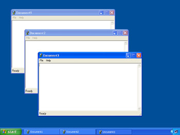
Figure 4-31: Notice that each window is top-level and appears in the taskbar as a separate program.
The sample application is a simple text editor. Each new document appears as a top-level window. The user can use the Windows taskbar or Alt+Tab to switch between document windows.
Building Upon…
Application #7: Object-Oriented Features
New Concepts
This application describes how to create applications with top-level forms. Top-level forms are sometimes used by document-centric applications, such as Microsoft Word and Microsoft Excel. Each time the user opens a new document or spreadsheet, it’s shown as a top-level window. This enables the user to use Alt+Tab to switch between the documents as if they were each a separate process, but without the overhead incurred by loading each document into a separate process. The user can also switch between documents by using the Windows taskbar.
Creating Multiple Open Forms
The sample application starts in the Sub Main routine inside a class named Forms. This Forms class controls execution flow by launching and managing each document window. When the application begins, Sub Main sets the main thread to run outside the control of a particular form so that closing one document does not terminate the whole process. This is accomplished by calling the Run method of the Application object. Each time the user selects New from the File menu, the Forms class creates a new document window. When the user closes a document window by choosing Close from the File menu, an event is raised back to the Forms class. This lets the Forms class keep track of all the document windows. When the final document window is closed, the entire application shuts down. The user can also exit the program by selecting Exit from the File menu.
Code Walkthrough
The Forms class contains the Sub Main routine, which launches the application and manages program execution. This code walkthrough will begin by examining the declarations section of the Forms class:
PublicClassForms
PrivateSharedm_FormsAsNewCollection()
PrivateSharedm_FormsCreatedAsInteger=0
m_Forms is a Collection object that manages a list of open document forms. Other forms such as the About form will not be in this list. Instead, only instances of frmMain will be added to this collection because only frmMain serves as the document window. m_FormsCreated is a counter for keeping track of the total number of document windows that have been opened. This counter is used in creating a default title for each new document window.
The Forms class Sub Main routine serves as the startup object for the sample application:
PublicSharedSubMain()
Try
NewForm()
CatchexpAsException
MessageBox.Show("Sorry,wewereunabletoloadadocument", _
"ApplicationMain",MessageBoxButtons.OK,MessageBoxIcon .Error)
Application.Exit()
EndTry


Application.Run()
EndSub
NewForm is a routine that opens a document window. By calling this routine within Sub Main, the first document window is opened by default. A Try/Catch/End Try exception block is used to handle any possible errors. Finally, Application.Run() sets the application’s main thread to run outside the control of a particular form so that closing one document window will not terminate the entire application.
The NewForm routine handles creating each new document window. NewForm is called when the application starts up (from Sub Main) and when the user selects New from the File menu:
m_FormsCreated+=1
DimfrmAsNewfrmMain()
frm.Text= "Document" &Forms.m_FormsCreated.ToString()
m_Forms.Add(frm,frm.GetHashCode.ToString())
First, the m_FormsCreated counter is incremented. Then a new instance of frmMain is created and its caption text is set to display the document number. Finally, the document window is added to the m_Forms collection.
After the document window is created, a series of event handlers are wired to handle certain events of the document window. This lets Forms keep track of when each document window is closing and when the application is ending:
AddHandlerfrm.Closed,AddressOfForms.frmMain_Closed
AddHandlerfrm.SaveWhileClosingCancelled,_
AddressOfForms.frmMain_SaveWhileClosingCancelled
AddHandlerfrm.ExitApplication,_
AddressOfForms.frmMain_ExitApplication
Finally, the Show method of the document window is called so that the form is displayed on screen:
frm.Show()
Users can open as many document windows as they would like without unduly consuming system resources.
Conclusion
Some document-based applications, such as Microsoft Word and Microsoft Excel support multiple windows, one per open document, displayed as top-level windows. This sample application demonstrates how to use this technique in your own document-centric applications.
Application #46 Dynamic Control Creation
This sample application demonstrates how to build a program that dynamically creates controls on the fly to generate its user interface. The sample application consists of two main forms. The first form allows the user to add Button and TextBox controls to the form at run time by clicking a Button control, as shown in Figure 4-32.
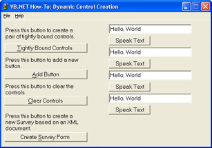
Figure 4-32: The main form of the sample application allows the user to dynamically create controls on the form.
The second form is a survey form that asks the user a series of questions. These questions are contained in a separate XML file. As the form is created, the application reads the data in the XML file to generate its user interface, as shown in Figure 4-33.
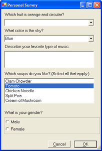
Figure 4-33: The Personal Survey form is dynamically created at run time.
Building Upon…
Application #7: Object-Oriented Features
Application #29: Use the ListBox and ComboBox
New Concepts
This application illustrates the use of tightly bound controls, and adding and clearing controls. Each of these concepts is described in more detail in the following sections.
Tightly Bound Controls
Clicking the Tightly Bound Controls button will add two controls to the form—a TextBox control and a Button control. The user can type text into the TextBox, and when he clicks the Button control, a message box will be displayed showing what the user typed. Event handlers are declared beforehand and wired to the controls’ events after the controls have been created. The “Code Walkthrough” section will demonstrate how this is done.
Adding and Clearing Controls
To add a control to a Windows Form at run time, first declare and instantiate an object of the type of control you want. For example,
DimtxtNewTextBoxAsNewTextBox
creates a new TextBox control. Then set its properties, such as Name, MultiLine, and MaxLength. In particular, you need to set its Size and Location so that the control is properly sized and placed on the form. It is also recommended that each new control be added to the Controls collection of the form. This can be done using the Add method of the Controls collection. Finally, use the AddHandler statement to wire up any event procedures to the control’s events.
To remove a control from a form, follow these steps. First, unwire any event procedures using the RemoveHandler statement. Second, remove the control from the Controls collection. Finally, call the control’s Dispose method. This will allow the control to be unloaded from the form.
Code Walkthrough
The declarations section of the sample application’s main form defines several variables and constants:
PrivateConstCONTROL_WIDTHAsInteger=300
PrivateConstCHARS_PER_LINEAsInteger=30
PrivateConstHEIGHT_PER_LINEAsInteger=19


Privatem_ControlCountAsInteger=0
Privatem_LocationAsNewPoint(10,10)
The constants are used to properly position the controls on the form. The variable, m_ControlCount, is used to keep track of the number of tightly bound control pairs that are created. For simplicity’s sake, the user is allowed to create only a maximum of five control pairs before the form runs out of room. The m_Location variable is used to keep track of the placement of the last control added to the form. This variable is needed to keep the controls from overlapping.
The Tightly Bound Controls Button
The btnTightlyBoundControls_Click subroutine handles the Tightly Bound Controls button’s Click event by creating two tightly bound controls. The two controls created are the Button and TextBox controls. The subroutine uses event handlers that have been previously defined to handle the events. When the Button is pressed, the text in the TextBox is displayed in a message box.
Looking at the code, the first step is to declare and instantiate a TextBox object:
DimtxtSpeakTextAsNewTextBox()
Then various properties for the TextBox need to be set:
txtSpeakText.Text= "Hello,World"
txtSpeakText.Name= "txtSpeakText"
txtSpeakText.Location=NewPoint(m_Location.X+250,m_Location.Y)
txtSpeakText.Size=NewSize(200,txtSpeakText.Height)
Next, the TextBox is added to the Controls collection:
Controls.Add(txtSpeakText)
m_Location is a module-level variable that keeps track of the position of the last control that was dynamically created. As mentioned previously, this positioning information is needed so that the controls don’t overlap each other:
m_Location.Y+=txtSpeakText.Height+5
After creating the TextBox control, a Button control is created. As you can see, the code to dynamically create a Button control is the same as the code for dynamically creating a TextBox control:
DimbtnSpeakTextAsNewButton()


btnSpeakText.Text= "SpeakText"
btnSpeakText.Name= "btnSpeakText"
btnSpeakText.Location=NewPoint(m_Location.X+250,m_Location.Y)
btnSpeakText.Size=NewSize(100,btnSpeakText.Height)


btnSpeakText.Tag=txtSpeakText


Controls.Add(btnSpeakText)


m_Location.Y+=btnSpeakText.Height+5
Only one line of code is new. This sets the Tag property of the Button control to the newly created TextBox control. This is needed to keep track of which Button is associated with which TextBox.
Finally, the AddHandler statement is used to wire up the button’s Click event procedure with the button’s Click event:
AddHandlerbtnSpeakText.Click,AddressOfSpeakTextClickHandler
The Clear Controls Button
This btnClearControls_Click event procedure clears all the dynamically generated controls on the form. It does this by removing all the controls from the Controls collection and calling the InitializeComponent subroutine. InitializeComponent was automatically generated by the Visual Studio .NET Windows Forms Designer. This is an easy way of resetting a form to its original state. The GetAssemblyAttributes subroutine is used to reset the text of each form’s caption to the name of the application. The module-level variables, m_Location and m_ControlCount are also re-initialized to default values:
PrivateSubbtnClearControls_Click(ByValsenderAsSystem.Object,_
ByValeAsSystem.EventArgs)HandlesbtnClearControls.Click


Controls.Clear()


InitializeComponent()


GetAssemblyAttributes()


m_Location=NewPoint(10,10)


m_ControlCount=0


Show()


EndSub
Conclusion
This sample application demonstrates how to perform dynamic control creation. It also shows how to add these controls to and remove these controls from the Controls collection of the Form and how to add and remove event handlers at run time. Using the techniques presented in this sample, you should be able to create dynamic user interfaces in your Visual Basic .NET applications.
About the Applications
- Working with Microsoft Visual Studio .NET 2003 and Microsoft .NET Framework 1.1
- Working with the Microsoft Visual Basic .NET Language
- Data Access
- Building Windows Forms User Interfaces
- Building Web Applications
- Working with Console Applications
- Interacting with the Operating System
- Working with the .NET Framework
- Advanced .NET Framework
- GDI+
- Building Enterprise Services Applications
- COM Interop/PInvoke
- Visual Studio .NET
- Securing Applications
- Coding Conventions
- Windows Server 2003 for .NET Developers
EAN: 2147483647
Pages: 157
