Eclipse Forms
Eclipse Forms provides a framework for creating flat, web-like user interfaces. This chapter shows you how to use the Eclipse Forms frame. You learn how to use the toolkit to create basic forms or scrollable forms. The chapter introduces Eclipse Forms custom widgets, such as hyperlinks, form texts, sections, and so on. Also, two Eclipse Forms layout managers are discussed at the end of this chapter.
Introduction to Eclipse Forms
A new Eclipse version 3.0 feature, Eclipse Forms, provides a convenient API for creating polished, web-like user interfaces. Eclipse Forms is used extensively in the Eclipse Plug-in Development Environment (PDE). Figure 21-1 shows a PDE Eclipse Forms–based plug-in descriptor file editor. If you take a close look, you might notice a few features of Eclipse Forms:
- SWT controls, such as buttons and texts, are polished to adapt them to forms.
- Some of the forms, including the one shown in Figure 21-1, are scrollable.
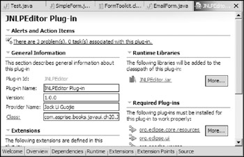
Figure 21-1 - Some controls on forms, such as labels, are wrapped to fill the provided width.
- Other features are included such as hyperlinks, sections, and so on.
Eclipse Forms uses a toolkit to adapt common SWT controls to the form environment. Additionally, it provides many custom controls — e.g., hyperlinks and sections designed to fit into forms. A new layout manager is created to lay out controls in a form with proper wrapping.
Before you begin programming with Eclipse Forms, you need to add the forms.jar (under the folder $ECLIPSE_HOME/plugins/org.eclipse.ui.forms_3.x.x) into your Java path. The following are the main packages of Eclipse Forms:
- org.eclipse.ui.forms: This package contains many UI management utility classes.
- org.eclipse.ui.forms.editor: If you are developing Eclipse plug-ins, you can use classes in this package to create multi-page editors.
- org.eclipse.ui.forms.events: This package contains new events created to support custom form widgets.
- org.eclipse.ui.forms.widgets: Custom form widgets, layout managers, and a form toolkit are defined in this package.
Creating a Basic Form
The following sample application (an e-mail message composition form) shows you how to create a basic form. The completed e-mail message composition form is shown in Figure 21-2.
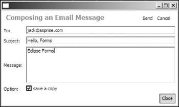
Figure 21-2
The following are the steps you follow to create the form:
- Set up a form toolkit.
- Create a form instance.
- Set the form title (optional).
- Add form body content.
- Add toolbar items and menus (optional).
First, let's create the application window by subclassing the ApplicationWindow class:
 public class EmailForm extends ApplicationWindow {
 /**
 * @param parentShell
 */
 public EmailForm(Shell parentShell) {
 super(parentShell);
 }

 public static void main(String[] args) {
 EmailForm emailForm = new EmailForm(null);
 emailForm.setBlockOnOpen(true);
 emailForm.open();
 }

 }
Next, override the createContents method to create the form:
 protected Control createContents(Composite parent) {
 Composite composite = new Composite(parent, SWT.NULL);
 composite.setLayout(new FillLayout());

 // Sets up the toolkit.
 FormToolkit toolkit = new FormToolkit(getShell().getDisplay());

 // Creates a form instance.
 Form form = toolkit.createForm(composite);
 form.setLayoutData(new GridData(GridData.FILL_BOTH));

 // Sets title.
 form.setText("Composing an Email Message");

 // Adds body contents.
 form.getBody().setLayout(new GridLayout(2, false));
 Label label = toolkit.createLabel(form.getBody(), "To: ", SWT.NULL);
 Text textTo = toolkit.createText(form.getBody(), "");
 textTo.setLayoutData(new GridData(GridData.FILL_HORIZONTAL));

 label = toolkit.createLabel(form.getBody(), "Subject: ", SWT.NULL);
 Text textSubject = toolkit.createText(form.getBody(), "");
 textSubject.setLayoutData(new GridData(GridData.FILL_HORIZONTAL));

 label = toolkit.createLabel(form.getBody(), "Message: ", SWT.NULL);
 Text textMessage = toolkit.createText(form.getBody(), "");
 textMessage.setLayoutData(new GridData(GridData.FILL_BOTH));

 label = toolkit.createLabel(form.getBody(), "Option: ", SWT.NULL);
 Button buttonOption = toolkit.createButton(
 form.getBody(), "save a copy", SWT.CHECK);

 Button buttonClose = toolkit.createButton(form.getBody(), "Close", SWT.PUSH);
 GridData gridData = new GridData();
 gridData.horizontalSpan = 2;
 gridData.horizontalAlignment = GridData.END;
 buttonClose.setLayoutData(gridData);

 // Adds toolbar items.
 form.getToolBarManager().add(new Action("Send") {
 public void run() {
 System.out.println("Sending email ...");
 }
 });

 form.getToolBarManager().add(new Action("Cancel") {
 public void run() {
 System.out.println("Cancelled.");
 }
 });

 form.updateToolBar();

 return composite;
 }
A composite is created to contain the form to be created. Before creating the form, you construct a FormToolkit. A form toolkit is capable of creating SWT controls adapted to work in Eclipse Forms. Besides creating the form-adapted versions of common SWT controls, a form toolkit is also responsible for creating custom form widgets.
The following code creates a Form instance:
Form form = toolkit.createForm(composite);
Form is a custom control that renders an optional title and a body composite. In Figure 21-2, the form title and toolbar items are displayed in the top of the form. All the widgets under the title are in the form's body composite. You can use the following methods of the Form class to get and set the form title:
 public java.lang.String getText()
 public void setText(java.lang.String text)
The body composite of the form can be obtained through the getBody method of the Form class:
public org.eclipse.swt.widgets.Composite getBody()
Initially, no layout manager is associated with the body composite of a form. You have to set a proper manager for it. Here, you use a GridLayout manager. You can add various controls on the body of the form.
Instead of creating those controls directly, you call various factory methods of the toolkit to create them. The factory methods of the FormToolkit class create controls and configure their appearance in order to adapt them to the form environment. Instead of using
Text textTo = new Text(form.getBody(), SWT.NULL);
you use the following code so that the text control is adapted to the form properly:
Text textTo = toolkit.createText(form.getBody(), "");
What happens if an SWT control does not have a corresponding factory method in the FormToolkit class? In this case, you create the control first and then use it as the argument to call the adapt method of the FormToolkit class. The adapt method adjusts colors of the control to match the form. For example, the following code creates a Combo control on a form:
 Combo combo = new Combo(form.getBody(), SWT.DROP_DOWN);
 toolkit.adapt(combo);
After creating all the necessary controls, you add two toolbar items. The getToolBarManager method returns the toolbar manager used by the form:
public org.eclipse.jface.action.IToolBarManager getToolBarManager()
Next. use the toolbar manager to add actions. For more details, see Chapter 9. After adding toolbar items, the updateToolBar method is invoked to notify the system that the toolbar has been updated.
When you run the program, the UI should look similar to the one that appeared in Figure 21-2.
Customizing Forms
If you resize the e-mail composition form, you might notice that the form is not scrollable. To make the form scrollable, you need to use ScrolledForm instead of Form. In the preceding code, you can replace the line:
Form form = toolkit.createForm(composite);
with
ScrolledForm form = toolkit.createScrolledForm(composite);
Now if you reduce the size of the window to less than the minimum size required by the form, scrollbars appear and you can use them to navigate the form.
The ScrolledForm class embeds a Form in itself and provides scrolling support.
To set the background color of a form, use the setBackground method:
public void setBackground(org.eclipse.swt.graphics.Color bg)
Use the setBackgroundImage method to set the background image to be rendered behind the title:
public void setBackgroundImage(org.eclipse.swt.graphics.Image backgroundImage)
If the image is too small, it will be tiled as many times as needed to fill the title area.
Using Custom Form Controls
In the last section, you built an e-mail composition form using common SWT controls such as labels, text fields, and buttons. Eclipse Forms provides a set of custom controls tailored for forms. This section introduces you to custom controls such as form texts, hyperlinks, sections, and so on. All of the custom form controls are subclasses of the org.eclipse.swt.widgets control class, which allows you to mix custom controls with common SWT controls. Let's begin with hyperlinks.
Using Hyperlinks
On the World Wide Web, a hyperlink is a reference to a hypertext document or other resource. A Web browser usually displays a hyperlink in a special color or style. A hyperlink in Eclipse Forms looks like a common hyperlink and it generates events when it is clicked.
Creating a Basic Hyperlink
The Hyperlink class represents a hyperlink in Eclipse Forms. For example, the following code creates a link, as shown in Figure 21-3:
 Hyperlink hyperlink = toolkit.createHyperlink(
 form.getBody(), "This is a hyperlink to Eclipse.org", SWT.NULL);
 hyperlink.setHref("http://www.eclipse.org");
 hyperlink.setForeground(getShell().getDisplay().getSystemColor(SWT.COLOR_BLUE));
 hyperlink.addHyperlinkListener(new IHyperlinkListener() {
 public void linkEntered(HyperlinkEvent e) {
 System.out.println("Mouse entered.");
 }

 public void linkExited(HyperlinkEvent e) {
 System.out.println("Mouse left.");
 }

 public void linkActivated(HyperlinkEvent e) {
 System.out.println("Hyperlink activated.");
 System.out.println("HREF = " + e.getHref());
 }
 });
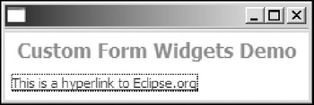
Figure 21-3
First, an instance of the Hyperlink class is created with the createHyperlink method of the FormToolkit class:
public Hyperlink createHyperlink(Composite parent, String text, int style)
You specify the composite containing the hyperlink, displayed text, and style of the hyperlink in the first, second, and third arguments, respectively. Then you set the object associated with this hyperlink through the setHref method:
public void setHref(java.lang.Object href)
In the Web environment, a hyperlink's reference is usually a Uniform Resource Identifier (URI). However, for an Eclipse Forms hyperlink, its reference object can be any Java object.
By default, the foreground color for a hyperlink is black. You call the setForeground method of the Hyperlink class to set the hyperlink's foreground color to blue. A hyperlink is capable of generating HyperlinkEvents. Then you add an IHyperlinkListener to listen to such events.
When the mouse pointer enters the hyperlink client area or keyboard focus switches to the hyperlink, the linkEntered method of the hyperlink listener is invoked. The linkExited method is called when the mouse pointer exits the hyperlink client area or keyboard focus switches from the hyperlink. If the user clicks the hyperlink or presses the Enter key while the hyperlink has keyboard focus, the linkActivated method is called. All of the three methods are called with a HyperlinkEvent object as the argument. You can obtain the object associated with the hyperlink through the getHref method of the HyperlinkEvent class:
public java.lang.Object getHref()
By default, the text of a hyperlink is underlined. You can use the setUnderlined method to control this behavior:
public void setUnderlined(boolean underlined)
Sometimes, you need to display an image in a hyperlink. In this case, you need the ImageHyperlink class.
Creating ImageHyperlinks
The ImageHyperlink class extends Hyperlink by adding the capability to render an image relative to the optional text. Additionally, an image hyperlink supports the display of custom images for hover and active states.
The following code creates an image hyperlink below the hyperlink that you created in the last section (see Figure 21-4):
 ImageHyperlink imageHyperlink = toolkit.createImageHyperlink(
 form.getBody(), SWT.NULL);
 imageHyperlink.setText("This is an image hyperlink.");
 imageHyperlink.setForeground(
 getShell().getDisplay().getSystemColor(SWT.COLOR_BLUE));
 imageHyperlink.setImage(new Image(getShell().getDisplay(), "icons/eclipse0.gif"));
 imageHyperlink.addHyperlinkListener(new HyperlinkAdapter() {
 public void linkActivated(HyperlinkEvent e) {
 System.out.println("Image hyperlink activated.");
 }
 });
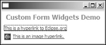
Figure 21-4
You might notice that the procedure is very similar to that of creating a text hyperlink. First, an instance of ImageHyperlink is created. Then you call the setText method to set text for this hyperlink. If you want to display an image only, you do not need call this method. The setImage method is used to set the image to be displayed on the hyperlink:
public org.eclipse.swt.graphics.Image getImage()
If you need the hyperlink to display different images in hover and active states, you can use the following methods to set them:
 public void setHoverImage(org.eclipse.swt.graphics.Image hoverImage)
 public void setActiveImage(org.eclipse.swt.graphics.Image activeImage)
Finally, you add a hyperlink listener for this image hyperlink. Instead of implementing the IHyperlinkListener interface, you can simply extend the HyperlinkAdapter class and override the desired methods only.
Managing Multiple Hyperlinks with HyperlinkGroups
You can use the HyperlinkGroup class to manage a group of hyperlinks. A HyperlinkGroup tracks hyperlink activation and updates normal and active colors of all the links belonging to this group. Use the add method of the HyperlinkGroup class to add a hyperlink to a group:
public void add(Hyperlink link)
Use the following methods to change the appearance of all the hyperlinks in a group:
 public void setBackground(org.eclipse.swt.graphics.Color bg)
 public void setForeground(org.eclipse.swt.graphics.Color fg)
 public void setActiveBackground(org.eclipse.swt.graphics.Color newActiveBackground)
 public void setActiveForeground(org.eclipse.swt.graphics.Color newActiveForeground)
For example, the following code adds both the text hyperlink and the image hyperlink created previously into a hyperlink group and uses the group to manage both hyperlinks:
 HyperlinkGroup group = new HyperlinkGroup(getShell().getDisplay());
 group.add(hyperlink);
 group.add(imageHyperlink);

 group.setActiveBackground(getShell().getDisplay().getSystemColor(SWT.COLOR_YELLOW))
 ;
 group.setActiveForeground(getShell().getDisplay().getSystemColor(SWT.COLOR_RED));
 group.setForeground(getShell().getDisplay().getSystemColor(SWT.COLOR_BLUE));
Using FormTexts
The FormText control is a powerful read-only text control that is capable of rendering styled text. One of the advantages of FormText over the Label control is that FormText is able to wrap text to fill the provided width.
Rendering Normal Text
The following code renders normal text using FormText, as shown in Figure 21-5:
 form.getBody().setLayout(new TableWrapLayout());

 FormText text = toolkit.createFormText(form.getBody(), true);

 text.setText(
 "Eclipse is a kind of universal tool platform - an open extensible " +
 "IDE for anything and nothing in particular. For more details, please " +
 "visit http://www.eclipse.org for more details.",
 false,
 false);
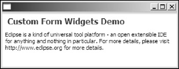
Figure 21-5
In order to enable FormText to wrap text, its containing composite must use a layout manager that supports wrap. In the preceding code, TableWrapLayout is used as the layout manager for the form body. More details on TableWrapLayout are covered later in this chapter.
An instance of FormText is created and returned through the createFormText method of the FormToolkit class:
public FormText createFormText(Composite parent, boolean trackFocus)
Specify the containing composite for the FormText in the first argument. If there are hyperlinks in the text and you want the toolkit to monitor focus transfer so that the hyperlink in focus is visible, you should set the trackFocus to true; otherwise, set it to false.
After the FormText instance is constructed, set the content text for it through the setText method of the FormText class:
public void setText(java.lang.String text, boolean parseTags, boolean expandURLs)
Specify the text content for the FormText instance in the first argument. You can provide the text content in either plain text format or XML format. For XML format, you set parseTags to true; otherwise, set it to false. If expandURLs is set to true, all hyperlinks within the content text will be parsed and displayed as Hyperlink instances.
When you resize the window, you might notice that the text is wrapped properly to fit the width provided. A URL link is included in the text content; the next section shows how to make the FormText parse it and display it as a hyperlink.
Automatically Parsing URLs
In this section, you learn how to use TextForm to parse URLs into hyperlinks and capture events generated by those hyperlinks.
The following code extends the code in the preceding section by adding automaticly the URL parsing feature:
 form.getBody().setLayout(new TableWrapLayout());
 FormText text = toolkit.createFormText(form.getBody(), true);

 HyperlinkGroup group = new HyperlinkGroup(form.getDisplay());
 group.setForeground(form.getDisplay().getSystemColor(SWT.COLOR_BLUE));
 group.setActiveForeground(form.getDisplay().getSystemColor(SWT.COLOR_BLUE));

 text.setHyperlinkSettings(group);

 text.setText(
 "Eclipse is a kind of universal tool platform an open extensible " +
 "IDE for anything and nothing in particular. For more details, please " +
 "visit http://www.eclipse.org web site.",
 false,
 true);

 text.addHyperlinkListener(new HyperlinkAdapter() {
 public void linkActivated(HyperlinkEvent e) {
 System.out.println("Link activated: " + e.getHref());
 }
 });
The first two lines are exactly the same as the code in the last section. A HyperlinkGroup instance is constructed and set to the FormText object. All the hyperlinks automatically parsed and constructed later will belong to this group. You can configure the appearance of the hyperlinks through the HyperlinkGroup object. Then you call the setText method of the FormText class. By setting the third argument to true, you configure the FormText instance to automatically parse and construct hyperlinks from URLs (see Figure 21-6).
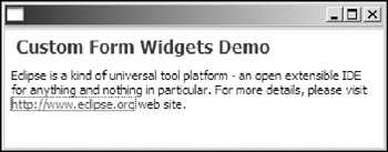
Figure 21-6
Hyperlinks are useful only if you can listen for events they generate. In order to listen for all the events generated from all the hyperlinks within the text, you add a hyperlink listener to the FormText object through the addHyperlinkListener method. When one of the hyperlinks generates an event, the hyperlink listener is notified. The getHref method of the HyperlinkEvent object passed to the listener returns a text string representing the corresponding URL of the hyperlink.
Rendering XML Text
FormText is capable of parsing and displaying XML tags. It supports only a very limited subset of HTML tags. For example, the following code renders the XML text, as shown in Figure 21-7.
 form.getBody().setLayout(new TableWrapLayout());
 FormText text = toolkit.createFormText(form.getBody(), true);

 Image image = new Image(form.getDisplay(), "icons/eclipse0.gif");
 text.setImage("eclipse", image);
 text.setText(
 "
" + "
Eclipse Projects:
" + "
- Platform - Eclipse frameworks
- " + "
- JDT - Java development tools
- " + "
- PDE - Plug-in development environment
- " + "
", true, false);
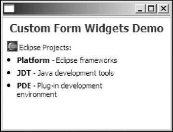
Figure 21-7
You might notice that FormText renders the text much as a Web browser does. However, there are a number of differences. For FormText, the root tag for the XML text must be form. FormText is not a Web browser, and it cannot automatically retrieve images from the Internet. In the preceding code, you create an image first and then register it with the FormText instance with a key (i.e., "eclipse"). In the XML text, you reference the image using its key through the href attribute of the img tag.
Currently, the FormText class supports only the following tags:
- p: Used to define paragraphs. It may have vspace as an attribute. If vspace is set to true, additional vertical space is added.
- li: Used to define unordered list items. It may have the following attributes: vspace, style (valid values: bullet, text, and image), value, indent, and bindent.
- img: Used to render an image. The href attribute is a key to the image registered with the FormText instance through the setImage method.
- a: Used to render a hyperlink. The href attribute defines the href value for the hyperlink.
- b: Used to decorate the enclosed text with bold.
- br: Used to force a line break.
- span: Used to set the color and the font for the enclosed text. It may have a color attribute and a font attribute.
As you can see, only a subset of HTML tags is supported by the FormText control. If you need to render HTML documents, use the Browser control (see Chapter 14 for more details).
Using ExpandableComposites
An expandable composite is capable of expanding or collapsing a single client control. An expansion toggle item and a title acting as a hyperlink are displayed at the top of an expandable composite. The client control is displayed below the title when expanded or hidden when collapsed.
The following code creates an expandable composite with FormText as its client (see Figure 21-8):
 form.getBody().setLayout(new TableWrapLayout());

 ExpandableComposite ec1 =
 toolkit.createExpandableComposite(
 form.getBody(),
 ExpandableComposite.TREE_NODE | ExpandableComposite.EXPANDED);
 ec1.setText("This is the title");

 FormText text = toolkit.createFormText(ec1, false);
 text.setText(
 "This is a long text. The user can show or hide this text "
 + "by expanding or collapsing the expandable composite.",
 false,
 false);
 ec1.setClient(text);

 ec1.addExpansionListener(new ExpansionAdapter() {
 public void expansionStateChanged(ExpansionEvent e) {
 // resizes the application window.
 getShell().pack(true);
 }
 });
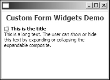
Figure 21-8
First, an instance of the ExpandableComposite class is created and obtained through the createExpandableComposite method of the FormToolkit class. You can define the toggle item in the second argument of the method. The TREE_NODE style creates the toggle control as a tree widget, while the TWISTIE creates a triangle-style toggle item. The EXPANDED style specifies that the expandable composite should be expanded initially.
The setText method of the ExpandableComposite class is used to set the title for the expandable composite. The client control, a FormText instance, is then created and set to the expandable composite. When the user expands or collapses an expandable composite, expansion events are generated. An expansion listener is added to the expandable to listen for expansion events and resize its containing window accordingly.
Using Sections
A section is an expandable composite. It extends an expandable composite by displaying a separate, optional description below the separator.
For example, the following code creates a section, as shown in Figure 21-9:
 form.getBody().setLayout(new TableWrapLayout());

 Section section = toolkit.createSection(form.getBody(), Section.DESCRIPTION |
 Section.TREE_NODE | Section.EXPANDED);

 section.setText("This is the title");
 toolkit.createCompositeSeparator(section);
 section.setDescription("-= This is a description -=");

 FormText text = toolkit.createFormText(section, false);
 text.setText(
 "This is a long text. The user can show or hide this text "
 + "by expanding or collapsing the expandable composite.",
 false,
 false);
 section.setClient(text);
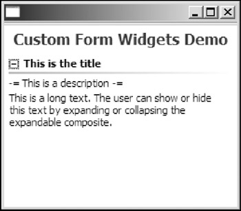
Figure 21-9
Use the createSection method of the FormToolkit class to create a Section instance. The DESCRIPTION style causes the description to be displayed under the separator. You use the setText method to set the title for the section. The separator between the title and the description is created with the createCompositeSeparator method of the FormToolkit class. The description text is set with the setDescription method of the Section class. Finally, the client control is created and set to the section.
Using Form Layout Managers
Eclipse Forms provides two additional layouts that aren't provided by SWT: TableWrapLayout and ColumnLayout.
Using TableWrapLayout
TableWrapLayout is a layout manager that attempts to positions controls using a two-pass auto-layout HTML table algorithm recommended by the W3C. You can view the TableWrapLayout manager as the layout manager used by a browser to lay out HTML tables. For more details on the W3C's HTML table auto-layout algorithm, please visit http://www.w3.org/TR/html4/appendix/notes.html#h-B.5.2.2.
TableWrapLayout behaves much like GridLayout, except for the following differences:
- TableWrapLayout is wrap-sensitive. It divides the space across columns to avoid excess wrapping for some controls.
- GridLayout distributes excess horizontal and vertical space to controls; however, TableWrapLayout fills only the horizontal space.
- TableWrapLayout works well only if all the controls that need to wrap have the appropriate style, i.e., SWT.WRAP. By default, all Eclipse Forms custom widgets have the SWT.WRAP style set.
Aside from the behavior differences just described, the usage of TableWrapLayout is very similar to that of GridLayout. For example, the following code lays out the controls, as shown in Figure 21-10.
 TableWrapLayout layout = new TableWrapLayout();
 layout.numColumns = 2;
 form.getBody().setLayout(layout);

 Color color = form.getDisplay().getSystemColor(SWT.COLOR_YELLOW);

 Label label = toolkit.createLabel(form.getBody(), "Some text spans over two columns
 in the first row. ", SWT.WRAP);
 TableWrapData data = new TableWrapData();
 data.colspan = 2;
 label.setLayoutData(data);
 label.setBackground(color);

 label = toolkit.createLabel(form.getBody(), "Some text in the first column of the
 second row. and here it goes on and on ... ... ... ... ", SWT.WRAP);
 label.setBackground(color);
 label = toolkit.createLabel(form.getBody(), "Some text in the second column of the
 second row. ", SWT.WRAP);
 label.setBackground(color);
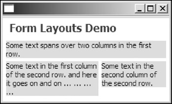
Figure 21-10
First, create an instance of the TableWrapLayout class. The total number of columns is set to 2 through the numColumns field of the TableWrapLayout object. The layout object is then set to the form body.
The first label is created through the createLabel method of the FormToolkit class. Note that the SWT.WRAP style is specified for the label. The configuration layout data class for TableWrapLayout is the TableWrapData class. Because you want the first label to span the whole row, you create a TableWrapData object with colsSpan equal to 2 and set this layout data object to the label.
Then you create the other two labels. By default, those two labels have colsSpan and rowsSpan both equal to 1.
If you look carefully at Figure 21-10, the widths for the second label and the third label are different because TableWrapLayout tries to avoid excess wrapping for the labels. Because the text string in the second label is much longer than the text string in the third label, the layout avoids excess wrapping by distributing more horizontal space to the second label.
Using ColumnLayouts
ColumnLayout arranges child controls in vertical columns. All the columns are set to be identical in size. ColumnLayout adapts the number of columns to the parent composite width. The number of columns increases as the parent composite width increases. It also tries to avoid large gaps at the end of the last column.
For example, the following code shows how ColumnLayout works:
 ColumnLayout layout = new ColumnLayout();
 layout.maxNumColumns = 4;
 form.getBody().setLayout(layout);

 Color color = form.getDisplay().getSystemColor(SWT.COLOR_YELLOW);

 Label label = null;
 for(int i=0; i<10; i++) {
 label = toolkit.createLabel(form.getBody(), "Text label #" + i);
 }
First, you create an instance of the ColumnLayout class. By default, the maximum and the minimum values for the number columns are 3 and 1, respectively. Here, you set the maximum number of columns allowed to 4 through the maxNumColumns field. Then you set the column layout as the layout manager for the form body. Finally, ten labels are added to the form body.
Initially, the screen output looks like Figure 21-11.
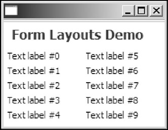
Figure 21-11
As the user resizes the window, the layout varies the number of columns (see Figure 21-12).
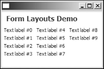
Figure 21-12
Summary
This chapter walked you through the Eclipse Forms framework. First, it showed you how to create forms. You can use the form toolkit to create a form easily. If you need a scrollable form, you can use ScrolledForm. A form can contain common SWT widgets. Furthermore, the Eclipse Forms framework provides many custom widgets such as hyperlinks, form texts, and sections. Form text is a very powerful control that is capable of displaying plain text as well as XML text. You learned about many types of layout managers in Chapter 6. The Eclipse Forms framework provides two additional layout managers: TableWrapLayout and ColumnLayout. You can use Eclipse Forms in every platform that SWT supports. SWT also supports many native features of underlying platforms. In the next chapter, you learn about OLE automation on Windows platforms.
Part I - Fundamentals
- Overview of Java UI Toolkits and SWT/JFace
- SWT/JFace Mechanisms
- Jump Start with SWT/JFace
- SWT Event Handling, Threading, and Displays
- Basic SWT Widgets
- Layouts
Part II - Design Basics
Part III - Dynamic Controls
- Scales, Sliders, and Progress Bars
- Other Important SWT Components
- SWT Graphics and Image Handling
- Drag and Drop and the Clipboard
- Printing
- JFace Windows and Dialogs
Part IV - Application Development
EAN: 2147483647
Pages: 147
