Creating Usable Interfaces
Overview
Sometimes it seems that no one can agree what user interface design really is. Is it the painstaking process an artist goes through to create shaded icons that light up when the mouse approaches? Is it the hours spent in a usability lab subjecting users to a complicated new application? Is it the series of decisions that determine how to model information using common controls and metaphors?
In fact, user interface design is really a collection of several different tasks:
- User interface modeling. This is the process where you look at the tasks a program needs to accomplish, and decide how to break these tasks into windows and controls. To emerge with an elegant design, you need to combine instinct, convention, a dash of psychology, and painstaking usability testing.
- User interface architecture. This is the logical design you use to divide the functionality in your application into separate objects. Creating a consistent, well-planned design makes it easy to extend, alter, and reuse portions of the user interface framework.
- User interface coding. This is the process where you write the code for managing the user interface with the appropriate classes and objects. Ideally, you follow the first two steps to lay out a specific user interface model and architecture before you begin this stage.
This book concentrates on the third, and most time-consuming step, where user interfaces designs are translated into code using the tools and techniques of .NET. However, it's impossible to separate good coding from good code design, and discussion about user interface architecture, the second item on the list, recurs throughout this book (and is the focus of the next chapter).
This chapter, however, focuses on the first task: user interface design. Here you'll examine the essential guidelines that no programmer can afford to ignore. You learn basic tips for organizing information, handling complexity, and entering into the mind of that often-feared final judge: the end user.
You could skip ahead at this point and dive right into .NET code. However, the greatest programming framework in the world won't solve some common, critical user interface mistakes. Learning how to design an interface is no less important than learning how to work with it in code.

 Companion Web Site
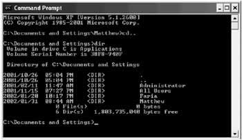
A Brief History of User InterfacesYou might think that user interface design is a history of continuous innovation. In fact, user interface design is actually marked by a series of distinct eras. Typically, in each era one predominant approach develops. Then, at some unpredictable time, a lone programmer or innovative programming team creates a truly new user interface model that dazzles the world. In the months that follow, hundreds of developers rush to create similar but mutually incompatible versions. This process of false imitation continues until the next revolution. So what are these eras of user interface development? It all began very simply. The Command Line EraAlmost everyone who has any experience with computers has at least glimpsed the fabled command line. Today's novice users instinctively think of it as some "back door" way of accessing features that are forbidden and hidden from most people. Even advanced computer users are sometimes bound by the superstition that a command line lurks behind the scenes in the latest Windows operating system, secretly controlling things. A command-line interface is the power user's dream. Of course, even power users have to learn somewhere, and most forget that the command line was not an easy tool to master. The command line is, in many respects, the original way of doing things, and it's arguable that it's not so much an interface design as a lack of any user interface, at least in the sense we use the term today. Command lines began as the basis for operating systems like DOS (see Figure 1-1) and UNIX, were the basis for early database applications like dBase, and continue to proliferate in unusual places.
For example, the Visual Studio .NET interface provides a Command Window that lets you interact with the IDE or execute simple lines of code against the currently running application. Besides a few rudimentary enhancements (like auto-complete), it's still a basic command-line interface (see Figure 1-2).
Command-line interfaces are characterized by the following traits:
Today, a command-line model could still turn up in one of your user interfaces, but it's unlikely. The Question Answer ModelThe question answer model is one of the oldest user interface models, and it's still alive and well in the modern world. Its principles are the polar opposite of a command-line interface:
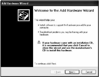
The question-answer programming model has a valuable place in the world today, and it's seen commonly in Windows program with wizards. Wizards lead you through a set of questions, and then perform a complicated task for you. As you've no doubt discovered, there are useful wizards (like those that set up hardware on your computer). There are also less useful wizards that seem to be more complicated, demanding, and restrictive than the program itself (like those that create documents for you in some popular graphics programs). Figure 1-3 shows the wizard Windows uses for adding new hardware.
Question-answer programs are double-edged swords that can frustrate as much as they please. The next few sections outline a few key principles that can help you use this model. Ask what the user can tell you It makes sense to ask a user to tell you what company made his or her printer. However, it doesn't make sense to ask a user whether you should convert tabs to spaces for DOS print operations. Instead, just pick a suitable default. Remember, no one likes to be asked a question they can't answer. When it comes to novice computer users, they might just give up altogether, or stop reading other prompts. Restrict it to a single task A wizard works well for a single task that can only be accomplished in one way (like adding a printer driver). As soon as you start adding an element of variety or creativity, the wizard can't keep up. Don't think that you should be proud of a complex wizard that branches out conditionally to use different windows depending on previous user selections. All you've done is created a traditional single-screen DOS program, where tasks must be completed in separate windows and in a set order. Beware of forcing your preferences Every wizard has its own hard-coded patterns. The user never has a choice about what order to answer questions or supply information, and that lack of control can frustrate anyone who wants to approach the task differently. Be forewarned, especially if you are using a wizard for a complex task: you are enforcing a single way of working according to your assumptions and biases. If it doesn't match the way the majority of users want to work, it will only make them miserable. The Menu Driven ModelThe menu-driven model is the most easily recognizable user interface model. It came to popularity with document-based programs like DOS word processors, and then took over nearly every application with the Windows operating system. It's easy to see why: menus represent an attractive compromise, allowing you to prompt users without restricting the way they work.
Menus are one of the dominant interface elements in Windows programming, and they allow absolutely no room for experimentation or innovation. To create a menu, you copy Microsoft Office as closely as possible, even adding a vestigial File menu when your program has nothing to do with files or documents. Similarly, you would do best to emulate basic options like Edit, View, Window, and even Tools before you start adding menus organized around program-specific concepts. You learn more about Microsoft's role in your user interface design a little later in this chapter. The GUI EraShortly after the menu excitement subsided, everyone fell in love with pictures, buttons, and the worlds of the Macintosh and Microsoft Windows. The GUI era introduced an avalanche of concepts and user interface elements, several of which are often summarized with the acronym WIMP (windows, icons, mouse, and pointers). One key innovation in the GUI era was the introduction of the mouse, which provides more points of entry for interacting with an application (as in, "I want to click here"). Another change was the shift to realistic representation-for example, word processors that show a close approximation of how a printed document will look. A central idea in the GUI era was to base user interfaces on real-world metaphors. For example, if you want to delete a file, drag it to an icon that looks like a trash can because that's what you use to dispose of rubbish in the real world. Of course, some things are much harder to convey with pictures than others (for example, no application provides an icon that accurately suggests "synchronize my email"). At the same time that the GUI era arrived, user interface design started to be treated as a genuine science. Some of the hallmarks of GUI era include:
All these points are essentially an effort to make a program so logical it's almost instinctual. The goal is for a user to require no special training, and just be able to apply assumptions garnered from other programs and the real world when learning a new application. Of course, because the focus is on the user, you need to know quite a bit about how an average user thinks before you can create the interface. This philosophy still holds today. The GUI model provides a great deal of freedom for the developer (some might say too much freedom). In the Windows world, designing a first-rate user interface has less to do with inventing metaphors, and more to do with following established conventions. |
||||||||||||||||||

Creativity vs ConventionMany user interface projects are sidetracked when they meet up with the developer's need for creativity. Unfortunately, an application's user interface doesn't just determine how a program looks, it also determines how it acts (or from the user's point of view, how it works). Ask yourself this question: would car manufacturers allow the same degree of creativity that some developers take in application design? The world's reliance on vehicles (and the seriousness of any mistake) makes it almost impossible to imagine a car manufacturer taking the same kind of liberties. Every year, new car models appear that have been tweaked by entire design teams of engineers with bold promises that they are entirely new and modern. It doesn't take much inspection to see that the air conditioners and radios always work almost exactly the same as before, down to the last button; the steering wheel looks and works exactly the same way; the seat configuration is generally unchanged; and the controls for starting, stopping, and slowing the car down are indistinguishable. The average driver could close his or her eyes and still locate the ignition in most cars. Even in the better applications of today, this consistency is rare. If you install a new program on your computer, are you confident that Ctrl+S is the save document command? Will File ? Print send your document straight to the printer or give you a chance to tweak some setting first? And exactly where do you find the menu command for that all-important Preferences or Options window… under Tools, Edit, or File?
To make a long story short, convention is the way that users learn to work with a variety of software. Violating convention because convention is somehow inferior to your highly idiosyncratic vision is doomed to fail. It just multiplies the amount of information a user needs to know to use computer software. Consistency in NETMicrosoft has made no secret that one of its goals with the .NET platform is to make the programming model more consistent for different programmers. You can see this in the different .NET languages, which share a consistent set of data types and functionality drawn from a shared class library. You can see this in the lavish use of interfaces and inheritance, which defines how specialized classes should work so they resemble other, similar classes. You can even see this in the way Visual Studio .NET allows you to use its powerful debugging tools, regardless of whether you're working with code for a Windows project, ASP.NET page, or even a database stored procedure. In short, if consistency is so prized by cutting-edge software developers, why would anyone assume it's not just as important for the beginning computer user? The Act Like Microsoft PrincipleWindows developers have it rather easy. The secret to making a program that the average user can understand, and even enjoy, is usually just to copy Microsoft as closely as possible. That isn't to say that Microsoft has made the best choices in their applications—but for the most part, that isn't important. If the users of your application have ever used another application, chances are that it's been Microsoft Windows, Microsoft Office, or Internet Explorer. In fact, if your users are regular computer users, they probably spend the majority of their computing time with Word and Excel. There's rarely a good reason for deviating from Microsoft standards. If average users have learned anything, it's the common keystrokes and menu organizations in an Office application. Not only that, but Microsoft is also known to pour ridiculous amounts of money into extensive usability tests, suggesting that their designs might not only be more recognizable than yours … they could very well be better. If you aren't creating an office productivity or document-based application, you should still pay careful attention to Microsoft's designs. In almost every field, they have a well-worn example (including playing music, browsing the Internet, and reading email). In some cases, you might need to investigate another application (like Adobe Photoshop in the graphics arena), but Microsoft is generally the standard.
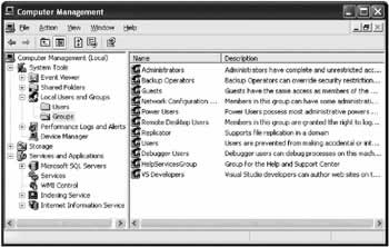
Administrative UtilitiesOne good example of a Windows convention is found in Microsoft's design of system and management utilities. These utilities almost always use a paired Tree-View and ListView control, loosely resembling Windows Explorer. In Windows 2000 and later operating systems, Microsoft uses this design everywhere it can, even stretching the convention to apply it to computer hardware configuration and user management (see Figure 1-5).
This type of design has significant merits. First of all, it's easy to see how items are related. The TreeView suggests the basic levels of grouping and subgrouping. You can often add multiple TreeView levels to combine features that would be scattered across several different windows. You can also gather a great deal of information without leaving the window. The ListView pane can be adapted to show a variety of types of data, without obscuring the navigational controls (the TreeView), allowing the users to be at ease. Finally, it doesn't enforce any required order for performing tasks. It also makes use of graphical icons to help break up the monotony of what can be a great deal of information displayed at once. This design also has some idiosyncrasies. For example, the menu conventions favor a streamlined Action menu instead of File and Tools menus. Sometimes records are edited in a special window that appears in place of the ListView, while in other cases a separate window pops up to allow the changes. It's also extremely ambitious. It could quickly confuse more basic users, who tend to have trouble understanding the relationship between the TreeView and the ListView control. Thus, the use of this interface style depends on your target audience. In an impressive attempt to achieve standardization, this design is found in almost all of Microsoft's current programs, from SQL Server to Visual Studio .NET. It's an example of a lesser-known, yet keenly important Microsoft standard: the Microsoft Management Console (MMC) framework. Currently, you can't create MMC applications in .NET, but you can (and should) follow the organization and conventions for common utility and management tasks like configuring users or browsing a database. You see examples of this style in the later chapters of this book. Ultimately, you need to know both your application type and your audience. For example, while the MMC design is ideal for advanced tasks, Microsoft Office provides the canonical rules for document-based applications geared to less experienced users. Know Your Application TypeIf you can't identify the type of application you are creating, you are in for a rough time. Here are some common types (which you examine in this book):
Know Your UserDifferent audiences require different degrees of assistance. The user browsing quickly and effortlessly through the intricacies of the Windows registry with regedit.exe is not the same user who turns to Microsoft Agent for help creating a graph. If you are designing a professional application for a specific audience, it may help you to begin by creating a user profile that clearly identifies the abilities, expectations, and computer comfort level of the end user. However, the "know your user" principle is often used as a crutch to excuse complicated interfaces based on the imagined requirements of professional users. As a rule, it is possible to design an interface that combines power-user shortcuts and first-time-user guidance. In fact, it's essential. The users of your application will have different requirements when they first begin to use the software (or evaluate it for a potential purchase) than when they master it as part of their daily routine. A good interface recognizes these challenges, and helps guide users as much as necessary, without obstructing functionality. For example, consider Microsoft Word, where novice users find their way around using the menus for clues, intermediate users save clicks with the toolbar icons, and power users can work speedily with shortcut keys and drag and drop. Not only does this interface handle multiple user levels, it helps users graduate from one level to another, because toolbar buttons match menu commands, and menu text includes the relevant shortcut keys.
The greatest art of user interface design is creating applications that can be used efficiently by different levels of users. To master this art, you need to know where to impose restrictions, and how to handle complexity. |
||||||||||||||||||||||||
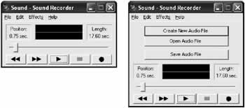
Handling ComplexitySome programmers (and many more management types) believe the myth that when users complain that an application is too complicated, it's because a specific feature is not prominently available. The immediate solution is often just to slap a new button somewhere that will supposedly make it quicker to access features and thus render the program easier to use. Unfortunately, life (and user interface programming) isn't that easy. For example, consider the sample audio recorder and its "improved" version, both shown in Figure 1-6. It may be a little quicker to open and save files, but is the interface actually easier to use?
In reality, when a user complains that an interface is confusing, it's rarely because it lacks a few quick shortcut controls or time-saving features. Rather, it's almost always a sign that the user interface is not logically organized. Adding more buttons to the audio recorder doesn't just make the interface look ugly; it also makes it seem impossibly complicated. Segmenting InformationDeciding how to divide a product's functionality into separate applications, windows, and controls is the most important user interface decision you will make. One common pattern is to group different types of information into similar management windows. For example, a database application might have an add/remove/configure window for configuring customer records or product records. Other applications use a task-based approach, with a wizard that steps through multiple steps leading to a single goal. Before beginning an application, you should identify the most obvious logical divisions, and build your application along those lines. Some other principles are outlined here:
Inductive User InterfaceMicrosoft has a new methodology designed to make user interfaces simpler by breaking features into individual self-explanatory windows. Each window is used for one task, rather than the common combined window that incorporates a set of tasks related to a single type of information. This type of interface, geared for the lowest (and most common) level of computer user, often combines web-style forms and requires more windows than usual. A current example of inductive user interface (IUI) design is Microsoft Money 2000. IUI is in its infancy. No clear conventions exist, and it's fairly labor intensive to design. For most programmers it makes sense to ignore IUI until it is a better established and more conventionalized model (and one with more .NET support). You can read the initial IUI guidelines in the MSDN (online at http://msdn.microsoft.com/library/en-us/dnwindev/html/iuiguidelines.asp). |
|||||||||||||||
Helpful RestrictionsMost programmers fall into the category of "power users" of computer systems. It's for that reason that it sometimes comes as a bit of a surprise when programmers learn that one of the kindest things they can do for a user is to impose restrictions. To a developer, restrictions often seem to run contrary to the goal of application programming- they make a program "less able" to do things. However, when you use intelligent restrictions you may curb the overall abilities of your program, but you increase the efficiency and confidence of the average user. Restricting the User s Ability to Make a MistakeIf you aren't careful, a great deal of code can be wasted attempting to detect and deal with errors. The problem is that once a user error has occurred, there is no elegant way to report it to the user and help the user continue. No matter how carefully worded or helpful the error message attempts to be, it's likely to make the user feel foolish, guilty, and frustrated. (In fact, usability studies show us that users will probably just click OK or Cancel as soon as the message appears to clear it from the screen, and then try the same thing over again.) It doesn't matter whether you display this message after the user clicks the OK button or (worse yet) as soon as a field loses focus. Mentally, the user has moved on to the next task, and the error message is an interruption. A better approach is to spend your energy preventing errors from happening in the first place. For example:
Restricting the User s ChoicesAnother common myth in user interface programming is that the more advanced an application is, the more options it should provide. Some developers even believe that if you can't decide between two different ways to provide a feature, you should do both, and allow the user to choose. Unfortunately, this type of logic (deciding not to decide) is shirking your duty as a user interface designer. The end user will not have the same in-depth understanding of the application, and may not even know that a configuration option is available or how it works. Adding more options dramatically raises the number of possible problems, and guarantees a lack of consistency across different installations. The basic rule is that if something appears more complicated, it is more complicated. Adding gratuitous options can make simple operations complicated. Think of the incredible complexity of nonconfigurable devices like a car or a microwave. If microwave users had to navigate through a series of menus that gave options about the pitch of the "food ready" beep, the intensity of the interior light, and the time display mode, the common household appliance would suddenly become much more intimidating. Even more practical enhancements, like allowing the user to fine-tune power levels, preset cooking time a day in advance, or set the platter rotation speed probably aren't worth the added complexity. Heavily customizable applications also bury genuinely useful options in a slew of miscellaneous, less important properties. Few users dig through the whole list to find the important options-you actually reduce the usable features of an application as you add extraneous elements. Most options can either be eliminated and handled by a reasonable default, or should graduate to a prominent place where the average user can configure them. Remember that every time you give a user an option you are forcing the user to make a decision. Many users become increasingly unsettled and less confident as they pass by options that they don't understand. Restricting the User s ImaginationIf you've ever worked at a Help desk, you probably understand that the human mind thinks in terms of cause and effect. The human bias to identify underlying reasons for events is so strong that users actually invent explanations for mysterious problems or unexpected behavior with their applications, even if these explanations seem wildly fantastical to a more experienced user. When designing a program, you need to restrict this natural tendency. Some ways you can do this include:
These tips can't redeem a terrible interface. However, if used when needed, they can bridge the gap between an attractive application, and one that's truly usable. |
||||||||||||||||||
Programming User Interface for the Web.NET provides web controls that resemble their common Windows counterparts, even maintaining their state automatically and raising server-side events. The programming models are so similar that user interface code can sometimes be transferred from one environment to the other. With new features like disconnected data access, you can even create a common back end of business objects that can be used in desktop and web applications. There are still some restrictions inherent to the world of HTML. Most significant, HTML is not a windowing system. There's no practical way to create equivalents for secondary windows, message boxes, or floating tool windows. Because of these limitations, it's extremely difficult to create some application types that are easy for desktop applications, like document editors. There are also no rich menu controls. It's very likely that third-party component developers will start to create custom .NET menu controls that can render themselves as client-side DHTML, but for now you need to use button navigation panes or other controls. The part of the .NET framework that allows you to create web applications is ASP.NET. ASP.NET elegantly solves some long-standing problems with Internet applications, but it also introduces a few wrinkles. For example, to react to an ASP.NET control event, you need to trigger a postback, which sends the page back to the server. This takes a short, but noticeable amount of time. It makes it impractical to update a display based on control changes, and impossible to use capture events like mouse movements or key presses. For reasons like this, you can't perform some types of automatic validations or restrictions. Instead, you need to validate all the controls after all the information is entered and the page is submitted. ASP.NET also introduces data binding as a key technique. It works quite a bit differently than data binding in a desktop application, however, and requires special considerations. Finally, you should also be aware that there is little standardization in the Internet world. Most users can agree about attractive and ugly sites, but the web developer who adopts the visual style of another web site is accused of copying, not praised for following convention. |
|||||||||||||||
The Last WordUser interface is really a blend of common sense, bitter experience, and a little luck. Many other books treat the subject in more detail, and can provide some fascinating reading. (One interesting resource is User Interface Design for Programmers, a short and insightful book from Apress.) There are also seminal works from Microsoft on Windows conventions, although the most well known, Microsoft Windows User Experience, is starting to show its age and no longer reflects modern controls and Microsoft's latest trends. Parts of Microsoft Windows User Experience can be read online on MSDN at http://msdn.microsoft.com/library/en-us/dnwue/html/welcome.asp. A large part of this chapter has focused on a back-to-basics approach that stresses organization and logic instead of graphic artistry. However, sometimes it's OK to be cool. For example, the next generation game wouldn't get anywhere it if looked like Microsoft Excel. The dividing line is usually drawn between productivity applications and entertainment. For example, WinAmp can get away with a highly proprietary interface, but you might find that the market for skinnable word processors isn't nearly as large. Now that you have a basic understanding of what makes an interface truly usable, it's time to shift your focus to the underlying architecture that makes it all possible. In the next chapter, you learn about what objects, classes, and tiers have to do with user interface programming, and how .NET and C# let you work with them. |
|||||||||||||||
Designing with Classes and Tiers |
|||||||||||||||
Introduction
EAN: 2147483647
Pages: 142
