Classic Controls
This chapter considers some of the most common types of controls, like menus, text boxes, and buttons. Many of these controls have existed since the dawn of Windows programming and don't need much description. To keep things interesting I'll present some related .NET variants. For example, at the same time that you look at the label, list box, and domain controls, you will learn about the hyperlink label, checked list box, and rich date controls. I'll also describe menus in detail, and show you a few new tricks, including how you can add thumbnail images to owner-drawn menu items, and attach context menus to other controls.
The final part of this chapter demonstrates two advanced .NET features. First, you learn how you can add support for drag-and-drop operations to your .NET applications, and allow the user to move controls and transfer information. Then you examine different ways to implement validation to gracefully handle invalid input before it becomes a problem.
Types of Controls
Not all controls are created equal. .NET uses specialized controls that don't appear on forms, enhance other controls, and provide backward compatibility with legacy ActiveX controls. The next few sections provide a whirlwind tour of these specialized control types, and how they fit into the .NET class library.
Invisible Controls
Invisible controls don't require a portion of form real estate. These include controls that never have a visual appearance, like the Timer and the ErrorProvider. They also include others that appear in special circumstances or in windows of their own, like the ContextMenu and the common dialog controls (OpenFileDialog, SaveFileDialog, ColorDialog, and so on).
When you drag an invisible control onto the form surface, a special icon appears for it in the component tray (see Figure 4-1). You configure its properties through this icon. If you look at the automatically generated code for the form, you'll see that the code for creating the invisible control is added as it would be for a normal control. However, the invisible control is not added to the form's Controls collection.
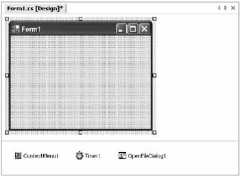
Figure 4-1: The component tray
In some cases, it's worth asking whether invisible controls are really controls at all. For example, the Timer is just a special way to automate user interface changes. In some respects, it's simpler than true multithreaded programming because it uses safe task switching and automatically performs its work on the user interface thread, ensuring that you don't need to marshal calls when interacting with a control. (In other words, there is no need to use the Control.Invoke() method, because the controls in the form are always on the same thread as the timer.) However, it's a far stretch to call the Timer a true control in the sense that the text box and label are.
| Note |
Invisible controls don't derive from the Control class. Instead, they derive from System.ComponentModel.Component (the Control class also derives from this class). The Component class adds the basic features needed for an item to be hosted in a container and provides a Dispose() method that causes it to release its resources immediately. |
Often, invisible controls can be created more flexibly at runtime in your own code. In some cases (like when you want to share one invisible control between forms), it's a necessity. For the most part, it's a matter of preference. The common dialog controls which represent one example of invisible controls, are described in the following chapter. Menus are another example of invisible controls, and are described later in this chapter.
Provider Controls
Providers are a special type of invisible control. They extend the properties of other controls on the current form. For example, the ToolTipProvider allows any control to display a tooltip when the mouse hovers over it. To use the ToolTipProvider, drag an instance of it onto the form. You can then set a tooltip in one of two ways:
- At design-time, select the appropriate control and look in the Properties window for the property "ToolTip on tipProvider" (where tipProvider is the name of the ToolTipProvider control).
- At runtime, use the ToolTipProvider.SetToolTip() method. You can also use the GetToolTip() method to retrieve a control's tooltip.
tips.SetToolTip(txtName, "Enter Your Name Here")
| Tip |
There really isn't any difference between using the SetToolTip() method and the extended ToolTip property provided by the designer.With providers, Visual Studio .NET simply translates what you type in the Properties window into the appropriate method call, and adds the code to the form class. So when you set the ToolTip property, you are still in fact using the SetToolTip() method. |
You can also configure some generic tooltip settings by adjusting the properties of the ToolTipProvider control, as detailed in Table 4-1.
|
Member |
Purpose |
|---|---|
|
|
|
|
Active |
The same as Enabled for most controls. When set to false, no tooltips are shown. |
|
|
|
|
AutomaticDelay, AutoPopDelay, InitialDelay, ReshowDelay |
These settings specify the number of milliseconds before the tooltip appears, the time that it remains visible if the mouse is stationary, and the time required to make it reappear. Generally, you should use the default values. |
|
|
|
|
ShowAlways |
If set to true, tooltips appear when the mouse hovers over a control even if the window containing the control does not currently have focus. |
|
|
|
|
SetToolTip(), GetToolTip(), and RemoveAll() |
These methods allow you to attach a descriptive string to a control and retrieve it. To remove a tooltip, you can either attach an empty string, or use RemoveAll() to clear all tooltips at once. |
.NET does not provide many provider controls, as they are generally used for specialized features. Toward the end of this chapter, you'll see an example that uses the ErrorProvider with control validation. Later, in Chapter 7, where you see how you can create custom provider controls.
ActiveX Controls
.NET includes excellent interoperability features that allow you to continue using COM components and ActiveX controls in your current applications. If you are using Visual Studio .NET, the process is even automated for you.
To add an ActiveX control to one of your projects in Visual Studio .NET, right-click the toolbox and select Customize Toolbox. Select the COM Components tab, and find the appropriate control on the list, and put a check mark next to it (see Figure 4-2).
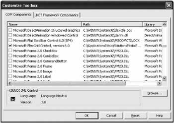
Figure 4-2: Adding a COM reference
Nothing happens until you add an instance of this control to a form. The first time you do this, Visual Studio .NET automatically creates a special interop assembly for you. For example, if you add the MSChart control, which has no direct .NET equivalent, it creates a file with a name like AxInterop.MSChart20Lib_2_0.dll.
The "Ax" at the beginning of the name identifies the fact that this interop assembly derives from System.Windows.Forms.AxHost. This class is used to create any .NET wrapper for an ActiveX control. It works "in between" your .NET code and the ActiveX component, as shown in Figure 4-3.
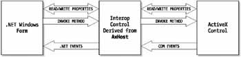
Figure 4-3: AxHost interaction
The control on your form is a legitimate .NET control, as you can see by examining the automatically generated designer code that defines and instantiates it. For example, consider an automatically generated interop class that supports the MSChart control:
AxMSChart20Lib.AxMSChart AxMSChart1;
Here's the code used to configure the control, in true .NET fashion:
this.AxMSChart1 = new AxMSChart20Lib.AxMSChart();
this.AxMSChart1.Location = new System.Drawing.Point(36, 24);
this.AxMSChart1.Name = "AxMSChart1"; this.axMSChart1.OcxState =
 ((AxHost.State)(resources.GetObject("axMSChart1.OcxState")));
this.AxMSChart1.Size = new System.Drawing.Size(216, 72);
this.AxMSChart1.TabIndex = 4;
You can see that this control supports basic .NET properties like Size and Location. It also uses a special OcxState property (inherited from the AxHost class) that retrieves the persisted state of an ActiveX control. From your program's point of view, you can communicate with a normal .NET control that supports .NET event handling and the basic set of features in the Control class. The AxHost-based control quietly communicates with the original ActiveX control, and mimics its behavior on the form. You can even dynamically resize the control and modify its properties using the built-in property pages, and it will respond exactly as it should.
In some cases, the new class may introduce changes. For example, when the MSFlexGrid control is imported, it changes the syntax used to set some properties into method calls:
grid.set_ColWidth(1, 3000); // This was grid.ColWidth(1) = 3000;
grid.set_ColAlignment(0, 1); // This was grid.ColAlightment(0) = 1;
Fortunately, you can always use the Object Browser to get to the bottom of any new changes.
If you are a war-hardened COM veteran, you can create interop controls by hand. However, this process is time-consuming and error-prone, and generally won't produce a better result than Visual Studio .NET's automatic support. Instead, you might want to subclass the interop control that Visual Studio .NET creates. In other words, you could create a custom control that inherits from the interop control. This extra layer gives you the chance to add additional .NET features, and won't hamper performance.
Should You Import ActiveX Controls?
Importing controls is easy, and it most cases it works without a hitch. Right now, it might be required to convert existing programs without rewriting large pieces of functionality. And while it is possible to recreate .NET controls for the MSChart or Internet Explorer Web Browser components, it can be time consuming.
You should also be aware of some of the potential problems:
- ActiveX licensing issues are back. .NET controls demonstrate the amazing xcopy installation capability of the .NET platform. ActiveX controls, however, need to be registered and reregistered whenever a change occurs. This isn't a new problem, but the return of an ugly one.
- Security issues appear. The .NET framework uses a special fine-grain approach to security, which allows controls to be used in semi-trusted environments with most of their functionality intact. ActiveX controls require full unmanaged code permission, which makes them more difficult to use in some scenarios.
- Performance could be affected. Generally, this is the least likely concern. ActiveX emulation is extremely fast in .NET. In some cases, certain controls may exhibit problems, but that will be the exception.
.NET controls will always be the best solution, and in the coming months there will be a proliferation of new third-party options that surpass most of the ActiveX controls used today. Until that time, you may want to use the built-in ActiveX interop, particularly if you have custom controls and don't have the time or budget to redesign them for .NET.
Some of ActiveX controls that you still need to use in the .NET world (at least for the time being) include:
- Microsoft's Web Browser control for displaying HTML content.
- Any ActiveX control related to Help, including Microsoft's new MS Help 2.0 components, which you explore in Chapter 14.
- Special grid or charting controls (some of which were included with previous Visual Studio releases) like Microsoft's FlexGrid, DataRepeater, and Charting controls. The .NET framework provides some basic tools, and there are sure to be a host of third party .NET controls in this area, but not all the existing controls have been brought over.
- Microsoft controls for animation or hosting media player.
- Microsoft Office-based components (including charting and spreadsheet components).
- Specialty Microsoft controls like the masked edit text box and the drop-down image list (although these can be manually recreated with .NET code without too much difficulty).
 Companion Web Site
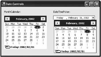
The Date ControlsRetrieving date information is a common task. For example, requiring a date range is a good way to limit database searches. In the past, programmers have used a variety of different controls to retrieve date information, including text boxes that required a specific format of month, date, and year values. The modern date controls make life much easier. For one thing, they allow dates to be chosen from a graphical calendar view that's easy to use and prevents users from choosing invalid dates (like the 31st day in February, for example). They also allow dates to be displayed in a range of formats. There are two date controls: DateTimePicker and MonthCalendar. DateTimePicker is ideal for choosing a single date value, and requires the same amount of space as an ordinary drop-down list box. When the user clicks the drop-down button, a full month calendar page is shown. The user can page from month to month (and even year to year) looking for a specific date with the built-in navigational controls. The control handles these details automatically. The MonthCalendar shows a similar expanded display, with a single month at a time. Unlike the DateTimePicker, it allows the user to choose a range of dates. Both controls are shown in Figure 4-8.
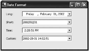
The DateTimePickerThe DateTimePicker allows a user to choose a single date. One nice thing about the DateTimePicker is that it automatically takes the computer's regional settings into consideration. That means you can specify Short for the DateTimePicker.Format property, and the date might be rendered as yyyy/mm/dd format or dd/mm/yyyy depending on the date settings. Alternatively, you can specify a custom format by assigning a format string to the CustomFormat property, and make sure the date is always presented in the same way on all computers. Figure 4-9 shows the different date formats.
The selected date is provided in the Value property. One important detail about date controls is that they always use the System.DateTime date type, which represents a date and time. Depending on your needs, you might configure a date control to show only the day or time portion. In this case, you may need to be careful to retrieve just the appropriate part. For example, imagine you are using a DateTimePicker control, which allows the user to choose the start date for a database search. The date control is configured to show dates in the long format, which doesn't include time information. When the form loads, you configure the date control: dtStart.Value = DateTime.Now; // Sets dtStart to the current date and time. The user might then click a different date. However, choosing a different date only updates the month, year, and day components of the date. The time component remains, even though it is not displayed! // The next line performs a search based on date and the original time. // This artificially limits the returned results. string SQLSelect = "SELECT * FROM Orders WHERE Date >'" + dtStart.Value.ToString() + "'"; If you initialized the DateTimePicker at lunchtime, you could lose the first half day from your search. There are a number of ways to avoid this problem. For example, you can use the DateTime.Date property, which returns another DateTime object that has its time portion set to 0 (midnight). // This gets the full day. string SQLSelect = "SELECT * FROM Orders WHERE Date >'" + dtStart.Value.Date.ToString() + "'"; You could also use the DateTime.Today property to set the initial value instead of DateTime.Now. This is a good technique for the MonthCalendar control as well. The MonthCalendar automatically sets the time component for the currentValue to 0 when the user selects a date, but if the user leaves the default date unchanged, and you've assigned a date with information, the time portion remains. You can also use a DateTimePicker to represent a time value with no date component. To do so, set the Format property to Time. You also need to set the UseUpDown property to true. This prevents the drop-down month display from being shown. Use the up/down scroll buttons instead to increment the highlighted time component (hours, minutes, or seconds). Table 4-9 lists the important properties of the DateTimePicker control.
MonthCalendarThe MonthCalendar control looks like the DateTimePicker, except that it always shows the month page display, and it doesn't allow the user to enter a date by typing it into a list box. That makes the MonthCalendar slightly less useful, except for situations when you need to let the user select a range of contiguous dates. You set the maximum number of dates that the user can select in the MaxSelectionCount property. The user selects a group of dates by dragging and clicking. Selected dates must always be next to each other. The first and last selected dates are returned as DateTime objects in the SelectionStart and SelectionEnd properties. Figure 4-10 shows a range of four days.
// Set a range of four days.
dt.SelectionStart = new DateTime(2003, 01, 17);
dt.SelectionEnd = new DateTime(2003, 01, 20);
Depending on your needs, you may still need to perform a significant amount of validation with selected dates to make sure they fit your business rules. Unfortunately, you can't easily use the DateChanged and DateSelected events for this purpose. They only fire after an invalid date has been selected, and you have no way to remove the selection unless you choose a different date range. Information about the original (valid) date range is already lost. Though the MonthCalendar control looks similar to the DateTimePicker, it provides a different set of properties, adding some features while omitting others. Table 4-10 lists the most important properties.
|
||||||||||||||||||||||||||||||||||||||||||||||||||||||||||||||||||||||||||||||||||||||

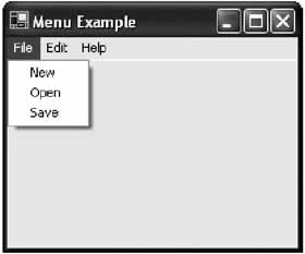
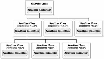
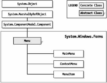
MenusApplications use two kinds of menus: main and context. Main menus provide a comprehensive set of options just below a window's title bar, and use standard headings like File, Edit, and Help. Context menus are floating or "pop up" menus that provide additional options. Typically, context menus appear when the user right-clicks a user interface element (like an object, or a system tray icon). Like main menus, context menus can contain nested layers of menus, but they tend to be much simpler. Consider the partial menu shown in Figure 4-11. In .NET, this menu is modeled as a collection of objects, as shown in Figure 4-12. MenuItem objects make up every part of a menu except the top-level container.
The next code snippet shows how to create the first part of this menu (all the entries contained under the File heading). Generally, you use the Visual Studio .NET IDE to create the menu and configure items automatically through the custom menu designer. // Build the menu starting with the deepest nested level // (in this case, New, Open, and Save). MenuItem mnuNew = new MenuItem(); mnuNew.Text = "New"; MenuItem mnuOpen = new MenuItem(); mnuOpen.Text = "Open"; MenuItem mnuSave = new MenuItem(); mnuSave.Text = "Save"; ' Create the top-level File menu. MenuItem mnuFile = new MenuItem(); mnuFile.Text = "File"; ' Add the contained menu items to the File menu. mnuFile.MenuItems.Add(mnuNew); mnuFile.MenuItems.Add(mnuOpen); mnuFile.MenuItems.Add(mnuSave); // Create the main menu container. MainMenu mnuMain = new MainMenu(); // Add the File menu to the main menu. mnuMain.Add(mnuFile); // Attach the main menu to the form. this.Menu = mnuMain; The next few sections dissect the .NET menu objects. The Menu ClassIn .NET, main menus, context menus, and menu items are all treated slightly differently. All of them inherit from the abstract Menu class (see Figure 4-13).
The Menu class contains a collection of MenuItem objects that corresponds to a single menu level, and provides functionality that lets you clone or merge these items into another menu, and find the top-level menu container. Table 4-11 lists the members of the Menu class.
The MainMenu and ContextMenu ClassesAt the top level, menu items are always contained in a MainMenu or ContextMenu class. These classes, which inherit from Menu, add a few additional frills. For example, the MainMenu class allows you to determine the form that owns the menu, while the ContextMenu class allows you to find the associated control and react to the Popup event when the menu is displayed (Tables 4-12 and 4-13). As you'll see, MainMenu and ContextMenu can't be treated equivalently in your code. This means that you can't display part of a main menu as a context menu, as you would in a Visual Basic 6 application.
The MenuItem ClassEach command and submenu in a menu is represented by a MenuItem object. The MenuItem class is the most full-featured menu object, with several properties for configuring appearance and reacting to menu events, as described in Table 4-14.
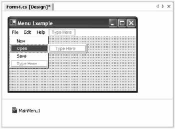
The Visual Studio NET Menu DesignerVisual Studio.NET includes built-in support for creating any type of menus. To start, drag a main menu or context menu onto your form. It will appear in the component tray. To design a menu, click once to select it, and then type text in the onscreen "type here" areas (see Figure 4-15).
Every time you add a new menu item, a "type here" area appears for a submenu and a new menu item. You can also drag and drop menu items in any order you want, and configure each menu item's name and properties in the Properties window when it is selected. Right-click a menu item and select Insert Separator to add a horizontal dividing line between menu entries. Attaching a MenuUnlike other controls, main menus are not added to the Controls collection of the hosting form. Instead, they are specifically set using the Menu property of the form. Once this link is set, the menu automatically appears at the top of the form. this.Menu = mnuMain; // Attach the mnuMain MainMenu object. Context menus use a similar technique with the ContextMenu property. ctrl.ContextMenu = mnuContext; // Attach the mnuContext ContextMenu object. Context menus, however, are not automatically shown. Instead, you need to show them manually using the ContextMenu.Show() method. Typically, you perform this task in the MouseUp event for the linked control. The example that follows displays the control's context menu. It uses the sender parameter, making it completely generic. You could use this event handler for every control with a context menu in your application.
private void lbl_MouseUp(Object sender, System.Windows.Forms.MouseEventArgs e)
{
 // Convert the sender parameter into a valid control reference.
 Control ctrl = (Control)sender;

 // If the right mouse button was pressed, show the menu.
 if (e.Button == MouseButtons.Right)
 {
 ctrl.ContextMenu.Show(ctrl, new Point(e.X, e.Y));
 }

}
Using a control's ContextMenu property is really just a convenience. You can display a context menu at any time, in response to any event, even if you haven't set the ContextMenu property of a nearby control. However, using the ContextMenu property allows you to write a generic method that can handle the MouseUp event for multiple controls. Your code simply needs to retrieve the ContextMenu property of the control that fired the event. Menu EventsThere are two ways you can handle menu selection events. You can write an individual event handler for the Click event of every MenuItem. This is ideal if you are writing all the menu code inside the current form.
private void mnuOpen_Click(System.Object sender, System.EventArgs e)
{
 // (Do something here.)
}

private void mnuNew_Click(System.Object sender, System.EventArgs e)
{
 // (Do something here.)
}

private void mnuSave_Click(System.Object sender, System.EventArgs e)
{
 // (Do something here.)
}
However, if your menu just hands the task off to another class, it probably makes sense to handle all menu events in the same event handler. (In this case, your event handler acts as a generic switchboard). You can then determine which MenuItem fired the event by converting the sender parameter into a MenuItem object and examining its Text, or just by comparing object references (which is preferred, because the compiler alerts you if you refer to a nonexisting MenuItem, but it doesn't alert you if you enter incorrect menu text). The following code snippet handles the Click event of three MenuItem objects, and compares the event sender to the appropriate form-level variables to determine which item was clicked.
private void mnu_Click(System.Object sender, System.EventArgs e)
 if (sender == mnuOpen)
 {
 MyApp.DoNew();
 }
 else if (sender == mnuNew)
 {
 MyApp.DoSave();
 }
 else if (sender == mnuSave)
 {
 MyApp.DoOpen();
 }
}
This approach of handling all menu clicks in one method also provides an easy way to implement the standard MFC logic, where a help string is displayed in another control (typically a status bar) whenever a menu item is highlighted. Copying and Cloning a Menu.NET imposes some restrictions on menus. Items cannot belong to more than one menu, and they cannot be shared between types of menus. In many applications, a context menu is actually a subset of a main menu. To set this up with .NET, you need to copy the appropriate branch of the menu. You might attempt this with the logical-appearing code shown below:
// A flawed approach.
ContextMenu mnuContext = new ContextMenu();

// Attempt to copy the menu items from the File menu.
foreach (MenuItem mnuItem in mnuFile.MenuItems)
{
 mnuContext.MenuItems.Add(mnuItem.Text);
}
Unfortunately, this will copy the items but lose the event handlers. To preserve the event handling logic, you need to use the CloneMenu() method, as shown here:
// A copy operation that preserves event handlers.
ContextMenu mnuContext = new ContextMenu();

// Copy the menu items from the File menu into a context menu.
foreach (MenuItem mnuItem in mnuFile.MenuItems)
{
 mnuContext.MenuItems.Add(mnuItem.CloneMenu());
}
Merging a MenuIn some cases, you might want to create a context menu that contains the entries from two different submenus. While you could do this by duplicating and manipulating the individual MenuItem objects, the easiest way is by using the built-in MenuItem.MergeMenu() method. The example below combines the menu items in the top-level File and Edit menus. // Create a copy of the menus you want to merge. MenuItem mnuMergeFile, mnuMergeEdit; mnuMergeFile = mnuFile.CloneMenu(); mnuMergeEdit = mnuEdit.CloneMenu(); // Merge the duplicate copy of the menus. mnuMergeFile.MergeMenu(mnuMergeEdit); // Now add the merged menu to the appropriate control. this.ContextMenu = mnuMergeFile; |
||||||||||||||||||||||||||||||||||||||||||||||||||||||||||||||||||||||||||||||||||||||||||||||||||||||||||||||||||||||||||||||||||
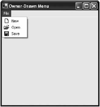
Owner Drawn MenusIf this is your first look at .NET menus, you may be disappointed to see that they don't support the common Windows convention of using embedded thumbnail bitmaps to help distinguish common items. To solve this problem, you could purchase a third-party control, but luckily the logic is easy to implement on your own. All it requires is a dash of GDI+. The steps for creating an owner-drawn menu are as follows.
The first step is easy enough. The second step requires a little bit more work. To specify the required size, you need to set the ItemHeight and ItemWidth properties of the MeasureItemEventArgs class with a value in pixels. However, the size required depends a great deal on the font and text you use. Fortunately, the MeasureItemEventArgs class also provides a reference to the graphics context for the menu, which provides a useful MeasureString() method. This method returns a Size structure that indicates the space required. To keep your code manageable, you should use a single event handler to measure all the menu items. In our example, this includes a "New," "Open," and "Save" menu entry.
private void mnu_MeasureItem(object sender,
 System.Windows.Forms.MeasureItemEventArgs e)
{
 // Retrieve current item.
 MenuItem mnuItem = (MenuItem)sender;

 Font menuFont = new Font("Tahoma", 8);

 // Measure size needed to display text.
 // We add 30 pixels to the width to allow a generous spacing for the image.
 e.ItemHeight = (int)e.Graphics.MeasureString(mnuItem.Text, menuFont).Height
 + 5;
 e.ItemWidth = (int)e.Graphics.MeasureString(mnuItem.Text, menuFont).Width
 + 30;
}
When displaying a drop-down menu, Windows automatically measures the size of each item, and uses the greatest required width for all menu items. The final step of displaying the menu item is similarly straightforward. You must find the appropriate picture, and write both the text and image to the screen using the graphics context provided by the DrawItem event handler and the DrawString() and DrawImage() methods. The result is shown in Figure 4-16.
private void mnu_DrawItem(object sender,
 System.Windows.Forms.DrawItemEventArgs e)
{
 // Retrieve current item.
 MenuItem mnuItem = (MenuItem)sender;

 // This defaults to the highlighted background if the item is selected.
 // Otherwise, it is the default grey background.
 e.DrawBackground();

 // Retrieve the image from an ImageList control.
 Image menuImage = imgMenu.Images[mnuItem.Index];

 // Draw the image.
 e.Graphics.DrawImage(menuImage, e.Bounds.Left + 3, e.Bounds.Top + 2);
 // Draw the text with the supplied colors and in the set region.
 e.Graphics.DrawString(mnuItem.Text, e.Font, new SolidBrush(e.ForeColor),
 e.Bounds.Left + 25, e.Bounds.Top + 3);
}
Note that this code uses the Windows standard font and colors, which are provided in properties like e.Font and e.ForeColor. Alternatively, you could create your own Color or Font objects and use them. The next example shows more flexible custom formatting.
An Owner Drawn Menu ControlWriting the correct code in the MeasureItem and DrawItem event handlers requires some tweaking of pixel offsets and sizes. Unfortunately, in our current implementation there is no easy way to reuse this logic for different windows (not to mention different applications). A far better approach is to perfect your menu as a custom control, and then allow this control to be reused in a variety of projects and scenarios. The following example adopts this philosophy, and shows a menu control that provides Image, Font, and ForeColor properties. This custom menu item handles its own drawing logic. All the client code needs to do is set the appropriate properties. The code also extends the previous example by correctly drawing disabled menu items.
using System;
using System.Windows.Forms;
using System.Drawing;
using System.Drawing.Text;

public class ImageMenuItem : MenuItem
{
 private Font font;
 private Color foreColor;
 private Image image;
 public Font Font
 {
 get
 {
 return font;
 }
 set
 {
 font = value;
 }
 }

 public Image Image
 {
 get
 {
 return image;
 }
 set
 {
 image = value;
 }
 }

 public Color ForeColor
 {
 get
 {
 return foreColor;
 }
 set
 {
 foreColor = value;
 }
 }

 public ImageMenuItem(string text, Font font, Image image, Color foreColor)
 : base(text)
 {
 this.Font = font;
 this.Image = image;
 this.ForeColor = foreColor;
 this.OwnerDraw = true;
 }

 public ImageMenuItem(string text, Image image) : base(text)
 {
 // Choose a suitable default color and font.
 this.Font = new Font("Tahoma", 8);
 this.Image = image;
 this.ForeColor = SystemColors.MenuText;
 this.OwnerDraw = true;
 }

 protected override void OnMeasureItem(
 System.Windows.Forms.MeasureItemEventArgs e)
 {
 base.OnMeasureItem(e);

 // Measure size needed to display text.
 e.ItemHeight = (int)e.Graphics.MeasureString(this.Text, this.Font).Height
 + 5;
 e.ItemWidth = (int)e.Graphics.MeasureString(this.Text, this.Font).Width
 + 30;
 }

 protected override void OnDrawItem(System.Windows.Forms.DrawItemEventArgs e)
 {
 base.OnDrawItem(e);

 // Determine whether disabled text is needed.
 Color textColor;
 if (this.Enabled == false)
 {
 textColor = SystemColors.GrayText;
 }
 else
 {
 e.DrawBackground();
 if ((e.State & DrawItemState.Selected) == DrawItemState.Selected)
 {
 textColor = SystemColors.HighlightText;
 }
 else
 {
 textColor = this.ForeColor;
 }
 }

 // Draw the image.
 if (this.Image != null)
 {
 if (this.Enabled == false)
 {
 ControlPaint.DrawImageDisabled(e.Graphics, this.Image,
 e.Bounds.Left + 3, e.Bounds.Top + 2, SystemColors.Menu);
 }
 else
 {
 e.Graphics.DrawImage(Image, e.Bounds.Left + 3, e.Bounds.Top + 2);
 }
 }
 // Draw the text with the supplied colors and in the set region.
 e.Graphics.DrawString(this.Text, this.Font, new SolidBrush(textColor),
 e.Bounds.Left + 25, e.Bounds.Top + 3);
 }
}
Because this class inherits from MenuItem, you can add instances of it to any MenuItems collection. Here's an example that creates the same menu you considered in your previous example by using the ImageMenuItem control:
mnuFile.MenuItems.Add(new ImageMenuItem("New", imgMenu.Images[0]));
mnuFile.MenuItems.Add(new ImageMenuItem("Open", imgMenu.Images[1]));
mnuFile.MenuItems.Add(new ImageMenuItem("Save", imgMenu.Images[2]));
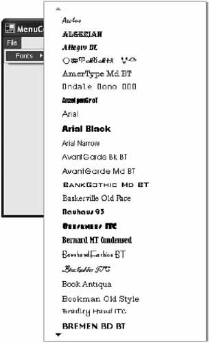
Alternatively, you can use the other supplied constructor to configure an unusual font and color combination. For example, the code that follows creates a submenu that lists every font, with each name displayed in its own typeface (see Figure 4-17).
InstalledFontCollection fonts = new InstalledFontCollection();

foreach (FontFamily family in fonts.Families)
{
 try
 {
 mnuFonts.MenuItems.Add(new ImageMenuItem(family.Name,
 new Font(family, 10), null, Color.CornflowerBlue));
 }
 catch
 {
 // Catch invalid fonts/styles and ignore them.
 }
}
Unfortunately, there is no easy way to insert an ImageMenu object into a menu using the integrated Visual Studio .NET menu designer. If you want to bridge this gap, you would have to create a custom MainMenu and ContextMenu objects, and then develop custom designers for them that would allow ImageMenu objects to be inserted. Chapter 8 introduces custom designers.
Now that you have a grip on the basic suite of .NET controls, the remainder of the chapter dives into two more interesting topics: adding drag-and-drop ability, and creating advanced validation code. |
|||||||||||||||||||||
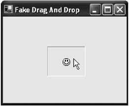
Drag and DropDrag-and-drop operations aren't quite as common today as they were a few years ago, because programmers have gradually settled on other methods of copying information that don't require holding down the mouse button (a technique that many users find difficult to master). For example, a drawing program is likely to use a two-step operation (select an object, and then draw it on) rather than a single drag-and-drop operation. Programs that do support drag-and-drop often use it as a shortcut for advanced users, rather than a standard way of working. Drag-and-drop is also sometimes confused with the ability to "drag" a picture or piece of user interface around a window. This "fake" drag-and-drop is useful in drawing and diagramming applications (including the drawing application developed in 13), but it needs to be coded manually. In this section, you will learn about both types of dragging operations. Fake Drag and DropTrue drag-and-drop is a user-initiated way to exchange information between two controls. You don't need to use drag-and-drop events to create objects that the user can move around the form (Figure 4-18). For example, consider the following program that allows a user to click on a picture box, drag it around, and release it somewhere else on the form.
Conceptually, a control is being dragged and dropped, but all the logic takes place in the appropriate mouse handling events. A Form level isDragging variable keeps track of when fake drag-and-drop mode is currently switched on.
// Keep track of when fake "drag and drop" mode is enabled.
private bool isDragging = false;

// Store the location where the user clicked the control.
private int clickOffsetX, clickOffsetY;

// Start dragging.
private void lblDragger_MouseDown(System.Object sender,
 System.Windows.Forms.MouseEventArgs e)
{
 isDragging = true;
 clickOffsetX = e.X;
 clickOffsetY = e.Y;
}

// End dragging.
private void lblDragger_MouseUp(System.Object sender,
 System.Windows.Forms.MouseEventArgs e)
{
 isDragging = false;
}

// Move the control (during dragging).
private void lblDragger_MouseMove(System.Object sender,
 System.Windows.Forms.MouseEventArgs e)
{
 if (isDragging == true)
 {
 // The control coordinates are converted into form coordinates
 // by adding the label position offset.
 // The offset where the user clicked in the control is also
 // accounted for. Otherwise, it looks like the top-left corner
 // of the label is attached to the mouse.
 lblDragger.Left = e.X + lblDragger.Left - clickOffsetX;
 lblDragger.Top = e.Y + lblDragger.Top - clickOffsetY;
 }
}
There are three components that factor into the position calculation:
Authentic Drag and DropReal drag-and-drop operations are quite a bit different. Essentially, they work like this:
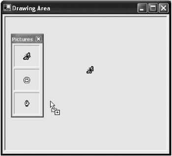
Unlike our fake drag-and-drop example, a real drag-and-drop operation can easily take place between controls, or even two different applications, as long as the drag-and-drop contract is followed. The example program below uses drag-and-drop to take a picture from a label control and draw it onto a picture box control. The actual drawing operation uses GDI+ methods that you examine in more detail later in this book. All other details are generic parts of any drag-and-drop application (Figure 4-19). You'll find the complete code with the samples for this chapter under the project name AuthenticDragAndDrop.
The first step is to configure the picture box control to accept dropped information. picDrawingArea.AllowDrop = true; To start the drag-and-drop, you can use the DoDragDrop() method of the source control. In this case, it is one of three labels. Dragging is initiated in the MouseDown event for the label.
private void lbl_MouseDown(object sender, System.Windows.Forms.MouseEventArgs e)
{
 Label lbl = (Label)sender;
 lbl.DoDragDrop(lbl.Image, DragDropEffects.Copy);
}
The same event handler handles the MouseDown event for each label. In the event handler, the generic sender reference (which points to the object that sent the event) is converted into a label. Then, a drag-and-drop copy operation is started. The information associated with this operation is the image from the label control. To allow the picture box to receive information, you need to verify that the information is the correct type in the DragEnter event, and then set a special event argument (e.Effect). DragEnter occurs once when the mouse moves into the bounds of the control.
private void picDrawingArea_DragEnter(object sender,
 System.Windows.Forms.DragEventArgs e)
{
 if (e.Data.GetDataPresent(DataFormats.Bitmap))
 {
 e.Effect = DragDropEffects.Copy;
 }
 else
 {
 e.Effect = DragDropEffects.None;
 }
}
The last step is to respond to the information once it is dropped, by handling the DragDrop event. You can do anything you want with the dropped information. In the current example, a GDI+ drawing operation is started (although it could make just as much sense to create a new object in that location and set its Image property).
private void picDrawingArea_DragDrop(object sender,
 System.Windows.Forms.DragEventArgs e)
{
 Graphics g = picDrawingArea.CreateGraphics();
 g.DrawImage((Image)e.Data.GetData(DataFormats.Bitmap),
 new Point(e.X - this.Left - 12, e.Y - this.Top - 30));
}
Note that the event handler provides screen coordinates, which must be converted into the appropriate coordinates for the picture box. Practically, you can exchange any type of object through a drag-and-drop operation. However, while this free-spirited approach is perfect for your applications, it isn't wise if you need to communicate with other applications. If you want to drag-and-drop into other applications, you should use data from a managed base class (like String or Image), or an object that implements ISerializable or IDataObject (which allows .NET to transfer your object into a stream of bytes, and reconstruct the object in another application domain). |
|||||||||||||||
ValidationThe best possible way to prevent invalid input is to make it impossible for users to enter it. You accomplish this by forcing users to choose from lists, and creating custom controls that automatically format data and ignore invalid key presses. Of course, sometimes this task is too daunting and you need to settle on the next best thing, which is checking for errors after the fact. If you take this approach, it's important that you report the error as soon as possible, preferably before the user continues to enter more information. The easiest way is to react to validation events. Validation events were designed to let you check information as soon as it is entered, rather than waiting for the whole form to be submitted. This kind of instantaneous error checking is very useful:
Validation solves this information by checking the field as soon as the user is finished entering it and changes focus to another control (either to enter new information, like choosing a text box, or to perform an action, like clicking a button). In the past, developers have tried to create "do-it-yourself" validation by responding to a control's LostFocus event. The problem with this event is that it occurs after the focus has already moved on. If you reset the focus because of invalid input, another control then receives its own LostFocus event. If both controls have invalid data, they may fight endlessly between each other, trying to move the focus somewhere else. .NET handles this problem with the Validating and Validated events. These events occur after the user has chosen to move to another control (for example, by pressing the Tab key), but before the focus has been changed, in the following order:
The Validated event allows you to respond to correctly entered data. The Validating event is more useful. It allows you to verify the data and, if it fails the test, stop the focus from moving to the new control. Validation only takes place if the source control (the control to be validated) has the CausesValidaton property set to true. In addition, the validation won't take place until the focus changes to a control that also has its CausesValidation property set to true. Table 4-15 shows some examples of what can happen when tabbing from one control to another.
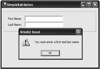
A Validation ExampleThe program shown in Figure 4-20 uses validation to verify that neither text box is left blank. If the user tries to change focus without entering any information, a message box appears, and the focus is reset to the empty text box.
The validation code for this application is shown here:
private void txtName_Validating(object sender,
 System.ComponentModel.CancelEventArgs e)
{
 if (((TextBox)sender).Text == "")
 {
 MessageBox.Show("You must enter a first and last name.", "Invalid Input",
 MessageBoxButtons.OK, MessageBoxIcon.Warning);
 e.Cancel = true;
 }
}
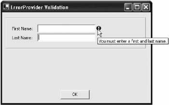
Note that buttons handle validation differently than other controls. They don't validate on a focus change except when they are clicked. If the user tries to click a button and validation fails, the focus is reset, and the Click event is ignored. Attempting to close with the top-right close button (displayed as an "X") also triggers validation. (This creates a problem if you need to let users escape from a form without completing the operation. The solution is to create a Cancel button that closes the form, and has its CausesValidation property set to false.) Validating with the ErrorProviderInterrupting users with a message box is a relatively crude way of alerting them to an error. It's better to provide some kind of onscreen indication about the problem, like an explanatory error message next to the incorrect input. The .NET framework provides an elegant way to accomplish this with its new error provider control. The ErrorProvider displays a special error icon next to an invalid control. If the user hovers the mouse above the control, a detailed message appears (see Figure 4-21).
The ErrorProvider is a special provider control. You add it once to your form, and you can use it to display an error icon next to any control. To add the ErrorProvider, drag it into the component tray, or create it manually in code. In the latter case, make sure you keep a form-level reference to use later. You show the error icon next to a control using the ErrorProvider.SetError() method. The following code segment shows the same text box validating code, but is rewritten to indicate the error using the ErrorProvider control instead of a message box.
private void txtName_Validating(object sender,
 System.ComponentModel.CancelEventArgs e)
{
 Control ctrl = (Control)sender;
 if (ctrl.Text == "")
 {
 errProvider.SetError(ctrl, "You must enter a first and last name.");
 }
 else
 {
 errProvider.SetError(ctrl, "");
 }
}
Note that you must explicitly clear the error message after validation succeeds. In this example, the validation event doesn't cancel the action; it just displays the error icon. This is a more user-friendly alternative, but it means that you need to explicitly check if the form has any errors before allowing users to continue if they have clicked on the OK button.
private void cdmOK_Click(object sender, System.EventArgs e)
{
 if (errProvider.GetError(txtFirstName) == "" &&
 errProvider.GetError(txtLastName) == "")
 {
 this.Close();
 }
 else
 {
 MessageBox.Show("You still have invalid input.", "Invalid Input", _
 MessageBoxButtons.OK, MessageBoxIcon.Warning);
 }
}
If you have a lot of controls, it makes more sense to iterate through the whole collection, rather than writing code checking each control individually. In the following example, the validation controls are all contained inside a single group box named grpValidation, so the code iterates its collection of child controls.
private void cmdOK_Click(object sender, System.EventArgs e)
{
 bool invalidInput = false;
 foreach (Control ctrl in this.grpValidation.Controls)
 {
 if (errProvider.GetError(ctrl) != "")
 {
 invalidInput = true;
 break;
 }
 }

 if (invalidInput)
 {
 MessageBox.Show("You still have invalid input.", "Invalid Input",
 MessageBoxButtons.OK, MessageBoxIcon.Warning);
 }
 else
 {
 this.Close();
 }
}
Validating with Regular ExpressionsThe ErrorProvider control is an ideal way to weave error feedback into your application. However, writing the actual validation code can still be painful and time consuming. One way to streamline your work is to use the .NET regular expression classes, which allow you to search text strings for specific patterns. Here's an example that validates an email address, by verifying that it contains an "at" symbol (@) and period (.) and doesn't include spaces or special characters. Unlike our previous example, this code is performed in the KeyPress event handler, which ensures that the error provider icon is updated immediately after any change.
private void txtEmail_KeyPress(object sender,
 System.Windows.Forms.KeyPressEventArgs e)
{
 System.Text.RegularExpressions.Regex regex;
 regex = new System.Text.RegularExpressions.Regex(@"S+@S+.S+");
 Control ctrl = (Control)sender;
 if (regex.IsMatch(ctrl.Text))
 {
 errProvider.SetError(ctrl, "");
 }
 else
 {
 errProvider.SetError(ctrl, "Not a valid email.");
 }
}
Regular expressions almost constitute an entire language of their own, with special characters and metacharacters. Most programmers and organizations create their own regular expression classes that provide commonly used expressions. One possible example is shown below.
public class RegularExpressions
{
 public const string Email = @"S+@S+.S+";

 // 4-10 character password that starts with a letter.
 public const string Password = @"[a-zA-Z]w{3,9}";

 // A sequence of 3-2-4 digits, with each group separated by a dash.
 public const string SSN = @"d{3}-d{2}-d{4}";
}
Once you have created this type of resource class, you can use it easily to create a RegEx object: Regex expression = new Regex(RegularExpressions.Email); A brief list of some common regular expression metacharacters is shown in Table 4-16. You can use these characters to create your own regular expressions.
However, it's often easier to look up a premade regular expression that suits your data using the Internet or a dedicated book on the subject. |
|||||||||||||||||||||||||||||||||||||||||||||||||||||||||||||||||||||||||||||||||||||||||||||||
The Last WordThis chapter has toured through the most common Windows controls, and demonstrated a few .NET twists like owner-drawn menus and the ErrorProvider control. You've also learned about the basic types of controls, the techniques you can use for drag-and-drop support, and the best ways to integrate validation code into your forms. The next chapter continues with the last core topic for Windows user interface programming: Forms. |
|||||||||||||||
Forms |
|||||||||||||||
Introduction
 Windows Forms and Custom Controls")
EAN: 2147483647
Pages: 142
