GDI+ Controls
Overview
Owner-drawn controls are one of the most ambitious projects a developer can undertake. This is not because they are conceptually tricky, but because a moderately sophisticated control needs a great deal of basic code just to handle all aspects of its appearance. If you can create a control using composition (i.e., a user control) or by inheriting from a similar control class, as shown in Chapter 7, you'll save yourself a great deal of effort. On the other hand, if you need complete control over drawing and behavior, or you want to introduce some of the unusual GDI+ features to your user interface, you need to create a control that performs its painting manually.
The prime advantage to GDI+ controls is freedom. The prime disadvantage with GDI+ controls is that they aren't nearly as autonomous as prebuilt controls. For example, with custom GDI+ controls you need to handle the following details manually:
- Scrolling support
- Focus cues (i.e., indicating when the control has focus)
- The "pushed" state appearance for a button control
- Special cues or "hot tracking" appearance changes when the mouse moves over the control
- Hit testing to determine if a click was made in an appropriate area
This chapter introduces several example controls, and shows how they confront these problems and add a few visual treats.
 Companion Web Site

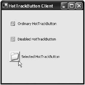
Creating Button ControlsThe label controls are fairly easy to develop because they are essentially static pieces of user interface. Other controls may need to support user interaction. For example, a button control needs to receive mouse clicks and a text box needs to handle key presses. To create one of these controls can require significant extra code and thorough testing to verify that its behavior is consistent under all circumstances. To illustrate some of these considerations, the next example presents a button that's been created from scratch by deriving from the base Control class. A Hot Tracking ButtonThis example develops a HotTrackButton that displays an image and text. When the mouse is positioned over the image, it appears with a raised border (see Figure 13-4).
This control project raises some unique, subtle challenges:
The first step is to create a control class that provides a member variable to track its current state. In our example, a State enumeration is defined to help track the valid button states.
public class HotTrackButton : Control
{
 public enum State
 {
 Normal,
 MouseOver,
 Pushed
 }

 private State state = State.Normal;

 // (Other code omitted.)
}
Next, you need to create the button's public interface. This includes an Image property to store the picture it will display, and a Text property to store the caption text. Every control automatically inherits the Text property; however, the HotTrackButton class needs to override it to make sure that the control is invalidated (and thus repainted) when the text is changed.
private Image image;
private Rectangle bounds;

public Image Image
{
 get
 {
 return image;
 }
 set
 {
 image = value;
 bounds = new Rectangle(0, 0, image.Width + 5, image.Height + 5);
 this.Invalidate();
 }
}

// You must override this property to invalidate the display and
// provide automatic refresh when the property is changed.
public override string Text
{
 get
 {
 return base.Text;
 }
 set
 {
 base.Text = value;
 this.Invalidate();
 }
}
Notice that a private member variable called bounds is used to track the drawing area of the control. This rectangle is slightly larger than the image itself, because it needs to accommodate the focus rectangle. When the button changes state in response to a mouse action, the control class code can then invalidate just the region defined by the bounds rectangle, guaranteeing a faster refresh. The next step is to override four mouse-related methods, including OnMouseMove(), OnMouseDown(), OnMouseUp(), and OnMouseLeave(). The code in these methods sets the button state appropriately, and forces a repaint if the state has changed.
protected override void OnMouseMove(System.Windows.Forms.MouseEventArgs e)
{
 base.OnMouseMove(e);

 // Check if the mouse pointer is over the button.
 // If the mouse moves off the button surface, it will be deactivated,
 // even if the button is being held in a pressed position.
 // The code repaints the button only if needed.
 if (bounds.Contains(e.X, e.Y))
 {
 if (state == State.Normal)
 {
 state = State.MouseOver;
 this.Invalidate(bounds);
 }
 }
 else
 {
 if (state != State.Normal)
 {
 state = State.Normal;
 this.Invalidate(bounds);
 }
 }
}

protected override void OnMouseLeave(System.EventArgs e)
{
 // Reset the button appearance. This will also deactivate the button
 // if it has been pressed but not released.
 // The code repaints the button only if needed.
 if (state != State.Normal)
 {
 state = State.Normal;
 this.Invalidate(bounds);
 }
}
protected override void OnMouseDown(System.Windows.Forms.MouseEventArgs e)
{
 // Change the button to a pushed state, provided the mouse pointer is
 // over the image and the Left mouse button has been clicked
 if (bounds.Contains(e.X, e.Y) &&
 (e.Button & MouseButtons.Left) == MouseButtons.Left)
 {
 state = State.Pushed;
 this.Invalidate(bounds);
 }
}

protected override void OnMouseUp(System.Windows.Forms.MouseEventArgs e)
{
 // Change the button to a normal state and repaint if needed.
 if (!((e.Button & MouseButtons.Left) == MouseButtons.Left))
 {
 state = State.Normal;

 if (bounds.Contains(e.X, e.Y))
 {
 state = State.MouseOver;
 }
 else
 {
 state = State.Normal;
 }

 this.Invalidate(bounds);
 }
}
Finally, the paint logic renders the button in the appropriate state and the associated text. It uses a raised three-dimensional border when the mouse is positioned over the button, and a sunken border when it is clicked, which is similar to the image bar style used in Microsoft Outlook. The text is placed to the right of the picture, and is vertically centered with the mid-point of the image by measuring the image and font sizes.
protected override void OnPaint(System.Windows.Forms.PaintEventArgs e)
{
 if (image == null)
 {
 // Draw the text without the image.
 e.Graphics.DrawString(this.Text, this.Font,
 new SolidBrush(this.ForeColor), 10, 0);
 }
 else
 {
 if (!this.Enabled)
 {
 // Paint the picture in a disabled state.
 ControlPaint.DrawImageDisabled(e.Graphics, image, 2, 2,
 this.BackColor);
 }
 else
 {
 // Paint the image according to the button state.
 switch (state)
 {
 case State.Normal:
 e.Graphics.DrawImage(image, 2, 2);
 break;
 case State.MouseOver:
 ControlPaint.DrawBorder3D(e.Graphics, bounds,
 Border3DStyle.Raised, Border3DSide.All);
 e.Graphics.DrawImage(image, 2, 2);
 break;
 case State.Pushed:
 ControlPaint.DrawBorder3D(e.Graphics, bounds,
 Border3DStyle.Sunken, Border3DSide.All);
 e.Graphics.DrawImage(image, 3, 3);
 break;
 }
 }

 // Paint the caption text next to the image.
 e.Graphics.DrawString(this.Text, this.Font,
 new SolidBrush(this.ForeColor), bounds.Width + 3,
 (bounds.Height - this.Font.Height) / 2);
 }
}
The drawing logic benefits from the ControlPaint class, which provides the DrawBorder3D() and the DrawImageDisabled() methods. This class, which was described in the previous chapter, could also help with the DrawFocusRect() method if you wanted to expand the control to be able to handle keyboard events. The only remaining task is to make sure the click event is only raised when the image is clicked. You can accomplish this by overriding the OnClick() method, and only calling the base implementation (which raises the event) if the mouse is currently positioned over the image.
protected override void OnClick(System.EventArgs e)
{
 // Only propagate the click to the client if it was detected over the image.
 if (state == State.Pushed)
 {
 base.OnClick(e);
 }
}
There's clearly a lot more you could add to this button control. For example, you could allow the user to change the orientation, place the text under the image, add support for text wrapping, or even create a compound control that contains a collection of images. From a conceptual point of view, these additions are easy. However, you'll find that the code can grow quite lengthy with the additional commands needed to evaluate the state and render the button control appropriately.
|
||||||||||||||||||
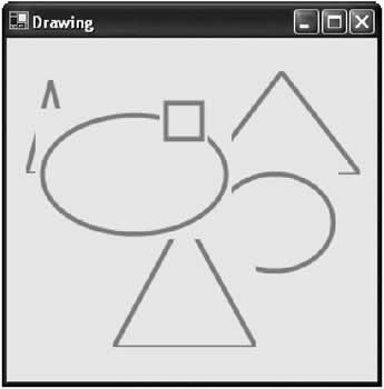
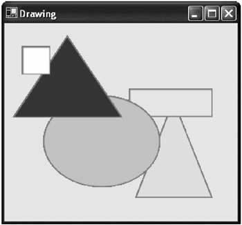
Reconsidering the Vector Drawing ProgramChapter 11 developed the basic framework for a control-based drawing program using the label control. The program worked well and introduced a basic framework that could accommodate any type of control. The only problem is that the .NET Framework doesn't include controls for common shapes like circles, triangles, and squares. Instead, the program "faked" a square by using a label control with a border. Now that you've covered GDI+, there's a far better solution available, and it only takes a little bit more coding. The basic concept is to create an owner-drawn control that paints the appropriate shape. Substitute this control in the place of the bordered label. The drawing framework handles the dragging, resizing, and coloring automatically by setting properties like Location, Size, and Font. There is a possible problem. If the user draws a circle, you want the circle shape to act like a circle for all mouse operations. In other words, the user shouldn't be able to click on a part of the control outside the circle and use that to move the control. Similarly, this "invisible" portion of the control shouldn't overwrite other controls on the drawing surface. Figure 13-5 shows a drawing program with shapes that doesn't take this into account.
Solving the Bounding ProblemLuckily, .NET makes it easy to create a control that has a nonrectangular bounding area. In fact, you saw this technique in Chapter 5 with shaped forms. All that's required is to set the control's Region property, which defines a new clipping region. Figure 13-6 shows a drawing program that uses the region property to define control borders. Note that this does have a side effect: the control cannot be as effectively antialiased (or blended with the background). As a result, the border appears more jagged.
This new drawing program supports rectangles, circles, and squares, but it could easily support any arbitrary or unusual shape. The program works by dynamically creating an instance of a custom shape control. The shape control has the following features:
Here's the complete Shape class code:
public class Shape : System.Windows.Forms.UserControl
{
 // The types of shapes supported by this control.
 public enum ShapeType
 {
 Rectangle,
 Ellipse,
 Triangle
 }

 private ShapeType shape = ShapeType.Rectangle;
 private GraphicsPath path = null;

 public ShapeType Type
 {
 get
 {
 return shape;
 }
 set
 {
 shape = value;
 RefreshPath();
 this.Invalidate();
 }
 }

 // Create the corresponding GraphicsPath for the shape, and apply
 // it to the control by setting the Region property.
 private void RefreshPath()
 {
 path = new GraphicsPath();
 switch (shape)
 {
 case ShapeType.Rectangle:
 path.AddRectangle(this.ClientRectangle);
 break;
 case ShapeType.Ellipse:
 path.AddEllipse(this.ClientRectangle);
 break;
 case ShapeType.Triangle:
 Point pt1 = new Point(this.Width / 2, 0);
 Point pt2 = new Point(0, this.Height);
 Point pt3 = new Point(this.Width, this.Height);
 path.AddPolygon(new Point[] {pt1, pt2, pt3});
 break;
 }
 this.Region = new Region(path);
 }

 protected override void OnResize(System.EventArgs e)
 {
 base.OnResize(e);
 RefreshPath();
 this.Invalidate();
 }

 protected override void OnPaint(System.Windows.Forms.PaintEventArgs e)
 {
 base.OnPaint(e);
 if (path != null)
 }
 e.Graphics.SmoothingMode = SmoothingMode.AntiAlias;
 e.Graphics.FillPath(new SolidBrush(this.BackColor), path);
 e.Graphics.DrawPath(new Pen(this.ForeColor, 4), path);
 }
 }
}
The drawing framework needs a slight modification: instead of creating a label control, it creates a Shape object and sets the Shape property depending on the user's menu selection. The menu options ("New Rectangle," "New Ellipse," and "New Triangle") are represented by three menu objects (mnuRectangle, mnuEllipse, and mnuTriangle), and the click event for each of these objects triggers the same event handler:
private void mnuNewShape_Click(object sender, System.EventArgs e)
{
 // Create and configure the shape with some defaults.
 Shape newShape = new Shape();
 newShape.Size = new Size(40, 40);
 newShape.ForeColor = Color.Coral;

 // Configure the appropriate shape depending on the menu option selected.
 if (sender == mnuRectangle)
 {
 newShape.Type = Shape.ShapeType.Rectangle;
 }
 else if (sender == mnuEllipse)
 {
 newShape.Type = Shape.ShapeType.Ellipse;
 }
 else if (sender == mnuTriangle)
 {
 newShape.Type = Shape.ShapeType.Triangle;
 }

 // To determine where to place the shape, you need to convert the
 // current screen-based mouse coordinates into relative form coordinates.
 newShape.Location = this.PointToClient(Control.MousePosition);

 // Attach a context menu to the shape.
 newShape.ContextMenu = mnuLabel;

 // Connect the shape to all its event handlers.
 newShape.MouseDown += new MouseEventHandler(lbl_MouseDown);
 newShape.MouseMove += new MouseEventHandler(lbl_MouseMove);
 newShape.MouseUp += new MouseEventHandler(lbl_MouseUp);

 // Add the shape to the form.
 this.Controls.Add(newShape);
}
With this minor modification, the drawing program now handles the ownerdrawn controls seamlessly, supporting the same features for resizing, dragging, and changing the fill color. One minor quirk appears with the ellipse shape. The drawing program only allows a shape to be resized using its bottom right corner. However, the ellipse's corners are clipped off to fit the circular region. A simple workaround is to add the ability to resize the shape from any of its sides. The revised MouseMove event handler is shown as follows.
private void lbl_MouseMove(object sender, System.Windows.Forms.MouseEventArgs e)
{
 // Retrieve a reference to the active shape.
 Control currentCtrl;
 currentCtrl = (Control)sender;

 if (isDragging)
 {

 // Move the control.
 currentCtrl.Left = e.X + currentCtrl.Left - clickOffsetX;
 currentCtrl.Top = e.Y + currentCtrl.Top - clickOffsetY;
 }
 else if (isResizing)
 {
 // Resize the control, according to the resize mode.
 if (currentCtrl.Cursor == Cursors.SizeNWSE)
 {
 currentCtrl.Width = e.X;
 currentCtrl.Height = e.Y;
 }
 else if (currentCtrl.Cursor == Cursors.SizeNS)
 {
 currentCtrl.Height = e.Y;
 }
 else if (currentCtrl.Cursor == Cursors.SizeWE)
 {
 currentCtrl.Width = e.X;
 }
 }
 else
 {
 // Change the cursor if the mouse pointer is on one of the edges
 // of the control.
 if (((e.X + 5) > currentCtrl.Width) &&
 ((e.Y + 5) > currentCtrl.Height))
 {
 currentCtrl.Cursor = Cursors.SizeNWSE;
 }
 else if ((e.X + 5) > currentCtrl.Width)
 {
 currentCtrl.Cursor = Cursors.SizeWE;
 }
 else if ((e.Y + 5) > currentCtrl.Height)
 {
 currentCtrl.Cursor = Cursors.SizeNS;
 }
 else
 {
 currentCtrl.Cursor = Cursors.Arrow;
 }
 }
}
|
||||||||||||||||||
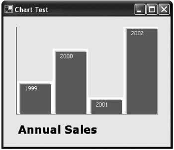
A Simple Graphing ControlThe last control considered here is a simple bar chart. It's a good demonstration of how you can create a higher-level GDI+ control. Instead of representing a single shape or button, it renders a complete display according to the supplied data. The basis of the chart is a BarItem class that stores information for a single bar. This information consists of a numerical value and a short title that can be displayed along with the bar.
public class BarItem
{
 public string ShortForm;
 public decimal Value;

 public BarItem(string shortForm, decimal value)
 {
 this.ShortForm = shortForm;
 this.Value = value;
 }
}
The data for a bar chart is made up of a collection of BarItem objects. Thus, to support the control you can create a strongly typed collection that only accepts BarItem objects. You could use an ordinary ArrayList or Hashtable collection with the control, but you would not be able to prevent the user from adding invalid objects to the chart data.
public class BarItemCollection : CollectionBase
{
 public void Add(BarItem item)
 {
 this.List.Add(item);
 }

 public void Remove(int index)
 {
 // Check to see if there is an item at the supplied index.
 if ((index > Count - 1) || (index < 0 ))
 {
 throw new System.IndexOutOfRangeException();
 }
 else
 {
 this.List.RemoveAt(index);
 }
 }

 public BarItem Item(int index)
 {
 // The appropriate item is retrieved from the List object and
 // explicitly cast to the BarItem type.
 return (BarItem)this.List[index];
 }
}
The SimpleChart control provides a BarItemCollection through its Bars property. The client programmer must create and add the appropriate BarItem objects. A more sophisticated control might add dedicated UITypeEditors that allow BarItem objects to be created and added at design time.
public class SimpleChart : System.Windows.Forms.UserControl
{
 private BarItemCollection bars = new BarItemCollection();

 public BarItemCollection Bars
 {
 get
 {
 return bars;
 }
 set
 {
 bars = value;
 RebuildChart();
 }
 }

 // (Drawing logic omitted.)
}
The last ingredient is the drawing logic for the chart. This logic consists of two parts. The first part steps through the data and determines the maximum BarItem value. All other bar items are sized proportionally.
private int barWidth
decimal maxValue;

public void RebuildChart()
{
 // Find out how much space a single bar can occupy.
 barWidth = (int)(this.Width / bars.Count);

 // Set the maximum value on the chart.
 maxValue = 0;
 foreach (BarItem bar in bars)
 {
 if (bar.Value > maxValue)
 {
 maxValue = bar.Value;
 }
 }

 this.Invalidate();
}
The RebuildChart() method is public, and the client must call it after adding the appropriate BarItem objects. Alternatively, you could add a BarChanged event to the BarItemCollection class, and rebuild the chart in the SimpleChart control whenever this event occurs. However, this approach could hamper performance, because the chart would be recalculated multiple times, as each individual bar is added. The OnPaint() routine steps through the collection of bars, and draws each one onto the form with the appropriate proportional size. Each bar is created using two rectangles and an outline, for a nice shadowed effect. The BarItem.ShortForm text is also drawn onto each bar.
protected override void OnPaint(System.Windows.Forms.PaintEventArgs e)
{
 base.OnPaint(e);

 if (bars.Count == 0)
 {
 return;
 }

 int x = 0;
 int baseLine = this.Height;
 Font textFont = new Font("Tahoma", 8);

 // Draw each item.
 foreach (BarItem bar in bars)
 {
 int height = (int)(bar.Value / maxValue * this.Height);
 int top = this.Height - height;

 // Draw bar (two rectangles are used for a shadowed effect),
 // along with an outline.
 e.Graphics.FillRectangle(Brushes.LightBlue, x + 4, top,
 barWidth - 7, height);
 e.Graphics.DrawRectangle(new Pen(Color.White, 4), x + 4, top,
 barWidth - 4, height);
 e.Graphics.FillRectangle(Brushes.SteelBlue, x + 8, top + 4,
 barWidth - 9, height - 5);

 // Draw title.
 e.Graphics.DrawString(bar.ShortForm, textFont, Brushes.White,
 x + 15, top + 5);
 x += barWidth;
 }

 // Draw the grid.
 e.Graphics.DrawLine(Pens.Black, 0, this.Height - 1, this.Width,
 this.Height - 1);
 e.Graphics.DrawLine(Pens.Black, 0, 0, 0, this.Height);
}
The code that follows creates a simple chart when the form first loads. The chart is shown in Figure 13-7.
private void Form1_Load(object sender, System.EventArgs e)
{
 simpleChart1.Bars.Add(new BarItem("1999", 10));
 simpleChart1.Bars.Add(new BarItem("2000", 20));
 simpleChart1.Bars.Add(new BarItem("2001", 5));
 simpleChart1.Bars.Add(new BarItem("2002", 27));
 simpleChart1.RebuildChart();
}
This is the same pattern you could follow to create any type of static control. In many ways, it's an easier task than creating a button or a user input control because it doesn't need to support user input or receive the focus, although it may require a significant amount of drawing code. For a faster refresh, you could apply the double-buffering techniques discussed earlier in this chapter. If you want to start tweaking the SimpleChart control, there are several interesting avenues. You might want to start by developing a better axis, allowing customizable bar captions, or creating a pie chart mode (the Graphics class also exposes a DrawPie() and FillPie() method). Look for SimpleChart project with the online samples for this chapter. |
|||||||||||||||
The Last WordGDI+ controls represent the fusion of two remarkable new features: the nextgeneration drawing framework GDI+, and .NET's simple and elegant class-based control development. The potential for owner drawn .NET controls is limitless, and major tool vendors have already begun developing .NET equivalents for common UI widgets like advanced scrollbars and image controls. Look for these on the Internet—some are even available to experiment with at no cost. If you want to master control development, the best approach is to review as many code examples as possible. There's no limit to what you can accomplish with dedication and a little ingenuity, but owner-drawn controls can require as much sheer code as a basic sales ordering database application. Microsoft, on its MSDN home page, provides several control samples that range from quirky and useless to genuinely groundbreaking. The next chapter shifts the focus to a new topic: integrating Help into your .NET applications, and creating intelligent interfaces. |
|||||||||||||||
Help and Application Embedded Support |
|||||||||||||||
Introduction
 Windows Forms and Custom Controls")
EAN: 2147483647
Pages: 142
