Modern Controls
Many of the controls you've looked at so far (like buttons, menus, and text boxes) have been around since the early days of Windows 3.1 without much more than the occasional facelift. As development entered the 32-bit world, more sophisticated controls began to appear and gain popularity. Controls like the TabControl, ListView, and TreeView began to do wonders organizing complex information. At the same time, the ToolBar and StatusBar revamped the look of the standard Windows application with a more modern feel.
In this chapter, you learn about all these controls. More important, you learn the tricks and techniques you need to master them. Custom control classes, one of my favorite themes, returns in this chapter with a few remarkable examples. You see how to create subclassed controls that are fine-tuned for specific data, or can automatically communicate and synchronize themselves with other controls.
The ImageList
The ImageList is a special type of collection that holds images of a preset size and color depth. Other controls access pictures in the ImageList using the appropriate index numbers. In this way, an ImageList acts as a resource for other controls, providing icons for controls like the ToolBar and TreeView.
| Note |
In some respects, the ImageList isn't really a control. It doesn't have a graphical representation, and the end user never interacts with it directly. On the other hand, ImageList objects are usually created and configured at design time when you are building the user interface. They are also closely linked to other modern controls like ListView, TreeView, and ToolBar controls. |
To create an ImageList at design time, drag it onto your form (it will appear in the component tray). The basic properties for the ImageList are described in Table 6-1.
|
Member |
Description |
|---|---|
|
|
|
|
ColorDepth |
A value from the ColorDepth enumeration that identifies the color resolution of the images in the control. Some common choices are 8-bit (256 color mode), 16-bit (high color), and 24-bit (true color). |
|
|
|
|
Images |
The collection of Image objects that are provided to other controls. |
|
|
|
|
ImageSize |
A Size structure that defines the size of the contained images. ImageList controls can only contain images that share the same size and color-depth. Images are converted to the specified format when they are added. |
|
|
|
|
TransparentColor |
Some image types, like icons and GIFs, define a transparent color that allows the background to show through. By setting the Transparent Color property, you can define a new transparent color that will be used when this image is displayed. This is useful for graphic formats that don't directly support transparency, like bitmaps. |
|
|
|
|
Draw() |
This method provides a quick and easy way to take an image and output it to a GDI+ drawing surface. |
|
|
|
| Tip |
Transparent regions are a must when mixing custom images and standard controls. If you simply use an icon with a grey background, your interface becomes garish and ugly on a computer where the default color scheme is not used, as a grey box appears around the image.You also run into problems if the icon can be selected, at which point it is highlighted with a blue background. |
You can add, remove, and rearrange images using the ListView designer. Just click the ellipsis (…) next to the Images property in the Properties window. Images can be drawn from almost any common bitmap file, including bitmaps, GIFs, JPEGs, and icons. When you add a picture, some related read-only properties about its size and format appear in the window (see Figure 6-1).
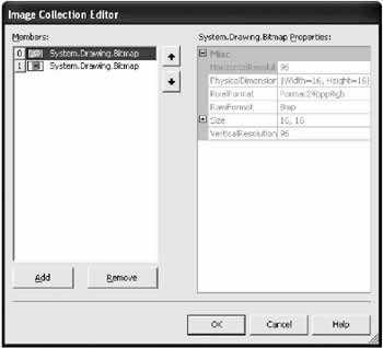
Figure 6-1: The ImageList designer
Dealing with the ImageList in Code
If you look at the automatically generated code, you'll see that the image files you add are stored in a resource file in your project (as is any binary data added at design time). When the form is loaded, the images are deserialized into Image objects and placed in the collection. A special class, the ImageListStreamer, makes this process a simple one-line affair, regardless of how many images are in your ImageList. This code is inserted automatically by VS .NET, and doesn't need to be modified manually
this.imagesLarge.ImageStream = ((System.Windows.Forms.ImageListStreamer)
 (resources.GetObject("imagesLarge.ImageStream")));
If you want to have an ImageList object around for a longer period (for example, to use in different forms), you should create it directly in code. You might also want to create Image objects out of graphic files rather than use a project resource.
First, you need a variable to reference the ImageList.
private ImageList iconImages = new ImageList();
Then, you can create a method that fills the ImageList.
// Configure the ImageList.
iconImages.ColorDepth = System.Windows.Forms.ColorDepth.Depth8Bit;
iconImages.ImageSize = new System.Drawing.Size(16, 16);

// Get all the icon files in the current directory.
string[] iconFiles = Directory.GetFiles(Application.StartupPath, "*.ico");

// Create an Image object for each file and add it to the ImageList.
// You can also use an Image subclass (like Icon).
foreach (string iconFile in iconFiles)
{
 Icon newIcon = new Icon(iconFile);
 iconImages.Images.Add(newIcon);
}
Once you have images in an ImageList control, you can use them to provide pictures to another control. Many modern controls provide an ImageList property, which stores a reference to an ImageList control. Individual items in the control (like tree nodes or list rows) then use an ImageIndex or similar property, which identifies a single picture in the ImageList by index number (starting at 0). You look at examples that use this technique later in this chapter.
In the meantime, you should also note that the ImageList can be a useful way to store images that you need to use in any scenario. The example that follows loops through an ImageList and draws its images directly onto the surface of a form. The result is shown in Figure 6-2.
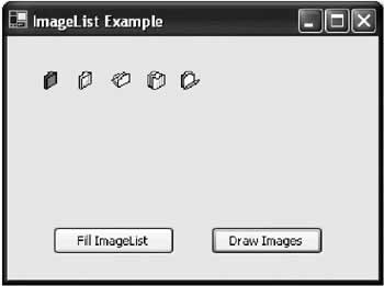
Figure 6-2: Directly outputting an ImageList
// Get the graphics device context for the form.
Graphics g = this.CreateGraphics();

// Draw each image using the ImageList.Draw() method.
for (int i = 0; i < iconImages.Images.Count; i++)
{
 iconImages.Draw(g, 30 + i * 30, 30, i);
}

// Release the graphics device context.
g.Dispose();
As with all manual drawing, these icons are erased as soon as the form is repainted (for example if you minimize and then maximize it). I tackle this issue in Chapter 12.

 Companion Web Site
Basic ListViewThe ListView control is most often used for a multicolumn list of items. It actually supports four distinct modes that you have probably already seen in Windows Explorer. You specify the mode by setting the ListView.View property to one of the values from the View enumeration.
To understand the different styles of ListView, it helps to create a simple example. First, create a ListView and two ImageList controls, one to hold any required small icons and one to hold large icons. You can associate the ListView with the corresponding ImageList like this: listAuthors.SmallImageList = imagesSmall; listAuthors.LargeImageList = imagesLarge; Once the ImageList is associated, images can be assigned to individual list items by setting a convenient ImageIndex property. You can change the ImageIndex at any time to indicate an item that has changed status. What follows is the code needed to load information into a ListView, in response to a button click. This example relies on a GetProducts() method that returns a DataTable (either by querying a database or by constructing it manually). I won't talk about the ADO.NET code you might use to create this DataTable (as this is better served by a dedicated book about databases and .NET), although you can look at the online code for this chapter to see the details. As with most of the examples I use, the data is retrieved from an XML file, which guarantees that you can use the examples even if you don't have a relational database product handy.
private void cmdFillList_Click(object sender, System.EventArgs e)
{
 // Fill a DataTable using a helper class (not shown).
 DataTable dt = StoreDB.GetProducts();

 foreach (DataRow dr in dt.Rows)
 {
 // Create the item, with the text from the ModelName field.
 ListViewItem listItem = new ListViewItem(dr["ModelName"].ToString());

 // Give every item the same picture.
 listItem.ImageIndex = 0;

 // Add the item to the ListView.
 listAuthors.Items.Add(listItem);
 }
}
This is ListView code is at its simplest. ListViewItem objects are created, and added to the list. The ListViewItem constructor allows you to specify the default item text (the Text property) and the ImageIndex points to the first picture in the collection. Note that the ImageIndex applies to both the SmallImageList and LargeImageList, meaning that your ImageList objects must use the exact same ordering. The appropriate picture is chosen based on the view style. Finally, to make the code a little more interesting, a group of radio buttons allows the user to switch between the different view styles. Rather than scatter the code for this in multiple procedures, use a single method that retrieves a tag value:
private void NewView(object sender, System.EventArgs e)
{
 // Set the current view mode based on the number in the tag value of the
 // selected radio button.
 listAuthors.View = (View)(((Control)sender).Tag);

 // Display the current view style.
 this.Text = "Using View: " + listAuthors.View.ToString();
}
The tag values can be set at design time or in code when the form is first loaded: optLargeIcon.Tag = View.LargeIcon; optSmallIcon.Tag = View.SmallIcon; optDetails.Tag = View.Details; optList.Tag = View.List; The NewView() method is attached to the CheckedChanged control event for all four option buttons in the form's initialization code: this.optList.CheckedChanged += new System.EventHandler(this.NewView); this.optDetails.CheckedChanged += new System.EventHandler(this.NewView); this.optSmallIcon.CheckedChanged += new System.EventHandler(this.NewView); this.optLargeIcon.CheckedChanged += new System.EventHandler(this.NewView); If you try this application, you'll see that it doesn't appear to work in details view. The reason is that the ListView only displays information in details view if you have added the appropriate column headers. The example below rewrites the ListView code to fill multiple columns of information. Note, however, that this extra information is ignored in other view styles.
private void cmdFillList_Click(object sender, System.EventArgs e)
{
 DataTable dt = StoreDB.GetProducts();

 // Suspending automatic refreshes as items are added/removed.
 listAuthors.BeginUpdate();

 foreach (DataRow dr in dt.Rows)
 {
 ListViewItem listItem = new ListViewItem(dr["ModelName"].ToString());
 listItem.ImageIndex = 0;

 // Add sub-items for Details view.
 listItem.SubItems.Add(dr["ProductID"].ToString());
 listItem.SubItems.Add(dr["Description"].ToString());

 listAuthors.Items.Add(listItem);
 }

 // Add column headers for Details view.
 listAuthors.Columns.Add("Product", 100, HorizontalAlignment.Left);
 listAuthors.Columns.Add("ID", 100, HorizontalAlignment.Left);
 listAuthors.Columns.Add("Description", 100, HorizontalAlignment.Left);

 // Re-enable the display.
 listAuthors.EndUpdate();
}
When adding a ColumnHeader, you have the chance to specify a width in pixels, a title, and the alignment for values in the column. Figure 6-4 shows the four different view styles. This test program is included with the chapter code with the project name ListViewExample.
The ListView is different from almost any other grid control in that it designates every column except the first one as a subitem. This idiosyncrasy shouldn't trouble you too much, but note that it causes the column header indexes to differ from the subitem indexes. For example, listItem.SubItems.Items(0) is the first subitem while the corresponding column is listAuthors.Columns.Items(1).
|
|||||||||||||||||||||||||||||||||||||||||||||||||||||
Advanced ListView TricksTo unlock all the functionality of the ListView control, you need to delve deeper into the .NET classes that support it. Some of the highlights are described in Table 6-3.
If you decide to use the ListView as a grid control, you can use a few useful properties to fine-tune the display by adding gridlines and row selection (rather than single-column value selection): listAuthors.GridLines = true; listAuthors.FullRowSelect = true; You probably also want to add the ability to sort and rearrange columns. If you only need to sort using the ListItem.Text property, you can make use of the Sorting property. listAuthors.Sorting = SortOrder.Ascending; If you want to provide column sorting in details view, life is a little more difficult. The ListView control has no intrinsic support for sorting by column. However, you can easily develop a custom IComparer sorting class to handle the task. This class has a simple responsibility: examine two ListView objects, and return a 1, 0, or −1 depending on how they compare. The best option is to create an IComparer class that stores a column index as a public member variable, allowing it to provide sorting for any column. In addition, the example includes a Boolean member variable called Alphabetic that allows two types of sorting: numeric or letter-by-letter alphabetic. For simplicity's sake, this class doesn't use any type of error checking.
public class CompareListViewItems : IComparer
{
 // This index identifies the column that is used for sorting
 public readonly int Column;

 // Is the sort alphabetic or number?
 public readonly bool Alphabetic;

 public CompareListViewItems(int columnIndex, bool alphabetic)
 {
 this.Column = columnIndex;
 this.Alphabetic = alphabetic;
 }

 public int Compare(object x, object y)
 {

 // Convert the items that must be compared into ListViewItem objects.
 string listX = ((ListViewItem)x).SubItems[Column].Text;
 string listY = ((ListViewItem)y).SubItems[Column].Text;

 // Sort using the specified column and specified sorting type.
 if (Alphabetic)
 {
 return listX.CompareTo(listY);
 }
 else
 {
 if (int.Parse(listX) > int.Parse(listY))
 {
 return 1;
 }
 else if (int.Parse(listX) == int.Parse(listY))
 {
 return 0;
 }
 else
 {
 return -1;
 }
 }
}
Now, you can easily create a ListView that re-sorts itself as a column header when it is clicked by handling the ColumnClicked event, generating a new CompareListViewItems object, and calling the ListView.Sort() method:
private void listAuthors_ColumnClick(object sender, ColumnClickEventArgs e)
{
 // Specify an alphabetic sort based on the column that was clicked.
 listAuthors.ListViewItemSorter = new CompareListViewItems(e.Column, true);

 // Perform the sort.
 listAuthors.Sort();
}
Another interesting trick is column reordering. This allows the user to rearrange columns by dragging the column header. This technique takes place automatically, if you set the AllowColumnReorder property to true. Unfortunately, there is no easy way to save these view settings and apply them later. To manage this type of advanced data display, you may want to consider the DataGrid control described in Chapter 9. Label EditingThe ListView includes an automatic label-editing feature that you have probably already witnessed in Windows Explorer. You trigger the label editing by clicking a selected item once. This automatic editing is confusing to many new users. If you use it, you should also provide another way for the user to edit the corresponding information. To enable label editing, set the LabelEdit property to true. You can programmatically start label editing for a node using the node's BeginEdit() method.
private void cmdStartEdit_Click(object sender, System.EventArgs e)
{
 // The user clicked a dedicated "Edit" button.
 // Put the label of the first selected item into edit mode.
 if (list.SelectedItems.Count > 0)
 {
 list.SelectedItems[0].BeginEdit();
 }

 // (You might also want to disable other controls until the user completes
 // the edit and the AfterLabelEdit event fires.)
}
In addition, you can prevent certain nodes from being edited by handling the BeforeLabelEdit event and setting the Cancel flag to true. You can also fix up any invalid changes by reacting to the AfterLabelEdit event.
Adding Information to a ListViewA typical application often needs to store information about display items that isn't rendered in the user interface. For example, you might want to keep track of unique identifier numbers that will allow you to look up a given item in a database, but you won't show this information to the end user, because it's of no use. Sometimes, programmers handle this in a control-specific way using hidden columns or other work arounds. However, a more generic and elegant approach is to find some way to bind the extra information to the control. There are three ways that you can add additional information to a ListView control to represent custom data.
Chapter 9 introduces a reusable pattern that allows a control to interact with data objects without needing to know their database-specific internals. It also provides the flexibility to change data access strategies or the display control. |
||||||||||||||||||||||||||||||||||||||||||||||||||||||||||||||||||||||||||||||||||||||||||
Basic TreeViewThe TreeView is a hierarchical collection of elements, which are called nodes. This collection is provided through the TreeView.Nodes property. With this collection, it's quite easy to add a few basic nodes:
treeFood.Nodes.Add("Apple");
treeFood.Nodes.Add("Peach");
treeFood.Nodes.Add("Tofu");
In this example, three nodes are added with descriptive text. If you've worked with the TreeView before through its ActiveX control, you might notice that the .NET implementation dodges a few familiar headaches, because it doesn't require a unique key for relating parent nodes to child nodes. This means it's easier to quickly insert a new node. It also means that unless you take specific steps to record a unique identifier with each item, you won't be able to distinguish duplicates. For example, the only difference between the two "Apple" entries in the example is their respective position in the list. To specify more information about a node, you have to construct a TreeNode object separately, and then add it to the list. In the example that follows, a unique identifier is stored in the Tag property. TreeNode newNode = new TreeNode(); newNode.Text = "Apple"; newNode.Tag = 1; treeFood.Nodes.Add(newNode); In this case, a simple integer is used, but the Tag property can hold any type of object if needed, even a reference to a corresponding database record.
foreach (DataRow drFood in dtFoods.Rows)
{
 TreeMode newNode = new TreeNode();
 newNode.Text = drFoods["Name"].ToString();
 newNode.Tag = drFood;
 treeFood.Nodes.Add(newNode);
}
TreeView StructureNodes can be nested in a complex structure with a virtually unlimited number of layers. Adding subnodes is similar to adding submenu items. First you find the parent node, and then you add the child node to the parent's Nodes collection.
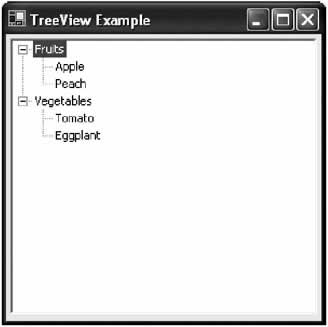
TreeNode node;

node = treeFood.Nodes.Add("Fruits");
node.Nodes.Add("Apple");
node.Nodes.Add("Peach");

node = treeFood.Nodes.Add("Vegetables");
node.Nodes.Add("Tomato");
node.Nodes.Add("Eggplant");
The Add() method always returns the newly added node object. You can then use this node object to add child nodes. If you wanted to add child nodes to the Apple node you would follow the same pattern, and catch the node reference returned by the Add() method. This code produces a hierarchical tree structure as shown in Figure 6-5.
Microsoft suggests that the preferred way to add items to a TreeView is by using the AddRange() method to insert an entire block of nodes at once. It works similarly, but requires an array of node objects.
TreeNode[] nodes = new TreeNode[2];

nodes[0] = new TreeNode("Fruits");
nodes[0].Nodes.Add("Apple");
nodes[0].Nodes.Add("Peach");

nodes[1] = new TreeNode("Vegetables");
nodes[1].Nodes.Add("Tomato");
nodes[1].Nodes.Add("Eggplant");

treeFoods.Nodes.AddRange(nodes);
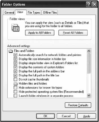
By using this technique, you ensure that the TreeView is updated all at once, improving performance dramatically. You can achieve a similar performance gain by using the BeginUpdate() and EndUpdate() methods, which suspends the graphical refresh of the TreeView control, allowing you to perform a series of operations at once. // Suspend automatic refreshing. treeFood.BeginUpdate(); // (Add or remove several nodes here.) // Enable automatic refreshing. treeFood.EndUpdate(); TreeView NavigationThe TreeView's multileveled structure can make it difficult to navigate through your tree structure to perform common tasks. For example, you might want to use a TreeView to provide a hierarchical list of check box settings (as Windows does for the View tab in its Folder Options, shown in Figure 6-6). You can configure the TreeView to display check boxes next to each node by setting a single property: treeSettings.CheckBoxes = true;
When the OK or Apply button is clicked, you then search through the list of settings and make the corresponding changes. The following section of code might seem like a reasonable attempt, but it won't work:
foreach (TreeNode node in treeSettings.Nodes)
{
 // (Process node here.)
}
The problem is that the TreeView.Nodes collection only contains the first level of the nodes hierarchy, which in this case corresponds to the main groupings (like "Files and Folders.") The correct code would go another level deep:
Dim node, nodeChild As TreeNode
foreach (TreeNode node in treeSettings.Nodes)
{
 // (Process first-level node here.)
 foreach (TreeNode nodeChild in node.Nodes)
 {
 // (Process second-level node here.)
 }
}
Alternatively, if you have a less structured organization where similar types of elements are held at various levels, you need to search through all the nodes recursively. The following code calls a ProcessNodes procedure recursively until it has walked through the entire tree structure.
private void cmdOK_Click(object sender, System.EventArgs e)
{
 // Start the update.
 ProcessNodes(treeSettings.Nodes);
}

private void ProcessNodes(TreeNodeCollection nodes)
{
 foreach (TreeNode node in nodes)
 {
 ProcessNode(node);
 ProcessNodes(node.Nodes);
 }
}

private void ProcessNode(TreeNode node)
{
 // Check if the node interests us.
 // If it does, process it.
 // To verify that this routine works, display the node text.
 MessageBox.Show(node.Text);
}
You can also use relative-based navigation. In this model, you don't iterate through the whole collection. Instead, you go from a current node to another node. currentNode = currentNode.Parent.Parent.NextNode; This example takes the current node, finds its parent (by moving one level up the hierarchy), then finds the parent's parent, and then moves to the next sibling (the next node in the list that is at the same level). If there is no next node, a null reference is returned. If one of the parents is missing, an error occurs. Table 6-4 lists the relative-based navigation properties you can use.
The next example shows how you could use the relative-based navigation to walk over every node in a tree.
private void cmdOK_Click(object sender, System.EventArgs e)
{
 // Start the update.
 ProcessNodes(treeUsers.Nodes.Item[0]);
}

private void ProcessNodes(TreeNode nodeStart)
{
 do
 {
 ProcessNode(nodeStart);

 // Check for contained (child nodes).
 if (nodeStart.Nodes.Count > 0)
 {
 ProcessNodes(nodeStart.FirstNode);
 }

 // Move to the next (sibling) node.
 nodeStart = nodeStart.NextNode();
 }
 while (nodeStart != null);
}

private void ProcessNode(TreeNode node)
{
 // Check if the node interests us.
 // If it does, process it.
 // To verify that this routine works, display the node text.
 MessageBox.Show(node.Text);
}
This type of navigation is generally less common in .NET programs, because the collection-based syntax is more readable and easier to deal with.
Manipulating NodesNow that you have a good idea of how to add nodes and find them in the tree structure, it's time to consider how nodes can be deleted and rearranged. Once again, you use the methods of the Nodes collection. Generally, the best way to delete a node is by first obtaining a reference to the node. You could also remove a node using its index number, but index numbers can change as nodes are removed or if sorting is used, so they raise the potential for unexpected problems. Once again, consider our tree of food products:
TreeNode node;

node = treeFood.Nodes.Add("Fruits");
node.Nodes.Add("Apple");
node.Nodes.Add("Peach");

node = treeFood.Nodes.Add("Vegetables");
node.Nodes.Add("Tomato");
node.Nodes.Add("Eggplant");
You can now search for the "Fruits" node in the collection and delete it. Note that when you use the Remove() method, all the child nodes are automatically deleted as well.
foreach (TreeNode searchNode in treeFood.Nodes)
{
 if (searchNode.Text == "Fruits")
 {
 treeFood.Nodes.Remove(searchNode);
 }
}
You can use the Remove() method to delete a node that exists several layers down the hierarchy. What that means is that if you obtain a reference to the "Apple" node, you can delete it directly from the treeFood.Nodes collection even though the collection doesn't really contain that node.
TreeNode nodeApple, nodeFruits;
nodeFruits = treeFood.Nodes.Add("Fruits");
nodeApple = nodeFruits.Nodes.Add("Apple");

// This works. It finds the nodeApple in the nodeFruits.Nodes sub-collection.
treeFood.Nodes.Remove(nodeApple);

// This also works. It directly removes the apple from nodeFruits.Nodes.
nodeFruits.Nodes.Remove(nodeApple);
The Nodes property provides an instance of the TreeNodeCollection. Table 6-5 lists a few more of its node manipulation features. Some, like the ability to Clear() all child nodes and Insert() a node at a specific position, are particularly useful.
.NET provides another way to manipulate nodes-using their own methods. For example, you can delete a node without worrying about what TreeView it belongs to by using the Node.Remove() method. This shortcut is extremely convenient. nodeApple.Remove(); Nodes also provide a built-in clone method that copies the node and any child nodes. This can allow you to transfer a batch of nodes between TreeView controls without needing to iterate over the Nodes collection. (A node object cannot be assigned to more than one TreeView control.) // Select the first node. TreeNode node = treeOrigin.Nodes[0]; // Clone it and all the sublevels. TreeNode nodeNew = node.Clone(); // Add the nodes to a new tree. treeDestination.Add(nodeNew); Selecting NodesOn their own, TreeNode objects don't raise any events. The TreeView control, however, provides notification about important node actions like selections and expansions. Each of these actions is composed of two events: a "Before" event that occurs before the TreeView display is updated, and an "After" event that allows you to react to the event in the traditional way when it is completed. (You'll see in some of the advanced examples how the "Before" event can allow you to perform just-in-time node additions. This technique is used in Table 6-6 lists the key TreeView events.
Every custom event in the TreeView is node-specific, and provides a reference to the relevant node. The TreeView control also inherits some generic events that allow it to react to mouse-clicks and other actions that occur to any part of the control, but these are generally not very useful. These TreeView node-based events provide a special TreeViewEventArgs object. This object has two properties: a Node property that provides the affected node, and an Action property that indicates how the action was triggered. The Action property uses the TreeViewAction enumeration, and can indicate whether an event was caused by a key press, mouse-click, or a node expansion/collapse. The next example reacts to the AfterSelect event and gives the user the chance to remove the selected node. You'll notice that when a node is deleted, the closest node is automatically selected.
private void treeUsers_AfterSelect(object sender,

 System.Windows.Forms.TreeViewEventArgs e)
{
 string message;
 message = "You selected " + e.Node.Text + " with this action: " +
 e.Action.ToString() + "

Delete it?";

 DialogResult result;
 result = MessageBox.Show(message, "Delete", MessageBoxButtons.YesNo);
 if (result == DialogResult.Yes)
 {
 e.Node.Remove();
 }
}
Depending on your TreeView, just having a reference to the node object may not be enough. For example, you might add duplicate node entries into different subgroups. This technique isn't that unusual: for example, you might have a list of team members subgrouped by role (programmer, tester, documenter, and so on). A single team member might play more than one role. However, depending on what subgroup the selected node is in, you might want to perform a different action. In this case, you need to determine where the node is positioned. You can use the node-relative properties (like Parent) to move up the tree, or you can retrieve a string that represents the full path from the node's FullPath property. A few possible values for the FullPath property are: Fruits FruitsPeach CountryStateCityStreet In these examples, a backslash is used to separate each tree level, although you can set a different delimiter by setting the TreeView.PathSeparator property. |
|||||||||||||||||||||||||||||||||||||||||||||||||||||||||||||||||||||||||||||||||||||||||||||||||
Advanced TreeView TricksThe TreeView is a sophisticated control, and it provides a great deal of customization possibilities. Some of the additional appearance-related properties are described in Table 6-7.
The TreeNode also provides some useful properties that haven't been discussed yet (Table 6-8). Mainly, these properties allow you to determine the state of node. Additional properties exist that let you modify a node's background and foreground color, and determine its relatives, as you saw earlier.
Node PicturesOne frequently used feature is the ability to assign icons to each node. As with all modern controls, this works by using a paired ImageList control. treeFood.ImageList = imagesFood; You can assign a default picture index that will be used by any node that does not specifically override it: treeFood.ImageIndex = 0; You can set an image for each individual node through the properties of the TreeNode object. Each node can have two linked images: a default image, and one that is used when the node is selected.
TreeNode node = new TreeNode("Apples");
node.ImageIndex = 1;
node.SelectedImageIndex = 2;
treeFood.Nodes.Add(node);
Expanding and Collapsing LevelsYou've already learned how to react when the user expands and collapses levels. However, you can also programmatically expand and collapse nodes. There are many uses for this trick:
.NET provides a few ways to accomplish these tasks. First, every node provides four useful methods: Collapse(), Expand(), ExpandAll(), and Toggle(). The Expand() method acts on the immediate children, while ExpandAll() expands the node and all subnodes. To expand or collapse the entire tree, you can use one of the TreeView methods: ExpandAll() or CollapseAll(). node.Expand(); // Expand the node to display its immediate children. node.Toggle(); // Switches the node: it was expanded, so now it is collapsed. node.ExpandAll(); // Expand all nodes and subnodes. tree.ExpandAll(); // Expand the entire tree. You can also use a node's EnsureVisible() method. This extremely useful method expands whatever nodes are required to make a node visible, and scrolls to the appropriate location. This is extremely useful if you are iterating through a tree looking for a node that matches certain criteria.
// Search the first level of a TreeView control.
foreach (TreeNode node in tree.Nodes)
{
 if ((int)(node.Tag) == 12)
 {
 // Collapse the whole tree to hide unimportant nodes.
 tree.CollapseAll();

 // Expand just the node that interests the user.
 node.EnsureVisible();
 break;
 }
}
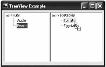
The TreeView control also provides a TopNode property that references the first fully visible node at the top of the current display window. It also provides a VisibleCount property that identifies the maximum number of nodes that can be displayed at a time in the TreeView at its current height. TreeView Drag and DropTreeView controls can support drag-and-drop operations just as easily as any other .NET control. However, when information is dragged onto a TreeView, you generally need to determine what node it was "dropped" on. To perform this magic, you need to perform your own hit testing, with a little help from the TreeView.GetNodeAt() method. The following example presents a form with two TreeViews. The user can drag a node from one TreeView to the other TreeView, or to another location in the same TreeView (see Figure 6-7). When a node is dropped, its content is copied, and the original branch is left untouched. Best of all, the code is generic, meaning that one set of event handlers responds to the events from both trees.
To start, you need to make sure that both TreeView controls can receive drag-and-drop events. At the same time, disable the HideSelection property so that you can highlight the node that will be the drop target, even if the TreeView doesn't have the focus. treeOne.AllowDrop = true; treeTwo.AllowDrop = true; treeOne.HideSelection = false; treeTwo.HideSelection = false; The step is to create the MouseDown event handling logic that starts the drag-and-drop operation. This code needs to investigate whether there is a node under the mouse pointer. If there is, the node is copied (along with all subnodes) and a drag-and-drop operation is started.
private void tree_MouseDown(object sender, System.Windows.Forms.MouseEventArgs e)
{
 // Get the tree.
 TreeView tree = (TreeView)sender;

 // Get the node underneath the mouse.
 TreeNode node = tree.GetNodeAt(e.X, e.Y);
 tree.SelectedNode = node;

 // Start the drag-and-drop operation with a cloned copy of the node.
 if (node != null)
 {
 tree.DoDragDrop(node.Clone(), DragDropEffects.Copy);
 }
}
Note that all the TreeView event handlers handle events in both trees. For example, the MouseDown event handler is attached to treeOne.MouseDown and treeTwo.MouseDown. This provides the flexibility that allows the user to drag nodes back and forth between both trees. In addition, this means that the event handler must retrieve the TreeView reference from the sender parameter to determine which tree fired the event. Next, both trees need to handle the DragOver event. Note that you use this event, instead of the DropEnter event, because the operation is permitted or allowed based on whether there is a node under the current mouse pointer.
private void tree_DragOver(object sender, System.Windows.Forms.DragEventArgs e)
{
 // Get the tree.
 TreeView tree = (TreeView)sender;

 // Drag and drop denied by default.
 e.Effect = DragDropEffects.None;

 // Is it a valid format?
 if (e.Data.GetData(typeof(TreeNode)) != null)
 {
 // Get the screen point.
 Point pt = new Point(e.X, e.Y);

 // Convert to a point in the TreeView's coordinate system.
 pt = tree.PointToClient(pt);

 // Is the mouse over a valid node?
 TreeNode node = tree.GetNodeAt(pt);
 if (node != null)
 {
 e.Effect = DragDropEffects.Copy;
 tree.SelectedNode = node;
 }
 }
}
Note that the drag-and-drop events provide mouse coordinates in the screen's frame of reference (measuring from the top left corner of the desktop). To perform the hit testing, you need to convert this point to a point in the TreeView control's coordinate system (which measures from the top left of the control). Finally, the actual copied node is inserted by a DragDrop event handler. The node that contains the added node is expanded to ensure that the addition is visible.
private void tree_DragDrop(object sender, System.Windows.Forms.DragEventArgs e)
{
 // Get the tree.
 TreeView tree = (TreeView)sender;

 // Get the screen point.
 Point pt = new Point(e.X, e.Y);

 // Convert to a point in the TreeView's coordinate system.
 pt = tree.PointToClient(pt);

 // Get the node underneath the mouse.
 TreeNode node = tree.GetNodeAt(pt);

 // Add a child node.
 node.Nodes.Add((TreeNode)e.Data.GetData(typeof(TreeNode)));

 // Show the newly added node if it is not already visible.
 node.Expand();
}
You can try this example in the TreeViewDragAndDrop project. This example doesn't provide any restrictions—it allows you to copy nodes anywhere you want. Most programs probably add more restrictive logic in the DragOver event handler. In addition, you might want to create a tree where dragging and dropping moves items instead of copies them. In this case, the easiest approach is to store a reference to the original node object (without cloning it): tree.DoDragDrop(node, DragDropEffects.Copy); The DragDrop event handler would then remove the node from the source tree, and add it to the target tree. However, you would typically need to perform some validation to ensure that the dragged node is an allowed child of the target node. TreeNode nodeDragged = e.Data.GetData(typeof(TreeNode)); // Copy to new position. node.Nodes.Add(nodeDragged.Clone()); // Remove from original position. nodeDragged.Remove();
|
||||||||||||||||||||||||||||||||||||||||||||||||||||||||||||||||||||||
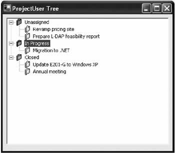
Taming the TreeViewThe TreeView control provides a sophisticated infrastructure that allows it to be used in countless different ways. Each individual TreeView, however, is generally only used in a specific set of limited ways, depending on the underlying data it represents. That means that the TreeView is an ideal control for subclassing. A Project TreeYou can easily create custom TreeView classes that are targeted for a specific type of data. Consider the ProjectTree class that follows:
public class ProjectTree : TreeView
{
 // Use an enumeration to represent the three types of nodes.
 // Specific numbers correspond to the database field code.
 public enum StatusType
 {
 Unassigned = 101,
 InProgress = 102,
 Closed = 103
 }

 // Store references to the three main node branches.
 private TreeNode nodeUnassigned = new TreeNode("Unassigned", 0, 0);
 private TreeNode nodeInProgress = new TreeNode("In Progress", 1, 1);
 private TreeNode nodeClosed = new TreeNode("Closed", 2, 2);

 // Add the main level of nodes when the control is instantiated.
 public ProjectTree() : base()
 {
 base.Nodes.Add(nodeUnassigned);
 base.Nodes.Add(nodeInProgress);
 base.Nodes.Add(nodeClosed);
 }

 // Provide a specialized method the client can use to add nodes.
 public void AddProject(string name, StatusType status)
 {
 TreeNode nodeNew = new TreeNode(name, 3, 4);
 nodeNew.Tag = status;

 switch (status)
 {
 case StatusType.Unassigned:
 nodeUnassigned.Nodes.Add(nodeNew);
 break;
 case StatusType.InProgress:
 nodeInProgress.Nodes.Add(nodeNew);
 break;
 case StatusType.Closed:
 nodeClosed.Nodes.Add(nodeNew);
 break;
 }
 }
}
When you use this class in a program, you don't add nodes objects; instead, you add projects. The only variable elements for a project are the name and the status. Once your class has these two pieces of information, it can automatically add a node to the correct branch with the correct icon. (The icons are identified by numbers and only come into effect if an appropriately configured ImageList is attached to the ImageList property. This detail could be incorporated in the ProjectTree class, but it would require more work and wouldn't produce any obvious benefits.) The client might use this custom TreeView as follows:
ProjectTree treeProjects = new ProjectTree();
treeProjects.Dock = DockStyle.Fill;
this.Controls.Add(treeProjects);

treeProjects.ImageList = imagesProjects;
DataTable dtProjects = GetAllProjects();

foreach (DataRow drProject in dtProjects.Rows)
{
 treeProjects.AddProject(drProject("Name").ToString(),
 drProject("Status").ToString());
}
The resulting display is shown in Figure 6-8.
The appeal of this approach is that the appropriate user interface class wraps many of the extraneous details and makes the rest of the code more readable. Depending on your application, you might want to develop a custom TreeView like this into a separate assembly you can reuse in different products. There's no limit to the possible features you can add to a TreeView class. For example, you can add special methods for finding nodes or presenting context menus. The danger is that you will make the control too specific, locking functionality into places where it can't be reused. Remember to think of your custom TreeView as a generic TreeView designed for a specific type of data. However, it should allow many different possible uses of that data. For example, if you determine that a user action should result in a database select or update, you must raise an event from the TreeView, and allow the code receiving that event to take care of the data layer. A Data Aware TreeViewAnother approach is to create a custom TreeView that recognizes the appropriate DataRow objects natively. When an item is selected, the custom class raises a specialized event that is more useful than the generic AfterSelect event. A different event is raised depending on the type of selected item, and the original DataRow object is returned as an argument.
public class ProjectUserTree : TreeView
{
 // Use an enumeration to represent the two types of nodes.
 public enum NodeType
 {
 Project,
 User
 }

 // Define a new type of higher-level event for node selection.
 public delegate void ItemSelectEventHandler(object sender,
 ItemSelectEventArgs e);

 public class ItemSelectEventArgs : EventArgs
 {
 public NodeType Type;
 public DataRow ItemData;
 }

 // Define the events that use this signature and event arguments.
 public event ItemSelectEventHandler UserSelect;
 public event ItemSelectEventHandler ProjectSelect;

 // Store references to the two main node branches.
 private TreeNode nodeProjects = new TreeNode("Projects", 0, 0);
 private TreeNode nodeUsers = new TreeNode("Users", 1, 1);

 // Add the main level of nodes when the control is instantiated.
 public ProjectUserTree() : base()
 {
 base.Nodes.Add(nodeProjects);
 base.Nodes.Add(nodeUsers);
 }

 // Provide a specialized method the client can use to add projects.
 // Store the corresponding DataRow.
 public void AddProject(DataRow project)
 {
 TreeNode nodeNew = new TreeNode(project["Name"].ToString(), 2, 3);
 nodeNew.Tag = project;
 nodeProjects.Nodes.Add(nodeNew);
 }

 // Provide a specialized method the client can use to add users.
 // Store the corresponding DataRow.
 public void AddUser(DataRow user)
 {
 TreeNode nodeNew = new TreeNode(user["Name"].ToString(), 2, 3);
 nodeNew.Tag = user;
 nodeUsers.Nodes.Add(nodeNew);
 }

 // When a node is selected, retrieve the DataRow and raise the event.
 protected override void OnAfterSelect(TreeViewEventArgs e)
 {
 base.OnAfterSelect(e);

 ItemSelectEventArgs arg = new ItemSelectEventArgs();
 arg.ItemData = (DataRow)e.Node.Tag;

 if (e.Node.Parent == nodeProjects)
 {
 arg.Type = NodeType.Project;
 ProjectSelect(this, arg);
 }
 else if (e.Node.Parent == nodeUsers)
 {
 arg.Type = NodeType.User;
 UserSelect(this, arg);
 }
 }
}
This technique of intercepting events and providing more useful, higher-level events is quite helpful, and provides an easier model to program against.
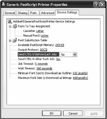
Unusual TreesAnother reason you might want to create a custom TreeView is to create an unusual tree like the one Windows uses for print settings (see Figure 6-9).
When a node is clicked in this window, an edit control (like a text box) is provided allowing information to be added in-place. Implementing a design like this, as long as you define clear rules, is fairly straightforward. You could store a collection of controls, or even store a control in each node's Tag property. In the OnAfterSelect() method, check to see if the node has a corresponding control, and if it does, display it next to the node. Design Time Support for the Custom TreeViewYou'll notice that your custom control class isn't added to the Toolbox. To accomplish that, you need to create a separate control project, as explained in Chapter 8. However, there's no reason that you can't use the custom TreeView class by instantiating manually in your code, as we saw earlier: ProjectTree tree = new ProjectTree(); tree.Dock = DockStyle.Fill; this.Controls.Add(tree); Another approach that works well for derived controls is to create a more basic, related control, and then modify the designer code in your form so that it creates your control instead. Then, you'll find that you can work with your control at design time, even setting its properties through the Properties window, without needing to create a separate project. In this example, you create a standard TreeView. Then, replace the following two lines (found at different places in the designer code): private tree As System.Windows.Forms.TreeView; this.tree = new System.Windows.Forms.TreeView(); With these lines (where CustomTreeView is the namespace of your project): private tree As CustomTreeView.ProjectTree; this.tree = new CustomTreeView.ProjectTree(); The tree even appears in the designer with its three main branches. Unfortunately, it also develops the nasty habit of adding its basic set of nodes twice: one at design-time, which is serialized in the form's designer code, and again at runtime. Chapter 8 explains how to code around these quirky behaviors. You can also refer to the CustomTreeView project included with the online samples. |
||||||||||||||||||
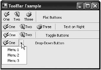
The ToolBarThe ToolBar control represents a strip of buttons that gives access to various features in an application. Conceptually, toolbars play the same role as menus. The difference is that toolbars are only a single level deep and are often restricted to the most important functions. Menus use a multilayered hierarchical structure that provides a single point of access to all features in an application. Toolbar buttons can include text and variable-size pictures. You can layer several toolbars on a form, and attach drop-down menus to a button. Figure 6-10 shows some common toolbar button styles.
Unfortunately, .NET does not currently provide any way to create a "cool bar," the snap-in toolbar strip used in applications like Microsoft Word that can include other controls (like drop-down list boxes) and can be manually detached by the user into floating tool windows. This is likely to change with future .NET framework releases (or third-party development). Until then, you can start to create your own using the information in Chapter 8, or use ActiveX interop with the components provided with Visual Studio 6. Most of the ToolBar properties are appearance-related (see Table 6-9).
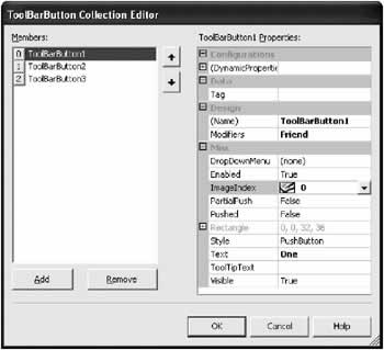
The most important part of a ToolBar is its Buttons property, which contains the collection of button controls. As with the TreeView and ListView, you can add individual ToolBarButton objects using a special designer in Visual Studio.NET (shown in Figure 6-11), or through code.
Each ToolBarButton provides its own set of important properties, as listed in Table 6-10.
Reacting to button clicks is not much different than reacting to a menu. You can handle each ToolBarButton.Click event separately, or you can handle them with the same event handler, and inspect the object reference to determine which button was clicked. |
|||||||||||||||||||||||||||||||||||||||||||||||||||||||||||||||||||||||||||||||||||||||||||||||
Synchronizing the ToolBarUsually, a toolbar duplicates functionality that is available in a window's menu. This can result in some rather tiresome state management code that has to carefully disable or enable menu items and the corresponding toolbar button at the same time. To simplify this process, you can create a customized menu class that automatically forwards its state to a linked toolbar control. This custom control project is a little trickier than some of the previous examples. For one thing, it limits your ability to use the menu designer, because the custom menu items need to be created and added through code. There's also more than one way to approach this problem. One possibility is to create a custom MenuItem class that stores a reference to a linked toolbar button.
public class LinkedMenuItem : MenuItem
{
 public ToolBarButton LinkedButton;

 // To save space, only one of the original constructors is used.
 public LinkedMenuItem(string text) : base(text)
 { }

 public bool Enabled
 {
 get
 {
 return base.Enabled;
 }
 set
 {
 base.Enabled = value;
 if (LinkedButton != null)
 {
 LinkedButton.Enabled = value;
 }
 }
 }
}
On the downside, this technique requires you to shadow the Enabled property (because it is not overridable), which is a sleight of hand that can further hamper design-time support for the menu. On the other hand, this is an extremely flexible approach. You could even replace LinkedButton with a collection that provides a whole series of controls that could be automatically enabled or disabled in the Enabled property procedure. Note that defensive programming is used to test the LinkedButton property before attempting to configure the referenced control, in case it has not been set. The client program can create a linked menu using this class like this:
MainMenu menuMain = new MainMenu();
this.Menu = menuMain;

LinkedMenuItem menuItem1 = new LinkedMenuItem("File");
LinkedMenuItem menuItem2 = new LinkedMenuItem("Exit");

// This ToolBarButton is defined as a form-level variable.
menuItem2.LinkedButton = this.ToolBarButton2;

menuMain.MenuItems.Add(menuItem1);
menuItem1.MenuItems.Add(menuItem2);

// Both the ToolBarButton and MenuItem are disabled at once.
menuItem2.Enabled = false;
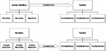
Another approach is to create a special MainMenu class. This class could provide an additional method that disables controls in tandem, without forcing you to observe this practice if you want to deal with MenuItem objects on your own. On the downside, you could forget to use the appropriate methods, and end up in an unsynchronized state. On the other hand, this approach provides you with more freedom. Figure 6-12 illustrates the difference.
The link is performed simply by setting the Tag property of the ToolBarItem to reference the appropriate MenuItem, but there are other possibilities. The Linked-MainMenu needs to iterate over all the buttons to find the matching one.
public class LinkedMainMenu : MainMenu
{
 public ToolBar LinkedToolbar;

 public void Enable(MenuItem item)
 {
 SetEnabled(true, item);
 }

 public void Disable(MenuItem item)
 {
 SetEnabled(false, item);
 }

private void SetEnabled(bool state, MenuItem item)
 {
 item.Enabled = state;
 if (LinkedToolbar != null)
 {
 foreach (ToolBarButton button in LinkedToolbar.Buttons)
 {
 if ((MenuItem)button.Tag == item)
 {
 button.Enabled = state;
 }
 }
 }
 }
}
And the client would follow this pattern:
LinkedMainMenu menuMain = new LinkedMainMenu();
menuMain.LinkedToolbar = myToolBar; // myToolBar is a form-level variable
this.Menu = menuMain;

MenuItem menuItem1 = new MenuItem("File");
MenuItem menuItem2 = new MenuItem("Exit");
menuMain.MenuItems.Add(menuItem1);
menuItem1.MenuItems.Add(menuItem2);

// (Create toolbar buttons as usual.)
ExitToolBarButton.Tag = menuItem2;

// Both the ToolBarButton and MenuItem are disabled at once.
menuMain.Disable(menuItem2);
In this case, I walked through two different approaches to creating a custom control. The following chapters won't have the luxury to be quite as discursive, but it's important that you start to think about all the possibilities for enhancing, customizing, and integrating controls. This is one of the most exciting aspects of .NET user interface programming. |
|||||||||||||||
The StatusBarThe StatusBar control is used to display brief information throughout the life of the application. This information should never be critical or take the place of informative messages or progress indicators, as many users won't notice it. This information should also be kept to a minimum to prevent a cluttered interface. Some possible status bar information includes:
These are some of the most useful ways to use a status bar. Status bars should never be used to display the current time. This common default is essentially useless, because the current time is always displayed in the system tray anyway. Although a status bar can be docked to any side (as set by the Dock property), it is always placed at the bottom of the window by convention. |
|||||||||||||||
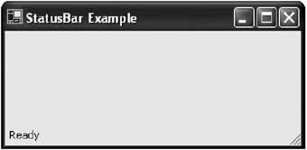
Basic StatusBarThere are two ways to use a status bar. You can display a single piece of text, or a combination of panels that can contain text or icons. To use a simple status bar, just set the ShowPanels and Text properties. This doesn't provide any border around the status bar (see Figure 6-13), so you might want to add an extra horizontal line above using a group box control.
statusBar.ShowPanels = false;
statusBar.Text = "Ready";
You can also tweak the Font for the current text and the SizingGrip property, which enables or disables the grip lines on the bottom right corner of the status bar (where the user can grab to resize the form). Alternatively, you can create a status bar that contains different pieces of information. This information is represented as a collection of StatusBarPanel objects in the Panels property. You can configure this collection at design-time using the custom designer, or at runtime in code. StatusBarPanel pnlNew = new StatusBarPanel(); pnlNew.Text = "Ready"; statusBar.Panels.Add(pnlNew); The StatusBarPanel object provides several appearance-related properties (see Table 6-11).
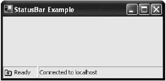
The code that follows creates a more sophisticated multipaneled status bar, shown in Figure 6-14:
StatusBarPanel pnlStatus = new StatusBarPanel();
pnlStatus.Text = "Ready";
pnlStatus.Icon = new Icon(Application.StartupPath + "\active.ico");
pnlStatus.AutoSize = StatusBarPanelAutoSize.Contents;

StatusBarPanel pnlConnection = new StatusBarPanel();
pnlConnection.Text = "Connected to " + serverName;
pnlConnection.AutoSize = StatusBarPanelAutoSize.Spring;

statusBar.Panels.Add(pnlStatus);
statusBar.Panels.Add(pnlConnection);
The StatusBar raises a PanelClick event that provides information about the mouse position and the StatusBarPanel object that was clicked. You can respond to this event to create system tray-like functionality. For example, you could add an icon that can be clicked to change modes. This technique can be neat, but it is often not obvious to the average end user.
Synchronizing the StatusBar to a MenuThere is no automatic way to connect menu item Help text to a status bar panel (some C++ programmers may remember this was a feature of the MFC application wizard). Before I tell you how you can do this, I should warn you why you might not want to. The problem with putting menu Help text in the status bar is that even advanced users rarely associate two controls together when they are separated by so much physical space. In other words, those who need the Help text will have no idea that it is there. Even worse, most users don't understand that they can hover over a menu item to select it, and probably just understand clicking a menu item, which immediately activates without providing the helpful information. Many critics complain that the status bar Help text feature is just a gambit to use up extra space in the status bar (see Figure 6-15).
If you still want to create this interface, all you need to do is handle the MenuItem.Select method. This technique is very similar to the example shown in Chapter 4. However, the MenuItem class doesn't provide any Tag property where you can store additional information (like the Help text). Instead, you have to keep a hashtable collection handy, and use the control reference to look up the Help string.
// This method handles mnuOpen.Click, mnuNew.Click, mnuSave.Click, and so on.

private void mnu_Click(object sender, System.EventArgs e)
{
 Status.Text = HelpCollection[sender];
}
You could also perform the same trick using a custom menu control, and overriding the OnSelect() method. It's similar to the technique used in the previous examples for the MenuItem interaction with a ToolBar. Chapter 7 shows a third way to implement this type of design-this time using a custom extender provider. |
||||||||||||||||||||||||||||||||||||||||||||||||||||||
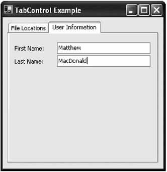
The TabControlThe TabControl is another staple of Windows development-it groups controls into multiple "pages." The technique has become remarkably successful because it allows a large amount of information to be compacted into a small, organized space. It's also easy to use because it recalls the tabbed pages of a binder or notebook. Over the years, the tab control has evolved into today's form, which is sometimes called property pages. In .NET, you create a TabControl object, which contains a collection of TabPage objects in the TabPages property. Individual controls are then added to each TabPage object. The example that follows shows the basic approach, assuming your form contains a TabControl called tabProperties.
TabPage pageFile = new TabPage("File Locations");
TabPage pageUser = new TabPage("User Information");

// Add controls to the tab pages.
// The code for creating and configuring the child controls is omitted.
pageUser.Controls.Add(txtFirstName);
pageUser.Controls.Add(txtLastName);
pageUser.Controls.Add(lblFirstName);
pageUser.Controls.Add(lblLastName);
tabProperties.TabPages.Add(pageFile);
tabProperties.TabPages.Add(pageUser);
The output for this code is shown in Figure 6-16.
The TabControl is easy to work with, and usually configured at design time. Some of its members are described in Table 6-12. TabPage properties are shown in Table 6-13.
|
||||||||||||||||||||||||||||||||||||||||||||||||||||||||||||||||||||||||||||||||||
The NotifyIconIn past programming frameworks, it's been difficult to use a system tray icon. In .NET it's as easy as adding a simple NotifyIcon control.
The NotifyIcon is an invisible control that appears in the component tray when added at design time. In many cases, it's more useful to create the NotifyIcon dynamically at runtime. For example, you might create a utility application that loads into the system tray and waits quietly, monitoring for some system event or waiting for user actions. In this case, you need to be able to create the system tray icon without displaying a form. A complete example of this technique is shown in Chapter 11. |
||||||||||||||||||||||||||||||||||||||||||
The Last WordIn this chapter you've toured some of the most important controls used in typical Windows user interfaces. Even as I've introduced these staples, I've already started to show you how you can tweak and extend them with custom control classes. Developing custom controls is one of the key ways to tame these full-featured controls. You'll see more examples throughout the book, including Chapter 7, where you will tackle a directory browser TreeView that reads information from the underlying file system automatically. |
|||||||||||||||
Custom Controls |
|||||||||||||||
Introduction
 Windows Forms and Custom Controls")
EAN: 2147483647
Pages: 142
