Design-Time Support for Custom Controls
Overview
The Custom Controls you have explored so far are full of promise. Being able to drop a tool like a directory browser or thumbnail viewer directly into your application without writing a single line of extra code is a remarkable advantage. However, there is one caveat. Though your custom controls perform wonders at runtime, many of them act oddly while a form is being designed. By default, only user controls appear in the toolbox, and even they only appear with a generic icon. Inherited controls need to be created in code, unless you create a similar control and manually edit the hidden designer instructions. Even if you use this trick, the results aren't always what you expect.
This chapter sorts through these quirks and shows how to create a control that behaves properly at design time. Some of the topics this chapter tackles include:
- Using attributes to classify and describe properties and other aspects of your control.
- Adding your control to the toolbox—with an icon.
- Using prebuilt UITypeEditor classes that allow directory names, collections, and other property types to be edited at design time.
- Creating your own UITypeEditor classes that allow your control to be configured with custom dialog windows.
- Using control designers to filter out unused properties, add designer wizards, and other tricks.
- Licensing your controls.
This chapter will explore these topics, and use them to revise some of the examples introduced in the previous chapter.

 Companion Web Site
Testing Custom ControlsTesting custom controls can sometimes be a little awkward. Visual Studio .NET provides several options:
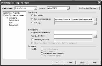
Even if you don't follow one of these specialized approaches, if an error occurs in your custom control code and the .vb source file is available, Visual Studio .NET automatically loads the file and enters break mode, pausing execution on the offending line. Debugging Design Time SupportIf you test your custom control in a project with the control source code, you are able to set breakpoints and use other debugging tricks. However, these breakpoints are ignored at design time, and only have an effect while the control is running "live." This limitation can hamper your testing to a certain extent. Developing good design-time support for your control requires a different set of considerations than creating its basic functionality. One solution to this problem is to debug the IDE itself. To accomplish this, add your control to the toolbox, and then configure your custom control project to start Visual Studio .NET when you run it (see Figure 8-8). You can now set breakpoints in your control code or custom designer code that are triggered as the control is manipulated in the IDE.
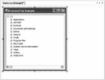
Testing for Design ModeYou may also notice some quirky design-time behavior that doesn't occur if the control is added programmatically. For example, if you add the DirectoryBrowser at design time, you'll discover some quirky behavior. At first, it seems straightforward enough-once you set the Drive property, the corresponding directory tree appears. You can even expand nodes and browse the directory structure at design time, as shown in Figure 8-9.
However, when you start your program, a second set of identical directory nodes appears. The problem is that the nodes you create at design time are automatically serialized to the form's designer code. At runtime, the control is re-created, the directory nodes are rebuilt when the drive property is set, and then the serialized nodes are added. There are several ways you can resolve this problem. First, you could change the order of the form designer lines so that the Drive property is configured after the serialized nodes are added (setting the Drive property automatically clears the current list of nodes). Alternatively, you could create a custom designer, as you do later in this chapter. The simplest approach, however, is just to configure DirectoryTree control so that it doesn't provide its directory Node display at design-time. You can do this by explicitly checking what mode the control is in before refreshing the display.
public char Drive
{
 get
 {
 return drive;
 }
 set
 {
 drive = value;
 if (!this.DesignMode)
 {
 RefreshDisplay();
 }
 }
}
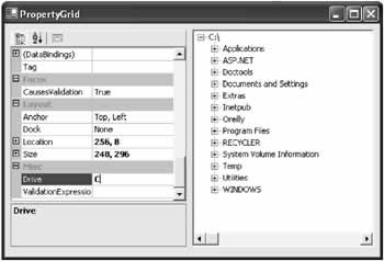
The PropertyGrid ControlAnother way to test your control is using .NET's specialized PropertyGrid control. This control is actually an exact replica of the Properties window contained in the Visual Studio .NET environment. You can add this control to a form, and use it to run your custom control through its paces by modifying any of its properties. This is a good practice to get into-if you try to set invalid property values, you'll probably discover that your control isn't as successful as you expect at rejecting them. By default, the PropertyGrid control doesn't appear in the toolbox. To add it, you need to choose Customize Toolbox and find it in the list. The PropertyGrid provides properties that allow you to format its appearance and configure its display. The most important property, however, is SelectedObject. When you set the SelectedObject to an instance of a control, the grid automatically fills with a list of all the available properties. When you change a property in the grid, it is applied to the control immediately. Figure 8-10 shows a test project that combines an instance of the DirectoryTree control with a PropertyGrid. This example is included with online samples for this chapter as the project named DirectoryTreeClient.
|
||||||||||||||||||
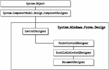
Custom DesignersOne of the problems with traditional ActiveX control development is that details about a control's design-time behavior are mingled with details about its runtime behavior. With .NET control development, this problem is neatly sidestepped by a new feature called a control designer. A control designer provides the design-time behavior for a control. The .NET framework provides a basic control designer in the System.Windows.Forms. Design.ControlDesigner class, and some derived classes that add support for child control containment and scrolling. Figure 8-11 shows the hierarchy.
Controls can also derive their own custom designers. Why would you create your own designer?
The next few sections consider all these topics by designing and enhancing a DirectoryTreeDesigner class that works with the DirectoryTree control. Filtering Properties and EventsSometimes, an event or property needs to be hidden from a control, but not removed entirely. For example, the ProgressBar control provides a Text property, which it inherits from the base Control class. This property can be used at the programmer's discretion, but it does not have any visible text because the ProgressBar doesn't provide a caption. For this reason, the Text property should be hidden from the Properties window. If you are defining or overriding a property, you can use the Browsable attribute to keep it from appearing in the Properties window. However, consider the TreeView control, which provides a Nodes collection. You may have noticed that the DirectoryTree displays the Nodes property in the designer, and allows it to be modified, even though the display is built automatically at runtime based on the Drive property. The TreeView.Nodes property is not overridable, so you can't use the Browsable attribute. However, you can create a custom designer that ensures it won't appear at design time. Designers provide six methods from the IDesignerFilter interface that you can override to filter properties, events, and attributes. These methods are listed in Table 8-3.
To use filtering with the DirectoryTree, create a custom designer class that derives from ControlDesigner. In this designer, you can override the PostFilterProperties() method, and use the provided properties collection to remove properties that you don't want displayed. You remove them by name.
public class DirectoryTreeDesigner : ControlDesigner
{
 protected override void PostFilterProperties(System.Collections.IDictionary
 properties)
 {
 properties.Remove("Nodes");
 }
}
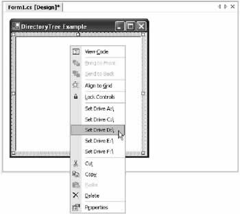
The next step is to link the custom designer to the DirectoryTree control. To do this, you use the Designer attribute, and specify the appropriate designer type. [Designer(typeof(DirectoryTreeDesigner))] public class DirectoryTree : TreeView Now, when you recompile the control and test it in the client, you'll notice that the Nodes property does not appear in the Properties window. However, the Nodes property is still accessible in code. This allows clients to perform other useful tasks (like enumerating through the collection of nodes) at their discretion. This code also ensures that the Nodes collection is not serialized at design time, effectively sidestepping the problem where the same set of drive nodes are added more than once to an instance of the DirectoryTree control. Designer VerbsYou can also use a custom designer to add to the context menu that is displayed when a programmer right-clicks your control in the design environment. This menu contains some standard options provided by Visual Studio .NET, but it can also contain your commands (technically known as verbs). To add verbs, you need to override the Verbs property in your custom designer, create a new DesignerVerbCollection, and add the appropriate DesignerVerb object entries. Your control designer handles the verb click event, generally by updating the associated control. The following example retrieves a list of all the drives on the current computer, and adds a context menu entry for each one. The user can click the appropriate entry to set the Drive property of the control.
public class DirectoryTreeDesigner : ControlDesigner
{
 private DesignerVerbCollection verbs = new DesignerVerbCollection();

 public DirectoryTreeDesigner()
 {
 // Configure the designer verb collection.
 string[] drives = System.IO.Directory.GetLogicalDrives();

 foreach (string drive in drives)
 {
 verbs.Add(new DesignerVerb("Set Drive " + drive,
 new EventHandler(OnVerb)));
 }
 }

 public override DesignerVerbCollection Verbs
 {
 get
 {
 return verbs;
 }
 }

 protected void OnVerb(object sender, EventArgs e)
 {
 // Retrieve the selected drive.
 char driveLetter = ((DesignerVerb)sender).Text[10];

 // Adjust the associated control.
 ((DirectoryTree)this.Control).Drive = driveLetter;
 }
}
The resulting context menu for the DirectoryTree control is shown in Figure 8-12.
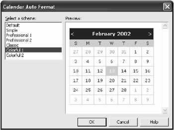
Generally, you won't use your designer verbs to provide settings for a simple property. A more interesting technique is to provide higher-level configuration operations that adjust several properties at once. One example of this is found in the ASP.NET Calendar control, which allows the user to choose a theme from a list of preset choices (see Figure 8-13). When a theme is selected, several properties are modified in conjunction.
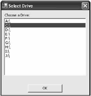
Implementing this design is refreshingly easy. Just add a Windows form to your project and display it when the appropriate designer verb is selected. Here's another simple example using the DirectoryTree. This time, only a single verb is available, which then displays a window that allows the user to choose a drive. When a drive is chosen, a public form-level variable is set and retrieved by the designer, which applies the change. This approach is more manageable than the previous design, and doesn't clutter the context menu with drive letters.
public class DirectoryTreeDesigner : ControlDesigner
{
 private DesignerVerbCollection verbs = new DesignerVerbCollection();

 public DirectoryTreeDesigner()
 {
 verbs.Add(new DesignerVerb("Set Drive",
 new EventHandler(OnVerb)));
 }
 public override DesignerVerbCollection Verbs
 {
 get
 {
 return verbs;
 }
 }

 protected void OnVerb(object sender, EventArgs e)
 {
 // Show the form.
 SelectDrive frm = new SelectDrive();
 frm.DriveSelection = ((DirectoryTree)this.Control).Drive;
 frm.ShowDialog();

 // Adjust the associated control.
 ((DirectoryTree)this.Control).Drive = frm.DriveSelection;
 }
}
The SelectDrive form is quite simple:
public class SelectDrive : System.Windows.Forms.Form
{
 public char DriveSelection;

 // (Designer code omitted.)

 private void SelectDrive_Load(object sender, System.EventArgs e)
 {
 string[] drives = System.IO.Directory.GetLogicalDrives();
 lstDrives.DataSource = drives;

 // Select the current drive.
 lstDrives.SelectedIndex = lstDrives.FindString(
 DriveSelection.ToString());

 // Attach the event handler.
 // This step is performed after the selected index is set,
 // to prevent it from being overwritten as the list is built.
 lstDrives.SelectedIndexChanged += new
 EventHandler(lstDrives_SelectedIndexChanged);
 }
 private void lstDrives_SelectedIndexChanged(object sender,
 System.EventArgs e)
 {
 DriveSelection = lstDrives.Text[0];
 }
}
Figure 8-14 shows the drive selection window that appears when the user edits the Drive property.
One quirk remains in the control designer. When the DirectoryTree.Drive property is modified by the designer, the Properties window is not updated until the control is deselected and then reselected. To correct this defect, you need to explicitly notify the IDE that a change has been made. The rewritten OnVerb() method handles this detail:
protected sub OnVerb(object sender, EventArgs e)
{
 // Show the form.
 SelectDrive frm = new SelectDrive();
 frm.DriveSelection = ((DirectoryTree)this.Control).Drive;
 frm.ShowDialog();

 // Adjust the associated control.
 ((DirectoryTree)this.Control).Drive = frm.DriveSelection;
 // Notify the IDE that the Drive property has changed.
 PropertyDescriptorCollection properties;
 properties = TypeDescriptor.GetProperties(typeof(DirectoryTree));
 PropertyDescriptor changedProperty = properties.Find("Drive", false);
 this.RaiseComponentChanged(changedProperty, "", frm.DriveSelection);
}
The final designer code for this example can be found in the DirectoryTree project with the online samples for this chapter.
Control Designer NotificationsVisual Studio .NET only creates one instance of a control designer per form. For example, if you create a custom DirectoryTreeDesigner class and add three DirectoryTree controls to a form, the single DirectoryTreeDesigner instance is reused to provide the behavior for all three trees. This detail can usually be ignored, unless you are designing controls that contain other special controls. For example, the TabControl class is designed to host one or more TabPage controls. Every time a TabPage is added, the TabControl needs to update its visual appearance (for example, the tab strip at the top) accordingly. To perform this sort of functionality, you need to create a control class that derives from ControlDesignerParent, and then access the features of the IComponentChangeService. Luckily, the ControlDesigner class provides a GetService() method to help you out. Here's an example that uses the GetService() method to register for notifications when child components have been added:
public void MyControlDesigner()
{
 IComponentChangeService service;
 service = GetService(typeof(IComponentChangeService));
 service.ComponentAdded += new ComponentEventHandler(ComponentAdded);
}
You should place this constructor inside your custom designer class, so that the designer registers for child control notifications as soon as it is created. This book doesn't consider custom container controls, and so none of the examples use the IComponentChangeService. However, if it's something you would like to explore, start with the overview of key events in Table 8-4.
|
||||||||||||||||||||||||||||||||||||||||||||||||||||||||||||||||||||||||||
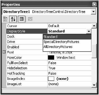
Data Types and UITypeEditorsThe Properties window does a solid job of providing support for all common data types. Basic data types like strings and numbers are all seamlessly supported. If you create a property that uses a custom enumeration, the Properties window automatically provides a drop-down list with the values from the enumeration. For example, consider the DisplayStyle property shown here:
public enum Display
{
 Standard,
 SpecialDirectoryPictures,
 AllDirectoryPictures
}

private Display displayStyle;

public Display DisplayStyle
{
 get
 {
 return displayStyle;
 }
 set
 {
 displayStyle = value;
 }
}
The enumerated values are shown in the Properties window (see Figure 8-15).
In addition to this basic level of support, you may have noticed that some richer object types have additional design-time support. For example, if you create a Property that has a Font or Color data type, a special color picker or font selection dialog is used in the Properties window. Similar magic happens if you create a Collection property. This support is provided through .NET UITypeEditor classes, which are special components that provide the design-time user interface that allows the programmer to set complex properties. Using Prebuilt UITypeEditorsThe base UITypeEditor class is found in the System.Drawing.Design namespace. You can inherit from this class to create your custom UITypeEditors, or you can use one of the derived classes that are provided with the .NET framework. These classes are listed in Table 8-5 (UITypeEditors that are only usable with specific web controls have been omitted).
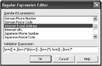
Depending on the data type of your property, .NET may use the corresponding UITypeEditor automatically (for example, with a Font). On the other hand, some UITypeEditors do not have dedicated types. An example is the RegExTypeEditor, which allows the programmer to choose a common regular expression for a control property. The regular expression is stored as an ordinary string, so it needs to be explicitly associated with the appropriate UITypeEditor. You associate a property with a UITypeEditor using the Editor attribute. Consider this example:
private string regEx = "";

[Editor(typeof(System.Web.UI.Design.WebControls.RegexTypeEditor),
 typeof(UITypeEditor))]
public string ValidationExpression
{
 get
 {
 return regEx;
 }
 set
 {
 regEx = value;
 }
}
When the programmer clicks this property in the Properties window, an ellipsis (…)appears next to the property name. If the programmer clicks the ellipsis button, a full dialog appears with common regular expression choices (see Figure 8-16).
Custom UITypeEditorsYou can also develop custom UITypeEditor classes to allow special settings to be configured. For example, consider the TreeView control. Its Nodes property is a collection, but it doesn't use the standard collection editor (which only allows strings to be entered). Instead, it uses its specialized UITypeEditor. To create a custom type editor, you must first create a class that derives from System.Drawing.Design.UITypeEditor. You can then override the four methods shown in Table 8-6.
The PaintValue() supported technique requires a little GDI+ wizardry, and you consider an example that uses it in Chapter 13. The next example, however, uses the EditValue() method with the DirectoryTree control. It allows editing of the Drive property by presenting the dialog box developed earlier.
public class DriveEditor : UITypeEditor
{
 public override System.Drawing.Design.UITypeEditorEditStyle GetEditStyle(
 System.ComponentModel.ITypeDescriptorContext context)
 {
 // We will use a window for property editing.
 return UITypeEditorEditStyle.Modal;
 }

 public override object EditValue(
 System.ComponentModel.ITypeDescriptorContext context,
 System.IServiceProvider provider, object value)
 {
 SelectDrive frm = new SelectDrive();

 // Set current drive in window.
 frm.DriveSelection = (char)value;
 frm.ShowDialog();

 // Return the new value.
 return frm.DriveSelection;
 }
 public override bool GetPaintValueSupported(
 System.ComponentModel.ITypeDescriptorContext context)
 {
 // No special thumbnail will be shown for the grid.
 return false;
 }
}
The type editor is attached to the appropriate property using an Editor attribute: [Editor(typeof(DriveEditor), typeof(UITypeEditor))] public Char Drive One benefit to this design is that you can reuse this UITypeEditor with any drive property in any control. It's specific to the property data type, not the control. An alternative approach is to use a DirectoryInfo object to represent the drive instead of an underlying char. Because the property editing is now handled by the UITypeEditor, there's no need to choose a basic type that can be edited with the default design-time support built into the property grid. That would also give you the freedom to enhance the control so it could be set to initially display a specific subdirectory, for example. |
|||||||||||||||||||||||||||||||||||||||||||||||||||||||||||||||||||||
Licensing Custom ControlsLicensing in the .NET world is far more customizable and far less painful than it was with ActiveX controls. The .NET framework provides several licensing classes in the System.ComponentModel namespace. By using and extending these classes, you can grant or allow access to your control, using ordinary .NET code to check external resources like the Windows registry, an XML file, or even a remote web service for registration information. Simple LIC File LicensingTo best understand .NET licensing, it helps to start with a simple example using the LicFileLicenseProvider class. This class doesn't provide any real protection, but it's a stepping-stone to the more advanced licensing strategies you look at next. The LicFileLicenseProvider searches for a text file in the same directory as the control assembly. This LIC file uses the control's fully qualified class name for a filename, so the DirectoryTree control requires a license file named DirectoryTreeControl.DirectoryTree.LIC. Inside this file is a simple predefined text string in the format "[Component] is a licensed component." Thus, the contents of the DirectoryTreeControl.DirectoryTree.LIC file would be: DirectoryTreeControl.DirectoryTree is a licensed component. This file must be placed in the client project's bin directory (where Visual Studio .NET compiles the final exe just prior to launching it).
To enforce LIC file licensing, you need to add a LicenseProvider attribute to your control class that tells .NET to use the LicFileProvider class to validate licenses. [LicenseProvider(typeof(LicFileLicenseProvider))] public class DirectoryTree : TreeView Additionally, you need to create the license when the control is created, using the static Validate() method of the LicenseManager Help class:
private License license;

public DirectoryTree()
{
 license = LicenseManager.Validate(this.GetType(), this);
}
The Validate() method throws a LicenseException if it doesn't find the correct string in the LIC file, and refuses to create your control. This restriction applies both to design time and runtime control creation. Finally, you need to dispose of the license when the control is disposed.
protected override void Dispose(bool disposing)
{
 if (license != null)
 {
 license.Dispose();
 }
 base.Dispose(disposing);
}
Custom LIC File LicensingClearly, simple LIC file licensing doesn't offer much in the way of protection. Any user who knows a little about the .NET framework will realize the generic format that must be created for a LIC file. However, you can add more stringent requirements by creating a custom license provider based on the LicFileLicenseProvider. All you need to do is inherit from the class and override the IsValid() method. The IsValid() method receives the contents of the LIC file, and returns true or false to indicate if the contents are correct. Thus, you could use the IsValid() method to check a license number against a company-specific algorithm. The example below extracts the first three characters from the license file, and verifies that they correspond to a number that is divisible by 7.
public class FileLicenseProvider : LicFileLicenseProvider
{
 protected override bool IsKeyValid(string key, System.Type type)
 {
 int code = int.Parse(key.Substring(0, 3))
 if (code <> 0)
 {
 if (Math.IEEERemainder(Code, 7) == 0)
 {
 return true;
 else
 {
 return false;
 }
 }
 else
 {
 return false;
 }
 }
}
Advanced License ProvidersControl licensing doesn't need to be based on LIC files. In fact, you can create any type of licensing scheme imaginable. You can even perform tremendously annoying tricks like only allowing controls to be registered to specific computers. To implement a custom licensing scheme, you need to create two classes: a custom license provider, and a custom license. The custom license is the easiest ingredient. It simply derives from the base License class, overrides the LicenseKey property and Dispose() method, and adds properties for any required pieces of information. You also need to add a constructor that configures the license, as the LicenseKey property is read-only.
public class CustomLicense : License
{
 private string key;

 public override string LicenseKey
 {
 get
 {
 return key;
 }
 }

 public CustomLicense(string key)
 {
 this.key = key;
 }
 public override void Dispose()
 {
 // This method must be overriden.
 }
}
The custom LicenseProvider plays the same role as the LicFileLicenseProvider. It provides a GetLicense() method, which the .NET framework calls to validate the control. For example, when you use the LicenseManager.Validate() method in the constructor for the DirectoryTree control, .NET uses the LicenseProvider.GetLicense() method to retrieve the license. In the GetLicense() method, you may want to examine whether the component is in design-time or runtime mode, and apply different rules. Additionally, you may want to return a valid license object, nothing at all, or throw a LicenseException to indicate that the control should not be created. The LicFileProvider throws a LicenseException to indicate when a LIC file is not valid. The example that follows looks for a predefined registry entry at design time. At runtime, it first examines the current context, and then defaults to the registry if a compiled license key can't be found. The registry value is stored under a predefined company name, followed by the fully qualified name of the control. The key is validated as long as it matches the string "1234567890" and a CustomLicense object encapsulating this key is returned.
public class RegistryLicenseProvider : LicenseProvider
{
 public override System.ComponentModel.License GetLicense(
 System.ComponentModel.LicenseContext context,
 System.Type type, object instance, bool allowExceptions)
 {
 string key;

 if (context.UsageMode == LicenseUsageMode.Runtime)
 {
 // Try to find key in current context.
 key = context.GetSavedLicenseKey(type, null);
 }

 // Always look in the registry at design time.
 // If the key wasn't found in the current context at runtime,
 // we can also look in the registry.
 // Another option might be to always allow the control at runtime,
 // and just restrict it at design time.
 if (key == "")
 {
 // A debugging hint (remove when you perfect the licensing scheme):
 MessageBox.Show("Performing registry lookup.",
 "RegistryLicenseProvider");

 RegistryKey rk;
 rk = Registry.LocalMachine.OpenSubKey(@"SoftwareMyCompany" +
 type.ToString());
 if (rk != null)
 {
 key = rk.GetValue("LicenseKey", "");
 }

 // Save key in current context.
 if (key != "")
 {
 context.SetSavedLicenseKey(type, key);
 }
 }

 // Check if key is valid.
 if (!IsValid(key))
 {
 if (!allowExceptions)
 {
 throw new LicenseException(type);
 }

 }

 // Return the license object.
 return new CustomLicense(key);
 }

 private bool IsValid(string key)
 {
 if (key == "1234567890")
 {
 return true;
 }
 else
 {
 return false;
 }
 }
 }
The GetLicense() method is provided with a fair bit of information, including the current LicenseContext, the type of the component that is requesting the license, and a reference to instance of the component. This means you can easily create a single LicenseProvider that could handle the licensing for all different types of controls. Custom licensing schemes are limited only by your imagination, and can become quite complex. The material presented here is only a basic introduction for what a component vendor might do. |
||||||||||||||||||
The Last WordThis chapter covered a lot of ground with custom controls. The story doesn't end here, however. In the coming chapters you continue to look at how custom controls can solve all kinds of programming problems, and handle everything from data access to rich graphics. In all these cases, knowing how to match custom controls with an appropriate level of design-time support will simplify your life immensely. If you are planning to develop and sell your components, it's indispensable. To see what other developers are creating, you can take your search online and begin working with the latest user interface elements. And if you develop your own controls, feel free to send me an email with the details. I can't critique your code creations, but I just might provide a link from this book's web site (http://www.prosetech.com) if there's enough interest…. |
|||||||||||||||
Data Controls |
|||||||||||||||
Introduction
 Windows Forms and Custom Controls")
EAN: 2147483647
Pages: 142
