Text Controls
Overview
In this chapter, two kinds of SWT text controls are introduced:
- Text
- StyledText
You learn basic text operations, selections with the Text control, and the StyledText control. In addition, this chapter introduces features of the StyledText control, such as text styles and line background customization.
Using Texts
The Text control represents a selectable user interface object that allows the user to input and modify text.
Styles
The following styles are used:
- CENTER, LEFT, RIGHT: You can use CENTER, LEFT, and RIGHT to specify the alignment of the text within the control. Only one of them may be specified. The default alignment is left-aligned.
- MULTI, SINGLE: MULTI indicates the text control supports multiple lines. If SINGLE is set, the text control supports one line only. Only one style, MULTI or SINGLE, may be specified. If neither style is specified and none of the WRAP, V_SCROLL, and H_SCROLL styles is set, the text control supports a single line only.
- READ_ONLY: A text control with this style does not allow the user to modify the text. However, you can still modify the text programmatically. By default, this style is not set.
- WRAP: This style applies only to text controls supporting multiple lines. If the WRAP style is set, the text control automatically wraps long lines. Figure 8-1 shows two text controls with the same series of characters as their text content. The text control on the left side does not have a WRAP style, but the one on the right does.
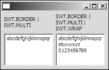
Figure 8-1
The Text class is a subclass of the Scrollable class; thus the H_SCROLL and V_SCROLL styles are inherited. Usually, you need to set H_SCROLL and V_SCROLL styles for text controls supporting multiple lines to enable the user to navigate the whole text content easily.
Text Basics
Creating text controls is not difficult. This subsection shows you how to create single-line and multipleline text controls. In addition, you can use methods provided by the Text class to access text information.
Creating Single-Line Text Controls
There is only one constructor in the Text class:
public Text(Composite parent, int style)
The following code creates two Text controls, as shown in Figure 8-2.
 (new Label(shell, SWT.NULL)).setText("User name: ");

 textUser = new Text(shell, SWT.SINGLE | SWT.BORDER);
 textUser.setText("default_user");
 textUser.setTextLimit(16);

 (new Label(shell, SWT.NULL)).setText("Password: ");

 textPassword = new Text(shell, SWT.SINGLE | SWT.BORDER);
 textPassword.setEchoChar('*');
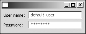
Figure 8-2
Both of the two text controls have the SINGLE and BORDER styles. For the first one, the setText method of the Text class is used to set the default user name. The other text control is used to accept a password; thus you need to set an echo character to make the text control display echo characters instead of plain password text. The setEchoChar method is used to set the echo character for a text control. The corresponding method to query the echo character is getEchoChar. The setTextLimit method of the Text class can be used to specify the maximum number of characters that a text control is capable of holding. To reset the text limit to the default value, you can use setTextLimit(Text.LIMIT).
Creating Multiple-Line Text Controls
The following code creates a text control supporting multiple lines, as shown in Figure 8-3.
 (new Label(shell, SWT.NULL)).setText("Remarks:");

 text = new Text(shell, SWT.MULTI | SWT.BORDER | SWT.V_SCROLL | SWT.H_SCROLL);
 text.setText("1234
56789");
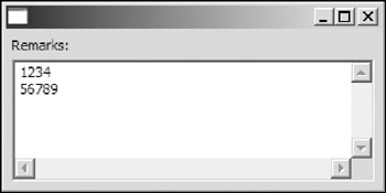
Figure 8-3
The text control is created with MULTI | BORDER | V_SCROLL | H_SCROLL styles. The setText method is used to put initial text into the text control. Two characters, and in the argument of the setText method, indicate a line break. A followed by forms a line delimiter. When the user presses an Enter key on an editable text control, a line delimiter is inserted at the caret position. As a result, two characters, and , are inserted. Line delimiters on different operating systems may vary. To check the line delimiter for the host operating system, you can call the getLineDelimiter method:
public String getLineDelimiter()
It is important to notice that characters used as line delimiters are always included when calculating total number of chars, caret offset, and so on.
For example, the following code
System.out.println("Number of chars: " + text.getCharCount());
prints the total number of characters in the text control:
Number of chars: 11
The nine visible characters plus two characters used for the line delimiter results in a total of eleven characters.
Accessing Text Information
The Text class provides several methods for you to access text information easily.
In the preceding section, the getCharCount method was introduced. The getLineCount method can be used to get the total number of lines in a text control:
public int getLineCount()
To check whether a text control is editable, you can use the getEditable method:
public boolean getEditable()
The getText method returns all the characters in the text control as a string:
public String getText()
To get a range of the text, you can use this method:
public String getText(int start, int end)
The start argument and the end argument specify the position of the first character and the position of the last character in the range. An empty string is returned if the end of the range is less than the start.
The following methods can be used to get and set the number of tabs:
 public int getTabs()
 public void setTabs(int tabs)
The width of a tab stop is equal to the total width of the specified number of the space ( ) characters.
To get the position of the caret, you can use the following:
public int getCaretPosition()
The line number that the caret is at can be determined using the getCaretLineNumber method.
public int getCaretLineNumber()
Text Operations
Text controls enable the user to append, insert, delete, or replace the text. Alternatively, the Text class provides methods for text operations such as inserting, cutting, and so on.
Appending, Pasting, and Inserting Text
To append a string to the text of a text control, you can use the append method:
public void append(String string)
The insert method can be used to insert a string at the current caret position:
public void insert(String string)
If there is a text selection called upon the insert method, the selected portion of the text is replaced with the given string. To insert a string at a particular position, you may first set the caret position using the setSelection method before inserting the string. More details on the setSelection method are introduced in the next section.
If you have used any text processing software, you must be very familiar with the copy, cut, and paste commands. To equip your applications with those operations, you can consider using the following methods of the Text class:
 public void copy()
 public void cut()
 public void paste()
The copy method copies the selected text to the system clipboard. The cut method not only copies the selected text to the clipboard, it also deletes the selected text. The paste method acts like the insert method, except it inserts text from the clipboard.
Verifying the Input
The text control allows you to verify the text when the text is about to be modified. A verify event is sent when a text change is about to occur. Verify events are sent prior to actual modification of the text. The Text class allows you to register verify listeners using the addVerifyListener method:
public void addVerifyListener(VerifyListener listener)
The corresponding method to remove a verify listener is removeVerifyListener. The sole method in the VerifyListener interface you need to implement is the verifyText method.
public void verifyText(VerifyEvent e)
When the text is about to be modified, the verifyText method is called with a VerifyEvent object as the argument. The text modification information is stored in fields of the VerifyEvent object:
- public int start, public int end: These two fields indicates the start and the end of the range of the text being modified.
- public String text: This field contains the new text to be inserted.
Because VerifyEvent is a subclass of the KeyEvent class, you may also access fields provided by the KeyEvent class:
- public char character: The character represented by the key that was typed.
- public int keyCode: This field represents the key code of the key that was typed. The key code constants are defined in the SWT class.
- public int stateMask: This field records the state of the keyboard modifier keys (including Alt, Shift, and Ctrl) at the time the event was generated.
- public boolean doit: This flag indicates whether the operation should be allowed or not. To cancel the operation, you can set the doit flag to false.
You can use verify listener to alter the behavior of text modification. For example, the following code converts all the input to a text control to uppercase.
 text.addVerifyListener(new VerifyListener() {
 public void verifyText(VerifyEvent e) {
 e.text = e.text.toUpperCase();
 }
 });
Verify listeners can also be used to implement an auto-completion mechanism. The code that follows automatically completes the word "VerifyListener" when you press Ctrl+spacebar after an uppercase V.
 text.addVerifyListener(new VerifyListener() {
 public void verifyText(VerifyEvent e) {
 if(e.end == e.start) { // Insert.
 if( e.character == ' ' && (e.stateMask & SWT.CTRL) != 0 ) {
 if(text.getText(e.end-1, e.end-1).equals("V")) {
 e.text = "verifyListener";
 }else{
 e.doit = false;
 }
 }
 }
 }
 });
First, you need to make sure the text modification to be performed is an insertion. This can be done by checking the start and the end of the range of selected text (if the start point is the same as the end point, which means that no text is selected, it's an insertion operation). Next, you need to check whether Ctrl and space keys are pressed. If the character immediately prior to the caret position is an uppercase V, you can modify the text field of the VerifyEvent object to append the remaining letters of the word. Otherwise, the action should be cancelled by setting the doit field of the event object to false. To implement a powerful auto-completion function, you can use a dictionary to perform word lookups.
Capturing Modification Events
After the text in a text control is modified, a modify event is generated and dispatched. You can register one or more modify listeners for modify events of a text control using the addModifyListener method of the Text class:
public void addModifyListener(ModifyListener listener)
The method to remove a registered modify listener is removeModifyListener. The modifyText method is only a single method to be implemented in the ModifyListener interface.
public void modifyText(ModifyEvent e)
During the modify event dispatching process, the modifyText method is called with a ModifyEvent object as the argument. However, this event object does not contain any information about the text change. You have to directly query the text control for text change.
For example, the following code registers a modify listener listening to the modify events and printing the current character count.
 text.addModifyListener(new ModifyListener() {
 public void modifyText(ModifyEvent e) {
 System.out.println("New character count: " + text.getCharCount());
 }
 });
Text Selections
A text control allows the user to select a part or whole of the text content. You can also manipulate text selections programmatically.
To select a range of text, you can use the setSelection method.
public void setSelection(int start, int end)
You specify the start and the end of a range of the text to be selected in terms of caret positions. The text between the two caret positions is selected. For example, if the text content is 123456789 and setSelection(1, 4) is called, text 234 is selected. If end is set equal to start, no character is selected and the caret is moved to the position of start. Alternatively, you can use the following method to set the caret position.
public void setSelection(int start)
After a text selection has been made, you can use the showSelection method to scroll the text selection into view. To select all the text in a text control, you can use the selectAll method.
public void selectAll()
The clearSelection method clears the current selection.
public void clearSelection()
To get information about the current selection, you can use the following methods:
 public Point getSelection()
 public int getSelectionCount()
 public String getSelectionText()
Again, assuming the text content is 123456789 and setSelection(1, 4) is called, the results of calling each of the three methods are:
 getSelection: Point {1, 4}
 getSelectionCount: 3
 getSelectionText: 234
Although you can register SelectionListeners to a text control, they listen to selection events of the text control rather than the text content so that they are not notified for text selections. Typically, the widgetDefaultSelected is called when the Enter key is pressed in a single-line text control.
Using StyledTexts
The StyledText control is a very customizable text control. It provides all of the features provided by the Text control. Additionally, it enables you to:
- Use various text foreground and background colors within the text
- Use different font styles
- Set line background colors
Most of the APIs introduced in the preceding section apply to the StyledText class, too. In this section, we will focus on the additional features provided by the StyledText class.
Setting Text Styles with StyleRanges
For styled text controls, you need to use StyleRanges to set text styles. Fields of the StyleRange class are:
- public int start, public int length: These two fields are used to define the range of the text to which the text style should be applied. The target text is the text starting from the start offset with length characters. You must make sure offsets start and start+length-1 are in the range of text content. Otherwise, an IllegalArgumentException is thrown when you try to set styles. The default value for both is 0.
- public Color foreground, public Color background: These fields represent the foreground color and the background color of the text. If they are not set (i.e., having null values), the styled text control will use the default control colors. You can make use of this feature to remove styles from a styled text control.
- public int fontStyle: The StyledText control does not support mixing multiple fonts or italic fonts. You can use the setFont method of the StyledText class to set the font of the whole text content within the control. The fontStyle field can be used to specify the style of the font to be used, either SWT.NORMAL or SWT.BOLD.
To add a style to a styled text control, you can use the setStyleRange method of the StyledText class:
public void setStyleRange(StyleRange range)
For example, the following code highlights part of the text, as shown in Figure 8-4.
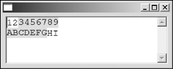
Figure 8-4
 styledText = new StyledText(shell,
 SWT.MULTI | SWT.WRAP | SWT.BORDER | SWT.H_SCROLL | SWT.V_SCROLL);

 styledText.setLayoutData(new GridData(GridData.FILL_BOTH));
 Font font = new Font(shell.getDisplay(), "Courier New", 12, SWT.NORMAL);
 styledText.setFont(font);

 styledText.setText("123456789
ABCDEFGHI");

 StyleRange styleRange1 = new StyleRange();
 styleRange1.start = 2;
 styleRange1.length = 16;
 styleRange1.foreground = shell.getDisplay().getSystemColor(SWT.COLOR_BLUE);
 styleRange1.background = shell.getDisplay().getSystemColor(SWT.COLOR_YELLOW);
 styleRange1.fontStyle = SWT.BOLD;

 styledText.setStyleRange(styleRange1);
After the text for the styled text control is set, a StyleRange is created and set to the control. The target text to be set style starts at offset 2 with length 16. The foreground color and background color are set to blue and yellow, respectively. The font style is set to bold. After the StyleRange instance has been properly configured, the setStyleRange method is called to apply the style.
You can add as many styles as you like to a styled text control. Let's apply a new style for the text DEF in the styled text control (see Figure 8-5).
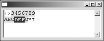
Figure 8-5
 StyleRange styleRange2 = new StyleRange();
 styleRange2.start = 14;
 styleRange2.length = 3;
 styleRange2.fontStyle = SWT.NORMAL;
 styleRange2.foreground = shell.getDisplay().getSystemColor(SWT.COLOR_YELLOW);
 styleRange2.background = shell.getDisplay().getSystemColor(SWT.COLOR_BLUE);

 styledText.setStyleRange(styleRange2);
You may notice that only the range of text specified in this StyleRange has been applied to the new style. The text outside the new style range keeps its existing style information.
When new text is inserted, all the existing text keeps its style information and the new text is not styled. For example, the following code inserts new text into the styled text control and the newly added text is not styled, as shown in Figure 8-6.
 styledText.setSelection(4);
 styledText.insert("000");
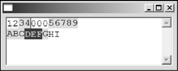
Figure 8-6
Two other methods enable you to add new styles to a styled text control:
 public void replaceStyleRanges(int start, int length, StyleRange[] ranges)
 public void setStyleRanges(StyleRange[] ranges)
The replaceStyleRanges deletes the existing styles in the specified range and adds the new styles. The StyleRange instance in the array should not overlap and should be within the specified start and length. Otherwise, exceptions could be thrown.
The setStyleRanges method replaces all the existing styles with the new StyleRange instances, which is equivalent to the following:
replaceStyleRanges(0, getCharCount(), ranges)
Setting Line Backgrounds
You can also customize the line background using the setLineBackground method:
public void setLineBackground(int startLine, int lineCount, Color background)
The lines specified must be in the range; otherwise an IllegalArgumentException is thrown.
The following code sets the line background of a styled text control, as shown in Figure 8-7.
 shell.setLayout(new GridLayout());

 styledText = new StyledText(shell,
 SWT.BORDER | SWT.MULTI | SWT.WRAP | SWT.H_SCROLL | SWT.V_SCROLL);

 styledText.setLayoutData(new GridData(GridData.FILL_BOTH));


 Font font = new Font(shell.getDisplay(), "Courier New", 12, SWT.NORMAL);
 styledText.setFont(font);

 styledText.setText("abcdefg
hijklmn");

 StyleRange styleRange1 = new StyleRange();
 styleRange1.start = 2;
 styleRange1.length = 3;
 styleRange1.foreground = shell.getDisplay().getSystemColor(SWT.COLOR_BLUE);
 styleRange1.background = shell.getDisplay().getSystemColor(SWT.COLOR_YELLOW);
 styleRange1.fontStyle = SWT.BOLD;

 styledText.setStyleRange(styleRange1);

 styledText.setLineBackground(0, 1,
 shell.getDisplay().getSystemColor(SWT.COLOR_GREEN));
 styledText.setLineBackground(1, 1,
 shell.getDisplay().getSystemColor(SWT.COLOR_YELLOW));
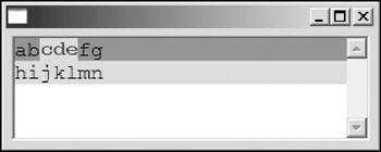
Figure 8-7
The background of the first line is set to green, and the background of the second one is set to yellow. You may notice that the styles applied are not affected by the line background setting method. If line background color and styles with custom background colors are used in conjunction with each other, the style background colors are displayed after the line background color is displayed.
Using LineStyleListeners and LineBackgroundListeners
In fact, there are two ways to specify text style information. You can use the methods provided by the StyleText class (as shown in preceding sections) or you may define your own LineStyleListeners. Similarly, you can either use the methods provided by the StyleText class to define line backgrounds (as shown in preceding sections) or define your own LineBackgroundListener.
You cannot use LineStyleListeners when you use the text style API methods provided by the StyleText class, and vice versa. Similarly, you cannot use LineBackgroundListeners when you use the line background API methods, and vice versa.
Using LineStyleListeners
To use a LineStyleListener, you must first create it and then register it to the styled text control with the method addLineStyleListener of the StyledText class.
The only method you need to implement a LineStyleListener is the lineGetStyle method:
public void lineGetStyle(LineStyleEvent event)
This method is called in order to get the line's style information when a line is about to be drawn. The fields of the LineStyleEvent class are as follows:
- public int lineOffset: This field contains the start offset of the line.
- public String lineText: This field contains the text content of the line.
- public StyleRange[] styles: You need to set this field to specify the text styles.
For example, the following code creates a styled text control with search keyword highlighting function as shown in Figure 8-8.
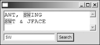
Figure 8-8
 public class SearchStyleText {
 Display display = new Display();
 Shell shell = new Shell(display);

 StyledText styledText;
 Text keywordText;
 Button button;

 String keyword;

 public SearchStyleText() {
 shell.setLayout(new GridLayout(2, false));

 styledText = new StyledText(shell,
 SWT.MULTI | SWT.WRAP | SWT.BORDER | SWT.H_SCROLL | SWT.V_SCROLL);
 GridData gridData = new GridData(GridData.FILL_BOTH);
 gridData.horizontalSpan = 2;
 styledText.setLayoutData(gridData);

 keywordText = new Text(shell, SWT.SINGLE | SWT.BORDER);
 keywordText.setLayoutData(new GridData(GridData.FILL_HORIZONTAL));
 Font font = new Font(shell.getDisplay(), "Courier New", 12, SWT.NORMAL);
 styledText.setFont(font);

 button = new Button(shell, SWT.PUSH);
 button.setText("Search");
 button.addSelectionListener(new SelectionAdapter() {
 public void widgetSelected(SelectionEvent e) {
 keyword = keywordText.getText();
 styledText.redraw();
 }
 });

 styledText.addLineStyleListener(new LineStyleListener() {
 public void lineGetStyle(LineStyleEvent event) {
 if(keyword == null || keyword.length() == 0) {
 event.styles = new StyleRange[0];
 return;
 }

 String line = event.lineText;
 int cursor = -1;

 LinkedList list = new LinkedList();
 while( (cursor = line.indexOf(keyword, cursor+1)) >= 0) {
 list.add(getHighlightStyle(
 event.lineOffset+cursor, keyword.length()));
 }

 event.styles = (StyleRange[])
 list.toArray(new StyleRange[list.size()]);
 }
 });
 styledText.setText("AWT, SWING
SWT & JFACE");
 shell.pack();
 shell.open();

 while (!shell.isDisposed()) {
 if (!display.readAndDispatch()) {
 // If no more entries in event queue
 display.sleep();
 }
 }

 display.dispose();
 }
 private StyleRange getHighlightStyle(int startOffset, int length) {
 StyleRange styleRange = new StyleRange();
 styleRange.start = startOffset;
 styleRange.length = length;
 styleRange.background =
 shell.getDisplay().getSystemColor(SWT.COLOR_YELLOW);
 return styleRange;
 }


 public static void main(String[] args) {
 new SearchStyleText();
 }
 }
When the user keys in a keyword in the text field and then clicks the search button, all the occurrences of the keyword in the text are highlighted.
Using LineBackgroundListeners
The method in the StyledText class to register a LineBackgroundListener is addLineBackgroundListener:
public void addLineBackgroundListener(LineBackgroundListener listener)
Only one method is declared in the LineBackgroundListener interface:
public void lineGetBackground(LineBackgroundEvent event)
This method is called when a line is about to be drawn in order to get its background color.
The following code highlights the lines with odd indices, as shown in Figure 8-9.
 styledText = new StyledText(shell,
 SWT.MULTI | SWT.WRAP | SWT.BORDER | SWT.H_SCROLL | SWT.V_SCROLL);
 styledText.setLayoutData(new GridData(GridData.FILL_BOTH));

 styledText.addLineBackgroundListener(new LineBackgroundListener() {
 public void lineGetBackground(LineBackgroundEvent event) {
 if(styledText.getLineAtOffset(event.lineOffset) % 2 == 1)
 event.lineBackground =
 shell.getDisplay().getSystemColor(SWT.COLOR_YELLOW);

 }
 });

 styledText.setText(
 "Line 0
Line 1
Line 2
Line 3
Line 4
Line 5
Line 6");
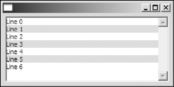
Figure 8-9
The content implementation for the StyleText class can also be user-defined. This can be achieved by implementing the StyledTextContent interface and using the setContent method to initialize a styled text control. However, developing a customized StyledTextContent implementation is very time consuming and error prone. We are not going to cover this topic here. In most of cases, you can easily utilize the text framework (see Chapter 20) to bypass this complicated task. If you still insist on implementing StyleTextContent, you can take a look at its default implementation in SWT — org.eclipse.swt.custom.DefaultContent.
Summary
This chapter introduced SWT text controls: Text and StyledText. You learned how to create single-line and multiple-line text controls. Text operations such as appending, pasting, and inserting can be easily performed against a text control. When the user keys in text in the text box, you can register listeners to verify the input. StyledText offers many more features than the Text control. You can set different text styles for different regions in the same text area.
Part I - Fundamentals
- Overview of Java UI Toolkits and SWT/JFace
- SWT/JFace Mechanisms
- Jump Start with SWT/JFace
- SWT Event Handling, Threading, and Displays
- Basic SWT Widgets
- Layouts
Part II - Design Basics
Part III - Dynamic Controls
- Scales, Sliders, and Progress Bars
- Other Important SWT Components
- SWT Graphics and Image Handling
- Drag and Drop and the Clipboard
- Printing
- JFace Windows and Dialogs
Part IV - Application Development
EAN: 2147483647
Pages: 147
