Other Important SWT Components
Overview
In this chapter, you learn about the rest of the SWT widgets that have not been covered in previous chapters:
- Group
- Sash, SashForm
- TabFolder
- Browser
Each control is discussed in detail. You learn how to use them through examples.
Using Groups
A group is a composite that provides an etched border with an optional title. The Group class extends the Composite class and provides two methods for optional title text handling:
 public String getText()
 public void setText(String string)
The getText method returns the title or an empty string (not null) if the title has not been set yet. You use the setText method to set the title for a group. Mnemonics are supported by the group control.
In addition to the styles inherited from the Composite class, you can specify one of the following border shadow styles:
- SHADOW_ETCHED_IN
- SHADOW_ETCHED_OUT
- SHADOW_IN
- SHADOW_OUT
- SHADOW_NONE
Shadow styles are just hints and may not be honored by every platform. Groups with different shadow styles are shown in Figure 14-1 (Windows XP) and Figure 14-2 (Red Hat Linux 9).
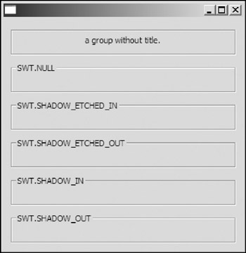
Figure 14-1
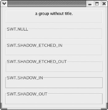
Figure 14-2
Figure 14-1 shows that the actual rendered shadows of groups with different styles are all the same on Windows. However, the underlying native UI system on Linux honors the style specified for each group (see Figure 14-2).
Groups are useful for organizing the controls logically on a shell and, as a result, make the UI more accessible. For example, the bug report application shown in Figure 14-3 uses two groups to separate controls for input of bug details and those for proxy setting. The corresponding code is shown here:
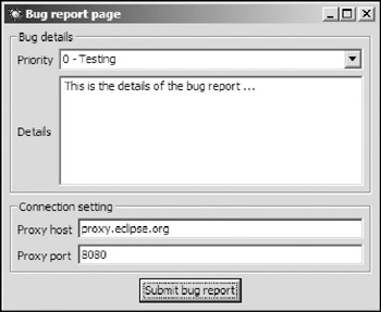
Figure 14-3
 Display display = new Display();
 Shell shell = new Shell(display);

 shell.setLayout(new GridLayout(1, true));
 shell.setImage(new Image(display, "icons/bug.gif"));
 shell.setText("Bug report page");
 Group groupBug = new Group(shell, SWT.NULL);
 groupBug.setText("Bug details");
 groupBug.setLayout(new GridLayout(2, false));
 groupBug.setLayoutData(new GridData(GridData.FILL_BOTH));

 new Label(groupBug, SWT.NULL).setText("Priority");
 Combo combo = new Combo(groupBug, SWT.BORDER);
 combo.setLayoutData(new GridData(GridData.FILL_HORIZONTAL));

 new Label(groupBug, SWT.NULL).setText("Details");
 Text text = new Text(groupBug, SWT.BORDER | SWT.MULTI);
 text.setLayoutData(new GridData(GridData.FILL_BOTH));
 Group groupProxy = new Group(shell, SWT.NULL);
 groupProxy.setText("Connection setting");
 groupProxy.setLayout(new GridLayout(2, false));
 groupProxy.setLayoutData(new GridData(GridData.FILL_HORIZONTAL));

 new Label(groupProxy, SWT.NULL).setText("Proxy host");
 Text textHost = new Text(groupProxy, SWT.SINGLE | SWT.BORDER);
 textHost.setLayoutData(new GridData(GridData.FILL_HORIZONTAL));
 new Label(groupProxy, SWT.NULL).setText("Proxy port");
 Text textPort = new Text(groupProxy, SWT.SINGLE | SWT.BORDER);
 textPort.setLayoutData(new GridData(GridData.FILL_HORIZONTAL));

 Button button = new Button(shell, SWT.PUSH);
 button.setLayoutData(new GridData(GridData.HORIZONTAL_ALIGN_CENTER));
 button.setText("Submit bug report");
Using Sashes and SashForms
This section provides a brief introduction to sashes. Then you learn how to use a sash form to place multiple UI components together.
Using Sashes
Sash represents a selectable user interface object that allows the user to drag a rubber-banded outline of the sash within the parent composite, as shown in Figure 14-4. In SWT GUI programming, a sash widget is rarely used directly. Instead, SashForms should be used to place two or more resizable components together. With basic knowledge of sashes, you can have a better understanding of sash forms, which are covered in the next subsection.
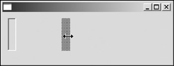
Figure 14-4
The sash in Figure 14-4 is created using the following code:
Sash sash = new Sash (shell, SWT.BORDER | SWT.HORIZONTAL);
The constructor of the Sash class is as follows:
public Sash(Composite parent, int style)
In addition to the styles inherited from the Control class, you can specify one of the orientation styles of the Sash class: SWT.HORIZONTAL and SWT.VERTICAL. The orientation styles specify the orientation of the sash divider and imply the direction in which a user can drag that divider. For example, the sash that you saw in Figure 14-4 is created with the SWT.VERTICAL style. This means the divider is vertical and a user can drag it horizontally. On the other hand, sashes with the SWT.HORIZONTAL style can be dragged in the vertical direction only. If none of the orientation styles is specified, the default SWT.HORIZONTAL is used.
The Sash class is a direct subclass of the Control class, and the Sash class provides only two additional methods:
 public void addSelectionListener(SelectionListener listener)
 public void removeSelectionListener(SelectionListener listener)
You can use the preceding methods to add or remove a selection listener for a sash. When a sash is dragged, a selection event is generated. The detailed information is contained in the event object passed to each selection listener.
The following code enables a sash to move as the user drags it:
 sash.addListener (SWT.Selection, new Listener () {
 public void handleEvent (Event e) {
 System.out.println("Selected. ");
 sash.setBounds (e.x, e.y, e.width, e.height);
 }
 });
It becomes very annoying if you need to handle the sash movement by yourself. Fortunately, you do not have to take care of this for a sash form.
Using SashForms
SashForms are used extensively in complex UI applications. A SashForm lays out its children in a row or a column and places a sash between adjacent children. The user can drag the sash to adjust the sizes of child controls. A SashForm is a composite that is capable of resizing its children when the user drags the sashes onto it.
Creating SashForms
The following is the only constructor of the SashForm class:
public SashForm(Composite parent, int style)
In addition to the styles inherited from the Composite class, the SashForm class supports optional orientation styles: SWT.HORIZONTAL and SWT.VERTICAL. If you want to place all the child controls in a row, you should specify SWT.HORIZONTAL. The SWT.VERTICAL style causes a SashForm to place its children in a column.
For example, the following code creates two SashForms, as shown in Figure 14-5.
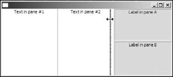
Figure 14-5
 sashForm = new SashForm(shell, SWT.HORIZONTAL);

 Text text1 = new Text(sashForm, SWT.CENTER);
 text1.setText("Text in pane #1");
 Text text2 = new Text(sashForm, SWT.CENTER);
 text2.setText("Text in pane #2");

 sashForm2 = new SashForm(sashForm, SWT.VERTICAL);
 final Label labelA = new Label(sashForm2, SWT.BORDER | SWT.CENTER);
 labelA.setText("Label in pane A");
 final Label labelB = new Label(sashForm2, SWT.BORDER |SWT.CENTER);
 labelB.setText("Label in pane B");
A SashForm named sashForm is created with the SWT.HORIZONTAL style. Two text widgets are created with the SashForm as their parent. Another SashForm named sashForm2 is created and placed in the first SashForm. With the SWT.VERTICAL styles, sashForm2 places its two children (labelA and lableB) in a column.
To get or set the orientation of a SashForm, you can use the following methods:
 public int getOrientation()
 public void setOrientation(int orientation)
Note that although the SashForm class is a subclass of the Composite class, it does not make sense to set a layout manager for a SashForm because it places its children using an internal algorithm. The setLayout method ignores any layout manager passed.
Resizing a SashForm's Children
By default, a SashForm initially allocates spaces for all its children evenly. If you are developing an IDE, you would let the source code pane occupy much more room than the message pane. You can use the following methods to get and set the percentage of total width (SashForms with the SWT.HORIZONTAL style) or total height (SashForms with the SWT.VERTICAL style) each child will occupy.
 public int[] getWeights()
 public void setWeights(int[] weights)
The getWeights method returns an array of integers representing the relative weights of the children. The weight represents the percentage of the space taken by a child control. The weights are returned in the order of the creation of child controls. Correspondingly, you use setWeights to set a weight for each child control. The size of the integer array you pass must be equal to the total number of children of the SashForm; otherwise, an exception is thrown.
The following line changes the initial sizes of child controls of the SashForm in the previous section. (see Figure 14-6):
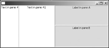
Figure 14-6
sashForm.setWeights(new int[]{1, 2, 3});
Because the weights are just relative ratios, setWeights(new int[]{10, 20, 30}) is equivalent to setWeights(new int[]{1, 2, 3}), which means the first component occupies 1/6 of the total available space, the second component occupies 2/6, and the third component occupies 3/6.
In most applications, you should add functions to save and load the weights of each SashForm so that the user does not have to adjust children in SashForms every time the application is started.
Maximizing a Control in a SashForm
Sometimes, it is desirable to maximize a control and hide all the others in a SashForm. For example, you may want to hide all other panes except the source code pane so that you can focus on coding. The SashForm class provides the setMaximizedControl method for you to maximize a control:
public void setMaximizedControl(Control control)
To set all the controls to normal layout, you can call the setMaximizedControl method with null as the argument and the sash form will lay out controls using the normal layout separated by sashes.
Use getMaximizedControl to query the current maximized control:
public Control getMaximizedControl()
This method returns the current maximized control or null if no control is maximized in the SashForm.
Let's modify the sample SashForm UI application from previous sections, as shown in Figure 14-7.
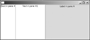
Figure 14-7
 labelA.addMouseListener(new MouseListener() {
 public void mouseDoubleClick(MouseEvent e) {
 if(sashForm2.getMaximizedControl() == labelA)
 sashForm2.setMaximizedControl(null);
 else
 sashForm2.setMaximizedControl(labelA);
 }

 public void mouseDown(MouseEvent e) {
 }

 public void mouseUp(MouseEvent e) {
 }
 });
When the label is double-clicked, the mouse listener is invoked. If the label is currently maximized, you set it back to normal; otherwise, you maximize it by calling the setMaximizedControl method.
Using TabFolders and TabItems
With the TabFolder class, you can place several controls (usually composites) in the same space. The user can choose the desired control to view by selecting the tab corresponding to the control.
In SWT, the tab items in a tab folder are represented by the TabItem class.
Basic Usages
Follow these basic steps to create a tab folder and add tab pages:
- Construct an instance of the TabFolder class.
- Create controls to be placed on the tab folder.
- Create a tab item for each control.
For example, the following code creates the tab folder shown in Figure 14-8:
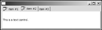
Figure 14-8
 TabFolder tabFolder = new TabFolder(shell, SWT.NULL);
 // tab item #1
 Button button = new Button(tabFolder, SWT.NULL);
 button.setText("This is a button.");

 TabItem tabItem1 = new TabItem(tabFolder, SWT.NULL);
 tabItem1.setText("item #1");
 tabItem1.setImage(icon);
 tabItem1.setControl(button);

 // tab item #2
 Text text = new Text(tabFolder, SWT.MULTI);
 text.setText("This is a text control.");

 TabItem tabItem2 = new TabItem(tabFolder, SWT.NULL);
 tabItem2.setText("item #2");
 tabItem2.setImage(icon);
 tabItem2.setControl(text);

 // tab item #3
 Label label = new Label(tabFolder, SWT.NULL);
 label.setText("This is a text label.");

 TabItem tabItem3 = new TabItem(tabFolder, SWT.NULL);
 tabItem3.setText("item #3");
 tabItem3.setControl(label);
First, the tab folder is created without any style specified. A button control is then created with the tab folder as its parent. After setting the text for the button, we create a tab item and set the button as its control using the setControl method of the TabItem class. The text and image labels for the tab item are set using the setText method and setImage method, respectively. Similarly, we create two more tab items.
When you create a tab folder, you can optionally supply one of the tab position styles — SWT.TOP and SWT.BOTTOM — in the constructor. If SWT.TOP is specified, the tabs will appear at the top of the tab folder (refer to Figure 14-8). Similarly, SWT.BOTTOM causes the tabs to appear at the bottom of the tab folder, as shown in Figure 14-9. If no style is specified, a tab folder has, by default, the SWT.TOP style.
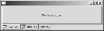
Figure 14-9
Accessing and Selecting TabItems
The TabFolder class provides several methods for you to access and select tab items.
To count the total number of tab items contained in a tab folder, use the getItemCount method:
public int getItemCount()
The getItems method returns all the tab items in an array:
public TabItem[] getItems()
You can get the tab item at the specified index position using the getItem method:
public TabItem getItem(int index)
The getItem may throw an exception if the given index is out of range. To find the index position of a given tab item in the tab folder, you use the indexOf method:
public int indexOf(TabItem item)
If the tab item is not contained in the tab folder, the indexOf method returns -1.
When the user clicks a tab, the tab item corresponding to the tab is selected and a selection event is generated. You use the getSelection method to get the current selected tab item.
public TabItem[] getSelection()
The getSelection method returns the current selected tab item in an array of size 1 or an empty array if none of the tab items is selected. If a tab item is selected, you can get it using getSelection()[0]. To get the index position of the current selected tab item, you can use the getSelectionIndex method:
public int getSelectionIndex()
The getSelectionIndex method returns the index of the selected tab item or -1 if no tab item is selected.
Use the following method to add/remove typed selection listeners:
 public void addSelectionListener(SelectionListener listener)
 public void removeSelectionListener(SelectionListener listener)
For example, you can add a selection listener to the tab folder sample application by using the following code:
 tabFolder.addSelectionListener(new SelectionListener() {
 public void widgetSelected(SelectionEvent e) {
 System.out.println("Selected item index = " +
 tabFolder.getSelectionIndex());
 System.out.println("Selected item = " +
 (tabFolder.getSelection() == null ?
 "null" : tabFolder.getSelection()[0].toString()));
 }

 public void widgetDefaultSelected(SelectionEvent e) {
 widgetSelected(e);
 }
 });
When the user clicks the middle tab, the following lines are printed out:
 Selected item index = 1
 Selected item = TabItem {item #2}
The TabFolder class also provides two methods for you to select tab items programmatically:
 public void setSelection(int index)
 public void setSelection(TabItem[] items)
For example, to select the middle tab item (index is 1) in the tab folder, you can use either setSelection(1) or setSelection(new TabItem[]{tabItem2}). Neither of the preceding methods generates selection events. When you call either of them, none of the selection listeners is notified. If this behavior is not desired, you can extend the TabFolder class and override the two methods to add some code to notify the selection listeners.
Customizing TabItems
In addition to the setControl method, the TabItem class offers several methods for you to customize the appearance of a tab item.
You can use the setImage method and the setText method to set the image label and the text label for a tab item. The image label and text label are displayed on the tab:
 public void setImage(Image image)
 public void setText(String string)
Optionally, you can set the tooltip text for a tab item using the setToolTipText method:
public void setToolTipText(String string)
Using Browsers
The SWT browser control renders HTML documents. The org.eclipse.browser package contains the Browser class and classes for event handling. The Browser class provides essential web navigation methods and methods for you to add and remove listeners for various events.
This section first shows you how to navigate using the browser control. During navigation, various events can be generated by the browser, and you can register proper event listeners. Finally, you learn how to build a simple web browser using the SWT browser control.
Navigation Methods
You use the setUrl method to load a web page for a URL:
public boolean setUrl(String url)
The preceding method loads the specified URL and returns true if the page is loaded successfully or false otherwise.
If you need to render the HTML document in memory, you can use the setText method:
public boolean setText(String html)
For example, the following code renders the text "SWT & JFace" in Header 1 format:
 browser.setText(
 "
" + "
SWT & JFace
" + "
");
To navigate to the previous session history page, use the back method:
public boolean back()
The back method returns true if the operation is successful, false otherwise. To check whether you can navigate to the previous session history page, you can use the isBackEnabled method:
public boolean isBackEnabled()
Similarly, you can use the forward method to navigate to the next session history item and the isForwardEnabled method to check whether the forwarding operation is possible:
 public boolean forward()
 public boolean isForwardEnabled()
Use the refresh method to refresh the current page and the stop method to stop any loading and rendering operation:
 public void refresh()
 public void stop()
Events
You learned about all the navigation methods in the previous section. When you navigate pages programmatically or use your keyboard or mouse, various events are generated. All the events that the browser control can generate are listed in the following table.
|
Events |
Listeners |
Remarks |
|---|---|---|
|
LocationEvent |
LocationListener |
Fired by a browser when the browser navigates to a different URL. |
|
TitleEvent |
TitleListener |
Generated when the title of the current document is available or when it changes. |
|
StatusTextEvent |
StatusTextListener |
Generated when the status text is changed. |
|
ProgressEvent |
ProgressListener |
Generated when progress is made during loading of a URL or when the loading is completed. |
|
WindowEvent |
OpenWindowListener |
Sent when a new window needs to be created or when a window needs to be closed. (When we are talking about browsers, a window is a browser control.) |
The terms LocationEvent, TitleEvent, StatusTextEvent, and ProgressEvent are easy to understand and handle. For example, the following code creates a shell containing a browser and registers a listener for TitleEvents:
 Shell shell = new Shell(display);
 shell.setLayout(new GridLayout());

 Browser browser = new Browser(shell, SWT.BORDER);
 browser.addTitleListener(new TitleListener() {
 public void changed(TitleEvent event) {
 shell.setText(event.title + " - powered by SWT");
 }
 });
When the title of the currently displayed HTML document is available or modified, you display the HTML document title on the top of the shell.
WindowEvents are a little complicated. The Javadoc of the WindowEvent class suggests using the following method to equip an existing browser control with the capability of handling window creating and closing requests:
 static void initialize(final Display display, Browser browser) {
 browser.addOpenWindowListener(new OpenWindowListener() {
 public void open(WindowEvent event) {
 Shell shell = new Shell(display);
 shell.setText("New Window");
 shell.setLayout(new FillLayout());
 Browser browser = new Browser(shell, SWT.NONE);
 initialize(display, browser);
 event.browser = browser;
 }
 });

 browser.addVisibilityWindowListener(new VisibilityWindowListener() {
 public void hide(WindowEvent event) {
 Browser browser = (Browser)event.widget;
 Shell shell = browser.getShell();
 shell.setVisible(false);
 }

 public void show(WindowEvent event) {
 Browser browser = (Browser)event.widget;
 Shell shell = browser.getShell();
 if (event.location != null) shell.setLocation(event.location);
 if (event.size != null) {
 Point size = event.size;
 shell.setSize(shell.computeSize(size.x, size.y));
 }
 shell.open();
 }
 });

 browser.addCloseWindowListener(new CloseWindowListener() {
 public void close(WindowEvent event) {
 Browser browser = (Browser)event.widget;
 Shell shell = browser.getShell();
 shell.close();
 }
 });
 }
It is simple to use the preceding method:
initialize(shell.getDisplay(), browser);
When the user clicks a link with the target as _blank (for example, <a href="go.html" target="_blank">Go</a>) or when a window opening JavaScript code (for example, window.open) is executed, the registered openWindowListener is invoked. The open method first creates a new browser control inside a new shell. The browser field of the event object is set to the newly created browser control — for example, this browser is the "new window." The HTML document is then opened in the new window. If no OpenWindowListener provides any browser control to the event object, no new window is constructed. Therefore, the new window opening operation is ignored.
A VisibilityWindowListener is registered to handle window visibility–related events. Note that WindowEvent objects may contain detailed information such as the location and size of the window. For example, the following JavaScript code gives information that will be included in WindowEvent objects.
 url = "http://www.asprise.com/special/popup.htm";
 window.open(url,'PopURL','width=400,height=327,screenX=0,screenY=0,left=0,top=0');
To handle window closing events, a CloseWindowListener is registered. If the window needs to be closed, simply close the shell containing the window.
A Simple Web Browser
In this section, we create a simple Web browser using the SWT browser control (see Figure 14-10).
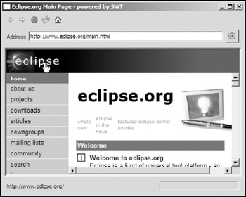
Figure 14-10
This simple Web browser allows the user to navigate Web pages easily and to go backward or forward. Additionally, it supports new window creation.
Create the UI components first:
 public class SWTBrowser {
 Display display = new Display();
 Shell shell = new Shell(display);

 Text textLocation;

 Browser browser;

 Label labelStatus;
 public SWTBrowser() {
 shell.setLayout(new GridLayout());

 ToolBar toolBar = new ToolBar(shell, SWT.FLAT | SWT.RIGHT);
 final ToolBarManager manager = new ToolBarManager(toolBar);

 Composite compositeLocation = new Composite(shell, SWT.NULL);
 compositeLocation.setLayout(new GridLayout(3, false));
 compositeLocation.setLayoutData(new GridData(GridData.FILL_HORIZONTAL));

 Label labelAddress = new Label(compositeLocation, SWT.NULL);
 labelAddress.setText("Address");

 textLocation = new Text(compositeLocation, SWT.SINGLE | SWT.BORDER);
 textLocation.setLayoutData(new GridData(GridData.FILL_HORIZONTAL));

 Button buttonGo = new Button(compositeLocation, SWT.NULL);
 buttonGo.setImage(new Image(shell.getDisplay(), "icons/web/go.gif"));

 browser = new Browser(shell, SWT.BORDER);
 browser.setLayoutData(new GridData(GridData.FILL_BOTH));

 Composite compositeStatus = new Composite(shell, SWT.NULL);
 compositeStatus.setLayoutData(new GridData(GridData.FILL_HORIZONTAL));
 compositeStatus.setLayout(new GridLayout(2, false));

 labelStatus = new Label(compositeStatus, SWT.NULL);
 labelStatus.setText("Ready");
 labelStatus.setLayoutData(new GridData(GridData.FILL_HORIZONTAL));

 final ProgressBar progressBar =
 new ProgressBar(compositeStatus, SWT.SMOOTH);
A label is created to display a status message and a progress bar is created to display page loading progress.
Next, register a selection listener for both the button and the address text field so that the user can navigate to the URL specified in the address text field by clicking the button or simply pressing the Enter key in the text field.
 Listener openURLListener = new Listener() {
 public void handleEvent(Event event) {
 browser.setUrl(textLocation.getText());
 }
 };

 buttonGo.addListener(SWT.Selection, openURLListener);
 textLocation.addListener(SWT.DefaultSelection, openURLListener);
 // Adds tool bar items using actions.
 final Action actionBackward =
 new Action(
 "&Backward",
 ImageDescriptor.createFromFile(
 null,
 "icons/web/backward.gif")) {
 public void run() {
 browser.back();
 }
 };
 actionBackward.setEnabled(false); // action is disabled at start up.

 final Action actionForward =
 new Action(
 "&Forward",
 ImageDescriptor.createFromFile(
 null,
 "icons/web/forward.gif")) {
 public void run() {
 browser.forward();
 }
 };
 actionForward.setEnabled(false); // action is disabled at start up.

 Action actionStop =
 new Action(
 "&Stop",
 ImageDescriptor.createFromFile(null, "icons/web/stop.gif")) {
 public void run() {
 browser.stop();
 }
 };

 Action actionRefresh =
 new Action(
 "&Refresh",
 ImageDescriptor.createFromFile(
 null,
 "icons/web/refresh.gif")) {
 public void run() {
 browser.refresh();
 }
 };

 Action actionHome =
 new Action(
 "&Home",
 ImageDescriptor.createFromFile(null, "icons/web/home.gif")) {
 public void run() {
 browser.setUrl("http://www.eclipse.org");
 }
 };

 manager.add(actionBackward);
 manager.add(actionForward);
 manager.add(actionStop);
 manager.add(actionRefresh);
 manager.add(actionHome);

 manager.update(true);
 toolBar.pack();
Several listeners such as LocationListener and StatusListener are registered to listen for events and to update the controls in the UI:
 browser.addLocationListener(new LocationListener() {
 public void changing(LocationEvent event) {
 // Displays the new location in the text field.
 textLocation.setText(event.location);
 }

 public void changed(LocationEvent event) {
 // Update tool bar items.
 actionBackward.setEnabled(browser.isBackEnabled());
 actionForward.setEnabled(browser.isForwardEnabled());
 manager.update(false);
 }
 });

 browser.addProgressListener(new ProgressListener() {
 public void changed(ProgressEvent event) {
 progressBar.setMaximum(event.total);
 progressBar.setSelection(event.current);
 }

 public void completed(ProgressEvent event) {
 progressBar.setSelection(0);
 }
 });

 browser.addStatusTextListener(new StatusTextListener() {
 public void changed(StatusTextEvent event) {
 labelStatus.setText(event.text);
 }
 });

 browser.addTitleListener(new TitleListener() {
 public void changed(TitleEvent event) {
 shell.setText(event.title + " - powered by SWT");
 }
 });
Finally, initialize the new window-handling mechanism for the browser by using the initialize method in the last section and open the shell.
 initialize(display, browser);

 shell.setSize(500, 400);
 shell.open();

 while (!shell.isDisposed()) {
 if (!display.readAndDispatch()) {
 // If no more entries in event queue
 display.sleep();
 }
 }

 display.dispose();
 }
Summary
Starting with the simple composite, Group, this chapter introduced several other important SWT controls that were not covered in previous chapters. The SashForm control is very useful for positioning and resizing several adjoining controls. To save the space, you can use a TabFolder to have many controls share the same space and the user can click the tab to access each corresponding control. The Browser control was also discussed. We developed a simple web browser to help you understand the navigation methods and browser event handling mechanism. In the next chapter, you learn about SWT graphics programming.
Part I - Fundamentals
- Overview of Java UI Toolkits and SWT/JFace
- SWT/JFace Mechanisms
- Jump Start with SWT/JFace
- SWT Event Handling, Threading, and Displays
- Basic SWT Widgets
- Layouts
Part II - Design Basics
Part III - Dynamic Controls
- Scales, Sliders, and Progress Bars
- Other Important SWT Components
- SWT Graphics and Image Handling
- Drag and Drop and the Clipboard
- Printing
- JFace Windows and Dialogs
Part IV - Application Development
EAN: 2147483647
Pages: 147
