White Space Characters
All of these different spacing options can be applied by choosing Type > Insert White Space, or by choosing Insert White Space from the Type Tool contextual menu (Right+Click/Ctrl+Click).
Figure 6.13. Insert White Space.
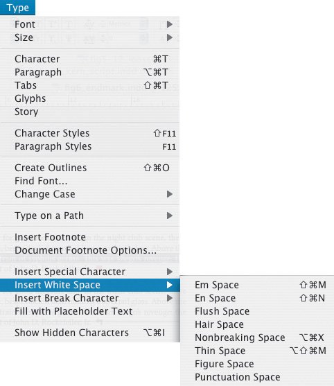
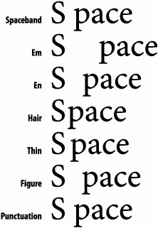
Figure 6.14. White Space Characters.
Em Space: Cmd+Shift+M (Ctrl+Shift+M)
An em space is a relative unit, equal in width to the size of your type. In 12-point type, an em space is 12 points wide; in 72-point type, it is 72 points. A common misunderstanding is that an em space is the width of an M.
En Space: Cmd+Shift+N (Ctrl+Shift+N)
An en space is one-half the width of an em space.
Flush Space
This adds a variable amount of space to the last line of a fully justified paragraph. A Flush Space can be useful if you want to add space between the last word and an end ornament or if you are preparing a price list and want to push the price flush with the right column edge. In justified text, the space expands to absorb all available extra space on the last line. A caveat: The Flush Space only works when you apply the Justify All Lines option to the paragraph. For that reason, you may be better off using a Right Indent Tab (Shift+Tab or Insert Special Character > Right Indent Tab) to get the same effect.
Hair Space: Cmd+Option+Shift+I (Ctrl+Alt+Shift+I)
One-twenty-fourth the width of an em space. That's pretty darn small. It could be a used as an alternative to a Thin Space.
Nonbreaking Space: Cmd+Option+X (Ctrl+Alt+X)
The same width as pressing the spacebar, but it prevents two (or more) words, like a name for example, from being broken across a line. In fact, if you have a short line at the end of a paragraph, using a Nonbreaking Space is preferable to forcing a line break with a Shift-Return. If the text is edited or reflowed, you're less likely to end up with a break in the middle of your line. You can achieve the same end by applying No Break to your selected range of text.
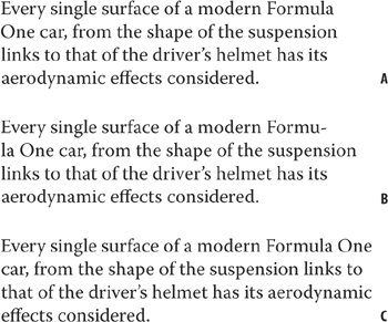
Figure 6.15. Without intervention, "Formula One" breaks over two lines (example A). Using a Nonbreaking Space causes "Formula" to hyphenate (example B). Selecting both words and choosing No Break moves the whole phrase up to the first line (example C).
Thin Space: Cmd+Option+Shift+M (Ctrl+Alt+Shift+M)
One-eighth the width of an em spacea good choice on either side of an em dash.
Figure Space
Lining numbers in most fonts are of equal width and a figure space is the same width as a number in the typeface. Figure Spaces can be used to help align numbers in tables.
Punctuation Space
A Punctuation Space is the same width as an exclamation mark, period, or colon in the typeface.
Line Break (aka Soft Return, Forced Line Break) Shift-Return
Line breaks are essential whenever you want to start a new line without starting a new paragraph. This will avoid creating a new paragraph that takes on the potentially unwanted formatting attributes of the paragraph that it came from.
Figure 6.16. Using a forced line breakShift-Return (example A) to move a broken word down to the next line vs. using a Return (example B), which creates a new paragraph based on the formats of the paragraph it came from.
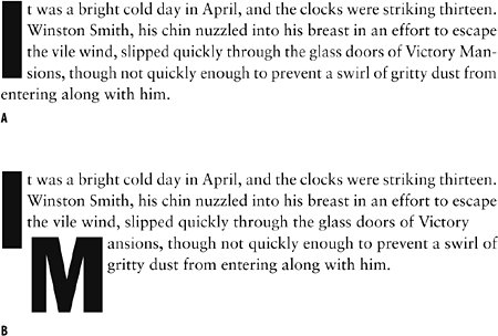
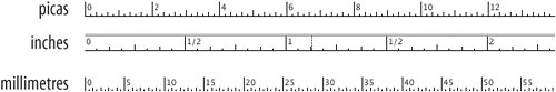
Figure 6.17. InDesign's rulers in picas, inches, and millimeters.
Note
If your measurement is in picas, expressing 6 points as merely 6 would be interpreted as 72 points. 6 points would be typed 0p6 or 6 pt. This probably sounds more confusing than it isyou'll quickly get the hang of it.
Tip
In reality, picas and points overlap with other measurement systemsmillimeters or inches (or both), depending on your preference And InDesign allows you to mix your measurements. Whichever unit of measurement you choose, you can type in values in any supported unit of measurement (just make sure you add the mm or the " after the number) and InDesign will make the conversion for you. So, if you're like me and prefer to work in picas, but sometimes like to express the dimension of certain elements like pictures frames in inches, then type "in" after the value.
The Glyphs Palette |
Part I: Character Formats
Getting Started
- Getting Started
- An InDesign Type Map: Where to Find Stuff
- Viewing Your Page
- Creating a Typography Workspace
- Up Next
Going with the Flow
- Going with the Flow
- A Blank Sheet: Typing on Your Page
- Text Flow
- Threading Text Frames
- Using Placeholder Text
- Pasting Text
- Importing Word Text
- Up Next
Character Reference
- Character Reference
- Less is More, Maybe
- Type Anatomy
- Type Classification
- Character Formatting Options
- Readability
- Up Next
Getting the Lead Out
- Getting the Lead Out
- How Much Is Enough?
- (Not) Using Auto Leading
- Keep It Consistent, Except. . .
- Leading Menu Options and Keyboard Shortcuts
- See Also
- Up Next
Kern, Baby, Kern
- Kern, Baby, Kern
- When to Kern
- Metrics Kerning
- Optical Kerning
- Manual Kerning
- How Much to Kern
- Tracking
- When to Track
- Controlling Widows and Orphans
- Up Next
Sweating the Small Stuff: Special Characters, White Space, and Glyphs
- Sweating the Small Stuff: Special Characters, White Space, and Glyphs
- Typographers Quotes
- Apostrophes
- Dashes
- Ellipses
- End Marks
- White Space Characters
- The Glyphs Palette
- Footnotes
- Footnote Options
- Up Next
OpenType: The New Frontier in Font Technology
- OpenType: The New Frontier in Font Technology
- Ligatures
- Discretionary Ligatures
- Ordinals/Raised and Lowered Characters
- Swash Characters
- Fractions
- Oldstyle Figures
- Contextual Alternates
- Opticals
- Glyph Positioning
- Stylistic Sets
- Up Next
Part II: Paragraph Formats
Aligning Your Type
- Aligning Your Type
- Centering Type
- Clean Shaven or Rugged: Justified vs. Ragged Type
- How InDesign Justifies Type
- Balancing Ragged Lines
- Right-Aligned Type
- Optical Margin Alignment
- Indent to Here
- Vertical Alignment
- Up Next
Paragraph Indents and Spacing
First Impressions: Creating Great Opening Paragraphs
- First Impressions: Creating Great Opening Paragraphs
- Creating a Simple Drop Cap
- Drop Cap Aesthetics
- Tricks with Drop Caps
- Up Next
Dont Fear the Hyphen
Mastering Tabs and Tables
- Mastering Tabs and Tables
- Setting Tabs
- Creating Decimal Tabs
- Using Tab Leaders
- Reply Forms
- Numbered Lists
- Right Indent Tab
- Working with Tables
- Creating a Table
- Working with Rows and Columns
- Working with Table Cells
- Up Next
Part III: Styles
Stylin with Paragraph and Character Styles
- Stylin with Paragraph and Character Styles
- Creating Styles
- Applying Styles
- Editing Styles
- Redefining Styles
- Creating Default Styles
- A Typical Style Sheet
- Up Next
Mo Style
Part IV: Page Layout
Setting Up Your Document
- Setting Up Your Document
- Choosing a Page Size
- Determining Margins
- Determining Column Width
- Changing Columns
- Break Characters
- Page Numbers
- Section Markers
- Up Next
Everything in Its Right Place: Using Grids
- Everything in Its Right Place: Using Grids
- Things to Consider
- Your Grid Tool Kit
- Calculating the Height of the Type Area
- Align to Grid
- First Baseline Options
- Snap to Guides
- Up Next
Text Wraps: The Good, the Bad, and the Ugly
- Text Wraps: The Good, the Bad, and the Ugly
- Applying Text Wraps
- Wrapping Type Around Irregularly Shaped Graphics
- Text Wrap Preferences
- Ignoring Text Wrap
- Anchored Objects
- Up Next
Type Effects
EAN: 2147483647
Pages: 186
- Chapter I e-Search: A Conceptual Framework of Online Consumer Behavior
- Chapter V Consumer Complaint Behavior in the Online Environment
- Chapter VII Objective and Perceived Complexity and Their Impacts on Internet Communication
- Chapter XI User Satisfaction with Web Portals: An Empirical Study
- Chapter XIII Shopping Agent Web Sites: A Comparative Shopping Environment
