When to Track
OK, after all the safety warnings and disclaimers, here are some scenarios when negative tracking can come in handy:
- In headlines, especially sans serif headlines, the space between the letters can look disproportionately large. Because widely set letters make the words harder to read, applying negative tracking can help the characters hold together better and form more easily recognized word shapes. Don't overdo it, though; tracking too tightly will cause characters to collide and words to run into each other.
Figure 5.10. A headline without tracking (example A) and with 25 tracking (example B) applied as part of a style sheet definition.

- Condensed typefaces may benefit from a modest amount (10) of negative tracking.
- Negative tracking can be used to help fix composition problems in passages of text. When tracking tighter across a range of text or a paragraph to pull back a line, remember that, like so much of good typography, your tracking adjustments should be "invisible." If the reader can tell, then you've gone too faras a general rule of thumb, avoid using more than 15/1000 of an em. Also, if you have your Justification and Hyphenation set up correctly, there will be much less need for manual intervention in the form of tracking. (See Chapter 8: " Aligning Your Type")
Tip: Quark Kerning and Tracking Conversions
If you're a Quark refugee, you'll need to multiply your old Quark kerning and tracking values by 5 to give you the equivalent InDesign values. In Quark terms, a kerning/tracking value of 1 equals 1/200th of an em; in InDesign, "1" equals 1/1000th of an em. For example, if you tracked text to 1 in Quark, you would need to track it to 5 in InDesign.
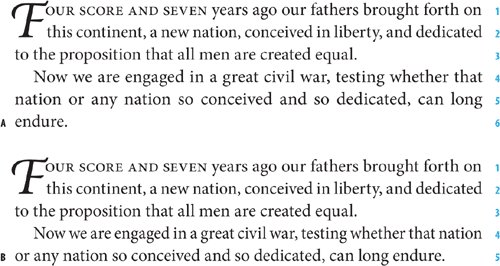
Figure 5.11. Tracking to bring back a short line. In example A, line 5 suffers from bad word spacing and line 6 is short. In example B, the second paragraph has 5 tracking applied, which is sufficient to pull the last line back as well as improve the word spacing.

- In script faces, the characters should connect with each other so that the type looks like handwriting. If the font has well-designed kerning metrics, no intervention will be necessary. But pay careful attention to the way these characters connector don't connect, as the case may beand adjust your tracking accordingly.
Positive tracking might be useful in these situations:
- Headlines set in all caps, especially in serif faces, look more elegant with positive tracking of up to 50/1000 of em.
- Positive tracking can help improve the type color of very small type like captions or photo credits. Again, be cautioustoo much tracking will cause the type to fall apart and lose its distinctive word shapes.
- When reversing type out of a solid background, positive tracking can improve readability.
Figure 5.12. All caps serif title treatment with no tracking (example A) and reduced in size with +200 tracking (example B).

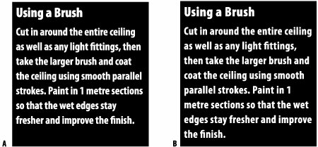
Figure 5.13. Reversed-out text with no tracking (example A) and with +25 tracking (example B).

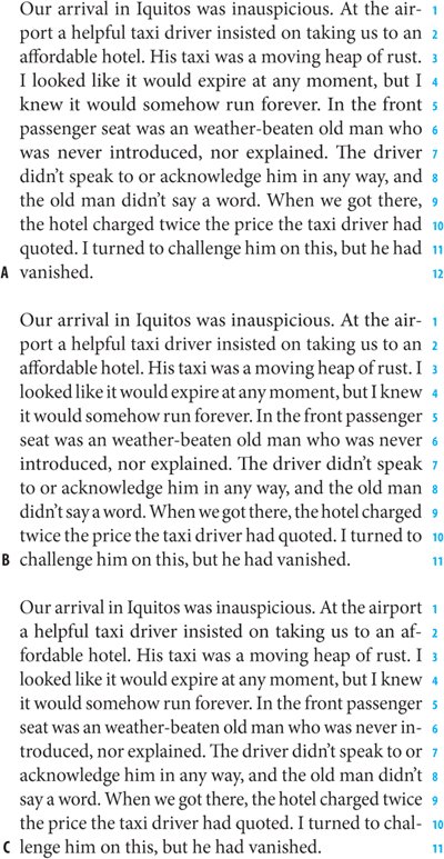
Figure 5.14. Text block with word spaces adjusted (example A) and tracked (example B).

Tip: Adjusting Word Spacing
Here's a handy feature: The ability to adjust the word spacing across a range of characters while leaving the character spacing unaffected. Command+Option+Delete (Ctrl-Alt-Backspace) will tighten the word spaces; Command+Option+Shift-Backslash (Ctrl+Alt+Shift+ Backslash) will increase the word spaces.
Controlling Widows and Orphans |
Part I: Character Formats
Getting Started
- Getting Started
- An InDesign Type Map: Where to Find Stuff
- Viewing Your Page
- Creating a Typography Workspace
- Up Next
Going with the Flow
- Going with the Flow
- A Blank Sheet: Typing on Your Page
- Text Flow
- Threading Text Frames
- Using Placeholder Text
- Pasting Text
- Importing Word Text
- Up Next
Character Reference
- Character Reference
- Less is More, Maybe
- Type Anatomy
- Type Classification
- Character Formatting Options
- Readability
- Up Next
Getting the Lead Out
- Getting the Lead Out
- How Much Is Enough?
- (Not) Using Auto Leading
- Keep It Consistent, Except. . .
- Leading Menu Options and Keyboard Shortcuts
- See Also
- Up Next
Kern, Baby, Kern
- Kern, Baby, Kern
- When to Kern
- Metrics Kerning
- Optical Kerning
- Manual Kerning
- How Much to Kern
- Tracking
- When to Track
- Controlling Widows and Orphans
- Up Next
Sweating the Small Stuff: Special Characters, White Space, and Glyphs
- Sweating the Small Stuff: Special Characters, White Space, and Glyphs
- Typographers Quotes
- Apostrophes
- Dashes
- Ellipses
- End Marks
- White Space Characters
- The Glyphs Palette
- Footnotes
- Footnote Options
- Up Next
OpenType: The New Frontier in Font Technology
- OpenType: The New Frontier in Font Technology
- Ligatures
- Discretionary Ligatures
- Ordinals/Raised and Lowered Characters
- Swash Characters
- Fractions
- Oldstyle Figures
- Contextual Alternates
- Opticals
- Glyph Positioning
- Stylistic Sets
- Up Next
Part II: Paragraph Formats
Aligning Your Type
- Aligning Your Type
- Centering Type
- Clean Shaven or Rugged: Justified vs. Ragged Type
- How InDesign Justifies Type
- Balancing Ragged Lines
- Right-Aligned Type
- Optical Margin Alignment
- Indent to Here
- Vertical Alignment
- Up Next
Paragraph Indents and Spacing
First Impressions: Creating Great Opening Paragraphs
- First Impressions: Creating Great Opening Paragraphs
- Creating a Simple Drop Cap
- Drop Cap Aesthetics
- Tricks with Drop Caps
- Up Next
Dont Fear the Hyphen
Mastering Tabs and Tables
- Mastering Tabs and Tables
- Setting Tabs
- Creating Decimal Tabs
- Using Tab Leaders
- Reply Forms
- Numbered Lists
- Right Indent Tab
- Working with Tables
- Creating a Table
- Working with Rows and Columns
- Working with Table Cells
- Up Next
Part III: Styles
Stylin with Paragraph and Character Styles
- Stylin with Paragraph and Character Styles
- Creating Styles
- Applying Styles
- Editing Styles
- Redefining Styles
- Creating Default Styles
- A Typical Style Sheet
- Up Next
Mo Style
Part IV: Page Layout
Setting Up Your Document
- Setting Up Your Document
- Choosing a Page Size
- Determining Margins
- Determining Column Width
- Changing Columns
- Break Characters
- Page Numbers
- Section Markers
- Up Next
Everything in Its Right Place: Using Grids
- Everything in Its Right Place: Using Grids
- Things to Consider
- Your Grid Tool Kit
- Calculating the Height of the Type Area
- Align to Grid
- First Baseline Options
- Snap to Guides
- Up Next
Text Wraps: The Good, the Bad, and the Ugly
- Text Wraps: The Good, the Bad, and the Ugly
- Applying Text Wraps
- Wrapping Type Around Irregularly Shaped Graphics
- Text Wrap Preferences
- Ignoring Text Wrap
- Anchored Objects
- Up Next
Type Effects
EAN: 2147483647
Pages: 186
