Creating a Table
There are three approaches to creating a table: from scratch, converting existing text to a table, or importing a table from Microsoft Word or Excel.
From Scratch
- Draw a text frame with the Type Tool, or insert your type pointer into an existing text frame.
- Choose Table > Insert Table.
- Specify the numbers of rows and columns and click OK. Optionally, if the table will span more than one column or frame, specify the number of (repeating) header or footer rows.
Each table cell is like a text frame. You type or paste text, or place text into a table cell just as you would do with a text frame. You can also paste or place (File > Place) graphics into table cells.
Note
If you add a graphic that is larger than the cell, the cell height expands to accommodate the graphic, but the cell width remains fixed, causing the graphic to extend beyond the right side of the cell. If the row is set to a fixed height, a graphic that is taller than the row height causes the cell to be overset.
Converting Text to a Table
If you are going to convert text to a table, it pays to set up the text properly with tabs separating the columns and paragraph returns separating the rows. Once your tabs and carriage returns are in the right place, select your text and choose Table > Convert Text to Table.
It's rare that you'd want to, but you can also make this conversion in reverse by inserting your Type Tool in a table and choosing Table > Convert Table to Text.
Figure 12.11. Tab Delimited Text.
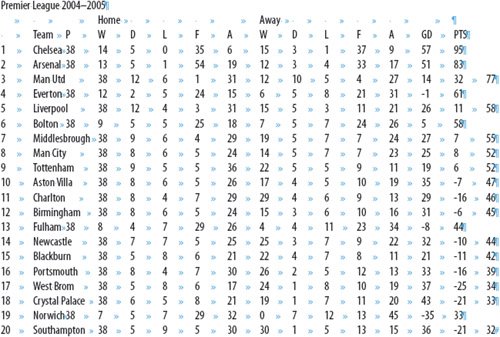
Figure 12.12. The same text converted to a Table (it looks worse than it is).
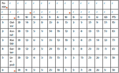
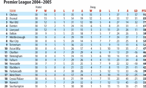
Figure 12.13. The cleaned-up table: Column Widths and Row Heights adjusted. Cell Inset Spacing reduced. Paragraph Styles Applied. Table Border, Row, and Column Strokes removed. Alternating Fills of 20 percent cyan applied.
Importing a Table
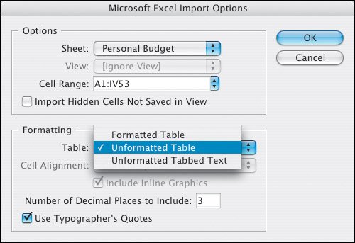
There's no point in reinventing the wheel: If you already have a table in a Microsoft Excel spreadsheet or in Microsoft Word, choose File > Place to import it into InDesign, either retaining the formatting (probably not a good idea) or stripping out the formattingthe information will appear as tabbed textand then using InDesign's Table tools to prettify it.
Figure 12.14. Table Import Options.
Selecting a Table
Selecting a whole table allows you to change the formatting of all the table's cells. To do so, move your pointer to the upper left corner of the tableit becomes a southeast pointing arrowand click. Alternatively, with your pointer inside the table, choose Table > Select > Table (Cmd+Option+A/Ctrl+Alt+A).
Breaking Tables Across Frames
Large tables can be a pain, but, thankfully, if the table is taller than the text frame in which it resides, you can thread the frame with another framein the same way as you would thread a regular text frameto continue the table.
Keep Options determines how many rows should remain together. You can also specify where a row breaks, such as at the top of a column or frame.
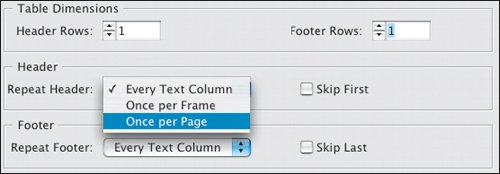
If you want a header or footer row to repeat information in the new frame, choose Table > Headers and Footers.
If you didn't set up a header or footer row first time around, you can easily convert an existing row to a header or footer row by choosing Table > Convert Rows > To Header or To Footer.
Tip: Tabs in Tables
When you're working in a table, pressing Tab moves your cursor to the next cell. If you want to insert a tab in a cell, choose Type > Insert Special Character > Tab.
Figure 12.15. Header and Footer Options.
Adding Borders, Strokes, and Fills to a Table
In the Table Options dialog box, you can change the stroke of the table border and add alternating strokes and fills to columns and rows.
To enhance the readability of a complicated table with a wide measure, use alternating strokes and/or fills to help the eye to track along the table rows. Depending on the nature of your data, you may want to experiment with Alternating Patterns. You can apply your fills or strokes to every other row, every second row, every third row, or, using the First and Next menus, come up with a Custom Row pattern. The same is true with columns.
Note
Unless you choose Preserve Local Formatting, any formatting previously applied to individual table cells will be overridden by the row and column formatting.
Figure 12.16. Preserve Local Formatting. Note that the Fill Color and Tint are shown as blank when this option is checked.
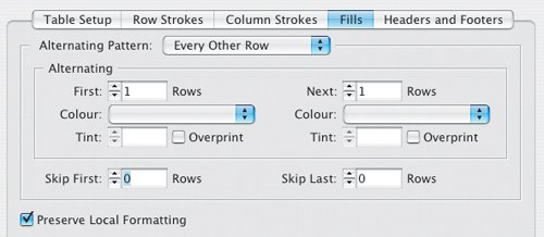
Confusingly, row strokes are set on even when Alternating Pattern is set to None. To turn off row strokes, columns strokes, and the table border at the same time, select the whole table and then target the Stroke swatch on the Swatches palette or at the bottom of the Tool Palette, and then choose None.
To turn off just row strokes, choose Every Other Row as the Alternating Pattern, and then choose None as the color for the First and the Next row. If you want row strokes on, but want to change their weight and/or color, make sure you change both the First and the Next row. Likewise when working with column strokes: They are on even though Alternating Pattern is set to None. To change their stroke weight, choose a different alternating pattern and change the options for the First and the Next column stroke weights.
Tip:Tables and Text Wraps
Text wraps do not work in tables without first jumping through a few hoops. Let's say you have a graphic and some text that you want to wrap around that graphic and you want to insert both items into a single table cell. Create your text frame and graphic outside the table, and then group them together (Cmd+G/Ctrl+G). Select the group, and copy and paste into the table cellthe relationship between the type and graphic is preserved.
Figure 12.17. Changing the weight of row strokes.

Figure 12.18. Table Formatting Shortcuts
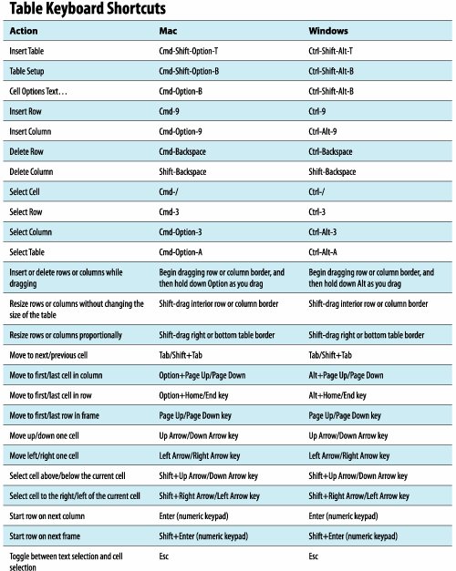
Figure 12.19. Tables and Text Wraps. This section of a film calendar shows a grouped text frame and graphic with text wrap pasted into a single table cell.

Figure 12.20. Using a table in a film poster is the best way to get a "double baseline" with the small credits. Without a table it would be necessary to position separate text frames next to the big credits, an approach that is cumbersome and difficult to edit.

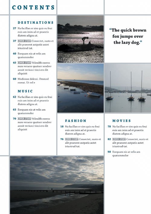
Figure 12.21. This table of contents page uses a clearly defined grid that is a good candidate for a table. Using a table in such a context can make it easier to edit the contents of individual cells in the publication's next issue.
Working with Rows and Columns |
Part I: Character Formats
Getting Started
- Getting Started
- An InDesign Type Map: Where to Find Stuff
- Viewing Your Page
- Creating a Typography Workspace
- Up Next
Going with the Flow
- Going with the Flow
- A Blank Sheet: Typing on Your Page
- Text Flow
- Threading Text Frames
- Using Placeholder Text
- Pasting Text
- Importing Word Text
- Up Next
Character Reference
- Character Reference
- Less is More, Maybe
- Type Anatomy
- Type Classification
- Character Formatting Options
- Readability
- Up Next
Getting the Lead Out
- Getting the Lead Out
- How Much Is Enough?
- (Not) Using Auto Leading
- Keep It Consistent, Except. . .
- Leading Menu Options and Keyboard Shortcuts
- See Also
- Up Next
Kern, Baby, Kern
- Kern, Baby, Kern
- When to Kern
- Metrics Kerning
- Optical Kerning
- Manual Kerning
- How Much to Kern
- Tracking
- When to Track
- Controlling Widows and Orphans
- Up Next
Sweating the Small Stuff: Special Characters, White Space, and Glyphs
- Sweating the Small Stuff: Special Characters, White Space, and Glyphs
- Typographers Quotes
- Apostrophes
- Dashes
- Ellipses
- End Marks
- White Space Characters
- The Glyphs Palette
- Footnotes
- Footnote Options
- Up Next
OpenType: The New Frontier in Font Technology
- OpenType: The New Frontier in Font Technology
- Ligatures
- Discretionary Ligatures
- Ordinals/Raised and Lowered Characters
- Swash Characters
- Fractions
- Oldstyle Figures
- Contextual Alternates
- Opticals
- Glyph Positioning
- Stylistic Sets
- Up Next
Part II: Paragraph Formats
Aligning Your Type
- Aligning Your Type
- Centering Type
- Clean Shaven or Rugged: Justified vs. Ragged Type
- How InDesign Justifies Type
- Balancing Ragged Lines
- Right-Aligned Type
- Optical Margin Alignment
- Indent to Here
- Vertical Alignment
- Up Next
Paragraph Indents and Spacing
First Impressions: Creating Great Opening Paragraphs
- First Impressions: Creating Great Opening Paragraphs
- Creating a Simple Drop Cap
- Drop Cap Aesthetics
- Tricks with Drop Caps
- Up Next
Dont Fear the Hyphen
Mastering Tabs and Tables
- Mastering Tabs and Tables
- Setting Tabs
- Creating Decimal Tabs
- Using Tab Leaders
- Reply Forms
- Numbered Lists
- Right Indent Tab
- Working with Tables
- Creating a Table
- Working with Rows and Columns
- Working with Table Cells
- Up Next
Part III: Styles
Stylin with Paragraph and Character Styles
- Stylin with Paragraph and Character Styles
- Creating Styles
- Applying Styles
- Editing Styles
- Redefining Styles
- Creating Default Styles
- A Typical Style Sheet
- Up Next
Mo Style
Part IV: Page Layout
Setting Up Your Document
- Setting Up Your Document
- Choosing a Page Size
- Determining Margins
- Determining Column Width
- Changing Columns
- Break Characters
- Page Numbers
- Section Markers
- Up Next
Everything in Its Right Place: Using Grids
- Everything in Its Right Place: Using Grids
- Things to Consider
- Your Grid Tool Kit
- Calculating the Height of the Type Area
- Align to Grid
- First Baseline Options
- Snap to Guides
- Up Next
Text Wraps: The Good, the Bad, and the Ugly
- Text Wraps: The Good, the Bad, and the Ugly
- Applying Text Wraps
- Wrapping Type Around Irregularly Shaped Graphics
- Text Wrap Preferences
- Ignoring Text Wrap
- Anchored Objects
- Up Next
Type Effects
EAN: 2147483647
Pages: 186
- Chapter VII Objective and Perceived Complexity and Their Impacts on Internet Communication
- Chapter X Converting Browsers to Buyers: Key Considerations in Designing Business-to-Consumer Web Sites
- Chapter XIII Shopping Agent Web Sites: A Comparative Shopping Environment
- Chapter XV Customer Trust in Online Commerce
- Chapter XVI Turning Web Surfers into Loyal Customers: Cognitive Lock-In Through Interface Design and Web Site Usability
