Type Classification
There is no single recognized standard for classifying typefaces; rather there are several overlapping standards. For our purposes I'm going to use a simplified version of Adobe's type classification, showing three examples of each category.
Venetian Oldstyle
Named after the first Roman typefaces that appeared in Venice around 1470, Venetian typefaces were initially designed to imitate the handwriting of Italian Renaissance scholars. Distinguishing features:
- Sloping bar on the lowercase e
- Angle of stress that approximates that of a broad-nibbed pen held at an angle to the page
- Little contrast between thick and thin strokes
- Examples: Adobe Jenson, Berkeley Oldstyle, Centaur
Garalde Oldstyle
Garalde typefaces include some of the most popular roman styles in use today. Distinguishing features:
- Horizontal bar on the lowercase e
- A slightly greater contrast between thick and thin strokes than Venetian types
- Axis curves that are inclined to the left
- Bracketed serifs
- Examples: Adobe Garamond, Bembo, Minion
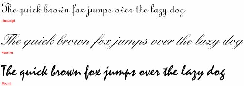
Script
Script typefaces mimic handwriting by joining letters with connecting lines. For this reason, scripts require extra attention to the kerning of their letters. Also, you never want to set a script typeface in all caps.
- Examples: Linoscript, Kunstler Script, Mistral
Figure 3.3. Venetian Oldstyle.
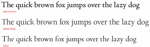
Figure 3.4. Garalde Oldstyle.
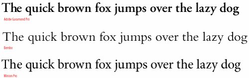
Figure 3.5. Script.
Transitional
Representing a move away from letter shapes based on handwriting, transitional types were the first typefaces to be drawn as shapes in their own right. They represent a transition between Garalde and Modern (Didone) typefaces, and contain aspects of both. Distinguishing features:
- A vertical, or near vertical axis
- Pronounced contrast between hairlines and main strokes
- Serifs are thin, flat and bracketed
- Examples: Baskerville, Perpetua, Stone Serif
Didone (Modern)
Named after Firmin Didot and Giambattista Bodoni, Didone typefaces were a response to improvements in late 18th Century paper production, composition, printing and binding, which made it possible to develop typefaces with strong vertical emphasis and fine hairlines. Distinguishing features:
- Strong contrast between thick and thin strokes
- Vertical axis
- Mechanical appearanceconstructed rather than drawn
- Fine, unbracketed, serifs
- Examples: Bodoni, Didot, Fenice
Slab Serif
With the Industrial Revolution came the increased use of posters, billboards, and other forms of advertising, and the need for bolder, more in-your-face typefaces. Slab serif typefaces were originally called "Egyptians," reflecting the public's enthusiasm for the archeological discoveries of the time. Distinguishing features:
- Heavy, squared-off serifs
- Relatively consistent stroke weight
- Sturdy
- Examples: Clarendon, Memphis, Rockwell
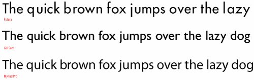
Sans Serif
The first sans serif typeface was issued in 1816, but it wasn't until the 1920s, with the influence of the Bauhaus and de Stijl art movements, that sans serifs became popular. Within the broad category of sans serif, there are four sub categories: Grotesque, Neo-Grotesque, Geometric, and Humanist.
- Examples: Futura, Gill Sans, Myriad Pro
Figure 3.6. Transitional.
![]()
Figure 3.7. Didone (Modern).
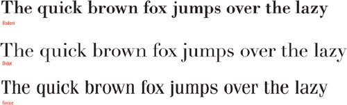
Figure 3.8. Slab Serif.
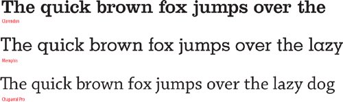
Figure 3.9. Sans Serif.
The following classes of type all play a supporting role:
Decorative & Display
While typefaces in this group incorporate elements from many styles, they are most effective when used in large sizes for display purposes, such as headlines and titles.
- Examples: Arnold Böcklin, Rosewood Standard, Industria
Tip: Formatting Type
In addition to using the Type Tool to select a range of text, you can also use the Selection Tool to select a text frame (or frames) and apply the same formatting options to the whole frame, including any overset text.
Blackletter
These typefaces are sometimes referred to as Old English or Gothic. They were used for text in Germany until World War II, but are now primarily used as display type.
- Examples: Fette Fraktur, Goudy Text
Monospaced
All of the characters in a monospaced typeface have the same width. Most typefaces have proportionally spaced characters, but monospaced characters may be required when setting text on forms, financial statements and other documents where exact spacing is required.
- Examples: Courier, OCR-A Std, Letter Gothic
Ornamentals
Ornamental typefaces contain decorative ornaments or symbols and can be used to embellish or decorate documents. Some OpenType fonts include ornaments as part of their extended character set.
- Examples: Adobe Wood Type Ornaments, Minion Pro Ornaments, Adobe Caslon Ornaments
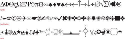
Symbol
Symbol or picture typefaces fulfill a number of nontext functions: musical notation, map making, mathematics, crossword, and puzzle publishing.
- Examples: ITC Zapf Dingbats, Symbol, Carta.
Figure 3.10. Decorative and Display.
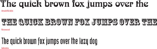
Figure 3.11. Blackletter.
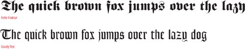
Figure 3.12. Monospaced.
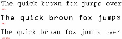
Figure 3.13. Ornamentals.
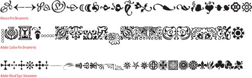
Figure 3.14. Symbol.
Figures 3.16A and 3.16B. Hidden Characters Shown.
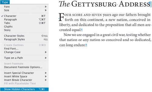
Tip
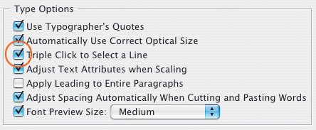
Work with your Hidden Characters visible. This is a good way to troubleshoot potential composition problems because you can see any forced line breaks, tabs, and multiple spaces that may have crept into your text. You can toggle this view option on and off by choosing Type > Show Hidden Characters or by pressing Cmd+Option+i (Ctrl+Alt+i).
Character Formatting Options |
Part I: Character Formats
Getting Started
- Getting Started
- An InDesign Type Map: Where to Find Stuff
- Viewing Your Page
- Creating a Typography Workspace
- Up Next
Going with the Flow
- Going with the Flow
- A Blank Sheet: Typing on Your Page
- Text Flow
- Threading Text Frames
- Using Placeholder Text
- Pasting Text
- Importing Word Text
- Up Next
Character Reference
- Character Reference
- Less is More, Maybe
- Type Anatomy
- Type Classification
- Character Formatting Options
- Readability
- Up Next
Getting the Lead Out
- Getting the Lead Out
- How Much Is Enough?
- (Not) Using Auto Leading
- Keep It Consistent, Except. . .
- Leading Menu Options and Keyboard Shortcuts
- See Also
- Up Next
Kern, Baby, Kern
- Kern, Baby, Kern
- When to Kern
- Metrics Kerning
- Optical Kerning
- Manual Kerning
- How Much to Kern
- Tracking
- When to Track
- Controlling Widows and Orphans
- Up Next
Sweating the Small Stuff: Special Characters, White Space, and Glyphs
- Sweating the Small Stuff: Special Characters, White Space, and Glyphs
- Typographers Quotes
- Apostrophes
- Dashes
- Ellipses
- End Marks
- White Space Characters
- The Glyphs Palette
- Footnotes
- Footnote Options
- Up Next
OpenType: The New Frontier in Font Technology
- OpenType: The New Frontier in Font Technology
- Ligatures
- Discretionary Ligatures
- Ordinals/Raised and Lowered Characters
- Swash Characters
- Fractions
- Oldstyle Figures
- Contextual Alternates
- Opticals
- Glyph Positioning
- Stylistic Sets
- Up Next
Part II: Paragraph Formats
Aligning Your Type
- Aligning Your Type
- Centering Type
- Clean Shaven or Rugged: Justified vs. Ragged Type
- How InDesign Justifies Type
- Balancing Ragged Lines
- Right-Aligned Type
- Optical Margin Alignment
- Indent to Here
- Vertical Alignment
- Up Next
Paragraph Indents and Spacing
First Impressions: Creating Great Opening Paragraphs
- First Impressions: Creating Great Opening Paragraphs
- Creating a Simple Drop Cap
- Drop Cap Aesthetics
- Tricks with Drop Caps
- Up Next
Dont Fear the Hyphen
Mastering Tabs and Tables
- Mastering Tabs and Tables
- Setting Tabs
- Creating Decimal Tabs
- Using Tab Leaders
- Reply Forms
- Numbered Lists
- Right Indent Tab
- Working with Tables
- Creating a Table
- Working with Rows and Columns
- Working with Table Cells
- Up Next
Part III: Styles
Stylin with Paragraph and Character Styles
- Stylin with Paragraph and Character Styles
- Creating Styles
- Applying Styles
- Editing Styles
- Redefining Styles
- Creating Default Styles
- A Typical Style Sheet
- Up Next
Mo Style
Part IV: Page Layout
Setting Up Your Document
- Setting Up Your Document
- Choosing a Page Size
- Determining Margins
- Determining Column Width
- Changing Columns
- Break Characters
- Page Numbers
- Section Markers
- Up Next
Everything in Its Right Place: Using Grids
- Everything in Its Right Place: Using Grids
- Things to Consider
- Your Grid Tool Kit
- Calculating the Height of the Type Area
- Align to Grid
- First Baseline Options
- Snap to Guides
- Up Next
Text Wraps: The Good, the Bad, and the Ugly
- Text Wraps: The Good, the Bad, and the Ugly
- Applying Text Wraps
- Wrapping Type Around Irregularly Shaped Graphics
- Text Wrap Preferences
- Ignoring Text Wrap
- Anchored Objects
- Up Next
Type Effects
EAN: 2147483647
Pages: 186
