First-Line Indents
The humble first-line indent plays a crucial role in the readability of documents, notifying the reader that one paragraph has ended and a new one is about to begin.
You wouldn't think there would be too much to say about first-line indents. They're indents on the first line of a paragraph. 'Nuff said. Not if you're Jan Tschichold. The famous typographer wrote several articles about first-line indents and was unequivocal on the subject: "The beginnings of paragraphs must be indented. Paragraphs without indent…are a bad habit and should be eliminated." And more: "Typesetting without indentation makes it difficult for the reader to comprehend what has been printed. And that is its most important disadvantage. While blunt beginnings seem to create a uniform and consistent impression when compared to normal typesetting, this impression is paid for with a serious loss of comprehension."
How Big Should They Be?
There is no hard and fast rule, but 1 em is a good starting point. If you're using 10-point type, a 10-point first-line indent is suitable. Anything less and the indent may be missed. Alternatively you can use your leading increment so that if your text is 10/12, then a 12-point first line indent is suitable. Some people prefer a slightly larger indent, especially if they're working with wide columns. Just make sure your first-line indent is not bigger than the exit lines of your paragraphs, as this will create ugly areas of trapped space between paragraphs.
How (and How Not) to Add First-Line Indents
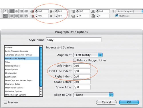
First-line indents can be applied through the Control palette, or better yet, incorporated into a style sheet definition. Don't create your first-line indents with tabs, or worse, by pressing the spacebar multiple times.
Figure 9.2. Control palette. Paragraph Style Options.
While first-line indents are generally more suited to reading matter, be it magazine or newspaper articles or literature, paragraph spacing may be more appropriate for reference material. To some degree it's a matter of preference, but here are some things to consider:
- Don't use first-line indents and paragraph spacing. It's an either/or proposition.
- Don't use first line-indents on centered or right-aligned type.
- Any paragraph spacing values will be overridden by the baseline grid if you align all the lines of your paragraph to the grid. Unless that is you ensure that your total paragraph spacing is a multiple of your baseline grid. (See Chapter 16: Everything in it Right Place: Using Grids.)
- If a paragraph follows a heading or subhead, the first-line indent is unnecessary to differentiate that paragraph and should be dropped.
- Dropping the first-line indent and adding a line of paragraph spacing before is a simple way to indicate a separation without implying a hierarchical difference between two paragraphs of type.
Alternatives to the First-Line Indent
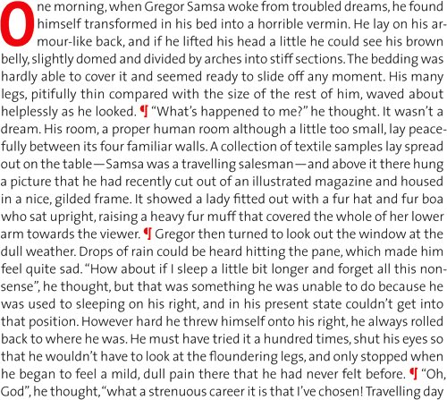
Not everyone loves a first-line indent. In Germany, as well as in some newspapers where space is especially tight, it's popular to have the paragraphs flush left, without any indentation. This can be problematic if the last lines of the paragraphs run the full column measure, making it difficult for the reader to discern one paragraph from another.
Instead of indents, try separating paragraphs with an em or en space, or with a decorative paragraph mark. This can be effective for short passages of text where you want to maintain a flush look, but don't want to compromise the meaning of the text.
Figure 9.3. Flush paragraphs. Without first-line indents it is difficult to find the beginning of the line, especially when the last line of the previous paragraph is long (line 10).

Figure 9.4. Paragraph ornaments are one way of maintaining a flush look to the paragraph without sacrificing comprehension of the text.
Hanging Indents
Hanging indents (also known as outdents), are where all the lines of the paragraph are indented except for the first line, which sticks out beyond the left margin edge. Hanging indents are achieved by applying a left indent, then applying a first-line indent of a negative value, typically the same amount as you entered for the left indent. For example, if you specify a left indent of 1 pica, your first-line left indent will be 1 pica.
Figure 9.5. When used sparingly, hanging indents or outdents can be an effective way of emphasizing the beginning of a paragraph.

To create a hanging indent, use the Control palette or the Paragraph palette. You can also use the Tabs palette: Specify a left-indent value greater than zero and drag the top marker to the left.
The most common example of a negative first-line indent is a bulleted or numbered list, where the second and subsequent lines of the paragraph align under the first character rather than under the bullet point or number. Bullets are great for lists that don't require a sequence or hierarchy. In days of yore, you made bulleted lists by indenting the text, making the first-line indent the same as the left indent, but negative, then inserting a tab before the first character (after the bullet) to move it over to the left indent value. These days, a single-click using the Control palette or the PageMaker Toolbar will not only set the hanging indent but also add the bullet character.
Figure 9.6. Using the Tabs palette to create a hanging indent.
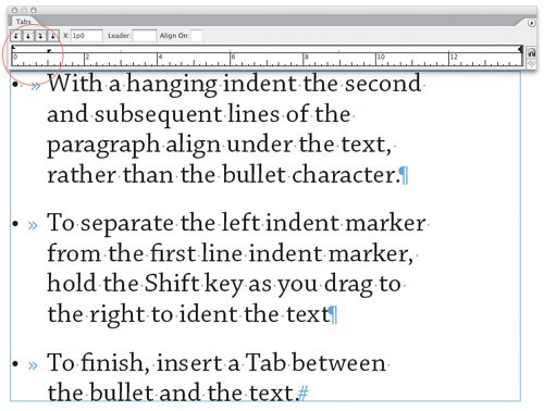
Figure 9.7. The Pagemaker Toolbar.

Tip
To remove bullets from a bulleted list created with the Bulleted List button in the PageMaker Toolbar, either click the Bulleted List icon again or apply a paragraph style that does not incorporate bullets.
Here's a bulleted list of things to consider when making a bulleted list:
- Sometimes, especially if your bullet character is a different font from the body text, the bullet may not vertically align perfectly. If necessary, adjust the vertical spacing of the bullet with Baseline Shift.
- If your items begin with a cap, center the bullet on the cap height.
- If your items begin with lowercase characters, center the bullets on the x-height.
- Don't indent the text too far from the bulletan em space is usually sufficient.
- You are not limited to the standard bullet character. There are many picture or dingbat fonts available. Common picture fonts include Carta, Zapf Dingbats, Symbol, Wingdings, and Davy's Dingbats, to name just a few.
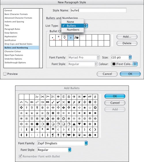
- New in CS2: Bullets (and Numbering) formatting can now be incorporated into the Paragraph Style definition. You can specify a specific font, size, and color for your bullet, and then apply this with a single click to multiple paragraphs. This is especially useful when you have specific paragraphs that always begin with a certain bullet. Defining a paragraph style with Bullets and Numbering saves you having to key in the bullet character every time. See Chapter 13: "Stylin' with Style Sheets" for more on Paragraph Styles.
Figures 9.8A and 9.8B. Bullets and Numbering options can be incorporated into a Paragraph Style definition. You can also add bullets from multiple fonts to the available bullet list by clicking the Add button in the Bullets and Numbering section of the Paragraph Style Options dialog.
- An attribute that cannot, as yet, be incorporated into the Bullets and Numbering formats of a Paragraph Style is baseline shift. This means that if your bullet character requires vertical adjustment to make it align, as mentioned above, with either the cap height or x-height of the type, your best option is the old-school method of defining your bullet as a Character Style. Once a Character Style is set up, you can easily apply the same formats to the subsequent bullets in the document, saving time and making sure that their formatting is consistent. You can go a step further and make a Nested Style, where the Character Style is incorporated into the Paragraph Style definition, and both are applied with a single mouse click. See Chapter 13: "Stylin' with Style Sheets" for more on Character Styles and Chapter 14: "More Styles" for information on how to create Nested Styles.
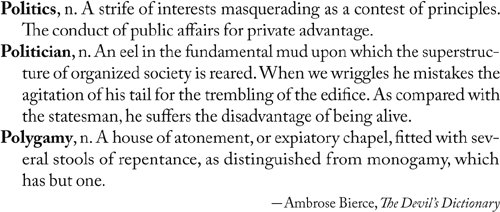
Hanging indents are also used for dictionaries and other reference sources, and sometimes on résumés.
Figure 9.9. A Dictionary entry.
Part I: Character Formats
Getting Started
- Getting Started
- An InDesign Type Map: Where to Find Stuff
- Viewing Your Page
- Creating a Typography Workspace
- Up Next
Going with the Flow
- Going with the Flow
- A Blank Sheet: Typing on Your Page
- Text Flow
- Threading Text Frames
- Using Placeholder Text
- Pasting Text
- Importing Word Text
- Up Next
Character Reference
- Character Reference
- Less is More, Maybe
- Type Anatomy
- Type Classification
- Character Formatting Options
- Readability
- Up Next
Getting the Lead Out
- Getting the Lead Out
- How Much Is Enough?
- (Not) Using Auto Leading
- Keep It Consistent, Except. . .
- Leading Menu Options and Keyboard Shortcuts
- See Also
- Up Next
Kern, Baby, Kern
- Kern, Baby, Kern
- When to Kern
- Metrics Kerning
- Optical Kerning
- Manual Kerning
- How Much to Kern
- Tracking
- When to Track
- Controlling Widows and Orphans
- Up Next
Sweating the Small Stuff: Special Characters, White Space, and Glyphs
- Sweating the Small Stuff: Special Characters, White Space, and Glyphs
- Typographers Quotes
- Apostrophes
- Dashes
- Ellipses
- End Marks
- White Space Characters
- The Glyphs Palette
- Footnotes
- Footnote Options
- Up Next
OpenType: The New Frontier in Font Technology
- OpenType: The New Frontier in Font Technology
- Ligatures
- Discretionary Ligatures
- Ordinals/Raised and Lowered Characters
- Swash Characters
- Fractions
- Oldstyle Figures
- Contextual Alternates
- Opticals
- Glyph Positioning
- Stylistic Sets
- Up Next
Part II: Paragraph Formats
Aligning Your Type
- Aligning Your Type
- Centering Type
- Clean Shaven or Rugged: Justified vs. Ragged Type
- How InDesign Justifies Type
- Balancing Ragged Lines
- Right-Aligned Type
- Optical Margin Alignment
- Indent to Here
- Vertical Alignment
- Up Next
Paragraph Indents and Spacing
First Impressions: Creating Great Opening Paragraphs
- First Impressions: Creating Great Opening Paragraphs
- Creating a Simple Drop Cap
- Drop Cap Aesthetics
- Tricks with Drop Caps
- Up Next
Dont Fear the Hyphen
Mastering Tabs and Tables
- Mastering Tabs and Tables
- Setting Tabs
- Creating Decimal Tabs
- Using Tab Leaders
- Reply Forms
- Numbered Lists
- Right Indent Tab
- Working with Tables
- Creating a Table
- Working with Rows and Columns
- Working with Table Cells
- Up Next
Part III: Styles
Stylin with Paragraph and Character Styles
- Stylin with Paragraph and Character Styles
- Creating Styles
- Applying Styles
- Editing Styles
- Redefining Styles
- Creating Default Styles
- A Typical Style Sheet
- Up Next
Mo Style
Part IV: Page Layout
Setting Up Your Document
- Setting Up Your Document
- Choosing a Page Size
- Determining Margins
- Determining Column Width
- Changing Columns
- Break Characters
- Page Numbers
- Section Markers
- Up Next
Everything in Its Right Place: Using Grids
- Everything in Its Right Place: Using Grids
- Things to Consider
- Your Grid Tool Kit
- Calculating the Height of the Type Area
- Align to Grid
- First Baseline Options
- Snap to Guides
- Up Next
Text Wraps: The Good, the Bad, and the Ugly
- Text Wraps: The Good, the Bad, and the Ugly
- Applying Text Wraps
- Wrapping Type Around Irregularly Shaped Graphics
- Text Wrap Preferences
- Ignoring Text Wrap
- Anchored Objects
- Up Next
Type Effects
EAN: 2147483647
Pages: 186
