Hyphenation Options
Words with at Least _ Letters
This refers to the minimum number of characters for hyphenated words. Changing this number from 5 to 6 will result in less hyphenation.
After First and Before Last
These rather confusingly named options refer, respectively, to the minimum number of characters at the beginning of a word and the minimum number of characters at the end of a word that can be broken by a hyphen. The golden rule is to leave at least two characters behind and take at least three forward.
Figure 11.1. The Hyphenation Settings dialog box (default settings shown).
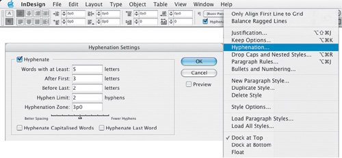
Hyphen Limit
This determines the maximum number of hyphens that can appear on consecutive lines so that you can avoid a stepped effect (ladders) on your column edge. While you'd never want more than two consecutive hyphens, it's debatable whether this option is the best method of preventing consecutive hyphens. You might want to set this option to 0, allowing unlimited consecutive hyphens, then manually fix any problems through a combination of tracking and/or rewriting and/or discretionary hyphens.
Here are some options for fixing ladders:
- Find a better break a few lines above and insert a discretionary hyphen.
- Find a line(s) where you can tighten the letter spacing with manual tracking.
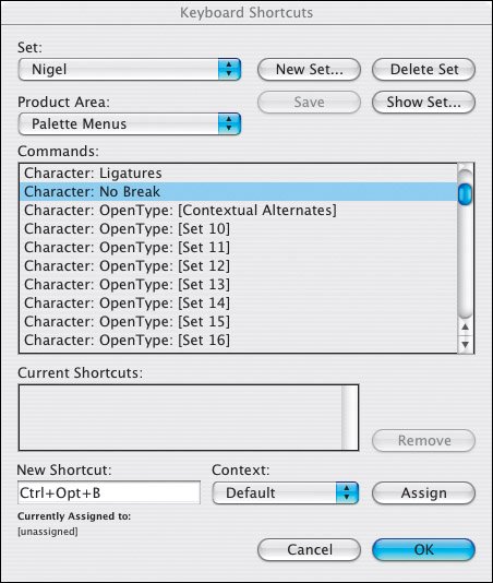
- Take the tightest hyphenated line and set the last word to No Break. This will turn the word over to the next line. You can do the same thing with line breaks (Shift+Return/Enter), but these can cause problems if the text is later edited, with line breaks showing up in the middle of a line.
- Rewrite, if you have the authority and it's appropriate.
Tip
Applying No Break to a word that you don't want to hyphenate is preferable to using line breaks, which can later come back to bite you if the text is edited, causing the line break to occur in the middle of a line rather than at the end. Because No Break is buried away on the Control palette menu you'll save a lot of time by assigning it a keyboard shortcut.
Figure 11.2. Add Discretionary Hyphens. In example A, lines 4 and 5 have consecutive hyphens. In example B, inserting a discretionary hyphen before "recognized" (line 5) turns that word over to the next line, fixing the problem andbecause the Adobe Paragraph Composer is appliedrecomposing the preceding lines.
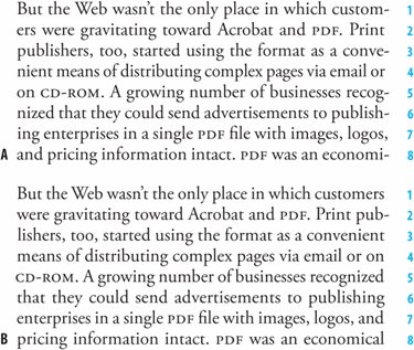
Figure 11.3. Assigning a shortcut to No Break.
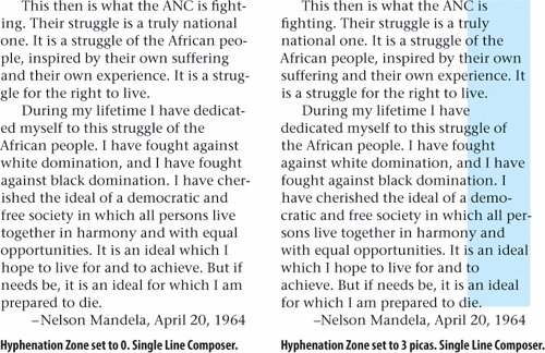
Hyphenation Zone
Despite the alluring name, this is nothing more than an invisible boundary set from the right margin. A larger Hyphenation Zone creates a hard rag, allowing more words to be pulled down to the next line, thus requiring fewer words to be hyphenated. A smaller Hyphenation Zone will create a softer rag, with more hyphenated words. Note: The Hyphenation Zone is relevant only if you're using ragged text.
Figure 11.4. Hyphenation Zone.
The Hyphenation Slider
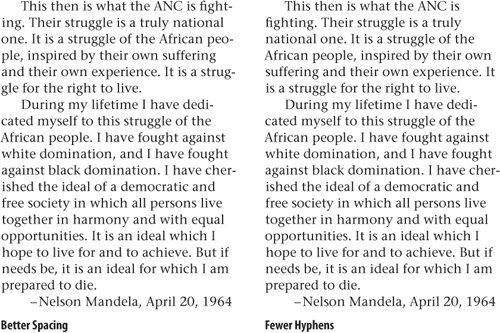
This enables you to alter the balance between better spacing and fewer hyphens. With justified text the spacing is adjusted between the words. With left-aligned text the rag (the right edge of the text) is adjusted. When working with left-aligned text avoid any gaping holes, long sloping edges, or words that stick out unattractively. Aim for a gentle wave that makes slight in-and-out adjustments as the eye travels down the column.
Figure 11.5. The Hyphenation Slider.
Hyphenate Capitalized Words
This does exactly what it says. Generally you want to avoid breaking proper nouns, but if they occur frequently and/or if there are a lot of them, checking this option yields better word spacing.
Hyphenate Last Word
Just what the doctor ordered when it comes to preventing word breaks at the end of a paragraph. Uncheck this to prevent the last word of a paragraph being hyphenated.
Figure 11.6. Hyphen examples.
Part I: Character Formats
Getting Started
- Getting Started
- An InDesign Type Map: Where to Find Stuff
- Viewing Your Page
- Creating a Typography Workspace
- Up Next
Going with the Flow
- Going with the Flow
- A Blank Sheet: Typing on Your Page
- Text Flow
- Threading Text Frames
- Using Placeholder Text
- Pasting Text
- Importing Word Text
- Up Next
Character Reference
- Character Reference
- Less is More, Maybe
- Type Anatomy
- Type Classification
- Character Formatting Options
- Readability
- Up Next
Getting the Lead Out
- Getting the Lead Out
- How Much Is Enough?
- (Not) Using Auto Leading
- Keep It Consistent, Except. . .
- Leading Menu Options and Keyboard Shortcuts
- See Also
- Up Next
Kern, Baby, Kern
- Kern, Baby, Kern
- When to Kern
- Metrics Kerning
- Optical Kerning
- Manual Kerning
- How Much to Kern
- Tracking
- When to Track
- Controlling Widows and Orphans
- Up Next
Sweating the Small Stuff: Special Characters, White Space, and Glyphs
- Sweating the Small Stuff: Special Characters, White Space, and Glyphs
- Typographers Quotes
- Apostrophes
- Dashes
- Ellipses
- End Marks
- White Space Characters
- The Glyphs Palette
- Footnotes
- Footnote Options
- Up Next
OpenType: The New Frontier in Font Technology
- OpenType: The New Frontier in Font Technology
- Ligatures
- Discretionary Ligatures
- Ordinals/Raised and Lowered Characters
- Swash Characters
- Fractions
- Oldstyle Figures
- Contextual Alternates
- Opticals
- Glyph Positioning
- Stylistic Sets
- Up Next
Part II: Paragraph Formats
Aligning Your Type
- Aligning Your Type
- Centering Type
- Clean Shaven or Rugged: Justified vs. Ragged Type
- How InDesign Justifies Type
- Balancing Ragged Lines
- Right-Aligned Type
- Optical Margin Alignment
- Indent to Here
- Vertical Alignment
- Up Next
Paragraph Indents and Spacing
First Impressions: Creating Great Opening Paragraphs
- First Impressions: Creating Great Opening Paragraphs
- Creating a Simple Drop Cap
- Drop Cap Aesthetics
- Tricks with Drop Caps
- Up Next
Dont Fear the Hyphen
- Dont Fear the Hyphen
- Hyphenation Options
- Discretionary Hyphens and Nonbreaking Hyphens
- Up Next
Mastering Tabs and Tables
- Mastering Tabs and Tables
- Setting Tabs
- Creating Decimal Tabs
- Using Tab Leaders
- Reply Forms
- Numbered Lists
- Right Indent Tab
- Working with Tables
- Creating a Table
- Working with Rows and Columns
- Working with Table Cells
- Up Next
Part III: Styles
Stylin with Paragraph and Character Styles
- Stylin with Paragraph and Character Styles
- Creating Styles
- Applying Styles
- Editing Styles
- Redefining Styles
- Creating Default Styles
- A Typical Style Sheet
- Up Next
Mo Style
Part IV: Page Layout
Setting Up Your Document
- Setting Up Your Document
- Choosing a Page Size
- Determining Margins
- Determining Column Width
- Changing Columns
- Break Characters
- Page Numbers
- Section Markers
- Up Next
Everything in Its Right Place: Using Grids
- Everything in Its Right Place: Using Grids
- Things to Consider
- Your Grid Tool Kit
- Calculating the Height of the Type Area
- Align to Grid
- First Baseline Options
- Snap to Guides
- Up Next
Text Wraps: The Good, the Bad, and the Ugly
- Text Wraps: The Good, the Bad, and the Ugly
- Applying Text Wraps
- Wrapping Type Around Irregularly Shaped Graphics
- Text Wrap Preferences
- Ignoring Text Wrap
- Anchored Objects
- Up Next
Type Effects
EAN: 2147483647
Pages: 186
