An InDesign Type Map: Where to Find Stuff
An InDesign Type Map Where to Find Stuff
Everything relates to type in one way or another, but here I want to point you in the direction of the most frequently used type-related menu and palette options as well as InDesign preferences that control how type behaves. As with any of the big-hitter design applications these days, there is usually more than one way to do something. Sometimes, it's nothing more than a matter of preference; other times, new features have been added improving on old featuresso that veteran users aren't alienated, the old menu options remain. What follows is my personal take on the best way of doing things.
Tip: Setting Defaults
When you make a change to InDesign's Preferences, you are affecting only the document you are working on. If you want to change the preferences for every document you create from this point on make sure you have no InDesign document open, that way your changes become application preferences. And this doesn't apply only to settings in the Preferences dialog boxyou can set your own defaults for just about anything. So, for example, if you're tired of getting Times New Roman 12 point every time you type into an empty text frame, just make sure you have no document open, choose Type>Font and change the font to something else, which then becomes your default font. One more thing: Should you want to return to the "factory defaults," hold down Shift+Option+Command+Control (Shift+Ctrl+Alt) as you start InDesign, then click Yes when asked if you want to delete your preference files.
Recommended Type Preferences
The key words here are "recommended" and "preferences." There are several preferences relating to type; for now, I just want to point out where they are and suggest a couple of changes to the factory default settings. I'll deal with each preference specifically in the relevant chapter. We all work differently; these are the settings I use.
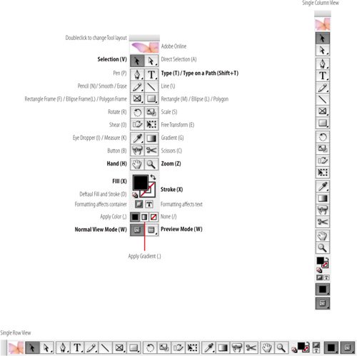
The Tools Palette
No matter how proficient you are, with InDesign there are two tools you'll use most of the time: the Selection Tool and the Type Tool. The Selection Tool is used for (among other things) moving text frames, resizing text frames and threading text frames. The Type Tool is used for formatting and editing the text inside those frames. You move back and forth between these two tools a lot, so it's handy that there's a way to toggle between them.
To work with text frames while the Type Tool is selected, hold down Command (Control) to switch to the Selection Tool. With the key held down, you can drag the frame to move it, or drag any of the frame handles to resize it. When you release the key, you're back in the Type Tool.
The companion shortcut to the above is when you're using your Selection Tool, you double-click a text frame and your cursor changes to the Type Tool, inserted at the point where you double-clicked.
Figure 1.1. Type Preferences. There's no compelling reason to change any of these.
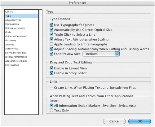
Figure 1.2. Advanced Type Preferences. I recommend changing the Superscript and Subscript preferences to the percentages shown. Superscript and Subscript are discussed in Chapter 3: Character Reference.
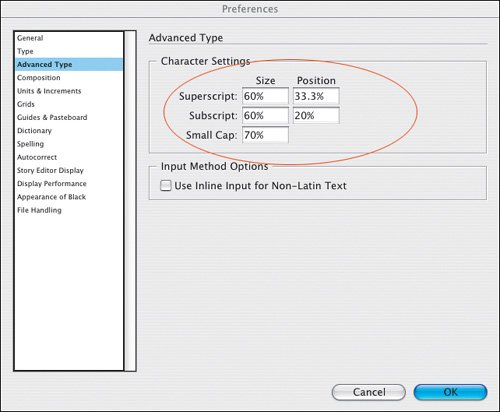
Figure 1.3. Composition Preferences. You might want to turn on the Highlight options depending on what stage of the design process you are in. When fine-tuning your document they can be useful in highlighting composition problems, like widows and orphans (Keeps Violationssee Chapter 5), bad word spacing (H&J Violationssee Chapter 8) and any unnecessary or over zealous kerning and/or tracking that may have been applied by someone else in your workgroup (Custom Tracking/Kerningsee Chapter 5).
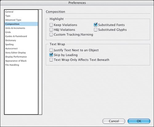
Figure 1.4. Units & Increments Preferences. Horizontal and Vertical Unit of Measurement: Picas. Perhaps not the most logical of measurement systems, but they are the typographic standard. For example, wouldn't you rather have an indent of 1 pica rather than 4.233 millimeters? For a discussion of pica and points see Chapter 6: Sweating the Small Stuff.
I change the Kerning increment to 5. Note that this also sets the increment for Tracking. For some bizarre reason the factory default for this preference is 20, which results in kerning or tracking amounts that are too coarse.
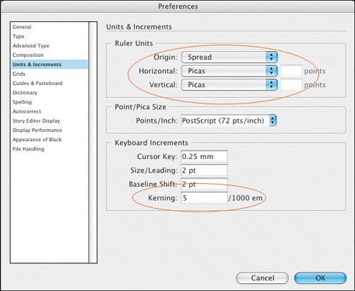
Figure 1.5. The Tools palette with the most important type-related tools in bold. Press the shortcut key (in parentheses) to select the tool (except when using the Type or Type on a Path tools).
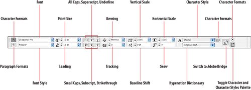
The Control Palette
The Control palette is a chameleon, changing its appearance according to what kind of element you have selected. When using the Type Tool the Control palette has two views, a handy toggle Cmd+Option+7 (Ctrl+Alt+7) switches between them.
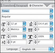
Figures 1.6A and 1.6B. The Control palette in Character Formats view and the Character palette, which offers the same options.
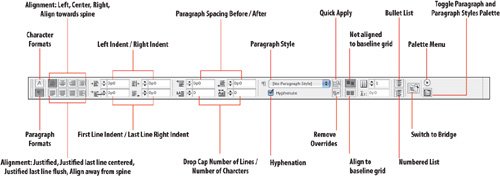
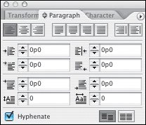
Figures 1.7A and 1.7B. The Control palette in Paragraph Formats view and the same options offered by the Paragraph palette.
Viewing Your Page |
Part I: Character Formats
Getting Started
- Getting Started
- An InDesign Type Map: Where to Find Stuff
- Viewing Your Page
- Creating a Typography Workspace
- Up Next
Going with the Flow
- Going with the Flow
- A Blank Sheet: Typing on Your Page
- Text Flow
- Threading Text Frames
- Using Placeholder Text
- Pasting Text
- Importing Word Text
- Up Next
Character Reference
- Character Reference
- Less is More, Maybe
- Type Anatomy
- Type Classification
- Character Formatting Options
- Readability
- Up Next
Getting the Lead Out
- Getting the Lead Out
- How Much Is Enough?
- (Not) Using Auto Leading
- Keep It Consistent, Except. . .
- Leading Menu Options and Keyboard Shortcuts
- See Also
- Up Next
Kern, Baby, Kern
- Kern, Baby, Kern
- When to Kern
- Metrics Kerning
- Optical Kerning
- Manual Kerning
- How Much to Kern
- Tracking
- When to Track
- Controlling Widows and Orphans
- Up Next
Sweating the Small Stuff: Special Characters, White Space, and Glyphs
- Sweating the Small Stuff: Special Characters, White Space, and Glyphs
- Typographers Quotes
- Apostrophes
- Dashes
- Ellipses
- End Marks
- White Space Characters
- The Glyphs Palette
- Footnotes
- Footnote Options
- Up Next
OpenType: The New Frontier in Font Technology
- OpenType: The New Frontier in Font Technology
- Ligatures
- Discretionary Ligatures
- Ordinals/Raised and Lowered Characters
- Swash Characters
- Fractions
- Oldstyle Figures
- Contextual Alternates
- Opticals
- Glyph Positioning
- Stylistic Sets
- Up Next
Part II: Paragraph Formats
Aligning Your Type
- Aligning Your Type
- Centering Type
- Clean Shaven or Rugged: Justified vs. Ragged Type
- How InDesign Justifies Type
- Balancing Ragged Lines
- Right-Aligned Type
- Optical Margin Alignment
- Indent to Here
- Vertical Alignment
- Up Next
Paragraph Indents and Spacing
First Impressions: Creating Great Opening Paragraphs
- First Impressions: Creating Great Opening Paragraphs
- Creating a Simple Drop Cap
- Drop Cap Aesthetics
- Tricks with Drop Caps
- Up Next
Dont Fear the Hyphen
Mastering Tabs and Tables
- Mastering Tabs and Tables
- Setting Tabs
- Creating Decimal Tabs
- Using Tab Leaders
- Reply Forms
- Numbered Lists
- Right Indent Tab
- Working with Tables
- Creating a Table
- Working with Rows and Columns
- Working with Table Cells
- Up Next
Part III: Styles
Stylin with Paragraph and Character Styles
- Stylin with Paragraph and Character Styles
- Creating Styles
- Applying Styles
- Editing Styles
- Redefining Styles
- Creating Default Styles
- A Typical Style Sheet
- Up Next
Mo Style
Part IV: Page Layout
Setting Up Your Document
- Setting Up Your Document
- Choosing a Page Size
- Determining Margins
- Determining Column Width
- Changing Columns
- Break Characters
- Page Numbers
- Section Markers
- Up Next
Everything in Its Right Place: Using Grids
- Everything in Its Right Place: Using Grids
- Things to Consider
- Your Grid Tool Kit
- Calculating the Height of the Type Area
- Align to Grid
- First Baseline Options
- Snap to Guides
- Up Next
Text Wraps: The Good, the Bad, and the Ugly
- Text Wraps: The Good, the Bad, and the Ugly
- Applying Text Wraps
- Wrapping Type Around Irregularly Shaped Graphics
- Text Wrap Preferences
- Ignoring Text Wrap
- Anchored Objects
- Up Next
Type Effects
EAN: 2147483647
Pages: 186
