Text Wrap Preferences
The following preferences determine how your text wrap behaves:
- Justify Text Next to an Object will justify text next to wrap objects that are placed in a single column. Note, this preference will not justify ragged type when the wrap object straddles more than one column. In my humble opinion it's not worth much, because you shouldn't be using ragged type with text wraps, and you certainly shouldn't be wrapping text around all sides of an object in a single column.
- Skip By Leading. When working with multiple columns of text, if you have a text wrap that affects some but not all of those columns, this preference ensures that the text below the wrap object is knocked down to the next available leading increment, making sure that your baselines align across columns. For some reason this does not work if the wrap object is at the top of the column. Rather than turn this preference on, you're better off using a baseline grid to get the same effect (see Chapter 16 "Everything in Its Right Place: Using Grids.").
Tip
When adding a text wrap to a picture, make sure you add the text wrap to the picture frame (selected with the Selection tool) and not the picture itself (selected with the Direct Selection tool). If you do the latter, the text will wrap according to the picture's uncropped dimensions rather than its cropped dimensions.
Figure 17.9. Text Wrap Preferences.
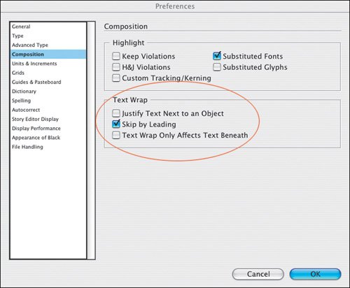
Figure 17.10. In example A Justify Text Next to an Object is turned off; in example B, this preference is turned on.
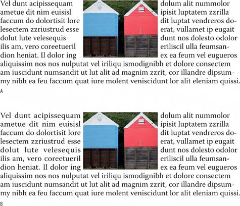
Figure 17.11. In example A, Skip by Leading is turned on, causing the line after the graphic to move down to the next available leading increment. Example B shows how the text looks with Skip by Leading turned off.
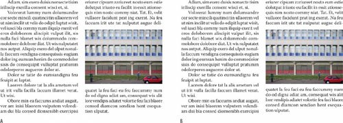
- Text Wrap Affects Only Text Beneath makes InDesign behave like Quark, where text wrapsor Runarounds as they are called in Quark landaffect only the text beneath them in the stacking order. This is a bad idea, because putting your pictures on the topmost layers can result in printing problems due to transparent objects that overlap type. (See Chapter 15: "Setting Up your Document") Rather than use this approach, if you don't want a text frame to get pushed around by a text wrap, choose Object > Text Frame Options and turn on Ignore Text Wrap (see below). This way you can put your text on the topmost layer and avoid any potential printing problems.
- Suppressing Text Wrap When Layer is Hidden. This option is not in Preferences, but rather is a Layer Optiondouble click any layer name to bring up its Layer Options. When you hide a layer that contains a text wrap object, the text on other layers continues to wrap around the object. This is so your text won't recompose if you turn off the layer. You can also use it to get interesting text-wrap shapes without seeing the text-wrap object. Turning on Suppress Text Wrap When Layer Is Hidden will cause the text to reflow when the layer containing the wrapping object is hidden. This may be useful if you want to edit or print only the text and not the images.
Note
If you are converting a Quark document to an InDesign document be sure to carefully check any text wraps. Because InDesign and Quark handle text wraps/runarounds differently, you may see differences between your original and the converted document.
Figure 17.12. Suppressing a text wrap.
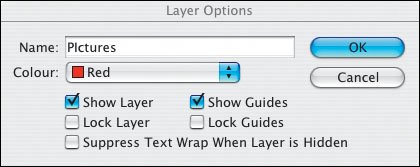
Figure 17.13. Hidden Layer.
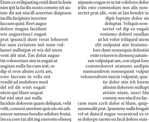
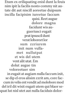
Figure 17.14. An inverted text wrap. The text is running inside the image shape, in this case a "Z" that has been converted to outlines (see Chapter 18: "Type Effects.:"), and put on a separate layer, which is then hidden.
Inverted Text Wraps
Every once in a while you might want to make the text wrap within the graphic shape, rather than around it. To do so, simply check the Invert box on the Text Wrap palette. This works best with simple shapes that allow for left-right reading of the text. It also helps if the type is a solid blockwithout paragraph breaks and indentsand tightly leaded and justified so that it better defines the object shape.
Ignoring Text Wrap |
Part I: Character Formats
Getting Started
- Getting Started
- An InDesign Type Map: Where to Find Stuff
- Viewing Your Page
- Creating a Typography Workspace
- Up Next
Going with the Flow
- Going with the Flow
- A Blank Sheet: Typing on Your Page
- Text Flow
- Threading Text Frames
- Using Placeholder Text
- Pasting Text
- Importing Word Text
- Up Next
Character Reference
- Character Reference
- Less is More, Maybe
- Type Anatomy
- Type Classification
- Character Formatting Options
- Readability
- Up Next
Getting the Lead Out
- Getting the Lead Out
- How Much Is Enough?
- (Not) Using Auto Leading
- Keep It Consistent, Except. . .
- Leading Menu Options and Keyboard Shortcuts
- See Also
- Up Next
Kern, Baby, Kern
- Kern, Baby, Kern
- When to Kern
- Metrics Kerning
- Optical Kerning
- Manual Kerning
- How Much to Kern
- Tracking
- When to Track
- Controlling Widows and Orphans
- Up Next
Sweating the Small Stuff: Special Characters, White Space, and Glyphs
- Sweating the Small Stuff: Special Characters, White Space, and Glyphs
- Typographers Quotes
- Apostrophes
- Dashes
- Ellipses
- End Marks
- White Space Characters
- The Glyphs Palette
- Footnotes
- Footnote Options
- Up Next
OpenType: The New Frontier in Font Technology
- OpenType: The New Frontier in Font Technology
- Ligatures
- Discretionary Ligatures
- Ordinals/Raised and Lowered Characters
- Swash Characters
- Fractions
- Oldstyle Figures
- Contextual Alternates
- Opticals
- Glyph Positioning
- Stylistic Sets
- Up Next
Part II: Paragraph Formats
Aligning Your Type
- Aligning Your Type
- Centering Type
- Clean Shaven or Rugged: Justified vs. Ragged Type
- How InDesign Justifies Type
- Balancing Ragged Lines
- Right-Aligned Type
- Optical Margin Alignment
- Indent to Here
- Vertical Alignment
- Up Next
Paragraph Indents and Spacing
First Impressions: Creating Great Opening Paragraphs
- First Impressions: Creating Great Opening Paragraphs
- Creating a Simple Drop Cap
- Drop Cap Aesthetics
- Tricks with Drop Caps
- Up Next
Dont Fear the Hyphen
Mastering Tabs and Tables
- Mastering Tabs and Tables
- Setting Tabs
- Creating Decimal Tabs
- Using Tab Leaders
- Reply Forms
- Numbered Lists
- Right Indent Tab
- Working with Tables
- Creating a Table
- Working with Rows and Columns
- Working with Table Cells
- Up Next
Part III: Styles
Stylin with Paragraph and Character Styles
- Stylin with Paragraph and Character Styles
- Creating Styles
- Applying Styles
- Editing Styles
- Redefining Styles
- Creating Default Styles
- A Typical Style Sheet
- Up Next
Mo Style
Part IV: Page Layout
Setting Up Your Document
- Setting Up Your Document
- Choosing a Page Size
- Determining Margins
- Determining Column Width
- Changing Columns
- Break Characters
- Page Numbers
- Section Markers
- Up Next
Everything in Its Right Place: Using Grids
- Everything in Its Right Place: Using Grids
- Things to Consider
- Your Grid Tool Kit
- Calculating the Height of the Type Area
- Align to Grid
- First Baseline Options
- Snap to Guides
- Up Next
Text Wraps: The Good, the Bad, and the Ugly
- Text Wraps: The Good, the Bad, and the Ugly
- Applying Text Wraps
- Wrapping Type Around Irregularly Shaped Graphics
- Text Wrap Preferences
- Ignoring Text Wrap
- Anchored Objects
- Up Next
Type Effects
EAN: 2147483647
Pages: 186
