Creating Styles
Time spent creating style sheets is an investment that will repay you many times over throughout the lifespan of the publication. Though you should set up your Styles at the beginning of the design process, it is easy to add to your Style Sheet and edit your styles as your document evolves. There are several different approaches:
Creating a Style Based on Existing Text
- Format the paragraph the way you want it to look.
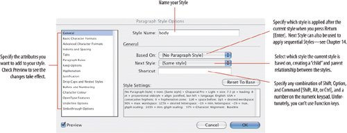
- Click the Create New Style icon at the bottom of the Paragraph Styles palette: "Paragraph Style 1" will appear in your Paragraph Styles palette.
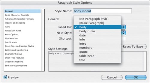
- Double click "Paragraph Style 1" to type a name for your Style and (optionally) specify a shortcut keystroke. If you want to add additional formatting, click the attributes list on the left and specify the options you want to add to your style. With Preview checked, you can see your formatting changes added to the paragraph.
Figure 13.3. Paragraph Style Options.
Tip: Style Naming Conventions
- Name your styles in a logical way. Keep in mind that it's likely you'll need to come back to a document months or even years down the road, so you'll want a style-naming strategy that is transparent. Alternatively, you may need to hand over your InDesign document to someone else to finish. So that you don't spend a long time on the phone explaining why you named your styles after your favorite Radiohead songs, keep them simple.
- Because InDesign lists your styles in alphanumeric order, consider putting a two digit number in front of your most commonly used styles to force them to the top of the list in the Styles palette. Putting a unique two character identifier at the beginning of your style names also makes it easier to access those styles using Quick Apply by simply pressing Cmd-Return (Ctrl-Enter) then typing the first two characters to access the style.
- Styles are case-sensitive: Body Text and body text are recognized as two distinct styles, so be precise when naming your styles, or you may end up with two versions of the style and no idea which is the real one.
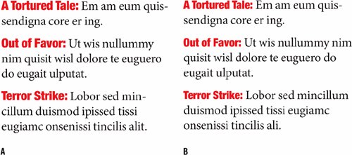
Figure 13.4. Mixing x-heights. In example A, the run-in head (Helvetica Neue Black Condensed) is the same size (10 pt.) as the body text (Minion), creating a disparity in x-heights. In example B, the run-in head has been reduced by 1 point to equalize the x-heights of the two fonts.
Loading Styles from Another InDesign Document
If you have an InDesign file with a style sheet already created, there's no need to reinvent the wheel. You can load those styles from one document to another. You can even import styles from Microsoft Word and RTF documents. Choose Load All Styles (to bring in Paragraph, Character and Object styles from the source document), then navigate to it and click Open. Note, you will not be able to load styles from an InDesign CS2 document into a CS document; you can do it in the other direction.
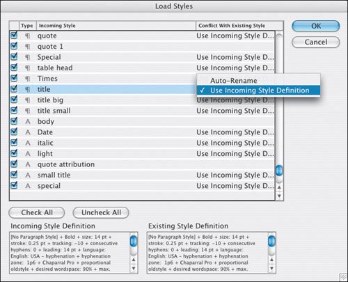
With InDesign CS2 you can import specific styles and determine how to deal with any style name conflicts: Where the style name is the same in both documents, you can choose to use the Incoming Style Definition or to rename the incoming style, which will have "copy" appended to its style name. (You can rename the style later if you wish.)
Creating the Style "Blind"
Using the Paragraph Style Options dialog box, you can create as many styles as you need without having a single character on your page. With experience, you can visualize what a style will look like without needing to see it formatted on your page, which makes setting up a Style Sheet much faster.
Figure 13.5. Load Styles.
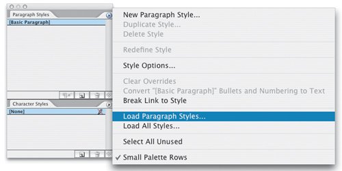
Figure 13.6. Mapping Styles.
Basing Styles on Other Styles
Hierarchy is a big concept in typography. Hierarchy gives your documents structure. Hierarchy is not about working for the Manit's about effective communication. Take a simple example: Your headings and subheadings will probably use the same font. For this reason you need to consider carefully the relationship between them. By basing one style on another, you create more than just a visual link between the styles. When you edit the base or "parent" style, the attributes that it shares with its "offspring" styles will also change. To establish this relationship between styles, choose the parent style in the Based On menu. The new style becomes the "child" style.
Figure 13.7. Basing one style upon another. The "child" inherits all the formatting of its "parent" style.
Applying Styles |
Part I: Character Formats
Getting Started
- Getting Started
- An InDesign Type Map: Where to Find Stuff
- Viewing Your Page
- Creating a Typography Workspace
- Up Next
Going with the Flow
- Going with the Flow
- A Blank Sheet: Typing on Your Page
- Text Flow
- Threading Text Frames
- Using Placeholder Text
- Pasting Text
- Importing Word Text
- Up Next
Character Reference
- Character Reference
- Less is More, Maybe
- Type Anatomy
- Type Classification
- Character Formatting Options
- Readability
- Up Next
Getting the Lead Out
- Getting the Lead Out
- How Much Is Enough?
- (Not) Using Auto Leading
- Keep It Consistent, Except. . .
- Leading Menu Options and Keyboard Shortcuts
- See Also
- Up Next
Kern, Baby, Kern
- Kern, Baby, Kern
- When to Kern
- Metrics Kerning
- Optical Kerning
- Manual Kerning
- How Much to Kern
- Tracking
- When to Track
- Controlling Widows and Orphans
- Up Next
Sweating the Small Stuff: Special Characters, White Space, and Glyphs
- Sweating the Small Stuff: Special Characters, White Space, and Glyphs
- Typographers Quotes
- Apostrophes
- Dashes
- Ellipses
- End Marks
- White Space Characters
- The Glyphs Palette
- Footnotes
- Footnote Options
- Up Next
OpenType: The New Frontier in Font Technology
- OpenType: The New Frontier in Font Technology
- Ligatures
- Discretionary Ligatures
- Ordinals/Raised and Lowered Characters
- Swash Characters
- Fractions
- Oldstyle Figures
- Contextual Alternates
- Opticals
- Glyph Positioning
- Stylistic Sets
- Up Next
Part II: Paragraph Formats
Aligning Your Type
- Aligning Your Type
- Centering Type
- Clean Shaven or Rugged: Justified vs. Ragged Type
- How InDesign Justifies Type
- Balancing Ragged Lines
- Right-Aligned Type
- Optical Margin Alignment
- Indent to Here
- Vertical Alignment
- Up Next
Paragraph Indents and Spacing
First Impressions: Creating Great Opening Paragraphs
- First Impressions: Creating Great Opening Paragraphs
- Creating a Simple Drop Cap
- Drop Cap Aesthetics
- Tricks with Drop Caps
- Up Next
Dont Fear the Hyphen
Mastering Tabs and Tables
- Mastering Tabs and Tables
- Setting Tabs
- Creating Decimal Tabs
- Using Tab Leaders
- Reply Forms
- Numbered Lists
- Right Indent Tab
- Working with Tables
- Creating a Table
- Working with Rows and Columns
- Working with Table Cells
- Up Next
Part III: Styles
Stylin with Paragraph and Character Styles
- Stylin with Paragraph and Character Styles
- Creating Styles
- Applying Styles
- Editing Styles
- Redefining Styles
- Creating Default Styles
- A Typical Style Sheet
- Up Next
Mo Style
Part IV: Page Layout
Setting Up Your Document
- Setting Up Your Document
- Choosing a Page Size
- Determining Margins
- Determining Column Width
- Changing Columns
- Break Characters
- Page Numbers
- Section Markers
- Up Next
Everything in Its Right Place: Using Grids
- Everything in Its Right Place: Using Grids
- Things to Consider
- Your Grid Tool Kit
- Calculating the Height of the Type Area
- Align to Grid
- First Baseline Options
- Snap to Guides
- Up Next
Text Wraps: The Good, the Bad, and the Ugly
- Text Wraps: The Good, the Bad, and the Ugly
- Applying Text Wraps
- Wrapping Type Around Irregularly Shaped Graphics
- Text Wrap Preferences
- Ignoring Text Wrap
- Anchored Objects
- Up Next
Type Effects
EAN: 2147483647
Pages: 186
