How Much Is Enough?
When it comes to leading there is no one size fits all. How much leading you give your type depends on several variables. Here are some factors to consider:
- The nature of the text. While text intended for continuous reading will always benefit from some breathing space, a short burst of advertising copy or a title might be more effective if the lines are tightly leaded.
- Type size: As point size increases you will want proportionally less leading. Body text that is 10 points in size is commonly set with 12 points of leadingwritten 10/12, spoken 10 on 12. When you get to display sizes, the spaces between the lines appears much larger. So much so that it's common to use negative leading for display type.
Figure 4.2. Text block with tight leading (example A); plus two points of leading (example B); and plus eight points of leading (example C).
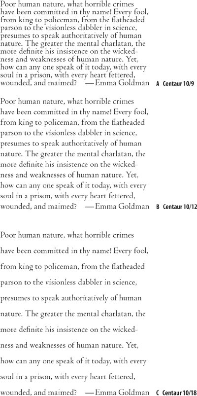
Figure 4.3. Leading is measured from baseline to baseline.
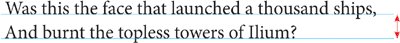
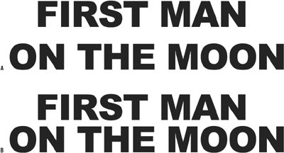
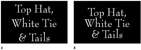
Figure 4.4. Leading and display type. Example A shows the headline with Auto Leading applied (42/50.4), with the result that the two lines seem disconnected from each other. The problem is exacerbated by the all-cap treatment, meaning there are no ascenders or descenders. Example B shows negative leading applied (42/38).
- Typefaces with larger x-heightscertain serif typefaces like Times New Roman, or sans serifs typefaces in generalare perceived to be bigger because the lowercase letters take up a relatively large part of the overall area of the character bounding box. Such typefaces require more leading. Conversely, type with small x-heights, Like Garamond, will seem to have more horizontal space between the lines and thus require less leading. Sans serif typefaces typically have higher x-heights and thus require more leading than serif faces.
- Some typefaces, like Bernhard Modern, may have particularly tall ascendersmeaning that with tight leading you run the risk of the ascenders colliding with the descenders of the previous line.
Figure 4.5. Four typefaces at the same size (38 point) with different x-heights.
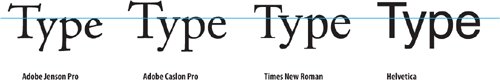
Figure 4.6. Bernhard Modern, because of its low x-height, can be leaded tightly. Example A shows 24 point on Auto Leading (28.8); example B shows 24/22.
- Typefaces with heavy stroke weights benefit from extra leading to prevent the type colorthe darkness or blackness of the letterforms as a blockappearing too dense.
- When your type is in all caps, there are no descenders, making the lines of type appear farther apart. Time to tighten the leading.
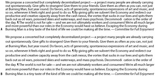
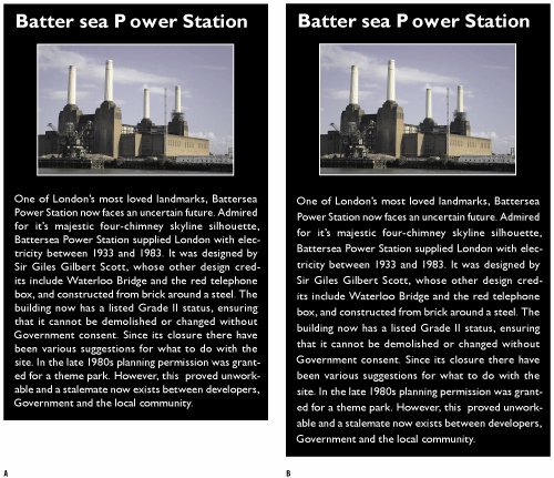
- Column Width: It's best to avoid setting type in wide columns, but if you have no choice, increasing the leading anywhere from a half point to 2 points will improve readability by keeping the lines distinct and preventing the eye from dropping off to the line below or doubling back to reread the same line.
- At the other extreme, justified type set in a narrow column may cause word-spacing problems. Because we read in words or clusters of words, rather than letter by letter, if the space between the words is bigger than the space between the lines, the eye may jump to the next line rather than to the next word. In such situations, extra leading might be necessary to ensure that the space between the lines is greater than the space between the words. The best solution is to avoid justified type on a narrow measure altogether, but in the real world we don't always have as much say as we might like.
Figure 4.7. Leading and Column Width. The text set solid (example A), and with three points of leading 8/11 (example B).
- Reversing Out: Because we are used to reading black type on white paper, when we choose to use the opposite, we're guaranteed to make our type attention-getting. However, reversed type tends to sparkle, making it harder to read. A slight increase in leadingas well as avoiding any fonts with delicate serifsmay compensate for the diminished readability of reversed out type.
- Very loose leading can create a luxurious look. But sometimes there's a fine line between looking spacious and looking like the different lines of type bear no relation to each other.
- Tight leading will increase the density of the type and can make it feel claustrophobic.
- Economy often dictates leading: You have a fixed number of words and you have to fit them into a finite amount of space. In such situations, choose a font that lends itself to being tightly leaded.
Figure 4.8. Example A is 10/12; example B is 10/14.
(Not) Using Auto Leading |
Part I: Character Formats
Getting Started
- Getting Started
- An InDesign Type Map: Where to Find Stuff
- Viewing Your Page
- Creating a Typography Workspace
- Up Next
Going with the Flow
- Going with the Flow
- A Blank Sheet: Typing on Your Page
- Text Flow
- Threading Text Frames
- Using Placeholder Text
- Pasting Text
- Importing Word Text
- Up Next
Character Reference
- Character Reference
- Less is More, Maybe
- Type Anatomy
- Type Classification
- Character Formatting Options
- Readability
- Up Next
Getting the Lead Out
- Getting the Lead Out
- How Much Is Enough?
- (Not) Using Auto Leading
- Keep It Consistent, Except. . .
- Leading Menu Options and Keyboard Shortcuts
- See Also
- Up Next
Kern, Baby, Kern
- Kern, Baby, Kern
- When to Kern
- Metrics Kerning
- Optical Kerning
- Manual Kerning
- How Much to Kern
- Tracking
- When to Track
- Controlling Widows and Orphans
- Up Next
Sweating the Small Stuff: Special Characters, White Space, and Glyphs
- Sweating the Small Stuff: Special Characters, White Space, and Glyphs
- Typographers Quotes
- Apostrophes
- Dashes
- Ellipses
- End Marks
- White Space Characters
- The Glyphs Palette
- Footnotes
- Footnote Options
- Up Next
OpenType: The New Frontier in Font Technology
- OpenType: The New Frontier in Font Technology
- Ligatures
- Discretionary Ligatures
- Ordinals/Raised and Lowered Characters
- Swash Characters
- Fractions
- Oldstyle Figures
- Contextual Alternates
- Opticals
- Glyph Positioning
- Stylistic Sets
- Up Next
Part II: Paragraph Formats
Aligning Your Type
- Aligning Your Type
- Centering Type
- Clean Shaven or Rugged: Justified vs. Ragged Type
- How InDesign Justifies Type
- Balancing Ragged Lines
- Right-Aligned Type
- Optical Margin Alignment
- Indent to Here
- Vertical Alignment
- Up Next
Paragraph Indents and Spacing
First Impressions: Creating Great Opening Paragraphs
- First Impressions: Creating Great Opening Paragraphs
- Creating a Simple Drop Cap
- Drop Cap Aesthetics
- Tricks with Drop Caps
- Up Next
Dont Fear the Hyphen
Mastering Tabs and Tables
- Mastering Tabs and Tables
- Setting Tabs
- Creating Decimal Tabs
- Using Tab Leaders
- Reply Forms
- Numbered Lists
- Right Indent Tab
- Working with Tables
- Creating a Table
- Working with Rows and Columns
- Working with Table Cells
- Up Next
Part III: Styles
Stylin with Paragraph and Character Styles
- Stylin with Paragraph and Character Styles
- Creating Styles
- Applying Styles
- Editing Styles
- Redefining Styles
- Creating Default Styles
- A Typical Style Sheet
- Up Next
Mo Style
Part IV: Page Layout
Setting Up Your Document
- Setting Up Your Document
- Choosing a Page Size
- Determining Margins
- Determining Column Width
- Changing Columns
- Break Characters
- Page Numbers
- Section Markers
- Up Next
Everything in Its Right Place: Using Grids
- Everything in Its Right Place: Using Grids
- Things to Consider
- Your Grid Tool Kit
- Calculating the Height of the Type Area
- Align to Grid
- First Baseline Options
- Snap to Guides
- Up Next
Text Wraps: The Good, the Bad, and the Ugly
- Text Wraps: The Good, the Bad, and the Ugly
- Applying Text Wraps
- Wrapping Type Around Irregularly Shaped Graphics
- Text Wrap Preferences
- Ignoring Text Wrap
- Anchored Objects
- Up Next
Type Effects
EAN: 2147483647
Pages: 186
