Tracking
This chapter is also about trackingadjusting the letter spacing across a range of characters. Tracking can be applied as part of a style sheet definition.
Tracking, a cousin to kerning, is an overall increase or decrease in letter spacing over a range of characters. Tracking can also be applied locally to fix widows and orphans by (imperceptibly) tightening the letter spacing across a range of words and "pulling back" a short line. Tracking values can also be applied "globally" as part of a style definition to give the type a denser or airier look (Word and Character space options in the Justification dialog can give you the same effect). Remember, when you do this you are overriding what the type designer, who slaved long and hard over his or her font, considered the optimum character spacing. Tracking body text is like taking a musician's composition and playing it at a different tempo. Track your body text and you could be breaking some poor font designer's heart. If you do use negative tracking as part of a style definition, pay careful attention to what happens to pairs like rn; tracked too tight these might look like an "m," ri might look like an "n," and cl like a "d."
Then there is the other extreme. Track type too loosely and you disrupt the relationships between the letters that readers rely on. The letters no longer form the familiar shapes of words or phrases, but are merely a scattershot of disconnected characters. Spacing your letters too loosely might not seem like such a big deal to a lay person, but typographers get quite upset about such practices. The American typographer Frederick Goudy famously said, "Men who would letter-space lower case would steel sheep." Reputedly, that's the sanitized version of the quote.
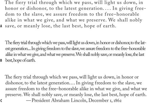
Figure 5.9. Type tracked too loosely (example A), too tightly (example B), and without tracking (example C).
Tracking is best used in moderation. If you're tempted to use tracking often, consider using a condensed typeface that has been designed with the efficient use of space in mind.
Note
Kerning and tracking are cumulative; they don't cancel each other out. You can use tracking to adjust the overall look of your type, and use kerning to adjust particular letter combinations.
To track a range of type, highlight the type and press Option+Left Arrow (Alt+Left Arrow) to go tighter, Option+Right Arrow (Alt+Right Arrow) to go looser. As with kerning, the default increment of 20/1000 of an em is too coarse, so it's a good idea to change this in your application Preferences.
When to Track |
Part I: Character Formats
Getting Started
- Getting Started
- An InDesign Type Map: Where to Find Stuff
- Viewing Your Page
- Creating a Typography Workspace
- Up Next
Going with the Flow
- Going with the Flow
- A Blank Sheet: Typing on Your Page
- Text Flow
- Threading Text Frames
- Using Placeholder Text
- Pasting Text
- Importing Word Text
- Up Next
Character Reference
- Character Reference
- Less is More, Maybe
- Type Anatomy
- Type Classification
- Character Formatting Options
- Readability
- Up Next
Getting the Lead Out
- Getting the Lead Out
- How Much Is Enough?
- (Not) Using Auto Leading
- Keep It Consistent, Except. . .
- Leading Menu Options and Keyboard Shortcuts
- See Also
- Up Next
Kern, Baby, Kern
- Kern, Baby, Kern
- When to Kern
- Metrics Kerning
- Optical Kerning
- Manual Kerning
- How Much to Kern
- Tracking
- When to Track
- Controlling Widows and Orphans
- Up Next
Sweating the Small Stuff: Special Characters, White Space, and Glyphs
- Sweating the Small Stuff: Special Characters, White Space, and Glyphs
- Typographers Quotes
- Apostrophes
- Dashes
- Ellipses
- End Marks
- White Space Characters
- The Glyphs Palette
- Footnotes
- Footnote Options
- Up Next
OpenType: The New Frontier in Font Technology
- OpenType: The New Frontier in Font Technology
- Ligatures
- Discretionary Ligatures
- Ordinals/Raised and Lowered Characters
- Swash Characters
- Fractions
- Oldstyle Figures
- Contextual Alternates
- Opticals
- Glyph Positioning
- Stylistic Sets
- Up Next
Part II: Paragraph Formats
Aligning Your Type
- Aligning Your Type
- Centering Type
- Clean Shaven or Rugged: Justified vs. Ragged Type
- How InDesign Justifies Type
- Balancing Ragged Lines
- Right-Aligned Type
- Optical Margin Alignment
- Indent to Here
- Vertical Alignment
- Up Next
Paragraph Indents and Spacing
First Impressions: Creating Great Opening Paragraphs
- First Impressions: Creating Great Opening Paragraphs
- Creating a Simple Drop Cap
- Drop Cap Aesthetics
- Tricks with Drop Caps
- Up Next
Dont Fear the Hyphen
Mastering Tabs and Tables
- Mastering Tabs and Tables
- Setting Tabs
- Creating Decimal Tabs
- Using Tab Leaders
- Reply Forms
- Numbered Lists
- Right Indent Tab
- Working with Tables
- Creating a Table
- Working with Rows and Columns
- Working with Table Cells
- Up Next
Part III: Styles
Stylin with Paragraph and Character Styles
- Stylin with Paragraph and Character Styles
- Creating Styles
- Applying Styles
- Editing Styles
- Redefining Styles
- Creating Default Styles
- A Typical Style Sheet
- Up Next
Mo Style
Part IV: Page Layout
Setting Up Your Document
- Setting Up Your Document
- Choosing a Page Size
- Determining Margins
- Determining Column Width
- Changing Columns
- Break Characters
- Page Numbers
- Section Markers
- Up Next
Everything in Its Right Place: Using Grids
- Everything in Its Right Place: Using Grids
- Things to Consider
- Your Grid Tool Kit
- Calculating the Height of the Type Area
- Align to Grid
- First Baseline Options
- Snap to Guides
- Up Next
Text Wraps: The Good, the Bad, and the Ugly
- Text Wraps: The Good, the Bad, and the Ugly
- Applying Text Wraps
- Wrapping Type Around Irregularly Shaped Graphics
- Text Wrap Preferences
- Ignoring Text Wrap
- Anchored Objects
- Up Next
Type Effects
EAN: 2147483647
Pages: 186
- Context Management of ERP Processes in Virtual Communities
- Intrinsic and Contextual Data Quality: The Effect of Media and Personal Involvement
- Healthcare Information: From Administrative to Practice Databases
- Relevance and Micro-Relevance for the Professional as Determinants of IT-Diffusion and IT-Use in Healthcare
- Development of Interactive Web Sites to Enhance Police/Community Relations
- Chapter II Information Search on the Internet: A Causal Model
- Chapter VII Objective and Perceived Complexity and Their Impacts on Internet Communication
- Chapter X Converting Browsers to Buyers: Key Considerations in Designing Business-to-Consumer Web Sites
- Chapter XII Web Design and E-Commerce
- Chapter XVII Internet Markets and E-Loyalty
