Optical Margin Alignment
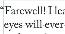
Ever notice how opening quotation marks and letters such as "W" or a "T" can make the left or right edges of a column appear misaligned? The problemlike all typographic problems more noticeable at large type sizesexists because InDesign aligns characters mechanically, that is, by the edge of the character plus its side bearing (the built-in space that surrounds each letter). Also, when the line begins with punctuation, like an opening quotation mark, you can get a visual hole or indentation at the beginning of the line relative to the characters below.
Until recently these shortcomings were regarded as part of the price of progress. After all, we could all do so much more with our page layout programs, at the end of the day did it really matter that we had to forgo a few niceties? Along came InDesign to the rescue.
Optical Margin Alignment allows the edges of letters to hang outside the text margin so that the column edge actually looks straighter. And not only that: Optical Margin Alignment will hang punctuation marks such as periods, commas, quotation marks, hyphens, and dashes outside the right-hand text margin.
It looks at the shapes and alignment of all the characters on the left and right margins and adjusts the spacing optically according to their letter shapes. Fan-frickin-tastic! Surprisingly, some people don't like this look, preferring everything contained within the text block. But then some people have become so accustomed to the taste of instant coffee that they no longer like the real thing.
Figure 8.19. Without Optical Margin Alignment (example A); Optical Margin Alignment applied (example B).

Figure 8.21. The opening quotation mark "hangs" to the left of the column edge.

Figure 8.20. To optically align your type check Optical Margin Alignment.

To apply Optical Margin Alignment to a story, select a text frame, then choose Type > Story and check Optical Margin Alignment. The font size setting determines the amount of overhang. Usually this should be the same size as the text, but you'll want to eyeball it.
Indent to Here |
Part I: Character Formats
Getting Started
- Getting Started
- An InDesign Type Map: Where to Find Stuff
- Viewing Your Page
- Creating a Typography Workspace
- Up Next
Going with the Flow
- Going with the Flow
- A Blank Sheet: Typing on Your Page
- Text Flow
- Threading Text Frames
- Using Placeholder Text
- Pasting Text
- Importing Word Text
- Up Next
Character Reference
- Character Reference
- Less is More, Maybe
- Type Anatomy
- Type Classification
- Character Formatting Options
- Readability
- Up Next
Getting the Lead Out
- Getting the Lead Out
- How Much Is Enough?
- (Not) Using Auto Leading
- Keep It Consistent, Except. . .
- Leading Menu Options and Keyboard Shortcuts
- See Also
- Up Next
Kern, Baby, Kern
- Kern, Baby, Kern
- When to Kern
- Metrics Kerning
- Optical Kerning
- Manual Kerning
- How Much to Kern
- Tracking
- When to Track
- Controlling Widows and Orphans
- Up Next
Sweating the Small Stuff: Special Characters, White Space, and Glyphs
- Sweating the Small Stuff: Special Characters, White Space, and Glyphs
- Typographers Quotes
- Apostrophes
- Dashes
- Ellipses
- End Marks
- White Space Characters
- The Glyphs Palette
- Footnotes
- Footnote Options
- Up Next
OpenType: The New Frontier in Font Technology
- OpenType: The New Frontier in Font Technology
- Ligatures
- Discretionary Ligatures
- Ordinals/Raised and Lowered Characters
- Swash Characters
- Fractions
- Oldstyle Figures
- Contextual Alternates
- Opticals
- Glyph Positioning
- Stylistic Sets
- Up Next
Part II: Paragraph Formats
Aligning Your Type
- Aligning Your Type
- Centering Type
- Clean Shaven or Rugged: Justified vs. Ragged Type
- How InDesign Justifies Type
- Balancing Ragged Lines
- Right-Aligned Type
- Optical Margin Alignment
- Indent to Here
- Vertical Alignment
- Up Next
Paragraph Indents and Spacing
First Impressions: Creating Great Opening Paragraphs
- First Impressions: Creating Great Opening Paragraphs
- Creating a Simple Drop Cap
- Drop Cap Aesthetics
- Tricks with Drop Caps
- Up Next
Dont Fear the Hyphen
Mastering Tabs and Tables
- Mastering Tabs and Tables
- Setting Tabs
- Creating Decimal Tabs
- Using Tab Leaders
- Reply Forms
- Numbered Lists
- Right Indent Tab
- Working with Tables
- Creating a Table
- Working with Rows and Columns
- Working with Table Cells
- Up Next
Part III: Styles
Stylin with Paragraph and Character Styles
- Stylin with Paragraph and Character Styles
- Creating Styles
- Applying Styles
- Editing Styles
- Redefining Styles
- Creating Default Styles
- A Typical Style Sheet
- Up Next
Mo Style
Part IV: Page Layout
Setting Up Your Document
- Setting Up Your Document
- Choosing a Page Size
- Determining Margins
- Determining Column Width
- Changing Columns
- Break Characters
- Page Numbers
- Section Markers
- Up Next
Everything in Its Right Place: Using Grids
- Everything in Its Right Place: Using Grids
- Things to Consider
- Your Grid Tool Kit
- Calculating the Height of the Type Area
- Align to Grid
- First Baseline Options
- Snap to Guides
- Up Next
Text Wraps: The Good, the Bad, and the Ugly
- Text Wraps: The Good, the Bad, and the Ugly
- Applying Text Wraps
- Wrapping Type Around Irregularly Shaped Graphics
- Text Wrap Preferences
- Ignoring Text Wrap
- Anchored Objects
- Up Next
Type Effects
EAN: 2147483647
Pages: 186
