Determining Column Width
The type area defined by your margins may be subdivided into columns. The relationship between the type size and the column width, or measure, is a key factor in determining the readability of your type. There's no cast-iron rule for determining column width. Some jobs lend themselves to generous columns; often economy dictates narrower columns than are optimal.
As a rough guide, aim for 40 to 70 characters (including the spaces) per line. That's a big range, so there's plenty of scope. More than 70 characters and "doubling" can occurthe eye returning to the left column edge only to read the same line again. If you are obligated to work with a measure that is too wide, you can improve its readability by increasing the leading of your type. At the other extreme, if you have less than 25 characters per line, getting evenly spaced type will be next to impossible.
Tip
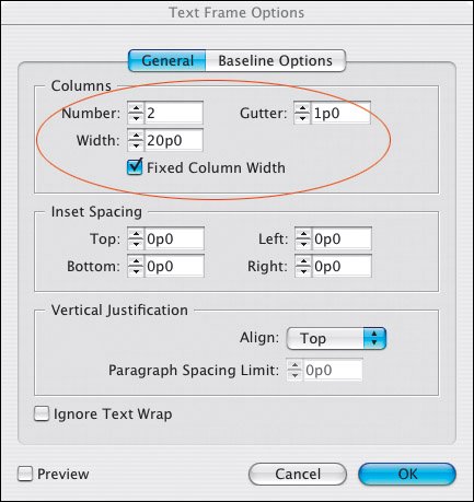
If you already know how wide you want your columns to be you can specify a fixed column width, and InDesign will adjust the size of your text frame accordingly. If you want columns of unequal widths, click and drag the column guides.
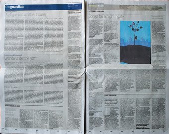
Take a look at your daily newspaper and you'll find justified columns with a lot less than 50 characters. You'll probably also findwithout looking too hardthat these columns are riddled with huge word spaces. This is due to poor justification as a consequence of the narrow column measure. We've gotten used to bad typography in newspaperswhich in their defense can say that they are produced under tight deadline pressureand read them easily despite their typography, not because of it. Historically newspapers used smaller type than they do today. But while the type has gotten bigger, the columns haven't grown proportionally, hence the justification problems. That said, there are notable exceptionsThe Guardian (UK) has significantly raised the bar for newspaper typography in the last few decades.
Figure 15.6. The British Newspaper, The Guardian.

Figure 15.7. Fixed Column Width.

The issue of column width is more problematic with justified type than with ragged type. If you are working with a narrow measure, do yourself a big favor and choose Left rather than Left Justified alignment.
Determining Gutter Width
In multicolumn documents, the separate columns of type should look like they are parts of a unified whole. If the space between your columns, or gutter width, is too wide, those columns will look like they bear no relation to each other. On the other hand, if the gutter width is too narrow, the reader's eye may mistakenly cross over from one column to the next.
Typically gutter widths (the space between the columns) are 1 pica or 1 pica and 6 points. You might want to use a gutter width relative to the type size. A rule of thumb is that the gutter should be at least 1.5 ems wide so that it is clearly larger than the widest word space in the line. If you are working with a baseline grid, to achieve a uniformity of spacing, set your gutter width to the same value as your baseline grid increment, which in turn will be based on the leading increment of your body text. (See Chapter 16: "Everything in its Right Place: Working with Grids")
Column Height
There's no golden rule for determining column height, except to say that for continuous reading, the columns should be vertical, i.e., taller than they are wide.
Changing Columns |
Part I: Character Formats
Getting Started
- Getting Started
- An InDesign Type Map: Where to Find Stuff
- Viewing Your Page
- Creating a Typography Workspace
- Up Next
Going with the Flow
- Going with the Flow
- A Blank Sheet: Typing on Your Page
- Text Flow
- Threading Text Frames
- Using Placeholder Text
- Pasting Text
- Importing Word Text
- Up Next
Character Reference
- Character Reference
- Less is More, Maybe
- Type Anatomy
- Type Classification
- Character Formatting Options
- Readability
- Up Next
Getting the Lead Out
- Getting the Lead Out
- How Much Is Enough?
- (Not) Using Auto Leading
- Keep It Consistent, Except. . .
- Leading Menu Options and Keyboard Shortcuts
- See Also
- Up Next
Kern, Baby, Kern
- Kern, Baby, Kern
- When to Kern
- Metrics Kerning
- Optical Kerning
- Manual Kerning
- How Much to Kern
- Tracking
- When to Track
- Controlling Widows and Orphans
- Up Next
Sweating the Small Stuff: Special Characters, White Space, and Glyphs
- Sweating the Small Stuff: Special Characters, White Space, and Glyphs
- Typographers Quotes
- Apostrophes
- Dashes
- Ellipses
- End Marks
- White Space Characters
- The Glyphs Palette
- Footnotes
- Footnote Options
- Up Next
OpenType: The New Frontier in Font Technology
- OpenType: The New Frontier in Font Technology
- Ligatures
- Discretionary Ligatures
- Ordinals/Raised and Lowered Characters
- Swash Characters
- Fractions
- Oldstyle Figures
- Contextual Alternates
- Opticals
- Glyph Positioning
- Stylistic Sets
- Up Next
Part II: Paragraph Formats
Aligning Your Type
- Aligning Your Type
- Centering Type
- Clean Shaven or Rugged: Justified vs. Ragged Type
- How InDesign Justifies Type
- Balancing Ragged Lines
- Right-Aligned Type
- Optical Margin Alignment
- Indent to Here
- Vertical Alignment
- Up Next
Paragraph Indents and Spacing
First Impressions: Creating Great Opening Paragraphs
- First Impressions: Creating Great Opening Paragraphs
- Creating a Simple Drop Cap
- Drop Cap Aesthetics
- Tricks with Drop Caps
- Up Next
Dont Fear the Hyphen
Mastering Tabs and Tables
- Mastering Tabs and Tables
- Setting Tabs
- Creating Decimal Tabs
- Using Tab Leaders
- Reply Forms
- Numbered Lists
- Right Indent Tab
- Working with Tables
- Creating a Table
- Working with Rows and Columns
- Working with Table Cells
- Up Next
Part III: Styles
Stylin with Paragraph and Character Styles
- Stylin with Paragraph and Character Styles
- Creating Styles
- Applying Styles
- Editing Styles
- Redefining Styles
- Creating Default Styles
- A Typical Style Sheet
- Up Next
Mo Style
Part IV: Page Layout
Setting Up Your Document
- Setting Up Your Document
- Choosing a Page Size
- Determining Margins
- Determining Column Width
- Changing Columns
- Break Characters
- Page Numbers
- Section Markers
- Up Next
Everything in Its Right Place: Using Grids
- Everything in Its Right Place: Using Grids
- Things to Consider
- Your Grid Tool Kit
- Calculating the Height of the Type Area
- Align to Grid
- First Baseline Options
- Snap to Guides
- Up Next
Text Wraps: The Good, the Bad, and the Ugly
- Text Wraps: The Good, the Bad, and the Ugly
- Applying Text Wraps
- Wrapping Type Around Irregularly Shaped Graphics
- Text Wrap Preferences
- Ignoring Text Wrap
- Anchored Objects
- Up Next
Type Effects
EAN: 2147483647
Pages: 186
