Organize the Information to Support Its Meaning and Use
You can't just take information and throw it onto the dashboard any way you please. How the pieces are arranged in relation to one another can make the difference between a dashboard that works and one that ends up being ignored, even though the information they present is the same. Keep the following considerations in mind when you determine how to arrange data on the screen:
- Organize groups according to business functions, entities, and use.
- Co-locate items that belong to the same group.
- Delineate groups using the least visible means.
- Support meaningful comparisons.
- Discourage meaningless comparisons.
7.1.1. Organize Groups According to Business Functions, Entities, and Use
A good first cut at organizing data is to form groups that are aligned with business functions (for example, order entry, shipping, or budget planning), with entities (departments, projects, systems, etc.), or with uses of the data (for instance, the need to compare revenues and expenses). These are the natural ways to organize most business data.
In a business, because entities and functions are parts of an interconnected system, someone whose role spans many of these individual units might prefer to see data organized in a way that is more integrated and aligned with the way she uses that information. For instance, a CEO stands above the divisions found in an organization's structure and usually wants to see relationships among data that are more holistic, perhaps based on the relative importance of each item to the company's bottom line, from greatest to least. In a case like this, items that others might naturally see as belonging to distinct groups might be grouped together to better serve the needs of the CEO. If there is a particular order in which the data ought to be scanned to build the desired overview as efficiently as possible, grouping and ordering items accordingly might work best.
When organizing data on a dashboard, start by learning precisely how the information will be used and how the pieces ought to be arranged to best serve these uses.
7.1.2. Co-locate Items That Belong to the Same Group
Once you've determined those items that belong together relative to the task at hand, the best means to connect them is to place them close to one another, yet delineated in some simple manner from surrounding groups. Using position to group items visually is a strategy that is preattentively and thus rapidly perceived.
7.1.3. Delineate Groups Using the Least Visible Means
Visual means that are used to delineate groups of data, such as grid lines, borders, and background fill colors, qualify as non-data pixels. As such, they should be only as visible as necessary to do the job. What is the least visible means to visually delineate groups of data? The answer is white space. When enough blank space surrounds a group of data to set it apart from the other groups, the objective is accomplished without adding any visual content to the dashboard that might distract attention from the data. Use white space to delineate groups of data whenever possible.
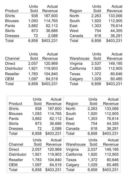
Of course, as dashboards are often high-density displays, they do not always have the spare space necessary to use white space alone to delineate the groups. When that is the case, subtle borders are usually the best means to distinguish the groups. You might be surprised at how light lines can be and still do the job. Take a look at Figure 7-1 for an example of how you can use white space or light borders to delineate the same groups of data.
Figure 7-1. The four tables on the top have been separated effectively using white space alone, but the four on the bottom, because they are closer together, have been separated using light borders.
7.1.4. Support Meaningful Comparisons
Measures of performance come alive only when you compare them to other measures. For example, knowing that quarter-to-date sales revenue is $92,354 is meaningful only when compared to one or more other measures that can be used as yardsticks to determine its merit, such as a target or the amount of revenue that had come in at this point in the prior quarter. You can encourage meaningful comparisons by doing the following:
- Combining items in a single table or graph (if appropriate)
- Placing items close to one another
- Linking items in different groups using a common color
- Including comparative values (for example, ratios, percentages, or actual variances) whenever useful for clarity and efficiency
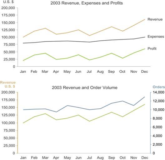
Figure 7-2 illustrates two of these practices. The graph on top shows several measures that share the same unit of measure, displayed in a single graph to encourage comparison. The graph on the bottom combines two data sets with different units of measure in a single graph by placing one quantitative scale on the left vertical axis and another on the right.
Figure 7-2. Two examples of combining multiple measures in a single graph to encourage comparisons.
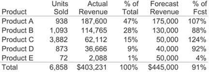
The table in Figure 7-3 illustrates how values can be expressed directly as comparative units of measure to encourage comparisons. Both the "% of Total" and "% of Fcst" columns contain values that are comparative by their very nature. Especially when you want to communicate the degree to which one value differs from another, percentages express this more directly than raw values.
Figure 7-3. You can use comparative values to directly support comparisons.
7.1.5. Discourage Meaningless Comparisons
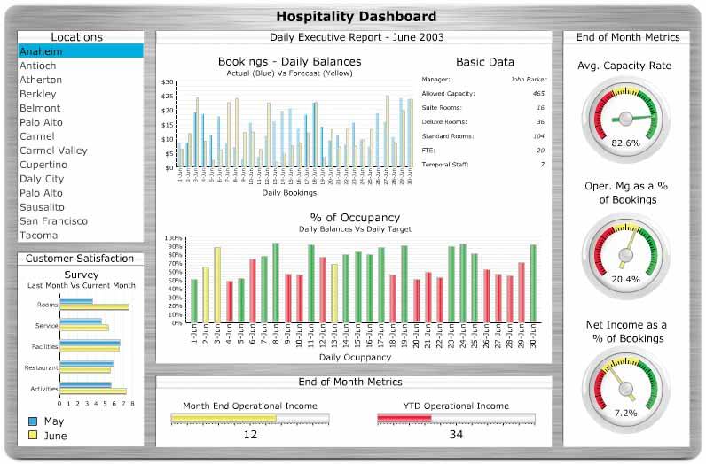
Even if it's all important to some job or set of objectives, not all the data that appears on a dashboard is meant to be compared. However, without vigilance, you might inadvertently make design choices that encourage the comparison of unrelated data. For instance, in Figure 7-4, some of the color choices produce this unintended effect. The colors green and red mean "good" and "bad" wherever they appear, which encourages us to assume that all the colors used on this dashboard mean the same wherever they appear. However, this isn't the casenotice that the color yellow means "satisfactory" in some contexts, but in one graph it represents forecast balances and in another the month of June. In this case, our natural inclination to link like colors is misleading.
Figure 7-4. This dashboard inadvertently encourages meaningless comparisons.
You can discourage meaningless comparisons by doing the opposite of the practices mentioned in the previous section:
- Separate items from one another spatially (if appropriate).
- Use different colors.
Clarifying the Vision
- Clarifying the Vision
- All That Glitters Is Not Gold
- Even Dashboards Have a History
- Dispelling the Confusion
- A Timely Opportunity
Variations in Dashboard Uses and Data
Thirteen Common Mistakes in Dashboard Design
- Thirteen Common Mistakes in Dashboard Design
- Exceeding the Boundaries of a Single Screen
- Supplying Inadequate Context for the Data
- Displaying Excessive Detail or Precision
- Choosing a Deficient Measure
- Choosing Inappropriate Display Media
- Introducing Meaningless Variety
- Using Poorly Designed Display Media
- Encoding Quantitative Data Inaccurately
- Arranging the Data Poorly
- Highlighting Important Data Ineffectively or Not at All
- Cluttering the Display with Useless Decoration
- Misusing or Overusing Color
- Designing an Unattractive Visual Display
Tapping into the Power of Visual Perception
- Tapping into the Power of Visual Perception
- Understanding the Limits of Short-Term Memory
- Visually Encoding Data for Rapid Perception
- Gestalt Principles of Visual Perception
- Applying the Principles of Visual Perception to Dashboard Design
Eloquence Through Simplicity
- Eloquence Through Simplicity
- Characteristics of a Well-Designed Dashboard
- Key Goals in the Visual Design Process
Effective Dashboard Display Media
- Effective Dashboard Display Media
- Select the Best Display Medium
- An Ideal Library of Dashboard Display Media
- Summary
Designing Dashboards for Usability
- Designing Dashboards for Usability
- Organize the Information to Support Its Meaning and Use
- Maintain Consistency for Quick and Accurate Interpretation
- Make the Viewing Experience Aesthetically Pleasing
- Design for Use as a Launch Pad
- Test Your Design for Usability
Putting It All Together
EAN: 2147483647
Pages: 80
