Gestalt Principles of Visual Perception
Back in 1912, the Gestalt School of Psychology began its fruitful efforts to understand how we perceive pattern, form, and organization in what we see. The German term "gestalt" simply means "pattern." These researchers recognized that we organize what we see in particular ways in an effort to make sense of it. Their work resulted in a collection of Gestalt principles of perception that reveal those visual characteristics that incline us to group objects together. These principles still stand today as accurate and useful descriptions of visual perception, and they offer several useful insights that we can apply directly in our dashboard designs to intentionally tie data together, separate data, or make some data stand out as distinct from the rest.
We'll examine the following six principles:
- Proximity
- Closure
- Similarity
- Continuity
- Enclosure
- Connection
4.3.1. The Principle of Proximity
We perceive objects that are located near one another as belonging to the same group. Figure 4-10 clearly illustrates this principle. Based on their relative locations, we automatically see the dots as belonging to three separate groups. This is the simplest way to link data that you want to be seen together. White space alone is usually all you need to separate these groups from the other data that surrounds them.
Figure 4-10. The Gestalt principle of proximity explains why we see 3 groups instead of just 10 dots in this image.

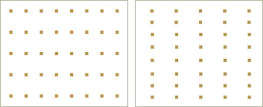
The principle of proximity can also be used to direct viewers to scan data on a dashboard predominantly in a particular direction: either left to right or top to bottom. Placing sections of data closer together horizontally encourages viewers' eyes to group the sections horizontally, and thus to scan from left to right. Placing sections of data closer together vertically achieves the opposite effect.
Notice how subtly this works in Figure 4-11. You are naturally inclined to scan the small squares that appear on the left horizontally as rows and the ones on the right vertically as columns, all because of how they are positioned in relation to each other.
Figure 4-11. The Gestalt principle of proximity can be used to encourage either horizontal or vertical scanning.
4.3.2. The Principle of Similarity
We tend to group together objects that are similar in color, size, shape, and orientation. Figure 4-12 illustrates this tendency.
Figure 4-12. When objects share some visual attribute in common, we tend to see them as belonging to the same group.
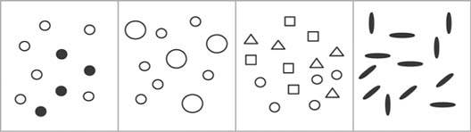
This principle reinforces what we've already learned about the usefulness of color (both hue and intensity), size, shape, and orientation to encode categorical variables. The principle of similarity applies very effectively to groups of visual objects that vary as different expressions of preattentive attributes such as these. It works especially well as a means of identifying different data sets in a graph (for example, income, expenses, and profits). Even when data that we wish to link resides in separate locations on a dashboard, the principle of similarity can be applied to establish that link.
For instance, if you wish to tie together revenue information that appears in various graphs, you can do so by using the same color to encode it wherever it appears. This technique can be useful for encouraging comparisons of any data that appear in various places, such as order count, order size, and order revenue.
4.3.3. The Principle of Enclosure
We perceive objects as belonging together when they are enclosed by anything that forms a visual border around them (for example, a line or a common field of color). This enclosure causes the objects to appear to be set apart in a region that is distinct from the rest of what we see. Notice how strongly your eyes are induced to group the enclosed objects in Figure 4-13.
Figure 4-13. The Gestalt principle of enclosure points out that any form of visual enclosure causes us to see the enclosed objects as a group.
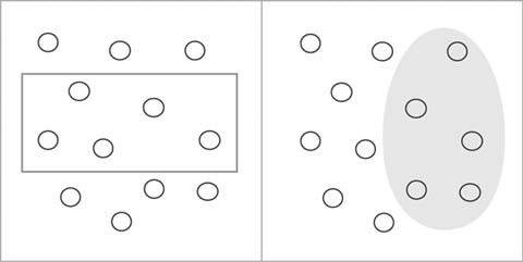
The arrangement of the two sets of circles in this figure is exactly the same, yet the differing enclosures direct us to group the circles in very different ways. This principle is exhibited frequently in the use of borders and fill colors or shading in tables and graphs to group information and set it apart. As you can see, it does not take a strong enclosure (e.g., bright, thick lines or dominant colors) to create a strong perception of grouping.
4.3.4. The Principle of Closure
Humans have a keen dislike for loose ends. When faced with ambiguous visual stimuliobjects that could be perceived either as open, incomplete, and unusual forms or as closed, whole, and regular formswe naturally perceive them as the latter. The principle of closure asserts that we perceive open structures as closed, complete, and regular whenever there is a way that we can reasonably do so. Figure 4-14 illustrates this principle.
Figure 4-14. The Gestalt principle of closure explains why we see these as closed shapes, despite the fact that they are not finished.
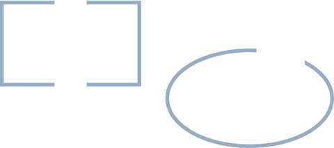
It is natural for us to perceive what appears on the left in Figure 4-14 as a rectangle rather than two sets of three connected lines connected at right angles and to perceive the object on the right as a complete oval rather than simply a curved line.
We can apply this tendency to perceive whole structures in dashboards, especially in the design of graphs. For example, we can group objects (points, lines, or bars in a graph, etc.) into visual regions without the use of complete borders or background colors to define the space. This is preferable, because the need to display a large collection of data in a small amount of space requires that we eliminate all visual content that is not absolutely necessary, to avoid clutter. As shown in Figure 4-15, it is sufficient to define the area of a graph through the use of a single set of X and Y axes, rather than by lines that form a complete rectangle around the graph, with or without a fill color.
Figure 4-15. The Gestalt principle of closure also explains why only two axes, rather than full enclosure, are required on a graph to define the space in which the data appears.

4.3.5. The Principle of Continuity
We perceive objects as belonging together, as part of a single whole, if they are aligned with one another or appear to form a continuation of one another. In Figure 4-16, for instance, we tend to see the individual lines as a continuation of one another, more as a dashed line than separate lines.
Figure 4-16. The Gestalt principle of continuity explains why we see this as a single wavy line.

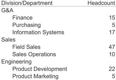
Things that are aligned with one another appear to belong to the same group. In the table in Figure 4-17, it is obvious which items are division names and which are department names, based on their distinct alignment. Divisions, departments, and headcounts are clearly grouped, without any need for vertical grid lines to delineate them. Even though the division and department columns overlap with no white space in between, their distinct alignment alone makes them easy to distinguish. This same technique can be used to tie together separate sections of data on a dashboard.
Figure 4-17. The Gestalt principle of continuity also explains how the indentation of text works as a means to group information.
4.3.6. The Principle of Connection
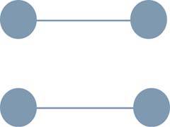
We perceive objects that are connected in some way, such as by a line, as part of the same group. In Figure 4-18, even though the circles are nearer to one another vertically than horizontally, the lines that connect them create a clear perception of two horizontally attached pairs.
Figure 4-18. The Gestalt principle of connection explains why we see these dots grouped by rows rather than columns.
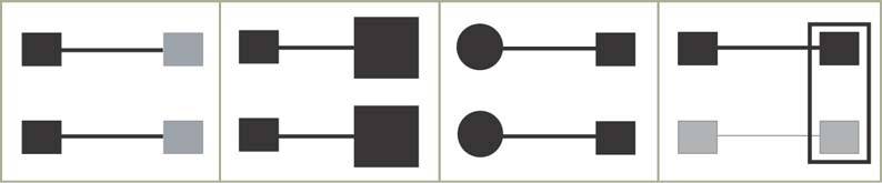
As Figure 4-19 illustrates, the perception of grouping produced by connection is stronger than that produced by proximity or similarity (color, size, and shape); it is weaker only than that produced by enclosure. The principle of connection is especially useful for tying together non-quantitative datafor example, to represent relationships between steps in a process or between employees in an organization.
Figure 4-19. When objects are connected, such as by the lines in these examples, they are grouped together more powerfully than by just about any other visual means. Only the enclosure in the rightmost example more strongly groups the two squares on the right than the connections formed by the lines.
Clarifying the Vision
- Clarifying the Vision
- All That Glitters Is Not Gold
- Even Dashboards Have a History
- Dispelling the Confusion
- A Timely Opportunity
Variations in Dashboard Uses and Data
Thirteen Common Mistakes in Dashboard Design
- Thirteen Common Mistakes in Dashboard Design
- Exceeding the Boundaries of a Single Screen
- Supplying Inadequate Context for the Data
- Displaying Excessive Detail or Precision
- Choosing a Deficient Measure
- Choosing Inappropriate Display Media
- Introducing Meaningless Variety
- Using Poorly Designed Display Media
- Encoding Quantitative Data Inaccurately
- Arranging the Data Poorly
- Highlighting Important Data Ineffectively or Not at All
- Cluttering the Display with Useless Decoration
- Misusing or Overusing Color
- Designing an Unattractive Visual Display
Tapping into the Power of Visual Perception
- Tapping into the Power of Visual Perception
- Understanding the Limits of Short-Term Memory
- Visually Encoding Data for Rapid Perception
- Gestalt Principles of Visual Perception
- Applying the Principles of Visual Perception to Dashboard Design
Eloquence Through Simplicity
- Eloquence Through Simplicity
- Characteristics of a Well-Designed Dashboard
- Key Goals in the Visual Design Process
Effective Dashboard Display Media
- Effective Dashboard Display Media
- Select the Best Display Medium
- An Ideal Library of Dashboard Display Media
- Summary
Designing Dashboards for Usability
- Designing Dashboards for Usability
- Organize the Information to Support Its Meaning and Use
- Maintain Consistency for Quick and Accurate Interpretation
- Make the Viewing Experience Aesthetically Pleasing
- Design for Use as a Launch Pad
- Test Your Design for Usability
Putting It All Together
EAN: 2147483647
Pages: 80
- Frame-Mode MPLS Configuration and Verification
- Cell-Mode MPLS over ATM Overview, Configuration, and Verification
- Basic MPLS VPN Overview and Configuration
- Case Study-Inter-AS Implementing Route-Reflector and BGP Confederation in Provider Networks
- Case Study 3: Implementing Layer 2 VPNs over Inter-AS Topologies Using Layer 2 VPN Pseudo-Wire Switching
