Introducing Meaningless Variety
The mistake of introducing meaningless variety into a dashboard design is closely tied to the one we just examined. I've found that people often hesitate to use the same type of display medium multiple times on a dashboard, out of what I assume is a sense that viewers will be bored by the sameness. Variety might be the spice of life, but if it is introduced on a dashboard for its own sake, the display suffers. You should always select the means of display that works best, even if that results in a dashboard that is filled with nothing but multiple instances of the same type of graph. If you are giving viewers the information that they desperately need to do their jobs, the data won't bore them just because it's all displayed in the same way. They will definitely get aggravated, however, if forced to work harder than necessary to get the information they need due to arbitrary variety in the display media. In fact, wherever appropriate, consistency in the means of display allows viewers to use the same perceptual strategy for interpreting the data, which saves time and energy.
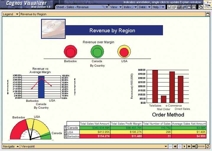
Figure 3-18 illustrates variety gone amok. This visual jumble requires a shift in perceptual strategy for each display item on the dashboard, which means extra time and effort on the user's part.
Figure 3-18. This dashboard exhibits an unnecessary variety of display media.
Clarifying the Vision
- Clarifying the Vision
- All That Glitters Is Not Gold
- Even Dashboards Have a History
- Dispelling the Confusion
- A Timely Opportunity
Variations in Dashboard Uses and Data
Thirteen Common Mistakes in Dashboard Design
- Thirteen Common Mistakes in Dashboard Design
- Exceeding the Boundaries of a Single Screen
- Supplying Inadequate Context for the Data
- Displaying Excessive Detail or Precision
- Choosing a Deficient Measure
- Choosing Inappropriate Display Media
- Introducing Meaningless Variety
- Using Poorly Designed Display Media
- Encoding Quantitative Data Inaccurately
- Arranging the Data Poorly
- Highlighting Important Data Ineffectively or Not at All
- Cluttering the Display with Useless Decoration
- Misusing or Overusing Color
- Designing an Unattractive Visual Display
Tapping into the Power of Visual Perception
- Tapping into the Power of Visual Perception
- Understanding the Limits of Short-Term Memory
- Visually Encoding Data for Rapid Perception
- Gestalt Principles of Visual Perception
- Applying the Principles of Visual Perception to Dashboard Design
Eloquence Through Simplicity
- Eloquence Through Simplicity
- Characteristics of a Well-Designed Dashboard
- Key Goals in the Visual Design Process
Effective Dashboard Display Media
- Effective Dashboard Display Media
- Select the Best Display Medium
- An Ideal Library of Dashboard Display Media
- Summary
Designing Dashboards for Usability
- Designing Dashboards for Usability
- Organize the Information to Support Its Meaning and Use
- Maintain Consistency for Quick and Accurate Interpretation
- Make the Viewing Experience Aesthetically Pleasing
- Design for Use as a Launch Pad
- Test Your Design for Usability
Putting It All Together
EAN: 2147483647
Pages: 80
