Exceeding the Boundaries of a Single Screen
My insistence that a dashboard should confine its display to a single screen, with no need for scrolling or switching between multiple screens, might seem arbitrary and a bit finicky, but it is based on solid and practical rationale. After studying data visualization for a while, including visual perception, one discovers that something powerful happens when things are seen together, all within eye span. Likewise, something critical is lost when you lose sight of some data by scrolling or switching to another screen to see other data. Part of the problem is that we can hold only a few chunks of information at a time in short-term memory. Relying on the mind's eye to remember information that is no longer visible is a rocky venture.
One of the great benefits of a dashboard as a medium of communication is the simultaneity of vision that it offers: the ability to see everything that you need at once. This enables comparisons that lead to insightsthose "Aha!" experiences that might not occur in any other way. Clearly, exceeding the boundaries of a single screen negates this benefit. Let's examine the two versions of this problemfragmenting data into separate screens and requiring scrollingindependently.
3.1.1. Fragmenting Data into Separate Screens
Information that appears on dashboards is often fragmented in one of two ways:
- Separated into discrete screens to which one must navigate
- Separated into different instances of a single screen that are accessed through some form of interaction
Enabling users to navigate to discrete screens or different instances of a single screen to access additional information is not, in general, a bad practice. Allowing navigation to further detail or to a different set of information that achieves its purpose best by standing alone can be a powerful dashboard feature. However, when all the information should be seen at the same time to gain the desired insights, that fragmentation undermines the unique advantages of a dashboard. Fragmenting data that should be seen together is a mistake.
Let's look at an example. The dashboard in Figure 3-1 fragments the data that executives need into 10 separate dashboards. This would be fine if the executives wouldn't benefit from seeing these various measures together, but that is hardly the case.
Figure 3-1. This dashboard fragments the data in a way that undermines the viewer's ability to see meaningful relationships.
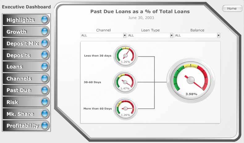
In this example, a banking executive is forced to examine the performance of the following aspects of the business separately:
- Highlights
- Deposits
- Past due loans
- Profitability
- Growth
- Loans
- Risk
- Deposit mix
- Channels
- Market share
Each of these screens presents a separate, high-level snapshot of a single set of measures that ought to be integrated into a single screen. Despite what you might assume about the available screen labeled "Highlights," it does not provide a consolidated visual overview of the data but consists primarily of a text table that contains several of the measures. A banking executive needs to see these measures together in a way that enables comparisons to understand how they relate to and influence one another.
Splitting the big picture into a series of separate small pictures is a mistake whenever seeing the big picture is worthwhile.
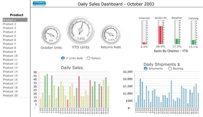
A similar example, from the same software vendor, is shown in Figure 3-2. This time the picture of daily sales has been split into a separate dashboard for each of 20 products. If the intention is to serve the needs of product managers who are each exclusively interested in a single product and never want to compare sales of that product to others, this design doesn't fragment the data in a harmful way. If, however, any benefit can be gained by viewing the sales of multiple products together, which is almost surely the case, this design fails.
Figure 3-2. This dashboard requires viewers to click on a desired product and view information for only one product at a time.
3.1.2. Requiring Scrolling
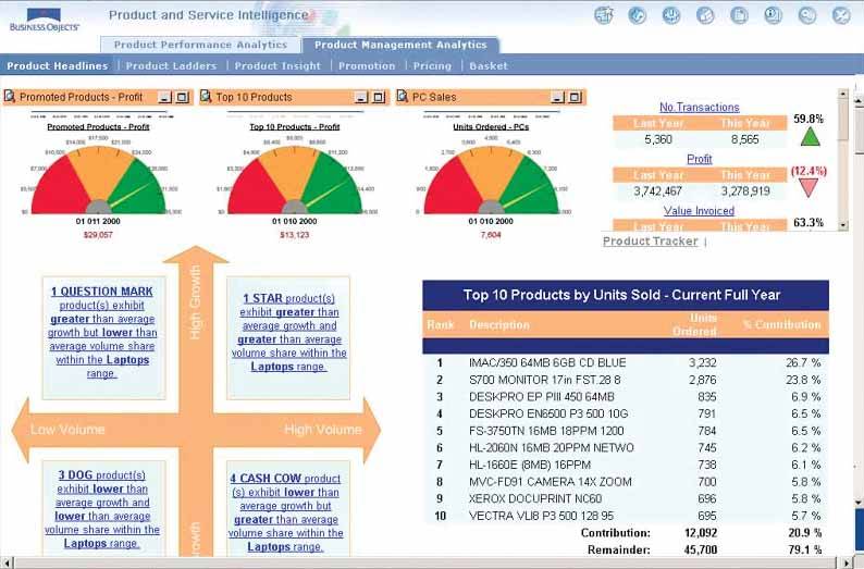
The dashboard in Figure 3-3 illustrates the problem that's created when scrolling is required to see all the data. Not only are we left wondering what lies below the bottom of the screen in the dashboard as a whole, but we're also given immediate visual access only to the first of many metrics that appear in the scrollable box at the top right, beginning with "No. Transactions." We'd be better off reading a printed report extending across multiple pages, because at least then we could lay out all of the pages at once for simultaneous viewing. People commonly assume that anything that lies beyond their immediate field of vision and requires scrolling to see is of less importance than what's immediately visible. Many viewers won't bother to look at what lies off the screen, and those who take the time will likely resent the effort.
Figure 3-3. This dashboard demonstrates the effectiveness that is sacrificed when scrolling is required to see all the information.
Clarifying the Vision
- Clarifying the Vision
- All That Glitters Is Not Gold
- Even Dashboards Have a History
- Dispelling the Confusion
- A Timely Opportunity
Variations in Dashboard Uses and Data
Thirteen Common Mistakes in Dashboard Design
- Thirteen Common Mistakes in Dashboard Design
- Exceeding the Boundaries of a Single Screen
- Supplying Inadequate Context for the Data
- Displaying Excessive Detail or Precision
- Choosing a Deficient Measure
- Choosing Inappropriate Display Media
- Introducing Meaningless Variety
- Using Poorly Designed Display Media
- Encoding Quantitative Data Inaccurately
- Arranging the Data Poorly
- Highlighting Important Data Ineffectively or Not at All
- Cluttering the Display with Useless Decoration
- Misusing or Overusing Color
- Designing an Unattractive Visual Display
Tapping into the Power of Visual Perception
- Tapping into the Power of Visual Perception
- Understanding the Limits of Short-Term Memory
- Visually Encoding Data for Rapid Perception
- Gestalt Principles of Visual Perception
- Applying the Principles of Visual Perception to Dashboard Design
Eloquence Through Simplicity
- Eloquence Through Simplicity
- Characteristics of a Well-Designed Dashboard
- Key Goals in the Visual Design Process
Effective Dashboard Display Media
- Effective Dashboard Display Media
- Select the Best Display Medium
- An Ideal Library of Dashboard Display Media
- Summary
Designing Dashboards for Usability
- Designing Dashboards for Usability
- Organize the Information to Support Its Meaning and Use
- Maintain Consistency for Quick and Accurate Interpretation
- Make the Viewing Experience Aesthetically Pleasing
- Design for Use as a Launch Pad
- Test Your Design for Usability
Putting It All Together
EAN: 2147483647
Pages: 80
