Sample Sales Dashboard
Apart from executive dashboards, I suspect that no one type of dashboard is implemented more often than a sales dashboard. Sales activity is the life-giving heart of most businesses. Those in charge of sales need to keep their fingers on the pulse at all times, even when all is well. Sales strategies might need to change quickly when new opportunities, problems, or competitive pressures arise. A well-designed dashboard can be a powerful tool for a sales manager.
Note: Keep in mind that the purpose of the samples in this chapter is not to define the data that you should include on any particular type of dashboard, but rather to illustrate how the visual design principles that you've learned in this book can be applied to real-world situations, and how they might look. It isn't possible to determine the precise data that will be appropriate for all dashboards of any particular type, such as a sales dashboard.
I began designing the sample sales dashboard by selecting the information that seemed most important for a sales manager to monitor. Each item that I selected is a measure of what's currently going on in sales. Here's the list:
- Sales revenue
- Sales revenue in the pipeline (expected revenue divided into categories of probability)
- Profit
- Customer satisfaction rating
- Top 10 customers
- Market share
For each of these items, I needed to make several decisions, including:
- At what level of summarization should I express this measure?
- What unit of measure should I use to express this measure?
- What complementary information should I include as context to enhance this measure's meaning?
- What means of display would best express this measure?
- How important is this measure to a sales manager compared to the other measures?
- At what point in the sequence of viewing the items on the dashboard might a sales manager want to see this measure?
- To what other measures might a sales manager want to compare this measure?
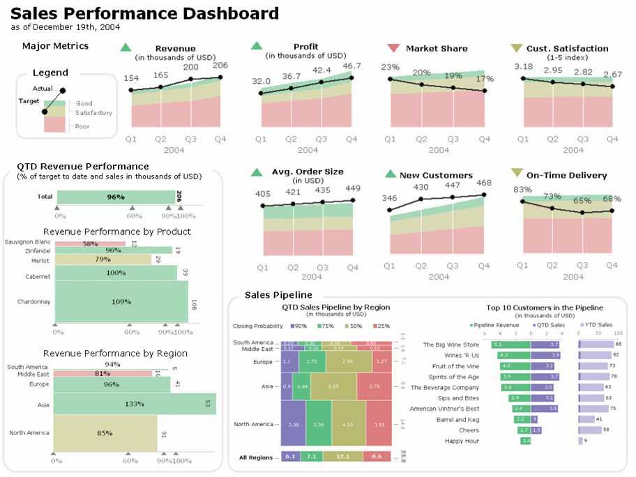
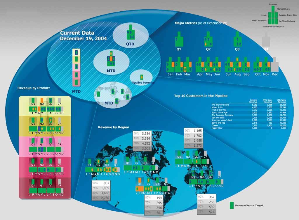
If I were designing a sales dashboard for a particular person or group, I would involve them in answering these questions. For my present purposes, however, I made several assumptions based on my knowledge of sales and produced the dashboard in Figure 8-1.
Figure 8-1. A sample sales dashboard that puts into practice the principles we've discussed throughout this book.
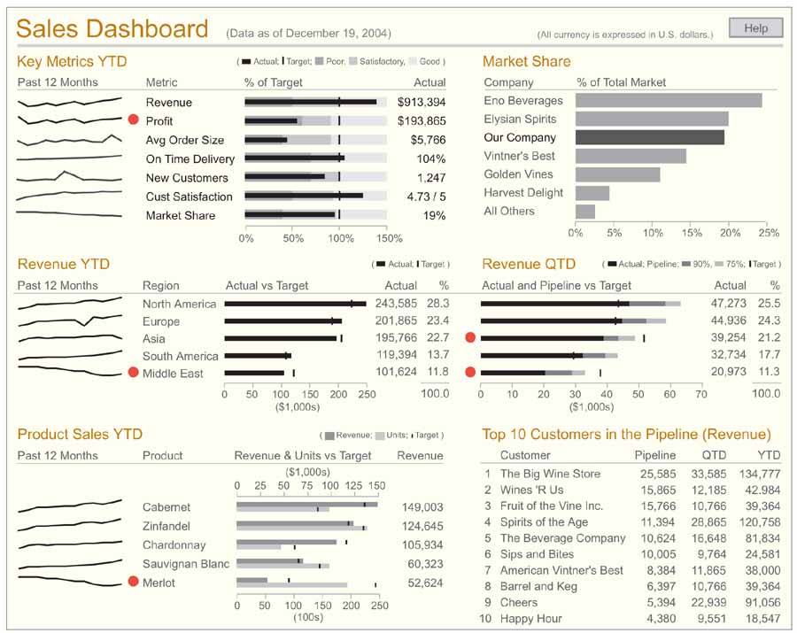
Examine this dashboard on your own, through eyes that can now recognize what works and what doesn't, with an understanding of why. Look at each measure, at what I included as context, and at every aspect of the visual design, both on its own and in relation to the whole. Ask yourself, "Why was it designed in this way?" Take some time now to do this before reading on. Hopefully, you'll be able to identify and explain the reasons for most of my design choices.
Here are a few of the highlights:
Color has been used sparingly. Other than the light-brown headings to clearly group the data into meaningful sections, the only other color that is not a gray-tone appears on the red alerts. This judicious use of color makes those items that must grab attention do so clearly, without competition from other colors that might also attract attention.
The prime real estate on the screen has been used for the most important data. Assuming that the measures that have been identified as the "key metrics" are generally the most important items on the dashboard, placing them in the upper-left corner of the screen gives them the prominence that they deserve.
Small, concise display media have been used to support the display of a dense set of data in a small amount of space. This dashboard displays a great deal of information, yet it isn't cluttered. Space-efficient and simple display media such as sparklines and bullet graphs are required to achieve this effect.
Some measures have been presented both graphically and as text. People who monitor sales activity are generally interested in knowing both the actual sales amounts and how well sales are doing compared to targets.
The display of quarter-to-date revenue per region combines the actual and pipeline values in the form of stacked bars. This approach enables viewers to easily see the result of adding anticipated to actual revenue in relation to the target.
White space alone has been used to delineate and group data. Borders, grid lines, and background fill colors are unnecessary and would severely clutter the screen.
The dashboard has not been cluttered with instructions and descriptions that will seldom be needed. A single help button has been provided to allow the viewer to access information that will probably be needed only once or twice, at the beginning of the dashboard's use.
Looking at this sample dashboard, you might see ways that different choices could have been made to further improve its effectiveness. I fully expect and even hope to receive feedback from readers like you to point out improvements that could be made.
You might find it useful to compare my sales dashboard to several others that were designed to meet the same exact set of requirements. I recently judged a data visualization competition for DM Review magazine. One of the four business scenarios that participants were asked to address with data visualization solutions required a sales dashboard with the same measures that I included in mine. The contestants were given the requirements without any design instruction or sample solutions. I'd like to show you a few of the solutions that were submitted, all of which are quite different from mine. Examine them to judge how the choices their designers made might have been improved. I believe that by doing this you will see how applying the design principles that you've learned in this book will offer clear advantages over these other approaches.
I've included a few comments following each of these alternative sales dashboard solutions, but take the time to examine each of them on your own before reading my critique. This effort will strengthen your understanding of dashboard design and help to more seamlessly integrate the principles we've covered into your thinking. I haven't bothered to list every one of the problems that I've discovered in each of the dashboards, but have focused primarily on unique problems.
Critique of Sales Dashboard Example 1
Figure 8-2. This text-based sample sales dashboard could be improved.
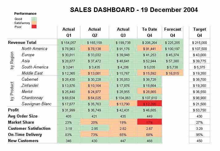
This sales dashboard uses an approach that relies almost entirely on text to communicate, using visual means only in the form of green, light red, and vibrant red hues to highlight items as "good," "satisfactory," or "poor." Expressing quantitative data textually provides precise detail, but this isn't usually the purpose of a dashboard. Dashboards are meant to provide immediate insight into what's going on, but text requires readinga serial process that is much slower than the parallel processing of a visually oriented dashboard that makes good use of the preattentive attributes of visual perception.
To compare actual measures to their targets, mental math is required. Graphical support of these comparisons would have been easier and faster to interpret.
Numbers have been center-justified in the columns, rather than right-justified. This makes them harder to compare when scanning up and down a column.
Some important measures are missing. This dashboard does not include pipeline revenue or the top 10 customers.
All four quarters of the current year have been given equal levels of emphasis. A sales manager would have greater interest in the current quarter. The design of the dashboard should have focused on the current quarter and comparatively reduced emphasis on the other quarters.
Proper care has not been given to make important distinctions. The greater intensity of the vibrant red hue that is used to highlight measures that are performing poorly will stand out clearly even to color-blind users, but the subdued shade of red and the equally subdued shade of green might not be distinguishable. Also, the numbers that ought to stand out most and be very easy to readthe poorly performing measuresare the hardest to read against the dark red background.
Critique of Sales Dashboard Example 2
Figure 8-3. This solution exhibits some of the same problems as the previous example, but also a few different ones.
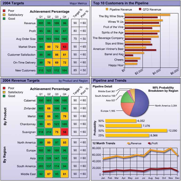
The grid lines that appear in the tables are not needed at all. Even if they were needed, they should have been muted visually. In their current heavy form, they imprison the numbers.
The grid lines that appear in the graphs are also unnecessary. They distract from the data. Especially in the context of a dashboard, you can't afford to include any unnecessary visual content.
The drop shadows on the bars and lines in two of the graphs and on the pie chart are visual fluff. These elements serve only to distract.
All of the numbers in the tables have been expressed as percentages. If those who use this dashboard only care about performance relative to targets, this is fine, but it is likely that they will want a sense of the actual amounts as well.
The pie chart is not the most effective display medium. Assuming that it is worthwhile to display how the 90% probability portion of the revenue pipeline is distributed among the regions, a bar graph with the regions in ranked order would have communicated this information more effectively.
Overall, this dashboard exhibits too many bright colors. The dashboard as a whole is visually overwhelming and fails to feature the most important data.
There is no comparison of trends in the revenue history. The 12-month revenue history shown in the line graph is useful, but it would also have been useful to see this history per region and per product, to allow the comparison of trends.
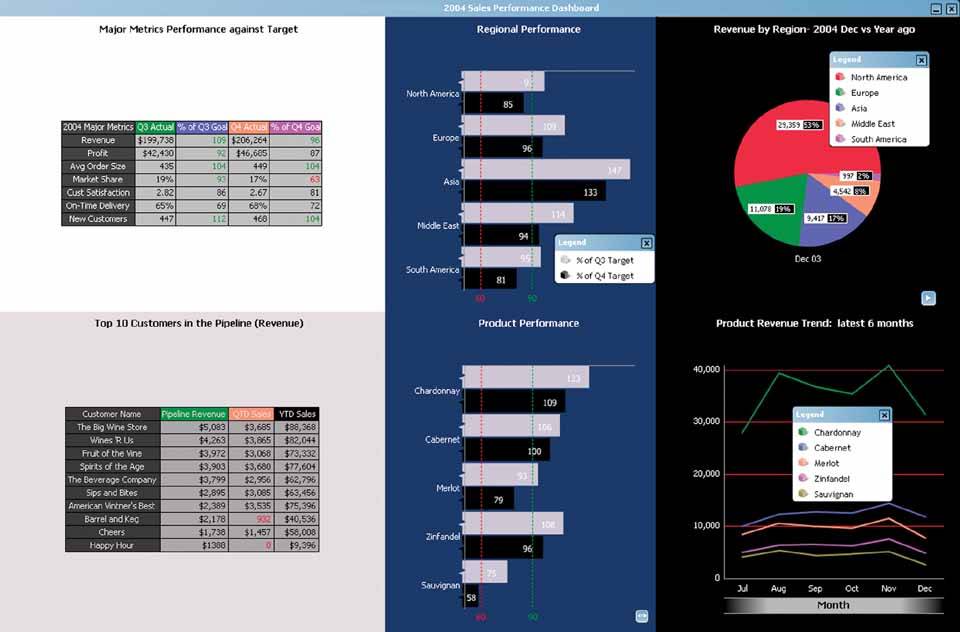
Critique of Sales Dashboard Example 3
Figure 8-4. This solution illustrates several of the problems that I pointed out in Chapter 3, Thirteen Common Mistakes in Dashboard Design.
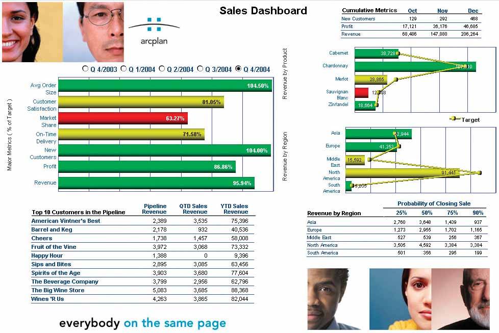
This design fragments the data that a sales manager would want to see into separate instances of the dashboard. Notice the radio buttons above the graph on the left, which are used to select the quarter that you want to see. This gives you no means to compare sales performance over time.
The photographs are chartjunk (a term coined by Edward Tufte to describe visual content in an information display that serves only as decoration). This useless decoration serves only to distract from the data. After seeing these faces for a couple of days, viewers will tire of them and wish the space had been better used. Furthermore, the most important real estate on the screen (at the top left) is taken up by photographs and a company logo. This is a waste of valuable space.
The bar graph in the upper left fails to visually display clear comparisons to the targets. You must read the numbers printed on the bars to determine the relationships to the targets.
The two graphs on the right make an attempt to visually compare the revenue measures to their targets, but they use a line to encode the targets, which is inappropriate for this data. Using a line to connect values in a graph suggests a relationship of change between the values, but revenue values for individual products or regions are not intimately connected to one anotherthey are discrete values along a nominal scale. The patterns formed by the lines are meaningless.
Critique of Sales Dashboard Example 4
Figure 8-5. This example used headache-inducing colors.
The use of color is too dramatic, especially in the areas with the dark backgrounds. A light, slightly off-white background throughout would have worked better. Also, the use of extremely different background colors to separate the data into four sections isn't necessary.
White space is overused. Rather than surrounding the two tables on the left in a large amount of white space, the tables could have been enlarged to make them easier to read.
Critique of Sales Dashboard Example 5
Figure 8-6. This solution exhibits some of the problems found in previous examples, and a few others.
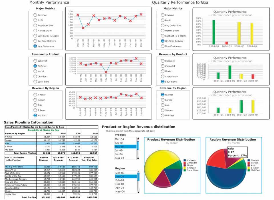
Once again, we have a design that has fragmented the data. Notice the radio buttons or sliders next to each of the graphs. We can only see one measure at a time in each graph, yet much of this data ought to be displayed together to enable us to make useful comparisons (such as between the regions).
The beautiful, brightly colored pie charts look so much like candy, I get a sugar-rush just looking at them. The colors are much too bright, and the photo-realistic shading to give them a 3-D appearance is simply not necessary. This effect makes the pie charts jump out as the dominant features of the dashboard, which is not warranted. Also, once again, pie charts are not the most effective means of displaying data on a dashboard, because they don't allow for comparisons as easily as bar graphs.
The visual shading on the bars and buttons, like that on the pie charts, is unnecessary and distracting. This contributes to the effect of making these objects pop out inappropriately.
Critique of Sales Dashboard Example 6
Figure 8-7. While visually appealing in some ways, this solution has some serious weaknesses.
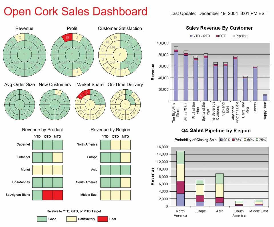
Despite the visual appeal of the left half of this dashboard, the display media were not well chosen. The circular representations of time-series data using hues to encode states of performance (good, satisfactory, and poor) are clever, but for the purpose of showing history, these are not as intuitive or informative as a linear display, such as a line graph.
None of the measures that appear on the left side of the dashboard is revealed beyond its performance state. Knowing the actual revenue amount and more about how it compares to the target would certainly be useful to a sales manager. Unlike some of the previous examples that used hues to encode states of performance, however, I believe that these hues were carefully chosen to be recognizable by those who are color-blind.
The circular display mechanisms treat all periods of time equally. There is no emphasis on the current quarter.
Gradient fill colors in the bar graphs add meaningless visual interest. They also influence perception of the values encoded by the bars in subtle ways. Bars that extend into the darker sections of the gradient appear slightly different from those that extend only into the lighter sections. Dashboard designers should be conscious of even these subtle effects and avoid them.
Critique of Sales Dashboard Example 7
Figure 8-8. This dashboard has a problem that we haven't seen so far that undermines its effectiveness.
Some of these graphs are too complex for easy interpretation. The revenue performance by product and region graphs at the lower left and the quarter-to-date sales pipeline by region graph in the center bottom position all use bars that encode values in two dimensions, using both the height and width of each bar. This is a worthwhile attempt to save space, but one that requires too much study to interpret due to limitations in visual perception. The two graphs on the left both use the X (horizontal) axis to encode revenue performance compared to target, and the Y (vertical) axis to encode the portion of each product or region to the whole, functioning like stacked bar graphs. The pipeline revenue graph in the center displays the different parts of the pipeline (90% probability, etc.) as segments of the bar running horizontally from left to right, and the regional portions of the total pipeline as vertical segments. Using both the height and width of the bars to encode quantitative valuesrectangles that tempt us to compare their 2-D areas to one anotherresults in inaccurate comparisons.
Critique of Sales Dashboard Example 8
Figure 8-9. This final example is quite a departure from the others and has some serious (and probably obvious) flaws.
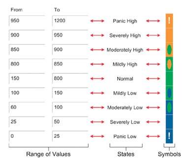
This dashboard, while an interesting contrast to the others, is confusing at first glance and likely to remain that way for some while. Much of the data it presents is also fairly imprecise. Colors and shapes have been used to encode values in the rectangles that appear throughout the dashboard. In the upper-right corner, you find a legend that tells you what each of the rectangles represents (revenue, market share, profit, etc.) wherever you see them arranged in this particular configuration. Although a key for the meaning of the various colors and shapes that appear in the rectangles does not appear on the dashboard, the key shown in Figure 8-10 was provided separately when it was submitted for the competition. You could certainly memorize the meanings of the various rectangle locations and of the colors and shapes inside them, but even after that effort, these rectangles would still never give you more than a rough sense of how the measures compare to their targets. For instance, seeing these measures encoded in this way and arranged side by side to represent months or quarters does not come close to providing the understanding of historical trend that a simple line graph could convey.
Figure 8-10. Key for interpreting the data in Figure 8-9.
Now that you've taken this little tour through several solutions to the same dashboard design challenge, go back and take a look once more at the dashboard in Figure 8-1. As you can see, there is an eloquence to data displayed simply that cannot be achieved if we stray from the essential goal of communication.
Clarifying the Vision
- Clarifying the Vision
- All That Glitters Is Not Gold
- Even Dashboards Have a History
- Dispelling the Confusion
- A Timely Opportunity
Variations in Dashboard Uses and Data
Thirteen Common Mistakes in Dashboard Design
- Thirteen Common Mistakes in Dashboard Design
- Exceeding the Boundaries of a Single Screen
- Supplying Inadequate Context for the Data
- Displaying Excessive Detail or Precision
- Choosing a Deficient Measure
- Choosing Inappropriate Display Media
- Introducing Meaningless Variety
- Using Poorly Designed Display Media
- Encoding Quantitative Data Inaccurately
- Arranging the Data Poorly
- Highlighting Important Data Ineffectively or Not at All
- Cluttering the Display with Useless Decoration
- Misusing or Overusing Color
- Designing an Unattractive Visual Display
Tapping into the Power of Visual Perception
- Tapping into the Power of Visual Perception
- Understanding the Limits of Short-Term Memory
- Visually Encoding Data for Rapid Perception
- Gestalt Principles of Visual Perception
- Applying the Principles of Visual Perception to Dashboard Design
Eloquence Through Simplicity
- Eloquence Through Simplicity
- Characteristics of a Well-Designed Dashboard
- Key Goals in the Visual Design Process
Effective Dashboard Display Media
- Effective Dashboard Display Media
- Select the Best Display Medium
- An Ideal Library of Dashboard Display Media
- Summary
Designing Dashboards for Usability
- Designing Dashboards for Usability
- Organize the Information to Support Its Meaning and Use
- Maintain Consistency for Quick and Accurate Interpretation
- Make the Viewing Experience Aesthetically Pleasing
- Design for Use as a Launch Pad
- Test Your Design for Usability
Putting It All Together
EAN: 2147483647
Pages: 80
