Choosing a Deficient Measure
For a measure to be meaningful, we must know what is being measured and the units in which the measure is being expressed. A measure is deficient if it isn't the one that most clearly and efficiently communicates the meaning that the dashboard viewer should discern. It can be accurate, yet not the best choice for the intended message. For example, if the dashboard viewer only needs to know to what degree actual revenue differs from budgeted revenue, it would be more direct to simply express the variance as9% (and perhaps display the variance of$8,066 as well) rather than displaying the actual revenue amount of $76,934 and the budgeted revenue amount of $85,000 and leaving it to the viewer to calculate the difference. In this case, a percentage clearly focuses attention on the variance in a manner that is directly intelligible.
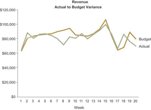
Figure 3-7 illustrates this point. While this graph displays actual and budgeted revenues separately, its purpose is to communicate the variance of actual revenues from the budget.
Figure 3-7. This graph illustrates the use of measures that fail to directly express the intended message.
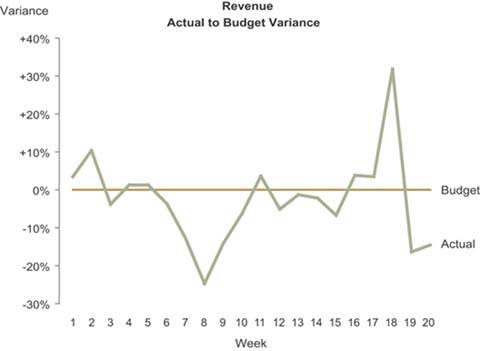
The variance, however, could have been displayed more vividly by encoding budgeted revenue as a reference line of 0% and the variance as a line that meanders above and below budget (expressed in units of positive and negative percentages, as shown on the next page in Figure 3-8). The point here is to always think carefully about the message that most directly supports the viewer's needs, and then select the measure that most directly supports that message.
Figure 3-8. This graph is designed to emphasize deviation from a target, which it accomplishes in part by expressing the difference between budgeted and actual revenues using percentages.
Clarifying the Vision
- Clarifying the Vision
- All That Glitters Is Not Gold
- Even Dashboards Have a History
- Dispelling the Confusion
- A Timely Opportunity
Variations in Dashboard Uses and Data
Thirteen Common Mistakes in Dashboard Design
- Thirteen Common Mistakes in Dashboard Design
- Exceeding the Boundaries of a Single Screen
- Supplying Inadequate Context for the Data
- Displaying Excessive Detail or Precision
- Choosing a Deficient Measure
- Choosing Inappropriate Display Media
- Introducing Meaningless Variety
- Using Poorly Designed Display Media
- Encoding Quantitative Data Inaccurately
- Arranging the Data Poorly
- Highlighting Important Data Ineffectively or Not at All
- Cluttering the Display with Useless Decoration
- Misusing or Overusing Color
- Designing an Unattractive Visual Display
Tapping into the Power of Visual Perception
- Tapping into the Power of Visual Perception
- Understanding the Limits of Short-Term Memory
- Visually Encoding Data for Rapid Perception
- Gestalt Principles of Visual Perception
- Applying the Principles of Visual Perception to Dashboard Design
Eloquence Through Simplicity
- Eloquence Through Simplicity
- Characteristics of a Well-Designed Dashboard
- Key Goals in the Visual Design Process
Effective Dashboard Display Media
- Effective Dashboard Display Media
- Select the Best Display Medium
- An Ideal Library of Dashboard Display Media
- Summary
Designing Dashboards for Usability
- Designing Dashboards for Usability
- Organize the Information to Support Its Meaning and Use
- Maintain Consistency for Quick and Accurate Interpretation
- Make the Viewing Experience Aesthetically Pleasing
- Design for Use as a Launch Pad
- Test Your Design for Usability
Putting It All Together
EAN: 2147483647
Pages: 80
