Characteristics of a Well-Designed Dashboard
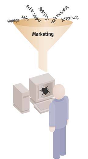
The fundamental challenge of dashboard design involves squeezing a great deal of useful and often disparate information into a small amount of space, all the while preserving clarity. This certainly isn't the only challengeothers abound, such as selecting the right data in the first place but it is the primary challenge that is particular to dashboards. Limited to a single screen to keep all the data within eye span, dashboard real estate is extremely valuable: you can't afford to waste an inch. Fitting everything in without sacrificing meaning doesn't require muscles, it requires finesse.
Figure 5-1. The fundamental challenge of dashboard design is to effectively display a great deal of often disparate data in a small amount of space.
Unless you know what you're doing, you'll end up with a cluttered mess. Think for a moment about the cockpit of a commercial jet. Years of effort went into its design to ensure that despite the many things pilots must monitor, they can see everything that's going on at a glance. Every time I board a plane, I'm grateful that skilled designers worked hard to present this information effectively. Similar care is needed for the design of dashboards, but unlike aircraft cockpit design, few of those who create dashboards have actually studied the science of design. You can become an exception to this unfortunate and costly norm. It is unlikely that people will lose their lives if you fail, but businesses do occasionally crash and burnand frequently lose moneydue to failed communication of just this sort.
Note: Henry David Thoreau, Walden (originally published in 1864).
Henry David Thoreau once penned the same word three times in succession to emphasize an important quality of life that applies to design as well: "Simplify, simplify, simplify!" Though I often fail, I strive to live my life and to design all forms of communication according to Thoreau's sage advice to keep things simple. Eloquence in communication is often achieved through simplification. Too often we smear a thick layer of gaudy makeup over data in an effort to impress or entertain, rather than focusing on communicating the truth of the matter in the clearest possible way.
When designing dashboards, you must include only the information that you absolutely need, you must condense it in ways that don't decrease its meaning, and you must display it using visual display mechanisms that, even when quite small, can be easily read and understood. Well-designed dashboards deliver information that is:
- Exceptionally well organized
- Condensed, primarily in the form of summaries and exceptions
- Specific to and customized for the dashboard's audience and objectives
- Displayed using concise and often small media that communicate the data and its message in the clearest and most direct way possible
Dashboards tell people what's happening and should help them immediately recognize what needs their attention. Just like the dashboard of a car, which provides easily monitored measures of speed, remaining fuel, oil level, battery strength, engine trouble, and so on, a business information dashboard provides an overview that can be assimilated quickly, but doesn't necessarily give you all the information you might need to thoroughly respond to any problems or opportunities that are revealed.
A full diagnosis to determine how to respond to the data gleaned from a dashboard often requires additional information. This is as it should be, because a dashboard that tried to give you everything you need to do your job, including all the details, would be unreadable. Instead, dashboards should provide a broad and high-level overview that informs you instantly about the state of things. If they go further by providing quick and easy access to the additional information that you might need, that's wonderfulbut that journey takes you beyond the dashboard itself.
5.1.1. Condensing Information via Summarization and Exception
The best way to condense a broad spectrum of information to fit onto a dashboard is in the form of summaries and exceptions. Summarization involves the process of reduction. Summaries represent a set of numbers (often a large set) as a single number. The two most common summaries that appear on dashboards are sums and averages. Measures of distribution and correlation are sometimes appropriate, but these are relatively rare.
Given the purpose of a dashboard to help people monitor what's going on, much of the information it presents is necessary only when something unusual is happening; something that falls outside the realm of normality, into the realm of problems and opportunities. Why make someone wade through hundreds of values when only one or two require attention? We call these critical values exceptions.
The best dashboards are designed to specifically address information needs related to a particular objective or set of objectives. Not only should the information be narrowed to what directly applies, but the communication of that information should use its audience's vocabulary. You wouldn't express the relationship between the costs of marketing and resulting revenues as a linear correlation coefficient if the audience had no idea what that was or how to make sense of it. A familiar graph would do a better job. Likewise, you wouldn't break the data into months if the audience were composed of sales managers who think entirely in terms of weeks. Customization is vital to the success of a dashboard.
An aspect of customization that is often overlooked involves expressing quantitative data at a level of precision that is appropriate to the task at hand. The greater the numeric precision, the more time it will take viewers to absorb the data. When examining financials, most executives rarely need to see numbers down to the level of cents or even beyond the nearest thousand, ten thousand, hundred thousand, or even million, but the manager of accounting might need to see every penny.
Display media must be designed to say exactly what they need to sayno moredirectly, clearly, and without any form of distraction, in a way that communicates the maximum meaning in the minimum amount of space. If a display mechanism that looks like a fuel gauge, thermometer, or traffic signal communicates the necessary information in this manner, then that's what you ought to use. If, however, it fails any of these tests, it ought to be replaced with something that does the job better. Insisting on cute displays when other means would work better is counterproductive, even if everyone seems to be in love with them. This love is fickle. The appeal of cuteness will fade quickly, and the only thing that will matter then is how well the display device works: how efficiently and effectively it communicates.
Two fundamental principles should guide the selection of the ideal dashboard display media:
- It must be the best way to display a particular type of information that is commonly found in dashboards.
- It must be able to serve its purpose even when sized to fit into a small space.
In the next chapter, we'll examine an ideal library of dashboard display media that fulfill these requirements. For now, let's examine some design principles.
Clarifying the Vision
- Clarifying the Vision
- All That Glitters Is Not Gold
- Even Dashboards Have a History
- Dispelling the Confusion
- A Timely Opportunity
Variations in Dashboard Uses and Data
Thirteen Common Mistakes in Dashboard Design
- Thirteen Common Mistakes in Dashboard Design
- Exceeding the Boundaries of a Single Screen
- Supplying Inadequate Context for the Data
- Displaying Excessive Detail or Precision
- Choosing a Deficient Measure
- Choosing Inappropriate Display Media
- Introducing Meaningless Variety
- Using Poorly Designed Display Media
- Encoding Quantitative Data Inaccurately
- Arranging the Data Poorly
- Highlighting Important Data Ineffectively or Not at All
- Cluttering the Display with Useless Decoration
- Misusing or Overusing Color
- Designing an Unattractive Visual Display
Tapping into the Power of Visual Perception
- Tapping into the Power of Visual Perception
- Understanding the Limits of Short-Term Memory
- Visually Encoding Data for Rapid Perception
- Gestalt Principles of Visual Perception
- Applying the Principles of Visual Perception to Dashboard Design
Eloquence Through Simplicity
- Eloquence Through Simplicity
- Characteristics of a Well-Designed Dashboard
- Key Goals in the Visual Design Process
Effective Dashboard Display Media
- Effective Dashboard Display Media
- Select the Best Display Medium
- An Ideal Library of Dashboard Display Media
- Summary
Designing Dashboards for Usability
- Designing Dashboards for Usability
- Organize the Information to Support Its Meaning and Use
- Maintain Consistency for Quick and Accurate Interpretation
- Make the Viewing Experience Aesthetically Pleasing
- Design for Use as a Launch Pad
- Test Your Design for Usability
Putting It All Together
EAN: 2147483647
Pages: 80
- An Emerging Strategy for E-Business IT Governance
- Linking the IT Balanced Scorecard to the Business Objectives at a Major Canadian Financial Group
- Technical Issues Related to IT Governance Tactics: Product Metrics, Measurements and Process Control
- Managing IT Functions
- Governance in IT Outsourcing Partnerships
